
While working with modern JavaScript frameworks, you quickly realize that user interfaces are becoming component-driven. Splitting interfaces into components provides better code reuse, favors DRY software principles, and improves code sharing in projects with similar needs.

This approach brought by frameworks is now the backbone of frontend development, making web development overall more approachable and less overwhelming. Now we have powerful frameworks like Vue.js, React, Svelte, and SolidJS, all of which came with huge improvements on the development experience, providing many useful tools for developers to build these components.
A framework like Vue gives us the ability to write reusable code in SFC (Single File Components), and the opportunity to document it via props, events, and code comments. However, we might still feel the lack of a more accessible way to provide solid documentation for our components during the development process.
This is where Storybook comes in. Storybook proposes a solid approach on visual testing and component isolation. It may come in handy when working either with a huge amount of complex components or with bigger teams that may have more interaction with user interfaces.
In this post we will get a practical introduction to Storybook. We’ll discuss how it interacts with Vue, glance through the bottlenecks we may encounter while setting up a Vue project with Storybook, and learn how to overcome them.
Storybook is an open source tool that helps you isolate your components while granting you the capacity to “play” with them.
While building your interface’s components, you may need to sandbox them to ease testing, previewing, and documentation. Storybook will boost your overall code maintainability by making your components show up like separate entities ready to be tested and integrated with others.
In addition, your sandboxed components can be shared with anyone in your team via your hosted Storybook instance, which can help create a smoother communication with other actors involved in building the interface.
We are going to create a basic single page app with a few components, then set up our stories on Storybook to work with them.
A story captures the rendered state of a UI component. In practice, a story is just a documented form of your isolated component in an environment with a preview panel and action buttons, which will help you tweak and visualize the state of your components.
Before starting Storybook, you need to have your Vue application running. For this tutorial, I am using Vite, a build tool that provides a better development experience for your web apps.
Run the following command to get your Vue project running:
npm init vite@latest
Now that you have an existing Vue app (Storybook is easier to install in existing apps because it has automatic project detecting abilities), initializing Storybook will create sample files based on your project files once you run this command:
npx sb init
The command above will install Storybook with its dependencies, configure Storybook’s instance, and add some boilerplate code to guide you.
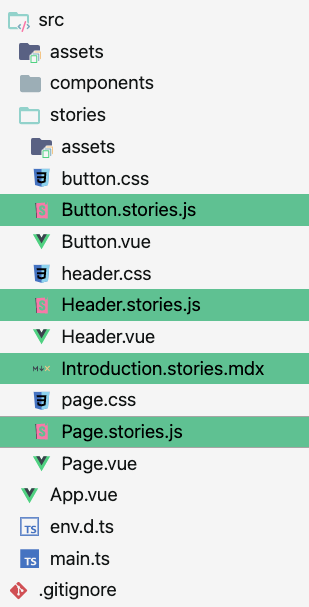
In your src/stories directory, you’ll find code added by Storybook. Stories are the files with the xxx.stories.js extension; the other files are samples to your project’s files. They will be deleted because they are not your app’s components. Storybook provides them as a means of guidance on how to write stories for your Vue components.
The Replay is a weekly newsletter for dev and engineering leaders.
Delivered once a week, it's your curated guide to the most important conversations around frontend dev, emerging AI tools, and the state of modern software.
Now that you are familiar with Storybook’s initialization phase, you can start your app to ensure that everything is working well:
npm run storybook
It should start a local development server for Storybook and automatically open in a new browser tab.
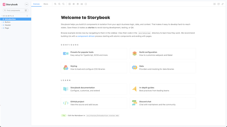
This is the introduction page opened when you run the above command, and it corresponds to the introduction.stories.mdx file created by Storybook. This file is written with MDX, a markup language that understands JSX.
Files in MDX are viewed as documentation stories because they do not isolate components for testing nor provide a playground. Instead they may be used for documentation pages, introduction pages, or about pages.
Now that we have a working app and a running Storybook instance, We’ll create a simple app with some basic buttons, cards and text, then we’ll create their stories, tweak their states and setup basic automated visual testing.
I’ve created a few components which you can add under src/components in your Vue project.
The first is a button component:
// Button.vue
<script setup lang="ts">
import Card from './components/Card.vue'
import Button from './components/Button.vue'
</script>
<template>
  <Card title="Hello"></Card>
  <Button label="Hello"></Button>
</template>
<style>
#app {
  font-family: Avenir, Helvetica, Arial, sans-serif;
  -webkit-font-smoothing: antialiased;
  -moz-osx-font-smoothing: grayscale;
  text-align: center;
  color: #2c3e50;
  margin-top: 60px;
}
</style>
The second is a card component:
// Card.vue
<template>
  <div class="card" @click="onClick" :disabled="disabled" :style="style">
    {{ title }}
  </div>
</template>
<script lang="ts">
import { reactive, computed } from 'vue';
export default {
  name: 'card',
  props: {
    title: {
      type: String,
      default: 'Button',
      required: true,
    },
    disabled: {
      type: Boolean,
      default: false,
    },
    rounded: {
      type: Boolean,
      default: false,
    },
    backgroundColor: {
      type: String,
      default: '#efcccf',
    },
  },
  emits: ['click'],
  setup(props: any, { emit }: any) {
    props = reactive(props);
    return {
      style: computed(() => ({
        backgroundColor: props.backgroundColor,
        borderRadius: props.rounded ? '3em' : '0px',
      })),
      onClick() {
        emit('clicked');
      }
    }
  },
};
</script>
<style scoped>
.card {
  font-family: Helvetica, Arial, sans-serif;
  border: 0;
  text-align: left;
  padding: 15px;
  width: 200px;
  height: 100px;
  box-shadow: rgba(50, 50, 93, 0.25) 0px 50px 100px -20px, rgba(0, 0, 0, 0.3) 0px 30px 60px -30px;
}
</style>
And finally, the third is a text component:
// Text.vue
<template>
  <p :style="style">
    {{ label }}
  </p>
</template>
<script lang="ts">
import { reactive, computed } from 'vue';
export default {
  name: 'txt',
  props: {
    label: {
      type: String,
      default: 'Button',
      required: true,
    },
    size: {
      type: Number,
      default: 14,
    },
  },
  setup(props: any) {
    props = reactive(props);
    return {
      style: computed(() => ({
        fontSize: `${props.size}px`,
      }))
    }
  },
};
</script>
We have our three components created; now let’s create their respective stories and see what happens.
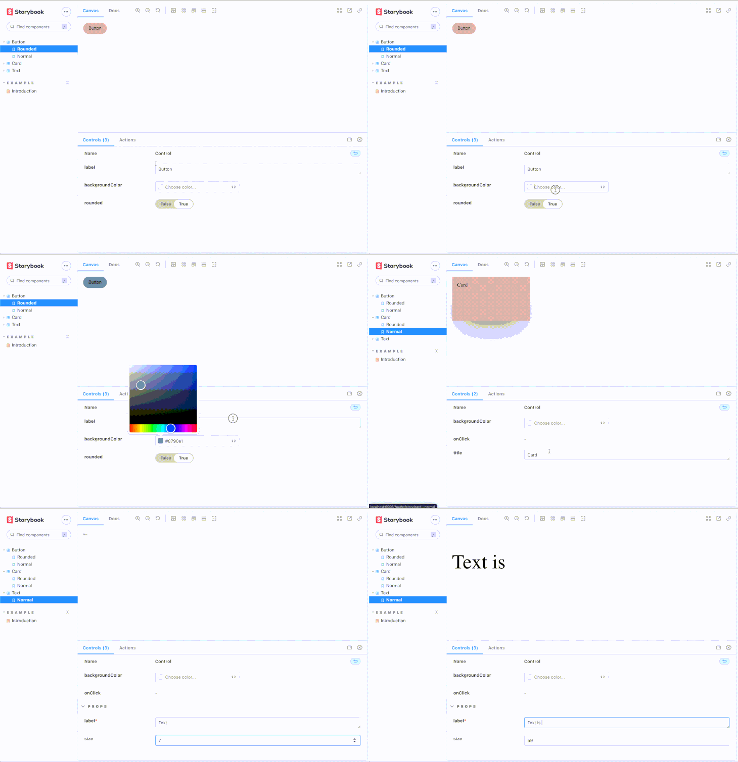
We created the preview above by writing different stories corresponding to the components. In an effort to make the post less cumbersome, I will only show the code for the button story:
// button.stories.js

import Button from '../components/Button.vue';
export default {
  title: 'Button',
  component: {Button},
  argTypes: {
    label: 'String',
    backgroundColor: { control: 'color' },
  },
};

const Template = (args) => ({
  // Components used in your story `template` are defined in the `components` object
  components: { Button },
  // The story's `args` need to be mapped into the template through the `setup()` method
  setup() {
    return { args };
  },
  // And then the `args` are bound to your component with `v-bind="args"`
  template: '<Button label="hello" v-bind="args" />',
});

export const Rounded = Template.bind({});
Rounded.args = {
  label: 'Button',
  rounded: true,
};
export const Normal = Template.bind({});
Normal.args = {
  label: 'Button',
};
If you would like to see the code for the other two components, here’s the full source code on my GitHub.
Most of your stories will have the configuration above. They are called Component Story Formats (CSF). The Component Story Format is an open standard for component examples based on JavaScript ES6 modules. This enables interoperation between development, testing, and design tools. It is also seen in UXPin and WebComponents.
In Storybook, we can separate a story’s code into the default export section, template section, and the name exports.
Default exports contain everything representing the metadata of the component, including the component itself. The title should be unique and accepts path-like strings in case you want to organize your stories in folders (for example base/button).
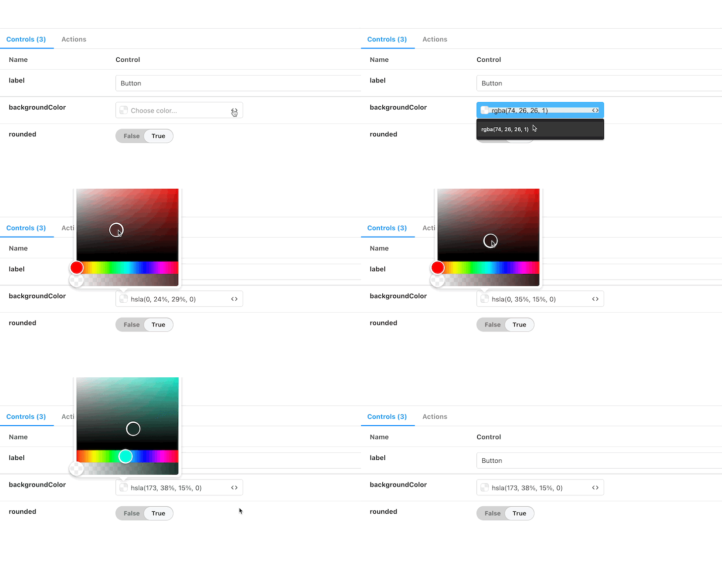
You can include argument types (argTypes) and parameters to improve the user experience while they are tweaking the state. They account for the action buttons at the bottom of the story’s preview. For example, in the button story we created, we associated backgroundColor to a color picker. We did not add argTypes for the other props in our Vue component because Storybook is able to understand primitive types and automatically create the corresponding action tool.
Below is what Storybook renders after reading your default export in a story. It is able to get the props from your component (rounded: Boolean and label: String) and create appropriate control inputs for them. Then, you can specify a custom argument type like we did for the background color to add a color picker input.
The template section helps Storybook call your Vue components with the necessary props and bindings. These bindings are then shared to named exports to create different story setups as shown above.
Named exports are the different stories for your apps. They correspond to one way of rendering your app with a particular configuration.
You can rely on arguments and still be able to sandbox and test your components, however, the named exports approach helps you create a specific setup for your component to be shown in a story.
You can find more information on how to write stories in the official documentation.
Storybook offers a specific approach to modern frontend development. Thanks to its flexibility, we have the ability to make our Storybook instance fit our use case and even make our project more maintainable. Storybook showcases a panoply of “addons”, which can help you achieve a highly personalized setup to your stories.
In case you need routed stories in Vue for components that rely on the state of the router, you might benefit from the Vue 3 storybook router addon.
The storyshots addon will help you create code snapshots automatically with Jest. These snapshots may help you test each of your components for visual regression. They can go as far as being integrated in your CICD process to provide you bug-proof code between your project upgrades.
The testing addon can help you write unit tests (with Jest) for your stories, without leaving Storybook. These tests provide a double layer of robustness to your components because they are tested in Storybook’s sandbox.
Storybook can go as far as mocking data, integrating design insights with tools like Figma or Zeplin, visually debugging your code with toolbars and controls, and testing internationalization.
As helpful as Storybook can be, it can also be cumbersome to make it work exactly as you want. The following is a list of common obstructions you may encounter, and tips to get through them.
If you are using basic CSS, you should check if it is scoped or not. Scoped styles in Vue are applied only to the component in which they are declared and scoped.
Because Storybook isolates your component, you should not expect global styles to be added to these components.
Scope your CSS (it is recommended) or import the global styles in your .storybook/preview.js file by importing '../styles/globals.css'.
If you are using SASS or any CSS preprocessor, you need to update your .storybook/main.js file to help it process SCSS by extending a WebPack loader to process your styles.
Sometimes your fonts are not imported; these need to be loaded too. You have to create a .storybook/preview-head.html file and call your fonts as you’d do in an HTML file.
If you are using Vuetify, Naive UI, Chakra, or any other Vue UI framework, you may see them unapplied on your components. This is because Storybook itself is considered another instance that only has a connection to your app via the components it sandboxes.
To solve this, you will need to decorate your stories with the framework’s wrapper (if it has one) or import it as you typically would in your app to make it work.
Storybook is a popular and well-maintained piece of software. Most of the limitations you may encounter while working on your app have been addressed or have an existing workaround solution if you check their documentation or discussion boards.
Great frameworks like Vue are always backed by a solid ecosystem that helps you get flawless code shipped fast. Storybook, being an important part of this ecosystem, provides developers with an irreplaceable documentation and testing tool.
If you’re interested, you can find the code for this article in this CodeSandbox.
Debugging Vue.js applications can be difficult, especially when users experience issues that are difficult to reproduce. If you’re interested in monitoring and tracking Vue mutations and actions for all of your users in production, try LogRocket.

LogRocket lets you replay user sessions, eliminating guesswork by showing exactly what users experienced. It captures console logs, errors, network requests, and pixel-perfect DOM recordings — compatible with all frameworks.
With Galileo AI, you can instantly identify and explain user struggles with automated monitoring of your entire product experience.
Modernize how you debug your Vue apps — start monitoring for free.

When should you move API logic out of Next.js? Learn when Route Handlers stop scaling and how ElysiaJS helps.

Explore how Dokploy streamlines app deployment with Docker, automated builds, and simpler infrastructure compared to traditional CI/CD workflows.

A side-by-side look at Astro and Next.js for content-heavy sites, breaking down performance, JavaScript payload, and when each framework actually makes sense.

AI-generated tests can speed up React testing, but they also create hidden risks. Here’s what broke in a real app.re
Hey there, want to help make our blog better?
Join LogRocket’s Content Advisory Board. You’ll help inform the type of content we create and get access to exclusive meetups, social accreditation, and swag.
Sign up now