According to its official website, lit-html is an efficient, expressive, and extensible HTML templating library for JavaScript. While the current version of lit-html is part of the Lit component library, the templating portion is factored into a standalone library, which we will discuss in this article.

This library makes markup reusable by allowing us to define placeholders that can contain different values in HTML. This saves developers valuable time and energy.In this article, we’ll take a look at how lit-html works and apply it by following a simple tutorial using HTML and CSS.
Let’s get started!
The Replay is a weekly newsletter for dev and engineering leaders.
Delivered once a week, it's your curated guide to the most important conversations around frontend dev, emerging AI tools, and the state of modern software.
A template is a combination of static and dynamic content that is structured a certain way. For example, an HTML template for a signup form may look something like this:
<div>
<p>First Name: <span>_____</span></p>
      <p>Last Name: <span>_____</span></p>
      <p>Email: <span>_____</span></p>
      <p>Phone Number: <span>_____</span></p>
</div>
The static content includes fields for first name, last name, email, and phone number. The lines represent the dynamic content.
If we were to manipulate the HTML above with plain JavaScript, we’d have to use DOM selecting APIs like querySelector(), querySelectorAll(), and getElementByTagName to get the element and perform an operation on it; this can quickly make the app appear bogus or poorly coded.
lit-html allows us to render HTML templates in JavaScript that are similar to the code we have above. The dynamic parts of the template can be rendered and manipulated, making the template easy to reuse.
lit-html has a number of benefits that improve both user and developer experience.
As you can see, lit-html is a powerful templating library and a great addition for any developer’s project.
lit-html relies on JavaScript’s ECMAScript 2015 (ES6) template literals, HTML’s <template> tag, and some other undisclosed technologies to function and boost performance.
Here is an example of a simple lit-html template:
html`
    <div>
        <h1>Hello ${recepient}</h1>
        <div>Hello ${content}</div>
    </div>
`
We can see the utilization of an advanced form of template literals called tagged templates. The tag, which is HTML in this case, is a function that processes the template literals. Template literals interestingly allow the embedding of domain-specific languages such as HTML (specific to the web domain) into JavaScript.
lit-html replaces expressions with placeholders, creating a string in the process that will be used to create the template. After the template is created, lit-html optimizes the template and takes note of where the placeholders are; these locations are termed parts. It then removes the placeholders, filling in the parts with values and updating the parts when the values change.
Although lit-html templates can be used to create and manipulate DOM elements, these templates are not tied to any component model. For component building, we can use LitElement.
LitElement is an awesome library for building web components powered by lit-html templates. According to the official website, it is “a simple base class for creating fast, lightweight web components.”
It provides an easy way to create native and web UI components that can be used anywhere you have HTML in your project, regardless of the frontend library or framework used.
Here is an example of a LitElement component:
import {LitElement, html} from 'lit-element';
class TodoItem extends LitElement {
  static get properties() {
    return {
      item: {type: String},
    };
  }

  render() {
    return html`
      <div class="todo-item">
        <span>${this.item}</span>
      </div>
    `;
  }
}

customElements.define('todo-item', TodoItem);
LitElement components follow the object-oriented programming paradigm, a programming paradigm that creates reusable code blueprints (classes) and instances of the blueprint (objects).
We declare properties as static properties in LitElement and create a render method that returns a template result containing the defined template. Next, we define the component to make it available throughout the project.
Components built with LitElement are framework-or library-agnostic; they follow web components standards, which means you can create reusable custom elements while separating their functionality from the rest of your code. The shadow DOM is used for encapsulation in LitElement.
Unlike many frontend libraries that need diffing to optimally re-render the DOM when there is a change in a node, LitElement utilizes lit-html to define and render HTML templates. DOM updates are lightning-fast, because lit-html only re-renders the dynamic parts of your UI.
Let’s get our hands dirty and solidify our knowledge of lit-html and LitElement by building a simple to-do list. We will be following an atomic methodology to create components. First, we build atoms, then stack them up to build molecules, and finally create organisms.
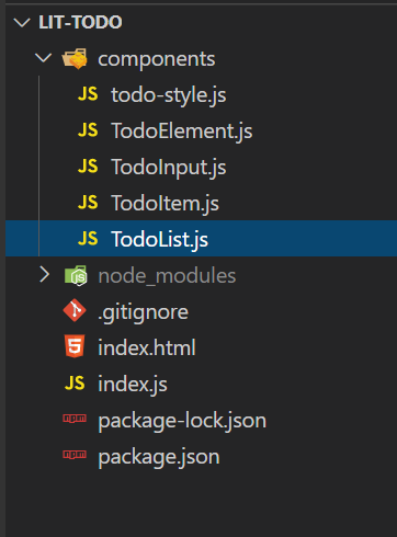
This is what the project directory will look like:

The styling for LitElement is stored in a JavaScript file named todo-style.js. Using lit-html’s CSS tag, we can write out styles in JavaScript:
import {css} from 'lit-element/lit-element.js';

export const style = css`
    *{
        font-family: monospace
    }
    ul{
        margin:0;
        padding-inline-start: 0
    }
    input{
        padding: 5px;
        font-size: 1rem;
        width:240px
    }
`
To make the style available to a LitElement, simply import the style and define it in a static styles property like so:
import { style } from "./todo-style";

static get styles() {
    return [style];
}
Like most common frontend frameworks, parent components can communicate with their children and vice versa through properties by emitting events. You can define a property using the methods below and view an example in the code snippet:
<p id="${...}"></p>?disabled="${...}".value="${...}"@event="${...}"class TodoElement extends LitElement {
static get properties(){
return {
list:{type:Array},
}
}
static get styles() {
return [style];
}
constructor() {
super();
this.list = JSON.parse(localStorage.getItem('litTodoList')) || [];
this.todo = '';
}
render() {
return html`
<div class="todo-body">
<h1>😎 Lit Todo 😎</h1>
<todo-list .list=${this.list}></todo-list>
</div>
`;
}
}
In this element, we are using a property list, signified by a dot before the property name, to pass down the list of to-dos, which we’ll be getting from localStorage.
We can easily map through the list in the TodoList component and pass each todo to the TodoItem component:
class TodoList extends LitElement {
    static get properties(){
        return {
            list:{type:Array}
        }
    }
    static get styles() {
        return [style];
      }
  render() {
    return html`
        <ul>
            ${this.list.map((todoItem) => html`<li><todo-item item=${todoItem}></todo-item></li>`)}
        </ul>
    `;
  }
}
We can also emit events to parent components, similarly to how it’s done in the TodoInput component:
class TodoInput extends LitElement {
  static get properties() {
    return {
      todo: {type: String},
      onInput: {type: Function},
      onKeyPress: {type: Function},
      createNewToDoItem: {type: Function},
    };
  }
  static get styles() {
      return [style];
  }
  render() {
    return html`
    <div class="todo-input">
        <input
            type="text"
            .value=${this.todo}
            @input=${this.onInput}
            @keypress=${this.onKeyPress}
        />
        <button
          class="todo-button"
          @click=${this.createNewToDoItem}
        >Add</button>
    </div>
    `;
  }
}
Here, the functions to be emitted are declared in the static properties method and are bound to functions in their parent component:
    handleKeyPress(e) {
        if (e.target.value !== '' && e.key === 'Enter') {
            this.createNewToDoItem();
        }
    }

    handleInput(e) {
        this.todo = e.target.value;
    }

    createNewToDoItem(){
        const todoList = JSON.parse(
         localStorage.getItem('litTodoList')
        ) || []
        todoList.push(this.todo)
        this.list = todoList
        localStorage.setItem('litTodoList', JSON.stringify(todoList))
        this.todo = ""
    }

<todo-input
  todo=${this.todo}
  .onInput=${this.handleInput.bind(this)}
  .onKeyPress=${this.handleKeyPress.bind(this)}
  .createNewToDoItem=${this.createNewToDoItem.bind(this)}
></todo-input>
I have left a little task for you! Add a delete functionality to the todo application. Here is the link to the source code.
In this article, we looked at what lit-html is, how it works, and the benefits of using it in a project. We also looked at some basic parts of LitElement by building a simple application. With the knowledge gained in this article, you should now be able to add LitElements to your project.
There’s no doubt that frontends are getting more complex. As you add new JavaScript libraries and other dependencies to your app, you’ll need more visibility to ensure your users don’t run into unknown issues.
LogRocket is a frontend application monitoring solution that lets you replay JavaScript errors as if they happened in your own browser so you can react to bugs more effectively.

LogRocket works perfectly with any app, regardless of framework, and has plugins to log additional context from Redux, Vuex, and @ngrx/store. Instead of guessing why problems happen, you can aggregate and report on what state your application was in when an issue occurred. LogRocket also monitors your app’s performance, reporting metrics like client CPU load, client memory usage, and more.
Build confidently — start monitoring for free.

AI-generated tests can speed up React testing, but they also create hidden risks. Here’s what broke in a real app.re

Why the future of DX might come from the web platform itself, not more tools or frameworks.

A hands-on test of Claude Code Review across real PRs, breaking down what it flagged, what slipped through, and how the pipeline actually performs in practice.

CSS art once made frontend feel playful and accessible. Here’s why it faded as the web became more practical and prestige-driven.
Would you be interested in joining LogRocket's developer community?
Join LogRocket’s Content Advisory Board. You’ll help inform the type of content we create and get access to exclusive meetups, social accreditation, and swag.
Sign up now