Editor’s note: This article was last updated on 25 February 2022 to include information for a more comprehensive guide to form validation in Flutter, including form validation with the Provider package, custom form fields, and Regex and Dart extension methods.

Form validation is an integral part of most applications, and an essential tool in the arsenal of any mobile application developer. With Flutter and its increasing popularity, we will explore how form validation works and alternative ways to make it work more efficiently.
The aim of this article is to provide you with a grasp of how a neat and scalable implementation of form validation in Flutter works. At the end of this blog post, you will be able to apply the concepts to all of your future app development projects.
The Flutter SDK provides us with an out-of-the-box widget and functionalities to make our lives easier when using form validation. In this article, we’ll cover two approaches to form validation: the form widget and the Provider package. You can find more information on these two approaches in the official Flutter docs.
First, we are going to create a simple login page that has the following fields:
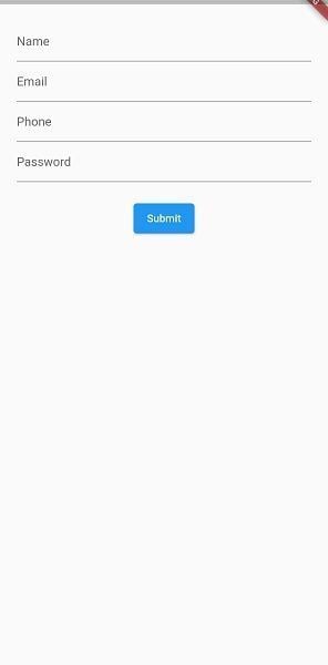
For the validation, we want the users of our app to fill in the correct details in each of these fields. The logic will be defined as such:
First, for the name field, we want the user to enter a valid first name and last name, which can be accompanied by initials.
For the email field, we want a valid email that contains some characters before the “@” sign, as well as the email domain at the end of the email.
For phone number validation, the user is expected to input 11 digits starting with the digit zero.
Finally, for our password validation, we expect the user to use a combination of an uppercase letter, a lowercase letter, a digit, and special character.
Only when the user’s input matches the above mentioned do we want to accept their input before making any requests, such as sending to a server or saving in a database.
Start by creating a new Flutter project in either of VS Code or Android Studio. Replace the Flutter default counter application in main.dart with your own stateful widget.
You should have something like this:
import 'package:flutter/material.dart';

import 'form/form_page.dart';

void main() {
  runApp(MyApp());
}

class MyApp extends StatelessWidget {
  // This widget is the root of your application.
  @override
  Widget build(BuildContext context) {
    return MaterialApp(
      title: 'Form Validation Demo',
      theme: ThemeData(
        primarySwatch: Colors.blue,
        visualDensity: VisualDensity.adaptivePlatformDensity,
      ),
      home: FormPage(),
    );
  }
}
This is what our main.dart file looks like currently. Now, create a new dart file and name it form_page.dart, then create the FormPage stateful widget inside of it with the following code:
import 'package:flutter/material.dart';

class FormPage extends StatefulWidget {
  @override
  _FormPageState createState() => _FormPageState();
}

class _FormPageState extends State {

//This key will be used to identify the state of the form.
  final _formKey = GlobalKey<FormState>();

  @override
  Widget build(BuildContext context) {
    return Scaffold(
      body: SafeArea(
        child: Form(
          key: _formKey,
          child: Column(
            children: [
              TextFormField(),
              ElevatedButton(
                onPressed: () {},
                child: const Text('Submit'),
              )
            ],
          ),
        ),
      ),
    );
  }
}
The formKey handles the state of the form, validation, and saving. Inside the column, we see a simple TextFormField and an ElevatedButton. This form will contain multiple such text form fields, with some modifications. This TextFormField widget will be extracted into a separate stateless widget and generalized for better reusability.
Now, let’s create a file called custom_form_field.dart and add the following starter code:
import 'package:flutter/material.dart';
class CustomFormField extends StatelessWidget {
  CustomFormField({Key? key,}) : super(key: key);

  @override
  Widget build(BuildContext context) {
    return TextFormField();
  }
}
This custom text field will have the following properties:
hintText, which provides hint text to be shown before any inputvalidator, a function that validates our input when instructedinputFormatter, which prevents unwanted input types in the text fieldNext, add the following code to the custom_form_field.dart:
import 'package:flutter/material.dart';
import 'package:flutter/services.dart';
class CustomFormField extends StatelessWidget {
  CustomFormField({
    Key? key,
    required this.hintText,
    this.inputFormatters,
    this.validator,
  }) : super(key: key);
  final String hintText;
  final List<TextInputFormatter>? inputFormatters;
  final String? Function(String?)? validator;
  @override
  Widget build(BuildContext context) {
    return Padding(
      padding: const EdgeInsets.all(8.0),
      child: TextFormField(
        inputFormatters: inputFormatters,
        validator: validator,
        decoration: InputDecoration(hintText: hintText),
      ),
    );
  }
}
Forms use validation as a data sanity check before processing the inputs further. Another way of ensuring that a user never enters bad data is by not allowing foreign characters to be entered in the text field. This is achieved using input formatters. inputFormatters in Flutter take a TextInputFormatter, which has a RegExp associated with it, and decides whether that RegExp has to be allowed or ignored during user input.
In order to make our lives easier and to avoid writing multiple if-else statements, we are going to employ the use of Regex and Dart’s extension methods in our application.
Let’s create an extension class that will contain all the extension methods we will be using for this tutorial:
extension extString on String {
  bool get isValidEmail {
    final emailRegExp = RegExp(r"^[a-zA-Z0-9.]+@[a-zA-Z0-9]+\.[a-zA-Z]+");
    return emailRegExp.hasMatch(this);
  }

  bool get isValidName{
    final nameRegExp = new RegExp(r"^\s*([A-Za-z]{1,}([\.,] |[-']| ))+[A-Za-z]+\.?\s*$");
    return nameRegExp.hasMatch(this);
  }

  bool get isValidPassword{
final passwordRegExp =
    RegExp(r'^(?=.*?[A-Z])(?=.*?[a-z])(?=.*?[0-9])(?=.*?[!@#\><*~]).{8,}/pre>');
    return passwordRegExp.hasMatch(this);
  }

  bool get isNotNull{
    return this!=null;
}

  bool get isValidPhone{
    final phoneRegExp = RegExp(r"^\+?0[0-9]{10}$");
    return phoneRegExp.hasMatch(this);
  }

}
For the scope of this article, we won’t spend much time elaborating on extension methods and how to construct Regex. If you are interested in learning more about extension methods in Dart, check the Dart docs here. You can also learn about constructing your own Regex here.
You’ll notice our string extension contains five methods:
isValidEmailisValidNameisValidPasswordisNotNullisValidPhoneAll the Regex methods above take the string and check if it matches the Regex pattern, then return true or false if it doesn’t match. Now all we need to do is import this file into any of our files we need to use the extension methods.
Back to our FormPage() widget, our widget tree is made up of the following: A Scaffold -> SafeArea -> Container -> Form -> Column.
We have created a formKey that will be added to our form widget to identify the state of our form, which is created by default in Flutter.
Now let’s create a text field for email:
CustomFormField(
                hintText: 'Email',
                validator: (val) {
                  if (!val.isValidName)
                    return 'Enter valid email';
                },
              ),
The validator field takes in the user input and checks to see if it satisfies our Regex condition. If it does, the field returns null. If it doesn’t, it returns a string, which will be the error message shown on our text field.
We simply repeat this for our other input fields and use the matching extension methods from our extension class. Once done for all the fields, form_field.dart will look like this:
class FormPage extends StatefulWidget {
  const FormPage({Key? key}) : super(key: key);
  @override
  _FormPageState createState() => _FormPageState();
}
class _FormPageState extends State<FormPage> {
  final _formKey = GlobalKey<FormState>();
  @override
  Widget build(BuildContext context) {
    return Scaffold(
      body: SafeArea(
        child: Form(
          key: _formKey,
          child: Column(
            children: [
              CustomFormField(
                hintText: 'Name',
                inputFormatters: [
                  FilteringTextInputFormatter.allow(
                    RegExp(r"[a-zA-Z]+|\s"),
                  )
                ],
                validator: (val) {
                  if (!val.isValidName) return 'Enter valid name';
                },
              ),
              CustomFormField(
                hintText: 'Email',
                validator: (val) {
                  if (!val.isValidEmail) return 'Enter valid email';
                },
              ),
              CustomFormField(
                hintText: 'Phone',
                inputFormatters: [
                  FilteringTextInputFormatter.allow(
                    RegExp(r"[0-9]"),
                  )
                ],
                validator: (val) {
                  if (!val.isvalidPhone) return 'Enter valid phone';
                },
              ),
              CustomFormField(
                hintText: 'Password',
                validator: (val) {
                  if (!val.isValidPassword) return 'Enter valid password';
                },
              ),
              ElevatedButton(
                onPressed: () {},
                child: const Text('Submit'),
              )
            ],
          ),
        ),
      ),
    );
  }
}
For the text field for phone number, an input formatter is used. That input formatter will allow only numbers to be input, and nothing else.
The way we trigger the validation on this page is by using the form key variable we created to give us access to the state of our form:
ElevatedButton(
                onPressed: () {
                  if (_formKey.currentState!.validate()) {
                    Navigator.of(context).push(
                      MaterialPageRoute(
                        builder: (_) => SuccessPage(),
                      ),
                    );
                  }
                },
                child: const Text('Submit'),
              )
So, whenever a user clicks on the button, we check _formKey.currentState!.validate(), then we carry out an action, which, in our case, would be simply navigating to a new screen.
Your success page can be anything or any screen you want to take the user to after completing the field validation and using the data entered by the user.
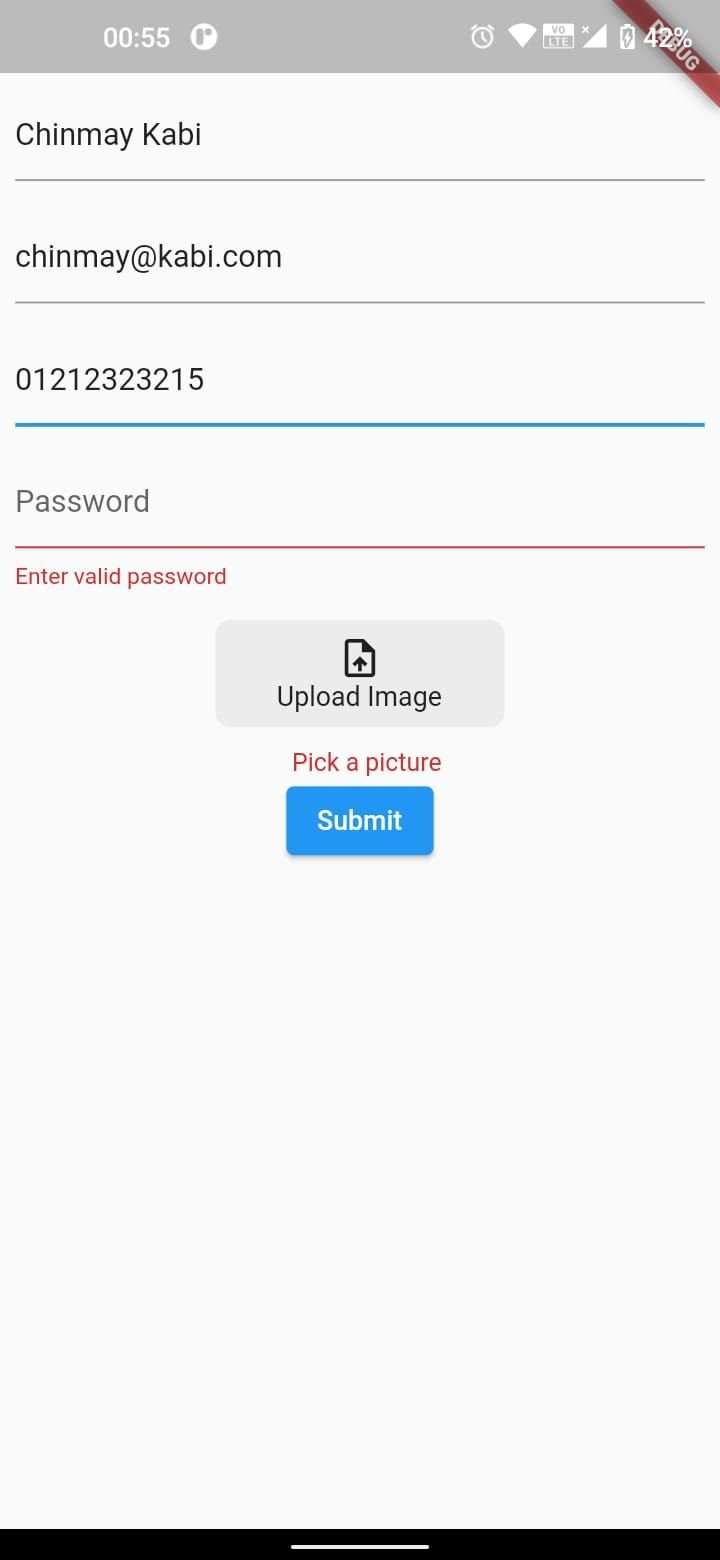
There are times in which a different widget is needed, depending on the design of your app. These widgets may not be available as a form widget in Flutter. For all such instances, there is a FormField widget, which helps us build custom form fields, adding features like validation. In this case we will build an image picker form field.
First add file_picker to pubspec.yaml. Then create a file called custom_image_form_field.dart. Here, we add the following code:
import 'dart:io';
import 'package:file_picker/file_picker.dart';
import 'package:flutter/material.dart';
class CustomImageFormField extends StatelessWidget {
  CustomImageFormField({
    Key? key,
    required this.validator,
    required this.onChanged,
  }) : super(key: key);
  final String? Function(File?) validator;
  final Function(File) onChanged;
  File? _pickedFile;
  @override
  Widget build(BuildContext context) {
    return FormField<File>(
        validator: validator,
        builder: (formFieldState) {
          return Column(
            children: [
              GestureDetector(
                onTap: () async {
                  FilePickerResult? file = await FilePicker.platform
                      .pickFiles(type: FileType.image, allowMultiple: false);
                  if (file != null) {
                    _pickedFile = File(file.files.first.path!);
                    onChanged.call(_pickedFile!);
                  }
                },
                child: Container(
                  margin: const EdgeInsets.all(8),
                  padding:
                      const EdgeInsets.symmetric(horizontal: 32, vertical: 8),
                  decoration: BoxDecoration(
                    borderRadius: BorderRadius.circular(8),
                    color: const Color(0xff707070).withOpacity(0.1),
                  ),
                  child: Column(
                    children: const [
                      Icon(Icons.upload_file),
                      Text('Upload Image')
                    ],
                  ),
                ),
              ),
              if (formFieldState.hasError)
                Padding(
                  padding: const EdgeInsets.only(left: 8, top: 10),
                  child: Text(
                    formFieldState.errorText!,
                    style: TextStyle(
                        fontStyle: FontStyle.normal,
                        fontSize: 13,
                        color: Colors.red[700],
                        height: 0.5),
                  ),
                )
            ],
          );
        });
  }
}
What differentiates a form widget from other widgets is formState. This contains important information necessary for a form to function, some of which we are leveraging here.
The validator callback in this code will return a File object if user has picked a certain file. We use this validator as we had done previously with the CustomTextField. Next, FilePicker is used to select files, and depending on whether user has picked a file or not, the onChanged callback is called, which again can be used similar to how it was used for CustomTextField.
Error text has to be shown manually in a separate widget. Whenever an errorText exists, it will be stored in formFieldState and we can fetch it from there.
Now, we can use this widget like this:
class FormPage extends StatefulWidget {
  const FormPage({Key? key}) : super(key: key);
  @override
  _FormPageState createState() => _FormPageState();
}
class _FormPageState extends State<FormPage> {
  final _formKey = GlobalKey<FormState>();
  @override
  Widget build(BuildContext context) {
    return Scaffold(
      body: SafeArea(
        child: Form(
          key: _formKey,
          child: Column(
            children: [
              CustomFormField(
                hintText: 'Name',
                inputFormatters: [
                  FilteringTextInputFormatter.allow(
                    RegExp(r"[a-zA-Z]+|\s"),
                  )
                ],
                validator: (val) {
                  if (!val.isValidName) return 'Enter valid name';
                },
              ),
              CustomFormField(
                hintText: 'Email',
                validator: (val) {
                  if (!val.isValidEmail) return 'Enter valid email';
                },
              ),
              CustomFormField(
                hintText: 'Phone',
                inputFormatters: [
                  FilteringTextInputFormatter.allow(
                    RegExp(r"[0-9]"),
                  )
                ],
                validator: (val) {
                  if (!val.isValidPhone) return 'Enter valid phone';
                },
              ),
              CustomFormField(
                hintText: 'Password',
                validator: (val) {
                  if (!val.isValidPassword) return 'Enter valid password';
                },
              ),
              CustomImageFormField(
                validator: (val) {
                  if (val == null) return 'Pick a picture';
                },
                onChanged: (_file) {},
              ),
              ElevatedButton(
                onPressed: () {
                  _formKey.currentState!.validate();
                },
                child: const Text('Submit'),
              )
            ],
          ),
        ),
      ),
    );
  }
}
When submit button is pressed, we see the following error message for an image upload.
This approach can be extended to any kind of widget, like date pickers or dropdowns, to make a custom text field.
Using Provider is another way to validate fields in Flutter. This technique is used mostly when we need to carry out some tasks on the user input without cluttering the UI classes with codes.
This is why we move the logic to our Provider class. We’ll use the Provider package and add it to our pubspec.yaml file:
# The following adds the Cupertino Icons font to your application.
# Use with the CupertinoIcons class for iOS style icons.
cupertino_icons: ^1.0.0
provider: ^6.0.2
Our pubspec.yaml file should now look like the above, and we can proceed to run flutter pub get to download the needed dependencies.
Then, we can create a new file called form_provider.dart and create a class inside it that extends ChangeNotifier. The ChangeNotifier class provides methods that enable us to listen to changes on objects we subscribe to using the ChangeNotifier.
This is why one of the most important methods provided by this class is notifylisteners()</code. This method tells our listeners to get the latest values from objects or variables they subscribe to.
Before we move to creating our Provider class, we are going to create a model that will have two variables: an error string, and another string that we will call value for now:
class ValidationModel {
  String? value;
  String? error;
  ValidationModel(this.value, this.error);
}
In our Provider class, we are going to create four fields in our ValidationModel for the inputs we receive from the user: name, email, password, and phone number. These fields will be private, so we will expose them using getters:
class FormProvider extends ChangeNotifier {
  ValidationModel _email = ValidationModel(null, null);
  ValidationModel _password = ValidationModel(null, null);
  ValidationModel _phone = ValidationModel(null, null);
  ValidationModel _name = ValidationModel(null, null);
  ValidationModel get email => _email;
  ValidationModel get password => _password;
  ValidationModel get phone => _phone;
  ValidationModel get name => _name;
}
Also, we create methods that get the input from the text fields and validate them against our conditions.
If they meet our requirements, we return null for the ValidationModel error message, and if the user input doesn’t meet our criteria, we return the error message.
Finally, we will call notifylisteners and pass the getter to the error message fields in each of our text fields.
These methods will looks something like this:
  void validateEmail(String? val) {
    if (val != null && val.isValidEmail) {
      _email = ValidationModel(val, null);
    } else {
      _email = ValidationModel(null, 'Please Enter a Valid Email');
    }
    notifyListeners();
  }
  void validatePassword(String? val) {
    if (val != null && val.isValidPassword) {
      _password = ValidationModel(val, null);
    } else {
      _password = ValidationModel(null,
          'Password must contain an uppercase, lowercase, numeric digit and special character');
    }
    notifyListeners();
  }
  void validateName(String? val) {
    if (val != null && val.isValidName) {
      _name = ValidationModel(val, null);
    } else {
      _name = ValidationModel(null, 'Please enter a valid name');
    }
    notifyListeners();
  }
  void validatePhone(String? val) {
    if (val != null && val.isValidPhone) {
      _phone = ValidationModel(val, null);
    } else {
      _phone = ValidationModel(null, 'Phone Number must be up to 11 digits');
    }
    notifyListeners();
  }
  bool get validate {
    return _email.value != null &&
        _password.value != null &&
        _phone.value != null &&
        _name.value != null;
  }
Now, in our Provider class, we have one getter function called validate that will return true if all our validation conditions are met.
Two new properties will be added to the CustomFormField, an errorText and an onChanged callback. The widget should look something like this:
class CustomFormField extends StatelessWidget {
  const CustomFormField({
    Key? key,
    required this.hintText,
    required this.errorText,
    this.onChanged,
    this.validator,
    this.inputFormatters,
  }) : super(key: key);
  final String hintText;
  final List<TextInputFormatter>? inputFormatters;
  final String? errorText;
  final Function(String?)? onChanged;
  final String? Function(String?)? validator;
  @override
  Widget build(BuildContext context) {
    return Padding(
      padding: const EdgeInsets.all(8.0),
      child: TextFormField(
        onChanged: onChanged,
        validator: validator,
        inputFormatters: inputFormatters,
        decoration: InputDecoration(hintText: hintText, errorText: errorText),
      ),
    );
  }
}
In our UI class, we will replace the previous code we had with something like this:
class ProviderFormPage extends StatefulWidget {
  const ProviderFormPage({Key? key}) : super(key: key);
  @override
  _ProviderFormPageState createState() => _ProviderFormPageState();
}
class _ProviderFormPageState extends State<ProviderFormPage> {
  final _formKey = GlobalKey<FormState>();
  late FormProvider _formProvider;
  @override
  Widget build(BuildContext context) {
     = Provider.of<FormProvider>(context);
    return Scaffold(
      body: SafeArea(
        child: Form(
          key: _formKey,
          child: Column(
            children: [
              CustomFormField(
                hintText: 'Name',
                inputFormatters: [
                  FilteringTextInputFormatter.allow(
                    RegExp(r"[a-zA-Z]+|\s"),
                  )
                ],
                onChanged: _formProvider.validateName,
                errorText: _formProvider.name.error,
              ),
              CustomFormField(
                hintText: 'Email',
                onChanged: _formProvider.validateEmail,
                errorText: _formProvider.email.error,
              ),
              CustomFormField(
                hintText: 'Phone',
                onChanged: _formProvider.validatePhone,
                errorText: _formProvider.phone.error,
                inputFormatters: [
                  FilteringTextInputFormatter.allow(
                    RegExp(r"[0-9]"),
                  )
                ],

              ),
              CustomFormField(
                hintText: 'Password',
                onChanged: _formProvider.validatePassword,
                errorText: _formProvider.password.error,
              ),
              Consumer<FormProvider>(
                builder: (context, model, child) {
                  return ElevatedButton(
                    onPressed: () {
                      if (model.validate) {
                        Navigator.of(context).push(
                          MaterialPageRoute(
                            builder: (_) => SuccessPage(),
                          ),
                        );
                      }
                    },
                    child: const Text('Submit'),
                  );
                }
              )
            ],
          ),
        ),
      ),
    );
  }
}
Lastly, before using a Provider, we need to register it higher up our widget tree.
Let’s do this in our main.dart file:
void main() {
 runApp(ChangeNotifierProvider(
create: (_) => FormProvider(), child: MyApp()));
}
Now we can proceed to run our application and see that we have similar results like the previous approach. The major reason to use the second approach — even if it looks like more work in terms of the lines of codes — is if you find yourself in a scenario in which you want to keep your UI code neat and tidy and avoid data manipulation in your app.
Another perk of using the Provider approach is that it validates the user input while the user interacts with the text fields. This means the user doesn’t wait to click on the “submit” button before knowing if their input is valid or not.
Aside from this approach to validation of forms in UI, which is not totally new, there are still many other ways to validate a form. The bloc library also provides a Flutter package for validating fields — it is called form_bloc. You can check out the documentation here. Thanks so much for reading!
Install LogRocket via npm or script tag. LogRocket.init() must be called client-side, not
server-side
$ npm i --save logrocket

// Code:

import LogRocket from 'logrocket';
LogRocket.init('app/id');
// Add to your HTML:

<script src="https://cdn.lr-ingest.com/LogRocket.min.js"></script>
<script>window.LogRocket && window.LogRocket.init('app/id');</script>
Would you be interested in joining LogRocket's developer community?
Join LogRocket’s Content Advisory Board. You’ll help inform the type of content we create and get access to exclusive meetups, social accreditation, and swag.
Sign up now
A breakdown of the wrapper and container CSS classes, how they’re used in real-world code, and when it makes sense to use one over the other.

This guide walks you through creating a web UI for an AI agent that browses, clicks, and extracts info from websites powered by Stagehand and Gemini.

This guide explores how to use Anthropic’s Claude 4 models, including Opus 4 and Sonnet 4, to build AI-powered applications.

Which AI frontend dev tool reigns supreme in July 2025? Check out our power rankings and use our interactive comparison tool to find out.

 Learn more →

4 Replies to "Flutter form validation: The complete guide"
Sir..Can I please get Git Hub link ?
Hello, how are you?
Can I please get Git Hub link ?
Thanks!
I got an error in the validation section then I solved the problem as follows;
validator: (val) {
if (!val.isValidName)
return ‘Enter valid email’;
},
You cant return string or null in function, so you need to return empty string.If you do that it will solve.I did share code in the below
validator: (val) {
if (!val.isValidName)
return ‘Enter valid email’;
return ”;
},
Wow! So helpful in getting a handle on various validation and input field formatting in Flutter. Thank you! This is helpful and useful because it shows actual working examples, building from the basic form. The registration form is a particularly good example because it illustrates most use cases for starting programmers (in general, or just new to Flutter, like me).
I’m not quite finished as I’ve got what I need for my current project, nonetheless I’m looking forward to the remainder (Making a custom form field, on). It really appears to fulfill on it’s title!