clampTypography is a very important aspect of a website, setting the tone and adding aesthetic appeal. The use of typographic elements like scale, spacing, and size can impact usability, readability, and accessibility. In this article, we’ll focus on the first element: scale.

Typography scale can provide a sense of rhythm and hierarchy to a website, but it also impacts how a font looks on different screen sizes. A font size that looks optimal on wide screens may look too large on smaller screens.
This is where the concept of fluid typography helps. In this article, we’ll discuss how to use modern CSS techniques to optimize fonts for different screen sizes. We’ll also investigate some tools that can be used to help create fluid typography scales.
Jump ahead:
clampIn the past, developers have approached the issue of creating responsive typography by using media queries to change the font-size property at different breakpoints. Here’s an example:
:root {
  --font-size-300: 1rem; /* 16px */
}

/* Between 600px and 767px */
@media screen and (min-width: 37.5rem) and (max-width: 47.9375rem) {
  :root {
    --font-size-300: 1.0625rem; /* 17px */
  }
}

/* Between 768px and 1023px */
@media screen and (min-width: 48rem) and (max-width: 63.9375rem) {
  :root {
    --font-size-300: 1.125rem; /* 18px */
  }
}

/* 1024px or bigger */
@media screen and (max-width: 64rem) {
  :root {
    --font-size-300: 1.1875rem; /* 19px */
  }
}

/* Applying the font-size */
body {
  font-size: var(--font-size-300);
}
This code will make a website’s font size adapt to fit different size screens, at least in theory. However, the result may feel a bit clunky; text may appear too small on some screens and too large on others. If you use this approach, be sure to test how your end result looks and adjust if necessary.
Responsive typography is not the main focus of this article though. If you want to better understand how responsive typography works, I recommend checking out this article by Ryan Feigenbaum; he even shares a Sass plugin that makes working with this approach easier. Just keep in mind that the responsive typography approach exists and, while it has its downsides, it’s still good for some use cases.
clampNow that we’ve seen the limitations of responsive typography, it’s time to discuss a more flexible way to create typography that responds to screen size more easily — using CSS’s clamp function to create fluid typography.
This function lets us set three values: minimum, preferred, and maximum. This means that we can set a value that will fluctuate between the minimum and maximum value, but will always try to set the preferred value if possible.
To use the clamp function to create fluid typography, we need to add a preferred value that adapts to screen size. We can accomplish this using the vw unit to create a font size that adapts to the user’s screen, like so:
body {
  font-size: clamp(1rem, 1vw, 1.1875rem);
}
In this example, which we’ll refer to throughout the article, the font size will fluctuate between 16px and 19px and the default size will be 1% of the screen’s width. This simple approach can help us to create completely fluid font sizes that will adapt to any size screen. In addition, the clamp function is well-supported, meaning it’s a very robust solution for creating fluid typography.
Fluid typography is not without caveats. The example we just looked at has a big accessibility problem. As Adrian Roselli points out in his article, “Responsive Type and Zoom”, the vw unit does not respond well to zoom functionality.
If we rely solely on vw for our font size, it won’t increase when the user tries to scale the font by zooming in on screen. This creates a serious accessibility problem as it does not meet WCAG criteria for resizing text.
We can solve this by using a CSS unit that scales with zoom, like rem. What we need to do is make the preferred value a combination of a vw value and a rem value. This approach considers both screen width and user preferences when scaling.
Let’s revisit our previous example and make the font size scale with both screen width and user preference considerations in mind. We’ll need to do something like this:
body {
  clamp(1rem, calc(0.93rem + 0.33vw), 1.19rem);
}
With this approach, it’s still important to test the results yourself to ensure the font scales correctly. Even if it should work in theory, it could have unexpected behavior that is worth considering.
We previously discussed creating a fluid typography scale with the CSS clamp function in general terms, but there are other questions we still need to consider. For example, we’ll need to determine how to select a proper medium value that scales well with screen sizes and consider what other factors might be needed. This is especially important for projects that use multiple font sizes, usually tied to a font scale, to create a sense of hierarchy and rhythm within a website.
There are a couple of ways that we can approach this task. We can use tools that create a fluid typography scale, or we can use Sass to create a function that enables us to create a typography scale using the clamp function.
We’ll discuss both options in this article. Neither is necessarily better than the other; one makes the job easier, but the other can be useful if you’re creating a tool or library for your team, so it’s up to you to decide which approach to select.
Some websites let us create a typography scale quite easily. One of the most well-known is the Utopia fluid-type scale calculator that uses the following information to create a typography scale:
Here’s an example, showing how the Utopia generator looks:

After adding our desired font sizes, scales, and viewport widths, the tool will provide a list of CSS custom properties that use the clamp function to create a scale:
/* @link <https://utopia.fyi/type/calculator?c=320,18,1.2,1240,20,1.333,5,2,&s=0.75|0.5|0.25,1.5|2|3|4|6,s-l&g=s,l,xl,12> */

:root {
  --step--2: clamp(0.70rem, calc(0.81rem + -0.13vw), 0.78rem);
  --step--1: clamp(0.94rem, calc(0.94rem + 0.00vw), 0.94rem);
  --step-0: clamp(1.13rem, calc(1.08rem + 0.22vw), 1.25rem);
  --step-1: clamp(1.35rem, calc(1.24rem + 0.55vw), 1.67rem);
  --step-2: clamp(1.62rem, calc(1.41rem + 1.05vw), 2.22rem);
  --step-3: clamp(1.94rem, calc(1.59rem + 1.77vw), 2.96rem);
  --step-4: clamp(2.33rem, calc(1.77rem + 2.81vw), 3.95rem);
  --step-5: clamp(2.80rem, calc(1.94rem + 4.28vw), 5.26rem);
}
There are other tools that we can consider, as well. One of my favorites is this Fluid Type Scale calculator made by Aleksandr Hovhannisyan; it offers more granular control and allows us to create a naming system for our custom properties.
Another tool to consider is the Min-Max-Value Interpolation calculator — it lets us create a calculation for a specific element instead of creating an entire scale. This is useful for specific cases like creating text that looks small on smaller screens but is really big on wider screens, or even for creating a font that decreases in size as the screen becomes wider. This can be achieved with the previous tools but we’d have to copy the entire scale — having a tool for these specific cases is more practical.
Aleksandr Hovhannisyan wrote a great article about using clamp for fluid typography. In this article, he covered a topic that is worth sharing: the math behind typography calculations.
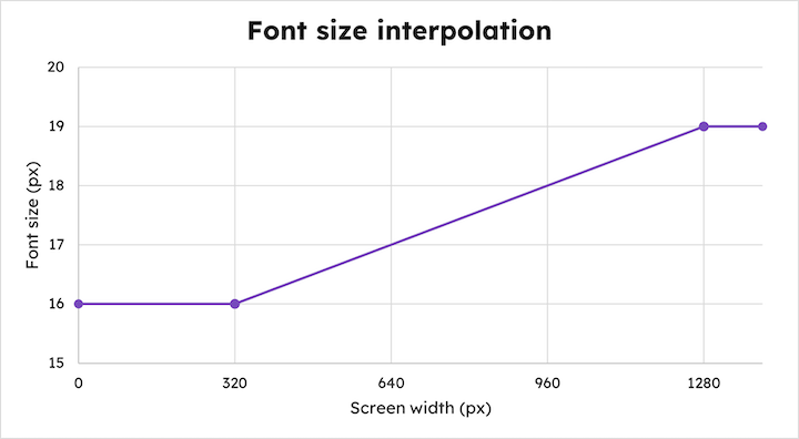
Following Aleksandr’s guide, let’s look at an example to better understand how the math behind typography works. For our example, let’s create a font size that is 16px on 320px screens and 19px on 1280px screens. Here’s how this font would increase with screen size:

What we need to determine here is the rate of increase. Because the increase is linear, we can use the slope-intercept equation: y = mx + b.
According to Aleksandr, we can find the slope of the line by using the above equation and considering the difference between max and min font sizes (y values) and the difference between the max and min viewport widths (x values).
Here’s the math we’ll need to follow to determine the slope in the font size interpolation:
m = (19px - 16px) / (1280px - 320px)
m = 3/960
m = 0.003125
Once we know the slope (m), we can plug it into the y = mx + b formula along with any x and y values to solve for the y-axis intercept (b). Here we use 19px for the y value and 1280px for the x value:
19px = (0.003125 * 1280px) + b
b = (0.003125 * 1280px) - 19px
b = 19px - 4px = 15px
We now have the pixel value and the slope value. To express the slope as a valid vw unit, we’ll need to multiply it by 100, meaning the slope is 0.3125 (rounded up to 0.31):
body {
  --font-size-300: clamp(16px, 0.31vw + 15px, 19px)
}
Next, we can convert it to a rem value by dividing it by 16:
body {
  --font-size-300: clamp(1rem, 0.31vw + 0.938rem, 1.19rem)
}
As Aleksandr points out, once we understand this logic, we can create a function in Sass that allows us to apply these calculations to create fluid typography. The detail involved in creating a library for fluid type scaling is a bit beyond the scope of this article, but I recommend checking out Aleksandr’s article: “Creating a Fluid Type Scale with CSS Clamp.”
Creating a custom fluid type scale library may be helpful for future projects, so keep this in mind as a possibility. You can also use tools to create a fluid typography scale, as we demonstrated earlier in this article.
Fluid typography can be very helpful, but there may be cases that require more granular control, and calculating the font size according to the viewport’s width is not the best option. Instead, we may want to calculate font size using the container’s width; this is where we can combine fluid typography with container queries.
Let’s consider an example where we have two cards. At a certain point, one of the cards will maintain the same width while the other will occupy the remaining space — making the smaller card look like a sidebar of sorts. Here are the font sizes we’ve created with the clamp function:
:root {
  --fs-300: clamp(1.00rem, 0.93rem + 0.33vw, 1.19rem);
  --fs-400: clamp(1.2rem, 0.883rem + 1.58vw, 2.11rem);
}
Here’s the result when we apply these font sizes to our example:

This doesn’t look great, right? The smaller card’s title is too large! Fortunately, we can use container queries to improve the card’s appearance.
First, we need to let the browser check a respective container to start measuring its width. We can do that with the container-type property:
li {
  container-type: inline-size;
}
Next, we’ll need to add a couple of custom properties that check the container’s width instead of the viewport’s width, so we’ll need to replace the vw unit with the cqi (container query inline) unit. We could also use the cqw (container query width) unit, but it is not very but it is not very friendly for internationalization.
We’ll give the new properties the same name, but we’ll add the container- prefix:
:root {
  --fs-300: clamp(1.00rem, 0.93rem + 0.33vw, 1.19rem);
  --fs-400: clamp(1.2rem, 0.883rem + 1.58vw, 2.11rem);
  --container-fs-300: clamp(1.00rem, 0.93rem + 0.33cqi, 1.19rem);
  --container-fs-400: clamp(1.2rem, 0.883rem + 1.58cqi, 2.11rem);
}
You’ll notice that our calculation is the same; the change resides only in respect to the width’s unit. Now, let’s apply this property to our containers:
li h2 {
  font-size: var(--container-fs-400);
}

li p {
  font-size: var(--container-fs-300);
}
Here’s the result:

With the new custom properties, the font sizes are appropriate for the size of the card. The smaller card’s title, in particular, has a much more reasonable font size. You can check this example in this CodePen:
See the Pen
Fluid typography and container queries by Cristian Diaz(@ItsCrisDiaz)
on CodePen.
Fluid typography can be helpful for keeping website text readable and proportional for different screen sizes. It’s also easy to implement with different readily available tools.
In this article, we demonstrated how to use modern CSS to achieve a more consistent result that respects the container’s width with only a few extra lines of code. When using this approach, it’s always a good idea to add a fallback for browsers that do not support container queries.
Also, be sure to test the accessibility of your fluid typography, because it may not have the behavior you expect. As long as you ensure your site remains accessible, fluid typography is a very helpful tool to use in your projects.
As web frontends get increasingly complex, resource-greedy features demand more and more from the browser. If you’re interested in monitoring and tracking client-side CPU usage, memory usage, and more for all of your users in production, try LogRocket.

LogRocket lets you replay user sessions, eliminating guesswork around why bugs happen by showing exactly what users experienced. It captures console logs, errors, network requests, and pixel-perfect DOM recordings — compatible with all frameworks.
LogRocket's Galileo AI watches sessions for you, instantly identifying and explaining user struggles with automated monitoring of your entire product experience.
Modernize how you debug web and mobile apps — start monitoring for free.
Would you be interested in joining LogRocket's developer community?
Join LogRocket’s Content Advisory Board. You’ll help inform the type of content we create and get access to exclusive meetups, social accreditation, and swag.
Sign up now
Discover how to use Gemini CLI, Google’s new open-source AI agent that brings Gemini directly to your terminal.

This article explores several proven patterns for writing safer, cleaner, and more readable code in React and TypeScript.

A breakdown of the wrapper and container CSS classes, how they’re used in real-world code, and when it makes sense to use one over the other.

This guide walks you through creating a web UI for an AI agent that browses, clicks, and extracts info from websites powered by Stagehand and Gemini.