Since it was introduced in browsers back in 2017, CSS Grid has given web designers and developers a new superpower. There are numerous articles/tutorials out there illustrating the benefits and algorithmic capabilities of CSS Grid, covering everything from the visual ASCII-inspired template-areas to auto-placement making media queries somewhat obsolete. However, media queries are still going strong and that can cause somewhat of an issue — maybe.

It’s 2020 and we have ever so slightly diverged from the idea that designers and developers can control every pixel of a design at any given screen size. And with the advent of design systems, we tend to think “components” rather than “pages.”
The problem with media queries is that they don’t play well with design systems, as components within said systems usually are defined with no specific context. Components should, for the most part, fit into any context of varying widths (and heights) and media queries “adjust things according to the constant that is the viewport”.
Thus, media queries fall short if we want to build a truly flexible component that should fit into any container and have its own set of instructions on how it should behave in different circumstances no matter the outside context.
In this article, I will look into how we can create flexible layout components with CSS Grid and math functions to gain more control over the hypothetical instructions we inscribe into our components.
If we scroll down the spec for CSS Values and Units Module Level 4, we come across a section called “Mathematical Expressions.” Besides good old “calc()”, we find the math functions “min()”, “max()”, and “clamp()”, which let us do more complex calculations than a simple calc() function — right in CSS.
This looks promising, but the naming of these new functions are a bit confusing at first. We use
Once that little confusion is all taken care of, let’s take a look at some examples.
The min() and max() functions take two values. The smallest and/or largest values respectively, separated with a comma. Consider the following min() expression:
width: min(100%, 200px);
Here we are saying that the default value is 200 pixels, but it is never wider than 100 percent of the parent container. This is essentially the same as saying this:
width: 100%;
max-width: 200px;
Quite flexible, right? And here’s another expression using max():
width: max(20vw, 200px);
This expression sets the width to 20 viewport units, but doesn’t let it go below 200 pixels.
So how can math functions help us with flexible components and layouts?
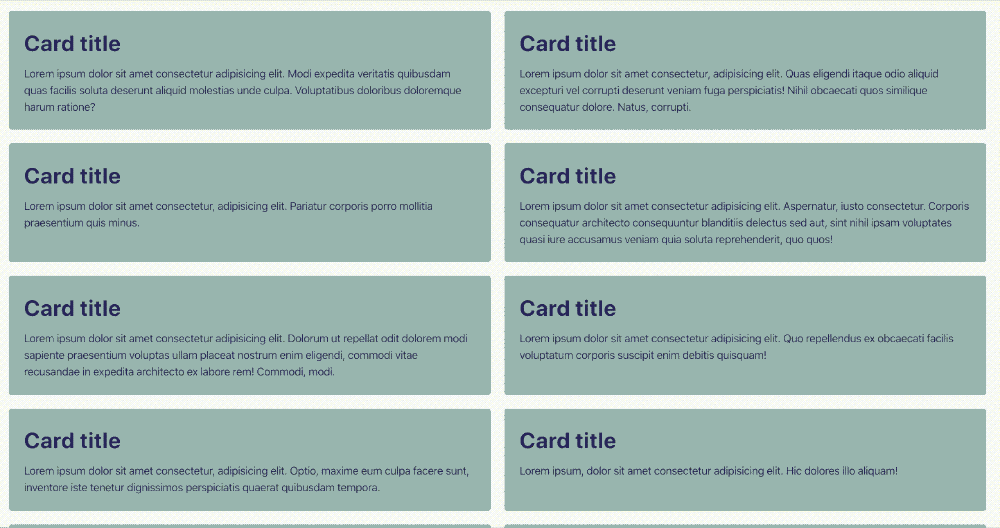
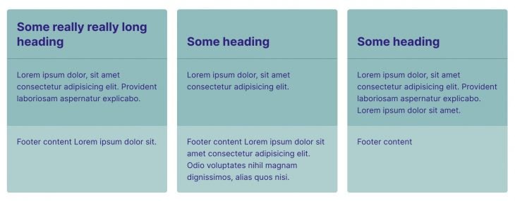
When we want a collection of items to behave in a responsive manner without introducing media queries rules, Grid’s auto-placement algorithm helps us do just that without doing any complex calculations. Using auto-fit or auto-fill alongside a minmax() statement, we can easily instruct the browser to figure out when it is appropriate to “break” the column count, thus creating a dynamically responsive grid:
grid-template-columns: repeat(auto-fit, minmax(350px, 1fr));
We are declaring that each card must be of a minimum of 350 pixels and a maximum of 1 fraction unit of the available space. Using auto-fit, each card, then, is allowed to be greater than 350 pixels, and we are telling the browser to squeeze in as many equal width, flexible sized cards as it can to fit inside the grid container.
In the example above, however, we can notice that the minimum value of the cards doesn’t respect the viewport width. If the viewport becomes smaller than the minimum value of the cards, they slide out of sight, and we get the added bonus of a horizontal scrollbar. And we don’t want to deal with horizontal scrollbars!
No Title
No Description
To circumvent this behavior we could just add a media query at the breakpoint in question and disregard the minimum value then. But what fun is that? Let us instead make use of our newly acquired knowledge of math functions.
min() was when we wanted to “impose a maximum value on something,” which is exactly what we want here.
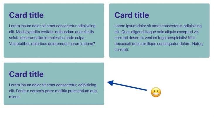
grid-template-columns: repeat(auto-fit, minmax(min(100%, 350px), 1fr));
We are telling the browser that the minimum value should be 350 pixels as long as those 350 pixels account for less than 100 percent of the parent container. Otherwise the maximum value is 100 percent.
No Title
No Description
Notice how the cards now are in full sight at (almost *) every screen size.
*The card container can only squeeze down to a point at which its content reaches the largest minimal size. With a string of text this usually means the size of the longest word.
This is promising. But can we do more?
What if we want a bit more control over the distribution of columns as well as the point at which it should break? Instead of having the browser making all the decisions while using the aforementioned auto-placement technique, we want full control.
Say instead we want two columns at larger screen sizes and one column once the viewport becomes smaller than a specified width we choose — nothing more, nothing less. Easy, right? Media queries… yeea.. No!
As with the previous example, we are going to use the auto-placement algorithm along with math functions, and if we combine min() with max() we can start to see the real power of math in CSS. This gives us even more control over the distribution of grid items.
Consider this:
min(100%, max(50%, 350px)
Notice how we are nesting max() inside min() in order to reach a more flexible value output. Here we are telling the browser that our width should be a maximum of 100 percent (of the container) and minimum of 50 percent, provided that 50 percent is bigger than 350 pixels… I think.
We could also nest the other way around and write:
max(50%, min(350px, 100%))
Other than min() and max(), we also have clamp() that can be a bit easier to read as the value is nestled between its minimum and maximum. From the spec it reads:
a clamp() function represents its central calculation, clamped according to its min and max calculations.
This means that we can write the calculation in question like this instead:
clamp(50%, 350px, 100%)
… which does indeed make it a lot easier to decipher, in my opinion.
We declare that the minimum value should be 50 percent, the preferred value should be 350 pixels, and the maximum size should be 100 percent. A much nicer syntax!
If we want to have a gap between the cards, we must account for this in our calculation by subtracting the size of said gap from the minimum size, as we see in the code example below. For managing things like this I recommend using custom properties to keep things as tidy as possible:
clamp(50% - 20px, 200px, 100%)
Do note that we don’t need to nest a calc() function inside a clamp() expression if we want to do calculations. The same goes for min() and max().
Can we go a step further? Yes, we can!
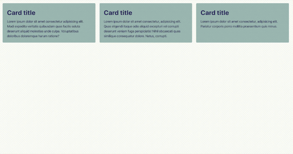
What if we want three or more columns to “collapse” straight into one without intermediate steps? This is, for instance, handy if we only have three cards and don’t want an “awkward situation” in which one of the cards is placed all alone on a new row:
You might suspect that it would be as easy as substituting the 50 percent for, say, 33.3333 percent (a third of the size of the parent container) ultimately creating three columns. If so, then you would be wrong, I’m afraid. At a certain breakpoint there is only enough room for two cards, thus resulting in a two column layout. This is not what we want.
The math for such layout is a bit more complicated. Luckily, Heydon Pickering has already kind of solved this using Flexbox with a technique he calls the “Holy Albatross.” He takes advantage of how the browser treats min and max values. From Heydon’s article he finds that:
min-width and max-width override flex-basis. So if the
flex-basisvalue is absurdly high, like 999rem, the width will fall back to 100%. If it’s absurdly low, like -999rem, it’ll default to 33%
This is similar to how minmax() work in CSS Grid. From MDN it reads:
If max < min, then max is ignored and
minmax(min,max)is treated as min
By the end, this is the formulae Heydon arrives at:
calc(40rem - 100% * 999)
The 40rem‘s represent the breakpoint at which it should stack.
Let’s try implementing this formulae into our grid example. Applying the Holy Albatross technique gives us something like this:
minmax(
    clamp(
          33.3333% - var(--gap), /* min value */
          (40rem - 100%) * 999, /* preferred value */
          100% /* max value */
        ),
        1fr
    )
The 33.3333 percent represents the size of each of our cards (making room for three columns) given that the value is no bigger than the preferred value: (40rem - 100%) * 999. When the grid container reaches 40rem, it becomes a single column grid with a maximum value of 100 percent.
We’ve created somewhat of a flexible component-like layout that should fit into any container with its own set of instructions on how it should behave in different circumstances.
The instruction for this layout reads, “If the card container goes below a width of 40rem, then the cards should stack.”
If we would like this instruction to be determined by a preferred width of the individual cards (perhaps a nifty ch-based value) instead of looking at the container size breakpoint, then we would have to make some minor adjustments to the preferred value in our clamp() expression. We do this by multiplying the minimum width of the cards with the number of preferred columns resulting in the following:
((30ch * 3) - 100%) * 999
Each card width must never be narrower than 30ch, and if we account for the gap between the cards the code results to this:
((30ch * 3 - var(--gap) * 2) - 100%) * 999
Note: In the Codepen above, I’ve used custom properties to make the code a bit more legible.
Now the instruction reads: “If each card becomes narrower than *30ch*, the parent container collapses to one column.”
The context in which components enter into isn’t always strictly defined, so by inscribing instructions — so to speak — into the component itself, you somewhat ensure that that it fits into any context no matter the outside boundaries. With math functions, we can induce multiple “breakpoints” which are informed by the individual layout components, as demonstrated in the following Codepen:
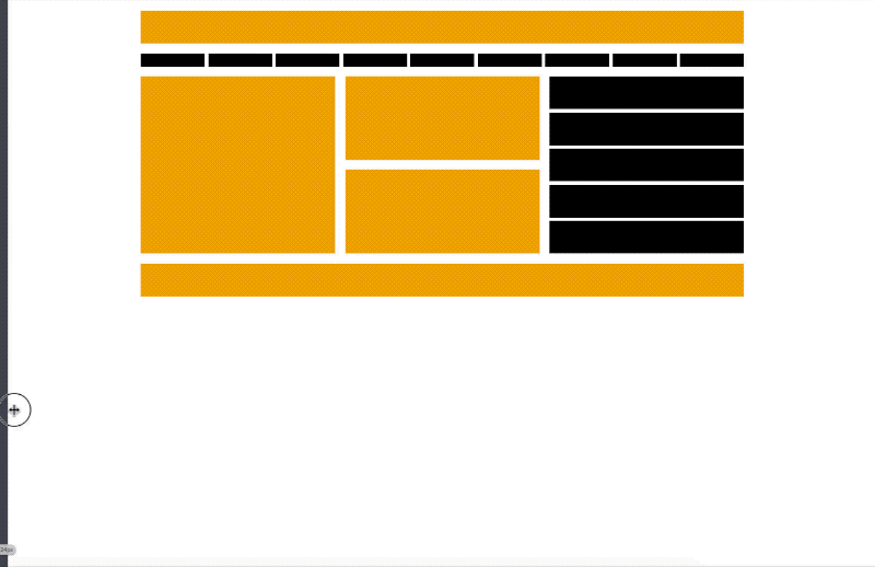
Notice that the point at which the nav items, middle section, and the aside elements stack all differ from each other. Each “breakpoint” is informed by the hypothetical inscription of the individual layout component rather than that of multiple — somewhat arbitrary — media queries.
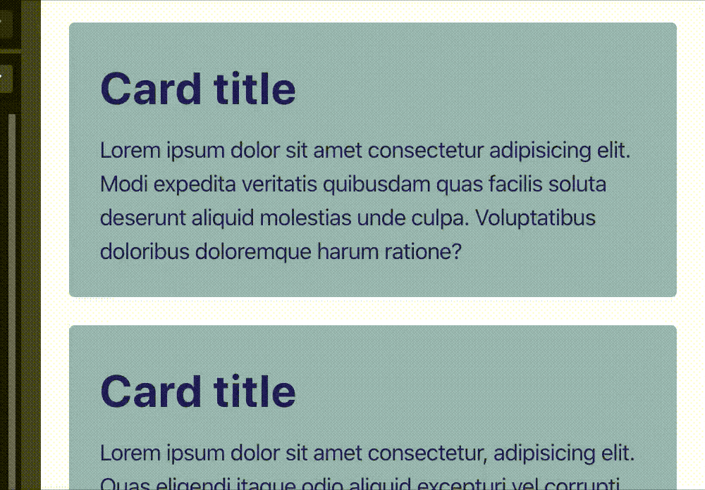
The added benefit of using CSS Grid instead of Flexbox for this kind of layout is the alignment capabilities we get from Subgrid. This way we can ensure that the content (e.g., headers, footer, etc.) of our individual cards are aligned when the cards are next to each other. Here’s what it looks like:
The alignment capabilities alongside clamp() in this example only work in Firefox 75+ for now.
The possibilities are almost endless with math functions in layouts. Another use case might be responsive font sizes with clamp() and no media queries.
I remember reading an article on fluid typography a while back showcasing a handy math equation for achieving this very result. The technique, though, requires using media queries to stop the text from becoming too big or too small.
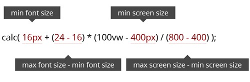
With math functions we can now eliminate the need for media query rules altogether:
font-size: clamp(
  var(--min-font-size) + 1px,
  var(--fluid-size),
  var(--max-font-size) + 1px /* we add 1px so the value becomes pixel-based */
);
Dave Rupert has made something similar without the need for complex calculation using viewport units as the fluid size. Using clamp() he is then able to cap the values at each end making sure that the font-size won’t become too big or too small.
h1 {
  --minFontSize: 32px;
  --maxFontSize: 200px;
  --scaler: 10vw;
  font-size: clamp(var(--minFontSize), var(--scaler), var(--maxFontSize));
}
This is very clever indeed, however, we don’t have the same level of control when resorting to viewport units. And those 10vw seem a bit arbitrary to me.
Also, there seems to be some caveats using viewport units for scaling font sizes. The browser’s zoom won’t work, resizing the browser window impacts readability, and the text will look massive on a large screen.
At this time of writing Chrome/Edge, Firefox (75+), and Safari (13.1+) all support min(), max(), and clamp(). As for Subgrid, unfortunately, this isn’t standardized yet and only works in Firefox for now.
Being solely based on the polygonal area of the viewport, media queries can be less flexible when you’re dealing with independent layout components. The auto-placement algorithm in CSS Grid along with CSS math functions provide extra flexibility when it comes to the way our elements are laid out, all without having to resort to explicitly define an outside context. I foresee a promising future for layouts on the web, and I’m looking forward to seeing more use cases with math functions in CSS.
Let me know if you are aware of other techniques or if you just want to comment on this article.
As web frontends get increasingly complex, resource-greedy features demand more and more from the browser. If you’re interested in monitoring and tracking client-side CPU usage, memory usage, and more for all of your users in production, try LogRocket.

LogRocket lets you replay user sessions, eliminating guesswork around why bugs happen by showing exactly what users experienced. It captures console logs, errors, network requests, and pixel-perfect DOM recordings — compatible with all frameworks.
LogRocket's Galileo AI watches sessions for you, instantly identifying and explaining user struggles with automated monitoring of your entire product experience.
Modernize how you debug web and mobile apps — start monitoring for free.

Chrome’s Modern Web Guidance embeds modern web platform skills into AI coding agents, helping them choose native HTML, CSS, and browser APIs over legacy patterns.

Learn how to use Fallow to analyze AI-generated code, detect dead code, duplicate logic, and complexity issues, and integrate automated code quality checks into your AI-assisted development workflow.

Learn how to protect full-stack projects from NPM supply chain attacks with a practical security checklist.

Explore 15 essential MCP servers for web developers to enhance AI workflows with tools, data, and automation.
Hey there, want to help make our blog better?
Join LogRocket’s Content Advisory Board. You’ll help inform the type of content we create and get access to exclusive meetups, social accreditation, and swag.
Sign up now

 Learn more →
