CSS layout has come a long way. Where we once wrestled with floats and clearfixes, we now have two powerful layout systems built right into CSS — Flexbox and Grid. They’ve replaced older layout techniques with cleaner, more flexible systems that make it easier to build responsive, scalable interfaces.
CSS Flexbox is designed for one-dimensional layouts — aligning and spacing items in a row or column. It shines in UI components and small-scale layouts. Grid layout, on the other hand, handles two-dimensional layouts with ease — making it ideal for full-page structures and more complex designs.
In this guide, you’ll get a clear breakdown of when to use Flexbox, when to use Grid, and how combining them can lead to cleaner, more scalable CSS.
Editor’s note: This article was thoroughly reviewed and updated on 3 June 2025 to reflect the latest developments, best practices, and practical examples in modern web layout techniques. The updates aim to provide clearer explanations and enhanced guidance for both beginners and experienced developers. The previous update was in January 2023.
The Replay is a weekly newsletter for dev and engineering leaders.
Delivered once a week, it's your curated guide to the most important conversations around frontend dev, emerging AI tools, and the state of modern software.
CSS Flexbox, introduced in 2009, is a powerful one-dimensional layout system designed to help you build responsive web pages and organize elements easily. It quickly became the go-to method for modern layouts because it eliminates the need for tricky hacks like floats and positioning.
Flexbox lets you arrange items in rows or columns, making it simple to control spacing, alignment, and order within a container.
If you’re new to Flexbox or want to practice in a playful way, check out Flexbox Froggy, an interactive game that helps you master Flexbox by guiding frogs to their lily pads with CSS rules.
Before we get into when you should use Flexbox and Grid, let’s go over a few properties that make these two concepts stand apart from each other. If you want to go into further properties of Flexbox and Grid, or how to start out with them, you can check out these beginner friendly articles on Flexbox and Grid, respectively.
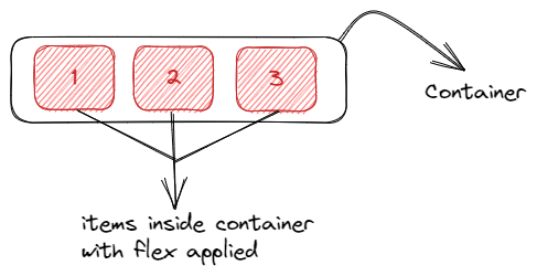
Say we have a <div> in our HTML that serves as a container for three child elements. All you need to do is create a flex container using the display: flex property. After that, every element that you have inside that flex container turns into a flex item.
The corresponding code would be:
<div class="container">
  <div id="one">1</div>
  <div id="two">2</div>
  <div id="three">3</div>
</div>


.container{
  display: flex;
}
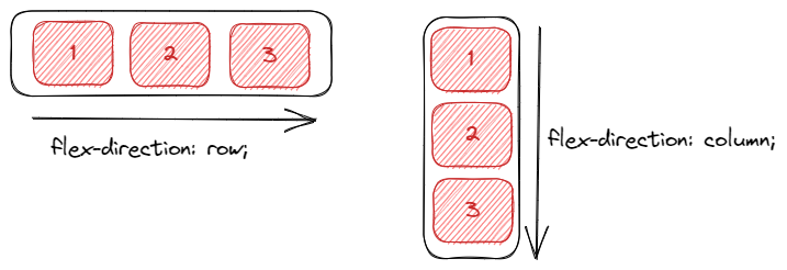
In our flex container, we could decide to set a direction for the items in our container. The most frequently used flex directions are row and column. Our corresponding CSS would look like this:
.container{
  flex-direction: row | column;
}
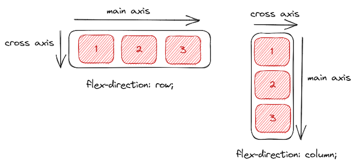
In some cases, flex-direction could be set to row-reverse or column-reverse. One important thing to note under flex directions is the concept of axes.
Depending on the flex direction, we can have a main axis and a cross axis. In the case where the flex-direction is row, the main axis is in the horizontal direction, and the cross axis is in the vertical direction. The opposite is the case when the flex-direction is column. This will be useful when we look into aligning:
By default, flex items try to fit on one line. You can allow them to wrap to multiple lines using flex-wrap:
.container{
  flex-wrap: wrap | nowrap| wrap-reverse;
}
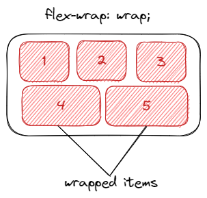
The problem with flex-wrap, however, is that when the items wrap, they form their own flex line below the ones above, and so are not perfectly aligned with the items above them. You see that item4 and item5 spread out to fill all the room below the elements above them.
Flexbox has many other properties that we can use to create amazing things. We can order the elements the way we want, reverse the order of elements, determine if our elements should grow or shrink, etc.
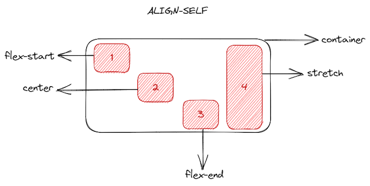
One concept that makes Flexbox so useful is the power of alignment of items within the flex container. To demonstrate this, let’s look at a few alignment-related properties of Flexbox such as align-self and justify-content.
For example, let’s imagine that our container div now has four elements, with the same width and height:
<div id="container">
  <div id="one">1</div>
  <div id="two">2</div>
  <div id="three">3</div>
  <div id="four">4</div>
</div>
In our CSS, we can use align-self to align these items within their container. That is, we can give a different alignment to each item:
#one{
  align-self: flex-start | flex-end | center | stretch
}
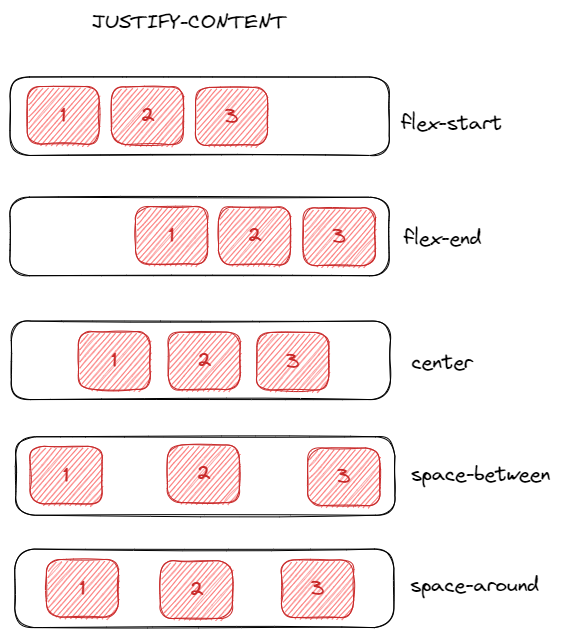
Instead of aligning each individual item, say we wanted to align all items together within the container. For that, we’ll use justify-content. Let’s assume that instead of four, we have three items again in our container:
.container{
  justify-content: flex-start | flex-end | center | space-between | space-around
}
You can notice how easy it is to align content within flex containers. Whether it be the individual items within the container, or all the items together. The above features only show a few common properties of Flexbox, and how easy it is to manage small parts of your layout.
While Flexbox is a one-dimensional layout system (handling rows or columns), CSS Grid takes layout to the next level by being a two-dimensional system. That means you can work with rows and columns simultaneously, making it the most powerful CSS layout tool available today.
Grid lets you create complex, organized designs without resorting to old, hacky CSS tricks. It’s perfect for building robust, structured layouts with precise control over both axes.
Let’s use the HTML snippet below, and see how we can get a grid layout out of it:
<div class="container">
  <div id="one">1</div>
  <div id="two">2</div>
  <div id="three">3</div>
  <div id="four">4</div>
  <div id="five">5</div>
</div>
To define a grid container, all you need to do is pass a display: grid property to your block element. Now you have a grid, so you should define how many rows and columns you want.
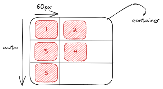
To create rows and columns, we use the grid-template-rows and grid-template-columns properties, and pass values that tell how much our grid items will span through the container:
grid-template-columns: 60px 60px;
grid-template-rows: auto;
From above, we can see that our layout will be set to two columns, each occupying 60px of the container, and since there are five elements, we’ll have three rows spanning the entire container due to the auto attribute:
Just like now, Grid also has some properties that let you align items within the container. An example is the justify-self property. This property aligns a grid item within its cell, along the row axis:
#one{
  justify-self: start | end | center | stretch
}
Taking the first item in our grid container as an example:
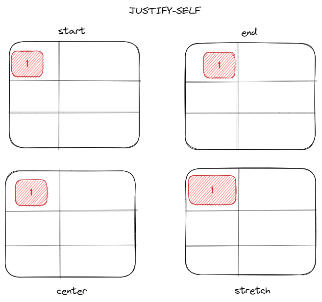
It is worth noting that justify-self is not the only alignment property that grid has. We could also use justify-content, justify-items, align-items, and align-self. You can easily notice that grid provides more flexibility when it comes to aligning and creating complex layouts.
While Flexbox and CSS Grid differ in many ways, they share some important common ground — starting with their core purpose: both are powerful layout systems designed to replace old, clunky techniques like floats and positioning hacks. Today, they make building complex, responsive layouts much simpler and more intuitive.
Both Flexbox and Grid support key alignment properties that help you control the positioning of items within containers:
justify-content — Aligns items along the main axis (horizontal in Flexbox row, horizontal in Grid by default)
align-content — Manages the spacing between rows or columns when there’s extra space
align-items — Aligns all items within the container on the cross axis (vertical in Flexbox row)
align-self — Allows individual items to override the container’s alignment settings
These shared properties provide consistency and make it easier to switch between Flexbox and Grid depending on your layout needs.
When Flexbox was first released, we thought that it could be the best layout system to use to build our web pages, but it wasn’t.
Flexbox helped developers start to create more responsive and maintainable web applications, but the main idea of a one-dimensional layout system doesn’t make sense when you need to build a more complex layout design.
CSS Grid really came to help us build more complex layout designs using a two-dimensional way, using both rows and columns. We should aim to use both of them together, but for different purposes. For your layout, use CSS Grid, for alignment of your elements, use Flexbox.
To master and know exactly when you’re going to need and how to use CSS Grid, you should first learn the basics and how Flexbox works, because when you need alignment of elements in your application, it’s Flexbox that you’re going to want to use.
display: flex and then define the flex-direction that we wantOf course, you can build your whole application using only Flexbox and get the same result as if you were building with CSS grid. But for a better CSS approach, to have a more concise, well-written, and maintainable application in the long-term, to create and fit your layout perfectly, the ideal method is to use CSS Grid.
grid-column and grid-row properties and you can have overlapping elements very easily. On the other hand, with Flexbox we still need to use some hacks such as margins, transforms, or absolute positioningBefore you decide which one you should use, don’t forget:
CSS Grid is for layout; Flexbox is for alignment.
Here’s an example of the right use of CSS Grid. Let’s imagine that we’re going to build a simple application, and the barebones of our applications is going to look a bit like this:
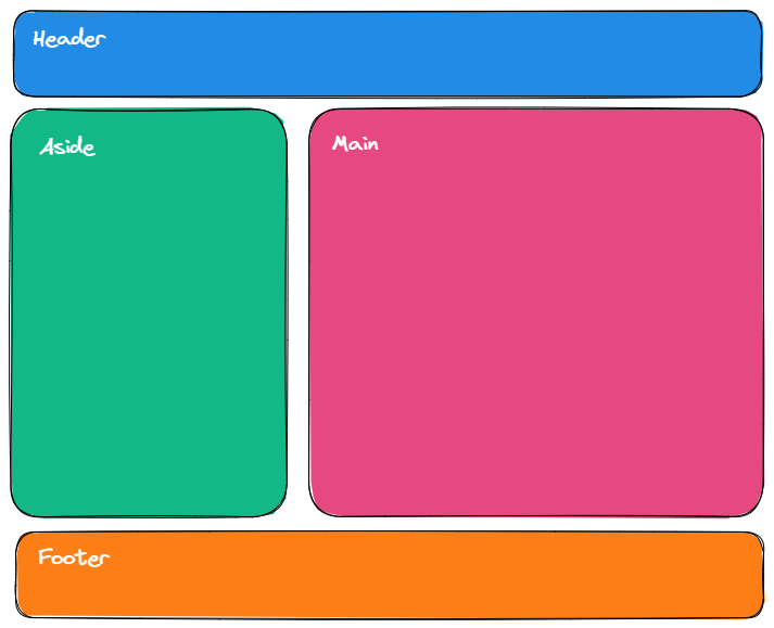
We have a header, an aside menu, main block content, and a footer. To create this layout using CSS Grid, we just need to create our elements:
<div id="container">
  <header>Header</header>
  <aside>Aside</aside>
  <main>Main</main>
  <footer>Footer</footer>
</div>
Now, create a grid container using display: grid and then create some rows and columns.
We create our design very simply, without having to use hacks such as float or positioning our elements, and without having to create many flex containers.
The best decision that you can take for your application in order to create a very decent and well-built web layout for your application is to use both together.
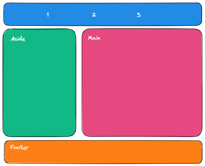
Let’s take our example and use both CSS Grid and Flexbox to show the power of both layout systems together. Inside our header, we’re going to create three div elements and align them in a row:
<header>
  <div>1</div>
  <div>2</div>
  <div>3</div>
</header>
To do that, all we need to do is declare our header a flex container using the display: flex property, make the flex-direction a row using flex-direction: row, and align the items:
Check out the corresponding Code Sandbox for this code. Feel free to play around with the code, to see how different you can make the layout look.
For now, our small web page looks like this:
For a major layout style, you could use CSS Grid, because it’s a two-dimensional layout system, and you can work with both rows and columns very easily. And for a more simple layout style, you can use Flexbox, a one-dimensional system, as it’s very helpful when working with rows.
What is Flexbox used for?
Flexbox is used to align and distribute items in one dimension — either a row or a column — making it great for simpler, linear layouts.
What is the difference between Flex and Flexbox?
Flex is a shorthand CSS property for flex items, while Flexbox refers to the entire layout model for arranging those items.
Is Flexbox still widely used?
Yes, Flexbox remains a popular choice for one-dimensional layouts and simple alignment tasks.
What makes CSS Grid different from Flexbox?
CSS Grid is a two-dimensional layout system, letting you control rows and columns simultaneously, unlike Flexbox’s one-dimensional approach.
Can CSS Grid replace Flexbox?
Not completely. CSS Grid is best for complex, grid-based layouts, while Flexbox is often simpler for single-row or column alignment.
Is CSS Grid supported by browsers?
Yes, all modern browsers fully support CSS Grid, so it’s safe for production use.
How do you control row and column sizes in CSS Grid?
With the grid-template-rows and grid-template-columns properties, which can define fixed, flexible, or automatic sizing.
Can CSS Grid handle responsive design?
Definitely! CSS Grid works well with media queries and flexible units like fr and minmax() to create adaptable layouts.
Here’s the takeaway:
Knowing when to use each — or both — makes building and maintaining your layouts way easier. Get comfortable with these, and your CSS will thank you.
As web frontends get increasingly complex, resource-greedy features demand more and more from the browser. If you’re interested in monitoring and tracking client-side CPU usage, memory usage, and more for all of your users in production, try LogRocket.

LogRocket lets you replay user sessions, eliminating guesswork around why bugs happen by showing exactly what users experienced. It captures console logs, errors, network requests, and pixel-perfect DOM recordings — compatible with all frameworks.
LogRocket's Galileo AI watches sessions for you, instantly identifying and explaining user struggles with automated monitoring of your entire product experience.
Modernize how you debug web and mobile apps — start monitoring for free.

I had four weeks to build a complete app from scratch using AI tools like OpenCode and Claude Opus: here’s how it went.
Learn how to build a reusable Vue 3 table engine that powers tables, cards, and lists with shared sorting and pagination logic.

Compare the best React chart libraries for 2026, including Recharts, Nivo, visx, Apache ECharts, MUI X Charts, and more.
Claude Code vs. OpenCode in a real Next.js refactor: benchmark results, mistakes, prompts, and when to use each CLI agent.
Hey there, want to help make our blog better?
Join LogRocket’s Content Advisory Board. You’ll help inform the type of content we create and get access to exclusive meetups, social accreditation, and swag.
Sign up now

 Learn more →
