Render-blocking resources are CSS stylesheets and JavaScript files that block the first paint of your page. To eliminate them, consider the following to improve page speed and boost SEO:

When a user loads your webpage, the browser must process various resources, including CSS and JavaScript, before rendering any content on the screen. Some of these resources can block the first paint of your page, thus impacting its initial page load. In this article, we’ll explore how to identify and eliminate render-blocking resources using Lighthouse.
Render-blocking resources are CSS stylesheets and JavaScript files that block the first paint of your page. When the browser encounters a render-blocking resource, it stops downloading the rest of the resources until these critical files are processed. In the meantime, the entire rendering process is put on hold.
Resources considered as render blocking include:
<head> of the documentdefer or async attributedisabled attribute, thus requiring the stylesheet to be downloadedmedia attribute specific to the user’s deviceEliminating render-blocking resources is crucial for improving Google’s Core Web Vitals performance metrics. The web vitals metrics impact search rankings and user experience. Metrics like First Contentful Paint (FCP) and Largest Contentful Paint (LCP) are particularly sensitive to delays caused by render-blocking CSS and JavaScript.
Editor’s note: This article was updated by Ivy Walobwa in April 2025 to include the most up-to-date strategies for the quick elimination of render-blocking resources in both CSS and JavaScript, and provide updated tools and real-world examples.
Several free performance metrics tools allow you to identify and analyze render-blocking resources. Choosing the right tool depends on factors such as the kind of data you want to use, whether field or lab data. Lab data is collected in a controlled environment and is used for debugging issues. Field data is used for capturing real-user experience, but with a more limited set of metrics.
The most common tools include:
When running tests on these tools, you’ll often find that the metrics reported don’t match up exactly. Each tool has differences in hardware, connection speed, locations, screen resolutions, and test methodology. We’ll use Lighthouse to improve the performance of a site with different speeds on mobile and desktop views.
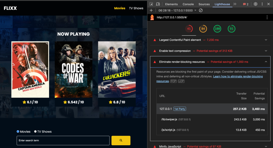
After running an audit on Lighthouse, you’ll see suggestions to improve site performance, such as Eliminate render-blocking resources — as shown in the image below: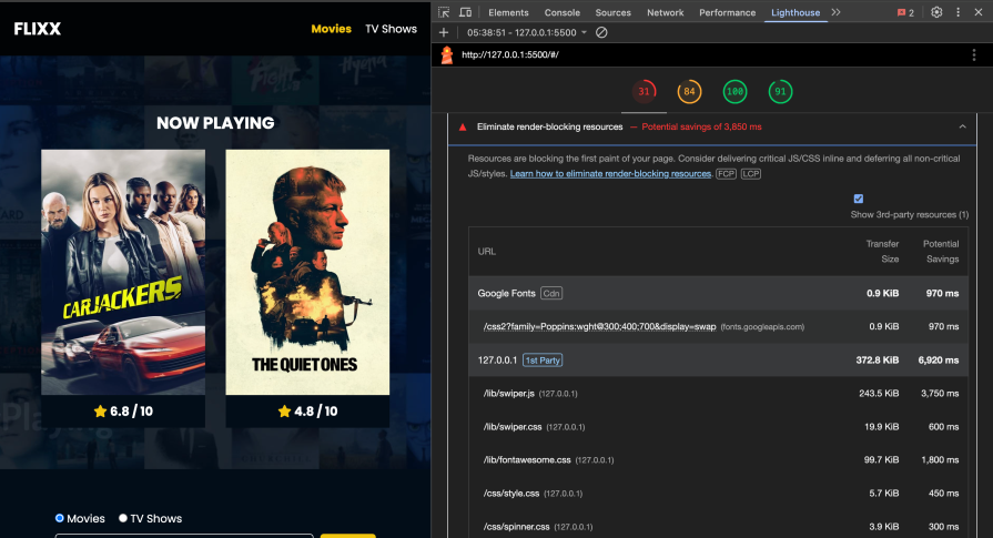
The following sections will dive into how to eliminate the render-blocking resources by optimizing CSS and JS delivery.
To eliminate render-blocking resources, it’s essential to identify which resources are needed to render the critical part of your page: above-the-fold content. Critical resources are necessary for rendering the first paint of your page, while non-critical resources apply to content that is not immediately visible. Non-critical resources can be deferred or loaded asynchronously to improve performance.
The Coverage tab on Chrome DevTools allows you to visualize critical and non-critical CSS and JS. It shows you how much code was loaded and how much is unused. In the image below, the red marking shows non-critical code while the grey marking shows critical code: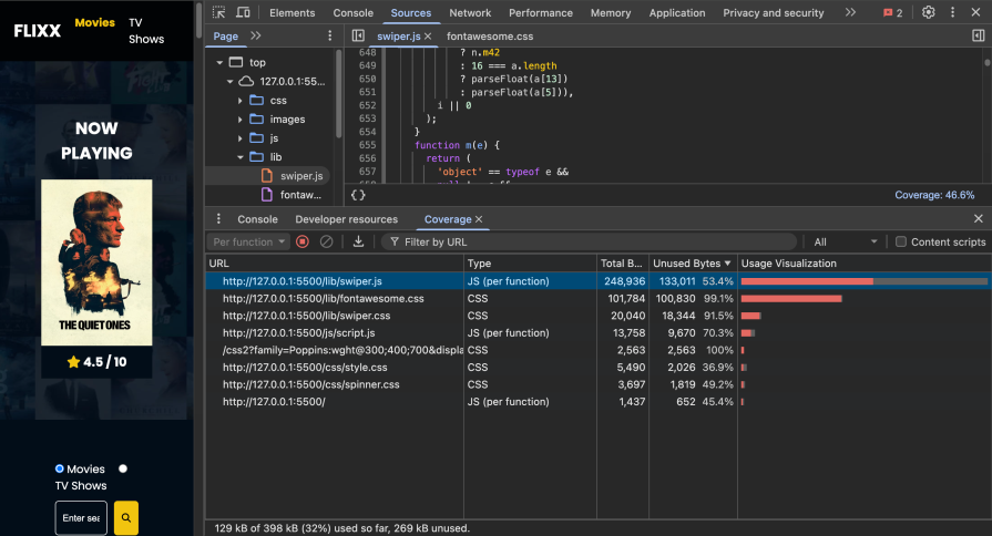
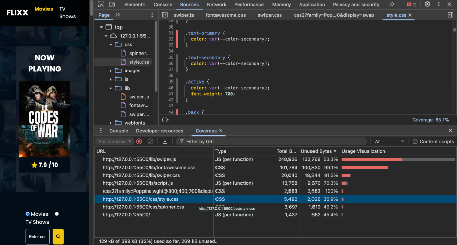
You can click on the URL to better look at the critical and non-critical lines of code and optimize their delivery:
Efficient handling of critical CSS is essential for improving page load performance and reducing render-blocking resources. Some CSS optimization techniques include inlining critical CSS, deferring non-critical CSS, and removing unused CSS.
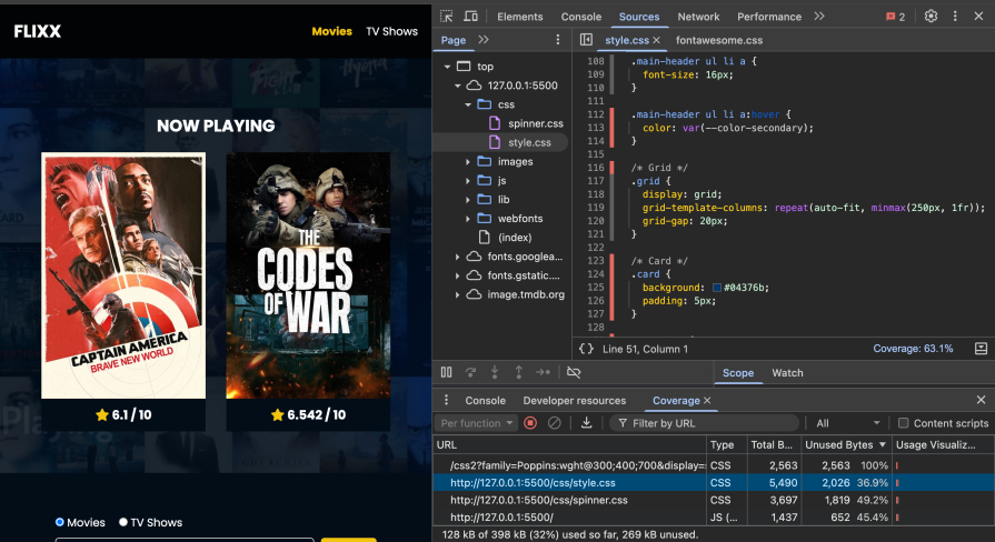
Critical styles required for the first paint are added to a <style> block in the <head> tag. Click on a CSS resource on the Coverage tab to see the critical and non-critical styles. The styles marked in grey are extracted and put in the <head> tag of the page:
<head>
...
<style>
...
.grid {
  display: grid;
  grid-template-columns: repeat(auto-fit, minmax(250px, 1fr));
  grid-gap: 20px;
}
...
</styles>
</head>
The non-critical CSS, marked in red, is then loaded asynchronously using the preload link or using CSS media types and media queries.
We add the link rel="preload" as="style" attributes to request the stylesheet asynchronously, then add the onload attribute to process the CSS when the stylesheet finishes loading. For browsers that don’t execute JavaScript, we add the stylesheet inside the noscript element:
<link rel="preload" href="styles.css" as="style" onload="this.onload=null;this.rel='stylesheet'">
<noscript><link rel="stylesheet" href="styles.css"></noscript>
To utilize CSS media types and media queries, we add the media attribute with print. Stylesheets that are declared in this format are applied when the page is being printed and are loaded with low priority; hence, they are not marked as render-blocking. The onload attribute is used to further load the styles dynamically based on screen size:
<link rel="stylesheet" href="css/style.css" media="print" onload="this.media='all'">
The process of extracting and inlining critical CSS and deferring non-critical CSS can be automated with tools such as Critical.
Based on configurations added when using Critical, it can extract critical CSS for you and add the styles to your document head. It also loads the remaining stylesheet asynchronously using CSS media types and media queries:
<style>
/* inline critical CSS */
</style>
<link href="https://fonts.googleapis.com/css2?family=Poppins:wght@300;400;700&display=swap" rel="stylesheet" media="print" onload="this.media='all'">
<link rel="stylesheet" href="lib/swiper.css" media="print" onload="this.media='all'">
<link rel="stylesheet" href="lib/fontawesome.css" media="print" onload="this.media='all'">
<link rel="stylesheet" href="css/style.css" media="print" onload="this.media='all'">
<link rel="stylesheet" href="css/spinner.css" media="print" onload="this.media='all'">
It’s good practice to add screen-specific styles to separate style sheets and load them dynamically based on the screen size:
<link rel="stylesheet" href="mobile.css" media="(max-width: 768px)" onload="this.media='all'">
Applying the techniques above removes render-blocking CSS and improves the page performance significantly, from 31% to 41%:
From the Coverage tab on Chrome DevTools, you can identify unused styles and manually remove them.
You can also use tools like PurgeCSS that check your CSS code and remove any unused selectors from it. This is useful, especially when using third-party libraries such as Bootstrap and Font-awesome.
To further improve the performance of your page, you can make use of CSS containment. CSS containment allows the browser to isolate a subtree of the page from the rest of the page. This is essential to fix performance issues such as layout shifts:
article {
// the strict value is a shorthand for applying all the containment types (size, layout, style, and paint) to the element.
  contain: strict;
}
To eliminate render-blocking JavaScript, use the defer or async attributes in your <script> tag, especially with third-party scripts. This will ensure that your JavaScript code is loaded asynchronously while your HTML is being parsed.
The async attribute downloads the scripts asynchronously while HTML parses and executes the scripts as soon as they are downloaded. This can potentially interrupt HTML parsing. The defer attribute downloads scripts asynchronously but defers their execution until HTML parsing is completed:
<script async src="bundle.js"></script>
<script defer src="bundle.js"></script>
<script async defer src="bundle.js"></script>
Lazy loading and code splitting can be implemented to optimize your app’s performance when loading JavaScript modules.
Lazy loading involves loading JavaScript modules only when needed, thus removing the need to load all scripts on first paint. Code splitting involves breaking down a large script bundle into smaller chunks that are loaded on demand. Both these approaches reduce the time taken for the first page render. You can follow our guides on lazy loading and code splitting to learn how to implement them and the best practices.
Loading third-party scripts can slow down your page performance. Some of the fixes to try to improve performance include:
async or defer attributesYou can explore the JavaScript optimization tricks mentioned above and more from this article.
For websites built with CMS, plugins offer a convenient way to optimize and manage render-blocking resources without extensive manual coding. Here are some examples of plugins available for different CMS platforms:
These plugins can optimize various aspects of your website, including aggregating, minifying, and deferring resources, as well as improving caching mechanisms and enhancing overall performance.
To use these plugins effectively:
To improve performance when using third-party style libraries like Font Awesome, you can consider these tricks:
To optimize Google Fonts loading, you can host them locally. You will need to download the font, upload the font to your project or server, and then use @font-face to reference the font in your CSS. To further improve speed, use <link rel="preload"> to load fonts asynchronously.
If you’re not using plugins, you can manually optimize your site by:
async and defer attributesSome of the best WordPress plugins to eliminate render-blocking resources include:
To eliminate render-blocking resources in a React application, consider the following approaches:
lazy() and Suspense to load components only when neededimport() with Webpack) to defer loading of non-critical scriptsasync or defer attributesWhile these strategies can help you eliminate render-blocking resources, thus improving web performance, it’s important to remember that some challenges may arise while implementing them. Here are some considerations to keep in mind:
Some techniques, like deferring non-critical CSS or asynchronously loading JavaScript, may be difficult to apply with third-party integrations. As it can be challenging to determine which resources are critical, always prioritize testing and monitoring to ensure everything on your website still works as expected.
When it comes to code splitting or removing unused code, a comprehensive understanding of the website’s technology stack and development environment is essential. This knowledge helps you avoid the accidental removal of critical code, ensuring the website’s functionality remains intact.
As websites often rely on third-party scripts, stylesheets, or services for functionality like analytics, advertising, or social media integration, the website’s ability to load or minify third-party resources may be limited by the requirements or limitations imposed by these external dependencies.
Optimizing web performance by eliminating render-blocking resources is a task that requires time, expertise, and development effort. However, it’s important to remember to balance these efforts with other development tasks. This ensures a holistic approach to website development, where all aspects are given due attention.
Eliminating render-blocking resources may involve trade-offs or considerations that need to be carefully evaluated. For example, deferring non-critical CSS may improve initial page load times but could impact the perceived performance or user experience. Understanding these trade-offs is essential for making informed decisions.
Eliminating render-blocking resources is just one step to improving the performance of your site. However, to achieve optimal speed and a seamless user experience, consider implementing lazy loading for images, minifying and compressing assets, leveraging a content delivery network (CDN), and optimizing JavaScript execution.
Regularly auditing your site with tools like Google Lighthouse can help identify new bottlenecks and guide further improvements.
For an in-depth guide to browser rendering, check out “How browser rendering works — behind the scenes.”
As web frontends get increasingly complex, resource-greedy features demand more and more from the browser. If you’re interested in monitoring and tracking client-side CPU usage, memory usage, and more for all of your users in production, try LogRocket.

LogRocket lets you replay user sessions, eliminating guesswork around why bugs happen by showing exactly what users experienced. It captures console logs, errors, network requests, and pixel-perfect DOM recordings — compatible with all frameworks.
LogRocket's Galileo AI watches sessions for you, instantly identifying and explaining user struggles with automated monitoring of your entire product experience.
Modernize how you debug web and mobile apps — start monitoring for free.

Learn how to use Fallow to analyze AI-generated code, detect dead code, duplicate logic, and complexity issues, and integrate automated code quality checks into your AI-assisted development workflow.

Learn how to protect full-stack projects from NPM supply chain attacks with a practical security checklist.

Explore 15 essential MCP servers for web developers to enhance AI workflows with tools, data, and automation.

Learn how contrast-color() automatically picks accessible text colors using native CSS, without JavaScript.
Hey there, want to help make our blog better?
Join LogRocket’s Content Advisory Board. You’ll help inform the type of content we create and get access to exclusive meetups, social accreditation, and swag.
Sign up now

 Learn more →
