Everywhere you look online, someone wants to sell you something. Whether it’s a brand, a social media influencer, a politician, or a celebrity, you receive a ton of information, and it can be tough to process it all. Because of this, you might quickly form an opinion on content and pivot away from whatever you deem uninteresting. On the other hand, you might dig into messaging and do your research to determine what brings you the most value.

This describes the two ways that people process information according to the elaboration likelihood model (ELM). Your level of motivation and ability to process information leads to one of two routes of persuasion: central or peripheral. Keep reading to learn more about the theory behind the ELM, how it works in UX design, and some best practices to use in your own websites and applications.
The elaboration likelihood model (ELM) is a psychological theory that describes how people process information and its impact on their attitudes. Developed by Dr. Richard E. Petty and Dr. John T. Cacioppo, two professors in psychology and social neuroscience, the ELM suggests that people can process information with either high or low levels of elaboration or thought, depending on factors such as their motivations or ability to think deeply about an argument.
When a person uses higher levels of elaboration, they’re more likely to use the central route of persuasion. These individuals tend to be highly motivated and capable of using cognitive effort to process the quality and content of the message while ignoring distractions. They want to invest time in carefully evaluating the stimulus to understand the message before forming an opinion.
This route of processing is used when making well-informed decisions and can lead to long-term impacts on a person’s behaviors.
On the other hand, when a person predominantly uses lower levels of elaboration, they’re more likely to use the peripheral route of persuasion. They respond more emotionally than logically to positive or negative cues. This route of persuasion rests on emotions and aesthetics rather than the quality of the stimulus.
The person fails to scrutinize the information deeply for importance or relevance, instead forming an attitude based on superficial elements, such as emotional appeal, attractiveness, or social proof. They also can be easily persuaded by distracting elements, which have applications in user experience if executed effectively.
When a person sees a persuasive message, they process the information using either the central route or peripheral route of persuasion based on their motivation and ability to process the message. This message could be an advertisement, political campaign, sales pitch, social media content, or any other type of communication intended to influence an audience’s attitudes or behaviors.
A person’s level of motivation comes from factors such as their level of interest in the message, how relevant it is to them, and the overall perceived importance of the message. Their ability to process the message also plays a role in how they process it.
Even a highly motivated individual might not use the central route of processing when unable to adequately process the information due to time constraints, knowledge of the topic, cognitive load, or the complexity of the message. These circumstances lead to a higher likelihood of the person using the peripheral route to process the message.
Someone seriously training for a marathon may invest the time and resources to research the best shoes to buy based on certain criteria, such as fit, durability, or price. This uses the central route of processing, as the person demonstrates motivation and ability to process information related to their goal.
However, a casual runner may not be as invested in buying the perfect shoe and could opt for one due to the perceived social credibility, the look of the shoe, and their emotional response to the advertisement. This uses the peripheral route of processing, as the individual forms an attitude based on cues.
User experience seeks to create experiences that positively impact users in a way that enables them to achieve their goals. Understanding the theory behind the ELM can help you make better design decisions when creating user experiences. By getting to know your users and considering their goals when consuming information related to your product, you can use those findings to inform how you intend to convey messages on your website or application.
Depending on the type of processing route your users take, you might cater towards one or both levels of elaboration. When your communication meets your users in a way that helps them make a decision, whether to sign up for a service or buy a product, you serve them by providing a good user experience. As a result, your conversion rates and overall user engagement levels should increase.
Let’s take a look at some real-life applications of the ELM and dive into their effectiveness on the user experience. Hopefully these examples give you a better idea of how you can apply the ELM to your own website or application.
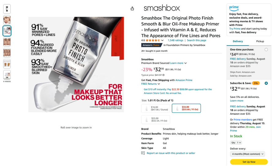
Shopping on Amazon’s website can be overwhelming with the number of categories and amount of information it throws at you. That’s why Amazon caters to a wide audience in the ways that it helps its users make buying decisions. For users who use lower levels of elaboration and rely on visual cues to influence their attitude, Amazon provides several cues, such as high-quality product images, star ratings, and the “Amazon’s Choice” label underneath the product title to persuade users to add the product to their cart:
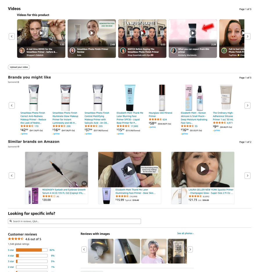
On the other hand, Amazon also caters to users that leverage the central route of processing by providing sections for comparison tables and detailed customer reviews that include images and videos. For users that really do their research and compare different products before deciding on one, Amazon does a great job at surfacing detailed information that can help change attitudes about a product:
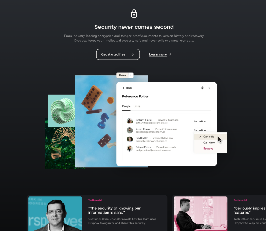
If you aren’t yet a customer, Dropbox’s landing page caters to both the central and peripheral routes of persuasion. The website displays clear headings to highlight its key features while describing the benefits of each in detail, making it easy for anyone to understand. If the messaging wasn’t convincing enough, Dropbox includes customer and tech influencer testimonials, which can be persuasive for both users using high and low levels of elaboration.
The landing page’s clean and modern design displays prominent call-to-action buttons that make it easy for users to sign up for a free trial, removing friction for those that don’t care to read all the descriptions and just want to get their hands on the product:
The ELM can be a powerful tool when implemented correctly in your products. However, before making any design decisions, it’s most important to understand your audience and their mindset. Conduct research with your users and create a persona to identify their goals, motivations, and behaviors.
This helps you understand what your customers value and how they make decisions. Your audience may contain different user types, so you may need to segment them into different personas depending on factors such as their domain knowledge or interest.
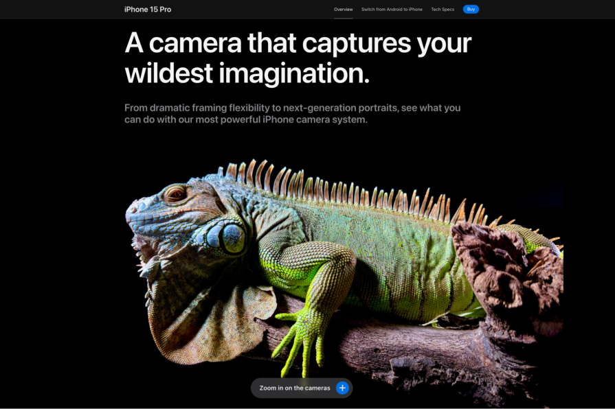
Designing for the peripheral route means ensuring that your page attracts viewers with a cohesive color palette and high-quality images. You want to evoke an emotional response from your audience, whether it’s through user success stories or strong imagery.
Include elements of social proof, such as influencer endorsements and ratings, that can easily persuade your audience. Using prominent headers and call-to-actions, such as “Get started” or “Buy now, can also help lead your users down the right path:
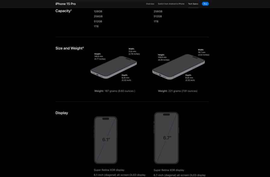
If you’re designing for the central route, ensure that your content follows a logical order. Since there might be a large amount of information to display, it’s best to keep the page organized so that users can easily navigate and find the information they’re looking for. Provide sections that help users analyze the information, such as comparison tables, customer reviews, technical specifications, and FAQs:
When getting to know your users on a deeper level, you might realize that they’re not all the same in the way that they think and rationalize their decisions. Some people have higher levels of interest than others in a topic, which can lead to how much they delve into relevant information before forming an opinion or changing their attitude towards it.
Understanding the theory behind the ELM helps you create both informative and visually appealing designs that provide value to all users. By catering your content to multiple segments of a population, you automatically widen your potential reach and create a more engaging user experience.
LogRocket lets you replay users' product experiences to visualize struggle, see issues affecting adoption, and combine qualitative and quantitative data so you can create amazing digital experiences.
See how design choices, interactions, and issues affect your users — get a demo of LogRocket today.
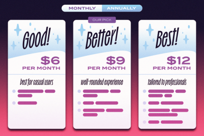
Subscription pages are meant for users and businesses, and they should work well for both parties. This blog is a thorough discussion of what’s best and what’s not when it comes to designing subscription pages.

Call it what it is. Product designers and UX designers have unique roles, even if their titles often get swapped. In this blog, know the difference and own your expertise.

Search bars are more than icons and inputs — they can be a retention magnet or a churn trigger. Sharing my tried-and-tested search bar design principles in this blog!

Are your colors clashing or cohesive? In this blog, I talk about clashing colors, their impact, and how you strike the perfect balance with colors in your designs.