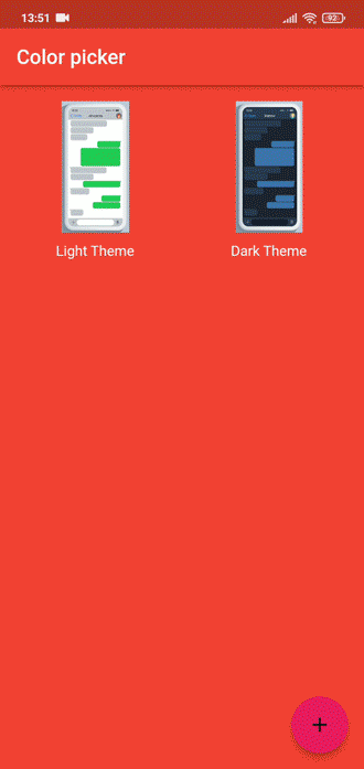
In the past, there was nothing cooler than a customized device (phone), the colors, icons, and background all looking great with a dynamic theme. Believe it or not, these themes gave mobile devices the majority of their appeal. Check out the two images below:
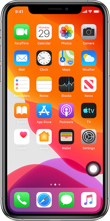
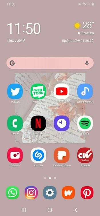
It’s not difficult to differentiate between the two — that is the benefit of a theme.
This article will guide you on how to create a dynamic theme switcher that can switch between three colors, generating a dynamic theme. It will also use the palette_generator Flutter package to identify the dominant color scheme from an image.
To jump ahead:
Let’s get to it!
The Replay is a weekly newsletter for dev and engineering leaders.
Delivered once a week, it's your curated guide to the most important conversations around frontend dev, emerging AI tools, and the state of modern software.
For this tutorial, we expect the reader to have the latest version of the Flutter SDK with null safety. Also, the reader must install the following dependencies:
flutter_colorpicker: v1.0.3material_color_generator: v1.1.0palette_generator: v0.3.3+2provider: v6.0.3shared_preferences: v2.0.15We will start by creating a new Flutter project, and to do that, we will paste the command below in the terminal:
Flutter create <foldername>
Note: Replace
<foldername>with the intended project name.
The command above creates the standard counter project of any new Flutter project. We won’t need that. Instead, we will replace the codes in the main.dart file with the code below:
import 'package:flutter/material.dart';
void main() {
  runApp(const MyApp(
    title: 'Color picker',
  ));
}
class MyApp extends StatefulWidget {
  const MyApp({Key? key, required this.title}) : super(key: key);
  final String title;
  @override
  State<MyApp> createState() => _MyAppState();
}
class _MyAppState extends State<MyApp> {
  @override
  Widget build(BuildContext context) => MaterialApp(
      title: 'Flutter Demo',
      debugShowCheckedModeBanner: false,
      home: Scaffold(
          appBar: AppBar(
        title: Text(widget.title),
      )));
}
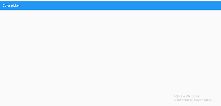
The difference between the code above and the default main.dart Flutter code is rather than using a stateless widget, we are using a stateful widget. This is because the project aims to affect the theme widget’s state, and we cannot accomplish that with stateless widgets. Here is the image of the project at this stage:
We will build on this component later, but before that, we will create a ChangeNotifier class that will handle the switching and persistence of our base widget.
ChangeNotifierWhat do we mean by persistence? In this context, persistence means when the app reloads or closes, the current state is stored, and thus, when loaded back up, the app restores the previous state it saved. To do that, we will use the shared_preference package mentioned in the prerequisites.
To begin, we will create a new file called themes.dart, and we will paste the code below in it:
import 'package:flutter/material.dart';
import 'package:shared_preferences/shared_preferences.dart';

class AppTheme extends ChangeNotifier {
  final String key = "theme";
  SharedPreferences? _prefs;
  late bool _darktheme;

  bool get darkTheme => _darktheme;

  AppTheme() {
    _darktheme = true;
    _loadprefs();
  }

  switchthemelight() {
    _darktheme = false;
    _saveprefs();
    notifyListeners();
  }

  switchthemedark() {
    _darktheme = true;
    _saveprefs();
    notifyListeners();
  }

  _initiateprefs() async {
    _prefs ??= await SharedPreferences.getInstance();
  }

  _loadprefs() async {
    await _initiateprefs();
    _darktheme = _prefs?.getBool(key) ?? true;
    notifyListeners();
  }

  _saveprefs() async {
    await _initiateprefs();
    _prefs?.setBool(key, _darktheme);
  }
}
Starting from the top, we created a class called AppTheme, which is an extension of the ChangeNotifier class. Within the class, there is a key for the shared preferences, a SharedPreferences instance, a Boolean instance, and a getter for the Boolean instance.
Next, we called an initializer and fed it the Boolean instance, which we set to the value true.
Then, we created two functions: switchthemelight() and switchthemedark(), which change the value of the Boolean to false and true, respectively. Finally, the last three functions _initiateprefs(), _loadprefs(), and _saveprefs() handle the initializing, load, and save properties of the SharedPreferences instance.
Note:
SharedPreferencescan only handle small amounts of data.
Now we can handle the UI portion of this project.
The user interface side of this Flutter project will be in two parts: selecting personal color choices for different theme properties and colors from images.
We will start by creating two fields, a list containing the images, and six variables with type Color (three each for two themes):
final urlImages = [
  'images/light.jpg',
  'images/dark.jpg',
];
Color lightindigo = Colors.indigo;
Color lightpink = Colors.pink;
Color lightred = Colors.red;
Color darkindigo = Colors.indigo;
Color darkpink = Colors.pink;
Color darkred = Colors.red;
Next, we will wrap the build method in a ChangeNotifierProvider. Doing this will require us to use the provider package mentioned in the prerequisites.
Then, we will set the child widget to a Consumer class (also made available by the provider package) and return the MaterialApp class:
Widget build(BuildContext context) => ChangeNotifierProvider(
    create: (context) => AppTheme(),
    child: Consumer<AppTheme>(builder: (context, state, child) {
      return MaterialApp(
      );
    })
);
By wrapping the MaterialApp class in a consumer, we can use the getters and functions created in the AppTheme class.
Starting with the most important thing on the list, we want to create a theme. So, in the MaterialApp class, we will create a theme widget, call an if-else statement, and set the condition to the getter darktheme created in the AppTheme class. The conditional statement checks the value of the darktheme getter initialized in the AppTheme class (in this case, true). The theme widget should use the first theme, and if false, it should use the second theme:
title: 'Flutter Demo',
debugShowCheckedModeBanner: false,
theme: state.darkTheme
    ? dark = ThemeData(
        appBarTheme: AppBarTheme(color: darkred),
        colorScheme: const ColorScheme.dark().copyWith(
          secondary: darkpink,
          brightness: Brightness.dark,
        ),
        scaffoldBackgroundColor: colors.isNotEmpty
            ? colors[_currentindex = 1].color
            : darkred,
      )
    : light = ThemeData(
        colorScheme: ColorScheme.fromSwatch(
          primarySwatch: generateMaterialColor(color: lightred),
        ).copyWith(
          secondary: lightpink,
          brightness: Brightness.light,
        ),
        scaffoldBackgroundColor: colors.isNotEmpty
            ? colors[_currentindex].color
            : lightindigo),
Note: We used tenary operators for the conditional statement, and we used the
material_color_generatorpackage to assign the color variable we created to theprimarySwatch.
To use an image within Flutter, we will head to the pubspec.yaml file and uncomment the asset section like the example below:
assets:
  - images/
Lastly, we will create a Gridview using the images we imported earlier. The images will be wrapped in a GestureDetector widget and linked to a dialog widget using a function.
We’ll create three widgets within the dialog widget that will use the colorpicker package. Doing that will allow the user to select custom color designs to replace the default Flutter theme.
Here is the final code:
import 'package:flutter/material.dart';
import 'package:flutter_colorpicker/flutter_colorpicker.dart';
import 'package:palette_generator/palette_generator.dart';
import 'package:provider/provider.dart';
import 'package:theme_switcher/themes.dart';
import 'package:material_color_generator/material_color_generator.dart';
void main() {
  runApp(const MyApp(
    title: 'Color picker (Light Theme)',
  ));
}
class MyApp extends StatefulWidget {
  const MyApp({Key? key, required this.title}) : super(key: key);
  final String title;
  @override
  State<MyApp> createState() => _MyAppState();
}
class _MyAppState extends State<MyApp> {
  late ThemeData light;
  late ThemeData dark;

  final urlImages = [
    'images/light.jpg',
    'images/dark.jpg',
  ];
  Color lightindigo = Colors.indigo;
  Color lightpink = Colors.pink;
  Color lightred = Colors.red;
  Color darkindigo = Colors.indigo;
  Color darkpink = Colors.pink;
  Color darkred = Colors.red;

  @override
  Widget build(BuildContext context) => ChangeNotifierProvider(
      create: (context) => AppTheme(),
      child: Consumer<AppTheme>(builder: (context, state, child) {
        return MaterialApp(
          title: 'Flutter Demo',
          debugShowCheckedModeBanner: false,
          theme: state.darkTheme
              ? dark = ThemeData(
                  appBarTheme: AppBarTheme(color: darkred),
                  colorScheme: const ColorScheme.dark().copyWith(
                    secondary: darkpink,
                    brightness: Brightness.dark,
                  ),
                  scaffoldBackgroundColor: colors.isNotEmpty
                      ? colors[_currentindex = 1].color
                      : darkred,
                )
              : light = ThemeData(
                  colorScheme: ColorScheme.fromSwatch(
                    primarySwatch: generateMaterialColor(color: lightred),
                  ).copyWith(
                    secondary: lightpink,
                    brightness: Brightness.light,
                  ),
                  scaffoldBackgroundColor: colors.isNotEmpty
                      ? colors[_currentindex].color
                      : lightindigo),
          home: Scaffold(
            appBar: AppBar(
              title: state.darkTheme ? Text("Color Picker (Dark Theme)") : Text(widget.title),
            ),
            body: GridView.builder(
              gridDelegate: const SliverGridDelegateWithFixedCrossAxisCount(
                crossAxisCount: 2,
                crossAxisSpacing: 16,
                mainAxisSpacing: 16,
              ),
              padding: const EdgeInsets.only(top: 16, left: 16, right: 16),
              itemBuilder: (BuildContext context, int index) {
                return GestureDetector(
                  onTap: () => index == 0
                      ? customizetheme(context, index, "Light Theme")
                      : customizetheme(context, index, "Dark Theme"),
                  child: Column(
                    children: [
                      Expanded(
                        child: Container(
                          alignment: Alignment.center,
                          decoration: BoxDecoration(
                            image: DecorationImage(
                                image: AssetImage(urlImages[index])),
                          ),
                        ),
                      ),
                      Container(
                        alignment: Alignment.bottomCenter,
                        padding: const EdgeInsets.fromLTRB(0, 10, 0, 0),
                        child: index == 0
                            ? const Text('Light Theme')
                            : const Text('Dark Theme'),
                      )
                    ],
                  ),
                );
              },
              itemCount: urlImages.length,
            ),
            floatingActionButton: FloatingActionButton(
              onPressed: () {},
              child: const Icon(Icons.add), //doesn't do anything
            ),
          ),
        );
      }));
  Widget buildappbarbackgroundColorPicker(index) => MaterialPicker(
        pickerColor: index != 0 ? darkred : lightred,
        onColorChanged: (Color color) => setState(() {
          if (index != 0) {
            darkred = color;
          } else {
            lightred = color;
          }
        }),
      );
  Widget buildbackgroundColorPicker(index) => MaterialPicker(
        pickerColor: index != 0 ? darkindigo : lightindigo,
        onColorChanged: (Color color) => setState(() {
          if (index != 0) {
            darkindigo = color;
          } else {
            lightindigo = color;
          }
        }),
      );
  Widget buildColorPicker(index) => MaterialPicker(
        pickerColor: index != 0 ? darkpink : lightpink,
        onColorChanged: (Color color) => setState(() {
          if (index != 0) {
            darkpink = color;
          } else {
            lightpink = color;
          }
        }),
      );
  void customizetheme(BuildContext context, index, String titlebody) =>
      showDialog(
          context: context,
          builder: (context) =>
              Consumer<AppTheme>(builder: (context, state, child) {
                return AlertDialog(
                  title: Text(titlebody),
                  content: SingleChildScrollView(
                    child: Column(
                      mainAxisSize: MainAxisSize.min,
                      children: [
                        const Text("Primary Swatch: "),
                        buildappbarbackgroundColorPicker(index),
                        const SizedBox(
                          height: 20,
                        ),
                        const Text("Scaffold Background: "),
                        buildbackgroundColorPicker(index),
                        const SizedBox(
                          height: 20,
                        ),
                        const Text("Secondary colorscheme"),
                        buildColorPicker(index),
                      ],
                    ),
                  ),
                  actions: <Widget>[
                    TextButton(
                        onPressed: () {
                          Navigator.of(context).pop();
                        },
                        child: const Text(
                          "Close",
                          style: TextStyle(fontSize: 20),
                        )),
                    TextButton(
                        onPressed: () {
                          if (index != 0) {
                            state.switchthemedark();
                            _currentindex = index;
                          } else {
                            state.switchthemelight();
                            _currentindex = index;
                          }
                          Navigator.of(context).pop();
                        },
                        child: const Text(
                          "Switch Themes",
                          style: TextStyle(fontSize: 20),
                        )),
                  ],
                );
              }));
}
palette_generator Flutter packageFinally, we want to get the dominant color of the image we chose. To do that, we will use the palette_generator package in Flutter.
Start by creating two instances, PaletteColor colors and int _currentindex. Then, we will initialize them in an initState() function, and within the function, we will call another function called _updatepalettes().
We will use a for loop within this new function to iterate over the image list we imported earlier. We will call the PaletteGenerator.fromImageProvider function, which will take the parameters size and AssetImage. Here is the result:
late List<PaletteColor> colors;
late int _currentindex;

@override
void initState() {
  super.initState();
  colors = [];
  _currentindex = 0;
  _updatepalettes();
}
_updatepalettes() async {
  for (String image in urlImages) {
    final PaletteGenerator pg = await PaletteGenerator.fromImageProvider(
        AssetImage(image),
        size: const Size(200, 200));
    colors.add(pg.dominantColor ?? PaletteColor(Colors.blue, 2));
  }
  setState(() {});
}
Then add the code below to any widget that implements colors:
colors[_currentindex].color
And this is our final result:
During this tutorial, we learned how to create a dynamic theme switcher in Flutter by allowing users to select custom themes. We also showed how to pick the dominant color from images using the palette_generator package. Check out the colorpicker package for more resources.
Thanks for reading, and happy coding!
Install LogRocket via npm or script tag. LogRocket.init() must be called client-side, not
server-side
$ npm i --save logrocket

// Code:

import LogRocket from 'logrocket';
LogRocket.init('app/id');
// Add to your HTML:

<script src="https://cdn.lr-ingest.com/LogRocket.min.js"></script>
<script>window.LogRocket && window.LogRocket.init('app/id');</script>
I tested the Speculation Rules API in a real project to see if it actually improves navigation speed. Here’s what worked, what didn’t, and where it’s worth using.
How AGENTS.md and agent skills improve coding agents, reduce mistakes, and make AI IDE workflows more reliable and project-aware.

Build a simple, framework-free Node.js app, and then deploy it to three different services that offer a free tier, Render, Railway, and Fly.io.
Understand best practices for structuring Node.js projects, such as separating roles using folder structures and practicing modular code.
Hey there, want to help make our blog better?
Join LogRocket’s Content Advisory Board. You’ll help inform the type of content we create and get access to exclusive meetups, social accreditation, and swag.
Sign up now

 Learn more →
