
The linear() easing function was introduced to CSS to give more precise control over the timing of animations. Don’t let the name of this function mislead you — it is not the same as the linear keyword that animates something at a constant speed.

The linear() function pushes the boundaries of CSS animation by enabling you to create dynamic, compound movements such as springy effects in CSS:
See the Pen
linear() by rob2 (@robatronbobby)
on CodePen.
Let’s take a quick refresher on what easing is and look at what other easing functions offer so we can better appreciate what the linear() easing function brings to the party! 🥳
The Replay is a weekly newsletter for dev and engineering leaders.
Delivered once a week, it's your curated guide to the most important conversations around frontend dev, emerging AI tools, and the state of modern software.
If you want to create a realistic animation, things need to move in a particular way. Objects in real life don’t just start and stop instantly, and they rarely move at a constant speed. For example, if you drop something, it will first accelerate downwards, then it will almost stop completely upon hitting the floor, before bouncing back up and coming to a rest. In animation, we accomplish this type of dynamic movement with easing.
Easing functions specify the rate of change of a parameter over time. You can specify the easing for a transition through the transition-timing-function property, and an animation through the animation-timing-function property.
The default value of the animation-timing-function property in CSS is ease, which is one of the predefined easing functions. Below is a table listing all of them and outlining their rate of change over time:
| Keyword | Starting speed | Middle speed | Ending speed | cubic-bezier() equivalent |
|---|---|---|---|---|
ease |
Fast acceleration | Fast acceleration | Slow acceleration | cubic-bezier(0.25, 0.1, 0.25, 1.0) |
linear |
Constant | Constant | Constant | cubic-bezier(0.0, 0.0, 1.0, 1.0) |
ease-in |
Slow acceleration | Fast acceleration | Full speed | cubic-bezier(0.42, 0, 1.0, 1.0) |
ease-out |
Full speed | Slow acceleration | Slow acceleration | cubic-bezier(0, 0, 0.58, 1.0) |
ease-in-out |
Slow acceleration | Full speed | Fast acceleration | cubic-bezier(0.42, 0, 0.58, 1.0) |
These easings can be visualized as graphs:
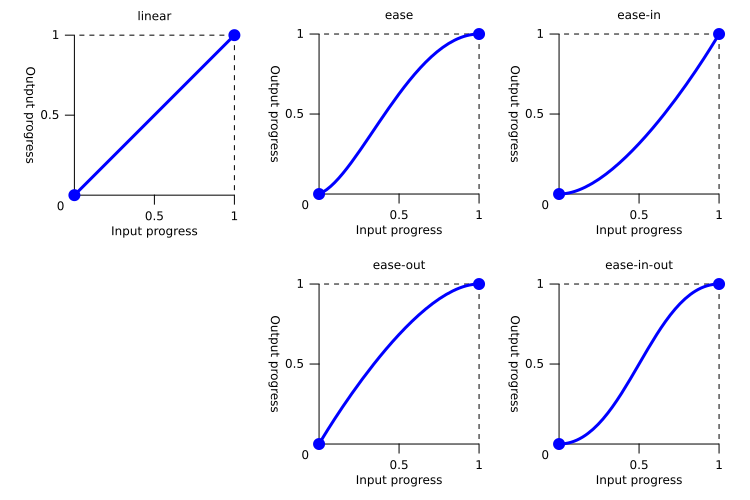
Here is a CodePen demonstrating these easings in use, each with identical styles aside from their animation-timing-function:
See the Pen
Easings comparison by rob2 (@robatronbobby)
on CodePen.
Just a quick point on terminology. Values for animation-timing-function are generally referred to as easing functions (and perhaps this should be avoided). That means that the aforementioned keywords may also be called easing functions!
This may become confusing if you associate the term “function” with receiving parameters, like a CSS function. Instead, it is best to think of all values for animation-timing-function implicitly as mathematical functions that return numerical values.
There are three types of custom easing functions that can receive parameters:
steps() CSS functioncubic-bezier() CSS functionlinear() CSS function that we will cover in more depth in this articlesteps() easing functionThe steps() function enables an animation to be divided into segments. You might choose to use this timing function when you want discrete intermediate states rather than a continuous transition between states. It can be used to animate a progress indicator, a typing effect, or an analog clock.
An analog clock is an ideal demonstration of steps(). The clock’s hands rotate in sudden and specific increments. The seconds’ hand rotates 60 times per minute, so the animation entails 60 steps and the duration of the animation is 60 seconds. We want it to run forever, so we can set the animation-iteration-count to be infinite:
.second {
  animation-name: tick
  animation-timing-function: steps(60, end);
  animation-iteration-count: infinite;
  animation-duration: 60s;
}

@keyframes tick {
  to {
    transform: rotate(360deg);
  }
}
Here is a CodePen of a clock with a ticking second hand to demonstrate this animation:
See the Pen
CSS Clock (animated second hand) by rob2 (@robatronbobby)
on CodePen.
You probably won’t reach for steps() very often, and I would say that its usage is quite niche.
cubic-bezier() easing functionThe cubic-bezier() function allows us to create a custom smooth easing that provides a continuous transition between states. It is quite versatile.
In CSS, Bézier curves are defined by four points that describe the curve: a starting point, an ending point, and two control points. You don’t need to come up with these values yourself. You can use the browser dev tools or https://cubic-bezier.com/ to create the curve you want by moving the two control points, like below:
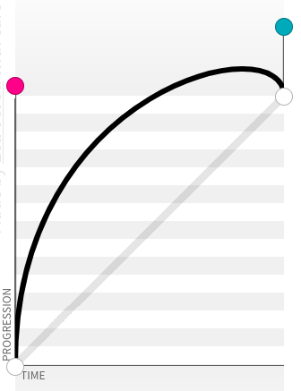
For example, I wanted to recreate the title animation for the TV series Schitt’s Creek. The text of the title rotates towards the viewer, overshoots its mark, and corrects itself slightly by rocking back. I needed to create a custom easing for this.
I created the easing on https://cubic-bezier.com/; it produced the snippet cubic-bezier(.14, 1.23, .33, 1.16) from the curve that I made:
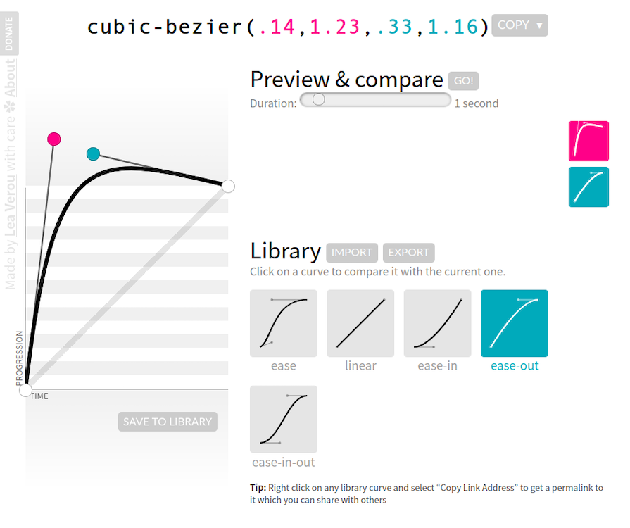
Here is a simplified animation of the custom easing in usage:
See the Pen
Pop word – cubic-bezier() by rob2 (@robatronbobby)
on CodePen.
Here is the final CSS animation for the Schitt’s Creek title (click the Rerun button if you missed it):
See the Pen
Schitt’s Creek (CSS) title animation by Rob (@robjoeol)
on CodePen.
If you look at easings.net, you can see the range of easing functions that are possible to make with cubic-bezier():
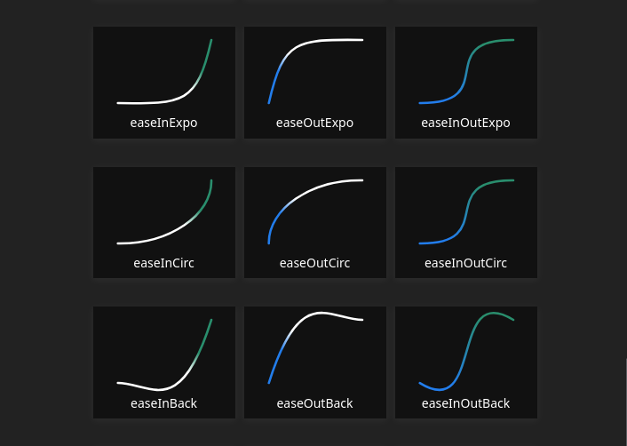
The limitation of the cubic-bezier() function is that you cannot create a curve where progress increases and decreases multiple times. If we wanted the text in my example to swing back and forth a few times, this would not be possible with a cubic-bezier() easing.
linear() easing functionThe linear() function can take any number of points as inputs to create a complex easing. Defined in the CSS Easing Level 2 specification, it enables us to create compound movements such as bouncy effects in CSS.
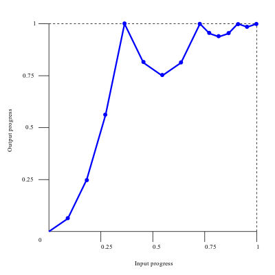
This animation of a football being dropped and bouncing a few times uses an easeOutBounce easing created with linear():
See the Pen
Football CSS animation – linear() by Rob (@robjoeol)
on CodePen.
There are many more examples of easing functions from easings.net that can be approximated with linear(). I say approximate because the points provided to the linear() easing function are joined as straight lines, so it is not a smooth curve like the graphs above. This is probably why it was named “linear.” As mentioned earlier, do not confuse it with the linear keyword, which is visualized as a single, straight line!
For example, if we want to create the easeOutBounce easing function using linear(), this is how it looks like as a graph:
This is the CSS for the football animation:
:root {
  --easeOutBounceEasing: linear(
    /* Start to 1st bounce */
    0, 0.063, 0.25, 0.563, 1 36.4%,
    /* 1st to 2nd bounce */
    0.812, 0.75, 0.813, 1 72.7%,
    /* 2nd to 3rd bounce */
    0.953, 0.938, 0.953, 1 90.9%,
    /* 3rd bounce to end */
    0.984, 1 100% 100%
  );
}

.ball {
  /* other props */

  animation: drop 2s infinite;
  animation-timing-function: var(--easeOutBounceEasing);
}

@keyframes drop {
  to {
    translate: 0;
  }
}
When you use easing functions effectively, you will find that the @keyframes are short and simple like above.
You are probably wondering what all the numbers provided to linear() are! Let’s walk through the syntax.
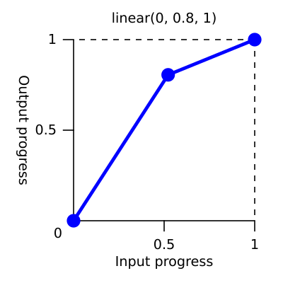
linear() syntaxGenerally, you will be supplying values between zero and one as a list of comma-separated arguments to the function. Each argument is a stop. By default, the stops are equidistant. So if there are three stops, they will occur at 0%, 50%, and 100% of the duration (the X axis on the graph).
For example, the linear(0, 0.8, 1) function has stops of 0, 0.8, and 1. The duration is the same (50%) to go from 0 to 0.8 (first line segment) as it is to go from 0.8 to 1 (second line segment):
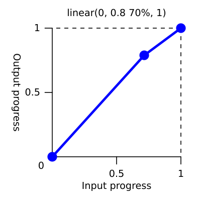
You can add a <linear-stop-length> percentage to a stop to have more precise control of the duration. It defines the start and/or length of each segment, allowing for a more controlled progression of the animation.
For example, the linear(0, 0.8 70%, 1) function has a <linear-stop-length> for the first segment. Now, 70% of the time is taken to go from 0 to 0.8, and 30% of the time is used to go from 0.8 to 1. It is almost a straight line:
Don’t worry if the syntax looks cumbersome, you are unlikely to write it by hand! 😅 You will probably copy a snippet from somewhere, or use a tool to generate the values. Let’s look at where you can get them from.
linear() easings and how to generate your ownMy go-to for complex animations is the GSAP (Greensock) JavaScript library, which has an excellent collection of pre-made easings. Its Ease Visualizer is very helpful for finding the right one.
Jhey Thompkins converted some of the easing functions from GSAP to CSS variables. The CSS variables below correspond to the names in the GSAP Ease Visualizer:
/* GSAP easings as CSS variables */
:root {
  --elastic-in: linear( 0, 0.0019 13.34%, -0.0056 27.76%, -0.0012 31.86%, 0.0147 39.29%, 0.0161 42.46%, 0.0039 46.74%, -0.0416 54.3%, -0.046 57.29%, -0.0357, -0.0122 61.67%, 0.1176 69.29%, 0.1302 70.79%, 0.1306 72.16%, 0.1088 74.09%, 0.059 75.99%, -0.0317 78.19%, -0.3151 83.8%, -0.3643 85.52%, -0.3726, -0.3705 87.06%, -0.3463, -0.2959 89.3%, -0.1144 91.51%, 0.7822 97.9%, 1 );
  --elastic-out: linear( 0, 0.2178 2.1%, 1.1144 8.49%, 1.2959 10.7%, 1.3463 11.81%, 1.3705 12.94%, 1.3726, 1.3643 14.48%, 1.3151 16.2%, 1.0317 21.81%, 0.941 24.01%, 0.8912 25.91%, 0.8694 27.84%, 0.8698 29.21%, 0.8824 30.71%, 1.0122 38.33%, 1.0357, 1.046 42.71%, 1.0416 45.7%, 0.9961 53.26%, 0.9839 57.54%, 0.9853 60.71%, 1.0012 68.14%, 1.0056 72.24%, 0.9981 86.66%, 1 );
  --elastic-in-out: linear( 0, -0.0028 13.88%, 0.0081 21.23%, 0.002 23.37%, -0.0208 27.14%, -0.023 28.64%, -0.0178, -0.0061 30.83%, 0.0588 34.64%, 0.0651 35.39%, 0.0653 36.07%, 0.0514, 0.0184 38.3%, -0.1687 42.21%, -0.1857 43.04%, -0.181 43.8%, -0.1297 44.93%, -0.0201 46.08%, 1.0518 54.2%, 1.1471, 1.1853 56.48%, 1.1821 57.25%, 1.1573 58.11%, 0.9709 62%, 0.9458, 0.9347 63.92%, 0.9349 64.61%, 0.9412 65.36%, 1.0061 69.17%, 1.0178, 1.023 71.36%, 1.0208 72.86%, 0.998 76.63%, 0.9919 78.77%, 1.0028 86.12%, 1 );

    --bounce-in: linear( 0, 0.0117, 0.0156, 0.0117, 0, 0.0273, 0.0468, 0.0586, 0.0625, 0.0586, 0.0468, 0.0273, 0 27.27%, 0.1093, 0.1875 36.36%, 0.2148, 0.2343, 0.2461, 0.25, 0.2461, 0.2344, 0.2148 52.28%, 0.1875 54.55%, 0.1095, 0, 0.2341, 0.4375, 0.6092, 0.75, 0.8593, 0.9375 90.91%, 0.9648, 0.9843, 0.9961, 1 );
  --bounce-out: linear( 0, 0.0039, 0.0157, 0.0352, 0.0625 9.09%, 0.1407, 0.25, 0.3908, 0.5625, 0.7654, 1, 0.8907, 0.8125 45.45%, 0.7852, 0.7657, 0.7539, 0.75, 0.7539, 0.7657, 0.7852, 0.8125 63.64%, 0.8905, 1 72.73%, 0.9727, 0.9532, 0.9414, 0.9375, 0.9414, 0.9531, 0.9726, 1, 0.9883, 0.9844, 0.9883, 1 );
  --bounce-in-out: linear( 0, 0.0078, 0, 0.0235, 0.0313, 0.0235, 0.0001 13.63%, 0.0549 15.92%, 0.0938, 0.1172, 0.125, 0.1172, 0.0939 27.26%, 0.0554 29.51%, 0.0003 31.82%, 0.2192, 0.3751 40.91%, 0.4332, 0.4734 45.8%, 0.4947 48.12%, 0.5027 51.35%, 0.5153 53.19%, 0.5437, 0.5868 57.58%, 0.6579, 0.7504 62.87%, 0.9999 68.19%, 0.9453, 0.9061, 0.8828, 0.875, 0.8828, 0.9063, 0.9451 84.08%, 0.9999 86.37%, 0.9765, 0.9688, 0.9765, 1, 0.9922, 1 );
}
Here is Jhey’s tool to generate a CSS easing from a GSAP easing string:
See the Pen
Convert GSAP Ease to CSS linear() by Jhey (@jh3y)
on CodePen.
The Open Props CSS library also has a collection of linear() easings in its easings.css style sheet. Here is an excerpt:
:where(html) {
 --ease-spring-1: linear(
    0, 0.006, 0.025 2.8%, 0.101 6.1%, 0.539 18.9%, 0.721 25.3%, 0.849 31.5%,
    0.937 38.1%, 0.968 41.8%, 0.991 45.7%, 1.006 50.1%, 1.015 55%, 1.017 63.9%,
    1.001
  );
  --ease-spring-2: linear(
    0, 0.007, 0.029 2.2%, 0.118 4.7%, 0.625 14.4%, 0.826 19%, 0.902, 0.962,
    1.008 26.1%, 1.041 28.7%, 1.064 32.1%, 1.07 36%, 1.061 40.5%, 1.015 53.4%,
    0.999 61.6%, 0.995 71.2%, 1
  );
  --ease-spring-3: linear(
    0, 0.009, 0.035 2.1%, 0.141 4.4%, 0.723 12.9%, 0.938 16.7%, 1.017, 1.077,
    1.121, 1.149 24.3%, 1.159, 1.163, 1.161, 1.154 29.9%, 1.129 32.8%,
    1.051 39.6%, 1.017 43.1%, 0.991, 0.977 51%, 0.974 53.8%, 0.975 57.1%,
    0.997 69.8%, 1.003 76.9%, 1
  );
  --ease-spring-4: linear(
    0, 0.009, 0.037 1.7%, 0.153 3.6%, 0.776 10.3%, 1.001, 1.142 16%, 1.185,
    1.209 19%, 1.215 19.9% 20.8%, 1.199, 1.165 25%, 1.056 30.3%, 1.008 33%, 0.973,
    0.955 39.2%, 0.953 41.1%, 0.957 43.3%, 0.998 53.3%, 1.009 59.1% 63.7%,
    0.998 78.9%, 1
  );
  --ease-spring-5: linear(
    0, 0.01, 0.04 1.6%, 0.161 3.3%, 0.816 9.4%, 1.046, 1.189 14.4%, 1.231,
    1.254 17%, 1.259, 1.257 18.6%, 1.236, 1.194 22.3%, 1.057 27%, 0.999 29.4%,
    0.955 32.1%, 0.942, 0.935 34.9%, 0.933, 0.939 38.4%, 1 47.3%, 1.011,
    1.017 52.6%, 1.016 56.4%, 1 65.2%, 0.996 70.2%, 1.001 87.2%, 1
  );

  --ease-bounce-1: linear(
    0, 0.004, 0.016, 0.035, 0.063, 0.098, 0.141, 0.191, 0.25, 0.316, 0.391 36.8%,
    0.563, 0.766, 1 58.8%, 0.946, 0.908 69.1%, 0.895, 0.885, 0.879, 0.878, 0.879,
    0.885, 0.895, 0.908 89.7%, 0.946, 1
  );
  --ease-bounce-2: linear(
    0, 0.004, 0.016, 0.035, 0.063, 0.098, 0.141 15.1%, 0.25, 0.391, 0.562, 0.765,
    1, 0.892 45.2%, 0.849, 0.815, 0.788, 0.769, 0.757, 0.753, 0.757, 0.769, 0.788,
    0.815, 0.85, 0.892 75.2%, 1 80.2%, 0.973, 0.954, 0.943, 0.939, 0.943, 0.954,
    0.973, 1
  );
  --ease-bounce-3: linear(
    0, 0.004, 0.016, 0.035, 0.062, 0.098, 0.141 11.4%, 0.25, 0.39, 0.562, 0.764,
    1 30.3%, 0.847 34.8%, 0.787, 0.737, 0.699, 0.672, 0.655, 0.65, 0.656, 0.672,
    0.699, 0.738, 0.787, 0.847 61.7%, 1 66.2%, 0.946, 0.908, 0.885 74.2%, 0.879,
    0.878, 0.879, 0.885 79.5%, 0.908, 0.946, 1 87.4%, 0.981, 0.968, 0.96, 0.957,
    0.96, 0.968, 0.981, 1
  );
  --ease-bounce-4: linear(
    0, 0.004, 0.016 3%, 0.062, 0.141, 0.25, 0.391, 0.562 18.2%, 1 24.3%, 0.81,
    0.676 32.3%, 0.629, 0.595, 0.575, 0.568, 0.575, 0.595, 0.629, 0.676 48.2%,
    0.811, 1 56.2%, 0.918, 0.86, 0.825, 0.814, 0.825, 0.86, 0.918, 1 77.2%,
    0.94 80.6%, 0.925, 0.92, 0.925, 0.94 87.5%, 1 90.9%, 0.974, 0.965, 0.974, 1
  );
  --ease-bounce-5: linear(
    0, 0.004, 0.016 2.5%, 0.063, 0.141, 0.25 10.1%, 0.562, 1 20.2%, 0.783, 0.627,
    0.534 30.9%, 0.511, 0.503, 0.511, 0.534 38%, 0.627, 0.782, 1 48.7%, 0.892,
    0.815, 0.769 56.3%, 0.757, 0.753, 0.757, 0.769 61.3%, 0.815, 0.892, 1 68.8%,
    0.908 72.4%, 0.885, 0.878, 0.885, 0.908 79.4%, 1 83%, 0.954 85.5%, 0.943,
    0.939, 0.943, 0.954 90.5%, 1 93%, 0.977, 0.97, 0.977, 1
  );
}
These should cover the most common cases. If you want to visually create a linear() easing, you can create and edit the easing as a graph in the browser dev tools. I will cover that in the next section.
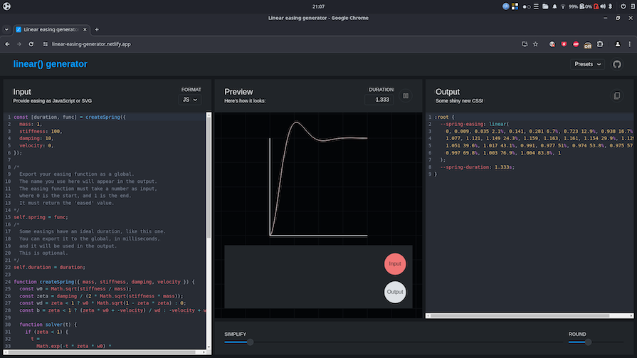
For more specialized cases, you may need to convert a JavaScript easing function yourself. Jake Archibald wrote a linear() generator tool where you can take a JavaScript function or SVG path as an input to generate a CSS snippet:
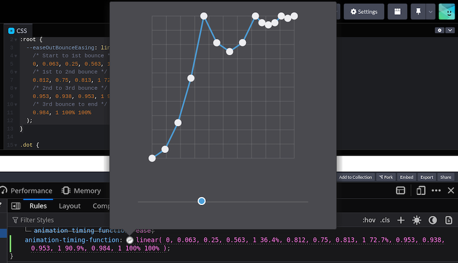
linear() easing function in the browser dev toolsFirefox has updated its dev tools to enable editing a linear() easing function as a graph. In the Rules tab, you click the gray icon that appears next to the easing function in the declarations of transition-timing-function, animation-timing-function, transition, or animation to open a visual editor pane.
You can drag existing points to shift their position and add new points by double-clicking on the line. Consult the Firefox documentation for more info on editing the easing function in the dev tools:
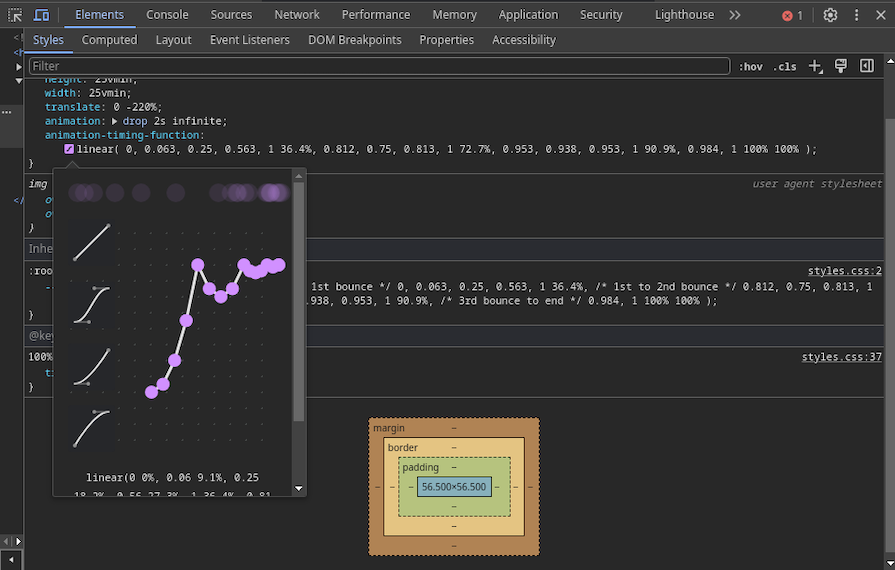
The Chrome dev tools have a similar editing experience to Firefox. They call it the Easing Editor in their docs. In the Styles tab, you click the purple icon that appears next to the easing function in the declarations of transition-timing-function, animation-timing-function, transition, or animation to open a visual editor pane:
linear(): Mimicking complex easing with @keyframesFinally, let’s demonstrate what it was like to make complex CSS animations before the release of linear(). We’ll compare the code required to make a mildly complex animation in CSS without and with linear() to see how they compare.
An alternative way to approximate a more complex custom easing is through some numerical voodoo using @keyframes. We need to dictate the exact value of an attribute of an element (position, size, rotation, etc.) at various points in time, which requires creating a long list of keyframes.
In the past, some developers used CSS preprocessors to help generate the code, but this approach had limitations. The team at easings.net provide pre-calculated snippets for the various easings for animating some attributes: size, position, and transparency. You’re out of luck if you want to animate another attribute.
For example, say we wanted to shrink a red dot in a bouncy manner. We want the equivalent of the easeOutBounce easing:
See the Pen
dot shrink animation – keyframes by rob2 (@robatronbobby)
on CodePen.
We can grab the @keyframes size snippet from easings.net. It has 10 intermediate points defined. Here is the snippet combined with the animation code:
.dot {
  transform: scale(0);
  animation: scale 2s infinite;
}

@keyframes scale {
    0% {
        transform: scale(1);
    }

    12% {
        transform: scale(0.89);
    }

    24% {
        transform: scale(0.56);
    }

    36% {
        transform: scale(0.02);
    }

    54% {
        transform: scale(0.25);
    }

    74% {
        transform: scale(0.02);
    }

    82% {
        transform: scale(0.06);
    }

    92% {
        transform: scale(0.01);
    }

    96% {
        transform: scale(0.02);
    }

    100% {
        transform: scale(0);
    }
}
The equivalent code using linear() is as follows:
:root {
  --easeOutBounceEasing: linear(
    0, 0.063, 0.25, 0.563, 1 36.4%,
    0.812, 0.75, 0.813, 1 72.7%,
    0.953, 0.938, 0.953, 1 90.9%,
    0.984, 1 100% 100%
  );
}

.dot {
  scale: 0;
  animation: scale 2s;
  animation-timing-function: var(----easeOutBounceEasing);
}

@keyframes scale {
  to {
    scale: 1;
  }
}
The code with linear() is more concise and flexible. In the past, you were likely to reach for JavaScript when you reached this territory. Here is the CodePen for the linear() version.
Some users prefer browsing the web with reduced motion because they experience over-stimulation or nausea from animated content. We should offer a proper alternative for them whenever possible. This can be easily done with the widely-supported prefers-reduced-motion media query:
.bouncy-ball {
  /* Regular animation */
  animation: bounce 1s;
}

@media (prefers-reduced-motion) {
  .bouncy-ball {
    /* Accessible animation -slowed down */
    animation: bounce 4s;
  }
}
In the past, CSS has lacked precise control over the timing of animations and transitions. The only way to get the desired behavior for more complex animations was to reach for JavaScript solutions.
Thanks to the introduction of the linear() function, you can create dynamic movements such as bouncy and elastic effects in CSS with ease (pardon the pun). It is widely supported in most browsers and has almost 100% interoperability according to the Web Platform Status, so you can use it with confidence right away!
As web frontends get increasingly complex, resource-greedy features demand more and more from the browser. If you’re interested in monitoring and tracking client-side CPU usage, memory usage, and more for all of your users in production, try LogRocket.

LogRocket lets you replay user sessions, eliminating guesswork around why bugs happen by showing exactly what users experienced. It captures console logs, errors, network requests, and pixel-perfect DOM recordings — compatible with all frameworks.
LogRocket's Galileo AI watches sessions for you, instantly identifying and explaining user struggles with automated monitoring of your entire product experience.
Modernize how you debug web and mobile apps — start monitoring for free.

Learn how Vite+ unifies Vite, Vitest, Oxlint, Oxfmt, Rolldown, and Node.js management in one CLI.

AI companies are buying developer tools as coding agents turn runtimes, package managers, and linters into strategic infrastructure.

Learn how AI-assisted development governance uses rules, agents, hooks, and protocols to help AI coding tools produce safer, more consistent code.

A step-by-step guide to building your first MCP server using Node.js, covering core concepts, tool design, and upgrading from file storage to MySQL.
Hey there, want to help make our blog better?
Join LogRocket’s Content Advisory Board. You’ll help inform the type of content we create and get access to exclusive meetups, social accreditation, and swag.
Sign up now