Web developers tend to use multiple components to make their React-based web applications more dynamic to enhance usability and flexibility.

A React component is an independent, reusable, and isolated UI building block written in JSX (or TSX). Web applications typically let the user interact with one component at a time — for example, a user can open an HTML popup and interact with the popup’s content. If the user clicks outside the popup’s area, the web application either closes the popup or prevents the user from closing the popup.
Web developers also use custom dropdowns to let users select from a list of several options. If the user clicks outside of the custom dropdown when it is open, the dropdown will be closed.
In these kinds of scenarios, if the user clicks outside a specific component, we have to trigger some actions.
In this tutorial, I will explain how you can extend your functional and class-based React components to detect an outside click, and I will explain an alternative way to do the same task with a popular npm library.
The Replay is a weekly newsletter for dev and engineering leaders.
Delivered once a week, it's your curated guide to the most important conversations around frontend dev, emerging AI tools, and the state of modern software.
Let’s build an HTML tooltip by creating a React functional component named InfoBox. The tooltip will appear when the user clicks a button, and it will be closed if the user clicks outside of the tooltip component. We need to detect a click outside a React component to implement a solution for this scenario.
First, we’ll create a new React app to get started. You can alternatively add the following outside click detection code to your existing React app.
Enter the following command and create a new app.
npx create-react-app react-outside-click
cd react-outside-click
yarn start
Now, we need to create a new functional component to implement the tooltip component. Add the following code into ./src/components/InfoBoxFunctional.js.
import { useEffect, useRef } from 'react';

export function InfoBox(props) {
  const ref = useRef(null);
  const { onClickOutside } = props;

  useEffect(() => {
    const handleClickOutside = (event) => {
      if (ref.current && !ref.current.contains(event.target)) {
        onClickOutside && onClickOutside();
      }
    };
    document.addEventListener('click', handleClickOutside, true);
    return () => {
      document.removeEventListener('click', handleClickOutside, true);
    };
  }, [ onClickOutside ]);

  if(!props.show)
    return null;

  return (
    <div ref={ref} className='info-box'>
        {props.message}
    </div> );
}
The above code snippet assigns the current component instance’s DOM reference to the ref variable with the help of the useRef Hook. After that, it registers a click handler inside the useEffect Hook to the entire document to detect global click events.
We can also return a function with cleanup code from the useEffect Hook, which means we can unregister our global click event listener when the component is unmounted. As you can see, the above code implements cleanup code with the removeEventListener DOM API function.
InfoBox tooltip componentThe InfoBox component supports three props:
message: specifies the tooltip messageonClickOutside: sets a callback that we need to trigger when there is an outside click eventshow: refers to the visibility state, and says whether the component is hidden or visible. If it is true, the tooltip is visible; if not, the component function will return null and won’t render any contentThe handleClickOutside function is triggered whenever the user clicks the document. Therefore, if we call onClickOutside directly, the tooltip will disappear even when the user clicks on the tooltip itself.
The above code checks whether the user clicks on the tooltip (or its children) via the contains DOM API function. Hence, the onClickOutside callback will be executed if a click event occurs outside of the tooltip component instance.
The InfoBox component is ready now. Add the following CSS code to the ./src/index.css file to apply some styles for the InfoBox component. You can also move your InfoBox-related CSS into a separate file, if you like. We’ll use the index.css file for demonstration purposes.
body {
  margin: 0;
  font-family: -apple-system, BlinkMacSystemFont, 'Segoe UI', 'Roboto', 'Oxygen',
    'Ubuntu', 'Cantarell', 'Fira Sans', 'Droid Sans', 'Helvetica Neue',
    sans-serif;
  -webkit-font-smoothing: antialiased;
  -moz-osx-font-smoothing: grayscale;
}
.container {
  display: flex;
  justify-content: center;
  padding-top: 40vh;
}
.container .info-box-wrapper {
  position: relative;
}
.container .info-box {
  user-select: none;
  width: 300px;
  background: #ffc00d;
  font-size: 14px;
  padding: 12px;
  box-shadow: 2px 2px 12px rgba(0, 0, 0, 0.2);
  border-radius: 4px;
  top: 20px;
  position: absolute;
}
Finally, update your ./src/App.js file with the following code to get our main application working.
import { useState } from 'react';
import { InfoBox } from './components/InfoBoxFunctional.js';
function App() {
  let [showInfo1, setShowInfo1] = useState(false);
  return (
    <div className="container">
      <div className="info-box-wrapper">
        <button onClick={() => {setShowInfo1(true)}} style={{marginRight: '4px'}}>Show InfoBox Functional</button>
        <InfoBox show={showInfo1} onClickOutside={() => {setShowInfo1(false)}} message="Click outside to close this"/>
      </div>
    </div>
  );
}
export default App;
The above code renders a button with a click action that opens the InfoBox. The InfoBox component is reusable (you can create many infoboxes), and we pass the required props into it as usual.
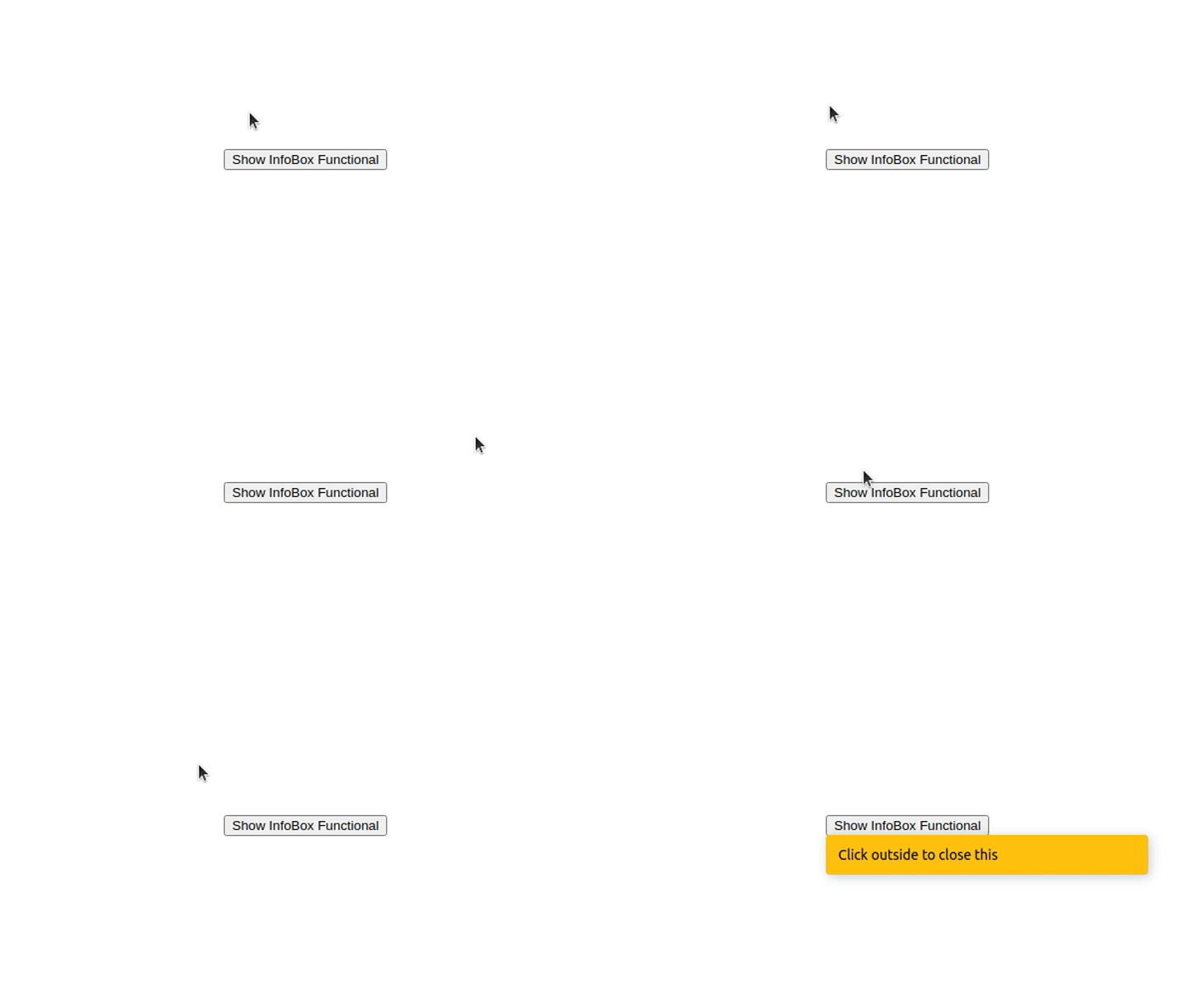
Look at the running application below. We can close the InfoBox instance by clicking outside of it. Moreover, it won’t disappear when you click on either button or the component.

The class-based component approach looks very similar to the functional component. We use the same props, DOM APIs, and implementation logic, but we have to write our code in the class-based style. Add the following code to ./src/components/InfoBoxClassBased.js.
import React from 'react';

export class InfoBox extends React.Component {
  constructor(props) {
    super(props);
    this.ref = React.createRef();
    this.handleClickOutside = this.handleClickOutside.bind(this);
  }

  handleClickOutside(event) {
    if (this.ref.current && !this.ref.current.contains(event.target)) {
      this.props.onClickOutside && this.props.onClickOutside();
    }
  };

  componentDidMount() {
    document.addEventListener('click', this.handleClickOutside, true);
  }

  componentWillUnmount() {
    document.removeEventListener('click', this.handleClickOutside, true);
  };

  render() {
    if(!this.props.show)
      return null;
    return (
      <div ref={this.ref} className='info-box'>
        {this.props.message}
      </div> );
  }
}
The above code snippet is similar to the functional component code, but there are some differences. For example, we use React.createRef instead of the useRef Hook because we cannot use React Hooks with class-based components.
Now, update your App.js by adding your new component references, as shown below. Note that we are using both functional and class-based components in the demo application, but you can use only the class-based implementation as you wish.
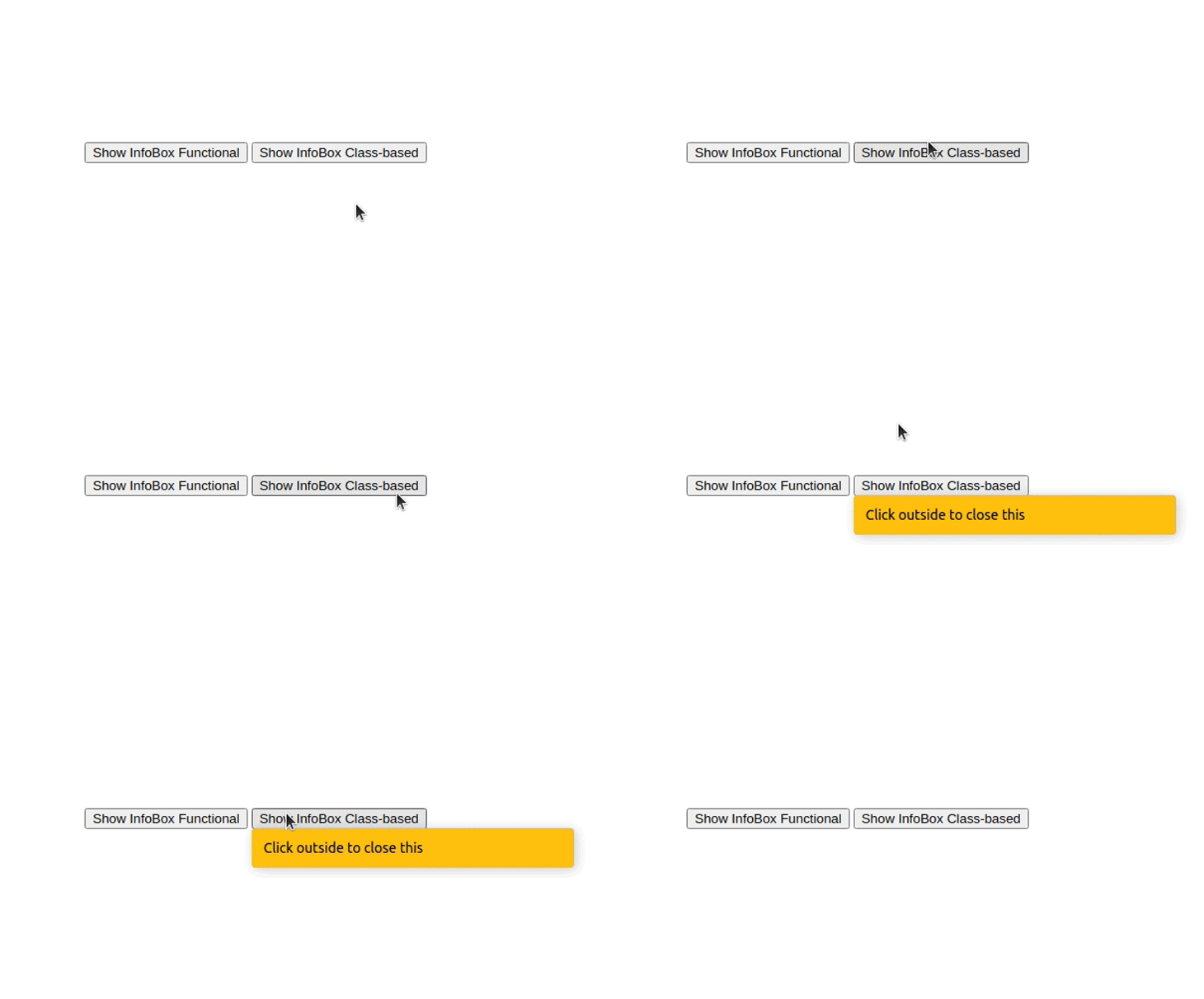
Let’s look at the running application once more. Now, there are two InfoBox instances: the class-based implementation and the functional implementation.

Here we used the click event to bind click event listeners. You can also use the mousedown event according to your requirements. You can find the full source code on my GitHub.
As I mentioned before, you can easily add this outside click detection code to any of your React components. The implementation consists of a few DOM API function calls and React API usages. But, nowadays, we have npm libraries for literally anything we can think to do with React — including several libraries for this scenario. If you need to add this outside click detection logic into many components, and you don’t want to implement it yourself, you can use a library. The react-outside-click-handler is a rather popular library for handling outside click events. Like any other npm library, this also affects your production bundle size a bit. React Outside Click Handler increases your production bundle size by about 20 kB. Let’s update our project with this npm library. We are going to modify both functional and class-based components by adding references to this npm library. Copy your current project into another directory and rename it to react-outside-click-lib. Install the npm library with the following command.
yarn add react-outside-click-handler
Update both components. First, add the following code to ./src/components/InfoBoxFunctional.js.
export function InfoBox(props) {
   if(!props.show)
    return null;

  return (
  <div className='info-box'>
      {props.message}
  </div> );
}
After that, you can add the following code to ./src/components/InfoBoxClassBased.js.
import React from 'react';
export class InfoBox extends React.Component {
  render() {
    if(!this.props.show)
      return null;
    return (
      <div className='info-box'>
        {this.props.message}
      </div> );
  }
}
As you can see now, we don’t have our own implementation for outside click detection inside both components. Let’s use the npm library to activate the outside click detection feature again.
Update your App.js with the following code.
import { useState } from 'react';
import { InfoBox as InfoBox1 } from './components/InfoBoxFunctional.js';
import { InfoBox as InfoBox2 } from './components/InfoBoxClassBased.js';
import OutsideClickHandler from 'react-outside-click-handler';
function App() {
  let [showInfo1, setShowInfo1] = useState(false);
  let [showInfo2, setShowInfo2] = useState(false);
return (
    <div className="container">
      <div className="info-box-wrapper">
        <button onClick={() => {setShowInfo1(true)}} style={{marginRight: '4px'}}>Show InfoBox Functional</button>
        <OutsideClickHandler onOutsideClick={() => {setShowInfo1(false)}}>
          <InfoBox1 show={showInfo1} message="Click outside to close this"/>
        </OutsideClickHandler>
      </div>
      <div className="info-box-wrapper">
        <button onClick={() => {setShowInfo2(true)}}>Show InfoBox Class-based</button>
        <OutsideClickHandler onOutsideClick={() => {setShowInfo2(false)}}>
          <InfoBox2 show={showInfo2} message="Click outside to close this"/>
        </OutsideClickHandler>
      </div>
    </div>
  );
}
export default App;
Here we are wrapping our InfoBox components with the OutSideClickHandler component defined in the library. We can use the onOutsideClick prop to pass a callback to execute some code — whenever the user clicks outside the particular component.
See the running application below. You’ll see the same app we had earlier, but this time, we are using a third-party library.

You can find the full source code on my GitHub.
Outside click detection is useful in various UI elements such as popups, dropdowns, and menus. Web developers often tend to integrate libraries for even simple things that they can implement themselves. Adding excessive dependencies can slow down your web app, make your bundle size heavy, and make your codebase less maintainable.
Therefore, it’s better if you can implement this outside click detection by yourself, but if you can’t — we need rapid feature implementations for web applications these days, after all — there won’t be any issue if you integrate the React Outside Click Handler library since it will increase your production bundle size only a little, by just 20 kilobytes.
Install LogRocket via npm or script tag. LogRocket.init() must be called client-side, not
server-side
$ npm i --save logrocket

// Code:

import LogRocket from 'logrocket';
LogRocket.init('app/id');
// Add to your HTML:

<script src="https://cdn.lr-ingest.com/LogRocket.min.js"></script>
<script>window.LogRocket && window.LogRocket.init('app/id');</script>

useEffect breaks AI streaming responses in ReactSee why useEffect breaks AI streaming in React, and how moving stream state outside React fixes flicker and stale updates.

A real-world debugging session using Claude to solve a tricky Next.js UI bug, exploring how AI helps, where it struggles, and what actually fixed the issue.

CSS wasn’t built for dynamic UIs. Pretext flips the model by measuring text before rendering, enabling accurate layouts, faster performance, and better control in React apps.

Why do real-time frontends break at scale? Learn how event-driven patterns reduce drift, race conditions, and inconsistent UI state.
Would you be interested in joining LogRocket's developer community?
Join LogRocket’s Content Advisory Board. You’ll help inform the type of content we create and get access to exclusive meetups, social accreditation, and swag.
Sign up now