First impressions matter. UI styling can greatly influence the amount of traffic generated by an application, as a user will form an impression about an application in a matter of seconds. This is why the user interface is such an important component of every modern web application.
CSS libraries, such as the newly released Open Props, enable developers to achieve a professional design without excessive coding. Having more styling options isn’t always better, though. Some CSS libraries and frameworks can be overly complex or rigid, resulting in a long learning curve or limiting customization.
Open Props, however, is designed for flexibility and is described as being non-prescriptive. It is an open source, color scheme-optimized CSS library that provides fast, consistent, customized design options. Open Props keeps an application’s CSS clean and simple, with less boilerplate code.
Unlike most other CSS libraries or frameworks, including Tailwind CSS, Open Props allows developers to create their own custom class names for selectors. Some developers prefer having the flexibility to use their own naming conventions rather than relying on predefined class names.
Pollen also permits user-generated classes, but lacks some of the animation effects offered by Open Props. With Open Props, developers may orchestrate their own animations using pre-made keyframe effects.
In this tutorial, we’ll review how to leverage Open Props to design a user interface for a sample project.
Open Props CDN can be added to web applications in a variety of ways, such as by using CSS, PostCSS, or design tokens. In this article, we’ll import the Open Props CDN directly into our CSS file.
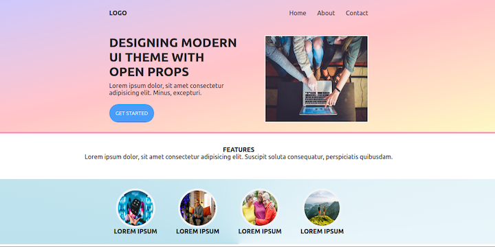
Here’s the sample UI that we’ll build in this tutorial:
We’ll begin by creating the folder structure for the UI design.
First, create the app folder using the following command:
mkdir Openpropsdemo && cd Openpropsdemo
Next, create the following folders and files:
mkdir assets/imgmkdir assets/csstouch index.htmlassets/css folder: styles.cssNow, add any images that will be used in the UI design to the assets/img folder. Then, open the app folder in your favorite code editor (VS Code users can do this using the code . command).
Here’s how the folder structure should look:
openpropsdemo
│ assets
│ ├── css
│ │ ├── style.css
│ ├── img
│ index.html
Next, let’s get started on the UI markup.
Open the index.html file, type doc, and hit TAB to create the following markup snippet:
<html lang="en">
<head>
  <meta charset="UTF-8">
  <meta http-equiv="X-UA-Compatible" content="IE=edge">
  <meta name="viewport" content="width=device-width, initial-scale=1.0">
  <title>Document</title>
</head>
<body>

</body>
</html>
Next, link the style.css file to the index.html file inside the <head> tag:
...
<link rel="stylesheet" href="./assets/css/style.css" />
...
Now, we’ll use the <header> and <section> tags to divide the markup into two parts. Start with the <header> and then place the following code snippet into the <body> tag.
...
<header>
      <div class="content">
      <div class="nav-bar">
        <h4>LOGO</h4>
        <ul>
          <li>Home</li>
          <li>About</li>
          <li>Contact</li>
        </ul>
      </div>
      <div class="container">
        <div class="info">
            <h4>DESIGNING MODERN UI THEME WITH OPEN PROPS</h4>
            <p>Lorem ipsum dolor, sit amet consectetur adipisicing elit. Minus, excepturi.</p>
            <button>GET STARTED</button>
          </div>
        <div class="thumbnail">
          <img src="./assets/img/photo-1516321497487-e288fb19713f.jpeg">
        </div>
      </div>
    </header>
...
Add the markup for the <section> tag. Then, add the following code snippet inside the <body> tag, after the closing <header> tag:
...
    <section>
       <div class="info">
         <h4>FEATURES</h4>
        <p>Lorem ipsum dolor, sit amet consectetur adipisicing elit. Suscipit soluta consequatur, perspiciatis quibusdam.</p>
      </div>
       <div class="content">
          <div class="features">
              <ul>
                <li>
                  <img src="./assets/img/erik-mclean-C3T8KTZxTFM-unsplash.jpg" class="circle">
                  <h4>LOREM IPSUM</h4>
                </li>
                <li>
                  <img src="./assets/img/istockphoto-1294303625-170667a.jpg" class="circle">
                  <h4>LOREM IPSUM</h4>
                </li>
                <li>
                  <img src="./assets/img/istockphoto-1312102723-170667a.jpg" class="circle">
                  <h4>LOREM IPSUM</h4>
                </li>
                <li>
                  <img src="./assets/img/istockphoto-1257851030-170667a.jpg" class="circle">
                  <h4>LOREM IPSUM</h4>
                </li>
              </ul>
          </div>
       </div>
     </section>
...
Now we’re ready to style the UI markup with Open Props. We’ll add custom styling to the following UI components:
To style the user interface header, start by opening the style.css file. Then, import the Open Props CDN into the CSS file:
@import "https://unpkg.com/open-props";
We’ll add global styling to all elements in the markup.
First, we’ll remove the custom padding and margin, set the size of the header with the box-sizing property, and specify the font-family.
* {
  padding: var(--size-fluid-0);
  margin: var(--size-fluid-0);
  box-sizing: border-box;
  font-family: var(--font-sans);
}
Next, we’ll style all content in the header element. We’ll center and specify a color for the text and set an Open Props gradient for the background-image. We’ll also specify padding, add a border (border-bottom) to the bottom of the header element, and add some extra space (margin-border) below the elements.
header {
  text-align: center;
  color: var(--gray-9);
  --op-gradient-direction: to top left;
  background-image: var(--gradient-15);
  padding: var(--size-fluid-2);
  border-bottom: 4px solid var(--pink-3);
  margin-bottom: var(--size-fluid-3);
}
Now, we’ll move to the .content selector within the header element. We’ll center all of the .content by setting the width to 50 percent and the margin to 0px:
header .content {
  margin: 0px auto;
  width: 50%;
}
To style the UI navigation, we’ll first move to the .nav-bar selector within the header element.
We’ll set the display property to flex in order to align the logo and the ul elements side-by-side. By default, the flex property displays contents in columns, so we’ll reset that by setting the flex-direction property to row.
We’ll use the justify-content property to add space between the logo and the ul elements. Then, we’ll use the align-items property to center align all of the navigation items. Lastly, we’ll use the display property to show the navigation items in an inline-block and the margin-left property to add spacing between the items.
header .nav-bar {
  display: flex;
  flex-direction: row;
  justify-content: space-between;
  align-items: center;
}
header .nav-bar ul li {
  display: inline-block;
  margin-left: var(--size-5);
}
Here’s the styled navigation bar:
Now, we’ll move to the .container selector within the header element. We’ll use the margin-top, display, and justify-content properties to space the content items and display them side by side.
We’ll use the .info selector to specify the width and use text-align to align the text. We’ll use font-size to increase the size of the h4 element. Lastly, we’ll use width and border to add a thumbnail around the image element in the .info selector.
header .container {
  margin-top: var(--size-fluid-4);
  display: flex;
  justify-content: space-between;
}
header .container .info {
  width: 50%;
  text-align: left;
}
header .container .info h4 {
  font-size: var(--font-size-5);
  margin-bottom: var(--size-2);
}
header .container .info p {
  margin-bottom: var(--size-4);
}
header .container .thumbnail {
  width: 40%;
  border: var(--border-size-2) solid var(--gray-1);
}
Here’s the styled header container:

Now, we’ll move to the .features selector within the section element. We’ll use the margin-top, width, margin, and text-align properties to format the text in this section.
section .features {
  margin-top: var(--size-fluid-3);;
  width: 50%;
  margin: 0px auto;
  text-align: center;
}
section .features ul {
  display: flex;
  align-items: center;
}
section .features ul li {
  margin: var(--size-fluid-2);
  list-style: none;
}
section .features ul li h4 {
  font-size: var(--font-size-1);
}
section .info{
  text-align: center;
  margin-bottom:var(--size-fluid-4);
}
Here’s the styled features section:

Next, we’ll style feature section’s circular image frames using the inline-size, aspect-ratio, border-radius, width, height, and border properties:
.circle {
  inline-size: var(--size-5);
  aspect-ratio: var(--ratio-box);
  border-radius: var(--radius-round);
  width: 100px;
  height: 100px;
  border: var(--border-size-3) solid var(--gray-1);
}
Now, we’ll style the images and buttons. We’ll specify that all images will have a width and height equivalent to 100 percent of the parent element. We’ll also specify the background, border, padding, color, and border-radius of the buttons.
img {
  width: 100%;
  height: 100%;
}
button {
  background: var(--blue-4);
  border: 0px;
  padding: var(--size-3);
  color: var(--gray-1);
  border-radius: var(--radius-round);
}
Here are the styled images:

In this tutorial, we demonstrated how to design a UI theme using Open Props. The simple UI theme used in this tutorial is available on GitHub. The design possibilities with Open Props’ CSS custom properties are pretty much endless. Check out the Open Props documentation to get some inspiration for your next UI design project.
As web frontends get increasingly complex, resource-greedy features demand more and more from the browser. If you’re interested in monitoring and tracking client-side CPU usage, memory usage, and more for all of your users in production, try LogRocket.

LogRocket lets you replay user sessions, eliminating guesswork around why bugs happen by showing exactly what users experienced. It captures console logs, errors, network requests, and pixel-perfect DOM recordings — compatible with all frameworks.
LogRocket's Galileo AI watches sessions for you, instantly identifying and explaining user struggles with automated monitoring of your entire product experience.
Modernize how you debug web and mobile apps — start monitoring for free.

Learn how to use Fallow to analyze AI-generated code, detect dead code, duplicate logic, and complexity issues, and integrate automated code quality checks into your AI-assisted development workflow.

Learn how to protect full-stack projects from NPM supply chain attacks with a practical security checklist.

Explore 15 essential MCP servers for web developers to enhance AI workflows with tools, data, and automation.

Learn how contrast-color() automatically picks accessible text colors using native CSS, without JavaScript.
Would you be interested in joining LogRocket's developer community?
Join LogRocket’s Content Advisory Board. You’ll help inform the type of content we create and get access to exclusive meetups, social accreditation, and swag.
Sign up now

 Learn more →
