
Over time, CSS has evolved significantly, providing web developers with tools for designing complex and flexible layouts. Among the latest additions to CSS is the subgrid feature, which enhances the capabilities of grid layouts.

In this guide, we’ll look at practical applications of CSS subgrid. We’ll explore situations where it is a better choice than the regular nested Grid, and see how to use it to make interesting and advanced layouts. Before you dive in, make sure you’re comfortable with CSS grid.
The Replay is a weekly newsletter for dev and engineering leaders.
Delivered once a week, it's your curated guide to the most important conversations around frontend dev, emerging AI tools, and the state of modern software.
CSS grid has been amazing, solving many layout issues seamlessly. Nevertheless, when it comes to certain layouts, you might encounter limitations, especially when attempting to implement nested grids — that is, grids inside another grid.
Consider the layout example below:
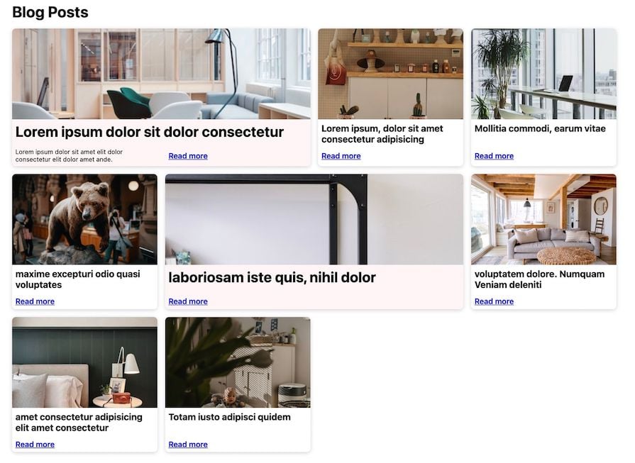
Usually, to set up the above structure, we’d employ a CSS grid to place the immediate items, such as the cards, inside the grid tracks. Additionally, we might use a nested grid to organize the card contents. However, because of how CSS grid works, the contents within each card may not align uniformly across. This happens because nested grids operate independently of each other and the parent grid.
In many situations, this isn’t an issue. However, there are times when the layout calls for a consistent alignment, as shown in the design below:
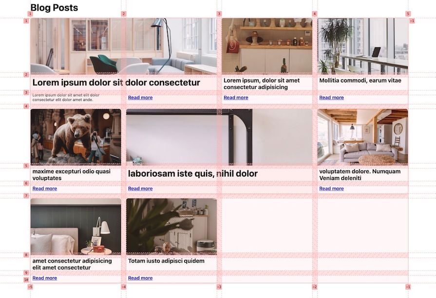
To guarantee proper alignment of the nested grid contents, it is essential they use a shared grid track. Recognizing this limitation with the traditional nested grid, CSS grid Level 2 introduced the subgrid feature to overcome this challenge.
CSS subgrid allows nested grid items to participate in the sizing of the tracks defined in their parent grid. This means that the tracks of a grid item can align with the tracks of the parent grid, resulting in a more flexible layout system.
Before delving into a more advanced layout demonstration, let’s familiarize ourselves with CSS subgrid’s browser support, syntax, and use cases.
subgrid is a value that we specify for grid-template-columns and/or grid-template-rows instead of creating a list of grid tracks:
.grid {
  display: grid;
  grid-template-columns: 1fr 1fr 1fr;
  grid-template-rows: 100px 200px;
}

.subgrid {
  display: grid;
  grid-template-columns: subgrid;
  grid-template-rows: subgrid;
}
When we apply the subgrid value in a nested grid, what we’re essentially saying is: “I want to be my own grid, but I want to adopt the grid tracks from the parent grid.”
Keeping this idea in mind, let’s look at a straightforward example. Consider the following HTML structure:
<div class="grid">
  <div class="item">Item 1</div>
  <div class="item">Item 2</div>
  <div class="item">Item 3</div>
  <div class="item">Item 4</div>
  <div class="subgrid">
    <div class="item">Item 5_1</div>
    <div class="item">Item 5_2</div>
  </div>
</div>
Our goal is to align the items of .subgrid with the items in the parent grid. Here’s what we expect:
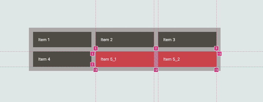
If we opted for a regular nested grid, we would have to carefully configure the columns of the subgridded items to align precisely with those of the parent. The same applies to the gap size:
.grid {
  display: grid;
  grid-template-columns: repeat(3, 1fr);
  gap: 1rem;
  padding: 1rem;
  background-color: #aba7a7;
}

.subgrid {
  display: grid;
  grid-template-columns: repeat(2, 1fr);
  grid-column: span 2;
  gap: 1rem;
}
Check it out on CodePen:
See the Pen
CSS grid-template-columns #1 by Ibaslogic (@ibaslogic)
on CodePen.
With the subgrid feature, we employ grid-template-columns: subgrid to indicate that, rather than creating a new track listing, the subgrid should adopt the column tracks defined in the parent grid:
.grid {
  /* same as before */
}

.subgrid {
  display: grid;
  grid-template-columns: subgrid;
  grid-column: span 2;
}
Note that we aren’t specifying a gap size. The subgrid automatically inherits the parent grid’s gap and line names (if available). If necessary, we can also override them within the subgrid:
See the Pen
CSS subgrid grid-template-columns #1 by Ibaslogic (@ibaslogic)
on CodePen.
subgrid introduces a new level of flexibility to grid layouts. As you will observe in the following sections, this feature will offer us control over grid layouts that were previously challenging to achieve.
Now that we have a grasp of the fundamentals of CSS subgrid, let’s delve into how to apply it in real world projects. We’ll walk through two examples: a responsive card-based layout and a responsive post listing layout.
Using the following HTML structure, we have a card-based layout where each card is comprised of a title, image, text contents, and an action link:
<section>
  <div class="card">
    <div class="flex">
      <h2>Find out how much</h2>
      <img />
    </div>
    <div class="content">some text</div>
    <div class="action">try it out</div>
  </div>
  <div class="card"><!-- ... --></div>
  <div class="card"><!-- ... --></div>
  <div class="card"><!-- ... --></div>
</section>
Here is the CSS:
section {
  display: grid;
  grid-template-columns: repeat(
    auto-fit,
    minmax(min(350px, 100%), 1fr)
  );
  gap: 1rem;
  /* ... */
}

.card {
  display: grid;
  border: 1px solid #cacaca;
  border-radius: 6px;
  padding: 16px;
}

/* Some other styles */
We have a layout as follows:

When creating a layout like this, each card can have its own nested grid structure within the parent grid. The issue with using a regular nested grid is the lack of consistent alignment among the card items:

See the Pen
CSS grid cards layout 1# by Ibaslogic (@ibaslogic)
on CodePen.
With subgrid, we can create a clean and organized layout. In the code below, we use grid-template-rows: subgrid; on the card class, signifying that it will inherit the row sizes from its parent grid, which, in this case, is the section element:
section {
  /* ... */
  grid-template-rows: auto 1fr auto;
}

.card {
  display: grid;
  /* ... */
  grid-template-rows: subgrid;
  grid-row: span 3;
}
As we’ve specified grid-row: span 3; for the card class, it will span three rows in the parent grid, ensuring that the first, second, and third rows align correctly:
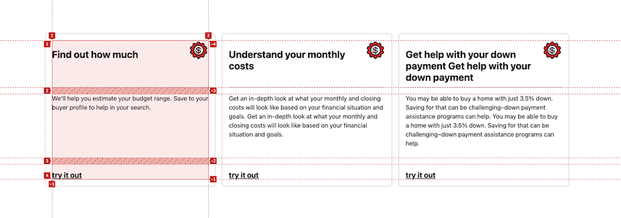
As mentioned earlier, gaps are inherited in the subgrid. Take note of the space between the title and the description. We have the option to override the gap with a different one in the subgrid:
.card {
  /* ... */
  gap: 5px;
}
See the Pen
CSS subgrid cards layout by Ibaslogic (@ibaslogic)
on CodePen.
Now, let’s build the example layout that was mentioned at the beginning of this lesson:

Below is the HTML structure for the layout:
<main>
  <article>
    <img
      src="https://images.unsplash.com/photo-1524758631624-e2822e304c36?crop=entropyq=80&w=400"
      alt=""
    />

    <h2 class="p7">Lorem ipsum dolor sit</h2>
    <div class="read__more">Read more</div>
  </article>
  <article><!-- ... --></article>
  <article><!-- ... --></article>
  <article><!-- ... --></article>
  <article><!-- ... --></article>
</main>
As expected, the nested grid items — in this case, the article items — won’t automatically adopt the parent tracks. Consequently, we need to manually configure each item with specific row definitions.
In this instance, we can utilize grid-template-rows or grid-auto-rows on the nested grid, as shown below:
main {
  display: grid;
  grid-template-columns: repeat(
    auto-fit,
    minmax(min(300px, 100%), 1fr)
  );
  gap: 1rem;
  grid-auto-flow: dense;
}

article {
  display: grid;
  grid-auto-rows: 180px 1fr auto;
  /* ... */
}

img {
  /* ... */
  height: 180px;
}
/* other css rules */
Here is the resulting CodePen:
See the Pen
CSS grid post listing cards layout by Ibaslogic (@ibaslogic)
on CodePen.
In the row definition, the first row has a fixed height equal to the image height. The second row, defined as 1fr, will take up the available space and grow proportionally. The third row, set to auto, will adjust its height based on its contents.
See the result below:
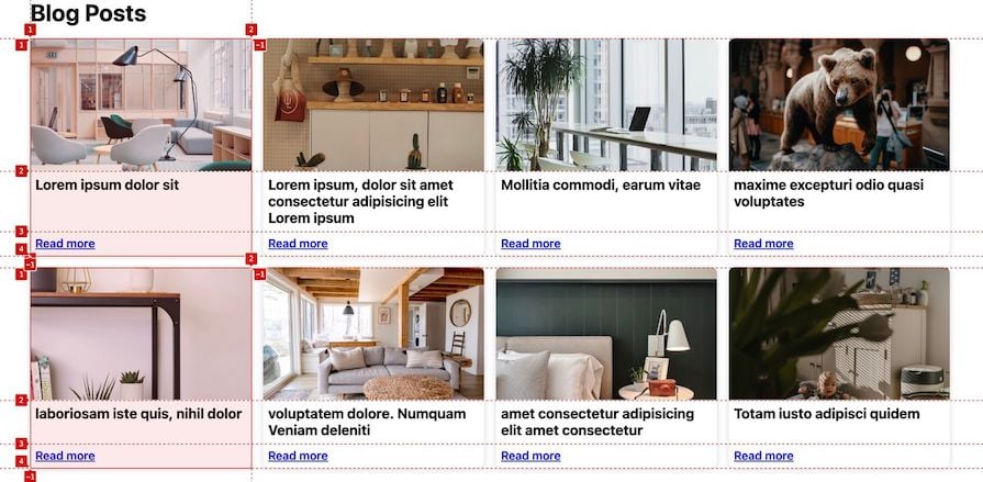
Although the nested items might appear aligned, they are, in fact, independent of each other. The alignment is due to the fixed height of the first row, and the title taking up the available space and growing proportionally. If, for instance, the text on the third row were to span multiple rows, the alignment would be distorted:
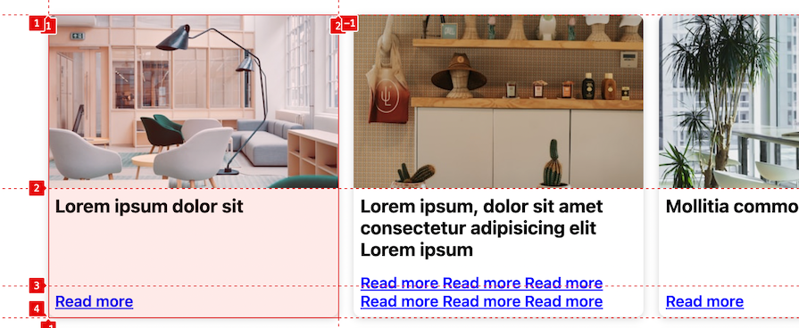
Instead of defining the row tracks on the article, we can delegate the definition to its parent grid, which is main. This allows all the article items to adopt their track sizing from that parent grid by using grid-template-rows: subgrid;:
main {
  /* ... */
  grid-auto-rows: 180px 1fr auto;
}

article {
  /* ... */
  display: grid;
  grid-row: span 3;
  grid-template-rows: subgrid;
  row-gap: 0px;
}
Using grid-row: span 3; allows the article to expand vertically, accommodating its contents without causing any overlap:
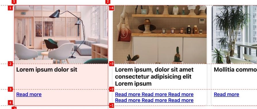
So far in our project, only the row tracks of the nested grid use the tracks defined on the parent, thanks to grid-template-rows: subgrid. The column tracks, however, still behave like a regular nested grid.
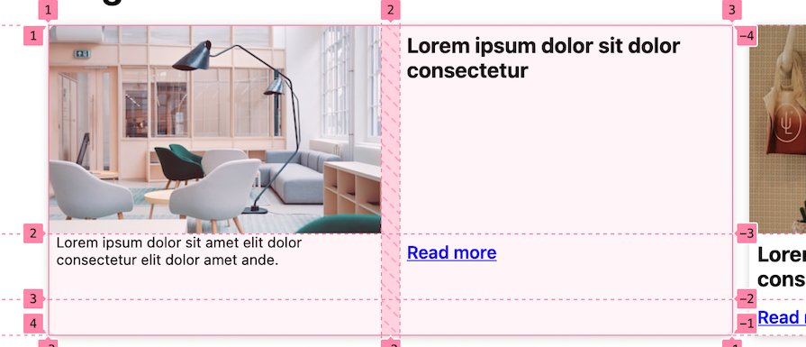
Upon revisiting the final project, we notice that some cards span two columns and may include a description. To ensure the description also aligns with the parent grid column track, we’ll utilize grid-template-columns: subgrid.
Let’s modify the card markup to include an optional description text:
<main>
  <article data-custom="true">
    <img... />
    <h2 class="p7">...</h2>
    <div class="description">
      Lorem ipsum dolor sit amet elit dolor consectetur elit
      dolor amet ande.
    </div>
    <div class="read__more">Read more</div>
  </article>
  ...
  <article><!-- ... --></article>
</main>
We’ve also introduced a custom data-* attribute to any article element that we want to style differently. This allows us to target them with article[data-custom='true'] and apply styles accordingly. Alternatively, you may use a class attribute for this purpose.
By default, we can hide the description for smaller screens:
.description {
  display: none; /* Hide description by default */
  font-size: 13px;
  padding: 0 7px 7px;
}
And we can use a media query to display it on larger screens:
article[data-custom='true'] {
  @media (min-width: 996px) {
    .description {
      display: block;
    }
  }
}
We’ve employed native CSS nesting to nest the @media and the selector.
Next, we’ll ensure that the selected articles span two columns in their parent grid. Afterward, we’ll apply subgrid so that they inherit their sizing from the columns of the parent grid:
article[data-custom='true'] {
  @media (min-width: 996px) {
    grid-column: span 2;
    grid-template-columns: subgrid;

    .description {
      display: block;
    }
  }
}
The nested grid items now look up to the parent grid for their placement:
Now, let’s ensure that both the image and title take up the entire width of the card:
article[data-custom='true'] {
  @media (min-width: 996px) {
    grid-column: span 2;
    grid-template-columns: subgrid;

    > img {
      grid-column: 1 / -1;
    }

    > h2 {
      grid-column: 1 / -1;
      font-size: 30px;
    }

    .description {
      display: block;
    }
  }
}
We’ve utilized grid-column: 1 / -1; to span the image and title from the first to the last column in the grid:

The project works fine and is responsive. See it yourself in the CodePen below:
See the Pen
CSS subgrid post listing cards layout #2 by Ibaslogic (@ibaslogic)
on CodePen.
CSS subgrid introduces an improved level of flexibility and control to grid layouts that were previously challenging to achieve. By understanding its syntax and exploring different use cases, we’ve learned how to leverage this feature to create advanced designs.
If you enjoyed reading this guide, share the post around the web. And if you have questions or recommendations, please share your thoughts in the comment section.
As web frontends get increasingly complex, resource-greedy features demand more and more from the browser. If you’re interested in monitoring and tracking client-side CPU usage, memory usage, and more for all of your users in production, try LogRocket.

LogRocket lets you replay user sessions, eliminating guesswork around why bugs happen by showing exactly what users experienced. It captures console logs, errors, network requests, and pixel-perfect DOM recordings — compatible with all frameworks.
LogRocket's Galileo AI watches sessions for you, instantly identifying and explaining user struggles with automated monitoring of your entire product experience.
Modernize how you debug web and mobile apps — start monitoring for free.

Learn how sibling-index() enables clean, JavaScript-free stagger animations using native CSS.

useEffect breaks AI streaming responses in ReactSee why useEffect breaks AI streaming in React, and how moving stream state outside React fixes flicker and stale updates.

A real-world debugging session using Claude to solve a tricky Next.js UI bug, exploring how AI helps, where it struggles, and what actually fixed the issue.

CSS wasn’t built for dynamic UIs. Pretext flips the model by measuring text before rendering, enabling accurate layouts, faster performance, and better control in React apps.
Would you be interested in joining LogRocket's developer community?
Join LogRocket’s Content Advisory Board. You’ll help inform the type of content we create and get access to exclusive meetups, social accreditation, and swag.
Sign up now