For many, design can seem like magic — a dark art that only few can master. It can be intimidating to learn, especially since many people think that design sense is innate: either you’re born with it or you’re out of luck. (Not true.)
Disclaimer: I’m not a designer. I’m an engineer and product manager but I’ve picked up a few tricks from my colleagues that have helped me hold my own in design reviews and projects.
My perspective is that becoming an advanced designer requires years of practice but that the basics of design is like learning guitar: You only need to learn four simple chords to play a lot of the music from the past 50 years. I’ve collected a few equivalent design fundamentals that have served me well. Most of the examples I’ll use here are from web design (my wheelhouse), but my hope is that you’ll find them broadly applicable.
I know the question sounds a little academic, but bear with me. After years of being corrected for my assumptions about the field, I’ve learned that everybody (including most designers) has a slightly different definition of design. Here’s the definition that makes the most sense to me as a starting point:
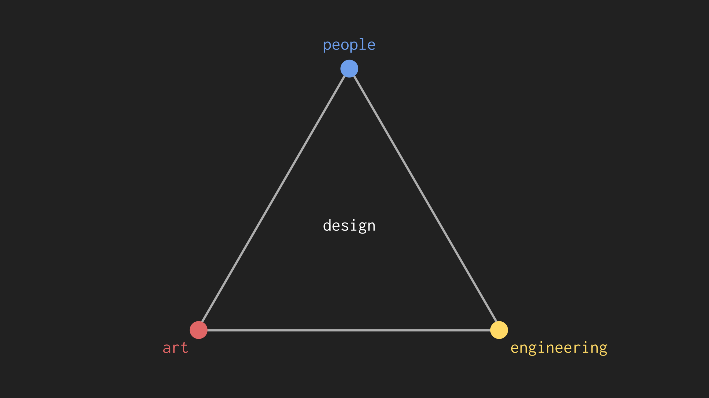
The field of design could be understood as the process of using art and engineering to impact people’s lives.
Different fields of design use each of these skills in different proportions, but they all leverage some combination of all three:
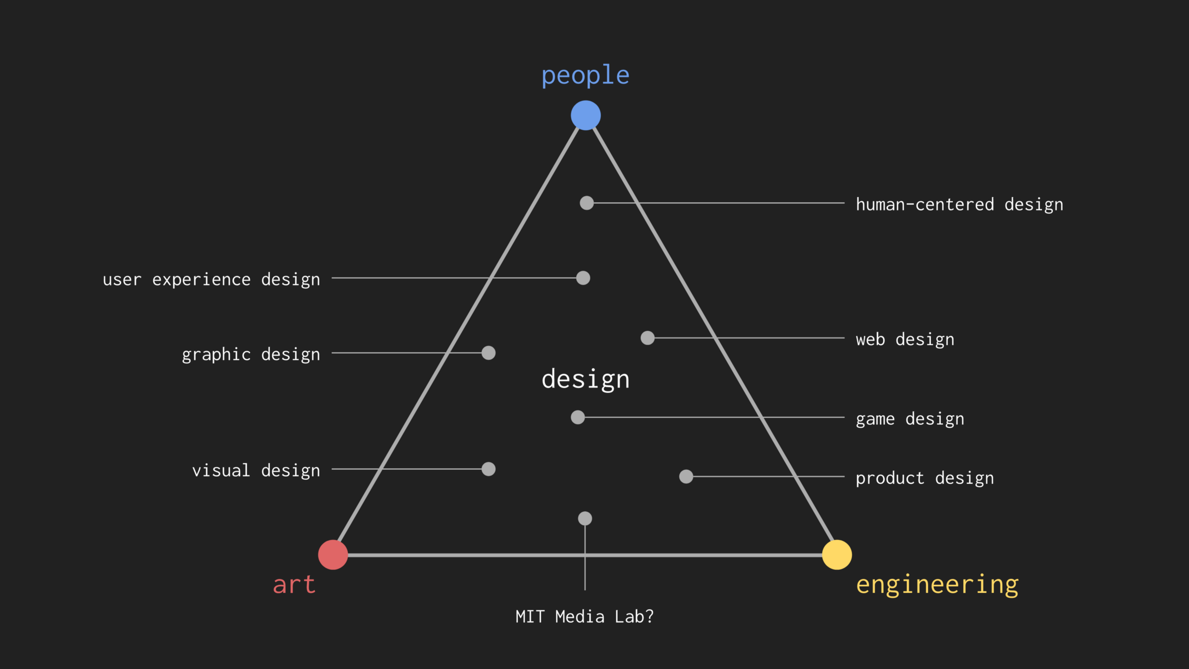
If the art-engineering-people triangle is an academic definition of design, here’s a more practical one:
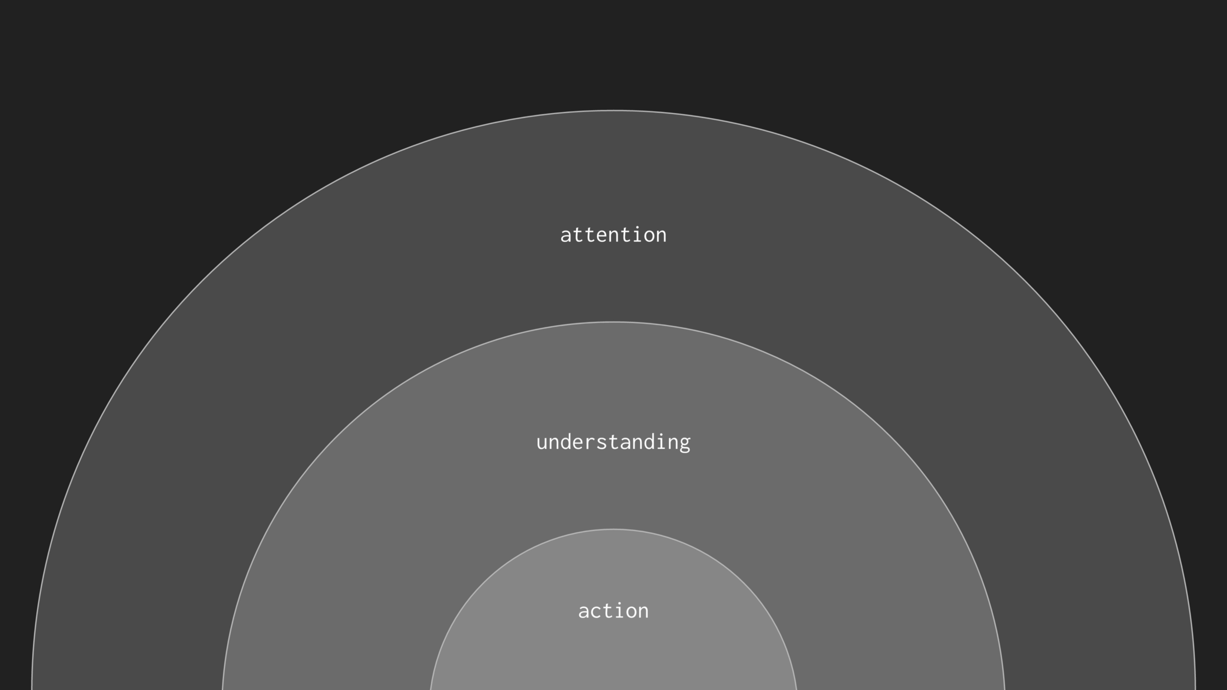
When we want to achieve a goal, we need to first understand the world around us and act accordingly. When we interact with the world, we rely on core assumptions about how objects and elements will function. These assumptions are created and reinforced by design.
Take a very simple goal: walking into a building. A well designed door can be easily identified from the exterior of a building, and a properly shaped door handle can only be turned one way to unlatch it.
It’s design’s job to help people understand objects in their world, and make their interactions with those objects intuitive. This flow — attention to understanding to action — is core to design. We can evaluate design by examining how effectively it directs attention, communicates meaning, and enables people to take action when needed.
There is lots of hard work required to become a designer: understanding art, engineering, and human psychology requires years of study. But when you’re just starting out? Cheating and stealing are perfectly acceptable as well. (Aside from complete and utter plagiarism.)
Becoming an artist is hard, but any teacher will tell you that imitation builds a strong foundation. A jazz musician might transcribe solos by Miles Davis, learning to play each note and phrase to better understand rhythm, harmony, and phrasing. Likewise, imitating your favorite designers can be a great starting place, especially when it comes to the more subjective choices like color and typography.
On the other hand, when it comes to engineering, copying others’ work isn’t very helpful. Instead, a few key tricks and cheats can get you a long way. In calculus, L’Hôpital’s rule, factoring, and completing the square are all useful techniques for parceling out a complex problem into solvable chunks.
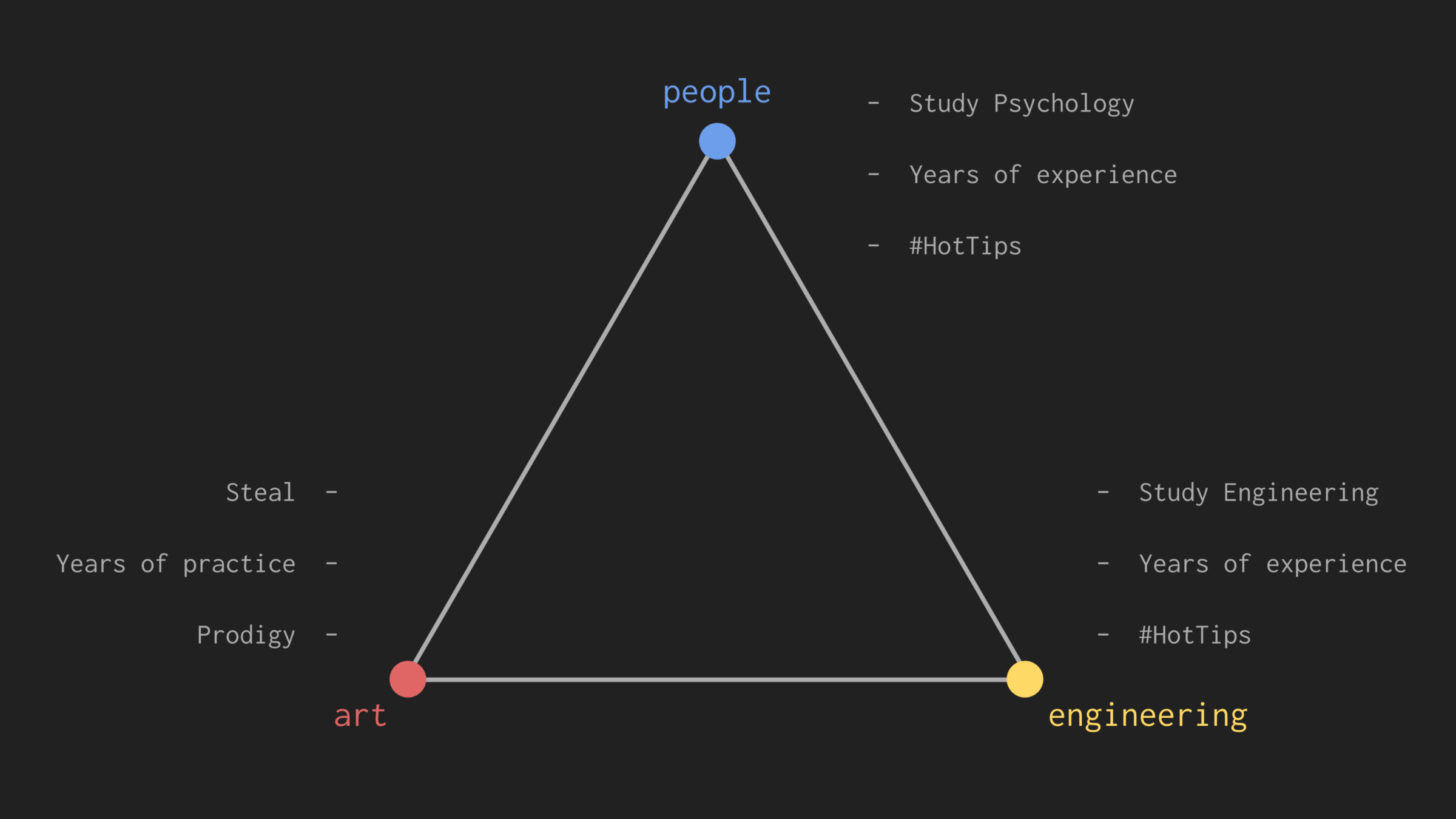
In design, these tricks take the form of best practices for layout, spacing.
In design, space is an extremely powerful tool for controlling attention, and conveying meaning.
Some designers use space well:
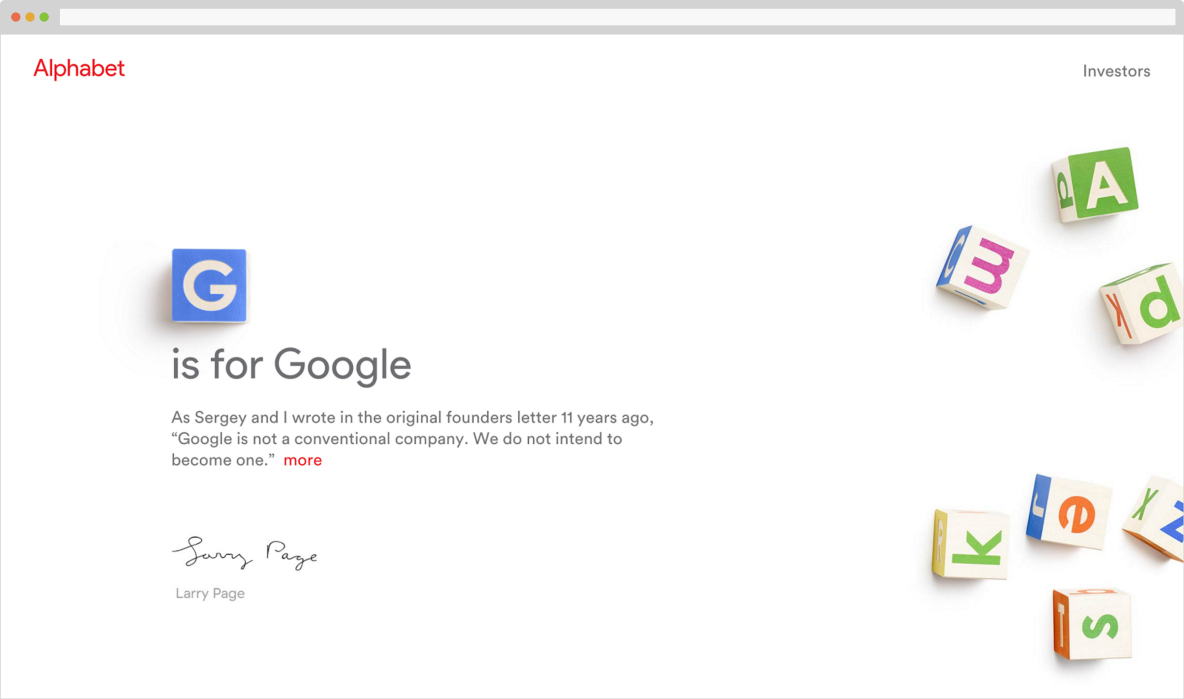
Others don’t:

So how can we use space effectively in design? To explore that question, let’s try an experiment. I’ll show you a few paragraphs of text and a captioned image, and you find the caption:
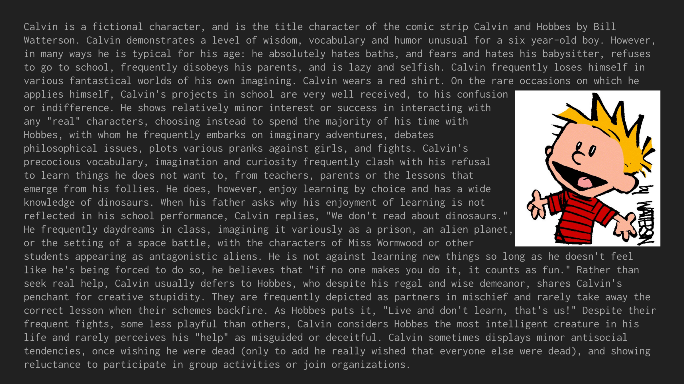
Can’t find it? How about here:
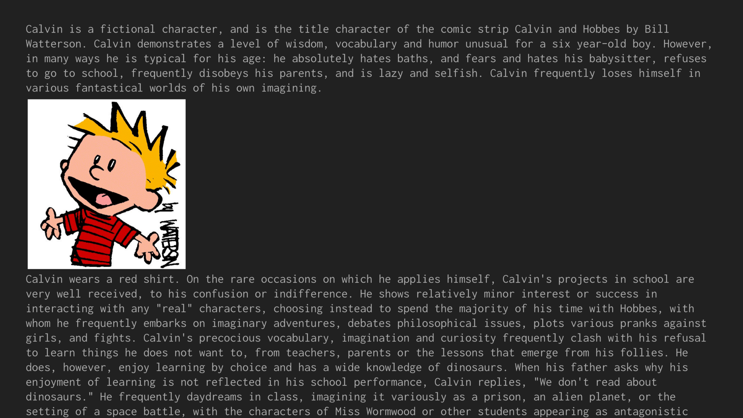
OK, you might have figured it out. But it took a second, and we can’t necessarily be sure. How about here:
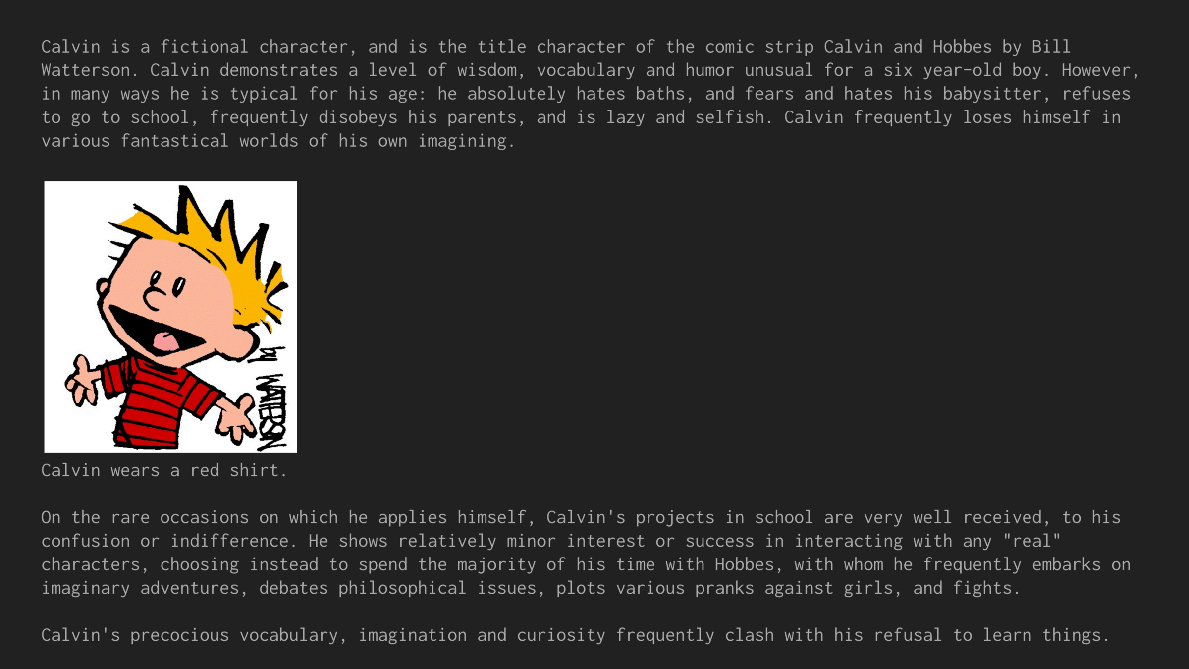
OK, pretty doable, but I think we can do better:
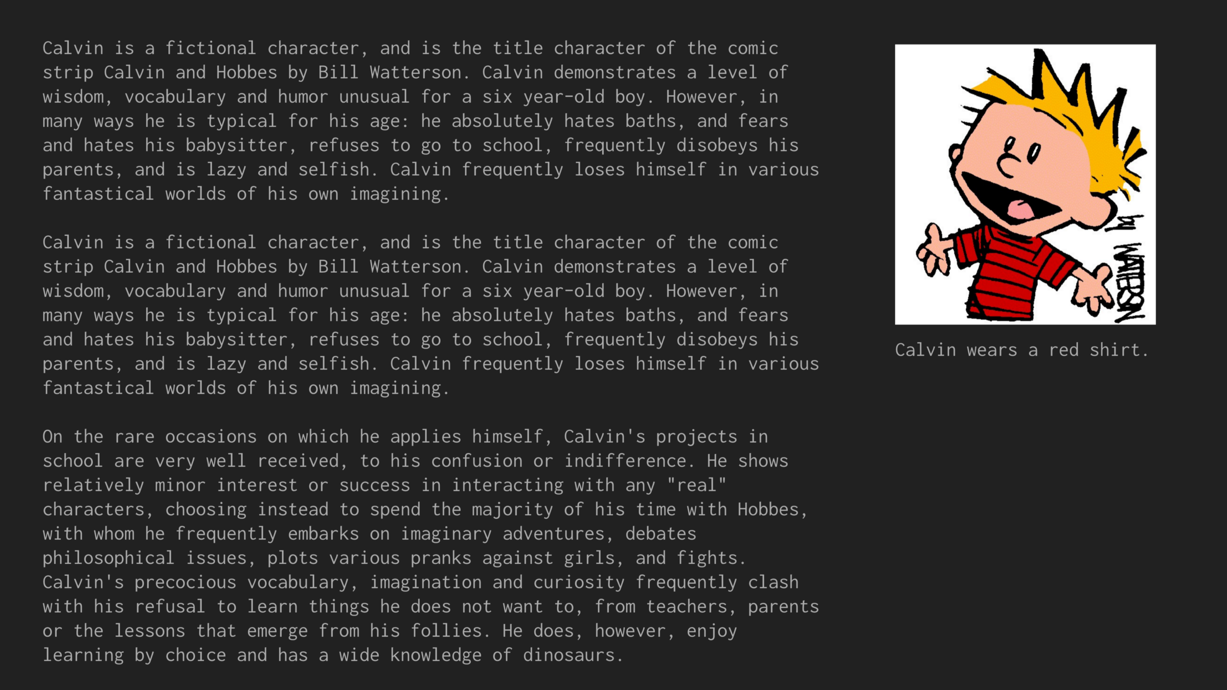
Finding the caption in that last example is easy, especially in comparison with the first version. Why?
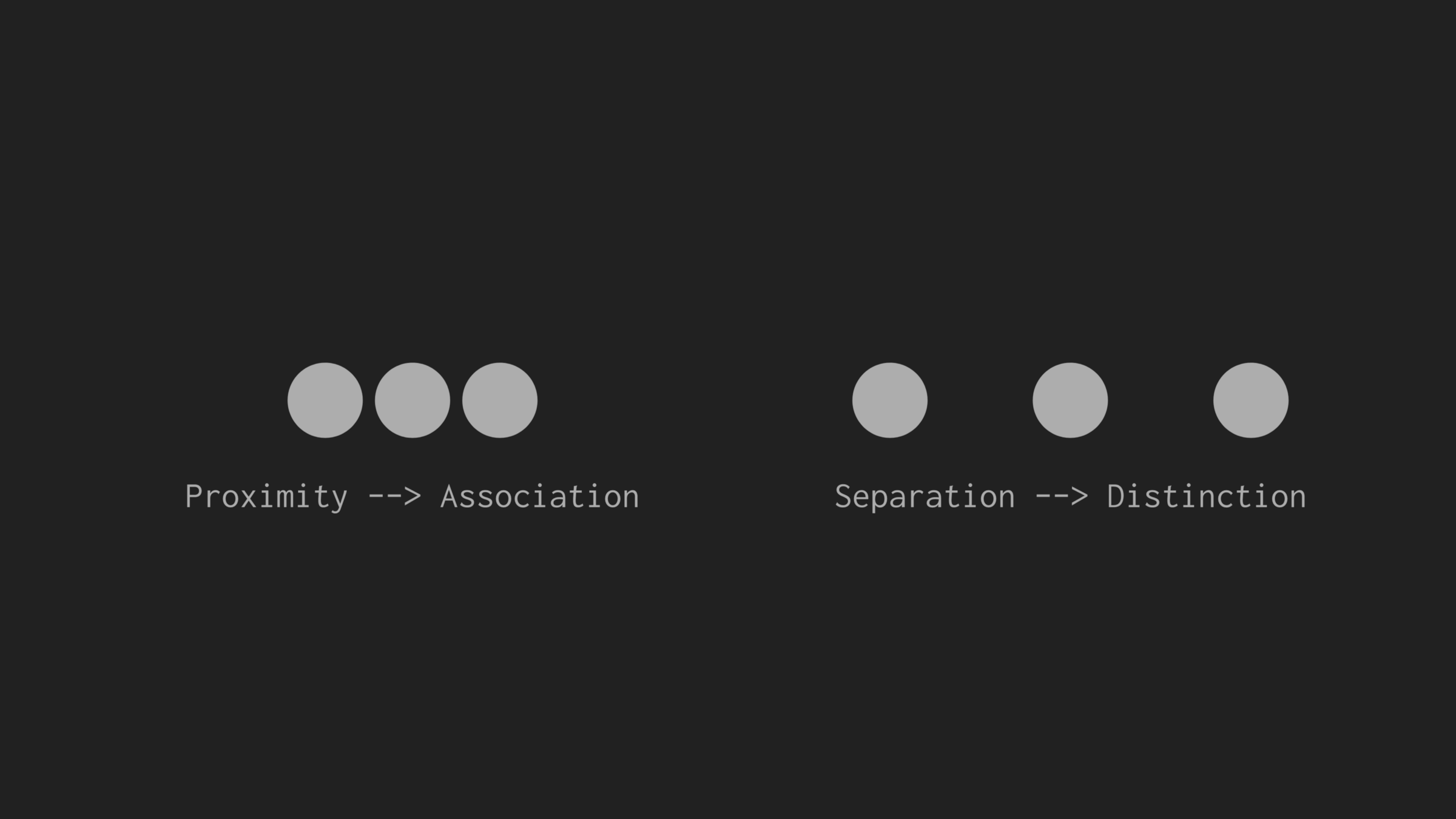
The problem with the first Calvin image was that it wasn’t clear which of the many sentences is associated with the image. Said differently, it wasn’t clear which sentence was meant to be distinct from the rest of the paragraphs.
In the revisions, space is added between distinct elements (the image and the text, the caption and the paragraphs). We can visualize this process by drawing boxes around visually grouped elements:
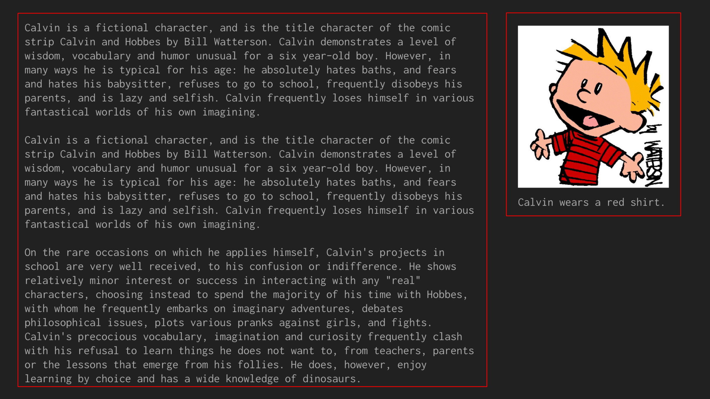
This final version is quite easily parsable and therefore it’s easy to draw boxes around the intended grouping of elements. If we apply this evaluation technique to our earlier examples, we can see that the same principle holds.
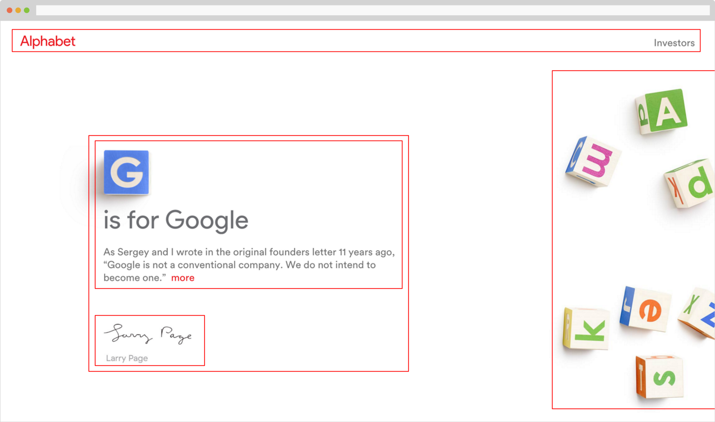
In Alphabet’s site, the “G is for Google” text is closely associated with the beginning of the note “As Sergey and I wrote.” Additionally, the signature and signature label are grouped, with ample space above them, as to make clear that the signature is one unit that is distinct from the note.
Looking at Columbia’s website, we find quite the opposite. It’s hard to draw meaningful boxes, and when we do, they’re very tight to each other, often overlapping.

Space should be used to make several elements distinct: the search box from “Email” and “Quick Links”, the dark blue bar at the top from the light blue sidebar and the content, and the image gallery from University news and events. See my simple mockup below as an example:

These general principles of space can help sketch out a basic layout, but when it comes to the details of precise positioning, things can get tricky.
The word grid here can be a bit misleading. In the context of web design, a grid is a set of columns that can be overlaid on top of a page. Elements on the page are typically sized to take up one or more columns. In between columns, we can place a “gutter,” or space, so that adjacent items are not overlapping.
Take a look at the Airbnb homepage (circa a few months back) to see how grids helped organize their design:
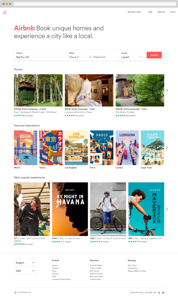
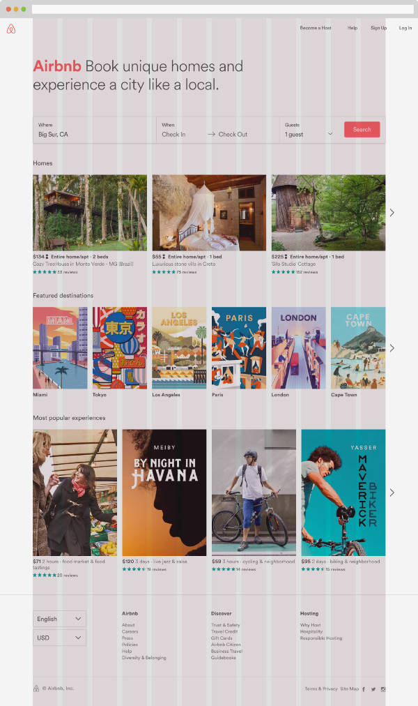
The principle here is consistency, consistency, consistency. Our brains are wired to notice things that are unexpected or outside normal (like a painting on a wall that’s not quite straight), and so as designers, we shouldn’t give them anything to squint at. On a grid, elements on a page make logical sense.
Notice how each image and piece of text on the page aligns with one of the grids. For example, while each row of images is a different height, they align on the grid. In the first row, each image is four columns wide, then two, then three.
Airbnb’s use of grids is unrelenting. Notice how they aligned the elements of the footer on the same 3-column groupings as the last row of images. Even the language and currency selectors (in the bottom left) are two columns wide!
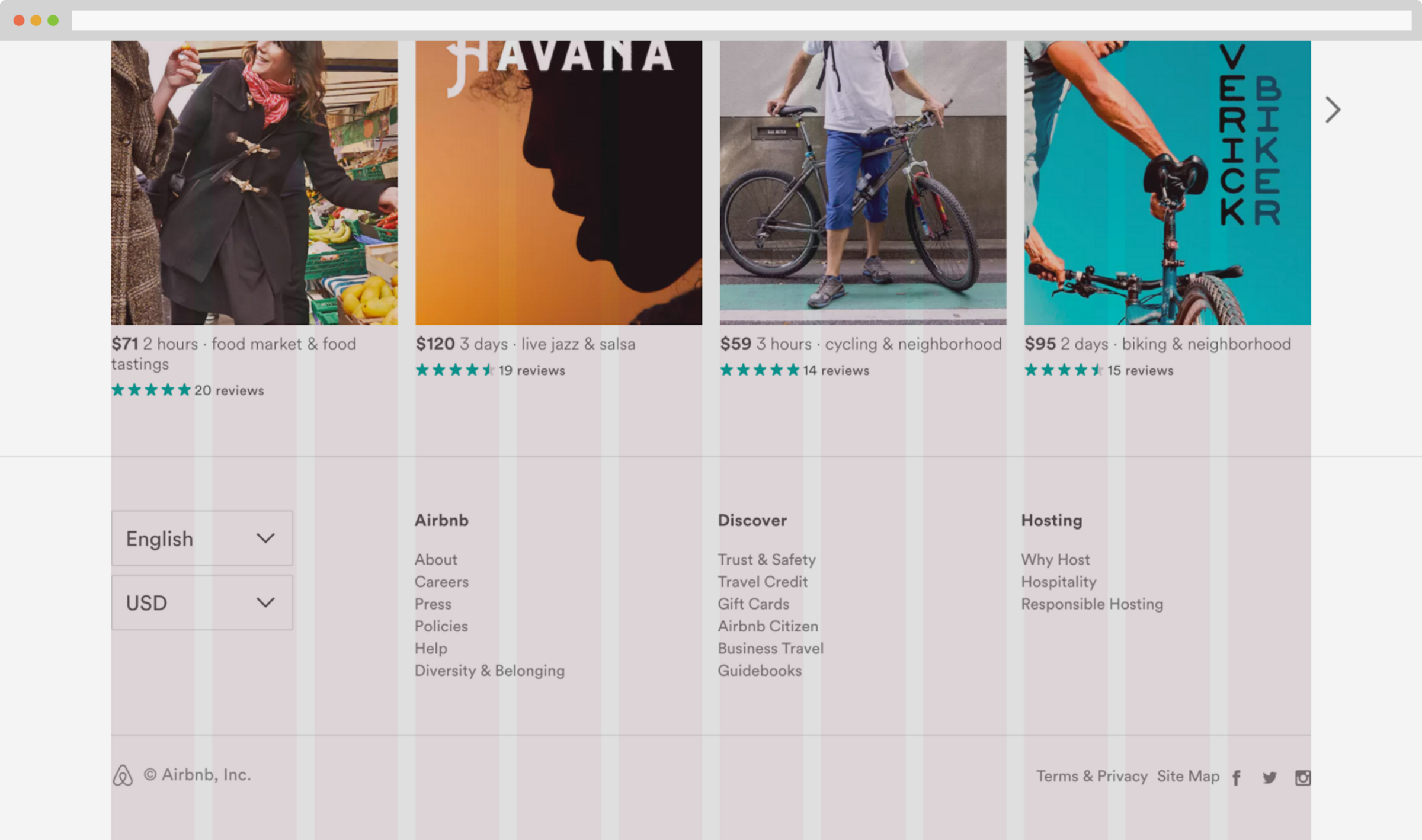
By aligning the majority of our design on a grid and breaking the trend for some elements, we can subconsciously draw a user’s eye. Take the top of the page: Can you spot the elements that break the grid system?
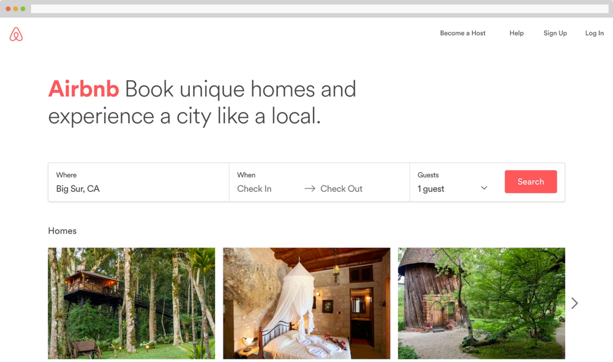
You might have noticed that the Airbnb logo and the four links (Become a host, Help, Sign Up, Log In) are all off-the-grid. This is because the navigation is meant to be made visually distinct from the rest of the page.
Notice anything else, though? This might be a stretch, but hang with me for a second. Take a look at the booking form with the grid overlay:
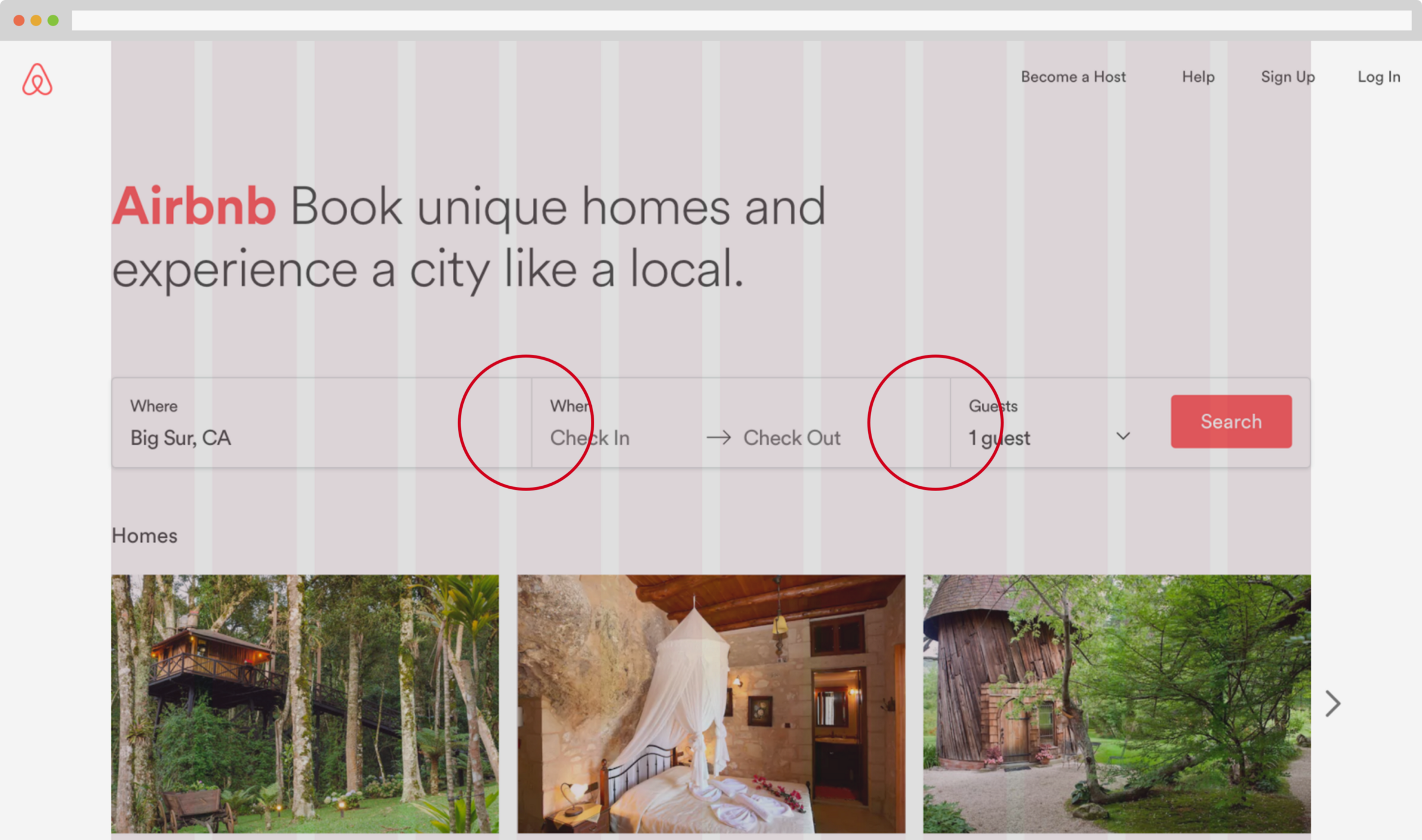
It’s off! Is it an error? A lazy web developer? I doubt it. Maybe I’m giving Airbnb too much credit here, but I would bet that the positioning of the lines between the “Where,” “When,” and “Guests” inputs is intentionally off-grid, shifting your eye to the right towards that lovely “Search” button. With the rest of the site being positioned meticulously on a grid, I can’t imagine that the designers and developers overlooked the search box on the homepage.
Whether you buy that or not, I stand by that there shouldn’t be a strict formula when it comes to grids. Careful bending of the rules for visual balance or emphasis can be a powerful tool.
Grids emphasize a more general principle of design:
Many designers frame good design as reducing the amount of work that a user has to do to understand your product and take the next action. This can take several forms:
Keep copy concise (versus jargony or text-heavy):
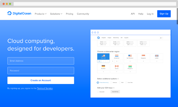

Opinionated design (versus asking users to make decisions):
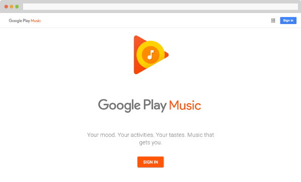

Or, taking one huge step forwards:
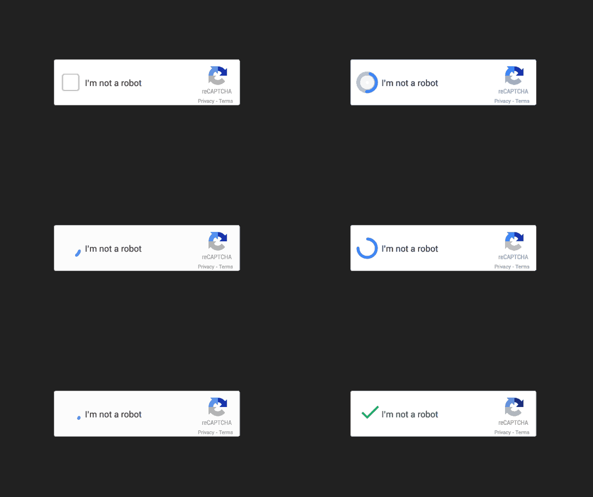
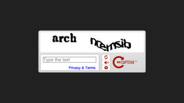
Whatever form mental strain takes in your design, aim to reduce it wherever possible.
While layout and organization may seem like more of a science, many elements of design are very clearly artistic. As an amateur designer, I’ve felt that developing opinions about these visual components to design comes with experience. That said, there are a few tricks that I’ve used to squeeze by:
Picking the right color or colors for your design can be hard. As a place to start, think about how color can subliminally affect how your user views your design.
Contrasting colors can be used to emphasize important components:
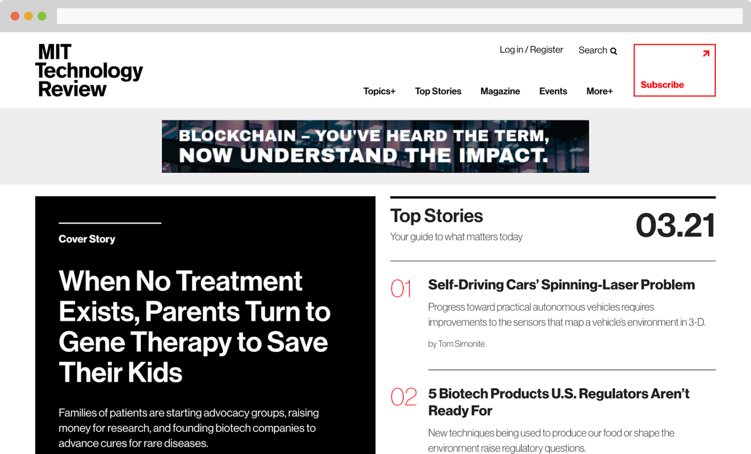
Commitment to a single color can help build a brand:

Or try to change one:

Finally, if you’re looking to pick actual hex codes, I’d recommend Jeff Hilnbrand’s article Picking Colors:
Personally, I don’t trust myself to pick colors quite yet. Often times, I just steal colors I like from other brands or websites. Great artists, yada yada.
Often picking the right font can feel like an impossible chore:
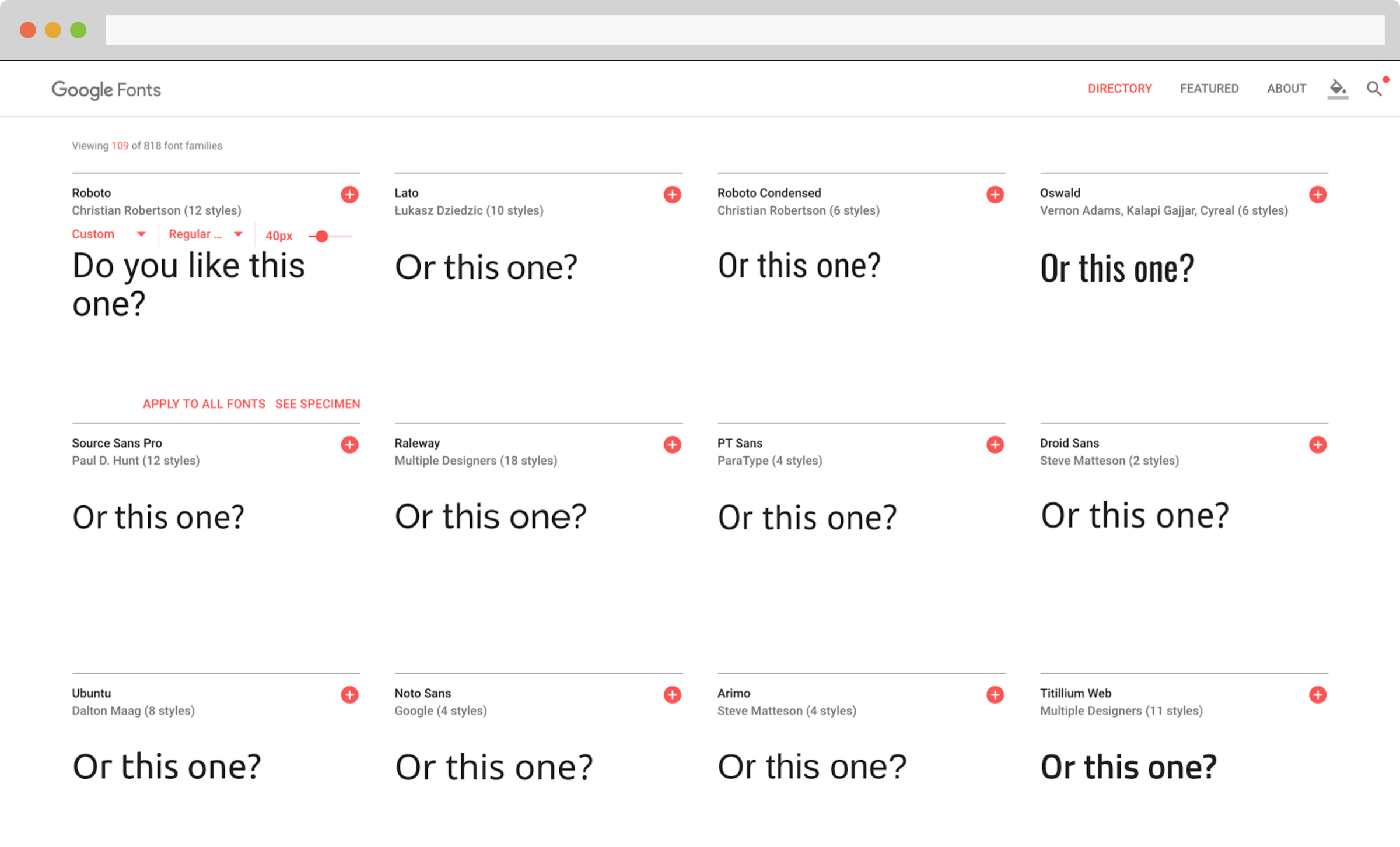
While I tend to pick fonts and font pairs that I like from other designs, there are a few properties to keep in mind:
Contrast is your friend:
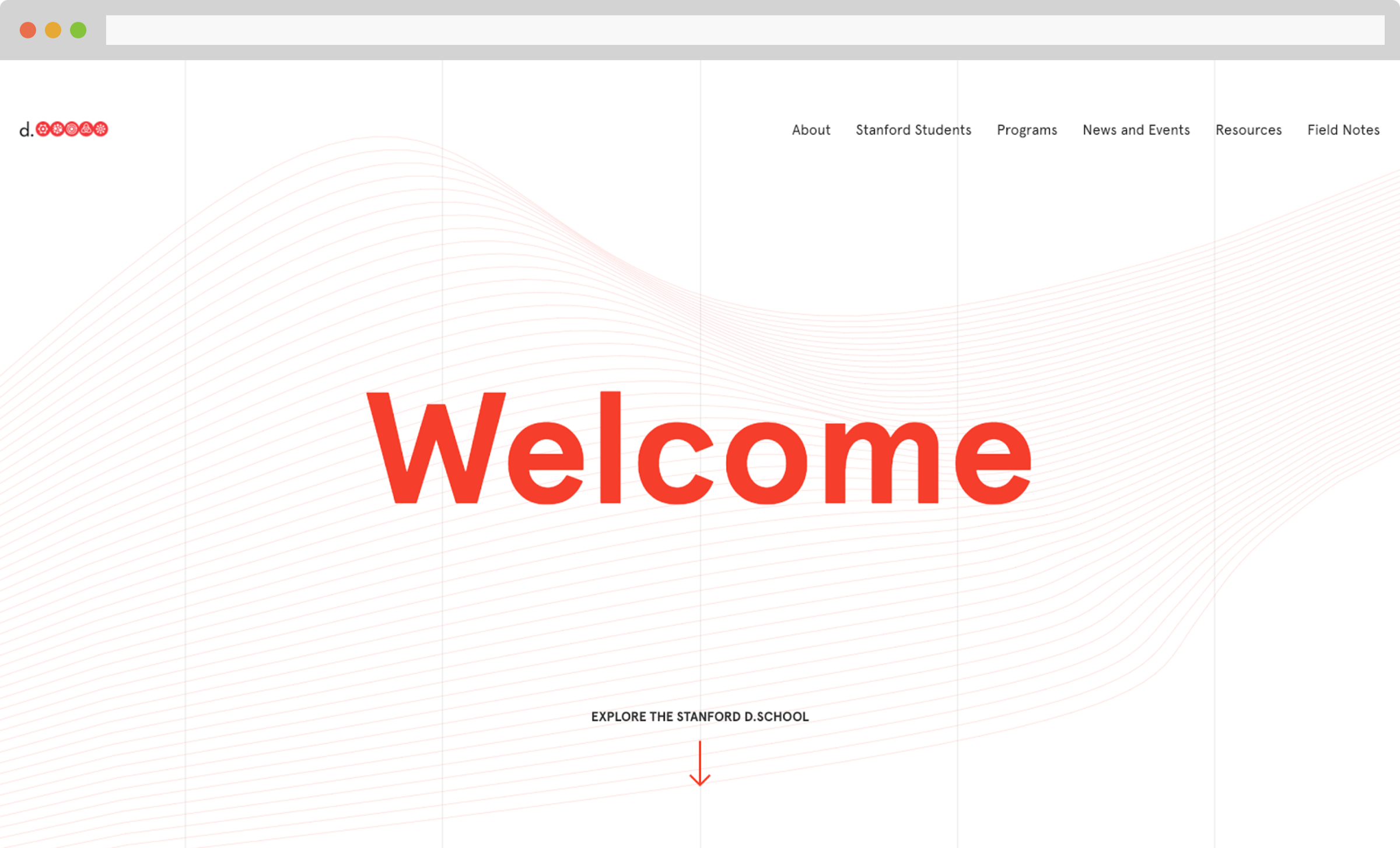
Tone is also crucial. What vibe do your fonts give off?
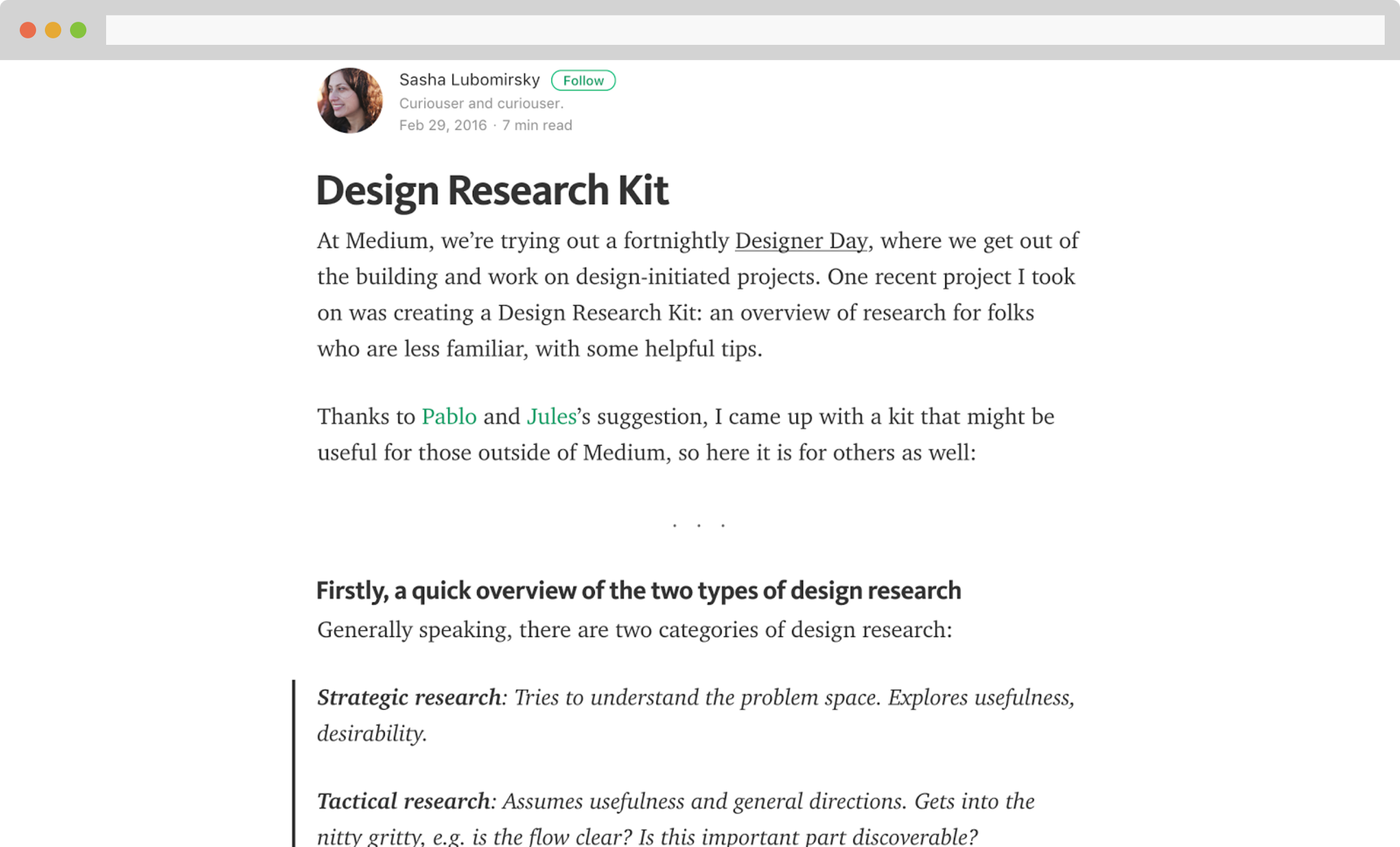
Don’t get too fancy. Clear, legible fonts get your point across:
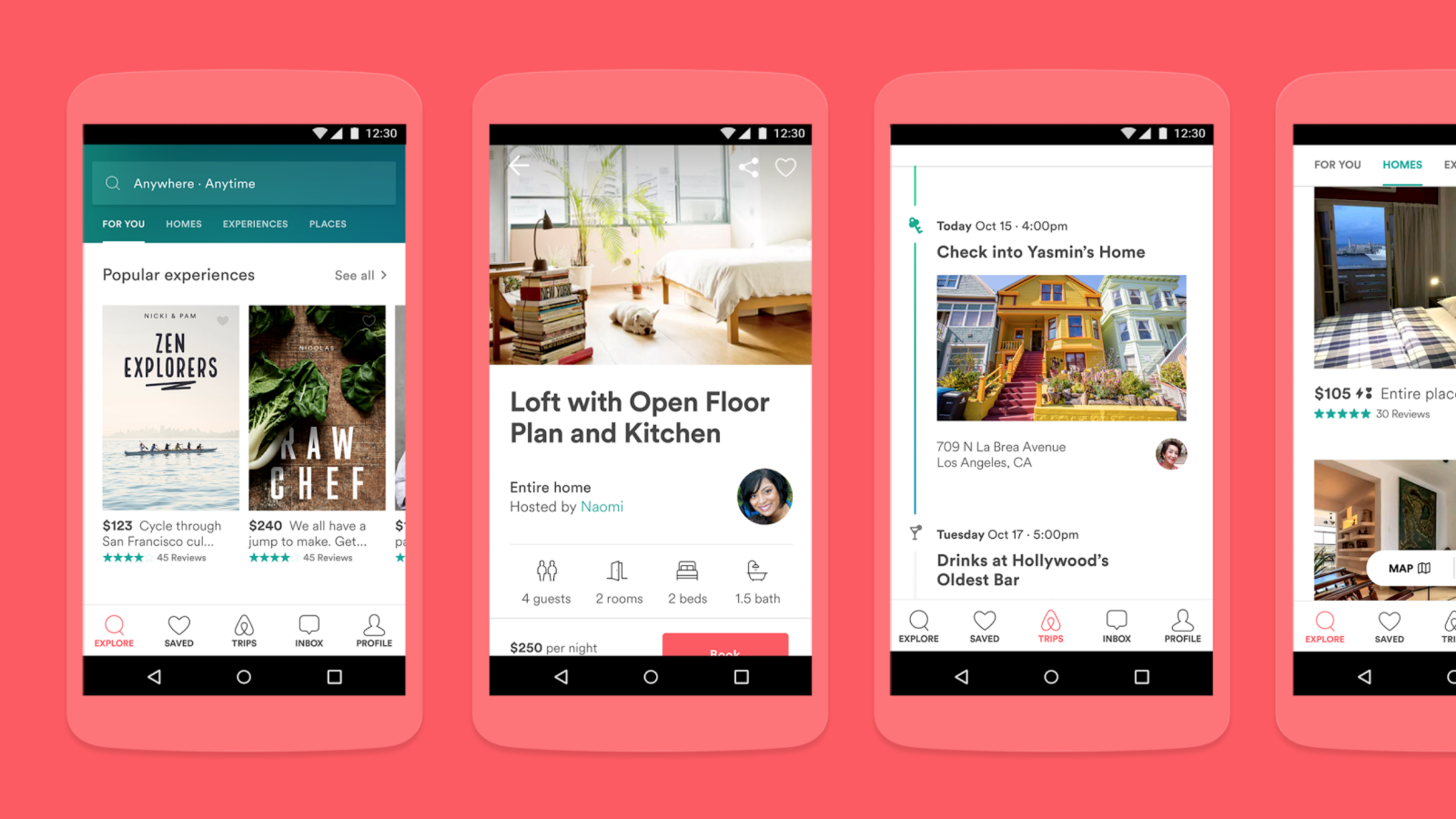
Again, with typography, don’t stress. Start by noticing what you like, and move from there.
To me, all explanations of illustration feel like this:
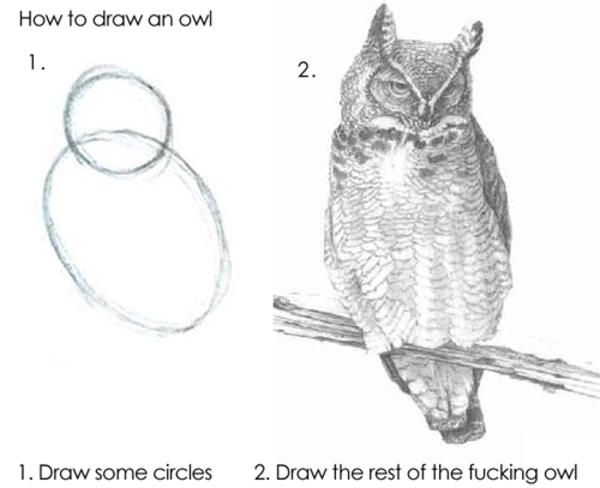
I know there are some brands that use illustration to their advantage, but it can be hard to pin down exactly how it works.
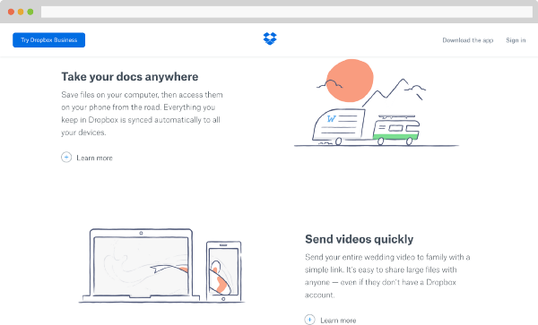
While I don’t have a great answer here (no, stealing other people’s illustrations is not an option), I would recommend reading Scott McCloud’s book, Understanding Comics, which has a lot of interesting theories about how comics work.
I particularly enjoyed his discussion on level-of-detail. McCloud explains how choice of style can make an illustration more relatable and emotional or more informative.
I’m still a design-toddler, but I manage to get by with a few tools in my belt:
Hopefully, with these tools, you’ll be able to generate a first draft of whatever design you’re working on. Once you do, share it! There’s no better way to learn than friendly critique; working with others will keep you honest and refine your design.
Good luck!
Hey there, want to help make our blog better?
Join LogRocket’s Content Advisory Board. You’ll help inform the type of content we create and get access to exclusive meetups, social accreditation, and swag.
Sign up now
This guide walks you through creating a web UI for an AI agent that browses, clicks, and extracts info from websites powered by Stagehand and Gemini.

This guide explores how to use Anthropic’s Claude 4 models, including Opus 4 and Sonnet 4, to build AI-powered applications.

Which AI frontend dev tool reigns supreme in July 2025? Check out our power rankings and use our interactive comparison tool to find out.

Learn how OpenAPI can automate API client generation to save time, reduce bugs, and streamline how your frontend app talks to backend APIs.