The status bar on a mobile device refers to the top area where the user can observe the current time, cell carrier info, wifi status, battery level, icons from various app notifications, and more.

This area could look similar to the iPhone 13 Pro example below:

When developing a React Native app, you might want to change the look of this area to perfectly match the current view on the screen.
You also need to take into account that some devices have a notch — like the example above — and some devices don’t. For those that do have a notch, apps can stretch their content up to the top of the screen. In that case, the app content would overlap with the status bar.
In this article, we will go over each of these aspects and understand how to master status bars in React Native. We will cover:
StatusBar in React Native to control the status barStatusBar for React NativeStatusBar in React Native to control the status barFirstly, how do we control the status bar inside of a React Native app? Couldn’t be simpler: the React Native framework offers us the StatusBar component for exactly this purpose.
The StatusBar component enables the developer to handle the look and feel of the device’s status bar based on the user’s location in the app or current needs.
For example, if the user is reading something and needs to stay focused, we might want to completely hide the status bar and limit distractions while they are on that particular screen.
There is also a second option for controlling the status bar in a React Native app. You could use the imperative API and programmatically change the look of the status bar instead of using the React Native StatusBar component.
In the following sections, we are going to take a look at each of these approaches, understand when to use each one, and how to use them properly.
What should we do when the device has a notch?
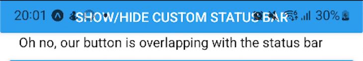
We know that the content of our app can overlap with the status bar on devices with a notch. In this case, we must ensure that we account for the height of the status bar and avoid putting any kind of text or buttons up there. Otherwise, we could end up with something like this:
To prevent this issue with the status bar, React Native offers a component called SafeAreaView.
The SafeAreaView component should be used as the root component of your screen instead of View. It will automatically take care of rendering the content within the safe boundaries of the device screen. However, it only works on iOS devices that are running at least iOS 11.
Therefore, the following snippet will produce a different result on iOS than on Android:
  <SafeAreaView style={{ flex: 1 }}>
     <View
       style={{
         height: 48,
         backgroundColor: 'purple',
         alignContent: 'center',
         justifyContent: 'center',
         paddingHorizontal: 16,
       }}>
       <Text style={{ color: 'white', fontWeight: 'bold' }}>NOW TRENDING</Text>
     </View>
     {renderContent()}
  </SafeAreaView>
The image below shows the how each device could display the results of the code above. On the left side is the Android result, whereas the right screenshot is on an iOS device. You can see that the SafeAreaView component took the notch into account on the iOS device:
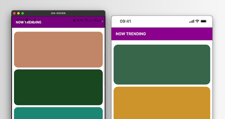
So, we know an iOS device will automatically apply the necessary padding to the top with the SafeAreaView component. However, we need to take care of this manually for an Android device.
To prevent our content from overlapping with the notch on an Android device, we should modify our snippet and add a paddingTop to the SafeAreaView. This is how we will do it:
import { Platform, NativeModules } from 'react-native';
const { StatusBarManager } = NativeModules;

<SafeAreaView style={{
  flex: 1,
  paddingTop: Platform.OS === 'android' ? StatusBarManager.HEIGHT : 0,
 }}>
 ...
Do not forget to add the imports at the top, the same way as you would add the snippet.
Modifying our code as shown above will render the following result:
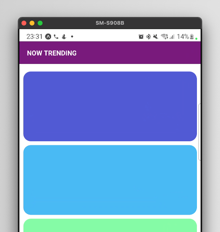
As you can see, we added a top padding to the root container of our screen that is equal to the height of the status bar.
Generally, we would also want to stretch the top color underneath the status bar. To do this we will want to move the padding inside of the component that is at the top — in our case, the purple title header. Take a look below:
 <SafeAreaView style={{ flex: 1 }}>
     <View
       style={{
         backgroundColor: 'purple',
         alignContent: 'center',
         justifyContent: 'center',
         paddingHorizontal: 16,
      // we are adding the following lines and we get rid of the height prop
      paddingTop: Platform.OS === 'android' ? StatusBarManager.HEIGHT : 0,
      paddingBottom: 16
       }}>
       <Text style={{ color: 'white', fontWeight: 'bold' }}>NOW TRENDING</Text>
     </View>
     {renderContent()}
  </SafeAreaView>
The above snippet will lead to the following result on an Android device:
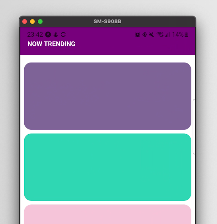
We nicely handled the height of the status bar for Android devices without affecting iOS unnecessarily.
However, something still looks a bit off in our app. Due to the purple background, the text and icons on the status bar are a bit difficult to decipher. In this case, we might want to change their color to white or another lighter color based on the darker background color.
Let’s say that you are developing an app that includes content from various brands, which would make use of a variety of branding colors.
In such a case, it would make sense to check the route that the app is currently on. You can then personalize the look of the status bar depending on the route to enhance the app’s UI and UX.
Why would you want to do this? Let’s take a look at the following example.
For the sake of simplicity, we will only have 2 screens: Home and Products. We are implementing a method that checks the current route.
In our case, we are checking against only two values. However, in a real-world scenario, you could have multiple arrays containing routes. There would be different styles for each of those arrays. These different styles would then be applied as the background of the current screen based on the route.
Let’s look at some code.
First, we need to add the needed imports for implementing our navigation and obtaining the routes for our example. They are added from the react-navigation library:
import {
  NavigationContainer,
  useNavigationContainerRef,
} from '@react-navigation/native';
import { createStackNavigator } from '@react-navigation/stack';
import { View, StatusBar, Button, Text } from 'react-native';
import { useRoute } from '@react-navigation/native';
import { NativeModules } from 'react-native';
const { StatusBarManager } = NativeModules;
Note that for this example, we are using React Navigation v6.
We are going to use a Stack navigator like so:
const Stack = createStackNavigator();
Now, things are getting a bit interesting. We are implementing a root container for each of our screens. This component will wrap each of our screens, thus avoiding code duplication:
const ScreenWrapper = ({ children }) => {
  // we obtain the object that contains info about the current route
  const route = useRoute();

  // for simplicity we will only modify the background color
const getBackgroundColorBasedOnRoute = () => {
    return route.name === 'Products' ? 'darkolivegreen' : 'orange';
  };

  // we are applying the background color to the component itself
return (
    <View
      style={{
        paddingTop: StatusBarManager.HEIGHT,
        backgroundColor: getBackgroundColorBasedOnRoute(),
        flex: 1,
      }}>
      <StatusBar
        barStyle={route.name === 'Products' ? 'light-content' : 'dark-content'}
      />
      {children}
    </View>
  );

};
Using the above ScreenWrapper component, we are now going to implement two basic screens:
const ProductsScreen = () => {
  return (
    <ScreenWrapper>
      <Text style={{ color: 'white', marginTop: 50, alignSelf: 'center' }}>
        Products screen
      </Text>
    </ScreenWrapper>
  );
};

const HomeScreen = ({ navigation }) => {
  return (
    <ScreenWrapper>
      <View style={{ marginTop: 50, width: 200, alignSelf: 'center' }}>
        <Button
          title="Go to products"
          onPress={() => navigation.push('Products')}
        />
      </View>
      <ScreenWrapper>
        {/*
      Component content goes here...
       */}
      </ScreenWrapper>
    </ScreenWrapper>
  );
};
In the code above, you might have noticed the navigation prop that the screens can receive. That prop is automatically passed in by the React Navigation library to those components that are used in a Screen component. You will see this in action below when we will implement our stack navigator.
Additionally, the default header of the navigator does not add value to our example. To hide it, we are providing the headerShown option and setting it to false:
export default function App() {
  return (
    <NavigationContainer>
      <Stack.Navigator
        screenOptions={{
          headerShown: false,
        }}>
        <Stack.Screen name="Home" component={HomeScreen} />
        <Stack.Screen name="Products" component={ProductsScreen} />
      </Stack.Navigator>
    </NavigationContainer>
  );
}
In this final code snippet above, we are tying everything together. We use a stack navigator that allows us to switch between the HomeScreen and the ProductsScreen. That is where we are passing by default the navigation prop.
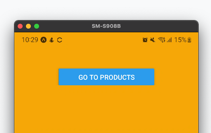
This code leads to the following home screen in our React Native app on an Android screen:
Pressing the button takes us to the products screen, which looks like so:
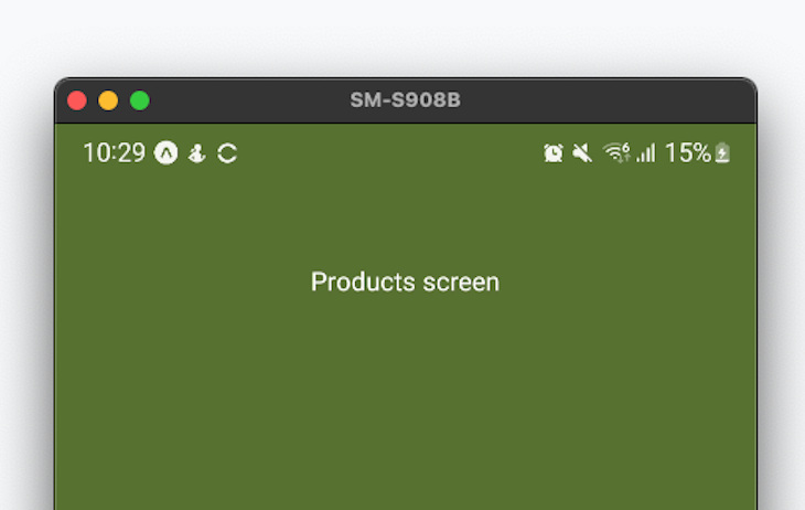
As you noticed, we are customizing the appearance of the status bar based on the route. More specifically, we are setting the status bar text to black when the background color is lighter, and we set it to white when we are dealing with a darker background.
Let’s say you want to further customize the status bar for your React Native app. You can also provide the backgroundColor prop to the StatusBar to set a custom background color as well, which will be independent from the background of your component.
StatusBar for React NativeWe also have another option if you would rather not use the StatusBar component. The imperative API allows us to push various styles to the status bar’s stack and thus modify its appearance.
There are various props that we can change on the status bar, all of which can be found in the official documentation. Right now we are going to take a look at some code so that we know how exactly this API is going to be used.
Let’s return to our previous example. We could easily add a useEffect to the ScreenWrapper component where we would push a different set of props to the status bar’s stack depending on the current route:
useEffect(() => {
    switch (route.name) {
      case 'Products':
        StatusBar.pushStackEntry({ barStyle: 'light-content', hidden: false });
        break;
      case 'Home':
        StatusBar.pushStackEntry({ barStyle: 'dark-content', hidden: false });
        break;
      default:
        StatusBar.pushStackEntry({ barStyle: 'light-content', hidden: true });
    }
  }, [route]);
Note that we are also adding a third screen to our StackNavigator called NotificationsScreen. Add this line to your stack navigator:
<Stack.Screen name="Notifications" component={NotificationsScreen} />
You also need to implement the NotificationsScreen component:
const NotificationsScreen = () => {
  return (
    <ScreenWrapper>
      <Text style={{ color: 'white', marginTop: 50, alignSelf: 'center' }}>
        Notifications screen
      </Text>
    </ScreenWrapper>
  );
};
Now let’s take a look at the switch in the useEffect. What are we doing there exactly?
Depending on the current route, we are pushing a different style to the status bar stack’s appearance. When we reach the notifications screen, we are hiding the bar altogether. Meanwhile, when switching between the other two screens, we are changing the theme according between dark and light content.
You can also pop the last added entry using popStackEntry. This will get rid of the style that was last added to the status bar stack.
It is also worth noting that in addition to using pushStackEntry and passing an object that contains the status bar style configuration, you can also use a set of methods that will have the same effects.
For example, you could use setBackgroundColor and setHidden instead of using a call to pushStackEntry() with an object containing backgroundColor and hidden.
Other props that are worth mentioning:
translucent: boolean; Android only
barStyle: StatusBarStyle enum
default, light-content, dark-contentanimated: boolean
backgroundColor, hidden, and barStyleYou can find the whole list and additional information in the React Native docs about StatusBar.
Deciding whether to use the StatusBar component or the imperative API is up to you, depending on your requirements, use case, and personal preferences.
For example, using the imperative API can be cleaner in some cases. If you want to avoid duplicating the StatusBar component in multiple places, then you can safely go for the imperative API approach and control the status bar from the same place.
Otherwise, if your status bar will have a pretty consistent look throughout the app, you can simply use the StatusBar component at the top level and it will work flawlessly.
You should discuss with your designer to determine how much you will customize the status bar dynamically. This information can help you choose the right approach.
However, keep in mind one caveat: you should not mix these approaches. Mixing them will lead to overriding whatever you set via the imperative API with what you are specifying in the StatusBar component.
Let’s say you have a StatusBar component set up for your screen. However, on the same screen, you change the status bar imperatively after an event such as a button being pressed. The status bar will be reset to the initial StatusBar component styling after a re-render, overriding your imperative API settings.
In this article, we dove into React Native’s StatusBar component and how to use it. We also looked at how to configure a stack navigator to make use of the current route for customizing the look and feel of the Status Bar.
Additionally, we looked over an example that uses the imperative API as an alternative to using the StatusBar component.
Thank you for staying until the end. I hope that reading this has been useful to you. Don’t hesitate to start a conversation in the comments — feedback is always welcome!

LogRocket's Galileo AI watches sessions for you and and surfaces the technical and usability issues holding back your React Native apps.
LogRocket also helps you increase conversion rates and product usage by showing you exactly how users are interacting with your app. LogRocket's product analytics features surface the reasons why users don't complete a particular flow or don't adopt a new feature.
Start proactively monitoring your React Native apps — try LogRocket for free.

We built the same app in TanStack Start RSC and Next.js RSC. TanStack shipped 40% less JS and built 4x faster — but Next.js is still the safer production bet.

From RSC vulnerabilities and the Vercel breach to TypeScript 7.0 Beta and AI agents — the nine frontend storylines that defined H1 2026, ranked.

AI tools generate working React code fast, but miss race conditions, empty states, debouncing, and accessibility. Here’s how to catch bugs before production.

Learn how to use Gemini CLI subagents to delegate frontend, backend, testing, and docs tasks to specialized agents with guardrails and clear ownership.
Hey there, want to help make our blog better?
Join LogRocket’s Content Advisory Board. You’ll help inform the type of content we create and get access to exclusive meetups, social accreditation, and swag.
Sign up now

 Learn more →
