Editor’s note: This article was last updated 21 June 2023 to add extra functionalities to the drag-and-drop component, like previewing, removing, and preventing duplicate files.

You’ve probably interacted with a file upload component before, possibly when updating your profile picture or uploading documents to the cloud. Although file upload components all have different designs, they tend to be more intuitive on the desktop. Typically, they allow you to drag and drop files into specific zones, usually called drop zones, and preview them.
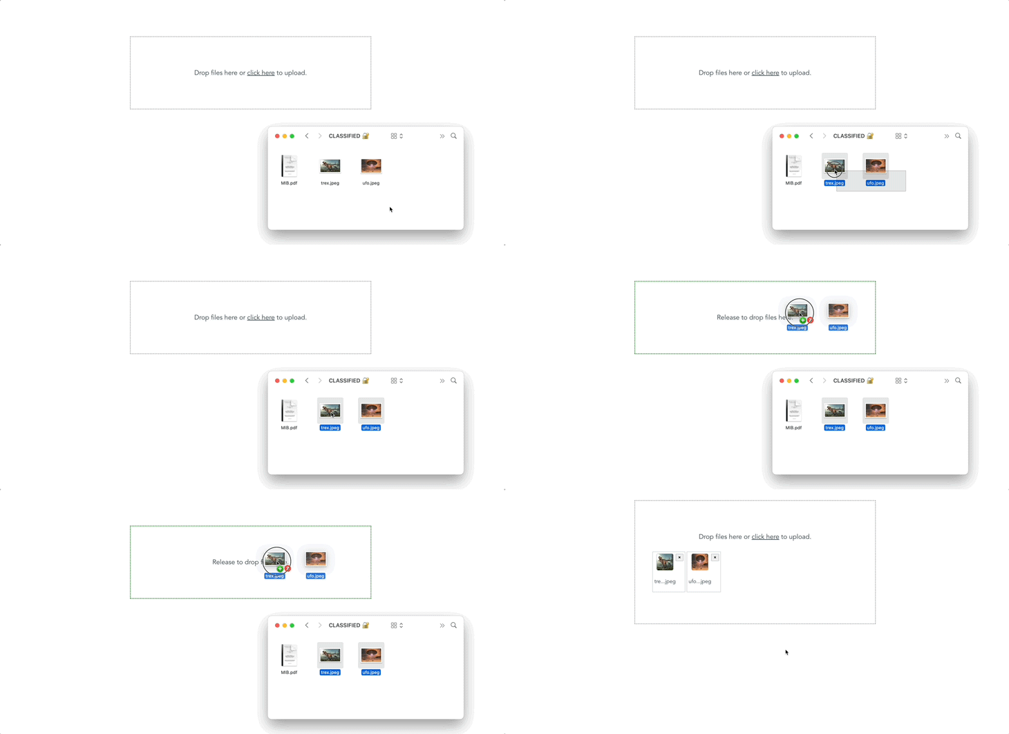
In this article, we’ll learn how to create our own drag-and-drop file upload component with Vue. We’ll have the ability to preview the selected files and remove any file before finally uploading it. To follow along, you can access the complete code on GitHub. Once we’re finished, it’ll look like the gif below:

Jump ahead:
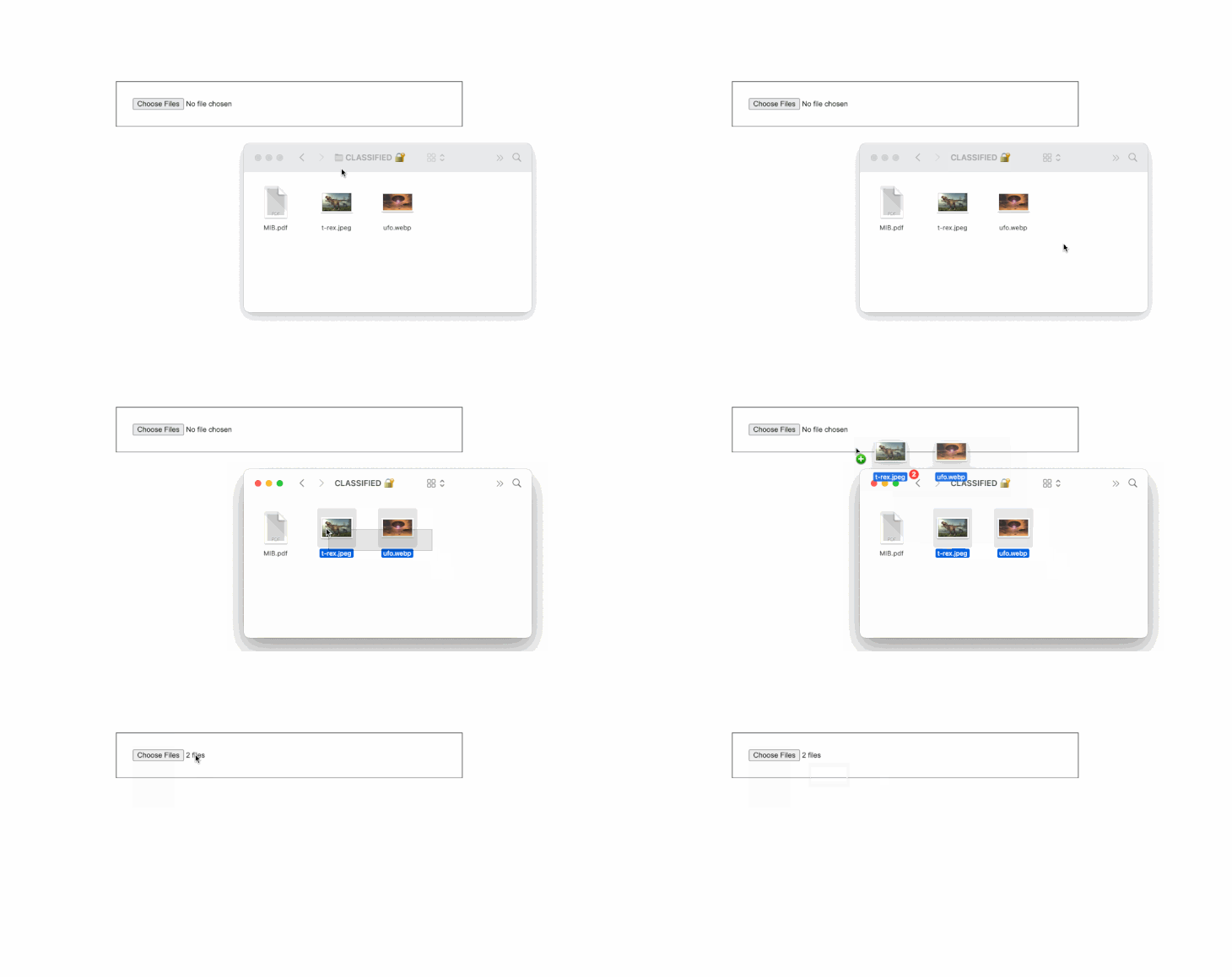
<inputtype=file><inputtype=file>Interestingly, the native HTML <input /> with type file supports drag-and-drop, but by default, it will only accept a single file. To accept more than one file, we could easily add the multiple attribute (i.e., <input type = "file" multiple />), stretch its width a little, and add a border and padding:

Aesthetically, you’ll agree that this just isn’t good enough. Instead, we’ll build a drag-and-drop file uploader that will work in a similar manner; we’ll still have a file input, but its visibility will be hidden. Then, we’ll add a visible label to make dragging to the file input possible. We’ll also add another custom event that’ll change the dragging status and allow us to display and remove selected files.
To get started, we’ll create a new Vue application by running the command below:
npm init vue@latest dropfile
Open the new project in your favorite text editor, then create an empty DropFile.vue file inside the src/component directory. Next, let’s import this component into our entry file. Open App.vue and replace its contents with the following code:
<template>
  <div id="app">
    <DropFile />
  </div>
</template>

<script>
import DropFile from "./components/DropFile.vue";
export default {
  name: "App",
  components: {
    DropFile,
  },
};
</script>
First, we’ll organize all the CSS-related code. Create a new dropfile.css file in the src/assets directory and paste the following code into it:
.main {
    display: flex;
    flex-grow: 1;
    align-items: center;
    height: 100vh;
    justify-content: center;
    text-align: center;
}

.dropzone-container {
    padding: 4rem;
    background: #f7fafc;
    border: 1px solid #e2e8f0;
}

.hidden-input {
    opacity: 0;
    overflow: hidden;
    position: absolute;
    width: 1px;
    height: 1px;
}

.file-label {
    font-size: 20px;
    display: block;
    cursor: pointer;
}

.preview-container {
    display: flex;
    margin-top: 2rem;
}

.preview-card {
    display: flex;
    border: 1px solid #a2a2a2;
    padding: 5px;
    margin-left: 5px;
}

.preview-img {
    width: 50px;
    height: 50px;
    border-radius: 5px;
    border: 1px solid #a2a2a2;
    background-color: #a2a2a2;
}
Next, replace the content in the DropFile.vue file with the following code:
<template>
  <div class="main">
    <div
      class="dropzone-container"
      @dragover="dragover"
      @dragleave="dragleave"
      @drop="drop"
    >
      <input
        type="file"
        multiple
        name="file"
        id="fileInput"
        class="hidden-input"
        @change="onChange"
        ref="file"
        accept=".pdf,.jpg,.jpeg,.png"
      />

      <label for="fileInput" class="file-label">
        <div v-if="isDragging">Release to drop files here.</div>
        <div v-else>Drop files here or <u>click here</u> to upload.</div>
      </label>
    </div>
  </div>
</template>

<script>
export default {
  data() {
    return {
      isDragging: false,
      files: [],
    };
  },
  methods: {
    onChange() {
      this.files.push(...this.$refs.file.files);
    },
    dragover(e) {
      e.preventDefault();
      this.isDragging = true;
    },
    dragleave() {
      this.isDragging = false;
    },
    drop(e) {
      e.preventDefault();
      this.$refs.file.files = e.dataTransfer.files;
      this.onChange();
      this.isDragging = false;
    },
  },
};
</script>
<style scoped src="@/assets/dropfile.css"></style>
Here, we created two reactive states: isDragging denotes the state if the user is trying to drag a file into our drop zone, and files is an array to hold selected or dropped files. We then attached a custom ref to the main file input to make it easily accessible in our Vue instance. We also added an onChange event that basically updates our files array with the files attached to our input.
Afterward, we created the dragover, dragleave, and drop methods, attaching them to the container holding our main file input. Therefore, the drop event and method will capture the dropped file and bind it to our file input, leveraging the custom ref we created earlier.
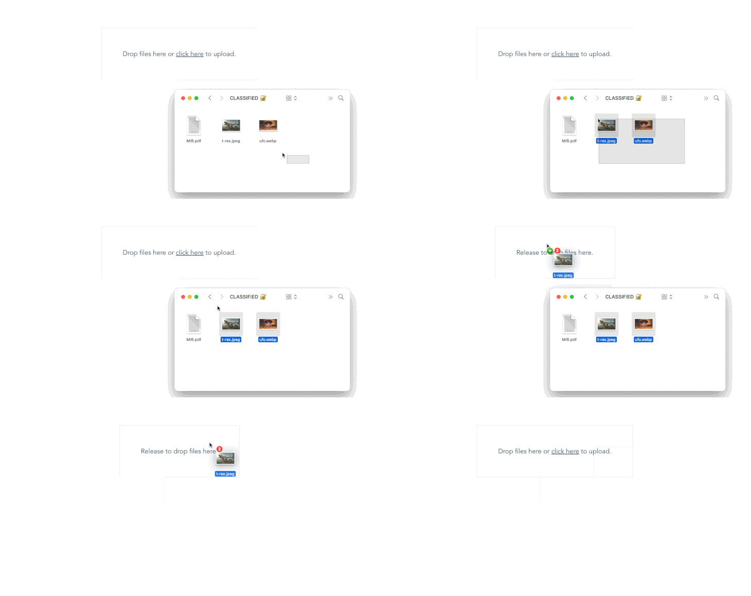
The dragover and dragleave methods also let us alter the state of isDragging as needed. Finally, we used conditional rendering with v-if and v-else to check the state of isDragging and display a custom message for each state. If we run our app at this point, we should have the following output:

Although the dropped files aren’t visible to us yet, they are actually somewhere in the background. To test this, log this.files to the console inside the onChange() method. Whenever you drop or manually select a file, the array should be logged to the console with each file containing the file name, size, last modified date, and other related information.
To elevate the dragging and dropping experience, we can modify the drop zone border to reflect its active state. Update the dropzone container style to include the following border styling:
.dropzone-container {
  /* . . .  */
  border: 2px dashed;
  border-color: #9e9e9e;
}
Next, update the dropzone-container markup to conditionally style its border during the dragging state:
<div
  :style="isDragging && 'border-color: green;'"
>
. . .
With this new update, your drop zone should look like the one below:

Previewing the selected and dropped files is pretty straightforward. We’ll only need to loop through our array of files. To accomplish this, add the following code immediately after the </label> tag in the previous code:
<!-- . . . -->
  </label>
      <!-- Note: Only add the code block below -->
      <div class="preview-container mt-4" v-if="files.length">
        <div v-for="file in files" :key="file.name" class="preview-card">
          <div>
           <p>
              {{ file.name }}
            </p>
          </div>
          <div>
            <button
              class="ml-2"
              type="button"
              @click="remove(files.indexOf(file))"
              title="Remove file"
            >
              <b>×</b>
            </button>
          </div>
        </div>
      </div>
In the code above, we used conditional rendering to check if our files array had a valid length. Then, we looped through all its content while displaying each file name in a paragraph.
In the previous code block, you’ll notice we also added a button to each iterable item, calling a remove() method while passing the index of the current file as its parameter. If we run our app at this point, we should see the selected file names displayed as expected as well as a button to remove them.
However, the remove button doesn’t work just yet. To fix this, append all the previous methods with a new remove() method:
// ..
remove(i) {
    this.files.splice(i, 1);
},
At this stage, everything should work as expected. We should be able to manually select files, drag and drop them, see their names, and also remove them. The gif below shows a preview of the output:

One additional feature that’ll make our drop zone component even more intuitive is the ability to preview selected image files. We can easily implement this by generating an arbitrary URL using the native URL.createObjectURL()method:
// ..
generateURL(file) {
    let fileSrc = URL.createObjectURL(file);
    setTimeout(() => {
        URL.revokeObjectURL(fileSrc);
    }, 1000);
    return fileSrc;
},
It is recommended to always revoke a URL after creating one with the URL.createObjectURL() method to avoid possible memory loss. We’ve added an additional timeout to automatically do this after one second.
Next, replace the paragraph <p> tag displaying all selected or dropped files’ names with the following code:
<!--  .  .  .  -->
<img class="preview-img"  :src=generateURL(file) "  />
<p>
{{ file.name }}
</p>
<!--  .  .  .  -->
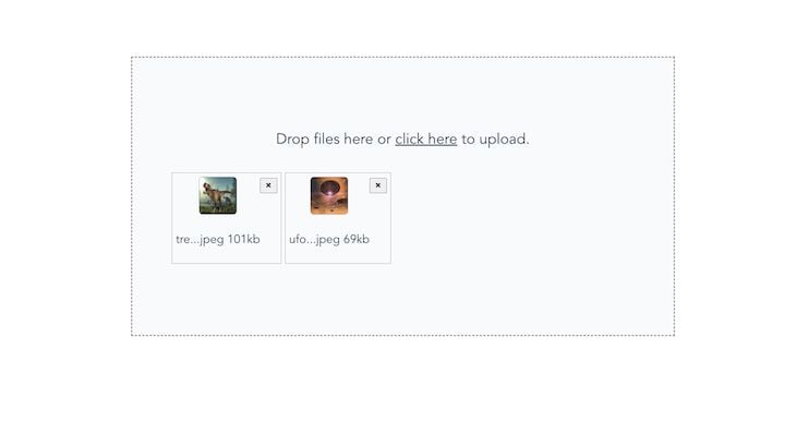
And with that, we have it all working! We can now easily drop, select, remove, and even preview selected files:

As explained in the previous section, we also have direct access to each selected file size and its last modified date. The file size is shown in bytes by default, however, we could easily divide by a thousand to convert to KB. Add the following code to the part of the file showing the file name:
<p>
    {{ file.name }} -
    {{ Math.round(file.size / 1000) + "kb" }}
</p>
Now, each selected file size will be shown along with its name:

Currently, our file drop zone permits us to drop duplicate files. To avoid this, we can enhance the functionality by iterating through the incoming files and checking if any of them already exist in our files array. If a duplicate is found, we can display a corresponding message.
To implement this, update the onChange method with the code below:
// . . .
onChange() {
  const self = this;
  let incomingFiles = Array.from(this.$refs.file.files);
  const fileExist = self.files.some((r) =>
    incomingFiles.some(
      (file) => file.name === r.name && file.size === r.size
    )
  );
  if (fileExist) {
    self.showMessage = true;
    alert("New upload contains files that already exist");
  } else {
    self.files.push(...incomingFiles);
  }
},
With this new update, our drop zone will check if the user is attempting to upload a file that already exists based on both its name and size.
Because the selected files are attached to the files state, uploading them to the server is a breeze. Although there are a few different strategies to achieve this, using FormData tends to be a more common approach.
The code below shows an example of how we could leverage FormData and Axios to send our files to an API or server for processing:
// . . .
uploadFiles() {
    const files = this.files;
    const formData = new FormData();
    files.forEach((file) => {
        formData.append("selectedFiles", file);
    });

    axios({
        method: "POST",
        url: "http://path/to/api/upload-files",
        data: formData,
        headers: {
            "Content-Type": "multipart/form-data",
        },
    });
},
We could then use other built-in functions or frameworks on the backend to process the files as desired.
In this article, we learned how to create a minimalist yet interactive drag-and-drop file uploader with Vue. Our file upload component lets us glance through the selected files’ names and size, preview image files, and even remove files before uploading.
It’s very easy to make mistakes while following a code-along tutorial like this one. To save you the trouble, the complete code for this tutorial is also available on GitHub. Thanks for reading!
Debugging Vue.js applications can be difficult, especially when users experience issues that are difficult to reproduce. If you’re interested in monitoring and tracking Vue mutations and actions for all of your users in production, try LogRocket.

LogRocket lets you replay user sessions, eliminating guesswork by showing exactly what users experienced. It captures console logs, errors, network requests, and pixel-perfect DOM recordings — compatible with all frameworks.
With Galileo AI, you can instantly identify and explain user struggles with automated monitoring of your entire product experience.
Modernize how you debug your Vue apps — start monitoring for free.
Would you be interested in joining LogRocket's developer community?
Join LogRocket’s Content Advisory Board. You’ll help inform the type of content we create and get access to exclusive meetups, social accreditation, and swag.
Sign up now
Not sure if low-code is right for your next project? This guide breaks down when to use it, when to avoid it, and how to make the right call.

Compare Firebase Studio, Lovable, and Replit for AI-powered app building. Find the best tool for your project needs.

Discover how to use Gemini CLI, Google’s new open-source AI agent that brings Gemini directly to your terminal.

This article explores several proven patterns for writing safer, cleaner, and more readable code in React and TypeScript.
2 Replies to "Customized drag-and-drop file uploading with Vue"
thanks, this was a very helpful tutorial.
Thanks for the feedback, Todd 🙂