Once upon a time, a developer searched for a wise frontend guru and found her. He had an important question in his mind.

“Should I use CSS Grid or CSS frameworks when building my application?” He asked.
“It depends,” she said after a long pause.
End of story.
I bet you knew the end of the story from the beginning, but let’s explore the storyline a bit further.
The Replay is a weekly newsletter for dev and engineering leaders.
Delivered once a week, it's your curated guide to the most important conversations around frontend dev, emerging AI tools, and the state of modern software.
CSS has come a long way since 1996. In 1996, we had fewer browsers and operating systems and there wasn’t a need for supporting complex layouts, different devices, and browse sizes.
Fast forward to 2011, when the first CSS frameworks like Bootstrap and Foundation were introduced. At that time we had more diverse browsers, operating systems, and devices and current trendy CSS3 features were still in experimental phase and not widely supported.
Back then, there was a true need for CSS frameworks. They had good cross-browser support, offered reusable components with related JavaScript functionality, gave a ready-to-use grid system for handling different browser sizes and most importantly standardized the way you work when building the UI part of your application.
CSS frameworks are still used today extensively. Although not all CSS frameworks are alike, most of them offer a set of pre-defined components, grid layouts, and customizable design systems, so as a developer you can drop them in a page without writing much CSS and it just works. Since Bootstrap is one of most famous CSS frameworks out there, we will use it as a reference in this article. Here is how Bootstrap defines itself officially:
The world’s most popular framework for building responsive, mobile-first sites, with BootstrapCDN and a template starter page.
Bootstrap is, currently (as of February 2020), ranked 6th for the most starred projects in Github with 139k stars.
CSS3 (the latest version of CSS) is catching up really fast and currently, we have a very wide support of its features in browsers. Today, we have access to cool features like CSS Grid, CSS Flexbox, CSS Variables, CSS extension languages like SASS, and many more. But since our focus in this article is on the grid systems, we will only focus on the comparison of CSS Grid with the grid support of CSS frameworks.
First, let’s get our terminology right. CSS Grid is a two-dimensional layout system, developed natively as part of CSS spec. Here is how CSS Grid defines itself, according to the official documentation:
This CSS module defines a two-dimensional grid-based layout system, optimized for user interface design.
CSS Grid is still not that popular in terms of usage on sites worldwide. A comparison of CSS features on Google Platform Status shows that CSS Grid usage across the sites is around 8% compared to 50% of Flexbox. But CSS Grid’s adoption is increasing.
Let’s get that “it depends” answer into perspective. The choice between CSS Grid and CSS frameworks depends on multiple factors. In this article we will focus on four of the main ones:
You would be writing many more divs, classes, and HTML elements if you are working with a framework like Bootstrap. Relying on pre-defined classes and elements means you will be spending most of your time in the HTML markup.
So, go with a framework if you feel more comfortable with using predefined elements and classes when building applications and you do not want to spend a lot of time writing CSS. We will build a simple photo gallery using Bootstrap to see this in action.
See the Pen
Less CSS or Html (Bootstrap) by Kasra (@KasraKhosravi)
on CodePen.
We can also use a library built on top of Bootstrap like Reactstrap for a more readable markup. If you use something other than React as a UI library, chances are there is an alternative for it. The usage of such libraries simplifies the process of building pages even further. This way, you can just use predefined components and attributes. This is what the page looks like when built using Reactstrap.
See the Pen
Less CSS or Html (Reactstrap) by Kasra (@KasraKhosravi)
on CodePen.
Now when it comes to CSS Grid, you will be mainly working on a semantic structure of your page in the HTML and then handle layout and positioning of elements in CSS. Choose CSS Grid if you want to only write the bare-bone structure of the page in HTML and spend most of your time writing CSS to handle the layout.
See the Pen
Less CSS or HTML (CSS Grid) by Kasra (@KasraKhosravi)
on CodePen.
Bootstrap v4 supports the latest, stables release of all major browsers. The only major browsers that Bootstrap v4 does not support are IE6-9. So if you need to support these browsers, it is important that you use Bootstrap v3. Additionally, there might be a need for prefixed CSS properties in IE10 to make Bootstrap v4.0 work.
The story of browser support for CSS Grid is a bit different. Even though it is supported in most of the modern browsers (like Chrome +v57 or Firefox +v52), the support for legacy browsers is not as extensive as Bootstrap. You need to be aware that older version of Browsers (like Chrome v4-v28 or Firefox v2-v39) do not support CSS Grid at all while some later versions of these browsers support it by enabling a flag in browser settings (like Chrome v29-v56 or Firefox v40-v51).

So my advice would be to do an analysis on your target audience and if data shows that they are mostly on older browsers/operating systems, go for a tool like Bootstrap which has better legacy browser support. But if you are working on a modern application and the target audience are all on new mobile phones and devices, then using CSS Grid without the need to sacrifice browser support would make sense.
But this situation is not so black and white, as it turns out. We have options when it comes to support legacy browsers while still going for a new technology. With the use of Feature Queries, which check the support of a certain CSS property in different browsers, we can add CSS Grid properties for the browsers that support it and reset any other CSS properties that we added for legacy browser support.
// Feature Query

@supports (display: grid) {
  ...
}
In the case that we need to position elements, using properties like float, vertical-align, and inline-block display would correctly do the job in legacy browsers. But in the case that a modern browser would encounter these properties, it simply ignores them if they are part of the grid container.
Showing below in the code example, you can see that we are relying on defining specific width and margin for image tags, to mimic the layout of a photo gallery in older browsers. Then, we reset the width and margin in the Feature Query and define the CSS Grid properties for handling width (grid-template-columns) and margin (grid-gap) between the images.

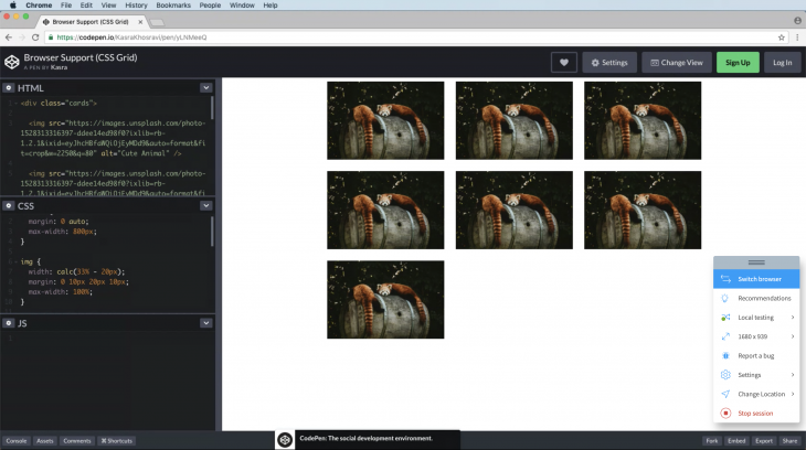
Here is an example of a browser that supports CSS Grid.
See the Pen
Browser Support (CSS Grid) by Kasra (@KasraKhosravi)
on CodePen.
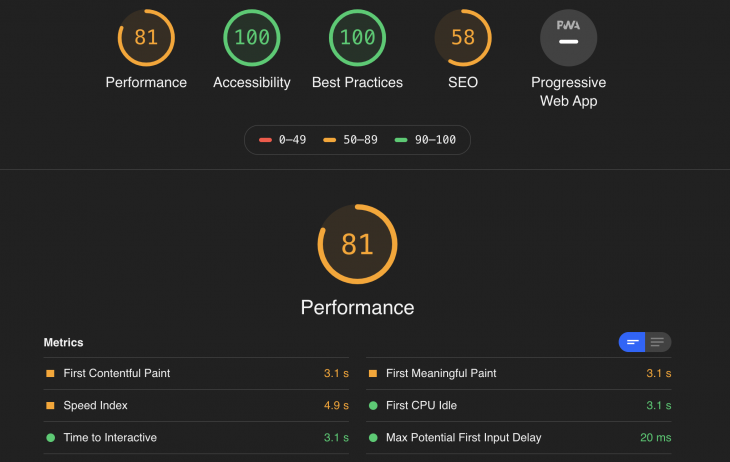
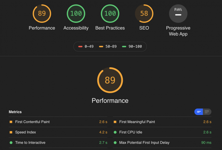
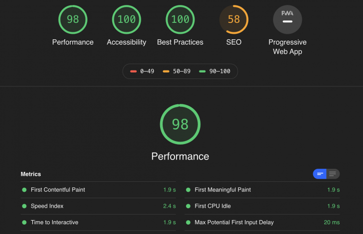
Bootstrap is composed of certain CSS/JS files and even though their total size does not exceed few kb (592 KB as precompiled zip folder), this does not prevent the browser to download it on every page load. However, when it comes to CSS Grid, around 92% of browsers (ad of Feb 2020) support it, so the browser does not need to download any additional dependencies for the site to load. To see this better in action, we will use a common performance audit tool, Lighthouse CLI, to measure the performance of our photo galleries, made by Bootstrap, Reactstrap, and CSS Grid.


It is clear the photo gallery built with CSS Grid gets a much better performance score from Lighthouse. If we look at the First Contentful Pain (FCP), it takes 1.9s from the navigation until the browser (desktop version on low-speed internet) renders the first bit of content from the DOM. This time is much higher for the Reactstrap version (3.1s) or Bootstrap version (2.6s). This could be due to the fact of unused but render-blocking CSS in Bootstrap implementation. This issue could be mitigated by using tools like PurgeCSS or UnCSS to an extent by removing unused styles from style sheets or even JS injected CSS. However, another simple reason for a lower speed on page load could the larger size of Bootstrap assets that has to be downloaded on each page load, which would hinder performance when compared to native CSS alternatives. If you are solely focusing on performance, choose a native solution like CSS Grid over a CSS framework.
Bootstrap defines itself as responsive with a mobile-first approach. Responsiveness in Bootstrap is handled mostly in HTML and using helper classes. You get five types of classes or attributes when handling sizings of elements, which is handled behind the curtain with their pre-defined media queries in the source code. This is limiting in a sense, but eliminates the need for guesswork.
// Extra small devices (portrait phones, less than 576px)
// No media query for `xs` since this is the default in Bootstrap

// Small devices (landscape phones, 576px and up)
@media (min-width: 576px) { ... }

// Medium devices (tablets, 768px and up)
@media (min-width: 768px) { ... }

// Large devices (desktops, 992px and up)
@media (min-width: 992px) { ... }

// Extra large devices (large desktops, 1200px and up)
@media (min-width: 1200px) { ... }
So you probably can imagine if we want to build our photo gallery in a responsive way using Bootstrap, we would mostly be adding Bootstrap’s pre-defined classes to our HTML.
See the Pen
Responsiveness (Bootstrap) by Kasra (@KasraKhosravi)
on CodePen.
The same goes for Reactstrap..
See the Pen
Responsiveness (Reactstrap) by Kasra (@KasraKhosravi)
on CodePen.
As you have probably guessed, handling responsiveness happens mostly in CSS via CSS Grid. You just define the basic layout of the page in HTML and handle responsiveness using media queries. The reason this approach is much more powerful is that handling responsive layouts does include much more than different sizings on different viewports. There is a chance that you might want to hide or re-order elements in different browser sizes and in my own experience, it is more intuitive to do this in CSS using media query and CSS Grid options. We will look at a simple responsive layout using CSS Grid and Media Queries.
See the Pen
Responsiveness (CSS Grid) by Kasra (@KasraKhosravi)
on CodePen.
It is also possible to take advantage of some special CSS Grid properties like minmax function and auto-fit to handle the responsive sizing without using any media queries. But in general, using media queries gives you more control and flexibility to handle responsiveness, especially if you consider using helpers media query mixins.
See the Pen
Responsiveness (CSS Grid Without Media Query) by Kasra (@KasraKhosravi)
on CodePen.
Now when you think about the guru’s answer, things are a bit more clear.
On a technical term, it makes sense to use a CSS frameworks if …
Go with CSS Grid if …
On a more general level …
These numbers represent percentages of Chrome page loads (across all channels and platforms) that use the corresponding CSS property at least once in the past 24 hours
As web frontends get increasingly complex, resource-greedy features demand more and more from the browser. If you’re interested in monitoring and tracking client-side CPU usage, memory usage, and more for all of your users in production, try LogRocket.

LogRocket lets you replay user sessions, eliminating guesswork around why bugs happen by showing exactly what users experienced. It captures console logs, errors, network requests, and pixel-perfect DOM recordings — compatible with all frameworks.
LogRocket's Galileo AI watches sessions for you, instantly identifying and explaining user struggles with automated monitoring of your entire product experience.
Modernize how you debug web and mobile apps — start monitoring for free.

AI companies are buying developer tools as coding agents turn runtimes, package managers, and linters into strategic infrastructure.

Learn how AI-assisted development governance uses rules, agents, hooks, and protocols to help AI coding tools produce safer, more consistent code.

A step-by-step guide to building your first MCP server using Node.js, covering core concepts, tool design, and upgrading from file storage to MySQL.

Using security headers in your Next.js apps is a highly effective way to secure websites from common security threats.
Would you be interested in joining LogRocket's developer community?
Join LogRocket’s Content Advisory Board. You’ll help inform the type of content we create and get access to exclusive meetups, social accreditation, and swag.
Sign up now