gap property vs. margin property
Creating a visually appealing webpage requires more than just putting HTML elements together. Each element interacts with the others, and it’s essential to provide the right amount of spacing between them.

CSS offers various properties for spacing elements, such as the margin, gap, padding, and more. In this guide, we’ll compare the margin and gap properties to help you make informed decisions on when to use them.
Jump ahead:
gap and margin propertiesgap vs. margin: Differences in syntaxmargin and gap properties togethergap and marginThe Replay is a weekly newsletter for dev and engineering leaders.
Delivered once a week, it's your curated guide to the most important conversations around frontend dev, emerging AI tools, and the state of modern software.
gap and margin propertiesThe CSS gap property defines the size of the gutter or gap between rows and columns in a multi-column layout, including flexbox and grid systems. This property was originally called grid-gap until it was renamed in CSS 3 to make it more generic.
The margin property in CSS allows us to add space around an HTML element. As you may recall from the CSS box model, every page element is essentially a box.
Let’s consider the following HTML element:
<div>Hello CSS</div>
We can make the box more visible by adding a border:
div {
  border: 5px solid skyblue;
}
This will create a blue border around the box, making it easier to see:
See the Pen
simple HTML & CSS by Ibaslogic (@ibaslogic)
on CodePen.
If we inspect the element using the browser’s DevTools, we’ll see a diagram of the box model, as illustrated below:
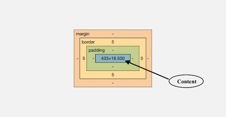
As we can see above, the margin is one of the key areas of the CSS box model, along with the content, padding, and border.
The padding creates space around the content area within the border box, while the margin creates space around the element outside the border box. In our example, we applied a 5px border to visually frame the box element, which we can also see is the value applied in the box model illustration.
Sometimes, adding padding is enough to space elements in a page layout, especially if we want more background. For instance, consider the following two elements:
<div>Box 1</div>
<div>Box 2</div>
We can apply a padding property to the individual element to space the contents, like this:
div {
  /* border: 5px solid skyblue; */
  padding: 1rem;
  background: #dadada;
}
You can see the result on CodePen:
See the Pen
CSS Box Model: Padding by Ibaslogic (@ibaslogic)
on CodePen.
Even though the text contents are spaced from each other, their boxes are still attached because padding only creates space around the text inside the border.
If we want to create actual spacing between the box borders, we need to use other CSS properties such as margin or gap. In the next section, we’ll explore the differences between them and when to use them.
gap vs. margin: Differences in syntaxLet’s start by comparing their syntax. To apply spacing with margins, we use the margin property. This shorthand property allows us to specify one, two, three, or four values. For example:
/* Apply to all four sides */
margin: 20px;

/* top & bottom margins are 20px
   right & left margins are 60px */
margin: 20px 60px;

/* top margin is 20px
   right & left margins are 60px
   bottom margin is 70px */
margin: 20px 60px 70px;

/* top margin is 20px
   right margin is 60px
   bottom margin is 70px
   left margin is 30px  */
margin: 20px 60px 70px 30px;
Margin values are specified using length units (such as px, em, rem, cm), percentages (%), or the keywords “auto” or “inherit”.
We can also use sub-properties to specify the margin size for each side of an element: margin-top, margin-right, margin-bottom, and margin-left.
The syntax for gap is similar, but the shorthand property only accepts one or two values:
/* Apply to row-gap & column-gap */
gap: 20px;

/* row-gap is 20px
   column-gap is 60px */
gap: 20px 60px;
Like margin, the gap can also accept values in length units, percentages, or the “inherit” keyword.
We can also specifically set the row and column gutters using the row-gap and column-gap properties, respectively.
Let’s examine how the margin and gap properties behave when block elements are stacked vertically and when the elements are part of the block formatting context.
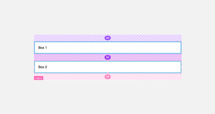
marginIn the example below, we have applied the margin property to the div items inside a section element to space them out:
<section>
  <div>Box 1</div>
  <div>Box 2</div>
</section>
div {
  /* border: 5px solid skyblue;
  padding: 16px; */
  margin: 32px 0;
}
From the layout below, we can see that the vertical margins collapse: the 32px margin-bottom of Box 1 collapses into the 32px margin-top of Box 2. In other words, vertical margins between siblings (or parent-children) collapse when they touch each other:
This behavior can be reasonable in many scenarios, such as when applying top and bottom margins to elements like paragraphs, headings, lists, and block quotes, lets us avoid doubling the space that separates the elements.
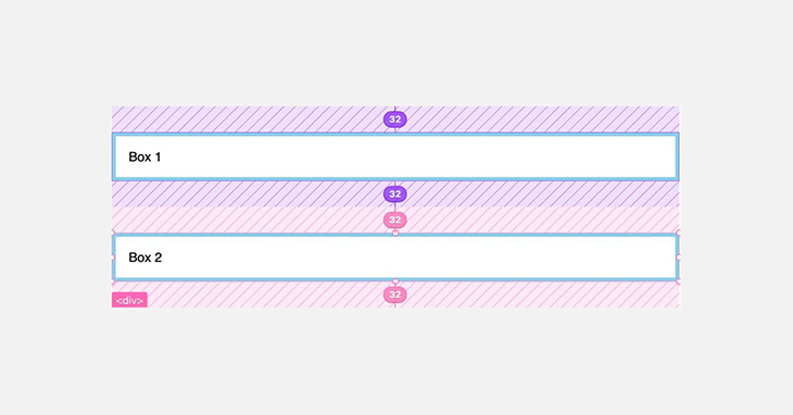
However, if we are dealing with elements in a block formatting context, we may encounter unexpected results. For instance, if the box items become grid or flex items:
section {
  display: grid;  /* creates a new block formatting context */
}
The vertical margins will no longer collapse, as we can see below:
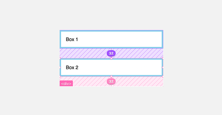
We can eliminate the extra gutter by specifying only the margin-bottom, like so:
div {
  /* border: 5px solid skyblue;
  padding: 16px; */
  margin-bottom: 32px;
}
We now have:
However, since the margin is applied to individual elements, using it to create spacing between elements, as we did above, ends up creating extra spacing after the last element.
In most cases, that is not what we want. We can prevent the extra spacing by applying the margin to a pseudo-selector, like so:
div:not(:last-child) {
  margin-bottom: 32px;
}
This applies the margin-bottom to all the grid items except the last item in the container.
gapA better way to space the items in this scenario is to use the gap property. Let’s start by removing the margin we placed on the items:
/* div:not(:last-child) {
  margin-bottom: 32px;
} */
We can now introduce the gap property.
The gap is applied to the item’s container element, not to the individual element. In our example, we’ll apply it alongside the display: grid; declaration:
section {
  display: grid;
  row-gap: 32px;
}
In the CSS above, we specifically set the row gutter using the row-gap property; if the layout requires a column gap, we’d include a column-gap property too. We can also use the gap shorthand:
section {
  display: grid;
  gap: 32px 0;
}
The layout should look like so:
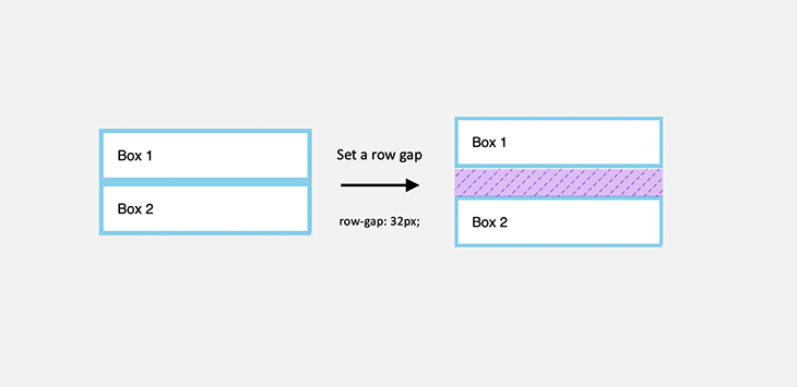
As we can see, using the gap only creates a gutter between elements, and not affecting the outside area. With the gap, we don’t have to worry about using a weird selector as we did with the margin property.
Let’s consider the following elements:
<section>
  <div>Box 1</div>
  <div>Box 2</div>
  <div>Box 3</div>
  <div>Box 4</div>
</section>
To create a responsive design, let’s make the section a grid container:
section {
  display: grid;
  grid-template-columns: repeat(auto-fill, minmax(180px, 1fr));
}

div {
  border: 5px solid skyblue;
  padding: 16px;
  margin-block-end: 20px;
}
marginAbove, we used margin-block-end, a logical property that maps to a physical margin-bottom, to create spacing among the items in our responsive design. This ensures that the margin gets properly applied in bi-directional sites, irrespective of the writing mode and direction.
However, we still have extra spacing after the last element. This was expected, as we learned earlier:
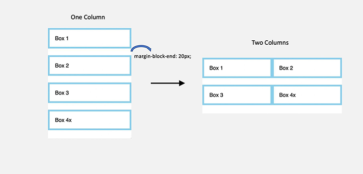
As we can also see above, we need to specifically add CSS rules to create gaps between the columns when the layout becomes two columns.
gapTo avoid worrying about additional style rules, we can easily achieve a consistent gap between items using the gap property:
section {
  display: grid;
  grid-template-columns: repeat(auto-fill, minmax(180px, 1fr));
  gap: 20px
}

div {
  border: 5px solid skyblue;
  padding: 16px;
  /* margin-block-end: 20px; remove the margin */
}
See the result on CodePen:
See the Pen
CSS gap spacing: Grid by Ibaslogic (@ibaslogic)
on CodePen.
Now, regardless of whether we have a single- or multiple-column design in a grid-like structure, the gap is consistent.
gap with FlexboxThis also applies to Flexbox layouts. For instance:
section {
  display: flex;
  flex-direction: column;
  gap: 20px
}
See the Pen
CSS gap spacing: Flex by Ibaslogic (@ibaslogic)
on CodePen.
marginThe margin property can be very useful when we want to horizontally center a block element within an available space. Let’s consider the following HTML code:
<section>
  <div>Box</div>
</section>
If the div element has a specified width, we can center it by assigning a margin-inline: auto; property to it. This is a logical property that sets the left and right margins to auto.
div {
  margin-inline: auto; /* margin left and right: auto; */
  width: 50%;
  border: 5px solid skyblue;
  padding: 16px;
}
See result on this CodePen:
See the Pen
margin: auto; by Ibaslogic (@ibaslogic)
on CodePen.
The value of auto on both sides of the element tells the browser to split the remaining space equally between the left and right margins, thus centering the element.
margin and gap properties togetherLet’s take a look at a practical example where we can use both the margin and gap properties in a more interesting way. In the following navigation structure, the Login and Signup buttons are positioned to the right, while the Home and About menu items are placed in the middle.
See the Pen
Using margin and gap properties by Ibaslogic (@ibaslogic)
on CodePen.
Usually, we could achieve this layout by placing the middle and the right items in separate container elements and positioning them however we want.
However, with good use of the margin property, we can achieve the desired result without complicating the layout with additional markup.
In the following HTML, we’ve placed all the items within a ul container element:
<header>
  <div class="inner">
    <h1>logo</h1>
    <nav>
      <ul>
        <li><a href="#">Home</a></li>
        <li><a href="#">About</a></li>
        <li><a href="#">Login</a></li>
        <li><a href="#">Signup</a></li>
      </ul>
    </nav>
  </div>
</header>
By applying a display: flex; on both the div and ul containers, we can easily align the items on a row:
.inner {
  display: flex;
  align-items: center;
}

ul {
  display: flex;
  list-style: none;
}
The result:

Because we’ve applied a flex property, the flex items shrink by default — this is why we have excess space on the right side. To ensure we have enough space to distribute these menu items evenly, we’ll apply a flex-grow: 1; to the nav item:
nav {
  flex-grow: 1;
}
Let’s also apply a gap property to the ul to provide a gutter between the flex items:
ul {
  /* ... */
  column-gap: 10px;
}
Now, we can distribute the items however we want — let’s target the third item and apply a margin-left: auto;, like so:
li:nth-of-type(3) {
  margin-left: auto;
}
The menu item, and any other item after it, will be pushed to the right side:
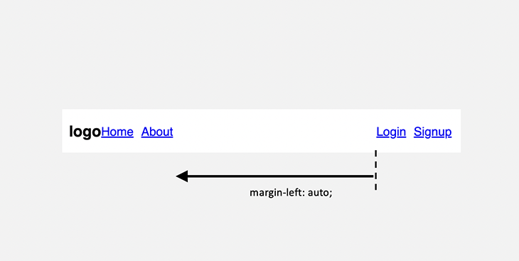
With margin-left: auto; applied to an element, the left side of the element will take a share of the unused horizontal space.
Now we need to add space between the logo and the first menu item with a margin property:
nav {
  margin-left: 1em;
}
Otherwise, we can further target the first menu item and apply a margin-left: auto; to also take a share of the remaining space.
li:nth-of-type(1) {
  margin-left: auto;
}
The result should now look like so:
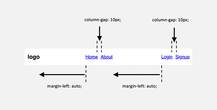
Now, we have achieved a cool, balanced layout using both the margin and gap properties.
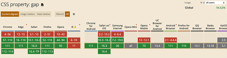
gap and marginThe CSS margin and gap properties are widely supported among modern browsers. See browser support for the gap property:
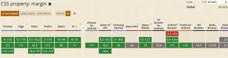
See support for the margin property:
In this guide, we’ve explored the differences between the CSS gap and margin properties by examining real-world examples. Ultimately, the choice between these properties depends on your specific context and ease of use.
The CSS gap property is particularly useful for adding gutters between child elements within a container without affecting the outside area. It’s especially valuable while building component-based, reusable, and responsive layouts.
On the other hand, the margin targets individual elements and creates space around individual elements, making it very versatile for moving elements around on a page.
If you’d like to learn more about the differences between the margin and padding properties, check out our comprehensive guide. And as always, feel free to leave any questions or contributions in the comment section.
As web frontends get increasingly complex, resource-greedy features demand more and more from the browser. If you’re interested in monitoring and tracking client-side CPU usage, memory usage, and more for all of your users in production, try LogRocket.

LogRocket lets you replay user sessions, eliminating guesswork around why bugs happen by showing exactly what users experienced. It captures console logs, errors, network requests, and pixel-perfect DOM recordings — compatible with all frameworks.
LogRocket's Galileo AI watches sessions for you, instantly identifying and explaining user struggles with automated monitoring of your entire product experience.
Modernize how you debug web and mobile apps — start monitoring for free.

useEffect breaks AI streaming responses in ReactSee why useEffect breaks AI streaming in React, and how moving stream state outside React fixes flicker and stale updates.

A real-world debugging session using Claude to solve a tricky Next.js UI bug, exploring how AI helps, where it struggles, and what actually fixed the issue.

CSS wasn’t built for dynamic UIs. Pretext flips the model by measuring text before rendering, enabling accurate layouts, faster performance, and better control in React apps.

Why do real-time frontends break at scale? Learn how event-driven patterns reduce drift, race conditions, and inconsistent UI state.
Hey there, want to help make our blog better?
Join LogRocket’s Content Advisory Board. You’ll help inform the type of content we create and get access to exclusive meetups, social accreditation, and swag.
Sign up now

 Learn more →
