
In computer science, “masking” refers to using one digital element (a mask) to modify or extract data from a second digital element. Programmers use masking in various computer science applications: bit masking is used when developing software systems/APIs, input masking is used in frontend development, and computer-graphics-based masking is used when developing GUI apps.

In mobile apps, we often use visual signals to improve the app’s quality and user-friendliness, including these kinds of mask-based static graphics and animations. For example, modern mobile apps include vector shapes or text that contain image textures or gradient layers. Some mobile apps reveal the main app screen with an animated vector mask (i.e., Twitter’s iOS app) to create a uniquely welcoming user experience.
The react-native-masked-view library lets you create masked views to add compelling visuals to your React Native apps. In this tutorial, I will explain how to use the react-native-masked-view library with some practical examples that you can use in your React Native apps.
Jump ahead:
The Replay is a weekly newsletter for dev and engineering leaders.
Delivered once a week, it's your curated guide to the most important conversations around frontend dev, emerging AI tools, and the state of modern software.
Learning library features helps to verify the feasibility of implementing your design ideas. So, let’s study some library features before using the library. This library comes with the following highlighted features:
Older React Native versions offered the official, inbuilt MaskedViewIOS framework component for implementing masked views on iOS. But in v0.59, the React Native team moved the MaskedViewIOS component to a separate community package called react-native-masked-view for better manageability; now, react-native-masked-view supports both Android and iOS platforms.
This library doesn’t limit app developers by offering only image-based masking; you can use any valid React element for the masking process. It’s possible to create text-based, image-based, or any React element-based masks with this library.
The React Native framework offers an inbuilt animation API for developers to animate platform-specific native UI elements. You can integrate the inbuilt animation API and this masking library to create compelling dynamic visuals in your React Native apps. Creating a unique opener animation with a vector shape mask is so easy!
Now that we know the primary features that the masking library offers, let’s start using the library to become more familiar with it.
First, we need to install the library in a React Native project. You can use the upcoming examples in an existing project or a new project. If you plan to create a new one, use the following command:
npx react-native init MaskedViewDemo
cd MaskedViewDemo
Now, install the library as follows:
npm install @react-native-masked-view/masked-view
# --- or ---
yarn add @react-native-masked-view/masked-view
Run the project to make sure that the masking package installation was successful:
npx react-native run-android
# --- or ---
npx react-native run-ios
We can create a simple mask element with a Text component and an Image component to get started. Here, we need to use the Text component as the mask element and use Image for the mask’s texture. In other words, we need to fill a text element with a background texture.
First, download the medium-sized image file from the Unsplash website into your app directory and rename it as texture.jpg. Next, add the following code to your App.js file:
import React from 'react';
import {
  SafeAreaView,
  StyleSheet,
  Text,
  View,
  Image
} from 'react-native';
import MaskedView from '@react-native-masked-view/masked-view';
import backgroundTexture from './texture.jpg';

function App() {
  return (
    <SafeAreaView style={styles.container}>
      <MaskedView
        style={styles.maskedView}
        maskElement={
          <View style={styles.maskWrapper}>
            <Text style={styles.mask}>Text Mask</Text>
          </View>
        }>
        <Image
          source={backgroundTexture}
          style={styles.image}
        />
      </MaskedView>
    </SafeAreaView>
  );
}

const styles = StyleSheet.create({
  container: {
    flex: 1,
    backgroundColor: '#444'
  },
  maskedView: {
    flex: 1,
    flexDirection: 'row',
    height: '100%'
  },
  maskWrapper: {
    backgroundColor: 'transparent',
    flex: 1,
    justifyContent: 'center',
    alignItems: 'center',
  },
  mask: {
    fontSize: 60,
    color: 'black',
    fontWeight: 'bold',
  },
  image: {
    flex: 1,
    height: '100%',
    backgroundColor: '#324376'
  },
});

export default App;
Above, we created a text mask and added a Text component within the maskElement prop. For positioning purposes, we wrapped the Text component with a transparent View. The Image component gets rendered behind the text mask, so we will see the image content only within the mask area:
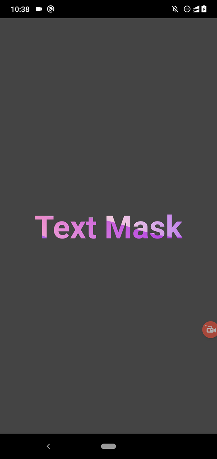
The MaskedView component reveals background components based on the maskElement‘s alpha channel, so we can use partial transparency to add interest to our styles. For example, we can partially show the background image around the text element as follows:
maskWrapper: {
  backgroundColor: 'rgba(0, 0, 0, 0.3)',
  flex: 1,
  justifyContent: 'center',
  alignItems: 'center',
},
The above styling definition sets an opacity value for the mask element via the rgba styling syntax. Now, you will see the following result:
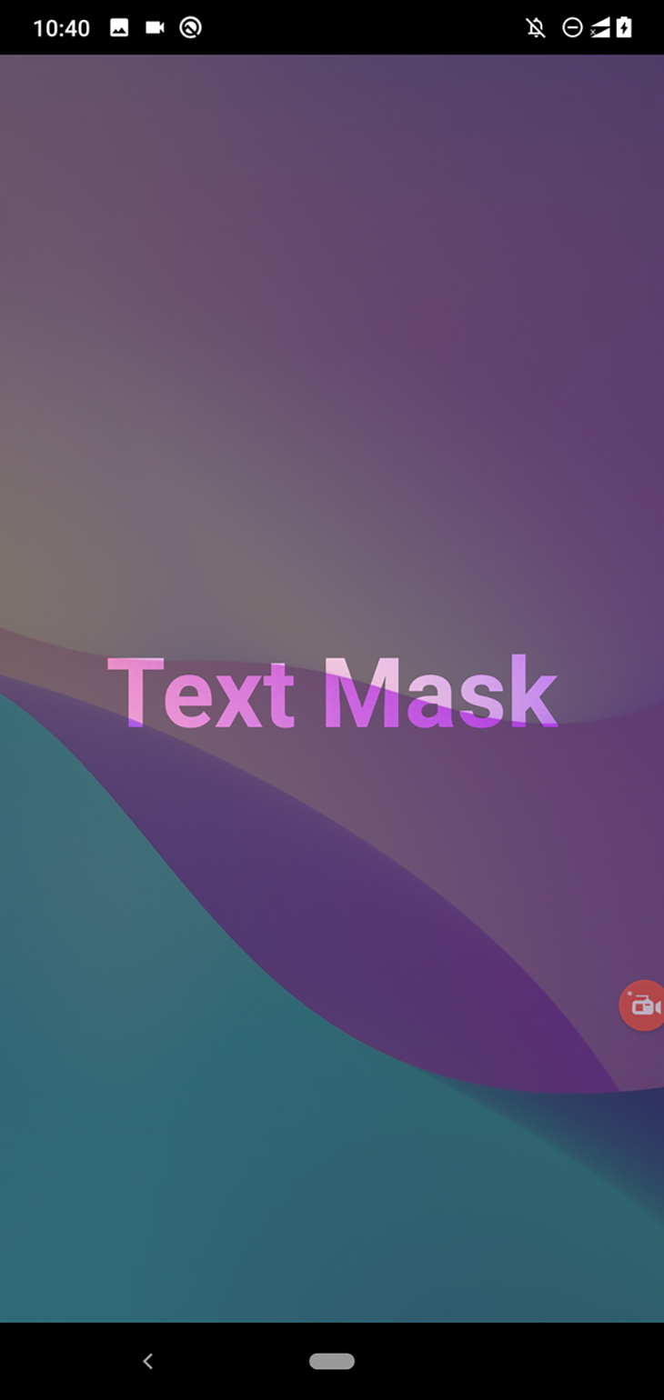
We can also change the text shadow to apply a blur effect around the text element:
maskWrapper: {
  backgroundColor: 'rgba(0, 0, 0, 0.08)',
  flex: 1,
  justifyContent: 'center',
  alignItems: 'center',
},
mask: {
  fontSize: 60,
  color: 'black',
  fontWeight: 'bold',
  textShadowRadius: 30,
  textShadowColor: 'rgba(0, 0, 0, 0.8)'
},
After you use the above code in your app, you will see a blur effect around the text element. Using a high alpha value for the shadow reveals the background image more, blurring the text element since the masking process uses the non-transparent regions to activate the mask. Look at the following preview:
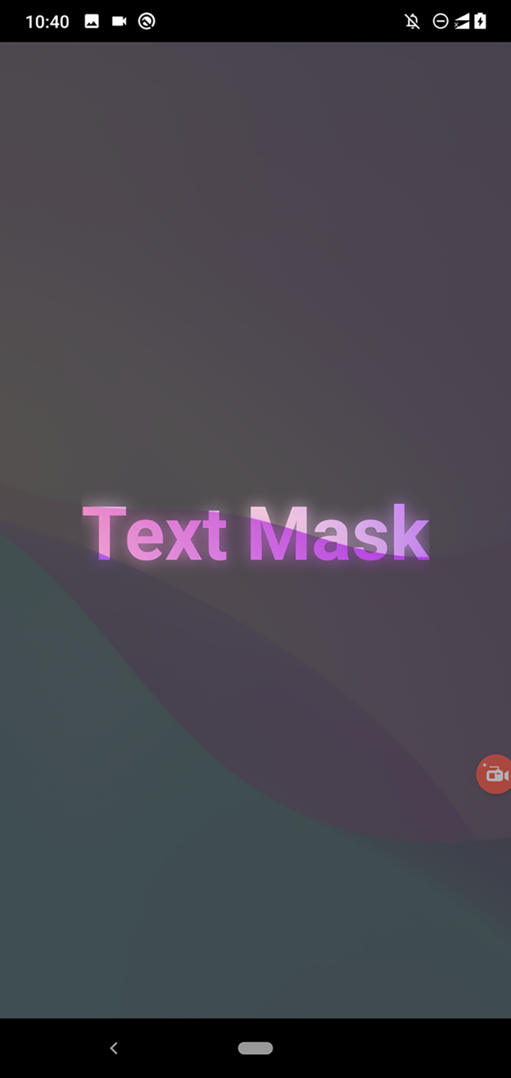
Earlier, we used a text mask with a background image. Now, we’ll use a vector shape as a mask. We can get started with shape masks by using a View component. As you already know, we can create a circle shape with a View component by adjusting its border radius.
Replace the Text component with a View component as follows:
maskElement={
  <View style={styles.maskWrapper}>
    <View style={styles.mask}></View>
  </View>
}>
Next, change the styling definition for the inner mask element:
mask: {
  width: 200,
  height: 200,
  backgroundColor: '#000',
  borderRadius: 100
},
Note that we still use maskWrapper for positioning purposes. The above styling snippet sets the border radius for the inner View, while the outer View uses a low alpha value to reveal the background image slightly, as shown in the following preview:
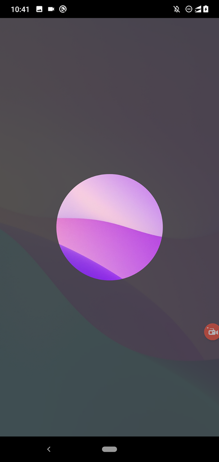
In previous examples, we used an image background with the mask, but the masking library supports using any React element behind the mask element. For example, you can use the well-known LinearGradient component behind the mask element as follows:
import React from 'react';
import {
  SafeAreaView,
  StyleSheet,
  Text,
  View,
  Image
} from 'react-native';
import MaskedView from '@react-native-masked-view/masked-view';
import LinearGradient from 'react-native-linear-gradient';

function App() {
  return (
    <SafeAreaView style={styles.container}>
      <MaskedView
        style={styles.maskedView}
        maskElement={
          <View style={styles.maskWrapper}>
            <View style={styles.mask}></View>
          </View>
        }>
        <LinearGradient
          start={{x: 0.0, y: 0.25}}
          end={{x: 0.5, y: 1.0}}
          locations={[0.2, 0.32, 0.4]}
          colors={['#0059FF', '#18AF00', '#6B99ED']}
          style={styles.image}
        />
      </MaskedView>
    </SafeAreaView>
  );
}

const styles = StyleSheet.create({
  container: {
    flex: 1,
    backgroundColor: '#444'
  },
  maskedView: {
    flex: 1,
    flexDirection: 'row',
    height: '100%'
  },
  maskWrapper: {
    backgroundColor: 'rgba(0, 0, 0, 0.2)',
    flex: 1,
    justifyContent: 'center',
    alignItems: 'center',
  },
  mask: {
    width: 200,
    height: 200,
    backgroundColor: '#000',
    borderRadius: 100
  },
  image: {
    flex: 1,
    height: '100%',
  },
});

export default App;
Note: Make sure to install the
react-native-linear-gradientpackage according to the official installation guidelines before running the following code.
The above code renders the following mask:
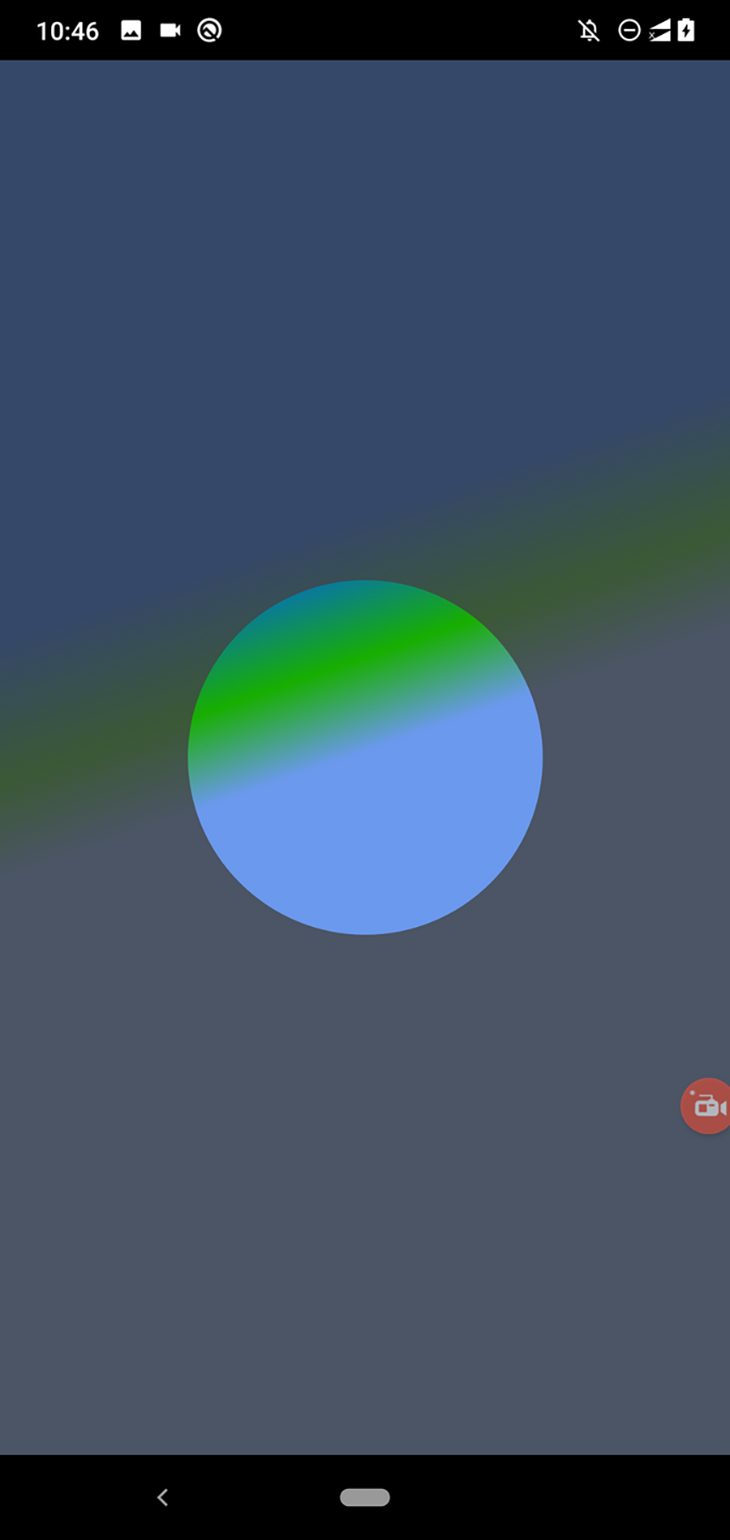
Using the same approach, you can use vector graphics from PNG files to create the mask element with the gradient background. Let’s try it!
Download this PNG image (a vector image of a heart sign from FlatIcon) in your project directory and rename it as heart.png. Next, add the following code to your App.js file:
import React from 'react';
import {
  SafeAreaView,
  StyleSheet,
  Text,
  View,
  Image
} from 'react-native';
import MaskedView from '@react-native-masked-view/masked-view';
import LinearGradient from 'react-native-linear-gradient';
import heartImage from './heart.png';
import backgroundImage from './texture.jpg';

function App() {
  return (
    <SafeAreaView style={styles.container}>
      <MaskedView
        style={styles.maskedView}
        maskElement={
          <View style={styles.maskWrapper}>
            <Image source={heartImage} style={styles.mask}/>
          </View>
        }>
        <LinearGradient
          start={{x: 0.0, y: 0.25}}
          end={{x: 0.5, y: 1.0}}
          locations={[0.2, 0.32, 0.35]}
          colors={['#AF0000', '#ED2F2F', '#FF5656']}
          style={styles.image}
        />
      </MaskedView>
    </SafeAreaView>
  );
}

const styles = StyleSheet.create({
  container: {
    flex: 1,
    backgroundColor: '#444'
  },
  maskedView: {
    flex: 1,
    flexDirection: 'row',
    height: '100%'
  },
  maskWrapper: {
    backgroundColor: 'rgba(0, 0, 0, 0.2)',
    flex: 1,
    justifyContent: 'center',
    alignItems: 'center',
  },
  mask: {
    width: 200,
    height: 200,
  },
  image: {
    flex: 1,
    height: '100%',
  },
});

export default App;
The above code uses a vector shape for the mask and a gradient as the mask’s background, as follows:
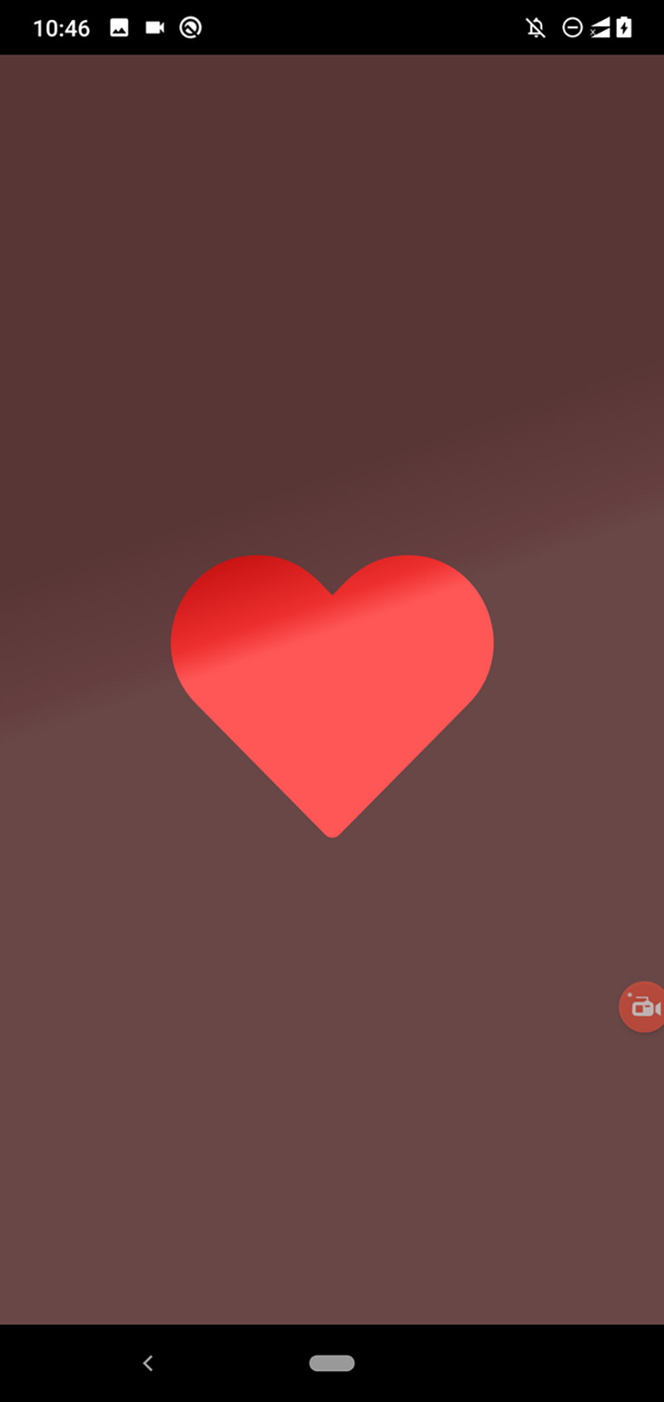
Image backgrounds also work as the same gradient backgrounds. Just use the following component instead of the previous LinearGradient component:
<Image source={backgroundImage} style={styles.image}/>
Now, the heart icon will reveal the background image we downloaded before:

Download more PNG files from the FlatIcon website and see what impressive backgrounds you can create for your login screen!
In previous examples, we used an image or a gradient layer as the mask element’s background. What if you need to show your app screen content through the mask element, such as to display a login screen through the previous vector mask?
Add the following code to your App.js:
import React, { useState, useEffect } from 'react';
import {
  SafeAreaView,
  StyleSheet,
  Text,
  TextInput,
  View,
  Image,
  Button,
} from 'react-native';
import MaskedView from '@react-native-masked-view/masked-view';
import LinearGradient from 'react-native-linear-gradient';
import heartImage from './heart.png';

function App() {
  return (
    <SafeAreaView style={styles.container}>
      <MaskedView
        style={styles.maskedView}
        maskElement={
          <View style={styles.maskWrapper}>
            <Image source={heartImage} style={styles.mask}/>
          </View>
        }>
        <View style={styles.loginBox}>
          <TextInput
            value=""
            placeholder="Username"
            placeholderTextColor="#666"
            style={styles.input}
          />
          <TextInput
            value=""
            placeholder="Password"
            placeholderTextColor="#666"
            secureTextEntry={true}
            style={styles.input}
          />
          <View style={styles.separator}/>
          <Button title="Login"/>
        </View>
      </MaskedView>
    </SafeAreaView>
  );
}

const styles = StyleSheet.create({
  container: {
    flex: 1,
    backgroundColor: '#444'
  },
  maskedView: {
    flex: 1,
    flexDirection: 'row',
    height: '100%'
  },
  maskWrapper: {
    backgroundColor: 'rgba(0, 0, 0, 0.2)',
    flex: 1,
    justifyContent: 'center',
    alignItems: 'center',
  },
  mask: {
    width: 360,
    height: 360,
  },
  loginBox: {
    flex: 1,
    height: '100%',
    justifyContent: 'center',
    backgroundColor: '#eee',
    padding: 80
  },
  input: {
    borderWidth: 1,
    borderColor: '#222',
    borderRadius: 4,
    padding: 12,
    marginBottom: 12
  },
  separator: {
    height: 20
  }
});

export default App;
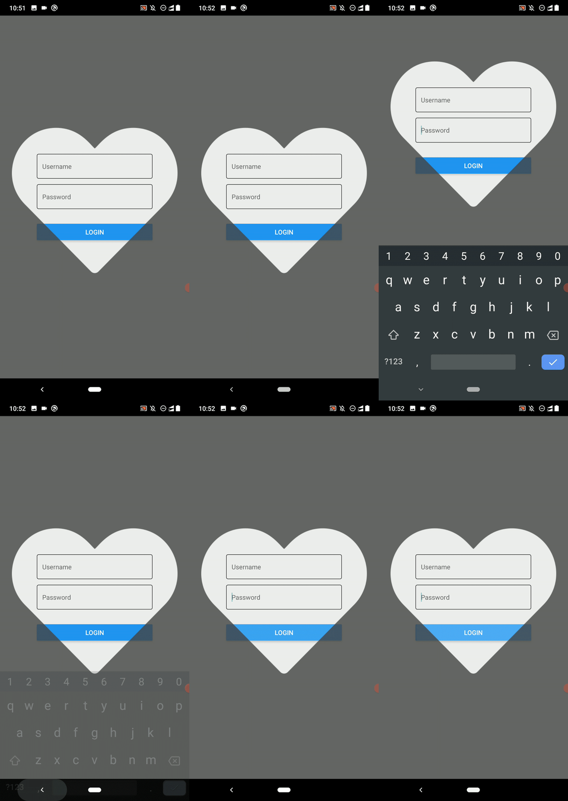
The above code implements a heart-shaped mask over a login box. You can click through the heart shape and activate the login box’s input elements — all touch events work perfectly through the mask region.
Look at the following preview:
Similarly, you can display vector shape masks over your app content. A good use case for this approach is to spotlight segments in your app for creating an app tour. Let’s turn the above heart-shaped mask into a simple app tour screen.
First, add the following styling definitions to your source code:
infoBox: {
  padding: 20,
  backgroundColor: '#555',
},
infoText: {
  fontSize: 14,
  color: '#eee'
}
Next, add the following info box code snippet after MaskedView:
</MaskedView>
<View style={styles.infoBox}>
  <Text style={styles.infoText}>Enter your login details in the above section...</Text>
</View>
You will see a simple app tour screen as follows:
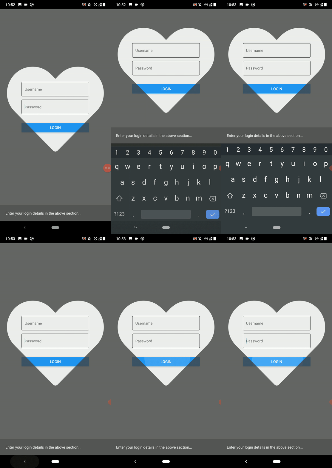
Here I demonstrated a use case with the vector shape we already downloaded — you’ll want to use a spotlight-like or a suitable vector mask element to create app tours.
If you’ve used the Twitter iOS app, you may remember its unique opener screen: when launched, it reveals the feed with an animated Twitter logo mask. The Twitter logo mask starts smaller and enlarges until the user sees the entire feed screen.
The react-native-masked-view library supports animated elements as the mask element, so we can create impressive opener animations with vector masks. Let’s animate the previous login screen’s mask and reveal the app content as the Twitter iOS app does.
Download or clone this GitHub repository where I stored the sample app content. Install dependencies and run the app. You will see the following animation:
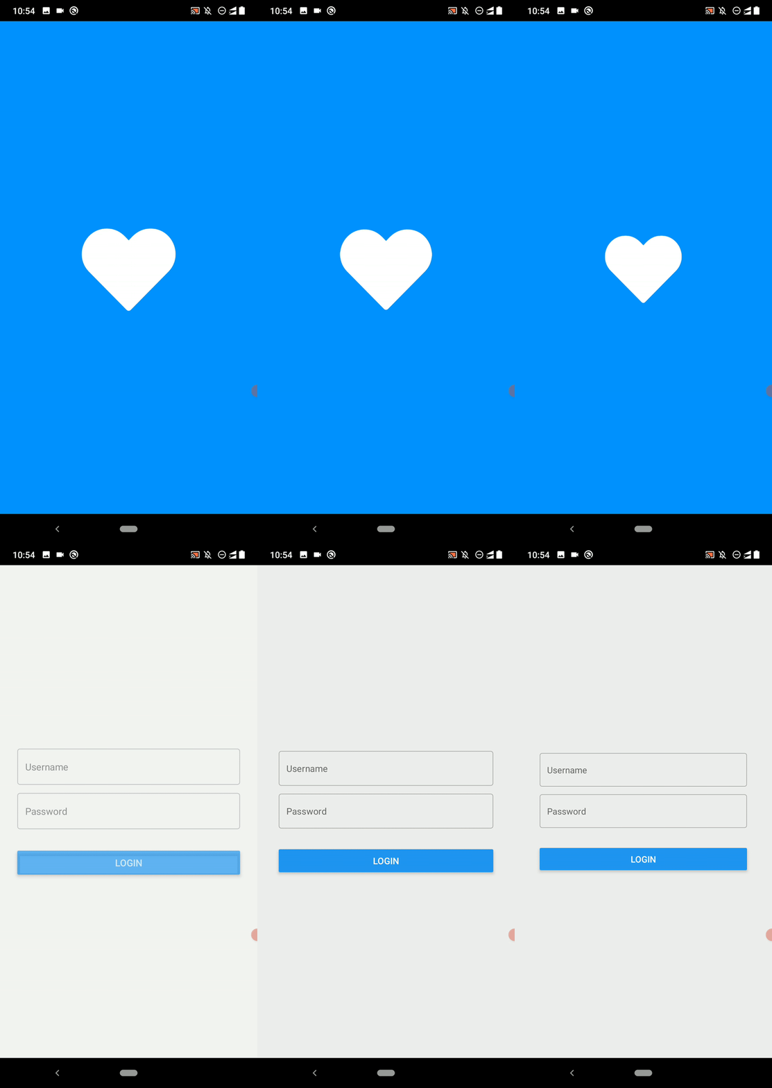
We used react-native-masked-view with the inbuilt animation API to create the animated heart icon. The animation looks simple, but it’s a bit confusing to envision its phases at this speed. We can view and understand the elements of the entire animation if we think about the following stages:
Let’s check some crucial facts in the above code. We used an Animated.Image component within the mask to dynamically change the mask’s scaling factor:
<MaskedView
  style={styles.maskedView}
  maskElement={
    <View style={styles.maskWrapper}>
      <Animated.Image source={heartImage}
        style={[styles.mask, maskScale]}/>
    </View>
For scaling down and fading in the login box, we used an Animated.View component:
<Animated.View style={[styles.loginBox, appScale, appOpacity]}>
The blue background layer comes before MaskedView in the code:
{ !animDone ? <View style={[StyleSheet.absoluteFill, styles.backgroundFillBlue]}></View> : null }
<MaskedView
The white background layer resides within MaskedView and is revealed during the heart icon mask animation. It disappears after the animation:
<MaskedView
  style={styles.maskedView}
  maskElement={
    <View style={styles.maskWrapper}>
      <Animated.Image source={heartImage}
        style={[styles.mask, maskScale]}/>
    </View>
  }>
  { !animDone ? <View style={[StyleSheet.absoluteFill, styles.backgroundFillWhite]}></View> : null }
  <Animated.View style={[styles.loginBox, appScale, appOpacity]}>
Now, use your mobile app’s logo instead of the heart.png file and adjust the animation as you wish. You also can wrap the above component’s source into a React Native package and create a compelling opener screen for your apps in record time.
Check this article from the React Native blog to learn more about implementing the Twitter iOS app’s opener animation in React Native. I used the same approach in the above demo app.
In this tutorial, we developed some practical examples to learn how to use the react-native-masked-view library to create compelling visuals in React Native apps. It’s possible to use this library to create text and vector masks with image, gradient, and app element-based backgrounds. Also, you can use any React element as the mask.
As I demonstrated before, you can use the inbuilt animation API with MaskedView to create dynamic, animated mask elements.

LogRocket's Galileo AI watches sessions for you and and surfaces the technical and usability issues holding back your React Native apps.
LogRocket also helps you increase conversion rates and product usage by showing you exactly how users are interacting with your app. LogRocket's product analytics features surface the reasons why users don't complete a particular flow or don't adopt a new feature.
Start proactively monitoring your React Native apps — try LogRocket for free.

A side-by-side look at Astro and Next.js for content-heavy sites, breaking down performance, JavaScript payload, and when each framework actually makes sense.

AI-generated tests can speed up React testing, but they also create hidden risks. Here’s what broke in a real app.re

Why the future of DX might come from the web platform itself, not more tools or frameworks.

A hands-on test of Claude Code Review across real PRs, breaking down what it flagged, what slipped through, and how the pipeline actually performs in practice.
Would you be interested in joining LogRocket's developer community?
Join LogRocket’s Content Advisory Board. You’ll help inform the type of content we create and get access to exclusive meetups, social accreditation, and swag.
Sign up now