Oftentimes as React Native developers, we are tasked with creating authentication flows that require the user to enter a one-time password, or OTP.

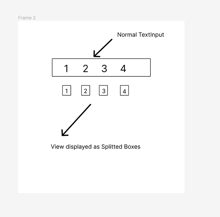
OTPs can be a daunting task when we consider the handling of a TextInput that comes with creating this feature. A classic TextInput display takes the text entered by a user and outputs it, albeit hidden by asterisks, within one box. But what if we want to split the display to create one box for each OTP digit? We can do exactly that!
In this article, we’ll learn how to create split OTP input fields in React Native without using external packages.
To set up the development environment, we’ll use the Expo CLI. To create a new React Native project in Expo, run the following command:
expo init splitOTP
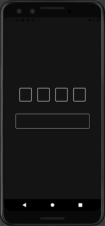
Select the blank option, and this will bootstrap your project for you. Next, run expo start to start up the Metro server. You can either open the app on an Android emulator or iOS simulator. The screenshots in this article will be Android, but it should be nearly identical on iOS.
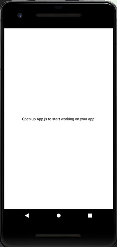
Right now, our emulator should be looking like this:
We’ll use styled-components for app styling, which you can install with:
>npm i start
or…
yarn add styled-components
The concept of implementing the split OTP feature is to make TextInput our reference component or, in other words, our source of truth. For each digit this text input receives, we’ll render a styled View in the form of a box.
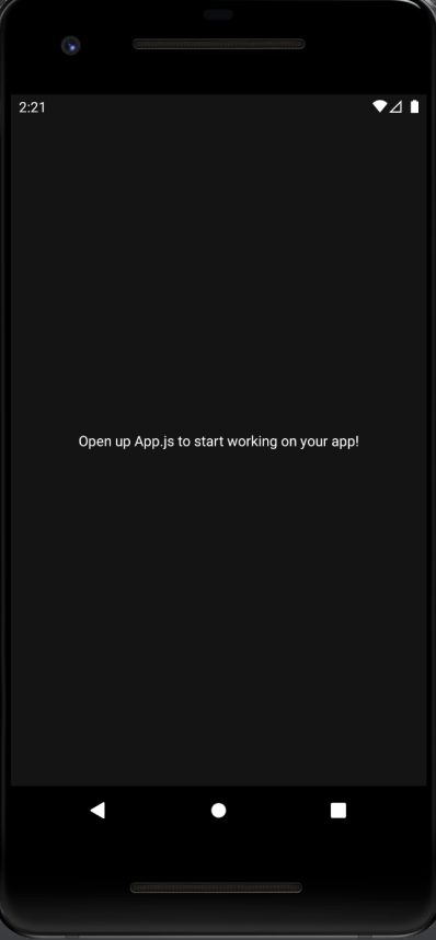
Afterward, the text input will be hidden and called using the useRef Hook as needed. I changed the background-color of the container View to be darker so our implementation is more visible.
The following code snippet shows our entry file, App.js, where we’ve modified the background color:
export default function App() {
 return (
   <View style={styles.container}>
     <Text
       style={{
         color: "white",
       }}
     >
       Open up App.js to start working on your app!
     </Text>
     <StatusBar style="auto" />
   </View>
 );
}

const styles = StyleSheet.create({
 container: {
   flex: 1,
   backgroundColor: "#141414",
   alignItems: "center",
   justifyContent: "center",
 },
});
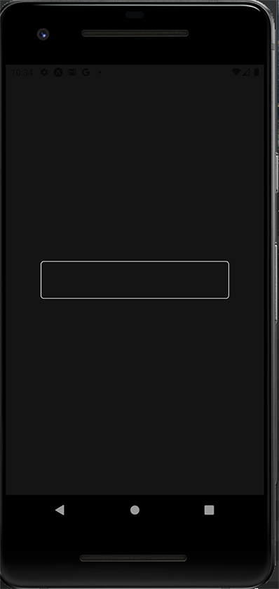
TextInput componentMoving on, we’ll create the components folder. Inside this folder, we will have another folder called OTP that will house the OTPInput.js and Styles.js files.
Inside the OTPInput.js file, we’ll have two components created with the styled component: TextInputHidden, the text input we will be hiding later; and OTPInputContainer, housing the text input itself.
Below is our Styles.js file:
import styled from "styled-components/native";

export const OTPInputContainer = styled.View`
 justify-content: center;
 align-items: center;
`;

export const TextInputHidden = styled.TextInput`
 width: 300px;
 border-color: #e5e5e5;
 border-width: 1px;
 border-radius: 5px;
 padding: 15px;
`;
And here is the code in our OTPInput.js file:
import React from "react";
import { OTPInputContainer, TextInputHidden } from "./styles";

const OTPInput = () => {
 return (
   <OTPInputContainer>
     <TextInputHidden />
   </OTPInputContainer>
 );
};

export default OTPInput;
Now, we’ll use the OTPInput component in App.js so we can render the whole implementation in our emulator/simulator:
import { StatusBar } from "expo-status-bar";
import { StyleSheet, Text, View } from "react-native";
import OTPInput from "./components/OTP/OTPInput";

export default function App() {
 return (
   <View style={styles.container}>
     <OTPInput />
     <StatusBar style="auto" />
   </View>
 );
}

const styles = StyleSheet.create({
 container: {
   flex: 1,
   backgroundColor: "#141414",
   alignItems: "center",
   justifyContent: "center",
 },
});
We’ll initialize some states in App.js and pass them down as props to the OTPInput.js file.
The first state will be code, an empty string that will store the value entered in the input field.
The second state will be isPinReady, a Boolean that will be false by default and true when the user enters the required number of expected digits.
Now, we will declare the maximum length of our expected numbers as four (this can be declared based on your use case).
We’ll pass these states as a prop to the OTPInput component. Next, we’ll destructure all the values we pass as props into the OTPInput.js component in App.js. The destructured values will be passed to TextInputHidden.
Next, we’ll set the value of the TextInput component to the code state and set the onChangeText to setCode. The onChangeText will update the code state (set as an empty string earlier) as the user enters the values.
Since we are only expecting numbers to be entered into the input field, we set keyboardType to number-pad and the maxLength as the maximum number that can be entered. In our case, again, it’s four.
To handle the onBlur event when the input is out of focus, we’ll use the useRef Hook and handleOnBlur function. We’ll create a reference variable with useRef and set the initial value to null. For the handleOnBlur function, we make a declaration for later use.
Now, in our App.js file, we will set all the states and pass it as props to the OTPInput component as shown below:
import { useState } from "react";
import { StatusBar } from "expo-status-bar";
import { StyleSheet, Text, View } from "react-native";
import OTPInput from "./components/OTP/OTPInput";

export default function App() {
 const [otpCode, setOTPCode] = useState("");
 const [isPinReady, setIsPinReady] = useState(false);
 const maximumCodeLength = 4;
 return (
   <View style={styles.container}>
     <OTPInput
       code={otpCode}
       setCode={setOTPCode}
       maximumLength={maximumCodeLength}
       setIsPinReady={setIsPinReady}
     />
     <StatusBar style="auto" />
   </View>
 );
}

const styles = StyleSheet.create({
 container: {
   flex: 1,
   backgroundColor: "#141414",
   alignItems: "center",
   justifyContent: "center",
 },
});
Inside OTPInput.js, we will receive the props we passed to the OTPInput component and destructure them for use:
import React, { useRef } from "react";
import { OTPInputContainer, TextInputHidden } from "./styles";

const OTPInput = ({ code, setCode, maximumLength, setIsPinReady }) => {
 const inputRef = useRef();

 const handleOnBlur = () => {};
 return (
   <OTPInputContainer>
     <TextInputHidden
       value={code}
       onChangeText={setCode}
       maxLength={maximumLength}
       ref={inputRef}
       onBlur={handleOnBlur}
     />
   </OTPInputContainer>
 );
};

export default OTPInput;
Now, we will create some components for the split input boxes themselves. First, we’ll create a Pressable component called SplitOTPBoxesContainer and give it some styling. Then, we’ll make a View component called SplitBoxes to render our split boxes and the text component (SplitBoxText) to display the text.
You can see the code in our Styles.js file below:
export const SplitOTPBoxesContainer = styled.Pressable`
 width: 80%;
 flex-direction: row;
 justify-content: space-evenly;
`;
export const SplitBoxes = styled.View`
 border-color: #e5e5e5;
 border-width: 2px;
 border-radius: 5px;
 padding: 12px;
 min-width: 50px;
`;

export const SplitBoxText = styled.Text`
 font-size: 20px;
 text-align: center;
 color: #e5e5e5;
`;
Moving back to OTPInput.js, we’ll put the SplitOTPBoxesContainer above the TextInputHidden component.
Inside the SplitOTPBoxesContainer, we’ll map through the digits of the TextInputHidden component and render a box for each of them. We’ll create an array with a maximum length of four using the Array.fill() method and initialize the input field indices with 0.
const boxArray = new Array(maximumLength).fill(0);
When we log the boxArray to the console, we get this as a result:
Array [
   0,
   0,
   0,
   0,
 ]
Now, we will create a function to handle the mapping for each value in the array and render a box for each value. It will receive the value and index from the Array.map method.
We first create a variable emptyInput, an empty string that will render when an input box is empty. Each digit will be extracted from the code input string using the index, and, if it’s empty, will return the emptyInput variable we declared earlier.
The View component for SplitBoxes will then be returned with the SplitBoxText. The value for the SplitBoxText will be the digit, and the index will be passed as the key to the SplitBoxes.
In the SplitOTPBoxesContainer, we’ll map through the boxArray and pass in the boxDigit function to render the split boxes. This will render the boxes in reference to the number of digits in the boxArray, which will be four.
We will implement this in our OTPInput.js file:
const OTPInput = ({ code, setCode, maximumLength, setIsPinReady }) => {
 const boxArray = new Array(maximumLength).fill(0);
 const inputRef = useRef();

 const boxDigit = (_, index) => {
   const emptyInput = "";
   const digit = code[index] || emptyInput;
   return (
     <SplitBoxes key={index}>
       <SplitBoxText>{digit}</SplitBoxText>
     </SplitBoxes>
   );
 };

 const handleOnBlur = () => {};
 return (
   <OTPInputContainer>
     <SplitOTPBoxesContainer>{boxArray.map(boxDigit)}</SplitOTPBoxesContainer>
     <TextInputHidden
       value={code}
       onChangeText={setCode}
       maxLength={maximumLength}
       ref={inputRef}
       onBlur={handleOnBlur}
     />
   </OTPInputContainer>
 );
};
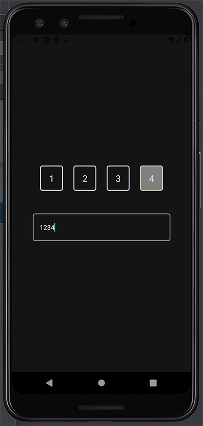
Now we can check the split boxes in our emulator/simulator and enter some values!
When we press each box, we need to highlight the current input box with its background color and trigger the keyboard. Remember that we have SplitOTPBoxesContainer, a pressable component. We’ll pass the onPress prop to it with the function handleOnPress.
To achieve this, we’ll declare a Boolean state to check whether we are in focus. It’ll be false by default for the input boxes.
In the handleOnPress function, we set the focus state we created to true and use the inputRef to trigger it to be in focus. In the handleOnBlur function, we will set the focus state back to false.
At this point, we should be able to press on the TextInput to enter the PIN digits and see them in the split boxes and the TextInput:
 const [isInputBoxFocused, setIsInputBoxFocused] = useState(false);

 const handleOnPress = () => {
   setIsInputBoxFocused(true);
   inputRef.current.focus();
 };

 const handleOnBlur = () => {
   setIsInputBoxFocused(false);
 };
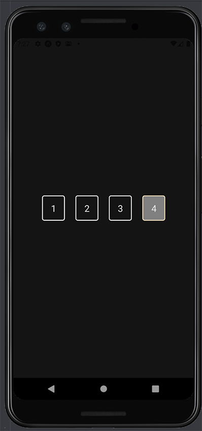
To complete the current box highlight, we’ll create a new styled component in our Styles.js file called SplitBoxesFocused that’ll be based on the SplitBoxes, modifying the background and border-color:
export const SplitBoxesFocused = styled(SplitBoxes)`
 border-color: #ecdbba;
 background-color: grey;
`;
In the boxDigit function, we’ll establish a few variables:
isCurrentValue: check if the mapping’s current value is the current digit or box to be focused onisLastValue: check for the last digitisCodeComplete: check and will be true if the length of the code is the same as the maximum length we specified earlierisValueFocused: check if the value is focused. This will be true if it is the current or last value, and if the code is complete.Now, we want to toggle between the SplitBoxes and SplitBoxesFocused. We will create a new variable called StyledSplitBoxes. If both the text input and value are focused, we will return the SplitBoxesFocused; otherwise, we will return SplitBoxes.
Next, we will replace the StyledSplitBoxes with the SplitBoxes. We can have our focused input box rendered with the specified background color.
const boxDigit = (_, index) => {
   const emptyInput = "";
   const digit = code[index] || emptyInput;

   const isCurrentValue = index === code.length;
   const isLastValue = index === maximumLength - 1;
   const isCodeComplete = code.length === maximumLength;

   const isValueFocused = isCurrentValue || (isLastValue && isCodeComplete);

   const StyledSplitBoxes =
     isInputBoxFocused && isValueFocused ? SplitBoxesFocused : SplitBoxes;
   return (
     <StyledSplitBoxes key={index}>
       <SplitBoxText>{digit}</SplitBoxText>
     </StyledSplitBoxes>
   );
What if we want to add dynamism to our app to make it look even better?
To achieve this, we can use the useEffect Hook and update the value of setIsPinReady to true whenever all the required digits have been filled.
 useEffect(() => {
   // update pin ready status
   setIsPinReady(code.length === maximumLength);
   // clean up function
   return () => {
     setIsPinReady(false);
   };
 }, [code]);
code was added as a dependency, so useEffect will only run when the code value changes. Then, we’ll update the TextInputHidden styled component to hide it entirely, but without losing any of its control:
export const TextInputHidden = styled.TextInput`
 position: absolute;
 opacity: 0;
`;
If the keyboard is pulled up and a user presses anywhere on the screen outside the boxes, the keyboard should be dismissed. We can use Pressable and Keyboard from React Native.
The View component wrapping the text input will be replaced by the Pressable component, and the onPress function will be attached to call the keyboard.dismiss function as shown below:
import { StyleSheet, Text, View, Pressable, Keyboard } from "react-native";
import OTPInput from "./components/OTP/OTPInput";

export default function App() {
 const [otpCode, setOTPCode] = useState("");
 const [isPinReady, setIsPinReady] = useState(false);
 const maximumCodeLength = 4;
 return (
   <Pressable style={styles.container} onPress={Keyboard.dismiss}>
     <OTPInput
       code={otpCode}
       setCode={setOTPCode}
       maximumLength={maximumCodeLength}
       setIsPinReady={setIsPinReady}
     />
     <StatusBar style="auto" />
   </Pressable>
 );
}
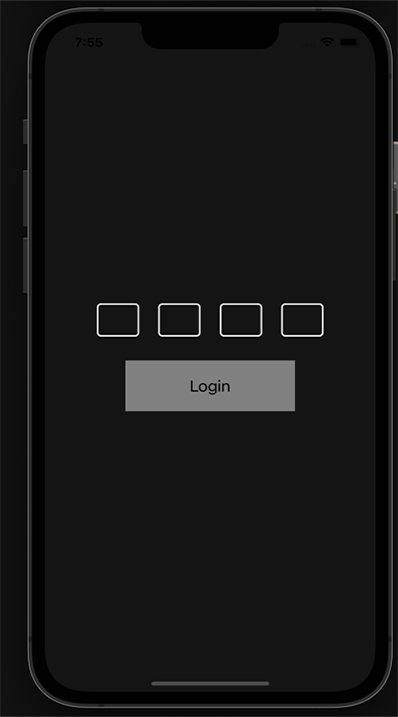
Let’s say we have a submit button in the design that needs to be implemented alongside this feature.
We can first create the button using the TouchableOpaity and Text component and render it in Styles.js:
export const ButtonContainer = styled.TouchableOpacity`
 background-color: #d8e9a8;
 padding: 20px;
 justify-content: center;
 align-items: center;
 width: 200px;
 margin-top: 30px;
`;

export const ButtonText = styled.Text`
 color: black;
 font-size: 20px;
`;
Then, in our App.js file, we’ll use the two components we just created:
export default function App() {
 const [otpCode, setOTPCode] = useState("");
 const [isPinReady, setIsPinReady] = useState(false);
 const maximumCodeLength = 4;
 return (
   <Pressable style={styles.container} onPress={Keyboard.dismiss}>
     <OTPInput
       code={otpCode}
       setCode={setOTPCode}
       maximumLength={maximumCodeLength}
       setIsPinReady={setIsPinReady}
     />

     <ButtonContainer>
       <ButtonText>Login</ButtonText>
     </ButtonContainer>
     <StatusBar style="auto" />
   </Pressable>
 );
}
Using the isPinReady state, we can toggle this button to be active or inactive, depending on whether all the digits have been entered.
<
ButtonContainer
       disabled={!isPinReady}
       style={{
         backgroundColor: !isPinReady ? "grey" : "#000000",
       }}
     >
       <ButtonText
         style={{
           color: !isPinReady ? "black" : "#EEEEEE",
         }}
       >
         Login
       </ButtonText>
     </ButtonContainer>
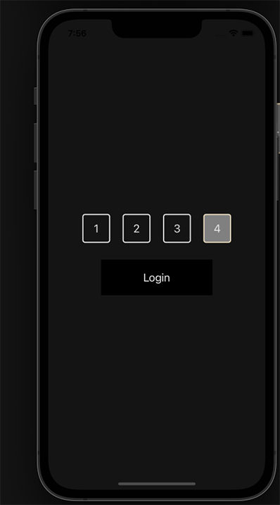
And there we have it!
We have successfully created a split OTP input field in React Native! It can be adjusted to the number of digits a user needs to enter by modifying the maximum length number.
You can find the link to the GitHub repository here.

LogRocket's Galileo AI watches sessions for you and and surfaces the technical and usability issues holding back your React Native apps.
LogRocket also helps you increase conversion rates and product usage by showing you exactly how users are interacting with your app. LogRocket's product analytics features surface the reasons why users don't complete a particular flow or don't adopt a new feature.
Start proactively monitoring your React Native apps — try LogRocket for free.

Learn how to use Fallow to analyze AI-generated code, detect dead code, duplicate logic, and complexity issues, and integrate automated code quality checks into your AI-assisted development workflow.

Learn how to protect full-stack projects from NPM supply chain attacks with a practical security checklist.

Explore 15 essential MCP servers for web developers to enhance AI workflows with tools, data, and automation.

Learn how contrast-color() automatically picks accessible text colors using native CSS, without JavaScript.
Would you be interested in joining LogRocket's developer community?
Join LogRocket’s Content Advisory Board. You’ll help inform the type of content we create and get access to exclusive meetups, social accreditation, and swag.
Sign up now

 Learn more →
