There are many libraries today that handle drag-and-drop, list sorting, and reordering. In the era of jQuery widgets, dozens of plugins could easily transform simple and static lists in deep-interactive and dynamic structures.

In the world of vanilla JavaScript, we have the famous Sortable.js. With more than 20.5k stars on its GitHub repo at the time of this writing, the community behind the library has built a solid environment that spreads throughout lots of supports: jQuery, Meteor.js, AngularJS, React, Polymer, Vue, Ember, Knockout and any CSS library, e.g. Bootstrap.
It is also supported in most modern browsers, including a fallback option available at the API for non HTML5 browsers, providing us with the ability to test the behavior in older browsers or make the drag-and-drop feel more consistent between desktop, mobile, and old browsers.
In this tutorial, we’re going to explore the official support for React via the react-sortablejs wrapping component. Let’s analyze how Sortable.js organizes a list of items by creating, editing, and deleting some of them. Finally, we’ll allow the user to switch between a list of items and a grid disposition.
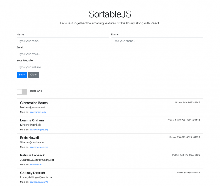
At the end of the tutorial, this is how our example will look:

The Replay is a weekly newsletter for dev and engineering leaders.
Delivered once a week, it's your curated guide to the most important conversations around frontend dev, emerging AI tools, and the state of modern software.
Before going any further, make sure you have a recent version of Node.js and npm installed. We’ll also need the npx package in order to make use of the create-react-app toolchain.
In a folder of your preference, run the following commands to initialize the Yarn management tool and then create our React project:
yarn init
npx create-react-app sortable-js-app
This will be enough to initialize the project with the React files we need so far. Next, install the following dependencies:
yarn add axios jquery bootstrap popper.js react-sortablejs styled-components
The Axios dependency will be used to retrieve a pre-fetched list of users from the public fake web services called json placeholder. It is very useful for CRUD or other types of web application testing. It provides fake endpoints with JSON data that we can use to check if our app structures are working.
Bootstrap, jquery and Popper.js are required to make the Bootstrap framework work. We won’t create any out-of-the-box design for this example, so let’s leave this job for Bootstrap.
The last two dependencies are the react-sortablejs lib itself, along with the styled-components that we’ll make use to infer some inline styling to our components.
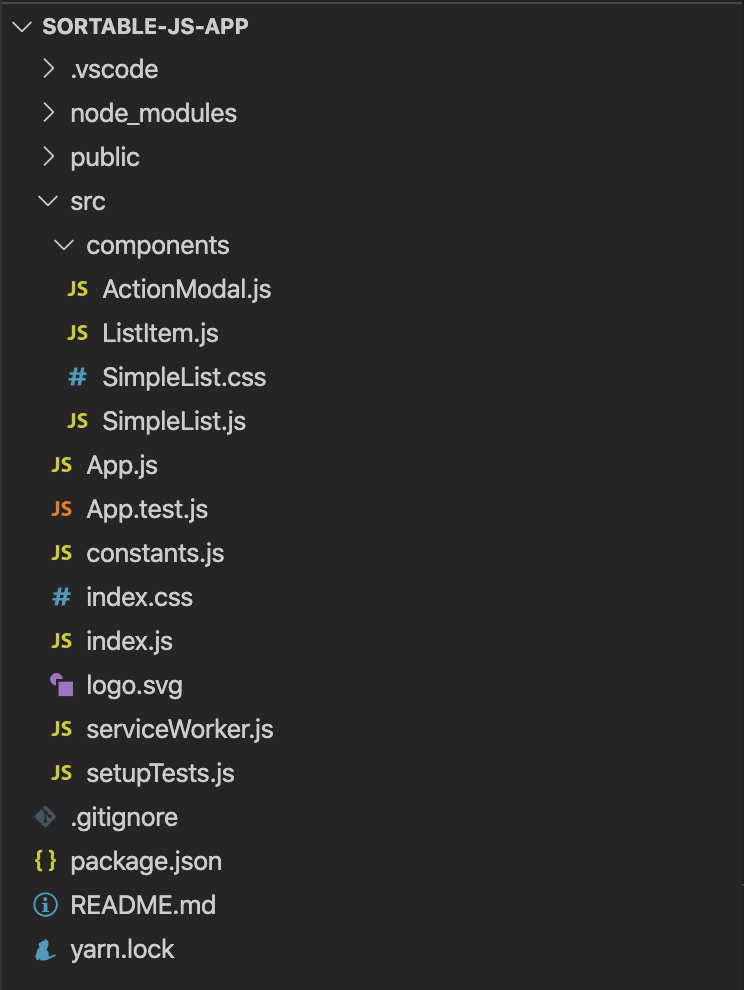
To finish, you’ll need to reproduce the file and folder’s structure to your local example. This is how the project structure looks:

Within the components folder, you may find the ActionModal.js component. It is responsible for holding the logic for the action modal, which will exhibit the editing and deleting options after one of the list or grid items is clicked.
We’ll provide a full CRUD for a list of users in this example. It lets us live edit and delete items from the list and get it refreshed right after.
The ListItem.js is going to host the structure for each one of the list’s items, while the SimpleList.js is our main component. It’s the one that will store the integration among the others and the main functions to sustain the example functioning.
Now, let’s move onto the example implementation starting with the index.js file, which is located at the heart of the app.
Open it and change its contents to the following:
import React from "react";
import ReactDOM from "react-dom";
import "./index.css";
import App from "./App";
import * as serviceWorker from "./serviceWorker";

import $ from "jquery";
import Popper from "popper.js";
import "bootstrap/dist/js/bootstrap.bundle.min";
import "bootstrap/dist/css/bootstrap.min.css";

ReactDOM.render(
  <React.StrictMode>
    <App />
  </React.StrictMode>,
  document.getElementById("root")
);

// If you want your app to work offline and load faster, you can change
// unregister() to register() below. Note this comes with some pitfalls.
// Learn more about service workers: https://bit.ly/CRA-PWA
serviceWorker.unregister();
Here, we’re just importing the Bootstrap CSS and JavaScript dependencies so they can be seen when we use them in later files.
You may notice too that the jQuery and Popper dependencies are “not being used,” as VS Code would state. However, they’re needed here. Otherwise, we can’t use the Bootstrap dynamic features, like the modal.
Leave the rest as it is and move forward to the ActionModal component. Open the file and place the following code into it:
import React from "react";
const ActionModal = ({ item, handleDelete }) => {
return (
<div className="modal fade" tabIndex="-1" id="actionModal" role="dialog">
<div className="modal-dialog" role="document">
<div className="modal-content">
<div className="modal-header">
<h5 className="modal-title">Action Modal</h5>
<button
type="button"
className="close"
data-dismiss="modal"
aria-label="Close"
>
<span aria-hidden="true">×</span>
</button>
</div>
<div className="modal-body">
<p>
What do you want to do with <b>{item.name}</b>?
</p>
</div>
<div className="modal-footer">
<button
type="button"
data-dismiss="modal"
className="btn btn-warning"
>
Edit item
</button>
<button
type="button"
className="btn btn-danger"
data-dismiss="modal"
onClick={() => handleDelete(item.id)}
>
Delete item
</button>
</div>
</div>
</div>
</div>
);
};
export default ActionModal;
Here, we’re receiving two props as params: the item to be edited or deleted, and the function to handle the deletion (handleDelete). These operations will be performed by the main component.
We’re not going to receive any handleEdit function, for example, because this logic will also be maintained by the root component, as you will see.
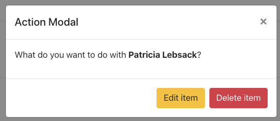
The component itself is very simple. It’s composed by a couple of divs and their respective Bootstrap classes, along with the delete button receiving the proper deletion function. The modal should look like this:

Now, let’s move onto the ListItem component. This should be its contents:
import React from "react";
import styled from "styled-components";

const Item = styled.div`
  background-color: #fff6;
  cursor: pointer;
`;

const ListItem = ({ item, prepareAction, isGrid }) => {
  return (
    <Item
      className={isGrid ? "col-md-3 grid-group-item" : "list-group-item"}
      data-toggle="modal"
      data-target="#actionModal"
      id={`person-${item.id}`}
      key={item.id}
      onClick={() => prepareAction(item)}
    >
      <div className="d-flex w-100 justify-content-between">
        <h5 className="mb-1">{item.name}</h5>
        <small>Phone: {item.phone}</small>
      </div>
      <p className="mb-1">{item.email}</p>
      <small>
        More on:{" "}
        <i>
          <a href={`https://${item.website}`}>www.{item.website}</a>
        </i>
      </small>
    </Item>
  );
};

export default ListItem;
This is the first time we’re making use of the styled-components. It’s just a small piece of code to add a background color and the cursor style to each list item.
The component, in turn, will receive three props: the same item to be displayed, the function that’ll take care of the preparation of an action (i.e., getting the selected item and placing it into the respective state value), and a boolean (isGrid) to determine if the user changed the view disposition from list to grid.
The latest boolean param is very important because it helps the rest of the component to switch between a list and a grid regarding the style classes. These classes are the way Bootstrap sees a list and a grid. We’ll also add some of our own CSS to enhance the overall style.
Note also that this part of the code doesn’t relate directly to the Sortable.js component. However, it is important because, in the end, it represents an individual item that will be placed within the sortable component.
Pay special attention to the key property of the Item component. There’s a caveat in the react-sortablejs documentation that states for the users to not use the index as a key for the list items, since the sorting will not work. Instead, you should use the object’s id.
The rest of the code is just concatenating the item’s properties to the Bootstrap elements.
Finally, we have the SimpleList component. Since it is a bit long, we’ll break it into smaller pieces so it’s easier to understand.
Open the file, and add the following content at the top:
import React, { useEffect, useState } from "react";
import { ReactSortable, Swap, Sortable } from "react-sortablejs";
import axios from "axios";

import ListItem from "./ListItem";
import { BASE_URL } from "../constants";
import ActionModal from "./ActionModal";

import "./SimpleList.css";

const initialState = {
  id: "",
  name: "",
  phone: "",
  email: "",
  website: "",
};

Sortable.mount(new Swap());

const SimpleList = () => {
  const [list, setList] = useState([]);
  const [user, setUser] = useState(initialState);
  const [isGrid, setIsGrid] = useState(false);

  const [isEdit, setIsEdit] = useState(false);
  const [isSuccess, setSuccess] = useState(false);
  const [actionItem, setActionItem] = useState(initialState);

};

export default SimpleList;
For now, we’re just initializing the necessary stuff, like the react-sortablejs components and Axios. We’re creating the initialState object that will help to reset the state whenever necessary.
The Sortable object helps with some auxiliary features like swapping. By default, Sortable.js stacks its list items and places the dragged item in the exact position you drop it, repositioning the rest of the pile accordingly.
When you state that it should swap, it’ll switch the dragged item position with the position of the place where the same item was dropped.
The rest of the code is just a bunch of state variables we’ll need for the CRUD work. You can see also the import of a constants.js file, which should be created as well and have the following code:
export const BASE_URL = `http://jsonplaceholder.typicode.com/users`;
This is basically the constant with the users endpoint to initialize our list.
Now, let’s jump to the component functions that, in turn, will help us with the component logic. You must place the following code right after the state variable declarations:
const handleChange = (event) => {
    if (isEdit) {
      setActionItem({
        ...actionItem,
        [event.target.name]: event.target.value,
      });
    } else {
      setUser({
        ...user,
        [event.target.name]: event.target.value,
      });
    }
  };

  const prepareAction = (item) => {
    setIsEdit(true);
    setActionItem(item);
  };

  const handleSubmit = (event) => {
    event.preventDefault();

    if (isEdit) {
      const copyList = [...list];
      let index = copyList.findIndex((item) => item.id === actionItem.id);

      copyList[index] = actionItem;
      setList(copyList);
    } else {
      setList([...list, user]);
    }

    setSuccess(true);

    reset();
  };

  const handleDelete = (id) => {
    setList(list.filter((item) => item.id !== id));
    reset();
  };

  const handleLayoutChange = () => {
    setIsGrid(!isGrid);
  };

  const reset = () => {
    document.getElementById("list-form").reset();
    setIsEdit(false);
    setUser(initialState);
    setActionItem(initialState);

    setTimeout(function () {
      setSuccess(false);
    }, 5000);
  };

  useEffect(() => {
    axios.get(BASE_URL).then((res) => {
      setList(res.data);
    });
  }, []);
A few important points here.
First off, the handleChange is the function that will make sure to update the user (or the actionItem if it’s an editing process) whenever the user inputs something into the respective form fields. Whenever the user clicks on an item, we’ll consider this as an intention to edit/delete it. That’s why we need two different objects to hold the values of a creation and an editing of a user.
There’s other ways to do that. You could display the editing form in a modal, for example, but we’ll stick to the same form for the sake of simplicity.
The prepareAction function is going to set the isEdit boolean to true, since it is an editing action. It will also set the current item (sent as a param) to the actionItem state. This object will be useful to display the proper values into the form fields.
The handleSubmit takes care of the form submission process. If they want to edit, create a copy of the current list of users (we don’t want to mess up with their values), find the index of the current selected item, and replace its element with the current actionItem. Since it is going to be properly updated with the changed values by the assurance of the handleChange function.
If it is a new user being created, though, we just add it to the list. Make sure to always reset the object states after each creation/editing, since a new action is probably going to happen further.
The reset function, in turn, calls the form resetting feature, and re-initializes all the React state’s values. Here, pay special attention to the success property, which holds the boolean to determine if the alert section should be visible or not. This section is going to show a success message after an action has finished to let the user know what’s happening in the app.
The handleDelete just performs a deletion over the list of users, then resets the state values again. Meanwhile, the handleLayoutChange function toggles the boolean variable that defines if the layout should be a list or a grid.
Finally, we have the useEffect Hook, which is going to execute after the React component has rendered. Its job is to call the external endpoint of users and feed our list with some data prior to its exhibition.
Let’s finish the code with the return content:
return (
<>
{isSuccess ? (
<div
className="alert alert-success alert-dismissible fade show"
role="alert"
>
<strong>Success!</strong>
<button
type="button"
className="close"
data-dismiss="alert"
aria-label="Close"
>
<span aria-hidden="true">×</span>
</button>
</div>
) : (
""
)}
<form onSubmit={handleSubmit} id="list-form">
<div className="form-row">
<div className="col">
<label htmlFor="name">Name:</label>
<input
type="text"
required
className="form-control"
id="name"
name="name"
defaultValue={actionItem.name}
placeholder="Type your name..."
onChange={handleChange}
/>
</div>
<div className="col">
<label htmlFor="phone">Phone:</label>
<input
type="text"
required
className="form-control"
id="phone"
name="phone"
defaultValue={actionItem.phone}
placeholder="Type your phone..."
onChange={handleChange}
/>
</div>
</div>
<div className="form-row mt-2">
<div className="col">
<label htmlFor="email">Email:</label>
<input
type="text"
required
className="form-control"
id="email"
name="email"
defaultValue={actionItem.email}
placeholder="Type your email..."
onChange={handleChange}
/>
</div>
</div>
<div className="form-row mt-2">
<div className="col">
<label htmlFor="website">Your Website:</label>
<input
type="text"
required
className="form-control"
id="website"
name="website"
defaultValue={actionItem.website}
placeholder="Type your website..."
onChange={handleChange}
/>
</div>
</div>
<button type="submit" className="btn btn-primary mb-4 mt-2">
Save
</button>
<button
type="button"
className="btn btn-secondary mb-4 ml-2 mt-2"
onClick={reset}
>
Clear
</button>
</form>
<hr className="mb-4" />
<div className="mb-3">
<label className="switch ">
<input type="checkbox" onChange={handleLayoutChange} />
<span className="slider"></span>
</label>
<span className="ml-2">Toggle Grid</span>
</div>
<ReactSortable
swap
id={isGrid ? "people-grid" : "people-list"}
className={isGrid ? "row" : "list-group"}
chosenClass="chosen-list"
list={list}
setList={setList}
animation={150}
>
{isGrid
? parseToGrid(list).map((array) =>
array.map((item) => (
<ListItem
isGrid={isGrid}
prepareAction={prepareAction}
item={item}
key={item.id}
/>
))
)
: list.map((item) => (
<ListItem
isGrid={isGrid}
prepareAction={prepareAction}
item={item}
key={item.id}
/>
))}
</ReactSortable>
<ActionModal item={actionItem} handleDelete={handleDelete} />
</>
);
As you can see, it’s a long code listing, because we have a lot of components shown in the page. You can, obviously, break it into more components and change as you feel.
The beginning shows the alert section, where we’ll display Bootstrap alert messages when the user successfully does something.
Right below, there’s the form with single input fields and a submit button at the end. Note that the default value of each field is directly connected to the actionItem props.
Then, we get the toggle switch that will allow the user to select the list disposition of its items. It is handcrafted, so we’ll need some CSS to make its style work.
The ReactSortable component is the main one. It’s responsible for wrapping the whole drag-and-drop list. We should also apply different rules when it is a grid or a list, as well as provide the list and setList values that will feed it.
The disposition of a list is a bit different from a grid. A grid is made of an array of arrays — in our case, an array of user arrays. Meanwhile, the list is just a single array.
That’s why we’re checking first whether the disposition is a grid or not so that we can call the proper logic. The parseToGrid function helps with that, by converting the array of items into a segregated list of arrays according to the params.
Here’s its content, which must be placed at the end of the code:
function parseToGrid(array, cols = 4) {
  let [...arr] = array;
  var res = [];
  while (arr.length) {
    res.push(arr.splice(0, cols));
  }
  return res;
}
Finally, we’ll call the ActionModal component. It’s important to remember that it won’t show upfront, since the button clicks are the ones to trigger such action.
To infer the customized styling we’ve mentioned before, this is the content of the SimpleList.css file:
.chosen-list {
  background-color: teal !important;
  color: white;
}

.grid-group-item {
  padding: 0.75rem 1.25rem;
  border: 1px solid rgba(0, 0, 0, 0.125);
}

.switch {
  position: relative;
  display: inline-block;
  width: 60px;
  height: 34px;
}

.switch input {
  opacity: 0;
  width: 0;
  height: 0;
}

.slider {
  position: absolute;
  cursor: pointer;
  top: 0;
  left: 0;
  right: 0;
  bottom: 0;
  background-color: #ccc;
  -webkit-transition: 0.4s;
  transition: 0.4s;
  border-radius: 4px;
}

.slider:before {
  position: absolute;
  content: "";
  height: 26px;
  width: 26px;
  left: 4px;
  bottom: 4px;
  background-color: white;
  -webkit-transition: 0.4s;
  transition: 0.4s;
}

input:checked + .slider {
  background-color: #2196f3;
}

input:focus + .slider {
  box-shadow: 0 0 1px #2196f3;
}

input:checked + .slider:before {
  -webkit-transform: translateX(26px);
  -ms-transform: translateX(26px);
  transform: translateX(26px);
}
The last small piece of our list puzzle belongs to the App component. There, you must import the SimpleList component just like that:
import React from "react";
import SimpleList from "./components/SimpleList";

const App = () => {
  return (
    <div className="container">
      <div className="px-3 py-3 pt-md-5 pb-md-4 mx-auto text-center">
        <h1 className="display-4">SortableJS</h1>
        <p className="lead">
          Let's test together the amazing features of this library along with
          React.
        </p>
      </div>
      <SimpleList />
    </div>
  );
};

export default App;
The majority of this code content relates to static Bootstrap content. The list component is imported right in the bottom.
Now, it’s time to test everything. Go ahead and play around with the CRUD operations, the drag-and-drop, and the switch that toggles between one view disposition and the other.
A good exercise would be to make your own custom configs by changing the styling or adding new levels to the grid. You could even allow the user to decide how many columns to show in the grid system.
I can’t stress enough the necessity of going through the official docs of both SortableJS and react-sortablejs. If you’re looking for other libs and framework’s support, at the end of the Sortable.js docs you can find the reference links, as well as some comparison videos made by the community.
You can also find the source code for this example here.
Install LogRocket via npm or script tag. LogRocket.init() must be called client-side, not
server-side
$ npm i --save logrocket

// Code:

import LogRocket from 'logrocket';
LogRocket.init('app/id');
// Add to your HTML:

<script src="https://cdn.lr-ingest.com/LogRocket.min.js"></script>
<script>window.LogRocket && window.LogRocket.init('app/id');</script>

Local AI proxy tutorial for detecting, masking, and rehydrating PII before prompts reach cloud LLMs.

Learn how Graph RAG uses connected knowledge structures to improve retrieval beyond simple text similarity.

Learn how sibling-index() enables clean, JavaScript-free stagger animations using native CSS.

useEffect breaks AI streaming responses in ReactSee why useEffect breaks AI streaming in React, and how moving stream state outside React fixes flicker and stale updates.
Would you be interested in joining LogRocket's developer community?
Join LogRocket’s Content Advisory Board. You’ll help inform the type of content we create and get access to exclusive meetups, social accreditation, and swag.
Sign up now