You can see dialog on nearly every mobile application out there. Most applications use dialog to give an alert or facilitate intermediate action that is an alternative from the main flow of the application.

As an example, let’s say there is a submit button, and when the user presses submit, it shows a dialog to indicate the action is complete and to include instructions on the next steps. That is an intermediate action from the main flow.
Because dialogs are essential to mobile applications, Flutter facilitates alert and full-screen dialogs and also gives you the option to create custom dialogs. We’ll be covering these aspects of dialogs in Flutter:
The Replay is a weekly newsletter for dev and engineering leaders.
Delivered once a week, it's your curated guide to the most important conversations around frontend dev, emerging AI tools, and the state of modern software.
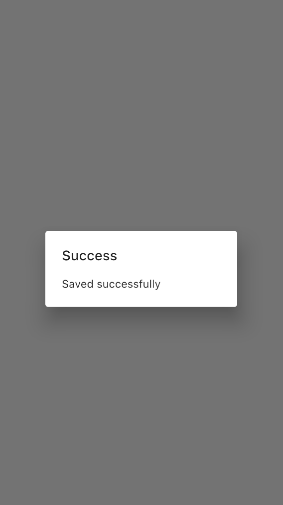
First of all, let’s create a simple dialog. The AlertDialog widget provides all the required functionalities to create a basic dialog in Flutter. The title and content properties should be specified to show a proper dialog. Neither of these is required, but you will not see any content or a title if you don’t specify these properties properly:
AlertDialog(
  title: Text("Success"),
    content: Text("Save successfully"),
)
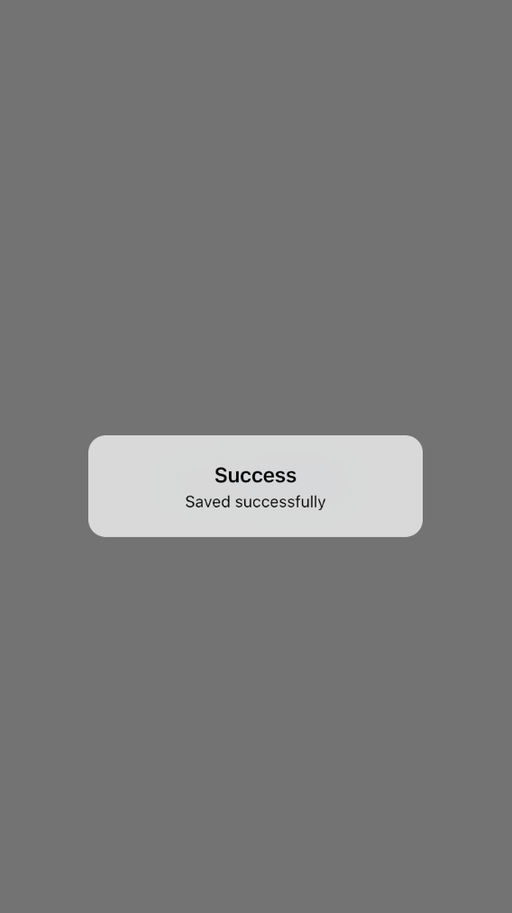
If you want to show an iOS-style dialog, you can use the CupertinoAlertDialog widget instead of the AlertDialog widget:
CupertinoAlertDialog(
  title: Text("Success"),
    content: Text("Saved successfully"),
)
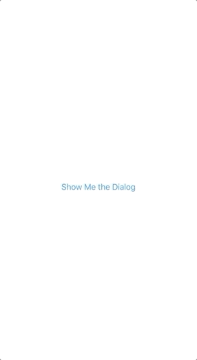
Now the question is, how can we show this dialog? That’s why we need to use the showDialog method, which helps to show the dialog above the current context of the application. This will take care of adding the dark, transparent layer when showing the dialog.
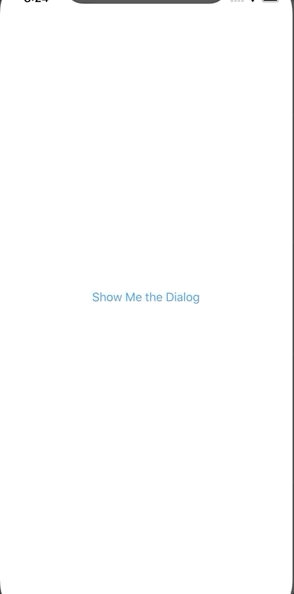
You can create a button (ElevatedButton/TextButton) and add the showDialog method like below in the onPressed method to show when you press the button:
ElevatedButton(
  child: Text("Show Me the Dialog"),
  onPressed:(){
    showDialog(context: context, builder: (BuildContext context){
    return AlertDialog(
      title: Text("Success"),
      content: Text("Saved successfully"),
    );
    });
  }
)
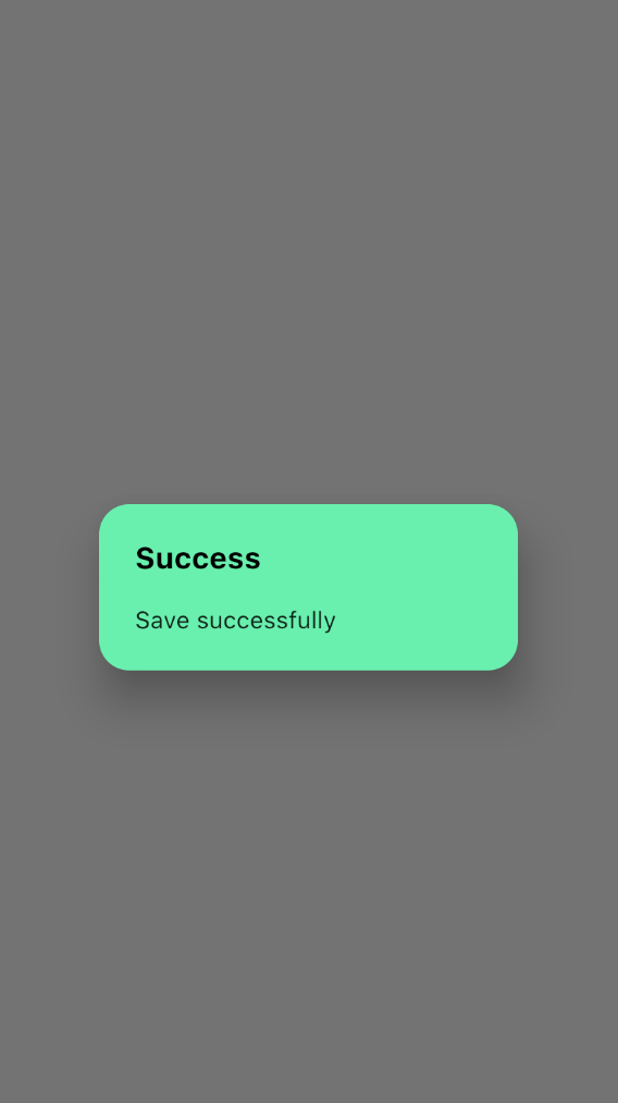
You can further customize the dialog by setting backgroundColor and titleTextStyle properties based on your need. But these properties will not be available in the CupertinoAlertDialog widget and are only available in the AlertDialog widget.
The default AlertDialog has a border radius of 4. The shape property gives you the flexibility to customize that value as you need. But CupertinoAlertDialog doesn’t allow the user to customize these properties, and you have to stick with the default values:
AlertDialog(
  title: Text("Success"),
  titleTextStyle: TextStyle(fontWeight: FontWeight.bold,color: Colors.black,fontSize: 20),
  backgroundColor: Colors.greenAccent,
  shape: RoundedRectangleBorder(
    borderRadius: BorderRadius.all(Radius.circular(20))
  ),
  content: Text("Save successfully"),
)
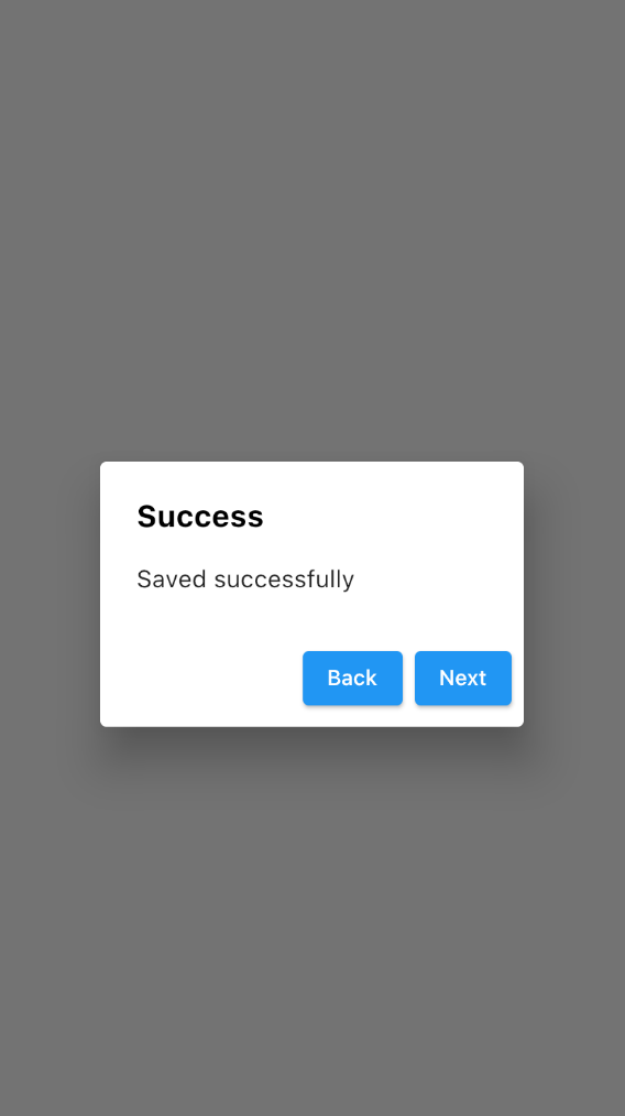
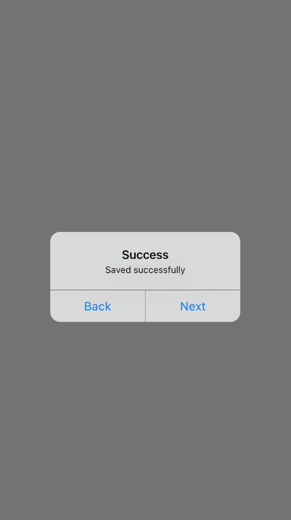
The AlertDialog widget can specify the action buttons that need to show in the dialog. These buttons will be shown at the bottom of the dialog.
There is no limit to the number of action buttons you can have. But it’s better to use 1–3 action buttons to give a good user experience and a less cluttered user interface:
AlertDialog(
  title: Text("Success"),
  titleTextStyle:
    TextStyle(
      fontWeight: FontWeight.bold,
      color: Colors.black,fontSize: 20),
    actionsOverflowButtonSpacing: 20,
    actions: [
      ElevatedButton(onPressed: (){
      }, child: Text("Back")),
      ElevatedButton(onPressed: (){
      }, child: Text("Next")),
    ],
    content: Text("Saved successfully"),
)
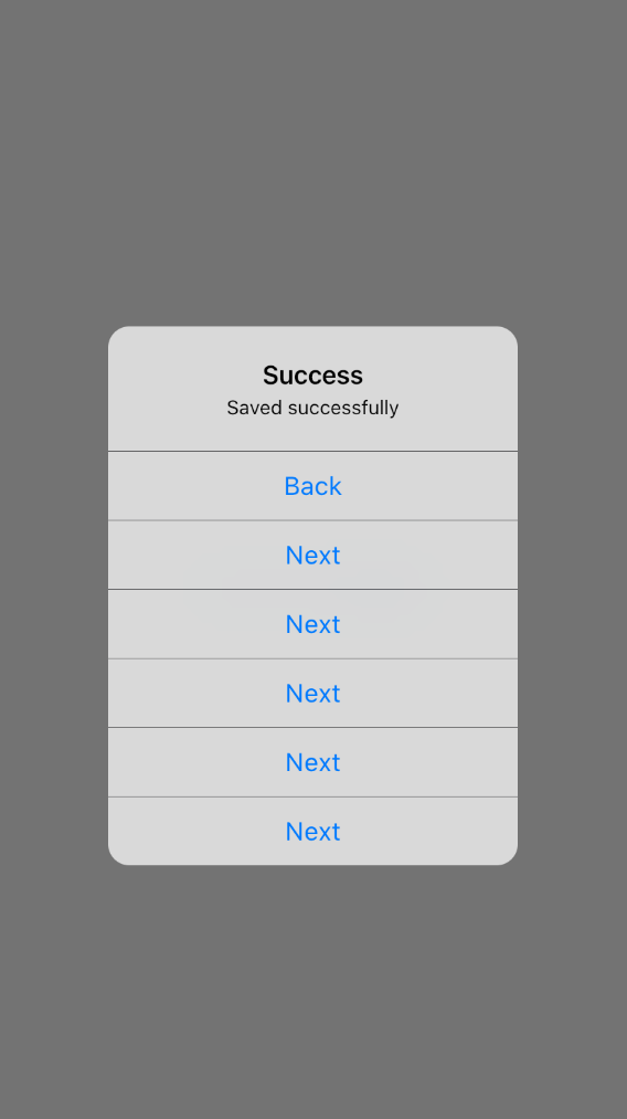
In the CupertinoAlertDialog, instead of the normal buttons, CupertinoDialogAction widgets have to be used inside the actions widget array:
CupertinoAlertDialog(
  title: Text("Success"),
  actions: [
    CupertinoDialogAction(onPressed: (){
    }, child: Text("Back")),
    CupertinoDialogAction(onPressed: (){
    }, child: Text("Next")),
  ],
  content: Text("Saved successfully"),
)
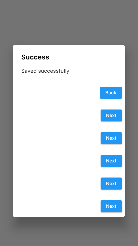
If your application requires more action buttons, you can add more based on your need. Those will stack as a column if there is no room to show in a single inline. If this overflow happens, you can control the button spacing by setting the actionsOverflowButtonSpacing property.
The actionsOverflowButtonSpacing property is only available in the AlertDialog widget and not available in CupertinoAlertDialog. In CupertinoAlertDialog, it usually shows a maximum of two buttons per row, and if there are more action buttons, those will be shown vertically:
AlertDialog(
  title: Text("Success"),
  titleTextStyle:
    TextStyle(fontWeight: FontWeight.bold,color: Colors.black,fontSize: 20),
  actionsOverflowButtonSpacing: 20,
  actions: [
    ElevatedButton(onPressed: (){

    }, child: Text("Back")),
    ElevatedButton(onPressed: (){

    }, child: Text("Next")),
    ElevatedButton(onPressed: (){

    }, child: Text("Next")),
    ElevatedButton(onPressed: (){

    }, child: Text("Next")),
    ElevatedButton(onPressed: (){

    }, child: Text("Next")),
    ElevatedButton(onPressed: (){

    }, child: Text("Next")),
  ],
  content: Text("Saved successfully"),
)
CupertinoAlertDialog(
  title: Text("Success"),

  actions: [
    CupertinoDialogAction(onPressed: (){

    }, child: Text("Back")),
    CupertinoDialogAction(onPressed: (){

    }, child: Text("Next")),
    CupertinoDialogAction(onPressed: (){

    }, child: Text("Next")),
    CupertinoDialogAction(onPressed: (){

    }, child: Text("Next")),
    CupertinoDialogAction(onPressed: (){

    }, child: Text("Next")),
    CupertinoDialogAction(onPressed: (){

    }, child: Text("Next")),
  ],
  content: Text("Saved successfully"),
)
You can use the Navigator class to remove the dialog when you press a button:
AlertDialog(
  title: Text("Success"),
  titleTextStyle: TextStyle(
    fontWeight: FontWeight.bold,color: Colors.black,fontSize: 20),
  actions: [
    ElevatedButton(onPressed: (){
    Navigator.of(context).pop();
    }, child: Text("Close")),
  ],
  content: Text("Saved successfully"),
)
The AlertDialog widget may not be suitable for every custom scenario that you are handling in your app. That’s when the Dialog widget comes in handy.
Even though the content property of AlertDialog accepts the widget type, it’s recommended to add only a simple dialog message, which means it’s not suitable for custom dialogs.
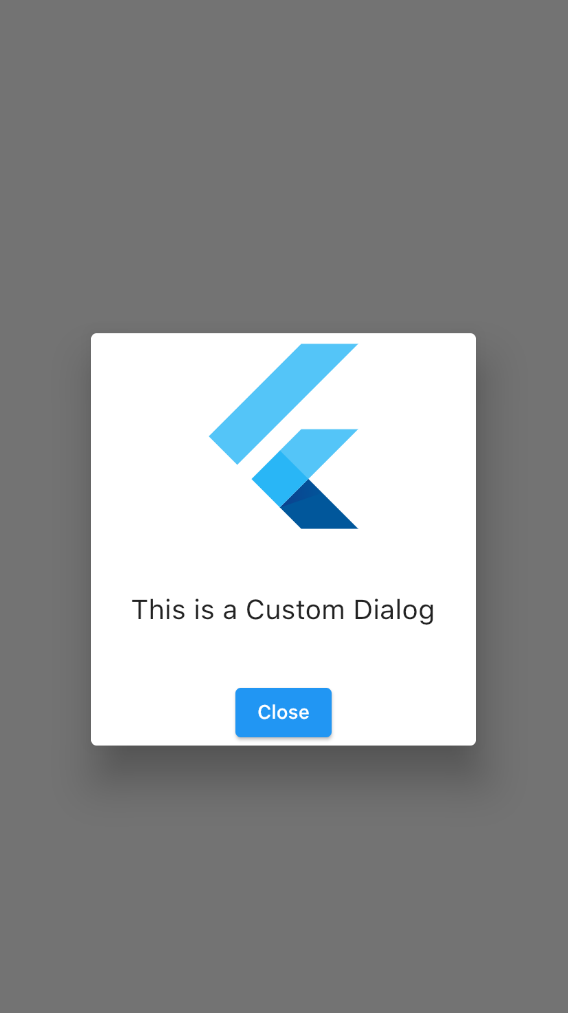
On the other hand, the Dialog widget can create a custom version of the dialog as you need. I have added a Container to control the dialog height, and inside the Container, there is a Column widget to lay out multiple widgets vertically. You can customize these widgets based on your need:
Dialog(
  child: Container(
    height: 300,
    child: Column(
      mainAxisAlignment: MainAxisAlignment.spaceBetween,
      children: [
        FlutterLogo(size: 150,),
        Text("This is a Custom Dialog",style:TextStyle(fontSize: 20),),
        ElevatedButton(

        onPressed: (){
        Navigator.of(context).pop();
          }, child: Text("Close"))
      ],
    ),
  ),
)
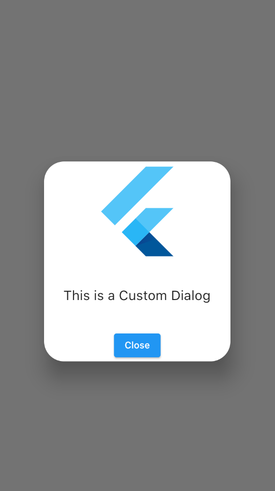
If you want to change the shape of the dialog, you can set the ShapeBorder for the shape property like the below example. Here I have used a RoundedRectangleBorder widget to change the border radius of the dialog:
Dialog(
  shape: RoundedRectangleBorder(
    borderRadius:BorderRadius.circular(30.0)),
  child: Container(
    height: 300,
    child: Column(
      mainAxisAlignment: MainAxisAlignment.spaceBetween,
      children: [
        FlutterLogo(size: 150,),
        Text("This is a Custom Dialog",style:TextStyle(fontSize: 20),),
        ElevatedButton(

        onPressed: (){
        Navigator.of(context).pop();
          }, child: Text("Close"))
      ],
    ),
  ),
)
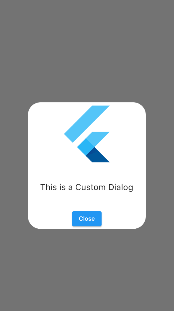
Dialog has a default elevation of 24. Elevation is the z coordinate of the dialog, and that can be changed by setting the elevation property of the dialog. If you set the elevation to 0, you can see there’s no shadow, and it shows both the dialogs and the views below that are on the same surface.
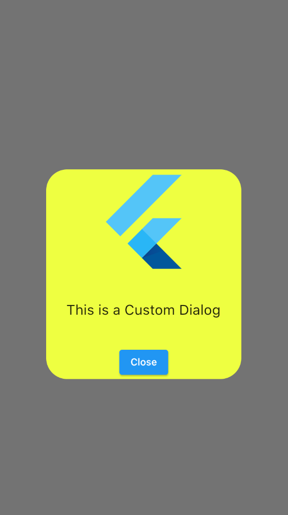
For AlertDialog, dialog background color can be set by changing the backgroundColor property of the Dialog widget:
Dialog(
  elevation: 0,
  backgroundColor: Colors.limeAccent,
  shape: RoundedRectangleBorder(
    borderRadius: BorderRadius.circular(30.0)),
  child: Container(
    height: 300,
    child: Column(
      mainAxisAlignment: MainAxisAlignment.spaceBetween,
      children: [
        FlutterLogo( size: 150,),
        Text(
          "This is a Custom Dialog",
          style: TextStyle(fontSize: 20),
        ),
        ElevatedButton(
          onPressed: () {
            Navigator.of(context).pop();
          },
          child: Text("Close"))
       ],
    ),
  ),
)
Creating a full-screen dialog cannot be done by the showDialog method. Instead, use the showGeneralDialog method.
In the pageBuilder, you should specify your dialog widget implementation. As a first widget, you can specify the SizedBox.expand widget, which converts your normal dialog to full-screen dialog.
Other than the pageBuilder property, you can control the dialog animation duration through the transitionDuration property to give nice and smooth animation:
showGeneralDialog(
  context: context,
  transitionDuration: Duration(milliseconds: 400),
  pageBuilder: (bc, ania, anis) {
    return SizedBox.expand(
      child: Container(
        color: Colors.black,
        child: Padding(
          padding: const EdgeInsets.all(20.0),
          child: Column(
            mainAxisAlignment: MainAxisAlignment.spaceBetween,
            children: [
              FlutterLogo(
               size: 200,
              ),
              Text(
                "This is a Full Screen Dialog",
                style: TextStyle(
                fontSize: 20,
                decoration: TextDecoration.none),
              ),
              ElevatedButton(
                onPressed: () {
                  Navigator.of(context).pop();
                },
              child: Text("Close"))
            ],
          ),
        ),
      ),
    );
})
Applying an alert dialog, custom dialog, or full-screen dialog will totally depend on your application and the different use case of the application.
Alert dialogs are more suitable for quick and simple alerts to users like success messages or info alerts. Custom dialogs can be used in places that require more personalized dialog with multiple widgets. Full-screen dialogs can be used if you want to give the sense of a completely new screen to a user without actually navigating to a completely new screen.
Among these dialogs, custom dialogs will be the most useful because you can give your own personal touch for each dialog to make it look nice and cool while maintaining your application’s theme.
Install LogRocket via npm or script tag. LogRocket.init() must be called client-side, not
server-side
$ npm i --save logrocket

// Code:

import LogRocket from 'logrocket';
LogRocket.init('app/id');
// Add to your HTML:

<script src="https://cdn.lr-ingest.com/LogRocket.min.js"></script>
<script>window.LogRocket && window.LogRocket.init('app/id');</script>
When should you move API logic out of Next.js? Learn when Route Handlers stop scaling and how ElysiaJS helps.

Explore how Dokploy streamlines app deployment with Docker, automated builds, and simpler infrastructure compared to traditional CI/CD workflows.
A side-by-side look at Astro and Next.js for content-heavy sites, breaking down performance, JavaScript payload, and when each framework actually makes sense.
AI-generated tests can speed up React testing, but they also create hidden risks. Here’s what broke in a real app.re
Hey there, want to help make our blog better?
Join LogRocket’s Content Advisory Board. You’ll help inform the type of content we create and get access to exclusive meetups, social accreditation, and swag.
Sign up now

 Learn more →
