The Replay is a weekly newsletter for dev and engineering leaders.
Delivered once a week, it's your curated guide to the most important conversations around frontend dev, emerging AI tools, and the state of modern software.
Lottie is an open-source animation library that is used to render Lottie-based animations. Lottie-based files are smaller in size but retain their quality and can be interactive. As devs, we can manipulate Lottie-based animations at any time with code. The most successful and famous mobile applications use Lottie to provide their users with an enhanced visual experience.

LottieFiles were initially introduced by Airbnb to seamlessly integrate complex animations in Native iOS, Android, and React Native applications.
Essentially, LottieFiles are JSON files that are exported directly from an Adobe After Effects animation file using an extension called Bodymovin. Then, lottie-react-native is used to render that Lottie animation natively in React Native.
To implement Lottie-based animations in our React Native project, we will use the lottie-react-native library, which is a wrapper around the Native iOS and Android Libraries.
We will also need the LottieFiles, which we actually want to show as an animation in the UI.
If you have experience with After Effects, you can create your own animation and export it as a JSON file through Bodymovin.
If you are a developer, you can use LottieFiles. They have tons of Lottie files already created by people from different parts of the globe, so you can pick any animation that suits your use case.
We are going to build a simple React Native application that will have three different animations:
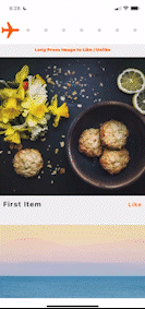
FlatList with a list of random images. As we scroll down, we’ll have a scroll progress animation at the header that will dynamically update based upon the scrollPosition of the listThe UI will be similar to this:

You can check out the complete code in this repository.
Let’s get started! To create a new React Native project, type the following into your terminal window:
react-native init LottieAnimations
I’ve named the project LottieAnimations. You can change your current working directory in the terminal to the project that we just created by executing the following:
cd <Your-Project-Name>
Next, we’ll install Pods in our iOS project by changing cwd to iOS and executing this command:
cd iOS
pod install
cd ..
Next, run the app on iOS and Android. If you use yarn:
yarn ios
yarn android
If you use npm:
npm run ios
npm run android
Once the app is running on our device, you will see default React Native boilerplate code. Let’s remove the code in App.js and paste the following:
import React from 'react'
import { SafeAreaView, Text } from 'react-native'
const App = () => {
    return (
        <SafeAreaView>
            <Text>Lottie Animations</Text>
        </SafeAreaView>
    );
};
export default App;
Now, you should see text on the screen saying, “Lottie Animations”.
Now, let’s add some style to our app. We will keep styles in a different file to keep our App.js file clean. Create an AppStyles.js file in the root directory of the project:
import {StyleSheet} from 'react-native';
export default StyleSheet.create({
  container: {
    flex: 1,
    backgroundColor: 'rgb(255, 255, 255)',
  },
  header: {
    height: 80,
    width: '100%',
    backgroundColor: 'rgb(255, 255, 255)',
    alignItems: 'stretch',
    justifyContent: 'center',
    zIndex: 1,
  },
});
Here, we’ve added a style object for header, but we have not created any component for it. Let’s add header to our app. Add this code to the App.js file inside the SafeAreaView component:
      <StatusBar
        backgroundColor={'rgb(255, 255, 255)'}
        barStyle={'dark-content'}
      />
      <View style={styles.header}>
        {/* We will add Lottie Animation file here */}
      </View>
Now, let’s add animation in our header. Notice we’ve added a StatusBar component, which we’ll use to override the styles of native StatusBar in Android and iOS.
Next, install the lottie-react-native package to our project:
yarn add lottie-react-native [email protected]
Note: You need to install a specific version of
lottie-iosbased upon your version of React Native, which you can check here.
Install the Pods for the iOS project.
cd ios
pod install
After installation is complete, we need to rebuild our application so that the library files are added to native Android and the iOS projects are compiled.
yarn ios
yarn android
Before we add the LottieView component from lottie-react-native, we will need our assets or JSON Lottie files. You can download files from LottieFiles if you want to add some other Lottie animation. To save your time searching for the animations, you can download the assets I’ve used in this project from here.
Download and keep them in the assets folder at the root of our application. Now, add an index.js file to that folder to export the assets to code. The directory will look like this:
Add the below code in the index.js file:
const assets = {
  lottieFiles: {
    planePath: require('./planePath.json'),
    like: require('./like.json'),
    unLike: require('./unLike.json'),
  },
};
export default assets;
Now that we have our assets in place, we can display these animations on our UI.
Switch to App.js file and import the LottieView component, which is responsible for rendering the Lottie animation.
import LottieView from 'lottie-react-native';
Then add this component to the header:
  <View style={styles.header} >
    <LottieView
      autoplay
      loop
      source={Assets.lottieFiles.planePath}
      colorFilters={[{keypath: 'Plane', color: 'rgb(255, 100, 0)'}]}
    />
  </View>
When you save and run the app on your device, you will see the animation automatically running in the header. Cool, huh?
Note that we are using autoplay and loop to let the animation know that it should start playing automatically once it is rendered and to continue playing once it finishes.
We are also using the colorFilters prop, which can be used to change any particular value of any property of a specific layer in the animation file. In our case, we are changing the color of Plane.
There are a bunch of useful props that this component provides us.
Let’s create an animation that will let a user know their position in the ScrollView. First, add a List to the application.
Create a file named StaticData.js and add the following code:
export const StaticData = [
  {key: 1, title: 'First Item', img: 'https://picsum.photos/800'},
  {key: 2, title: 'Second Item', img: 'https://picsum.photos/800'},
  {key: 3, title: 'Third Item', img: 'https://picsum.photos/800'},
  {key: 4, title: 'Fourth Item', img: 'https://picsum.photos/800'},
  {key: 5, title: 'Fifth Item', img: 'https://picsum.photos/800'},
  {key: 6, title: 'Sixth Item', img: 'https://picsum.photos/800'},
];
This will export a StaticData array, which we will use as a DataSource for our FlatList.
import { StaticData } from './StaticData';
Now, add the FlatList inside App.js to show a list of images on the UI.
  <FlatList
    showsVerticalScrollIndicator={false}
    data={StaticData}
    keyExtractor={item => item?.key}
    renderItem={({item}) => <ImageCard data={item} />}
    contentContainerStyle={styles.list}
  />
Notice we’re rendering an ImageCard component that shows the image in the UI, but we have not created the component yet.
Create an ImageCard.js file in the root directory of the project and add the following code:
import LottieView from 'lottie-react-native';
import React, {useState} from 'react';
import {Image, Text, View} from 'react-native';
import styles from './AppStyles';
import Assets from './assets';

export const ImageCard = ({data}) => {
  const [isLiked, setIsLiked] = useState(false);

  return (
    <View
      key={data?.key}
      style={styles.item}
    >
      <Image
        source={{uri: data?.img}}
        resizeMode={'cover'}
        style={styles.itemImage}
      />
      <View style={styles.cardRow}>
        <Text style={styles.itemText}>{data?.title}</Text>
        <Text style={styles.likeText}>{isLiked ? 'UnLike' : 'Like'}</Text>
      </View>
    </View>
  );
};
This will show an image with some data below it. Notice that we have isLiked state, which we are using for the like and unlike animations.
We have to create styles for these new components. After adding all the styles to our AppStyles.js, it will look like this:
import {StyleSheet} from 'react-native';
export default StyleSheet.create({
  container: {
    flex: 1,
    backgroundColor: 'rgb(255, 255, 255)',
  },
  header: {
    height: 80,
    width: '100%',
    backgroundColor: 'rgb(255, 255, 255)',
    alignItems: 'stretch',
    justifyContent: 'center',
    zIndex: 1,
  },
  text: {
    fontSize: 30,
    color: '#fff',
  },
  list: {
    backgroundColor: 'rgb(240, 240, 240)',
    paddingVertical: 14,
  },
  item: {
    paddingVertical: 14,
    marginVertical: 10,
    zIndex: 1,
  },
  itemText: {
    color: 'rgb(0, 0, 0)',
    fontSize: 20,
    letterSpacing: 2,
    fontWeight: 'bold',
    paddingTop: 12,
  },
  likeText: {
    color: 'rgb(255, 100, 0)',
    fontWeight: '600',
    fontSize: 16,
    letterSpacing: 2,
  },
  itemImage: {
    height: 400,
    width: '100%',
  },
  cardRow: {
    flexDirection: 'row',
    justifyContent: 'space-between',
    alignItems: 'baseline',
    paddingHorizontal: 10,
  },
  infoText: {
    fontSize: 12,
    color: 'rgb(255, 100, 0)',
    fontWeight: '900',
    letterSpacing: 0.2,
    lineHeight: 12,
    textAlign: 'center',
    zIndex: 2,
    alignSelf: 'center',
    position: 'absolute',
    bottom: -24,
  },
  overlayLottie: {
    ...StyleSheet.absoluteFillObject,
    zIndex: 10,
    justifyContent: 'center',
    alignItems: 'center',
    backgroundColor: 'rgba(240, 240, 240, 0.4)',
  },
});
These are all the styles that we will use in this project, with the UI similar to this:
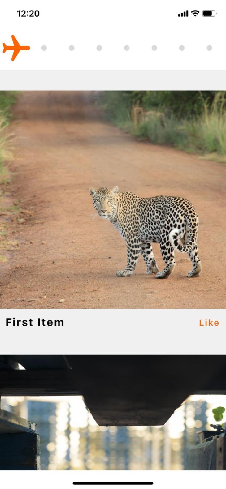
Let’s begin animating our plane in the header! The animation is pretty straightforward — we just need to change the progress prop of our LottieView component as the user scrolls through the list.
We will use the onScroll event of FlatList, which is triggered every time a user scrolls the list. We will also use scrollEventThrottle so that we never miss any scroll event from ScrollView / FlatList.
After making these changes, App.js will look like this:
import LottieView from 'lottie-react-native';
import React, {useRef} from 'react';
import {Animated, SafeAreaView, StatusBar, Text, View} from 'react-native';
import styles from './AppStyles';
import Assets from './assets';
import {ImageCard} from './ImageCard';
import {StaticData} from './StaticData';
const App = () => {
  const scrollPosition = useRef(new Animated.Value(0)).current;
  const handleScroll = ({nativeEvent}) => {
    const calculatedScrollPosition =
      nativeEvent.contentOffset.y /
      (nativeEvent.contentSize.height - nativeEvent.layoutMeasurement.height);
    scrollPosition.setValue(calculatedScrollPosition);
  };

  return (
    <SafeAreaView style={styles.container}>
      <StatusBar
        backgroundColor={'rgb(255, 255, 255)'}
        barStyle={'dark-content'}
      />
      <View style={styles.header}>
        <LottieView
          progress={scrollPosition.interpolate({
            inputRange: [0, 1],
            outputRange: [0, 1],
            extrapolate: 'clamp',
          })}
          source={Assets.lottieFiles.planePath}
          colorFilters={[{keypath: 'Plane', color: 'rgb(255, 100, 0)'}]}
        />
      </View>
      <FlatList
        bounces={false}
        showsVerticalScrollIndicator={false}
        scrollEventThrottle={1}
        onScroll={handleScroll}
        data={StaticData}
        keyExtractor={item => item?.key}
        renderItem={({item}) => <ImageCard data={item} />}
        contentContainerStyle={styles.list}
      />
    </SafeAreaView>
  );
};

export default App;
We have created the following:
Animated variable scrollPosition, which will track the user’s position in ScrollViewhandleScroll method, which will be triggered every time the user scrolls the list. It calculates the scroll position of the user based upon the values received in the event and then sets that value to scrollPositionprogress prop in our LottieView component and used the interpolated value of scrollPosition from 0 to 1bounces to false in FlatList so that we don’t get negative scrollValues for iOSIf you save and re-run the application, you will see that the plane moves as you scroll through the list.
Let’s create our like and unlike animations. The logic we’ll use is this: when the user longPresses the image, the image is liked. But if the user longPresses the image again after liking the image, the image becomes unliked. We’ll run the animation for two seconds for each of these actions.
After the modification in ImageCard.js, our file will look like this:
import LottieView from 'lottie-react-native';
import React, {useRef, useState} from 'react';
import {Animated, Image, Pressable, Text, View} from 'react-native';
import styles from './AppStyles';
import Assets from './assets';
export const ImageCard = ({data}) => {
  const [isLiked, setIsLiked] = useState(false);
  const [processing, setProcessing] = useState(false);
  const animationProgress = useRef(new Animated.Value(0)).current;
  const showAnimation = () => {
    setProcessing(true);
    animationProgress.setValue(0);
    Animated.timing(animationProgress, {
      toValue: 1,
      duration: 2000,
      useNativeDriver: true,
    }).start(({finished}) => {
      if (finished) {
        setIsLiked(!isLiked);
        setProcessing(false);
      }
    });
  };
  return (
    <Pressable
      key={data?.key}
      style={styles.item}
      onLongPress={() => showAnimation()}>
      {processing && (
        <Animated.View
          style={[
            styles.overlayLottie,
            {
              opacity: animationProgress.interpolate({
                inputRange: [0, 0.1, 0.9, 1],
                outputRange: [0, 1, 1, 0],
                extrapolate: 'clamp',
              }),
            },
          ]}>
          <LottieView
            progress={animationProgress}
            source={
              isLiked ? Assets.lottieFiles.unLike : Assets.lottieFiles.like
            }
          />
        </Animated.View>
      )}
      <Image
        source={{uri: data?.img}}
        resizeMode={'cover'}
        style={styles.itemImage}
      />
      <View style={styles.cardRow}>
        <Text style={styles.itemText}>{data?.title}</Text>
        <Text style={styles.likeText}>{isLiked ? 'UnLike' : 'Like'}</Text>
      </View>
    </Pressable>
  );
};
Let’s break this down. We’ve added:
processing state is introduced to determine if there is any animation already in progressAnimated animationProgress to handle the animation progress of the LottieViewshowAnimation method is:
processing state to true, so that we know animation is in progressanimationProgress to 0 if the animation is already runninganimationProgress for 2 seconds, as well as on the UI thread so that the JS thread is not blocked and the user can continue scrolling through the listisLiked state and set the processing flag to falseNotice that we are showing the animation overlay on the UI above the image only when an animation is in progress and that we’ve wrapped the LottieView around an Animated.View. This is using the interpolated value of animationProgress as opacity so that the overlay container can fadeIn and fadeOut when hidden or shown.
Finally, in our actual animation, LottieView is using animationProgress as progress of the animation. We change the source of the animation file based upon the isLiked state. For example, if the state is false, i.e., the image is not liked, then we show the like animation and vice versa.
Now, if you save and re-run the app, you can see the Like animation when you longPress the image. If you longPress the same image, you will see the UnLike animation.
That’s it! We’ve learned how to create interactive animations with lottie-react-native in our React Native application. The complete code for this project is available here.
Lottie-based animations are the future of seamless and precise animations for web and mobile applications. You should use them when you want to implement a complex, high-performing, and yet tiny-in-size animation to your application. Thanks for reading!

LogRocket's Galileo AI watches sessions for you and and surfaces the technical and usability issues holding back your React Native apps.
LogRocket also helps you increase conversion rates and product usage by showing you exactly how users are interacting with your app. LogRocket's product analytics features surface the reasons why users don't complete a particular flow or don't adopt a new feature.
Start proactively monitoring your React Native apps — try LogRocket for free.
Local AI proxy tutorial for detecting, masking, and rehydrating PII before prompts reach cloud LLMs.

Learn how Graph RAG uses connected knowledge structures to improve retrieval beyond simple text similarity.
Learn how sibling-index() enables clean, JavaScript-free stagger animations using native CSS.

useEffect breaks AI streaming responses in ReactSee why useEffect breaks AI streaming in React, and how moving stream state outside React fixes flicker and stale updates.
Would you be interested in joining LogRocket's developer community?
Join LogRocket’s Content Advisory Board. You’ll help inform the type of content we create and get access to exclusive meetups, social accreditation, and swag.
Sign up now

 Learn more →
