Editor’s note: This article was last updated by Carlos Mucuho on 3 June 2024 to disable scrolling on mobile devices and to incorporate advanced menu customization techniques to your menu such as by using CSS variables, gradients and shadows, and hover effects.

A clear, concise, and intuitive navigation menu is essential for an optimized website user experience. The responsiveness of the menu is a key factor as well. As of this writing, over 50 percent of web traffic worldwide is attributed to mobile.
With mobile-first responsive design, developers start with the smallest screen size and then gradually scale up, adding more features and functionality for larger screen sizes. The resulting webpages will automatically adjust to the size of a user’s browser window.
However, as important as a responsive menu is to a website’s UX, it’s not necessary to build it in JavaScript. This tutorial will review how to create a mobile-first responsive menu using only HTML and CSS.
There are many techniques available for building responsive mobile menus. One common practice is to use pure CSS without a single line of JavaScript. This technique employs a simple HTML list structure to develop a menu of links that can be styled and rendered differently based on a device’s screen size.
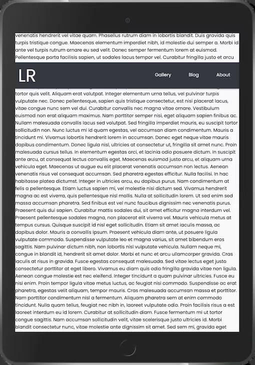
In this tutorial, we’ll use CSS to build the following responsive menu for mobile, tablet, and desktop:
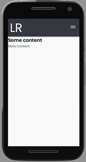
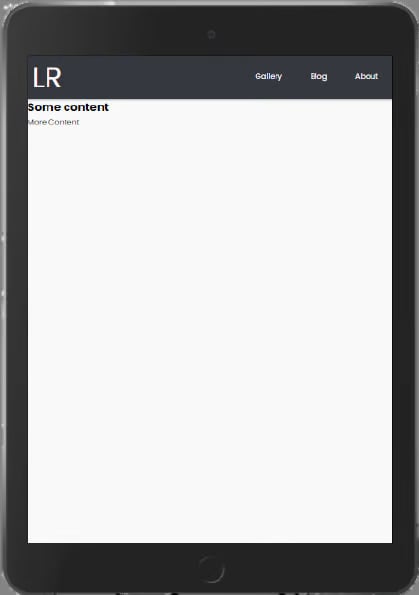
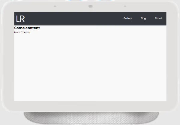
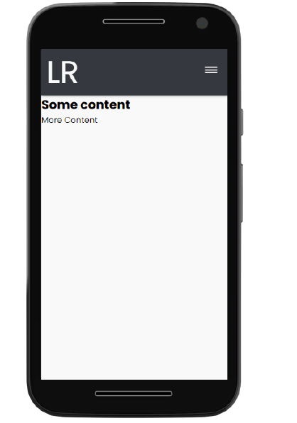
For smaller screens, the user must click on a hamburger icon to reveal the menu items. Larger screens will display the menu items inline in the navigation bar.
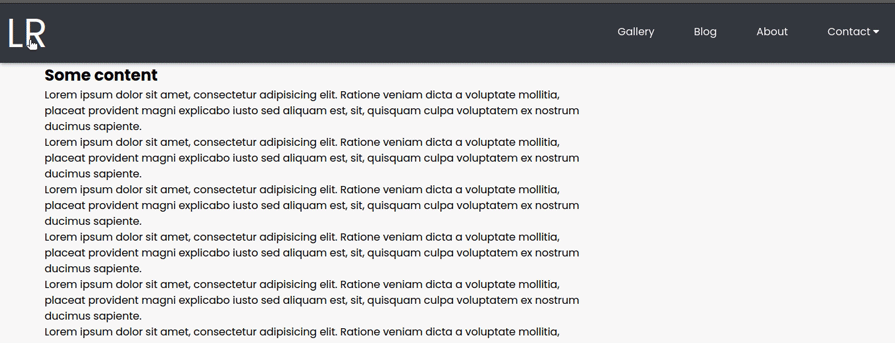
In this tutorial, we’ll build a responsive menu, including a hamburger icon, entirely from pure HTML and CSS. Our result will look like this:
Using your favorite text editor, such as VS Code, create two files in one common folder:
index.html for HTML codestyle.css for CSS codeCopy the index.html file path and paste it into a browser to preview the app.
Add the following code to the index.html file:
<html lang="en">
<head>
    <meta charset="UTF-8">
    <meta http-equiv="X-UA-Compatible" content="IE=edge">
    <meta name="viewport" content="width=device-width, initial-scale=1.0">
    <!-- App title -->
    <title>Responsive Pure CSS Menu</title>
    <!-- Link CSS file -->
    <link rel="stylesheet" href="style.css">
</head>
<body>
    <!-- Navigation bar -->
    <header class="header">
        <!-- Logo -->
        <a href="#" class="logo">LR</a>
        <!-- Hamburger icon -->
        <input class="side-menu" type="checkbox" id="side-menu"/>
        <label class="hamb" for="side-menu"><span class="hamb-line"></span></label>
        <!-- Menu -->
        <nav class="nav">
            <ul class="menu">
                <li><a href="#">Gallery</a></li>
                <li><a href="#">Blog</a> </li>
                <li><a href="#">About</a></li>
            </ul>
        </nav>
    </header>
    <!-- Main content -->
    <main>
        <article>
            <h1>
                Some content
            </h1>
            <p>
                More Content
            </p>
        </article>
    </main>
</body>
</html>
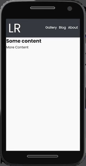
This code contains the structure and contents of the webpage, as well as a reference to the CSS style sheet. We use the header and main semantic tags to separate the navigation bar and the main contents of the page. And we add a logo using the <a> anchor tag.
Lastly, we create a hamburger menu using a checkbox hack. With this strategy, we can style the menu according to whether the checkbox is checked.
We use a label tag to define the hamburger menu icon. The input tag is used to conditionally display the menu depending on the state of the checkbox (class side-menu).
Then, we add the menu items as link list elements, <li>, in an unordered list, ul. The nav tag serves as the list container.
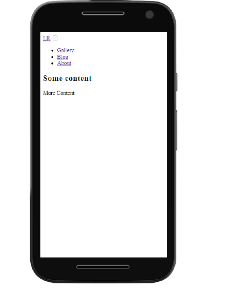
Here’s the output with HTML only:
Now, we’ll use CSS to style the different UI components and features.
We’ll add the following code to the style.css file to adjust the appearance of the HTML content:
/* Theming */
@import url("https://fonts.googleapis.com/css2?family=Poppins:wght@400;700&display=swap"); /* import font */

:root{
    --white: #f9f9f9;
    --black: #36383F;
    --gray: #85888C;
} /* variables*/

/* Reset */
*{
    margin: 0;
    padding: 0;
    box-sizing: border-box;
}
body{
    background-color: var(--white);
    font-family: "Poppins", sans-serif;
}
a{
    text-decoration: none;
}
ul{
    list-style: none;
}
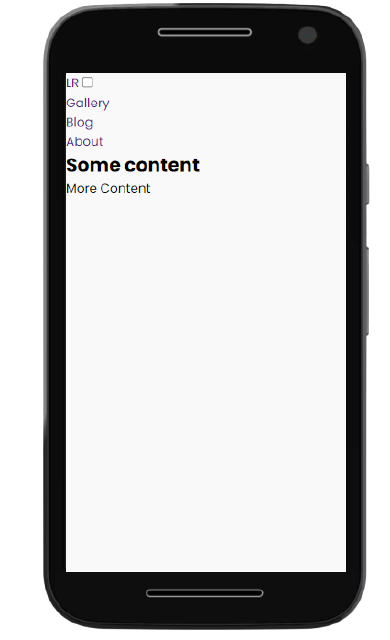
This code imports the Poppins Google font for use in the app.
We define the CSS variables for the colors to be used in the app. Then, we use CSS Reset to remove the browser’s default settings for margin , padding , box-sizing, text-decoration, and list-style.
We also specify a white background-color and the Poppins font-family for the page content. Here’s the output, displaying the styled content and background:
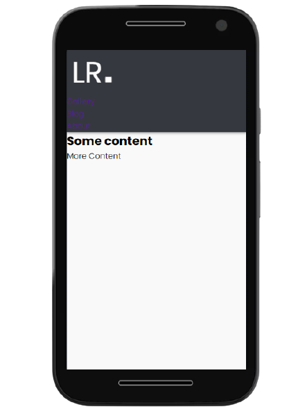
The code below adds a black background-color and gray box-shadow to the header. To keep the header at the top of the screen during scrolling, we specify a sticky position and a zero offset from the top. We also adjust the header to stretch across the full width of the device:
/* Header */
.header{
    background-color: var(--black);
    box-shadow: 1px 1px 5px 0px var(--gray);
    position: sticky;
    top: 0;
    width: 100%;
}
/* Logo */
.logo{
    display: inline-block;
    color: var(--white);
    font-size: 60px;
    margin-left: 10px;
}
We style the logo by specifying the color, font-size, and left-margin. Not to be confused with padding, the margin is the area around the logo that separates it from other elements.
Here’s the output, displaying the styled header and logo:
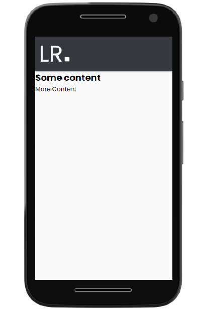
In the code below, we specify width and height properties of 100 percent for the nav element to fit the content to the screen. Then, we specify a fixed position to overlay the navigation menu on top of the main app content. We also select a black background-color for the nav element and specify that any overflow content from the nav element should be hidden.
For the menu link elements, we specify a block format display, add padding and color, and change the background-color from white to gray on hover.
Lastly, we use the CSS transition property and a max-height of zero to hide the nav element by default but reveal it when the menu icon is clicked:
/* Nav menu */
.nav{
    width: 100%;
    height: 100%;
    position: fixed;
    background-color: var(--black);
    overflow: hidden;

}
.menu a{
    display: block;
    padding: 30px;
    color: var(--white);
}
.menu a:hover{
    background-color: var(--gray);
}
.nav{
    max-height: 0;
    transition: max-height .5s ease-out;
}
Here’s the output, displaying the styled navigation menu:
In the code below, we specify that a pointer cursor should be displayed when a user interacts with the hamburger menu. We position the label element to the right and add some padding. Next, we style the span element to create the three menu icon lines.
We use the CSS pseudo-elements [::before] and [::after] on the span element to define the three hamburger icon lines.
The .hamb-line selector defines the center, or second, line. The .hamb-line::before and .hamb-line::after position the first and third lines 5px above and below the center line, respectively.
Lastly, we use the display property on .side-menu to hide the checkbox:
/* Menu Icon */
.hamb{
    cursor: pointer;
    float: right;
    padding: 40px 20px;
}/* Style label tag */

.hamb-line {
    background: var(--white);
    display: block;
    height: 2px;
    position: relative;
    width: 24px;

} /* Style span tag */

.hamb-line::before,
.hamb-line::after{
    background: var(--white);
    content: '';
    display: block;
    height: 100%;
    position: absolute;
    transition: all .2s ease-out;
    width: 100%;
}
.hamb-line::before{
    top: 5px;
}
.hamb-line::after{
    top: -5px;
}

.side-menu {
    display: none;
} /* Hide checkbox */
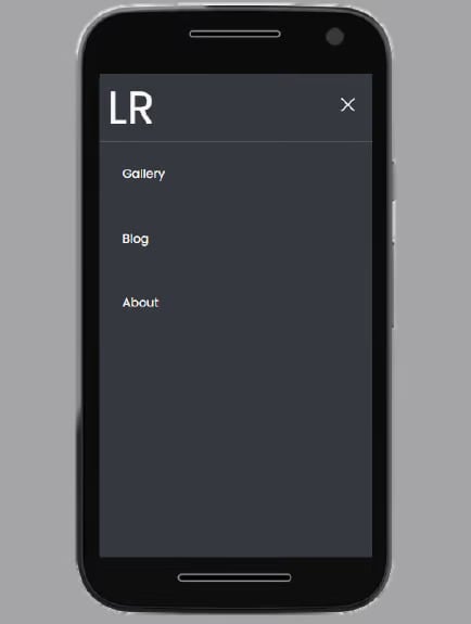
Here’s the output, displaying the styled hamburger menu:
In the code below, we style the hamburger menu icon to alter its appearance when checked. First, we specify the max-height of the nav element when the checkbox is checked (class .side-menu:checked).
Then, we follow a two-step process to create an X-shaped close icon to indicate that the checkbox is checked. First, we hide the second line of the hamburger icon by setting its background to transparent. Then, we rotate the first and third lines by -45 and 45 degrees, respectively, to form an X shape.
Lastly, to enhance the user experience on mobile devices, we can disable page scrolling when the menu is opened. This ensures that the focus remains on the menu itself, preventing any accidental scrolling of the background content:
/* Toggle menu icon */
.side-menu:checked ~ nav{
    max-height: 100%;
}
.side-menu:checked ~ .hamb .hamb-line {
    background: transparent;
}
.side-menu:checked ~ .hamb .hamb-line::before {
    transform: rotate(-45deg);
    top:0;
}
.side-menu:checked ~ .hamb .hamb-line::after {
    transform: rotate(45deg);
    top:0;
}

body:has(.side-menu:checked) {
  overflow: hidden;
}
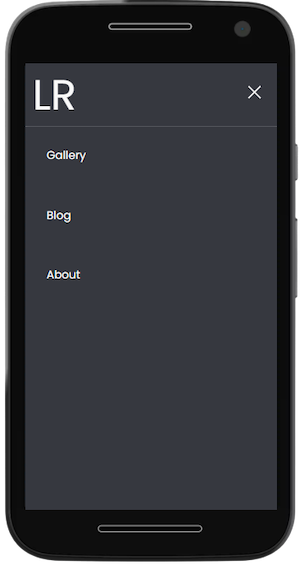
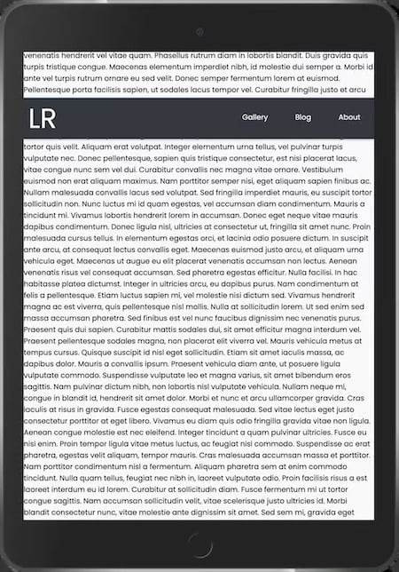
Here’s the output, displaying the toggled menu:
We can make the app responsive by using media queries to include CSS properties conditionally. In other words, the properties inside a media query will be applied to the webpage only when the condition set is valid:
/* Responsiveness */
@media (min-width: 768px) {
    .nav{
        max-height: none;
        top: 0;
        position: relative;
        float: right;
        width: fit-content;
        background-color: transparent;
    }
    .menu li{
        float: left;
    }
    .menu a:hover{
        background-color: transparent;
        color: var(--gray);

    }

    .hamb{
        display: none;
    }
}
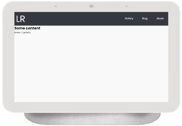
In this code, we add a @media rule with the device condition set to a 768px min-width. We want devices with this minimum width to see the full navigation menu, rather than the hamburger menu.
We remove the max-height property of the nav element by setting it to none. We position the nav element at the top-right of the screen and specify its width to fit-content.
We also float the menu list items to the left of the nav. We specify the background color to be transparent and the menu list items to be gray on hover. Lastly, we use the display property to hide the hamburger menu icon.
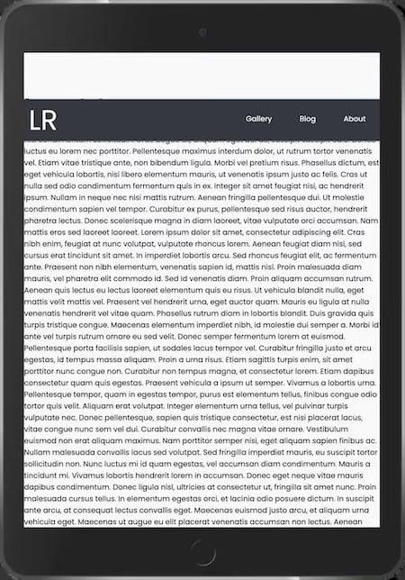
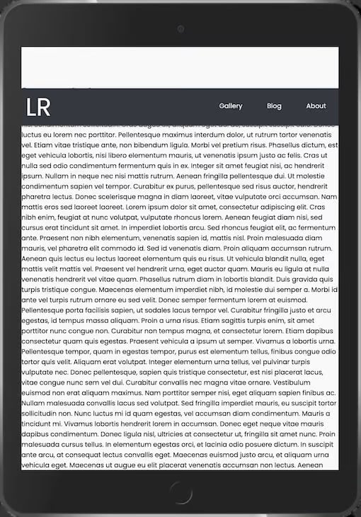
Here’s the fully styled app:
This video demonstrates the app’s responsive user interface:
The CSS position property can be used to position the navigation menu on a webpage. The top, right, bottom, and left properties can be used to position an element on the page.
With fixed positioning, the navigation menu will remain in the same position despite scrolling. This might cause the navbar to overlap with some content on the webpage. Page content will adjust to fit the gap:
Relative positioning places an element relative to the page. Other content on the page, however, does not adjust to fit the gap:
Sticky positioning, on the other hand, sets the navbar to scroll along with other content until it reaches a specified offset. The page content does not adjust to fit the gap but scrolls under the positioned navbar:
Update the styling of the .header element as shown below, varying the position property from fixed to relative to sticky, and note how the behavior changes:
.header{
    background-color: var(--black);
    box-shadow: 1px 1px 5px 0px var(--gray);
    position: sticky;
    top: 100px;
    width: 100%;
}
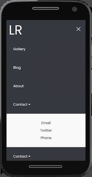
You can nest menu items inside other menu items. This reduces the amount of space consumed on the navbar and keeps your links organized, making it easier for users to explore your site.
To add a submenu, update the index.html file to contain an extra li element as shown below. The fa fa-caret-down icon can be obtained by adding a font-awesome script tag to your HTML file:
....
<link rel="stylesheet" href="https://cdnjs.cloudflare.com/ajax/libs/font-awesome/4.7.0/css/font-awesome.min.css">

...
<li class="subnav">
  <p class="subnavbtn">Contact <i class="fa fa-caret-down"></i></p>
  <div class="subnav-content">
      <a href="#">Email</a>
      <a href="#">Twitter</a>
      <a href="#">Phone</a>
  </div>
</li>
...
You can then update your stylesheet to hide and display the submenu when hovered, as shown below:
...
/* Sub nav */
.subnav-content {
    background-color:  var(--white);
    width: 100%;
    z-index: 1;
    padding: 20px 0 ;
    display: none;
  }
.subnav-content a {
    color: var(--black);
    text-decoration: none;
    padding: 0;
    margin: 10px 0;
    text-align: center;
}
.subnav:hover .subnav-content {
    display: block;
}
....
@media (min-width: 768px) {
   ....
    /* Sub nav */
    .subnav-content {
        padding: 20px 0 ;
        display: none;
        background-color:  var(--black);
    }
    .subnav-content a {
        color: white;
    }
}
This video demonstrates the app’s submenus:
Enhancing the appearance of your menu can help you create a unique and visually appealing design. We’ll explore how to use CSS variables, gradients, shadows, and other styling techniques, to easily customize your menu’s appearance.
CSS variables allow you to define reusable values that can be used throughout your stylesheet. This makes it easy to update your menu’s styling without having to change each style rule.
Here’s how you can use CSS variables to customize your menu:
/* Define CSS variables for colors */
:root {
    --menu-background-color: #333; /* Dark background color */
    --menu-text-color: #fff; /* White text color */
    --hover-color: #ff9900; /* Color on hover */
}

/* Use CSS variables in your menu styles */

.nav {
  width: 100%;
  height: 100%;
  background-color: var(--menu-background-color);
  overflow: hidden;
}
.menu a {
  display: block;
  padding: 30px;
  color: var(--menu-text-color);
}
CSS gradients and shadows can be used to add depth and visual interest to your menu. Here’s an example of how you can use gradients and shadows in your menu styles:
/* Add gradient background */
.menu {
    background-image: linear-gradient(to bottom, #333, #666); /* Gradient from dark to light */
}

/* Add box shadow */
.menu {
    box-shadow: 0 2px 5px rgba(0, 0, 0, 0.2); /* Shadow with blur effect */
}
Adding hover effects to your menu items can enhance user interactivity and provide visual feedback. With CSS, you can easily create hover effects that change the color, size, or style of your menu items when users hover over them.
To add a hover effect to your menu items, you can use the :hover pseudo-class in CSS. Here’s how you can do it:
/* Change text color on hover */
.menu a:hover {
    color: var(--hover-color); /* Change to your desired hover color */
}

/* Add underline on hover */
.menu a:hover {
    text-decoration: underline;
}

/* Scale effect on hover */
.menu a:hover {
    transform: scale(1.3); /* Increase the size by 30% on hover */
}

/* Fade in/out effect on hover */
.menu a {
    opacity: 0.7; /* Set initial opacity */
    transition: opacity 0.3s ease; /* Add transition for smooth effect */
}
.menu a:hover {
    opacity: 1; /* Change to full opacity on hover */
}
The GIF below demonstrates the hover effects suggested:

By incorporating subtle animations such as sliding or fading effects, you can make your menu more visually appealing and engaging for users.
To achieve this effect, we’ll use CSS animations. First, let’s define the animation properties in our CSS file:
/* Define the slide animation */
@keyframes slideIn {
  from {
    transform: translateY(-100%);
    opacity: 0;
  }
  to {
    transform: translateY(0);
    opacity: 1;
  }
}

/* Apply the animation to the menu items */
.side-menu:checked~nav .menu a {
  animation: slideIn 0.5s forwards;
}
In this example, we’ve defined a slideIn animation that moves the menu items from the top (-100%) to their original position (0). The opacity property ensures that the items fade in as they slide into view. This animation will activate when desktop users hover over the Contact navigation item and when mobile users open the menu:

Accessibility is a critical aspect of web development, ensuring that people with disabilities can effectively access and use your website. ARIA (Accessible Rich Internet Applications) attributes play a key role in making your web content more accessible.
Here’s how you can add ARIA attributes to the elements of your mobile menu:
<!-- Navigation bar -->
  <header class="header" role="banner">
    <!-- Logo -->
    <a href="#" class="logo" aria-label="Home">
      LR
    </a>
    <!-- Hamburger icon -->
    <input class="side-menu" type="checkbox" id="side-menu" />
    <label class="hamb" for="side-menu" aria-label="Menu">
      <span class="hamb-line"></span>
    </label>
    <!-- Menu -->
    <nav class="nav" role="navigation" aria-label="Main">
      <ul class="menu">
        <li><a href="#" aria-current="page">Gallery</a></li>
        <li><a href="#">Blog</a></li>
        <li><a href="#">About</a></li>
        <!-- Contact submenu -->
        <li aria-haspopup="true">
          <div class="subnav">
            <a href="#" class="subnavbtn" aria-label="Contact" aria-controls="contact-submenu"
              tabindex="0">Contact <i class="fa fa-caret-down"></i></a>
            <ul class="subnav-content" role="menu" id="contact-submenu">
              <li><a href="#" role="menuitem">Email</a></li>
              <li><a href="#" role="menuitem">Twitter</a></li>
              <li><a href="#" role="menuitem">Phone</a></li>
            </ul>
          </div>
        </li>
      </ul>
    </nav>
  </header>
In the above code, we added a role="banner" attribute to the header, which helps screen readers identify it as a banner landmark, making navigation more intuitive. Additionally, we used role="navigation" for the menu, clarifying its purpose for assistive technologies.
To improve accessibility for users navigating with screen readers, we’ve added aria-label attributes to the logo and hamburger icon. These labels provide descriptive text that explains the purpose of these elements, ensuring users understand their functionality.
We’ve also enhanced the indication of the current page within the menu by adding aria-current="page" to the Gallery link. This provides users with clear feedback about their current location on the site.
For the submenu, we’ve made a structural change by using an unordered list (ul) instead of a div. This change helps assistive technologies better understand the hierarchy of the submenu items, improving navigation for users.
Add the following CSS code inside the media query:
@media (min-width: 768px) {
  ...

  .subnav-content li {
    display: block;
    width: 100%;
    background-color: var(--black);
  }
  .subnavbtn:focus+.subnav-content {
    display: block;
  }
  .subnav:hover .subnav-content {
    display: block;
  }
  .subnav:focus-within .subnav-content {
    display: block;
  }
  .subnav-content a:focus {
    background-color: var(--white);
    color: var(--black);
  }
}
The code above was added to improve the visibility and usability of the submenu. The submenu items are being displayed as blocks to ensure they are correctly positioned in the dropdown. We’ve also added styles to highlight focused submenu items, making it easier for keyboard users to see which item is selected.
To ensure the submenu remains visible during interaction, we’ve updated the display property for the submenu to block when the contact link is focused or when the submenu itself is hovered over. This change ensures a more seamless experience for all users.
Here’s a demonstration of how you can interact with the menu using just the keyboard’s Tab key:
The mobile navigation menu can be displayed horizontally or vertically based on preference. With horizontal navigation, the nav links are placed before the page’s main content. In comparison, with vertical navigation, the links are arranged along the side of the page. Vertical navigation menus are typically opened and closed with a hamburger button.
The horizontal mobile navbar is the more popular choice, as it’s used on most websites. The left-to-right order feels more natural to English speakers. Additionally, this layout encourages more concise nav link descriptions on the navigation menu.
However, this layout offers limited space for links to be added. As a result, adding top-level links can be challenging, while dropdown menus may overlap web content.
In comparison to the horizontal mobile navbar layout, a vertical mobile navbar provides more room for additional links. As a result, the names of the nav links can be longer, and adding new links is simpler.
However, this flexibility can discourage organized and concise nav links on the navigation menu. Additionally, because this layout is less common and intuitive, users may encounter some difficulty when using the navigation.
Users may also find it difficult to access submenus that extend to the side compared to the horizontal navbar whose submenu extends below.
Compare these vertical and horizontal mobile navbar examples below:
In this tutorial, we designed and built a mobile-first responsive menu using only HTML and CSS, and without JavaScript. The complete code used in this article is available in this GitHub repository.
The technique used in this article is just one of many methods that can be used to build a responsive mobile menu. By experimenting with different methods, you can decide which ones you prefer.
Happy coding!
As web frontends get increasingly complex, resource-greedy features demand more and more from the browser. If you’re interested in monitoring and tracking client-side CPU usage, memory usage, and more for all of your users in production, try LogRocket.

LogRocket lets you replay user sessions, eliminating guesswork around why bugs happen by showing exactly what users experienced. It captures console logs, errors, network requests, and pixel-perfect DOM recordings — compatible with all frameworks.
LogRocket's Galileo AI watches sessions for you, instantly identifying and explaining user struggles with automated monitoring of your entire product experience.
Modernize how you debug web and mobile apps — start monitoring for free.

A guide for using JWT authentication to prevent basic security issues while understanding the shortcomings of JWTs.

Discover how to build, render, and automate product demo videos with Remotion, replacing traditional screen recordings with reusable React code.

Chrome’s Modern Web Guidance embeds modern web platform skills into AI coding agents, helping them choose native HTML, CSS, and browser APIs over legacy patterns.

Learn how to use Fallow to analyze AI-generated code, detect dead code, duplicate logic, and complexity issues, and integrate automated code quality checks into your AI-assisted development workflow.
Would you be interested in joining LogRocket's developer community?
Join LogRocket’s Content Advisory Board. You’ll help inform the type of content we create and get access to exclusive meetups, social accreditation, and swag.
Sign up now

 Learn more →
