We have all come across a progress bar on a mobile device at least once, such as while installing anything from Google.
Our goal in this article is to build an animated, neumorphic progress bar using React and CSS. The progress bar graphics will be accompanied by a textual representation of the progress in a percentage format ranging from 1–100.
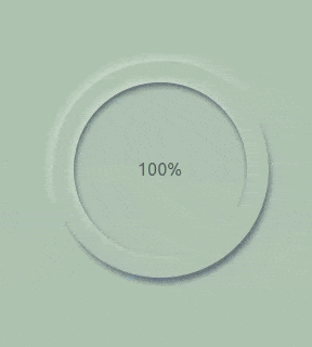
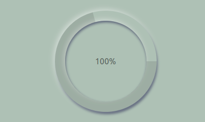
At the end of this tutorial, this is what we should have:

In this article, we will learn how to build and style a neumorphic progress bar in React through the following sections:
progress-barcomponent
useStateand useEffectReact HooksNeumorphism, also known as soft UI or the improvement of skeuomorphism, uses highlights and the box-shadow properties in CSS to make elements appear as if they float above the UI.
If you know skeuomorphism, well, neumorphism is the new version of it. It is a product of flat and skeuomorphic designs. According to many resources out there, Alexander Plyuto is the father of this design, as he was the first to post a design using this style on dribble in 2019.
Readers should have foreknowledge of using SVGs in React and should also install:
The first step to getting our project running is to create a folder for the project. I named mine progress-bar.
Install React. I will do this by running this in my code editor:
npx create-react-app progress-bar @version 18
Change into the progress-bar folder and run:
npm start
Our React app should show up in your browser. Lastly, to get everything all set, delete the unneeded files and everything returned in our JSX.
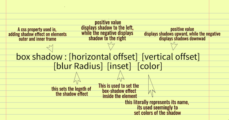
This eye-catching design is possible thanks to one major CSS property used in its development: the box-shadow. It’s advisable to know your way around the box-shadow property in CSS, because there is literally no way to implement neumorphism without this property.
Here’s a quick refresher in case you need it:
progress-bar componentThere are three major steps to achieving our goal:
We will need a neumorphic component to get started; we can name it Neumorphism.js. This component will have two divs, which have classNames attached to them for styling.
Let’s import these into our main App.js to enable it to render in browsers at localhost:3000.
//IMPORT COMPONENT
import React from 'react';
import Neumorphism from './Neumorphism';
import './App.css';

function App() {
 return (
   <main>
     <Neumorphism />
   </main>

 );
}

export default App;
Our component file should look like this:
//NEUMORPHISM.JS

import React from 'react';
import './App.css';

function App() {
 return (
   <main className='container'>
     <div className="outside-progress-bar">
    <div className='inside-progress-bar'>
      <p> Neurmophism</p>
    </div>
   </div>
   </main>
 );
}
Over with the divs, we need the styling and animation for this application.
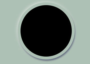
The first step of our project is creating a neumorphic circle in our neumorphism.js component. Since we are creating a progress bar, centering our div is advisable. Let’s get it done.
.container {
   height: 100Vh;
   display: flex;
   align-items: center;
   justify-content: center;
   background-color: rgb(178, 190, 181);
}

//you can also add 30px of padding to center the container
For our neumorphic effect, we’ll need to create two circles of the dimensions 160px and 140px, respectively, to display the progression effect. Let’s get that done by adding basic styles to our classNames:
.circle1 {
   height: 160px;
   width: 160px;
   border: 1px solid black;
   border-radius: 50%;
   padding: 3%;
}

.circle2 {
   height: 140px;
   width: 140x;
   border: 1px solid black;
   border-radius: 50%;
   height: 100%;
}
This is where we add a box-shadow to create the effects of neumorphism on our circle:
.circle1 {
   height: 160px;
   width: 160px;
   border-radius: 50%;
   padding: 3%;
   box-shadow: -3px -3px 10px #ffffff73,
               2px 5px 5px rgba(94, 104, 121, 288);
}

.circle2 {
   height: 140px;
   width: 140x;
   border-radius: 50%;
   height: 100%;
   box-shadow: -3px -3px 10px #ffffff73,
               inset 1px 3px 5px rgba(94, 104, 121, 288);
}
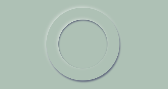
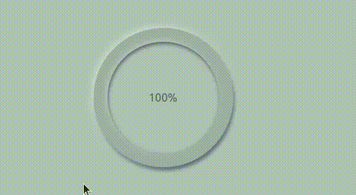
Undoubtedly, this looks really great.
We need to display a number that we can add functionality to, so it can display the percentage of our app’s progression. A div and styles are needed to accomplish this.
<div>
   <p>100%</p>
</div>
//center the paragraph

display: flex;
align-items: center;
justify-content: center;
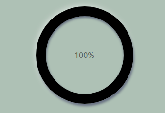
Now, we’ll use SVG tags in React to fit into our neumorphic circle and display our progression.
How are we able to make a circle that would fit in our neumorphic circle? It’s logical to get the size of the circle, which can be gotten from the browser’s console using the ctrl+shift+i command in the browser.
In our case, we have the outer-circle set to 200px by 200px, and the inner-circle set to 160px x 160px, with padding of 20px. This gives us an idea of exactly what the dimensions of our SVG circle should be.
Let’s get this done. Here are the steps:
cx, cy, and r CSS attributeimport React from 'react';
import './progress.css';
function Progress(){
return(
<main className='container'>
<div>
<svg className='circle'>
<circle cx="100px" cy="100px" r="90px" />
</svg>
</div>
</main>
)
}
export default Progress
We need to import this component into our main app.js, so we can render it in our browser as we did earlier.
import React from 'react';
import Neumorphism from './Neumorphism';
import Progress from './Progress';
import './App.css';

function App() {
 return (
   <main>
     <Neumorphism />
     <Progress />
   </main>

 );
}

export default App;
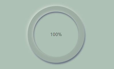
Here is what it looks like in our browser now:

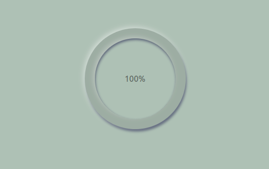
At this point, we need to make our SVG circle fit in our neumorphic circle above. With no doubt, the position-absolute CSS property will get the job done fastest.
 .circle {
       height: 300px;
       width: 300px;
       position: absolute;
       bottom: 20%;
       right: 34.3%;
   }
I reduced the height and width of the circle to show how position-absolute gets the job done.
We obviously can’t leave the SVG display progression over our neumorphic circle while it’s filled, which takes us to our next step.
Set the fill to none and add a stroke of 20px to fit in perfectly:
stroke-width: 20px;
fill: none;
stroke: black;
Now, let’s add a blur to the stroke, just because it makes it more attractive:
stroke: rgba(0, 0, 0, 0.1);
Our next step is to animate our stroke. Using a stroke-dasharray to trace out the pattern of dashes used in our circle, we’ll outline the animation of this shape more easily. In our case, it is 565px.
We’ll also use a stroke-dashoffset to take off whatever the stroke-dasharray has rendered. We needed the stroke-dasharray because, when the stroke-dasharray renders the full shape of the circle, the offset takes the rendered stroke-dasharray off so it can be refilled by animation. We will set this to 565px in order to allow animation perform the refilling progression.
Our last step is to add the animation property to the SVG circle. In my case, I named it progression and gave it 1s to progress forward. We also need to set @keyframes for our progression to be 100%, and our stroke-dashoffset to 0, to get it animated.
Below are the styles added:
// Styles
{
stroke-dasharray: 565px;
   stroke-dashoffset: 565px;
   animation: progress 1s linear forwards;
}

@keyframes progress {
   100% {
       stroke-dashoffset: 0;
   }
}
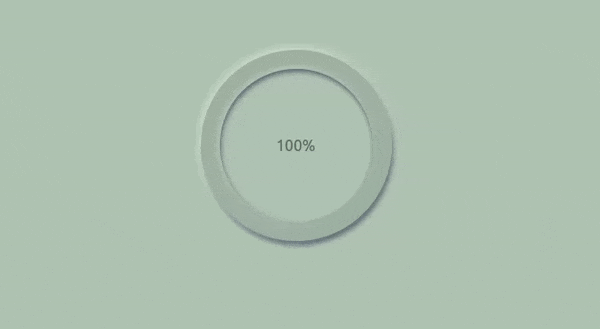
Now, whenever we refresh, we have our progress bar well animated.
useState and useEffect React HooksYou may have noticed that, despite creating the animation, our progress bar displays a static number of 100%. In order to get the correct amount of progression displayed numerically, we need to use the useState and useEffect Hooks to make it display our progress in percentages. These Hooks will be imported into our neumorphism.js component.
import React, { useState,useEffect } from 'react';
Using the useState Hook, our state will be a number, preferably starting from 0.
const [progress, setprogress] = useState(0);
Next, we need a useEffect Hook with no dependencies, so we create an interval to run every 2ms. The basic job of this interval is to set our progress. To have better control, we use the callback form from the set progress to increment by 1.
To clear up this interval and avoid an infinite loop, we employ an if statement, so when it reaches 98 or it equates to 100, it stops running, and we return the value, which should be 100%.
Lastly, we need to pass our progress in our JSX, so we can see it increment. Let’s see this all done.
import React, { useState,useEffect } from 'react';
import './App.css';
function Neumorphism() {
 const [progress, setprogress] = useState(0);

useEffect(()=>{
 const interval= setInterval(()=>{
   setprogress((oldvalue)=>{

     let newValue=oldvalue + 1;

     if(newValue>98){
       clearInterval(interval);
     }

     return newValue;

   })
 },20)
 },[]);

 return (
   <main className='container'>
     <div className="circle1">
       <div className='circle2'>
         <div>
           <p className='text'>{progress}%</p>
         </div>
       </div>
     </div>
   </main>
 )
}

export default Neumorphism;
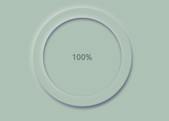
Here is what we finally have:
We have been able to build a progress bar with a neumorphic effect. In our case, we used it to style a progress bar to display downloaded files. Having this type of neumorphic design in your application makes your UI more attractive, and given how easy it can be to implement in your existing React apps, I hope you try it out soon.
Install LogRocket via npm or script tag. LogRocket.init() must be called client-side, not
server-side
$ npm i --save logrocket

// Code:

import LogRocket from 'logrocket';
LogRocket.init('app/id');
// Add to your HTML:

<script src="https://cdn.lr-ingest.com/LogRocket.min.js"></script>
<script>window.LogRocket && window.LogRocket.init('app/id');</script>

Learn how to use Fallow to analyze AI-generated code, detect dead code, duplicate logic, and complexity issues, and integrate automated code quality checks into your AI-assisted development workflow.

Learn how to protect full-stack projects from NPM supply chain attacks with a practical security checklist.

Explore 15 essential MCP servers for web developers to enhance AI workflows with tools, data, and automation.

Learn how contrast-color() automatically picks accessible text colors using native CSS, without JavaScript.
Would you be interested in joining LogRocket's developer community?
Join LogRocket’s Content Advisory Board. You’ll help inform the type of content we create and get access to exclusive meetups, social accreditation, and swag.
Sign up now

 Learn more →
