
Regardless of the type of application that you are building in Unity, there is a high chance that you will use some user interface (or UI for short). However, as simple as this task can be, keeping a clean and reliable system for your UI components is not so trivial. As a matter of fact, a few wrong steps can quickly undermine future changes and generate hours of overwork and revision.
To save you from spending all that energy with unproperly built UI, this article goes through the main steps on learning what Unity offers as far as UI elements followed by a simple workflow to develop your interface structure and, finally, how to use free assets and other Unity tools to enhance its visual elements.
The Replay is a weekly newsletter for dev and engineering leaders.
Delivered once a week, it's your curated guide to the most important conversations around frontend dev, emerging AI tools, and the state of modern software.
Before heading into the UI components, it is often helpful to first adjust Unity’s layout for more productive development. There are two steps I like to consider when doing that: setting up the Scene view and Game view side-by-side, so I can change UI elements simultaneously as I see the result, and changing the Game view to the proper resolution while I am working.
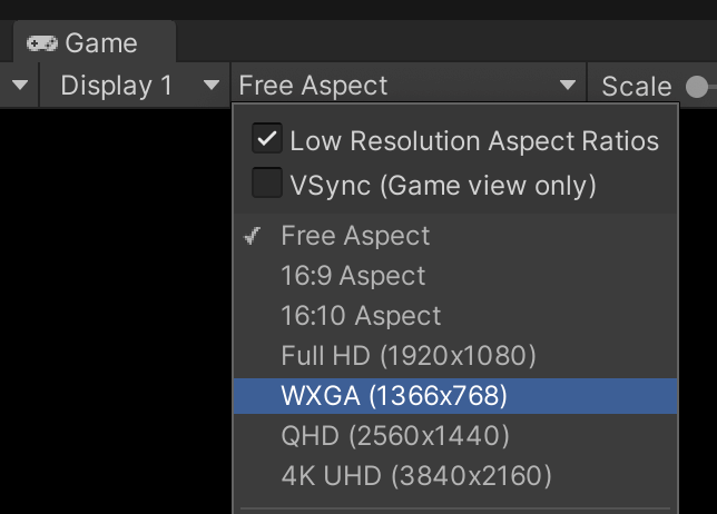
Typically, the Game view is set to Free Aspect by default. By clicking on the resolution option, you can change it to match either the target’s resolution (1366×768 or 1920×1080) or the target’s aspect ratio (16×9 or 18×9). As we will see, this step is critical to adequately assess your progress while working on the UI.
Besides taking care of the Unity panels composition, a new Unity scene has elements that considerably distract from a clean UI. These are mostly the camera, light, and skybox.
Starting from the Camera component, responsible for rendering the Game view, I often change the Clear Flags to Solid Color (which removes Unity’s standard skybox from the Game view) and change the Background to match the background color I want. Notice this step is paramount for menus and other scenes in which the skybox is unnecessary. Besides that, removing the skybox changes your application aesthetics away from a rough prototype.
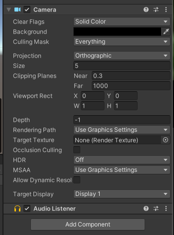
Moreover, I often do a few extra steps when working exclusively for a menu type of scene, be it an additive scene or not, by adjusting the camera settings for culling and projection.
Culling is related to visibility culling techniques used by Unity to optimize its rendering performance. The Culling Mask selects which objects should be rendered or not by the camera. In a UI scene, I often keep only the UI-related objects in the Culling Mask to avoid leftover rendering objects and other helper game objects by mistake.
The Occlusion Culling is a visibility culling technique done by Unity to remove from the renderer objects currently hidden by other objects in front of them. For menu scenes, I prefer to keep this option off since this is not likely to happen on any scale that could be beneficial, nor would it work for 2D scenes.
Furthermore, I often remove the default Light from the scene since the UI elements will not be affected by it. As for the skybox, we could also open the Lighting tab and change it, which is often unnecessary since we already disabled it with the camera options.
Unity UI components must be placed in a specific game object called Canvas. All UI elements are game objects placed as children of the Canvas. The order of these game objects in the Canvas hierarchy matters.
Elements will be drawn in their order: the first element will be drawn first, then the second, and so on. If two elements share the same area on the screen, the latest in the hierarchy will be drawn on top of the others.
After adding a Canvas game object to your scene, some game components will be attached to it automatically, including a Canvas component. To avoid confusion between game objects and scripts, I often rename my Canvas game object to match its responsibility, such as MenuCanvas or PauseCanvas.
Using only one Canvas for your entire UI is possible, but it is essential to consider the consequences. Unity updates and redraws the Canvas every time one of its elements is updated (such as highlighting a button or moving a slider). If your Canvas is complex and contains many elements, any runtime change can be costly to your performance.
For that, consider having multiple Canvases for different responsibilities and update styles (for example, keeping frequently animated objects in a separate Canvas from static objects). To safeguard your hierarchical structure, it is also possible to nest Canvases.
Before adding content to our Canvas(es), two settings require some attention.
The Canvas Render Mode defines how the Canvas will be rendered in the scene. There are three types of render modes: Overlay, Screen Space, and World Space.
Overlay simply renders the canvas on top of the game screen, bypassing the camera and post-processing effects. Screen Space, on the other hand, renders the canvas based on a given distance to the game’s camera. Thus, Screen Space render mode looks more like it is placed in the game world, with elements potentially showing up on top of the UI. Moreover, since Screen Space renders according to a camera, it is affected by the camera’s setup (such as perspective and field of view), as well as post-processing effects.
Finally, World Space deserves an article on its own. World Space renders the Canvas as if it is a 3D element in the game world. It is often used when we want to have UI elements popping up on top of 3D objects or to design a diegetic interface. For this article, we are not discussing the World Space render mode further.
Often, for menus and other UI canvases, we use either Overlay or Screen Space, depending on whether we want the UI to be affected by the camera and post-processing effects. Later on, we will discuss situations in which we might choose one over the other.
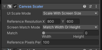
The Canvas Scaler is not a default component of the Canvas game object, but it is one that deserves to be considered, especially when building applications for multiple resolutions. Given the current resolution, the Canvas Scaler uses a reference resolution to scale the UI elements and match them to the current one.
For example, if the Canvas Scaler uses a reference resolution of 200×400 and the current resolution of 400×800, it will scale the components twice. If the current resolution does not match the reference aspect ratio, the Canvas Scaler uses the Match property to decide which size to use as the primary point: width, when it is set to 0, or height, when it is set to 1. Values between 0 and 1 will match width and height proportionally.
As for the other Unity systems manipulated in the Scene view and Hierarchy view, the Unity UI system is also based on game objects. Although different game objects are listed under the UI menu in Unity, there are mainly four that are repeatedly used to make any type of UI. These are Images, Buttons, Text, and Panels. Most of the others, such as Sliders and Input Fields, are mainly combinations of these four with additional scripts.
The Image is a noninteractive graphical element in the UI. Images are used extensively by other components to have a visual representation. Unity also contains a Raw Image component which mainly differs from regular Images by accepting any sort of textures, while Images only accept Sprite assets.
Regularly, Images are used more often than Raw Images due to their features. Notably, the feature to Preserve Aspect, which forces the displayed graphic to keep its aspect ratio regardless of the Image properties on the screen, such as its scaling.
Originally, Unity had a Text component that was used to display non-interactive text elements on the screen. Depending on which version of Unity you use, it will likely still be presented (even if deprecated or set to Legacy). From Unity’s 2021 onwards, the suggested alternative for Texts is to use TextMeshPro components.
The core functionalities of both components are very similar, including changing the text font, size, display options, and color. TextMeshPro offers many more options for displaying the text, but they require you to convert your Font files into specific TextMeshPro Font assets.
Buttons are interactive elements on the UI which invoke Unity Events when clicked. Typically, Buttons have an Image component that controls the Button’s visual transitions, such as hovering the mouse on top or changing its color while clicking on them.
However, that is not mandatory, and it is possible to add a Button component to UI elements without an Image component.
Adding interaction to a Unity Button is very simple and requires that new events are added to the Unity Event list under the Button component.
It might sound silly, but many developers forget that a Unity Button can be used for multiple events at once, such as activating a script and playing a sound. You just need to add these events to the Button’s event list.
The Panel is actually more of an organizational tool rather than a component itself. To be more precise, the Panel is just an Image with default settings for its display. We often use Panels to pack and organize the hierarchy of elements in the scene, rather than to achieve any particular functionality. Moreover, Panels are good candidates to place controlling scripts, since they are often at the head of their hierarchies.
As said before, there are other UI elements with considerable importance, but they are often used in specific scenarios, such as the Mask component or the Canvas Group. For this article, we are focusing on the most used components for general UI implementation, but it is advised to study and practice the use of these other tools, as they might come in handy to speed up your development process.
Different from regular 3D game objects which contain a Transform component to store the game object’s transformations in the 3D space, objects that belong to the Unity UI have a Rect Transform component.
Rect Transforms can be understood as the 2D equivalents of the Transform and work similarly for scaling and rotation operations.
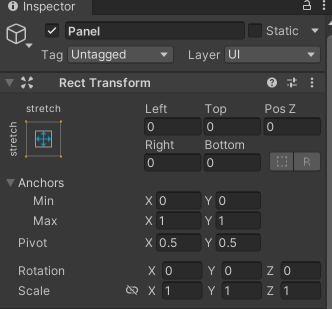
The Rect Transform component commands how UI elements are displayed on the Canvas, as well as how they are positioned and anchored in the layout. The Anchors are a set of two 2D positions that determine the reference the Rect Transform will use to display its content.
As seen in the image above, the Anchors can be accessed in the component by adjusting the minimal and maximum values for X and Y. These values are normalized, i.e., from 0 to 1, where 0 means the 0 percent of the screen and 1 means 100 percent of the screen. An Anchor that goes from Min(0,0) and Max(1,1) covers the horizontal x 100 percent of the screen and the vertical y 100 percent of the screen.
By parenting Rect Transforms, the Anchors no longer refer to the entire screen but to the entire area of its parents. For example, if my screen is 800×600 and my Anchors are the same as the image above (Min(0,0) and Max(1,1)), then my component will span over 800 by 600 units. However, if it is parented to an object that takes half of the screen horizontally and vertically (400×300), then these same Anchors will now span over 400 by 300 units.
Anchors do not necessarily need to control the width and height of their components. In fact, they can either serve as guides for the content area as well as just control a reference point from which its content must align itself. By changing the Anchors, the Rect Transform component will change its labels to match the type of anchoring used.
To facilitate our work, Unity already has a series of Anchor Presets that save us time from manually setting the Anchors for all our components. The Anchor Presets can be found by clicking the Anchor image on the upper left corner of the Rect Transform.
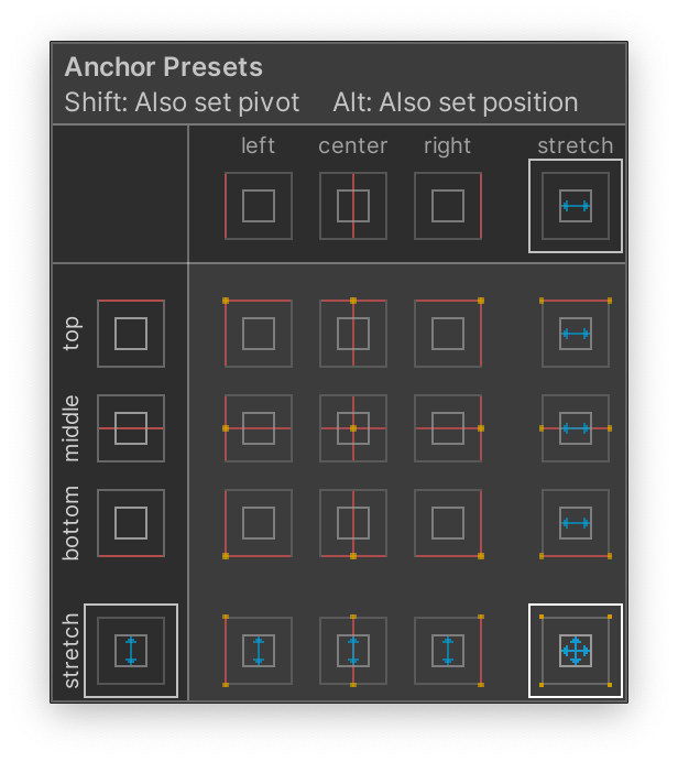
When the values for min and max match in either x, y, or both, the corresponding label on the Rect Transform will change accordingly. Let us discuss the three main variations we can find by working with the Anchors:

 |
 |
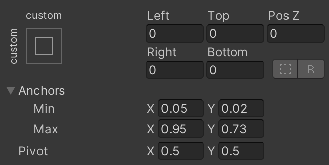
There are many options in combining Anchors to design the layout of our UI. The most important key point while anchoring is to use Anchors (and Presets) to organize where the elements should be on the screen and how they should behave as the screen size changes.
Also, consider that even if your screen size remains the same during your development, it is very likely that you will move elements around and change their sizes. For that, the correct use of Anchors will ensure that your operations will keep the expected rules and behaviors.
Moreover, consider that the parenting Rect Transforms is an important step that will inherit the anchoring and positioning of the parent objects. If a given Rect Transform is anchored in a position with a certain width and height, its child objects will take that as their area and are bound to change if the parent changes too. That is at first a point to consider and be careful about, but later a step towards efficiency, since we can simply inherit specific placement and stretching from the parents and build our UI elements assuming only their local needs.
To better understand this process and good practices in building a UI, let us now mock up the main menu of a game using the abovementioned components. Initially, we will design the components and placements with only the basic Unity UI default assets. Then we will use free Asset Store assets to mock up a final UI.
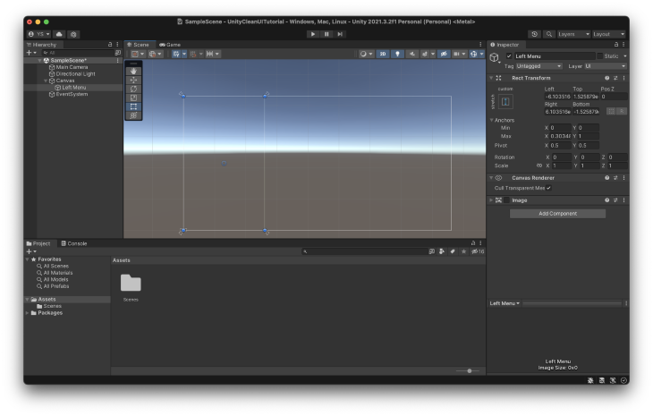
Normally, the first step I take while designing a menu is to create panels that will divide the screen for the main components of the menu. Since we are mocking the main menu, we will have a left panel to hold the menu and the game’s logo.
As stated previously, Panels are nothing more than Images with default values. Since we do not need the images for these initial panels, I often disable the Image component. I prefer to disable it instead of removing it because I activate it to check overlaps and visual artifacts.
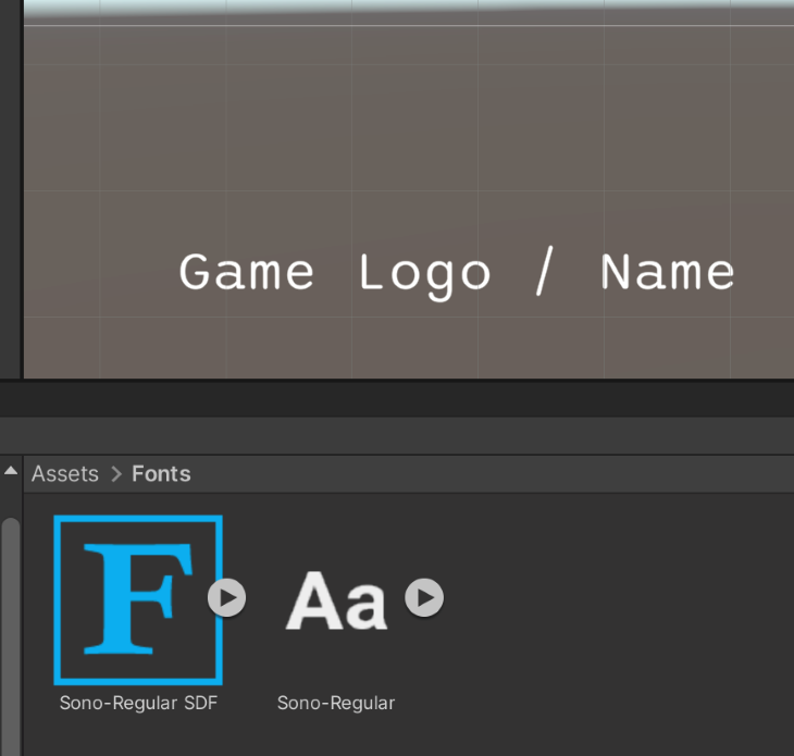
As a placeholder for the game’s logo, I am using a simple TextMeshPro component. As stated previously, this component requires you to generate a font asset. That can be done by simply right-clicking a font file in your Project view followed by Create > TextMeshPro > Font Asset.
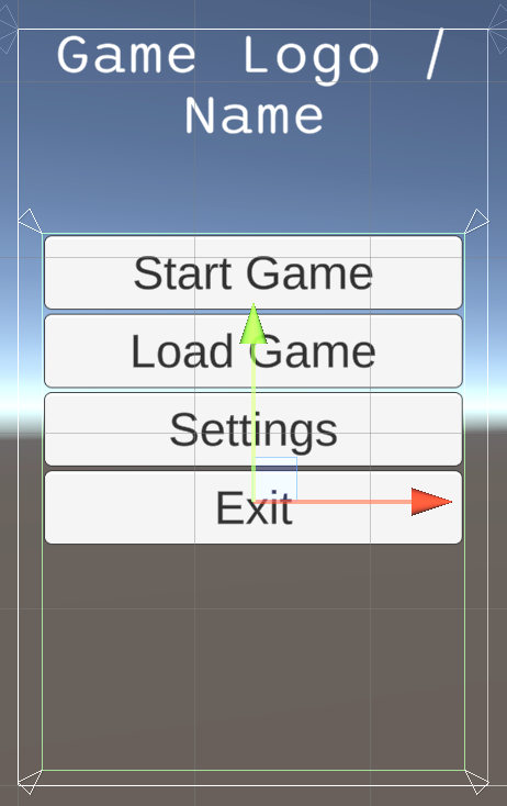 |
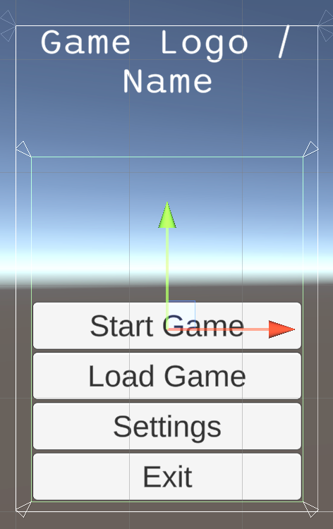 |
We use a combination of components for the menu buttons to give us better flexibility and easier maintenance. First, instead of placing them directly on the left panel we created, it is best to create another panel just for the buttons.
By using parenting panels we can more precisely control the area of all buttons simultaneously instead of one by one. If we need to move all buttons, for instance, to add another component below them (or above), we can achieve it by simply moving their parent panel.
Furthermore, we should be able to move all components within the new panel for whatever reason, while the content will still abide by how the panel is being displayed and stretched on the screen.
In general, it is always a good idea to group your content into specific panels and make the hierarchy based on these assortments of panels. As any change is necessary, all parented panels will keep their particular anchors regarding their parents. Thus, applying a significant change to any content is unnecessary, as it will keep anchoring.
It is vital to change the anchors to achieve any of these operations. Changing other components will not necessarily maintain the same behavior in eventual resolution changes or updates in the UI. For that, I usually recommend the use of custom Anchors, as seen above, so that exactly all operations are performed accordingly to all components.
The other technique employed to keep all buttons consistent is the use of auto layouts. More specifically, I added a Vertical Layout Group, which automatically organizes child elements in order, on top of each other.
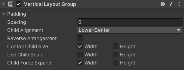
By using the properties to Control Child Size and Child Force Expand, which respectively control the size of each element and whether they should completely expand to fill in the parent, we can easily obtain a good presentation.
Moreover, we do not need to apply any changes to newly added buttons. When we add a new button, it will follow the orders specified at the Vertical Layout Group and behave visually like the others. As long as there is space for new buttons, this approach allows you to have easy-to-expand menus with ease.
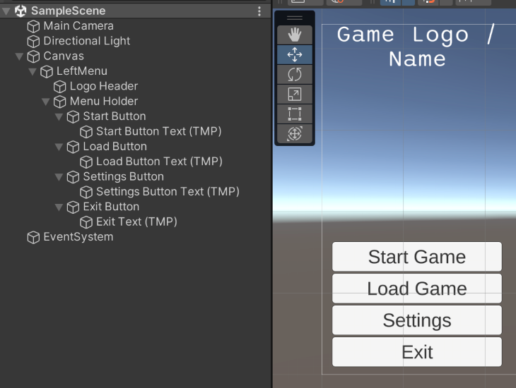
By following the previous steps, we should have a hierarchy similar to the one above. Notice that as new content is added, new panels are introduced to control them. Also, components that are not visually linked in groups, such as the game logo and the main menu, are kept as siblings in the hierarchy, without a parent-child relation.
The images below show how the UI reacts when we change the resolution to 4:3 and 8:3.
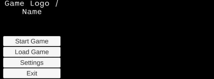
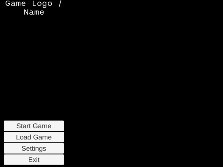
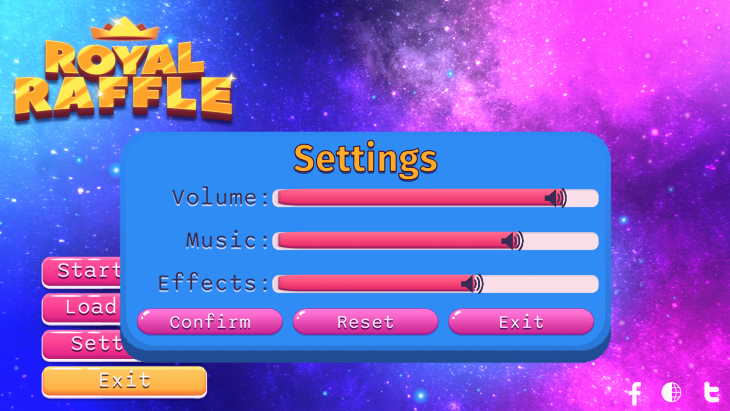
A common feature in this type of menu is to have other windows popping up to display more information and functionalities. For our example, let us see how we could achieve it by using these same previous steps to achieve a Settings window like the one displayed below.
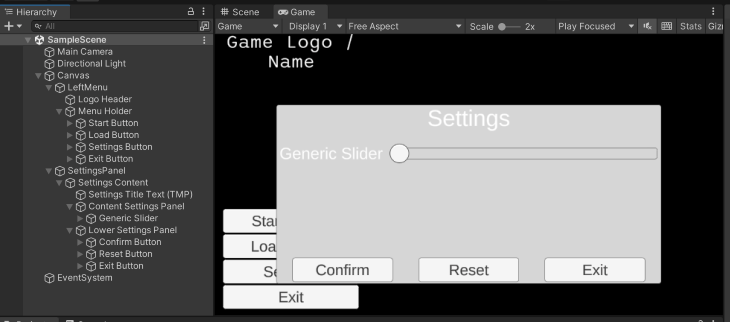
Since the Settings window takes its own space on the screen, it makes more sense to keep it separate from the Left Menu hierarchy. With that, we can set its anchors according to the entire canvas, instead of related to the Left Menu. We can do that by creating a Panel as a child of the Canvas.
In the case of Window type of UI elements, I often create a child Panel within the Window panel to hold its content. This is often helpful if I decide to change the borders of the window or use different graphics for its background and foreground.
Remember that the rule of thumb we are often using for panels is to create more panels in the hierarchy every time we want to group objects that share the same intent or feature. In this particular case, we want to create a new panel to hold all of the window’s content.
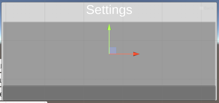
We apply the same principle when creating panels for the separate types of content inside the window. As seen in the images before, we want some sort of Settings area, with sliders, and a Confirmation area, with buttons.
For both the Settings area and the Confirmation area, we can use Auto Layouts again to quickly allow them to expand/shrink in content as necessary. To be more precise, for the Settings area, we can use another Vertical Layout Group to handle the sliders and other possible settings features we might want, while for the Confirmation area we can use a Horizontal Layout Group to handle the buttons horizontally.
The only component from this window we did not discuss before is the Slider component. The slider is a Unity component that let us control a numeric value using a predefined range. It allows us to select the range (which is not limited by 0 and 1) and add one or more Unity Events that are called whenever the slider changes.
The slider is a composition of other elements we discussed before, such as Panels and Images. It is also a good example of how to organize your hierarchy to achieve similar results. To achieve the filling effect as the handle is moved, the Slider uses an interesting Image property called Fill.
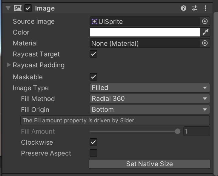
To control the image fill in other contexts, you have to change the Image Type to Filled. That will display the specific Fill properties, such as how much the image is being filled in. Although in this context the image’s fill is being handled by the Slider component, you can use it in other contexts. For example, to make a loading bar or a health bar.
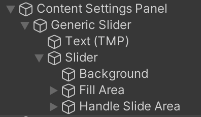
Unfortunately, the Slider component does not come with inbuilt text such as the Toggle or the Button components. In this case, to achieve the text label next to the slider, the approach used was to first create a new Panel to hold all the slider’s content (Slider and Text) and then add the Text and the Slider as child objects of this Panel.
If you are repeatedly adding new Sliders to this menu, it would be wise to make it a prefab.
The image below shows what the hierarchy for the Slider and its content looks like.
Now that we have a base menu, it is easy to replace its images and elements to mock up a proper game UI. The image below shows what this same layout, with minor adjustments and additions, would look like if we were to use the free assets Dark Theme UI, 2D Logo Templates, and Free Galaxy Background.
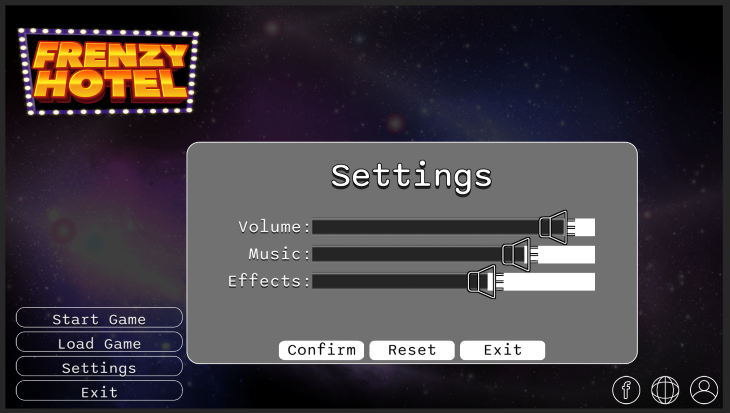
Notice that the main changes done were to replace the TextMeshPro with an Image, so I could use a logo, and to add a new panel in the bottom right corner for social media buttons.
The same process could be done with other assets using the same base. Following you can see another version of this UI using the free assets from Extra Clean UI, 2D Casual UI HD, and KartInnka Buttons Set.
If you’ve read any of my other posts, you know I am a huge fan of using post-processing effects to enhance the visual quality of my projects. For this one, it is not different. However, let us remember that there is an important UI-specific decision to be made before going further: the Canvas Renderer type.
As stated previously, Canvas has a specific render method that influences whether the Canvas can be affected by post-processing or not. If you want elements to be affected by post-processing, set their Canvas to be in the render mode Screen Space. Otherwise, use Overlay.
For this project, I used Bloom, Vignette, and Color Grading to improve the visual cohesion and quality of the menus. Below there are images of the before and after for both UIs.


As you can see, the post-processing effects help to bring the colors together, which enhances the feeling of a cohesive UI. Moreover, it helps to bring that extra flavor to shiny elements (like the game’s logo with the Bloom effect) and focus the user (using the Vignette to darker the edges).
Thanks for reading, and let me know if you would like more Unity UI and UI components strategies for fast development and prototyping. You can see more of my work at www.dagongraphics.com.
Install LogRocket via npm or script tag. LogRocket.init() must be called client-side, not
server-side
$ npm i --save logrocket

// Code:

import LogRocket from 'logrocket';
LogRocket.init('app/id');
// Add to your HTML:

<script src="https://cdn.lr-ingest.com/LogRocket.min.js"></script>
<script>window.LogRocket && window.LogRocket.init('app/id');</script>

Learn about TypeScript v6’s breaking changes, new ES2025 features, and deprecated options. A complete migration guide from v5 to prepare for v7.

Learn how Vite+ unifies Vite, Vitest, Oxlint, Oxfmt, Rolldown, and Node.js management in one CLI.

AI companies are buying developer tools as coding agents turn runtimes, package managers, and linters into strategic infrastructure.

Learn how AI-assisted development governance uses rules, agents, hooks, and protocols to help AI coding tools produce safer, more consistent code.
Would you be interested in joining LogRocket's developer community?
Join LogRocket’s Content Advisory Board. You’ll help inform the type of content we create and get access to exclusive meetups, social accreditation, and swag.
Sign up now