The need to integrate carousels into our web applications frequently arises. Carousels are UI components that display multiple items in a single space.

They’re one of the most aesthetic components on a web page but often prove difficult to create from scratch, especially in frameworks like React.
React Slick is a great library for creating carousels quickly and easily. It offers accessibility and responsiveness to help you create simple, sleek, performant carousels. In this article, you will learn how to create a simple carousel component with React Slick and explore some of its main features.
To follow along, you should have a basic understanding of
In this tutorial, we’ll create a Carousel view that displays rooms available in a hotel.
Open up your terminal and run the following command to install React:
npx create-react-app react-carousel
Next move into the react-carousel directory:
cd react-carousel
And install the following dependencies:
npm install react-slick slick-carousel react-icons
React Slick is the main library that provides us with the carousel component. slick-carousel provides styling for this component while react-icons will be used for importing icons.
All styling for this application is located in src/index.css available in the source code. View the live project.
From the root directory, create the path components/Carousel.js and import this component into App.js:
//App.js
import Carousel from "../components/Carousel";

export default function App() {
  return <Carousel />;
}
Usually, the content displayed in each item of a carousel is similar. Therefore, we can store this content in an array as such:
// Carousel.js
import 'slick-carousel/slick/slick.css'
import 'slick-carousel/slick/slick-theme.css'

export default function Carousel() {
  const hotelCards = [
    {
      imageSrc:
        'https://images.unsplash.com/photo-1559508551-44bff1de756b?ixid=MnwxMjA3fDB8MHxwaG90by1wYWdlfHx8fGVufDB8fHx8&ixlib=rb-1.2.1&auto=format&fit=crop&w=387&q=80',
      title: 'Studio Room',
      description: 'Lorem ipsum dolor sit amet, consectur dolori',
      pricingText: 'USD 50/Day',
      features: ['Free Wifi', 'Free breakfast'],
    },
    {
      imageSrc:
        'https://images.unsplash.com/photo-1616940844649-535215ae4eb1?ixlib=rb-1.2.1&ixid=MnwxMjA3fDB8MHxwaG90by1wYWdlfHx8fGVufDB8fHx8&auto=format&fit=crop&w=387&q=80',
      title: 'Deluxe Room',
      description: 'Lorem ipsum dolor sit amet, consectur dolori',
      pricingText: 'USD 80/Day',
      features: ['Free Wifi', 'Free breakfast'],
    },
    {
      imageSrc:
        'https://images.unsplash.com/photo-1599619351208-3e6c839d6828?ixlib=rb-1.2.1&ixid=MnwxMjA3fDB8MHxwaG90by1wYWdlfHx8fGVufDB8fHx8&auto=format&fit=crop&w=872&q=80',
      title: 'King Deluxe Room',
      description: 'Lorem ipsum dolor sit amet, consectur dolori',
      pricingText: 'USD 150/Day',
      features: ['Free Wifi', 'Free breakfast', 'Discounted Meals'],
    },
    {
      imageSrc:
        'https://images.unsplash.com/photo-1461092746677-7b4afb1178f6?ixlib=rb-1.2.1&ixid=MnwxMjA3fDB8MHxwaG90by1wYWdlfHx8fGVufDB8fHx8&auto=format&fit=crop&w=774&q=80',
      title: 'Royal Suite',
      description: 'Lorem ipsum dolor sit amet, consectur dolori',
      pricingText: 'USD 299/Day',
      features: [
        'Free Wifi',
        'Free breakfast',
        'Discounted Meals',
        "MacBook for work use (hotel's property)",
      ],
    },
  ]

  return (
    <div className='content'></div>
  )
}
Notice I’ve also imported two stylesheets from slick-carousel at the top of the component.
Slider and configuring Slider settingsWith the content we need, let’s begin mapping out the structure of the Carousel component. React Slick has a Slider component responsible for displaying the carousel:
// Carousel.js
import Slider from 'react-slick'

import 'slick-carousel/slick/slick.css'
import 'slick-carousel/slick/slick-theme.css'

export default function Carousel() {

  const sliderSettings = {
    slidesToShow: 3,
    slidesToScroll: 1,
    infinite: false,
  }

  const hotelCards = [
    // ...
  ]

  return (
    <div className='content'>
      <Slider {...sliderSettings}>
        {hotelCards.map((card, index) => (
          <div key={index}>
            <h2>{card.title}</h2>
            <img alt={card.title} src={card.imageSrc} width="100" height="100" />
            <p>{card.description}</p>
            <ul>
              {card.features.map((feature, index) => (
                <li key={index}>{feature}</li>
              ))}
            </ul>
            <button className='btn'>Buy Now</button>
          </div>
        ))}
      </Slider>
    </div>
  )
}
In the code block above, we’ve created a sliderSettings variable to store the carousel settings. We then spread this object into the Slider component.
sliderSettings has three configurations so far:
slidesToShow — number to determine the number of slides to keep in viewslidesToScroll — number to determine the number of slides to move when navigating the carouselinfinite — Boolean to determine if the carousel continues in a loop when the last item is reachedThe end result at this point should look like this:
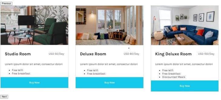
N.B. React Slick has more carousel configurations, which we’ll get into momentarily.
The default control buttons given by React Slick do the work, but probably don’t pass the UI test.
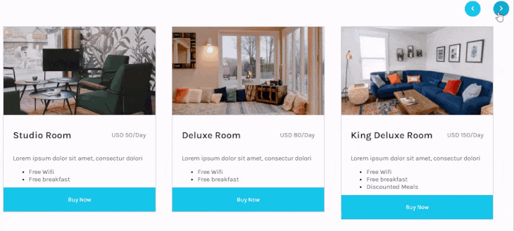
So, let’s create custom buttons of our own and use React Slick’s API to make them function. We’ll start by removing the buttons:
// Carousel.js
import {useState} from 'react'
import Slider from 'react-slick'
import {FaChevronLeft, FaChevronRight} from 'react-icons'

import 'slick-carousel/slick/slick.css'
import 'slick-carousel/slick/slick-theme.css'

export default function Carousel() {
  const [sliderRef, setSliderRef] = useState(null)

  const sliderSettings = {
    // removes default buttons
    arrows: false,
    slidesToShow: 3,
    slidesToScroll: 1,
    infinite: false,
  }

  const hotelCards = [
    // ...
  ]

  return (
    <div className='content'>
      <div className='controls'>
        <button>
          <FaChevronLeft />
        </button>
        <button>
          <FaChevronRight />
        </button>
      </div>
      <Slider ref={setSliderRef} {...sliderSettings}>
        {pricingCards.map((card, index) => (
          <div key={index}>
            <h2>{card.title}</h2>
            <p>{card.description}</p>
            <ul>
              {card.features.map((feature, index) => (
                <li key={index}>{feature}</li>
              ))}
            </ul>
            <button>Buy Now</button>
          </div>
        ))}
      </Slider>
    </div>
  )
}
In order to have access to React Slick’s API, we have to store an instance of Slider in a variable (state) by linking Slider‘s ref value to the state — whose initial value is set to null. When the component then renders, we can access the API through this state.
The two functions we want to use from the API are slickPrev and slickNext, which move the carousel back and forth respectively by the number specified in slidesToScroll. Applying this on the buttons, our return function should look like this:
return (
    <div className='content'>
      <button onCLick={sliderRef?.slickPrev}>
        <FaChevronLeft />
      </button>
      <button onCLick={sliderRef?.slickNext}>
        <FaChevronRight />
      </button>
      <Slider ref={setSliderRef} {...sliderSettings}>
        {pricingCards.map((card, index) => (
          <div key={index}>
            <h2>{card.title}</h2>
            <p>{card.description}</p>
            <ul>
              {card.features.map((feature, index) => (
                <li key={index}>{feature}</li>
              ))}
            </ul>
            <button>Buy Now</button>
          </div>
        ))}
      </Slider>
    </div>
  )
React Slick also lets us control responsiveness through the responsive property.
The responsive property is an array with two values: breakpoint and settings.
breakpoint — number (in pixels) at which we want the subsequent settings to take effectsettings — object containing carousel settings to apply when breakpoint is reachedAdd the following configuration to sliderSettings:
const sliderSettings = {
  // ...
  responsive: [
    {
      breakpoint: 1024,
      settings: {
       slidesToShow: 2,
      }
    },
    {
      breakpoint: 600,
      settings: {
       slidesToShow: 1,
      }
     }
  ]
};
With this, it becomes easier to control the view of our carousel across multiple devices without hurting the UX.
Asides from responsiveness, React Slick also has its accessibility option set to true by default. This allows arrow keys and the gesture of dragging the mouse across the carousel to move the carousel.
Below are some other settings you can try out. View all examples on their page:
const settings = {
    fade: true ,
    speed: 500, // ms
    autoplay: false,
    initialSlide: 2,
    lazyLoad: true,
    autoplaySpeed: 3000,
}
React Slick is a library filled with good options that can fit into your web projects easily. With 800k+ downloads on npm, React Slick might really be the last React carousel you’ll ever need.
Install LogRocket via npm or script tag. LogRocket.init() must be called client-side, not
server-side
$ npm i --save logrocket

// Code:

import LogRocket from 'logrocket';
LogRocket.init('app/id');
// Add to your HTML:

<script src="https://cdn.lr-ingest.com/LogRocket.min.js"></script>
<script>window.LogRocket && window.LogRocket.init('app/id');</script>

Discover how to build, render, and automate product demo videos with Remotion, replacing traditional screen recordings with reusable React code.

Chrome’s Modern Web Guidance embeds modern web platform skills into AI coding agents, helping them choose native HTML, CSS, and browser APIs over legacy patterns.

Learn how to use Fallow to analyze AI-generated code, detect dead code, duplicate logic, and complexity issues, and integrate automated code quality checks into your AI-assisted development workflow.

Learn how to protect full-stack projects from NPM supply chain attacks with a practical security checklist.
Hey there, want to help make our blog better?
Join LogRocket’s Content Advisory Board. You’ll help inform the type of content we create and get access to exclusive meetups, social accreditation, and swag.
Sign up now

 Learn more →
