Animations are a major part of modern-day web development components. They add an aesthetic and visual appeal to how web applications are presented to users, and they improve usability and overall experience.
As such, the need for animated web pages is growing, but it is getting more complicated to animate certain web components without causing a major performance or usability problem.
Kendo UI has done a great job of creating reusable animation components that we can build on to customize seamless animations for our web applications. In this post, I’ll demonstrate how we can quickly get started with the Kendo UI Animation component for React to add predefined animations to our React application.
Under the hood, Kendo UI React Animations use the React TransitionGroup component to animate elements that appear, enter, or exit the view. Consequently, it uses the ReactTransitionGroup add-on to perform CSS transitions and animations when a React component enters or exits.

The Kendo UI Animation component delivers a set of customizable animation types that you can use according to your needs. It offers the following types of animations:
The Fade Animation animates newly added children by using a fade-in effect to bring the new child into view. Here’s a simple demo that adds a new child to the component each time a button is clicked:
import { Fade } from '@progress/kendo-react-animation';
class App extends Component {
  constructor(props) {
      super(props);
      this.state = { index: 1 };
  }
  onClick = () => {
    this.setState({
        index: this.state.index + 1
    });
  }
  render(){
    const { index } = this.state;
    return(
      <div>
        <Fade><div> {index} </div></Fade>
        <button onClick={this.onClick}>Animate</button>
      </div>
    )
  }
}
Here, we rendered the Fade Animation component and passed in a counter to update the child component each time the button is clicked. The TransitionGroup lifecycle hook will automatically detect the enter and exit state of the element and animate it appropriately. Here’s the output animation in action:

The next one is the Expand Animation. It animates the scaleY() and scaleX()CSS properties of the container element. Consider the example below:
  import { Expand } from '@progress/kendo-react-animation';
  class App extends Component {
    constructor(props) {
      super(props);
      this.state = { show: true };
    }
    onClick = () => {
      this.setState({
          show: !this.state.show
      });
    }
    render() {
      const { show } = this.state;
      const children = show ? (<div>Content Here ...</div>) : null;
      return (
        <div>
          <Expand>
              {children}
          </Expand>
          <button onClick={this.onClick}>Animate</button>
        </div>
      )}
  }
Just like before, we are passing a custom child component to the parent Animation component, which will use the show variable in the state object to animate the element when the button is clicked. Here’s the output on the browser:

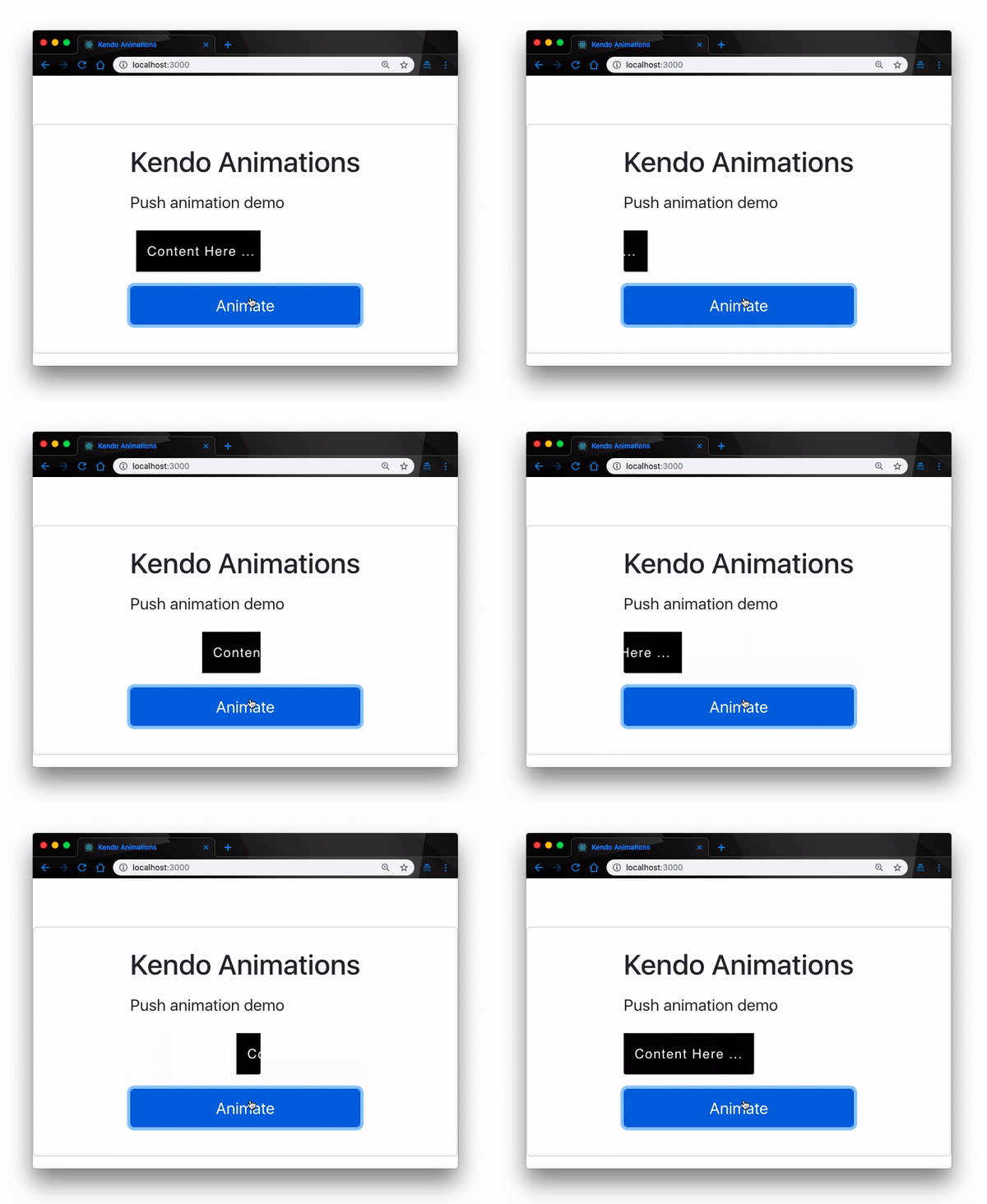
The Push Animation simply slides in the new component by pushing the old one out. The TransitionGroup hook adds the animation effects accordingly as the components enter and exit the view.
import { Push } from '@progress/kendo-react-animation';
...
  <Push>
     {children}
  </Push>
...
The Push Animation component is one of the few components that slide child components across the screen, giving it an edge for the visual appeal it offers. Here’s how it plays out:

Just like the Expand Animation, the Reveal Animation animates the height and the width CSS properties of the container element.
import { Reveal } from '@progress/kendo-react-animation';
...
  <Reveal>
     {children}
  </Reveal>
...
The Reveal Animation exerts its effect on the parent component. This makes it possible for you to define the child components as you please. The composition, properties, and features of the elements in the parent have no effect on the Reveal Animation itself. Here’s a demo from the snippet above:

The Slide Animation is not very different from the Expand Animation. Unlike Expand, however, the Slide Animation slides a single piece of content in a predefined direction.
import { Slide } from '@progress/kendo-react-animation';
...
  <Slide>
     {children}
  </Slide>
...
The major difference between Slide and the Expand Animation is the ability to predefine the direction of the animation effect. With Slide, the component slides in and out from the top by default, but you can customize the entry and exit positions. Here’s a demo:

Finally, Kendo UI has a Zoom Animation component that works in a similarly to the Fade Animation. It displays its content by applying a zoom-in and a zoom-out transition effect.
import { Zoom } from '@progress/kendo-react-animation';
...
  <Zoom>
     {children}
  </Zoom>
...
The Zoom Animation exerts a zoom-in or zoom-out effect on the parent component. It’s similar to the Reveal Animation; this time, however, it zooms in or out instead of exerting Reveal effects on the height and width properties. Here’s a demo:

Irrespective of the type of Animation you’ve chosen to implement, they are all fully customizable. For each Animation type, you have the ability to control the duration of the entering and exiting Animation effects. For instance, we can speed up the effect of the Zoom Animation by redefining the code to add transition duration values like this:
import { Zoom } from '@progress/kendo-react-animation';
...
<Zoom
  transitionEnterDuration={500}
  transitionExitDuration={800}>
      {children}
</Zoom>
...
The lower the transition durations, the faster the Animation effect. This is applicable to every other type of Animation we’ve discussed here.
Having seen all the different Animation types that Kendo UI offers, let’s bring it together and create a mini React project with an animated login page using the Kendo UI Animation component. First, let’s create a React project. Open a terminal window and run the commands below:
create-react-app animations-demo
cd animations-demo && npm start
N.B., you need to have the React CLI tool installed globally to run the command above.
This will create the animations-demo project and start the development server on localhost:3000 in your default browser. Open the browser to that port, and you should get the project live:

Next, we install the Kendo UI Animation component. Open a terminal in the project’s root directory and run the command below:
npm install --save @progress/kendo-react-animationThis will install the Animations package in your project. Next, add the Kendo UI default theme package. Open the index.html file inside the public directory, and add this link within the <head/> tag:
<link rel="stylesheet" href="https://unpkg.com/@progress/kendo-theme-default@latest/dist/all.css" />
Next, we create our Login component. In the src directory, create a new directory called components. Inside the new components directory, create a new file called Login.js.
What we want to do is implement a simple login page where users will provide their login details. If their credentials are correct, the components animate into a new page; if the credentials are wrong, we throw an error dialog with the Kendo UI Dialog component.
That said, let’s get to it. Open the Login.js file we created earlier and update it with the code below:
<!-- src/components/Login -->
import React, { Component } from "react";
import { Push } from "@progress/kendo-react-animation";
import { Dialog, DialogActionsBar } from "@progress/kendo-react-dialogs";
class Login extends Component {
  constructor(props) {
    super(props);
    this.state = {
      email: "",
      password: "",
      show: true,
      visibleDialog: false
    };
    this.handleEmailChange = this.handleEmailChange.bind(this);
    this.handlePasswordChange = this.handlePasswordChange.bind(this);
    this.loginUser = this.loginUser.bind(this);
    this.toggleDialog = this.toggleDialog.bind(this);
  }
  ...
}
Here, we have defined a constructor and initialized our state object with the values we’ll need throughout the app. We have also bound all our event handlers to this context.
Next, let’s define them. Update the file with the snippet below:
  <!-- src/components/Login -->
  ...
  toggleDialog = () => {
    this.setState({
      visibleDialog: !this.state.visibleDialog
    });
  };
  handleEmailChange(e) {
    this.setState({ email: e.target.value});
  }
  handlePasswordChange(e) {
    this.setState({ password: e.target.value});
  }
  loginUser(e) {
    e.preventDefault();
    if (this.state.email === "[email protected]" && this.state.password === "1234"){
      this.setState({
        show: !this.state.show
      });
    } else {
      this.toggleDialog();
    }
  }
  ...
Here we’ve defined the functionalities of the event handlers:
toggleDialog() function helps us display the Dialog component when a wrong credential is submittedhandleEmailChange() and handlePasswordChange() help us update the email and password variables in the state object with the values of the login input fieldsloginUser() function helps us animate the login component if the credentials match, or throw the Dialog if they don’t.Next, we define our render() method to conditionally show our login component using the value of the show variable we defined in the state object:
  <!-- src/components/Login -->
  ...
  render() {
    const { show } = this.state;
    const children = show ? (
      <div>
        <form>
          <div class="form-group">
            <label for="exampleInputEmail1">Email address</label>
            <input
              value={this.state.email}
              onChange={this.handleEmailChange}
              type="email"
              class="form-control"
              id="exampleInputEmail1"
              aria-describedby="emailHelp"
              placeholder="Enter email"/>
          </div>
          <div class="form-group">
            <label for="exampleInputPassword1">Password</label>
            <input
              value={this.state.password}
              onChange={this.handlePasswordChange}
              type="password"
              class="form-control"
              id="exampleInputPassword1"
              placeholder="Password"
            />
          </div>
          <div class="form-group form-check">
            <input
              type="checkbox"
              class="form-check-input"
              id="exampleCheck1"
            />
            <label class="form-check-label" for="exampleCheck1">
              Remember me
            </label>
          </div>
          <button onClick={this.loginUser} class="btn btn-primary form-control">
            Login
          </button>
        </form>{" "}
      </div>
    ) : null;
  ...
}
Here, we first check if the show variable is true; if it is, we render the login form for users to supply their details. In the return() method of the render() function, we’ll define our Dialog and render the login form in a Push Animation component.
  <!-- src/components/Login -->
  ...
  return (
      <div>
        <div>
          {!this.state.visibleDialog}
          {this.state.visibleDialog && (
            <Dialog title={"Login Error"} onClose={this.toggleDialog}>
              <p style={{ margin: "25px", textAlign: "center" }}>
                Wrong credentials, try again?
              </p>
              <DialogActionsBar>
                <button className="k-button" onClick={this.toggleDialog}>
                  No
                </button>
                <button className="k-button" onClick={this.toggleDialog}>
                  Yes
                </button>
              </DialogActionsBar>
            </Dialog>
          )}
        </div>
        <div class="text-center mt-5">
          <Push transitionEnterDuration={500} transitionExitDuration={800}>
            {children}
          </Push>
        </div>
      </div>
    );
  }
}
export Default Login
Finally, we update the App.js file with the new login component we just created. Open it up and update it with the code below:
// src/App.js
import React, { Component } from 'react';
import './App.css';
import Login from './components/Login'
  class App extends Component {
    render() {
      return(
      <Login/>
      );
    }
 }

export default App;
Here’s the logic behind our implementation: we have defined a single user who can log in to our application with email [email protected] and password 1234. Obviously, you would perform your proper authentications and validations in production; we’ve only used this technique for demonstrative purposes.
As a result, if these exact credentials are not supplied, we throw the error Dialog; if they are, we animate the login component away with the Kendo UI Push Animation component. If you run the app we’ve just set up, you should have this functionality:

In this post, we have gone over the Kendo UI React Animation component. We have demonstrated the types of animations we can achieve with Kendo UI and gone ahead to build a mini animated React login page to put words into action.
There’s so much more you can do with Kendo UI, as you will find in the official documentation. I feel the need to mention that you can’t handle extended, complex animations with Kendo UI, but if what you are looking to build falls within the scope of Kendo UI’s capabilities, it is a great choice.
Install LogRocket via npm or script tag. LogRocket.init() must be called client-side, not
server-side
$ npm i --save logrocket

// Code:

import LogRocket from 'logrocket';
LogRocket.init('app/id');
// Add to your HTML:

<script src="https://cdn.lr-ingest.com/LogRocket.min.js"></script>
<script>window.LogRocket && window.LogRocket.init('app/id');</script>
Would you be interested in joining LogRocket's developer community?
Join LogRocket’s Content Advisory Board. You’ll help inform the type of content we create and get access to exclusive meetups, social accreditation, and swag.
Sign up now
Which AI frontend dev tool reigns supreme in July 2025? Check out our power rankings and use our interactive comparison tool to find out.

Learn how OpenAPI can automate API client generation to save time, reduce bugs, and streamline how your frontend app talks to backend APIs.

Discover how the Interface Segregation Principle (ISP) keeps your code lean, modular, and maintainable using real-world analogies and practical examples.

<selectedcontent> element improves dropdowns