
The Replay is a weekly newsletter for dev and engineering leaders.
Delivered once a week, it's your curated guide to the most important conversations around frontend dev, emerging AI tools, and the state of modern software.
Product tours are used to familiarize new and existing users with the interface of your application and guide them towards taking meaningful actions that will help them utilize your application to its full potential.
In this article, I’ll walk you through how you can craft product tours that will help convert new users of your application into long-term users or customers.
All software, especially new products that are the first of their kind, often have a bit of a learning curve. As the product owner, your goal is to help shorten that curve by showing users how to efficiently use your product and its features. This can be done with the help of product tours.
Product tours also help with user retention and conversion, as most users who can’t navigate through the UI of your application will get frustrated and go on to use your competitors’ product instead.
Please note that product tours are not a substitute for a great user interface design, so it’s important to consider investing in high quality designs as well.
While product tours are a great tool, if poorly executed, they can quickly frustrate new users, preventing them from discovering your product’s core value and making them more likely to abandon your product too soon. The key is to focus on your product’s value and user goals, instead of dragging users through every feature. In this article, we’ll cover tips for designing effective product tours.
Creating awesome product tours isn’t rocket science, but it does apply scientific principles in that you have to test and iterate on your tour multiple times to find out what is best for your users while following basic design principles. Let’s take a look at some useful tips, shall we?
Not every user likes to be lectured on how to use a product. Some of them learn by playing around with your user interface and figuring things out themselves, and forcing a product tour on them could make them less interested. For this reason, think about adding a “skip” button to your tour. Do note that there are cases where adding a product tour might be crucial, but this depends on your product type.
When creating product tours, don’t try to overcomplicate things. Not every new user is eager to use your products, so try to respect their time by keeping it short and simple.
You can achieve this by streamlining your product tour to contain only key steps the user needs in order to get acquainted with your product and get the most out of it.
Throwing around random highlights and tooltips isn’t the best way to show your users that you respect their time, and it can be confusing. Try your best to make your product tour follow a particular sequence instead. This will make your users eager to explore your product offerings.
Most of the time, instead of showing your users all of your product’s features at once, you can simply suggest features they should try out or features they should know about after they’ve carried out a specific action or set. This encourages them to learn by self-discovery which is arguably one of the best methods of learning.
Try to focus only on your product’s core offerings instead of boring your users with every little detail. The 80/20 principle can also be applied here in the sense that most of your users will only use 20 percent of your product’s features to achieve 80 percent of their needs. This means you should find out what that 20 percent of your product offering is and feature it in your tour.
vue-tourThere are tons of libraries we can use in crafting our product tours in Vue.js, but we’ll take a look at using the vue-tour library. vue-tour is the most widely used at 20,000 downloads weekly and 2,000 Github stars. It’s also easy to get it up and running and offers plenty of customizations.
To practice how we can craft product tours in Vue.js, we’ll take an existing dashboard application and add a product tour feature to it using the vue-tour library.
You can find the Github repository for crafting product tours with vue-tour here.
Please note that the repository has two branches: one is the main branch which is the initial, and the second is the product-tour branch, which is the final product.
To get started, let’s fork the repository and clone it into our local machine.
Then we install node modules using the following command:
yarn install
#OR if you prefer using npm
npm install
Next, we install the vue-tour library by running the command below:
yarn add vue-tour
#OR
npm install vue-tour
Unfortunately, the vue-tour library isn’t yet compatible with Vue 3. This is being worked on and is going to be released by the project maintainers in an update coming soon, but for now, we’ll be using it with Vue 2.
In your main.js file add the following lines of code. This imports the vue-tour library, its default styling, and also specifies that we want to use the library globally in our application:
import VueTour from 'vue-tour';
import 'vue-tour/dist/vue-tour.css';
Vue.use(VueTour)
vue-tourFirst we have to add either a unique class name, ID name, or data property to the element we want our tour to target.
Navigate to DashboardHome.vue through src > views > dashboard > DashboardHome:
<template>
  <v-main>
    <v-container>
      <div class="lg:flex">
        <v-container class="left-side">
          <v-row>
            <v-col cols="12">
              <h2 class="text-xl">Hello, Iniubong!</h2>
              <p class="text-sm mt-2 text-gray-400">
                Let's travel around the world again
              </p>
            </v-col>
            <v-col cols="6">
              <v-card
                id="v-step-0"
                height="150px"
                class="rounded-lg text-center cursor-pointer"
              >
                <router-link :to="'/dashboard/plan-trip'">
                  <div>
                    <v-avatar class="icon avatar-badge mt-6" size="50">
                      <v-icon color="primary">mdi-plus</v-icon>
                    </v-avatar>
                    <p class="mt-3">Add Trip</p>
                  </div>
                </router-link>
              </v-card>
            </v-col>
            <v-col cols="6">
              <v-card
                height="150px"
                class="v-step-1 rounded-lg text-center cursor-pointer">
                <router-link :to="'/dashboard/fund-wallet'">
                  <div>
                    <v-avatar class="icon avatar-badge mt-6" size="50">
                      <v-icon color="primary">mdi-plus</v-icon>
                    </v-avatar>
                    <p class="mt-3">Fund Wallet</p>
                  </div>
                </router-link>
              </v-card>
            </v-col>
            <v-col cols="12">
              <v-card height="300px" class="rounded-lg">
                <v-card-title>Popular Destinations</v-card-title>
                <v-container>
                  <PopularPlacesSlider />
                </v-container>
              </v-card>
            </v-col>
          </v-row>
        </v-container>
        <v-container class="right-side">
          <v-row>
            <v-flex class="flex-col">
              <v-col>
                <div class="flex justify-between items-center">
                  <p>Upcoming Trips</p>
                  <div>
                    <router-link
                      :to="'/dashboard/upcoming-trips'"
                      class="flex justify-end items-start">
                      <p>See all</p>
                      <v-icon>mdi-arrow-right</v-icon>
                    </router-link>
                  </div>
                </div>
              </v-col>
              <v-col cols="12">
                <UpcomingTrips>
                  <template v-slot:trip-name>Desert Surfing</template>
                  <template v-slot:trip-duration
                    >30th June 2021 - 20th July 2021</template
                  >
                </UpcomingTrips>
              </v-col>
              <v-col cols="12">
                <UpcomingTrips>
                  <template v-slot:trip-name>Flexing in Hawaii</template>
                  <template v-slot:trip-duration
                    >30th June 2021 - 20th July 2021</template
                  >
                </UpcomingTrips>
              </v-col>
              <v-col data-v-step="2">
                <VectorMap />
              </v-col>
            </v-flex>
          </v-row>
        </v-container>
      </div>
    </v-container>
  </v-main>
</template>
Next, we define the steps as an array of objects in our component’s data property, our Vuex store, or anywhere else.
Each of the array of objects should contain at least the target element, and the content you want in it. There’s also room to make some other customizations such as the placement of tooltip or header:
data() {
return {
steps: [
{
target: '#v-step-0',
header: {
title: 'Plan Trip',
},
content: `Click here to plan a solo trip or with family and friends`
},
{
target: '.v-step-1',
content: 'Add funds to your wallet or setup up a schedule to save up for that big trip you\'ve always planned for.'
},
{
target: '[data-tour-step="2"]',
// You can use HTML tags. Even emojis too 😏
content: 'Here\'s a map showing all of your travels as you go on amazing journies to amazing places.<br> Click on each point to relieve memories from each trip. 🌠',
params: {
// This sets the placement of the popup
placement: 'top'
}
}
]
};
},
Next, to make our product tour show up on our page, we add the following line of code:
<v-tour name="myTour" :steps="steps"></v-tour>
The final step is to add the following line of code in our mounted hook, or whenever we want the tour to begin:
this.$tours['myTour'].start()
In our case, we want the tour to start when our user loads the page, so we load it in the mounted hook as shown below:
  mounted: function () {
    this.$tours['myTour'].start()
  }
There we have it, our product tour is up and running. Obviously it isn’t anything fancy, but we’ve learned how to build one.
From here you can tweak and customize this project or your own product tours to whatever works best for you and your users.
For more information how to use and customize vue-tour check out their documentation here.
In this tutorial, we’ve reviewed the definition and importance of product tours. We’ve also discussed some of the best practices for creating really good product tours that help increase user conversion and retention. We’ve also practiced adding a product tour feature to our Vue.js application.
Debugging Vue.js applications can be difficult, especially when users experience issues that are difficult to reproduce. If you’re interested in monitoring and tracking Vue mutations and actions for all of your users in production, try LogRocket.
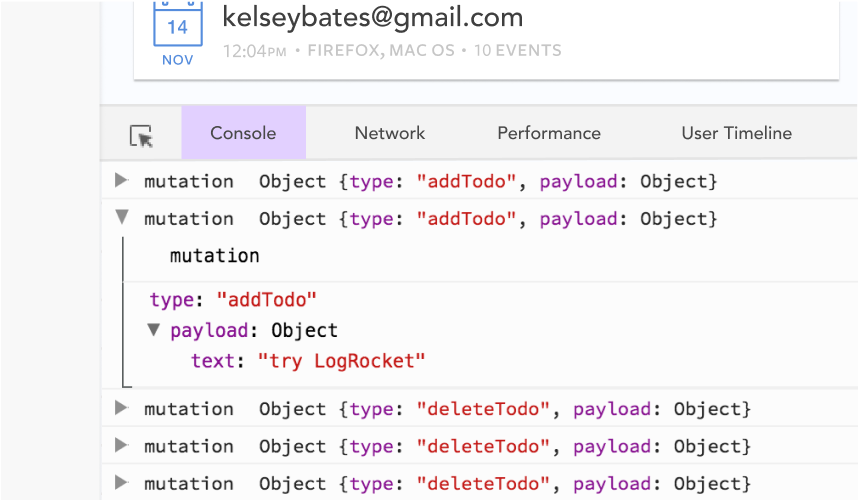
LogRocket lets you replay user sessions, eliminating guesswork by showing exactly what users experienced. It captures console logs, errors, network requests, and pixel-perfect DOM recordings — compatible with all frameworks.
With Galileo AI, you can instantly identify and explain user struggles with automated monitoring of your entire product experience.
Modernize how you debug your Vue apps — start monitoring for free.

Learn about TypeScript v6’s breaking changes, new ES2025 features, and deprecated options. A complete migration guide from v5 to prepare for v7.
Learn how Vite+ unifies Vite, Vitest, Oxlint, Oxfmt, Rolldown, and Node.js management in one CLI.
AI companies are buying developer tools as coding agents turn runtimes, package managers, and linters into strategic infrastructure.
Learn how AI-assisted development governance uses rules, agents, hooks, and protocols to help AI coding tools produce safer, more consistent code.
Would you be interested in joining LogRocket's developer community?
Join LogRocket’s Content Advisory Board. You’ll help inform the type of content we create and get access to exclusive meetups, social accreditation, and swag.
Sign up now