Whether building the next Airbnb, Wizz Air, or any other booking or logistics app with Vue.js, providing users a way to submit date and time information in the frontend without making the UX complicated is imperative.
Date picker components provide this much-needed functionality.
Date pickers allow apps to send date and time information to the backend while ensuring the selected date and time fit an application’s purpose, like prohibiting users from selecting a date earlier than the current date.
For Vue.js, there are many date picker libraries in the Vue ecosystem. In this post, we’ll discuss which libraries are the best and their features.
When reviewing these libraries, we will consider the following for each:
v-modelWithout further ado, let’s see some of the best date picker libraries in the Vue ecosystem.
The Replay is a weekly newsletter for dev and engineering leaders.
Delivered once a week, it's your curated guide to the most important conversations around frontend dev, emerging AI tools, and the state of modern software.
In this section, we will look at some of the top standalone date picker libraries in the Vue ecosystem.
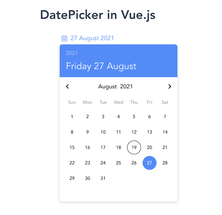
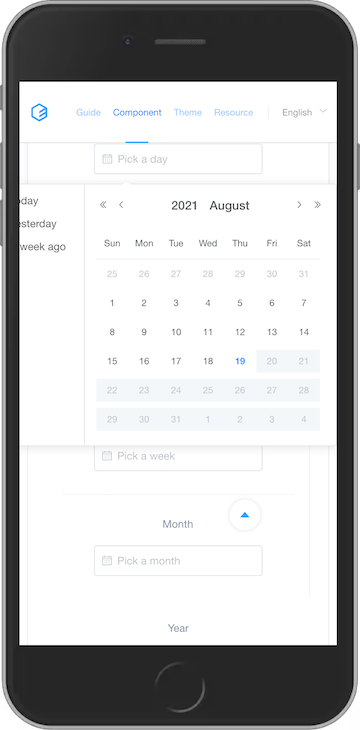
vuejs-datepickervuejs-datepicker is a lightweight and zero-dependency date picker component for Vue 2 apps. It’s by far one of the most popular date picker libraries in the Vue ecosystem with roughly 120k weekly downloads on npm at the time of posting.
It also supports 50 languages at the time of writing this post, and users can contribute new languages if one is not available.
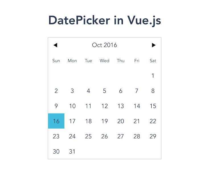
One vuejs-datepicker feature that stands out is the ability to render the date picker component inline or not using the inline prop. When rendered inline, the date picker component appears without clicking on an input field or button.
This is very useful as it fits the UI design demand for most web apps.
To use the inline prop, add the following code block:
<template>
  <datepicker :value="date" :inline="true"></datepicker>
</template>

<script>
export default {
  data() {
    return {
      date: new Date(2016, 9, 16),
    };
  },
};
</script>
Note: don’t forget to import the date picker component!
When the inline prop is set to true, it renders the following:
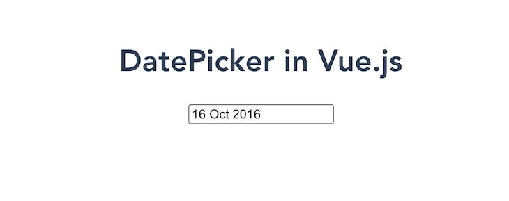
However, if the inline prop is not used, the date picker does not render with a full calendar, leaving a not-so-intuitive interface.
vuejs-datepicker also fully supports two-way data binding with v-model, which makes getting users’ input easy for Vue developers.
It’s worth also noting that this package works in Nuxt with SSR support even when importing a locale.
Although the package was last updated in 2019, it is still one of the top date picker component libraries available in the Vue ecosystem.
Overall features for vuejs-datepicker include the following:
v-modelHowever, vuejs-datepicker unfortunately doesn’t support Vue 3 or multirange date selection.
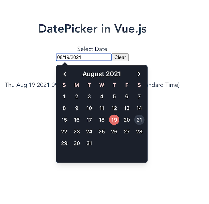
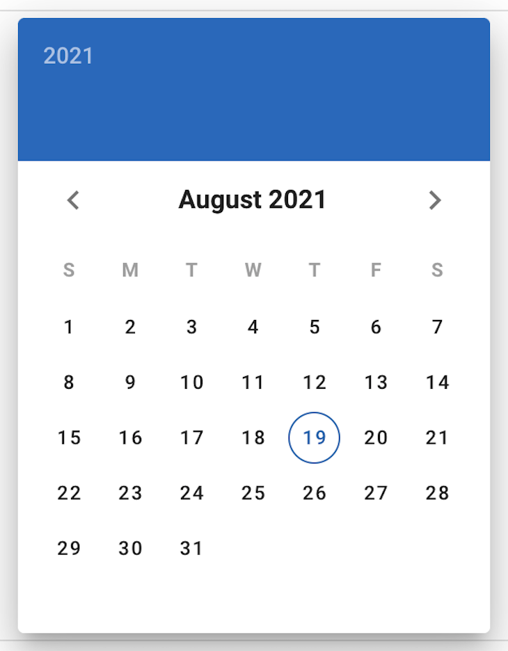
vue2-datepickerThe vue2-datepicker component has a lot of out-of-the-box features like multirange date selection and disabledDate and disabledTime, making customizing the date picker component super easy. Even though it was built for Vue 2, it currently supports Vue 3.
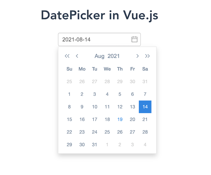
While the default date picker, seen below, may seem basic, it provides a lot more functionality.
The most unique feature vue2-datepicker provides is the ValueType prop, which gives you the option to configure the date picker to return a Date object, timestamp, or format.
This is useful because you may not have to convert user data from the date picker component to fit your application needs.
Another cool feature worth discussing is vue2-datepicker‘s support of selecting a date range. This is a feature needed in most web applications with a date picker, saving developers time writing custom code.
Users can then select a date range and validating it to ensure it fits the application’s needs.
It also has a couple of features like shortcuts and showTimePanel, which can greatly improve user experience.
Overall, vue2-datepicker features the following:
v-modelIf interested, I created a GitHub Gist you can use to set this component up in a Nuxt app.
The Vue DatePicker is a more robust date picker component. It is by far one of the easiest to customize and it supports RTL mode, inline support without input, and minDate and maxDate props, which programmatically set the minimum and maximum date a user can select.
This component is patterned after the Material Design guidelines with some fancy hover effects, transitions, and touchable feedback. It feels natural to use in a web application and provides a great user experience!
Overall, Vue DatePicker features the following:
v-modelIt however does not support multirange date selection or Vue 3.
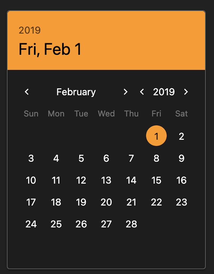
V-CalendarV-Calendar, according to its official docs, is an elegant calendar and date picker plugin for Vue.js. One great thing about this package is the documentation, which makes the plugin easy to integrate and use.
V-Calendar fully supports Vue 3, colors, dark mode, and you can truly customize the format and parse dates. And, with inputEvents, you can reveal the date picker component on a mouse hover or any other input event.
Here is a screenshot of how V-calendar looks in dark mode:
V-calendar also has a lot of attributes that help build truly elegant experiences for users. You can use it in a form using a custom input with a validation message.
This is by far the most complete date picker component library in the Vue ecosystem. If you are looking for a robust date picker component for your Vue app with great community support, consider this plugin.
With a decent amount of contributors on GitHub and 84 versions released at posting, with the recent version released on 13 July 2021, this is an active community.
However, its robust nature comes with a price, as it has a 16.7 MB bundle size. So, if you don’t need that much weight in your app, go for a more lightweight solution.
Overall, V-calendar features the following:
v-modelCtkDatetimePickerCtkDatetimePicker is a Vue.js component that selects dates and times, including a range mode and dark mode support. This component also has a decent UI because it provides more visually than other date pickers:
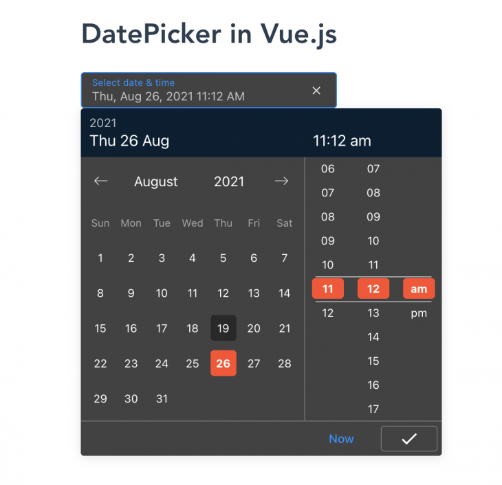
For the screenshot above, I customized the colors with the following:
<style scoped>
::v-deep .header-picker {
  background-color: #082032 !important;
}
::v-deep .time-picker-column-item.active .time-picker-column-item-effect,
::v-deep
  .datepicker-container
  .datepicker-days
  .datepicker-day.selected
  .datepicker-day-effect {
  background-color: #ff4c29 !important;
}
</style>
Note that the scoped attribute must be present in the style tag for this to work!
Adding localization support is pretty straightforward through using the locale props VueCtkDateTimePicker provides. In this code example, we are setting the locale to Russia.
<VueCtkDateTimePicker v-model="date" dark locale="ru" />
Overall, CtkDatetimePicker features the following:
v-modelAlthough CtkDatetimePicker has great features, the documentation is not always useful because it doesn’t cover how to customize the component to fit your application needs.
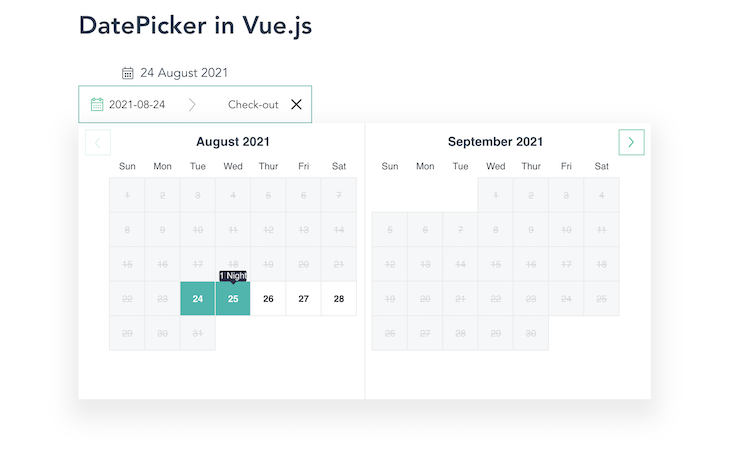
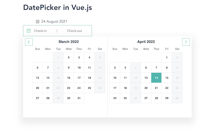
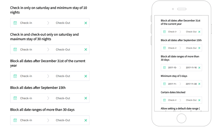
Vue Hotel Datepicker is a responsive date range picker for Vue.js that displays the number of nights selected with several useful options such as custom check-in and check-out rules, localization support, and more.
The check-in and check-out rules include the maxNights, minNights, and disabledDaysOfWeek props.
The maxNights prop accepts a number that programmatically sets the maximum number of days a user can book for a service. So, when a user selects up to five days from the date picker, it disables the other dates in the calendar:
<HotelDatePicker :maxNights="5" />
Below is the rendering of the maxHeight prop set to 5:
The minNights prop also accepts a number to specify the minimum number of days a user can book a service.
In the demo below, the minNights is set to 8, so the check-in rule requires booking for a minimum of eight nights.
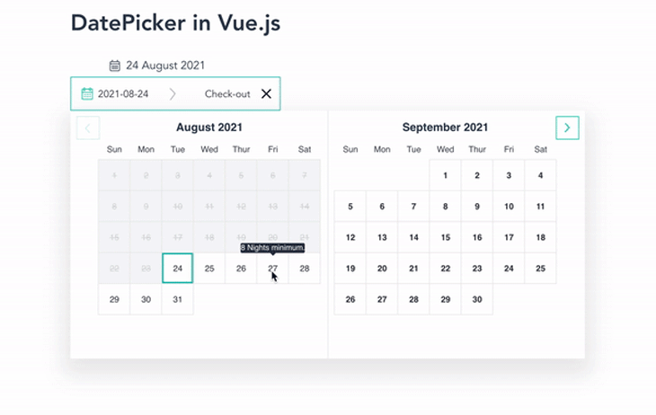
Notice the tooltip above notifying us what the minimum number of nights that can be booked.
The disabledDaysOfWeek prop accepts an array of strings containing the days of the weeks you want to prevent users from booking for your service.
This is the date picker component with Tuesdays and Saturdays disabled:
Vue Hotel Datepicker is a great fit if you are building a hotel or some form of accommodation booking application because it solves most of the common date picker needs of a hotel web app.
The component looks great on both mobile and desktop screens, providing a great user experience.
vue-hotel-datepicker GitHub repository.One of the drawbacks of this component, however, is the docs; they don’t cover much on how to use the package even for a basic case like getting date inputs from users. Another big drawback is the lack of support for two-way data binding with v-model.
Overall, Vue Hotel Datepicker features the following:
While there is no support for Vue 3, it is currently a work in progress. It also does not support two-way data binding with v-model.
vue-airbnb-style-datepickerThe vue-airbnb-style-datepicker component is the Vue implementation of airbnb/react-dates and has a similar look and functionality. Its UI is clean, modern, and collecting date information is built with user experiences in mind.
vue-airbnb-style-datepicker GitHub repository.While it has a beautiful look and feel, I would not advise using it in a really big project as it is not actively maintained.
Overall, vue-airbnb-style-datepicker features the following:
It does not support two-way data binding with v-model, localization and internationalization, or Vue 3.
In the section, we will look at date picker components with associated Vue UI component libraries like Vuetify, Quasar framework, and Element UI.
DatePickerThe Element DatePicker component comes packaged within the Element UI component library itself. This means to use this component, you must install the Element UI.
Its attributes make customizing and setting dates and times programmatically easy. Alongside the DatePicker is the DateTimePicker component, which allows users to select dates and times in one picker.
This is pretty cool because it comes with some common use cases like preventing a user from selecting an end date before the start date from the DatePicker component.
DatePicker also supports two-way data, date and time with shortcuts, date and time range in one input, and Vue 3 support.
One of the drawbacks when using Element UI, in general, is that some of its components are not mobile responsive, including the DatePicker component.
Overall, the Element DatePicker features the following:
v-modelv-date-pickerThe v-date-picker is one of the many components that ships with Vuetify, a Vue UI library with beautifully handcrafted material components.
The v-date-picker component supports internationalization, dynamic orientation, multiple date selection, date events to specify events using arrays, objects, functions, and v-model support.
Here is a screenshot of the default v-date-picker component:
One of the biggest advantages of using Vuetify’s date picker is the community support and well-written documentation.
However, I don’t recommend installing Vuetify when all you need is a date picker component. This is largely because of its 18.2 MB size and will affect the performance of your app. But if you are using it as the UI library for your entire Vue/Nuxt app, the date picker component is worth looking at.
Overall, v-date-picker features the following:
v-modelQDate date pickerJust like the Vuetify and Element UI date picker components, the Quasar QDate date and time picker component comes packaged with the whole Quasar UI component framework itself.
It follows the Material Design pattern so there’s a huge focus on the consistency of the design to provide better user experiences. This means you’ll only get the full benefit of using this component if you also use the whole UI component library.
The Qdate component is very similar to Vuetify’s date picker implementation; while both follow the Material Design guide, they can be customized. Getting dark mode support with QDate, however, is pretty straightforward, unlike in Vuetify.
In Qdate, dark mode is simply enabled with dark attribute, unlike in Vuetify, where you must configure your themes to enable dark mode in the v-date-picker component.
Overall, Qdate features the following:
v-modelWe’ve covered quite a lot of date picker components in the Vue ecosystem. When deciding on a date picker component for your next Vue/Nuxt app, consider the size of your project, format of date data collection from your user, user experience, user locales, and SSR support.
When considering these aspects, you can make an informed decision.
I hope you’ve found this post useful. Feel free to drop a comment about any great date picker component you have used in your Vue project. You can find my implementation of all the date picker libraries here on GitHub.
You can also find me on Twitter and LinkedIn. Thank you for reading!
Debugging Vue.js applications can be difficult, especially when users experience issues that are difficult to reproduce. If you’re interested in monitoring and tracking Vue mutations and actions for all of your users in production, try LogRocket.
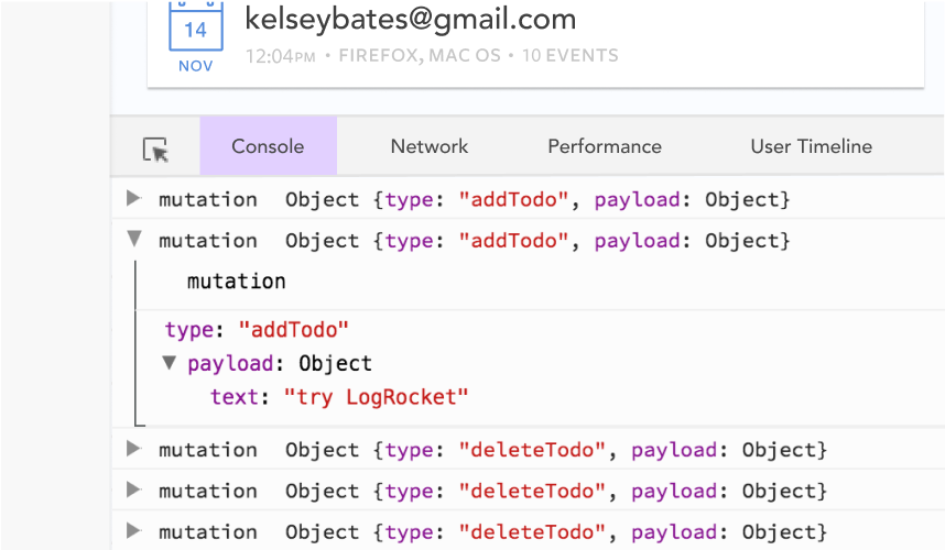
LogRocket lets you replay user sessions, eliminating guesswork by showing exactly what users experienced. It captures console logs, errors, network requests, and pixel-perfect DOM recordings — compatible with all frameworks.
With Galileo AI, you can instantly identify and explain user struggles with automated monitoring of your entire product experience.
Modernize how you debug your Vue apps — start monitoring for free.

AI companies are buying developer tools as coding agents turn runtimes, package managers, and linters into strategic infrastructure.
Learn how AI-assisted development governance uses rules, agents, hooks, and protocols to help AI coding tools produce safer, more consistent code.

A step-by-step guide to building your first MCP server using Node.js, covering core concepts, tool design, and upgrading from file storage to MySQL.

Using security headers in your Next.js apps is a highly effective way to secure websites from common security threats.
Hey there, want to help make our blog better?
Join LogRocket’s Content Advisory Board. You’ll help inform the type of content we create and get access to exclusive meetups, social accreditation, and swag.
Sign up now

 Learn more →
