A date picker is a helpful addition to your UI that makes it easy for your app users to select dates from a calendar. Whether you’re adding a date of birth field to a registration form or offering time slots for users to book an appointment, you can use a date picker library to simplify the process.

In this tutorial, we’ll explore three popular date picker libraries for Flutter, Flutter Datetime Picker, Flutter Date Range Picker, and Flutter date_time_picker. We’ll examine the functionality of each library and install each in a simple mobile application.
To follow along with this tutorial, you’ll need:
Let’s get started!
The Flutter Datetime Picker is easy to customize, supporting date and time selection in multiple languages. Flutter Datetime Picker is simple to install and provides a sleek, user-friendly interface.
To build our date picker with Flutter Datetime Picker, we’ll initialize a new Flutter app and install a copy of the Flutter Datetime Picker package. Navigate into your work directory from your terminal if you’re using a Mac or the command prompt if you’re using Windows. Run the code below:
flutter create date_picker_app
Once initialization is complete, navigate into the date_picker_app folder and run the command below to install the Flutter Datetime Picker package:
flutter pub add flutter_datetime_picker
Now, let’s build a basic date and time picker that will be displayed once the user selects a button. Add the following code to main.dart:
TextButton(
    onPressed: () {
        DatePicker.showDatePicker(context,
                              showTitleActions: true,
                              minTime: DateTime(2018, 3, 5),
                              maxTime: DateTime(2019, 6, 7), onChanged: (date) {
                            print('change $date');
                          }, onConfirm: (date) {
                            print('confirm $date');
                          }, currentTime: DateTime.now(), locale: LocaleType.en);
    },
    child: Text(
        'show date time picker',
        style: TextStyle(color: Colors.blue),
    ));
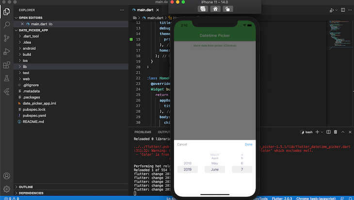
In the code above, whenever a user clicks on the show date time picker button, we fire showDatePicker with the TextButton. Recall that the package is shipped with support for multiple languages; in our case, we set the currentTime locale to LocaleType.en, setting the default language to English.
Next, open either your Android emulator or iOS Simulator and run the app with the command below:
flutter run
Your app should look similar to the image below:
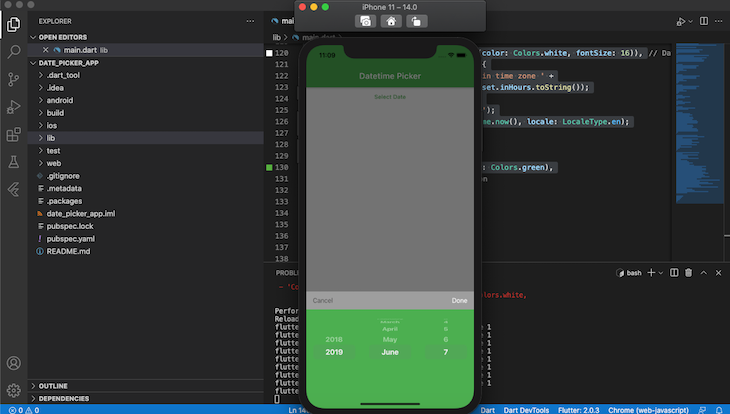
Flutter Datetime Picker also has support for theming, allowing you to customize colors to achieve your desired look and feel. Let’s add custom styling to our application by creating a new buttonText component with the inscription Date. In the main.dart file, add the following code to the new buttonText component:
import 'package:flutter/material.dart';
import 'package:flutter_datetime_picker/flutter_datetime_picker.dart';
void main() => runApp(new MyApp());
class MyApp extends StatelessWidget {
  // This widget is the root of your application.
  @override
  Widget build(BuildContext context) {
    return new MaterialApp(
      title: 'Flutter Demo',
      debugShowCheckedModeBanner: false,
      theme: new ThemeData(
        primarySwatch: Colors.green,
      ),
      home: new HomePage(),
    );
  }
}
class HomePage extends StatelessWidget {
  @override
  Widget build(BuildContext context) {
    return Scaffold(
      appBar: AppBar(
        title: Text('Datetime Picker'),
      ),
      body: Center(
        child: Column(
          children: <Widget>[
            //new buttonText starts
            TextButton(
                onPressed: () {
                  DatePicker.showDatePicker(context,
                      showTitleActions: true,
                      minTime: DateTime(2018, 3, 5),
                      maxTime: DateTime(2019, 6, 7),
                      theme: DatePickerTheme(
                          headerColor: Colors.grey,
                          backgroundColor: Colors.green,
                          itemStyle: TextStyle(
                              color: Colors.white,
                              fontWeight: FontWeight.bold,
                              fontSize: 18),
                          doneStyle:
                              TextStyle(color: Colors.white, fontSize: 16)),
                      onChanged: (date) {
                    print('change $date in time zone ' +
                        date.timeZoneOffset.inHours.toString());
                  }, onConfirm: (date) {
                    print('confirm $date');
                  }, currentTime: DateTime.now(), locale: LocaleType.en);
                },
                child: Text(
                  'Date with theme',
                  style: TextStyle(color: Colors.green),
                )),
              //new buttonText ends.
          ],
        ),
      ),
    );
  }
}
Restart your app by pressing r in either your terminal or the command prompt. Now, when you click on the Date with theme button, your app should look similar to the screenshot below:
With the Flutter Date Range Picker, users can easily select a single date, multiple dates, or a date range. To restrict date selection, you can set a minimum or a maximum number of days for the user to choose. You can also blackout or restrict days to prevent the user from selecting them.
To create a date picker with Flutter Date Range Picker, first, install the widget by running the code below in either the terminal or the command prompt:
flutter pub add syncfusion_flutter_datepicker
Once installation is complete, update the main.dart file with the code below:
import 'package:flutter/material.dart';
import 'package:intl/intl.dart';
import 'package:syncfusion_flutter_datepicker/datepicker.dart';
void main() {
  return runApp(MyApp());
}
/// My app class to display the date range picker
class MyApp extends StatefulWidget {
  @override
  MyAppState createState() => MyAppState();
}
/// State for MyApp
class MyAppState extends State<MyApp> {
  @override
  Widget build(BuildContext context) {
    return MaterialApp(
      debugShowCheckedModeBanner: false,
        home: Scaffold(
            appBar: AppBar(
              title: const Text('Date Range picker'),
            ),
            body: Stack(
              children: <Widget>[
                Positioned(
                  left: 0,
                  right: 0,
                  top: 0,
                  height: 80,
                  child: Column(
                    mainAxisAlignment: MainAxisAlignment.spaceEvenly,
                    mainAxisSize: MainAxisSize.min,
                    crossAxisAlignment: CrossAxisAlignment.start,
                  ),
                ),
                Positioned(
                  left: 0,
                  top: 80,
                  right: 0,
                  bottom: 0,
                  child: SfDateRangePicker(
                    selectionMode: DateRangePickerSelectionMode.range,
                    initialSelectedRange: PickerDateRange(
                        DateTime.now().subtract(const Duration(days: 4)),
                        DateTime.now().add(const Duration(days: 3))),
                  ),
                )
              ],
            )));
  }
}
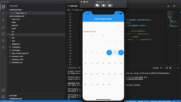
The first parameter of the SfDateRangePicker class, selectionMode, denotes which type of date to display. In this case, we displayed a range, however, you may choose to display a single date.
The second parameter initialSelectedRange is responsible for the default selected dates. We create the date range using the DateTime class.
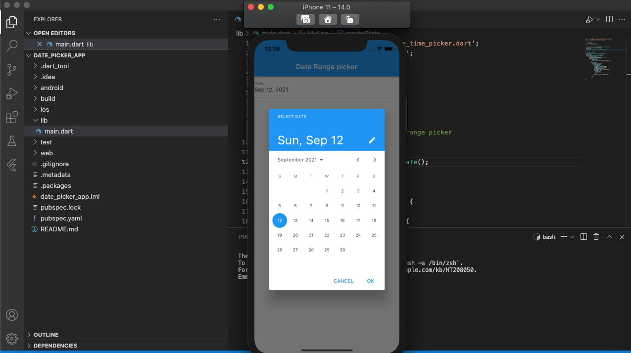
Your app should look similar to the screenshot below:
With just a few lines of code, we created an organized date picker with a pleasing UI.
date_time_pickerThe date_time_picker is a Flutter widget that displays the date and time using a text form field.
Install the package by running the code below in either your terminal or command prompt:
flutter pub add date_time_picker
To create a simple date picker with Flutter date_time_picker, simply add the code below:
DateTimePicker(
  initialValue: '',
  firstDate: DateTime(2000),
  lastDate: DateTime(2100),
  dateLabelText: 'Date',
  onChanged: (val) => print(val),
  validator: (val) {
    print(val);
    return null;
  },
  onSaved: (val) => print(val),
);
In the code snippet above, we utilize the DateTimepicker class. initialValue holds the value of the date text field. firstDate is the year the calendar begins to display, while the lastDate is the last year it ends.
Now that we understand the fundamentals of the date_time_picker package, let’s build and customize our own. To create a date and time picker dialog, replace the code in your main.dart file with the code below:
import 'package:date_time_picker/date_time_picker.dart';
import 'package:flutter/material.dart';

void main() {
  return runApp(MyApp());
}
/// My app class to display the date range picker
class MyApp extends StatefulWidget {
  @override
  MyAppState createState() => MyAppState();
}
/// State for MyApp
class MyAppState extends State<MyApp> {
  @override
  Widget build(BuildContext context) {
    return MaterialApp(
        debugShowCheckedModeBanner: false,
        home: Scaffold(
            appBar: AppBar(
              title: const Text('Date Range picker'),
            ),
            body: Stack(
              children: <Widget>[
                DateTimePicker(
                  initialValue: '',
                  firstDate: DateTime(2000),
                  lastDate: DateTime(2100),
                  dateLabelText: 'Date',
                  onChanged: (val) => print(val),
                  validator: (val) {
                    print(val);
                    return null;
                  },
                  onSaved: (val) => print(val),
                )
              ],
            )));
  }
}
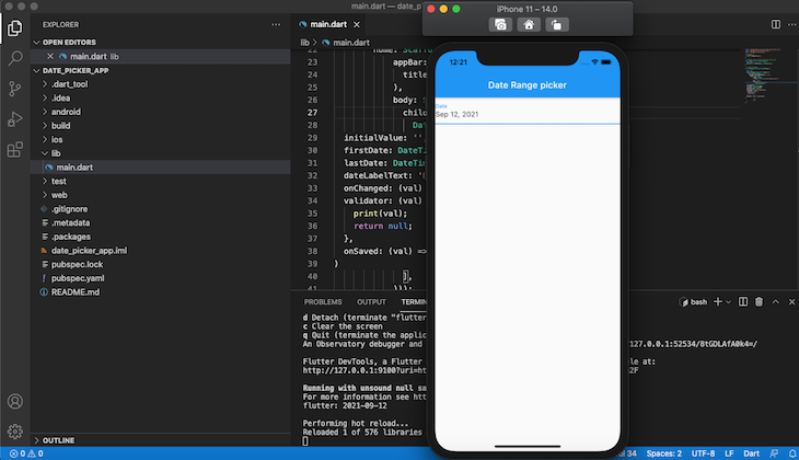
Your app should look similar to the screenshot below:
When you click on the date text field, you should have a calendar dialog similar to the screenshot below:
Having explored three popular Flutter date picker libraries, you should now be equipped to choose one that best suits your needs and install it in your own application. Although these tools are similar,the right choice may depend on the unique nature of your project.
For example, if your application utilizes languages other than English, you may be better off with Flutter Datetime Picker. To easily restrict date selection, Flutter Date Range Picker is a good choice.
All three tools provide organized, attractive, and customizable interfaces that you can set up within a matter of minutes.
Install LogRocket via npm or script tag. LogRocket.init() must be called client-side, not
server-side
$ npm i --save logrocket

// Code:

import LogRocket from 'logrocket';
LogRocket.init('app/id');
// Add to your HTML:

<script src="https://cdn.lr-ingest.com/LogRocket.min.js"></script>
<script>window.LogRocket && window.LogRocket.init('app/id');</script>

Chrome’s Modern Web Guidance embeds modern web platform skills into AI coding agents, helping them choose native HTML, CSS, and browser APIs over legacy patterns.

Learn how to use Fallow to analyze AI-generated code, detect dead code, duplicate logic, and complexity issues, and integrate automated code quality checks into your AI-assisted development workflow.

Learn how to protect full-stack projects from NPM supply chain attacks with a practical security checklist.

Explore 15 essential MCP servers for web developers to enhance AI workflows with tools, data, and automation.
Would you be interested in joining LogRocket's developer community?
Join LogRocket’s Content Advisory Board. You’ll help inform the type of content we create and get access to exclusive meetups, social accreditation, and swag.
Sign up now

 Learn more →
