Modern mobile apps often involve a step in the onboarding process where you need to enter a verification PIN sent to your email or phone number. Sometimes, you’ll need to enter the PIN using something like a split OTP input field. Another way to input a verification PIN is by using a dialpad.

In this article, we will demonstrate how to create a custom number pad designed for React Native apps. Building a custom React Native numpad can be a great alternative to split inputs or the conventional TextInput element for personalizing your mobile application design.
You can check out the full source code for our React Native project and follow along as we set up the number pad step by step. Let’s get started.
There are many professional use cases for a numpad in React Native apps.
A common example is one-time passcode (OTP) input validation. For example, let’s say you send an OTP to a new app user’s mobile number as part of the onboarding process. After sending the OTP, the user is directed to a screen to input and validate it using a number pad.
Another use case is adding a layer of security to your app, which is important for apps containing sensitive information. When your users log back into your application, you can present them with a number pad where they can input a PIN for your app to validate before logging them in.
In our tutorial, we’ll create a simple example of this second use case. We’ll see how to set up a number pad from scratch in React Native so users can create a PIN and log into the app using that PIN.
Let’s get started with building a React Native app with a custom number pad feature. We will be using the Expo CLI for development, but you can also use the React Native CLI if you wish.
Run the following command to quickstart an Expo app:
npx create-expo-app my-app
The command above will create the basic React Native project files we need. Once that’s done, start up the development server on the iOS or Android simulator:
//for iOS
npm run ios
//for Android
npm run android
After running the appropriate command, you should have a screen like this pop up in your simulator:
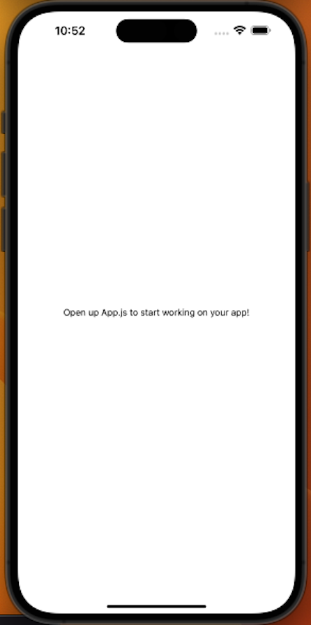
This is the output of the code inside the App.js file in your project folder.
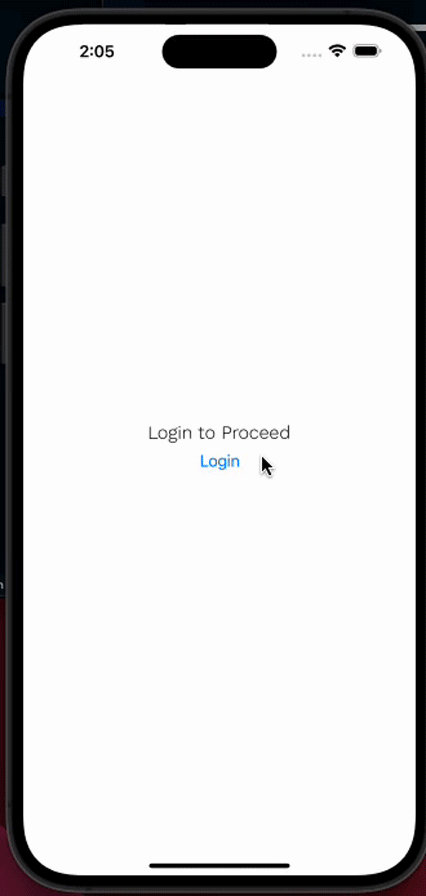
In this section, we will begin creating three screens: Login, CustomDialpad, and Home.
The Login screen will be the first screen users see when they initially load the app. It will have a button that moves the user to the CustomDialpad screen, where they can input their PIN. Once the correct PIN is entered, the app will move the user to the Home screen.
Let’s start building our React Native app with these three screens. First, install the following packages that we need to set up and configure basic navigation in React Native:
npx install @react-navigation/native @react-navigation/native-stack react-native-safe-area-context react-native-screens
Also, create a folder named screens with three files inside it: Login.jsx, CustomDialPad.jsx, and HomeScreen.jsx.
Next, inside your App.js file, implement the basic navigation as shown below:
import { StyleSheet } from "react-native";
import { NavigationContainer } from "@react-navigation/native";
import { createNativeStackNavigator } from "@react-navigation/native-stack";
import HomeScreen from "./screens/HomeScreen";
import Login from "./screens/Login";
import CustomDialPad from "./screens/CustomDialPad";

const Stack = createNativeStackNavigator();
export default function App() {
 return (
   <NavigationContainer>
     <Stack.Navigator
       screenOptions={{
         headerShown: false,
       }}
     >
       <Stack.Screen name="Login" component={Login} />
       <Stack.Screen name="Dialpad" component={CustomDialPad} />
       <Stack.Screen name="Home" component={HomeScreen} />
     </Stack.Navigator>
   </NavigationContainer>
 );
}

const styles = StyleSheet.create({
 container: {
   flex: 1,
   backgroundColor: "#fff",
   alignItems: "center",
   justifyContent: "center",
 },
});
Here, we wrap the entire app inside the NavigationContainer and use the Stack.Navigator component to manage the stack of screens. When a user navigates to a screen, it gets pushed to the top of the stack. Then, when the user navigates to another page, it pops the screen off the top of the stack.
In this case, the initial screen at the top of the stack will be the Login screen. When the user presses the button to navigate to the CustomDialpad screen, the CustomDialpad screen is pushed on top of the Login screen, and so on:
Now that the screen navigation is all set up, we can begin setting up the number pad logic and UI.
CustomDialpad.jsx fileCreate a component folder in the root directory and add a DialpadKeypad.jsx file inside it. We’ll build our number pad UI and functionality in this file later.
Then, import the DialpadKeypad.jsx component file inside the CustomDialpad.jsx file:
//CustomDialPad.js

import {
 SafeAreaView,
 StyleSheet,
 Text,
 View,
 Dimensions,
} from "react-native";
import React, { useState } from "react";
import { Ionicons } from "@expo/vector-icons";
import DialpadKeypad from "../components/DialpadKeypad";

const { width, height } = Dimensions.get("window");
We also used the Dimensions.get method to extract the screen width and height of the user’s device. This will help us ensure our UI adapts responsively to different screen sizes.
Next, to start building our React Native number pad, we first need to create some variables:
const dialPadContent = [1, 2, 3, 4, 5, 6, 7, 8, 9, "", 0, "X"];

const dialPadSize = width * 0.2;
const dialPadTextSize = dialPadSize * 0.4;

const pinLength = 4;
Let’s briefly review the purpose of each variable:
dialPadContent — The content that we’ll display on the number pad UI. In this case, we want to display an array of twelve values arranged in a three-column, four-row gridpinLength — The length of the PIN the user should enter. We want the user to enter a four-digit PIN, but this can be adjusted based on your project’s needsdialPadSize — The size of the number pad, which is determined by multiplying the mobile phone screen’s width by 0.2 to get 20 percent of the screen’s widthdialPadTextSize — The size of the text displayed inside the number pad, which is determined by multiplying the dialPadSize value by 0.4 to get 40 percent of the dialPadSizeIn the rest of the CustomDialpad.jsx file, we define our CustomDialPad component and use the useNavigation Hook to enable us to control screen navigation. We also set up the component structure and styles, and export the custom component to make it available for use in other parts of our app:
const CustomDialPad = () => {
 const navigation = useNavigation();
 return (
   <SafeAreaView style={styles.container}>
     <View style={styles.textContainer}>
       <TouchableOpacity
         onPress={() => navigation.goBack()}
         style={{ position: "absolute", top: -5, left: 10 }}
       >
         <Ionicons name="ios-chevron-back" size={45} color="#5E454B" />
       </TouchableOpacity>
       <Text style={styles.pinText}>Create PIN</Text>
       <Text style={styles.pinSubText}>Enter your secure four-digit code</Text>
       <DialpadKeypad
         dialPadContent={dialPadContent}
         pinLength={pinLength}
         dialPadSize={dialPadSize}
         dialPadTextSize={dialPadTextSize}
       />
     </View>
   </SafeAreaView>
 );
};

export default CustomDialPad;

const styles = StyleSheet.create({
 container: {
   flex: 1,
   backgroundColor: "#FAF0E6",
 },
 textContainer: {
   justifyContent: "center",
   alignItems: "center",
   marginTop: 40,
   position: "relative",
 },
 pinText: {
   fontSize: 30,
   fontWeight: "medium",
   color: "#5E454B",
 },
 pinSubText: {
   fontSize: 18,
   fontWeight: "medium",
   color: "#5E454B",
   marginVertical: 30,
 },
Additionally, we implemented a back button with the TouchableOpacity component, enabling the user to navigate back to the Login page using the navigation.goBack() method.
DialpadKeypad.jsx fileNow let’s work in the DialpadKeypad.js file. First, we’ll import all the necessary modules and components:
import {
 StyleSheet,
 Text,
 View,
 FlatList,
 TouchableOpacity,
} from "react-native";
import React from "react";
import { Feather } from "@expo/vector-icons";
Next, let’s take the props that we passed to the component in the CustomDialPad.js file and use them to build the keypad UI. Then, we’ll use a Flatlist to render the dialPadContent array we defined earlier:
const DialpadKeypad = ({
 dialPadContent,
 pinLength,
 navigation,
 dialPadSize,
 dialPadTextSize,
}) => {
 return (
   <FlatList
     data={dialPadContent}
     numColumns={3} // set number of columns
     keyExtractor={(_, index) => index.toString()}
     renderItem={({ item }) => {
       return (
         <TouchableOpacity
           disabled={item === ""} // make the empty space on the dialpad content unclickable
          >
           <View
             style={[
               {
                 backgroundColor: item === "" ? "transparent" : "#fff",
                 width: dialPadSize,
                 height: dialPadSize,
               },
               styles.dialPadContainer,
             ]}
           >
             {item === "X" ? (
               <Feather name="delete" size={24} color="#3F1D38" />
             ) : (
               <Text
                 style={[{ fontSize: dialPadTextSize }, styles.dialPadText]}
               >
                 {item}
               </Text>
             )}
           </View>
         </TouchableOpacity>
       );
     }}
   />
 );
};
We set the numColumns prop to 3 to render our dialPadContent array in three columns. The blank "" value in the array lets us make the rendered three-column, four-row number pad more visually balanced.
In the number pad, we made the blank button unpressable and removed its background color. We also rendered a delete icon for the button corresponding to the X value in the array. Otherwise, we render the numbers in the array for the rest of the buttons in the number pad.
We also wrapped the View component inside the TouchableOpacity component to render the dialpadContent.
Our last step in this file is to define our component’s styles:
export default DialpadKeypad;

const styles = StyleSheet.create({
 dialPadContainer: {
   justifyContent: "center",
   alignItems: "center",
   margin: 10,
   borderRadius: 50,
   borderColor: "transparent",
 },
 dialPadText: {
   color: "#3F1D38",
 },
});
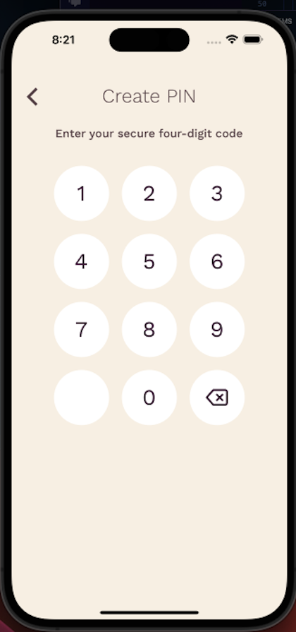
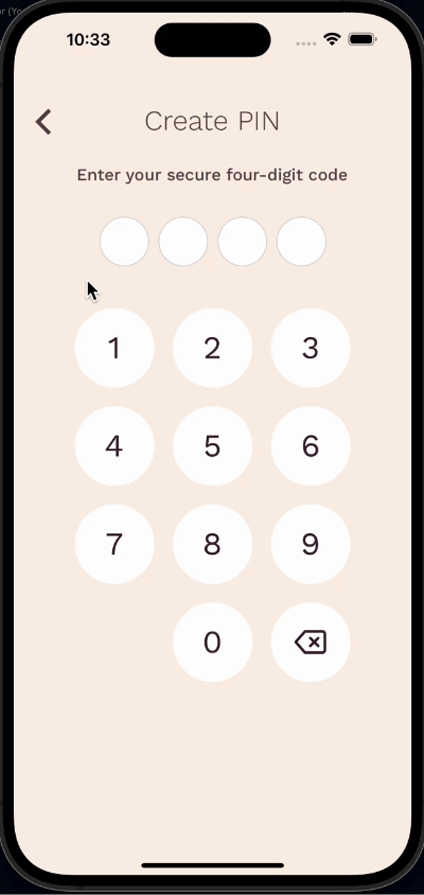
Let’s look at the React Native number pad we have currently:
Let’s set up the functionality for when we press a button on the keypad. We’ll track the value of each button pressed on the keypad using a state where the initial data type will be an array. This will then be passed as a prop to the DialpadKeypad component.
In the DialpadKeypad file, we’ll take the code and setCode props and use them to implement the desired functionality. When the Keypad content is clicked, we’ll call the onPress prop to first check:
X. If so, it should remove the last item in the array — in other words, delete the last PIN value selectedX. If so, it should use the setCode prop to add the selected item into the code arraypinLength - 1. If so, it should navigate the user to the Home screenThe reason we’re using pinLength - 1 against the length of the code prop is because the required pinLength is specified as 4.
If there are four items in the code state array, the length will be 3, since indexed values in an array start from 0. Therefore, to navigate to the Home screen once the four-digit PIN has been entered into the code array, we use pinLength -1.
To implement all of this, we need to update the code in the CustomDialPad.js file like so:
const CustomDialPad = () => {
 const navigation = useNavigation();
 const [code, setCode] = useState([]);

// rest of the code

  <DialpadKeypad
         dialPadContent={dialPadContent}
         pinLength={pinLength}
         setCode={setCode}
         code={code}
         dialPadSize={dialPadSize}
         dialPadTextSize={dialPadTextSize}
       />
Likewise, update the DialpadKeypad.js file like so:
const DialpadKeypad = ({
 dialPadContent,
 pinLength,
 code,
 setCode,
 navigation,
 dialPadSize,
 dialPadTextSize,
}) => {

// rest of the code
    <TouchableOpacity
           disabled={item === ""} // make the empty space on the dialpad content unclickable
           onPress={() => {
             if (item === "X") {
               setCode((prev) => prev.slice(0, -1));
             } else {
               if (code.length === pinLength - 1) {
                 navigation.navigate("Home");
               }
               setCode((prev) => [...prev, item]);
             }
           }}
         >
MultiView for the entered PINIn this section, we will add a MultiView. In this instance, this is a View that will allow us to view the selected input — in other words, the entered PIN.
To begin, create a DialpadPin.js file inside the component folder and render it in the CustomDialPad component. Then we will pass the pinLength, pinSize, code, and dialPadContent props to the DialpadPin.js file.
Inside the DialpadPin.js file, we will render a View based on the PIN length of 4 that we established earlier. We want to display this on the CustomDialpad screen as a row of four evenly spaced out circles between the prompt to enter the PIN and the number pad.
Inside the rendered View, we will also render the PIN value, which will let us know whether a value has been selected. If a value has been selected from the keypad, we will display it in the MultiView so users know how many digits they currently have selected in the input.
To implement all of this, update the CustomDialPad.js file like so:
const dialPadContent = [1, 2, 3, 4, 5, 6, 7, 8, 9, "", 0, "X"];

const dialPadSize = width * 0.2;
const dialPadTextSize = dialPadSize * 0.4;

const pinLength = 4;
const pinContainerSize = width / 2;
const pinSize = pinContainerSize / pinLength;
const CustomDialPad = () => {
 const fontsLoaded = useCustomFonts();
 const navigation = useNavigation();
 const [code, setCode] = useState([])

// rest of the code

       <DialpadPin
         pinLength={pinLength}
         pinSize={pinSize}
         code={code}
         dialPadContent={dialPadContent}
       />
Then, update the DialpadPin.js file as well:
import { StyleSheet, Text, View } from "react-native";
import React from "react";

const DialpadPin = ({ pinLength, pinSize, code, dialPadContent }) => {
 return (
   <View style={styles.dialPadPinContainer}>
     {Array(pinLength)
       .fill()
       .map((_, index) => {
         const item = dialPadContent[index];
         const isSelected =
           typeof item === "number" && code[index] !== undefined;
         return (
           <View
             key={index}
             style={{
               width: pinSize,
               height: pinSize,
               borderRadius: pinSize / 2,
               overflow: "hidden",
               margin: 5,
             }}
           >
             <View
               style={[
                 {
                   borderRadius: pinSize / 2,
                   borderColor: !isSelected ? "lightgrey" : "#3F1D38",
                 },
                 styles.pinContentContainer,
               ]}
             >
               {isSelected && (
                 <View
                   style={[
                     {
                       width: pinSize * 0.5,
                       height: pinSize * 0.5,
                       borderRadius: pinSize * 0.35,
                     },
                     styles.pinContent,
                   ]}
                 />
               )}
             </View>
           </View>
         );
       })}
   </View>
 );
};

export default DialpadPin;

const styles = StyleSheet.create({
 dialPadPinContainer: {
   flexDirection: "row",
   marginBottom: 30,
   alignItems: "flex-end",
 },
 pinContentContainer: {
   flex: 1,
   backgroundColor: "#fff",
   borderWidth: 1,
   justifyContent: "center",
   alignItems: "center",
 },
 pinContent: {
   backgroundColor: "#5E454B",
 },
});
Now, let’s see what we have:
As you can see, inputting or removing digits using the number pad fills in the MultiView accordingly. To protect the user’s security, the selected PIN values are shown as colored dots instead of displaying the actual numbers.
We can go a step further to animate the dotted pin selected from the number pad. In the DialpadPin.jsx file, import the Animated library, which is provided out of the box by React Native. Then, wrap the View that shows the dotted selection with Animated.View:
 {isSelected && (
    <Animated.View
     style={[
         {
           width: pinSize * 0.5,
           height: pinSize * 0.5,
           borderRadius: pinSize * 0.35,
          },
     styles.pinContent,
    ]}
   />
  )}
Now we will create a useEffect Hook that will be triggered whenever the value of the code changes. Anytime the user enters a number on the keypad, the animation will be triggered using the Animation.timing method. The animatedValue is animated from its current value to the code.length value over 300 milliseconds:
const DialpadPin = ({ pinLength, pinSize, code, dialPadContent }) => {
 const animatedValue = useRef(new Animated.Value(0)).current;

 useEffect(() => {
   Animated.timing(animatedValue, {
     toValue: code.length,
     duration: 300,
     useNativeDriver: true,
   }).start();
 }, [code]);
Next, we’ll use the animatedStyle style object to apply scaling transformations when a number is selected on the keypad:
 const animatedStyle = {
           transform: [
             {
               scale: animatedValue.interpolate({
                 inputRange: [index, index + 1],
                 outputRange: [1, 1.3],
                 extrapolate: "clamp",
               }),
             },
           ],
         };
We used the interpolate method here to map the input value to the output value, ensuring smooth animations. The inputRange and outputRange props define the value for the interpolation.
Lastly, the extrapolate prop defines the behavior of the output value. Its clamp value indicates that the output value is clamped within the defined range. Add the animatedStyle object to the styling input for the Animated.View:
   {isSelected && (
                 <Animated.View
                   style={[
                     {
                       width: pinSize * 0.5,
                       height: pinSize * 0.5,
                       borderRadius: pinSize * 0.35,
                     },
                     styles.pinContent,
                     animatedStyle,
                   ]}
                 />
               )}
The final result with our added animation should look like the below:
As you can see, the colored dots appear in the MultiView bubbles slightly smaller at first, then expands to fill the bubble more completely. This makes our number pad feature more visually engaging in a subtle way that isn’t overly distracting.
To improve this number pad implementation in a real React Native app meant for use in production, we would need to set up a backend service to talk to our frontend implementation. Let’s review what this would entail for each of our use cases.
The first use case we discussed uses the number pad to verify an OTP sent to the user’s phone or email during onboarding. So, when a new user signs up for your app, you would need to:
Now the user is expected to use the number pad to enter the OTP they received. Ideally, when they enter the complete OTP, you should be able to send a request to a verify endpoint in your backend to verify that the OTP you sent to that user matches what they entered on the frontend:
Home screenIn our current project, we aren’t verifying the PIN because we don’t have a backend service set up. However, if you were to set this up in a real project, the verify endpoint should be called in the DialpadKeypad.js file, where we’re checking the code.length against the pinLength:
<TouchableOpacity
  disabled={item === ""} // make the empty space on the dialpad content unclickable
  onPress={() => {
  if (item === "X") {
   setCode((prev) => prev.slice(0, -1));
   } else {
    if (code.length === pinLength - 1) {
// call the endpoint here, once the user enters the required pin length
     navigation.navigate("Home");
    }
    setCode((prev) => [...prev, item]);
    }
    }}
   >
The second use case we discussed is using the number pad for login security. Just as in the first use case, you can customize the number pad in your app to show on your login page.
The user can enter a PIN when they sign up. Then, when the user re-enters their PIN to sign back into the app, you can have your backend endpoint verify that the password created during signup matches the one being entered.
If your backend endpoint verifies the match, you can then allow the user to log in. If not, you can show a customized alert message — for example, Pin does not match.
This use case ensures that users are not just entering the app without the necessary security checks in place.
React Native supports a few different methods for creating a number pad. For example, we could use the TextInput component and pass the keyboard type as numeric to set up our number pad. However, there are some known issues associated with this method:
TextInput. A possible workaround for this issue is using the TouchableWithoutFeedback API component to dismiss the TextInput keyboard when you tap outside of itThere are also a few existing open source libraries for a number pad feature, including React Native Numpad and React Native Numeric Pad. However, these libraries are somewhat limited in their features and customizability.
In many cases, your React Native application may have a unique design and particular requirements regarding how the number pad feature should be built and implemented. Building a custom feature means you won’t be limited by the library’s capabilities.
In addition, installing too many packages in your React Native application can make it heavy. Building your own features and installing fewer packages can help reduce the size of your application.
Lastly, libraries may not remain actively maintained and could even become abandoned entirely, which could crash your application. If you do opt for a third-party library, always try to use stable and well-maintained options.
Here’s a quick summary of your available options for creating number pads in React Native:
| Method | Pros | Cons |
|---|---|---|
TextInput component |
– Built-in React Native component, which helps achieve platform consistency out of the box – Quick setup and ease of use as you only need to import the API component in your project and use it straight up |
– Might not be the best choice to use if you want to customize the design for your app. – Known performance and optimization issues |
| React Native Numpad library | – Simplified numeric input feature provided out of the box – Ability to enter both decimals and integers – Cross-platform compatinility |
– Limited customization options – Complex learning curve |
| React Native Numeric Pad library | – Provides a dedicated numeric keypad input out of the box – Ability to customize its appearance and behavior |
– Limited customization options – Complex learning curve |
| Custom number pad | – Ability to customize the number pad to suit your overall app design – No feature limitations; you can implement functionalities that might not be available out of the box using the conventional numeric keypad (e.g input validation, actions on specific buttons, animations) |
– Takes time to develop – Achieving consistent behavior and functionality across iOS and Android platforms could be a challenge during development |
The method you choose boils down to your project’s needs. For example, using libraries can help you save significant development time. However, if you need particular features or customizations, it may be better to invest time in building your own.
In this article, we have learned how to create a custom number pad in React Native. We also compared our method with other options, like the built-in TextInput component and third-party open source libraries, to better understand when and why to build this feature from scratch.
A custom number pad is a great mobile app feature for use cases like authenticating users with one-time passcodes or having them log in using a PIN. You can find the full source code for our demo project in this repository.

LogRocket's Galileo AI watches sessions for you and and surfaces the technical and usability issues holding back your React Native apps.
LogRocket also helps you increase conversion rates and product usage by showing you exactly how users are interacting with your app. LogRocket's product analytics features surface the reasons why users don't complete a particular flow or don't adopt a new feature.
Start proactively monitoring your React Native apps — try LogRocket for free.

I migrated 20 production-style components from Tailwind to StyleX. Here’s what the data showed about LOC, CSS bundle size, build time, and type safety.

A guide for using JWT authentication to prevent basic security issues while understanding the shortcomings of JWTs.

Discover how to build, render, and automate product demo videos with Remotion, replacing traditional screen recordings with reusable React code.

Chrome’s Modern Web Guidance embeds modern web platform skills into AI coding agents, helping them choose native HTML, CSS, and browser APIs over legacy patterns.
Would you be interested in joining LogRocket's developer community?
Join LogRocket’s Content Advisory Board. You’ll help inform the type of content we create and get access to exclusive meetups, social accreditation, and swag.
Sign up now

 Learn more →
