
Editor’s note: This article was last updated by Nwani Victory on 25 May 2023 to add information about the advantages of customizing your syntax highlighter, as well as to compare different syntax highlighting libraries, such as Prism.js and Highlight.js.
Long gone are the days when developers coded in Notepad and blogs displayed the code blocks using just HTML. Highlighted code is much more pleasing to the eye and far easier to read.
In this tutorial, we will create a React code editor and syntax highlighter so you can type in your code and see how it gets highlighted. We will also provide interactivity within the editor, meaning users will be able to switch between multiple languages and themes. The source code will be available here, for reference.
Jump ahead:
useState HookSyntax highlighting is a feature built into text and code editors alongside Integrated Development Environments (IDEs) to style a rendered block of code according to the linting rules and conventions of the programming language.
Syntax highlighting dates back to the late 60s when text editors such as Emacs and Vi introduced basic styling features such as line numbering and character highlighting. Since then, IDEs such as Turbo Pascal have been developed, which provide more advanced syntax highlighting features to differentiate code keywords with colors and font styles.
Syntax highlighting contributes to the developer experience (DX) obtained from coding in a specific language. Highlighting code blocks makes it more human-readable, and helps with error detection and visual code navigation.
Technical articles that contain code samples use syntax highlighting to differentiate the code blocks within the tutorial from the normal text.
While the HTML code element recognizes and displays computer code using the monospace font, it doesn’t do much to highlight code syntax. So, developers need to create custom code editors within their applications to render code inputs and blocks.
Although building a custom code editor will require significant engineering resources, having a custom code editor will let you tailor the user experience to meet the needs of your users through customized user interfaces.
To reduce the complexity of highlighting the code within an editor, open source packages such as Prism.js and Highlight.js have been made available to developers to leverage within their code editors.
Let’s examine these popular syntax highlighting libraries for JavaScript applications.
Prism.js is a lightweight and performant syntax highlighter library at an 18.8KB minified bundle size. Prism supports a wide variety of programming and markup languages. To stay lightweight and performant, Prism provides only basic features by default and allows developers to extend their existing features or add new ones through external plugins. Prism also provides a large collection of themes and styles for developers to customize the look and feel of the highlighted code.
Over time, Prism has become the foundation for other modern syntax highlighters such as Refractor.
Highlight.js is similar to Prism.js as it also supports a broad range of programming and markup languages, alongside configuration files. However, at a 910.9KB minified bundle size, Highlight.js is not as lightweight as Prism.js but it provides advanced features such as automatic language detection from the code syntax and compatibility with old browsers.
Once again, developing your own syntax highlighter from scratch offers you the ability to tailor the user experience to the needs of your users. It also offers performance gains as you can focus on providing only the features that your users need and not provide a wide range of features that they may never use.
First, let’s create a simple wireframe to design the layout of the components:
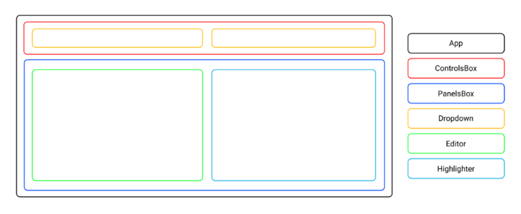
The entire app will reside in App, which will be the main wrapper for our application. Inside App, there will be ControlsBox and PanelsBox components.
ControlsBox will further include two Dropdown components. One will be for selecting the input language, and the other for selecting the theme of the highlighting.
To create a project boilerplate, we will use Create React App, which will set up a fully configured React project in a minute or less.
To do that, open your terminal and run the following command:
npx create-react-app syntax-highlighter
Then switch to the newly created folder by running cd syntax-highlighter and start the React development server by running npm start. This should automatically open up your browser. You should be presented with a React default app on port 3000.
Open the src folder and remove all the files except App.js, App.css, index.js, and index.css. Then remove the contents in each of those, as we will rewrite each file entirely from scratch.
First, we will create the base structure of our project to build upon. Let’s start with the index.js file, which will render our app. Open it up and add the following code:
import ReactDOM from "react-dom";
import "./index.css";
import App from "./App";

ReactDOM.render(
  <React.StrictMode>
    <App />
  </React.StrictMode>,
  document.getElementById("root")
);
To render, we first imported the ReactDOM component. Then we imported an extended stylesheet to style the base. Finally, we imported the App component and set it up so that it will be rendered in the root element inside the DOM tree.
Now, open the index.css file and include the following styles:
* {
  margin: 0;
  padding: 0;
  box-sizing: border-box;
}

body {
  width: 100vw;
  min-height: 100vh;
  font-family: sans-serif;
  background-color: #ffdee9;
  background-image: linear-gradient(0deg, #ffdee9 0%, #b5fffc 100%);
}
We first created the reset rules for margin, padding, and box-sizing, so we do not have to worry about the default browser values for these later. It’s common practice and recommended for any project you ever build from scratch.
We then created specific rules for the body element so that it always fills the entire viewport of the screen. We also set a particular font family and a gradient background.
Open App.js, where all the logic of our app will live. Include the following code:
import "./App.css";

export default function App() {
  return (
    <div className="App">
      <div className="ControlsBox"></div>
      <div className="PanelsBox"></div>
    </div>
  );
}
First, we imported an external stylesheet for the App.js component. We then created an App function, which will be rendered in the previously created index.js. Inside it, we created an App div element, which will be the main wrapper for our app. Furthermore, inside the App wrapper, there will be ControlsBox and PanelsBox components.
Now, open the App.css file and add the following styles:
.App {
  max-width: 1200px;
  margin: 0 auto;
  padding: 20px;
}

.ControlsBox {
  display: grid;
  grid-template-columns: 1fr 1fr;
  gap: 20px;
}

.PanelsBox {
  display: grid;
  grid-template-columns: repeat(auto-fit, minmax(400px, 1fr));
  gap: 20px;
  margin-top: 20px;
}
Here, we made sure that the App wrapper never exceeds the specified width. We also centered it in the viewport and added the padding inside it.
For the ControlsBox children, we set the grid layout with two columns, each of the same width. We also added a gap between both columns.
The PanelsBox children will also use a grid layout with two columns and a gap between them. The layout will automatically switch to one column if the width of the children is less than 400px, meaning the included Editor and Highlighter components will be shown below each other.
To separate PanelsBox from ControlsBox, we added a margin on the top.
useState HookThe data will change because, in our app, there will be user interaction triggered by the user selecting languages and themes. To display them properly on the screen, we will need to store them in the state variables.
For that, we will use React’s built-in useState Hook, which is a standard way of handling this in the React ecosystem. Open App.js and add the following code:
import React, { useState } from "react";
import "./App.css";

export default function App() {
  const [input, setInput] = useState("");
  const [language, setLanguage] = useState("");
  const [theme, setTheme] = useState("");

  return (
    <div className="App">
      <div className="ControlsBox"></div>
      <div className="PanelsBox"></div>
    </div>
  );
}
First, we imported the React useState Hook and then included input, language, and theme variables inside the App function.
The input state will keep track of the input the user has written in the editor, the language state will track the programming language the user has selected, and the theme state will track which highlight theme the user has selected.
To divide the building blocks of the app from the app logic, we will create several components to later import into App.js. We’ll create a separate folder in the project’s root called components, and create separate JS and CSS files for Dropdown, Editor, and Highlighter components.
You can create the files manually within the src directory, or you can execute the command below within your terminal to save time:
cd src && mkdir components && cd components && touch Dropdown.js Dropdown.css Editor.js Editor.css Highlighter.js Highlighter.css
Dropdown componentWe will use the Dropdown component for both language and theme selection. The only variable that will change will be the data we will pass in.
Open the Dropdown.js file and add the following code:
import "./Dropdown.css";

export const Dropdown = ({ defaultTheme, onChange, data }) => {
  return (
    <select className="select" defaultValue={defaultTheme} onChange={onChange}>
      {Object.keys(data)
        .sort()
        .map((theme, index) => {
          return (
            <option key={index} value={theme}>
              {theme}
            </option>
          );
        })}
    </select>
  );
};
In this code block, we first imported the external stylesheet for Dropdown.js. We used the select element and then looped through the data prop we will receive from App to display the available theme options. We then sorted the options in alphabetical order.
We also used defaultProp so we can later set up the default theme option shown on the initial launch, as well as the onChange prop, so we later have control of what happens when the user selects a particular theme.
Now, switch to the DropDown.css file and add the following styles:
.select {
  height: "100px";
  border: none;
  border-radius: 5px;
  padding: 5px 0;
  background-color: #ffffff;
  width: 100%;
}
For the Select component, we set the specific height, removed the default border, rounded the corners, added the padding inside, set the background to white, and made sure it uses all the available space of the parent horizontally.
Editor componentThe Editor component will be the text area where the user will enter the code. Open the Editor.js file and add the following code:
import "./Editor.css";

export const Editor = ({ placeHolder, onChange, onKeyDown }) => {
  return (
    <textarea
      className="editor"
      placeholder={placeHolder}
      onChange={onChange}
    ></textarea>
  );
};
Notice we first imported the external stylesheet for Editor.js. Then, we returned the textarea element and included the placeholder prop that will display the placeholder value on the initial launch. We also included the onChange prop so we later have control of what happens when the user types in the code.
Let’s add some styling to the Editor component. Open Editor.css and include the following styles:
.editor {
  border: none;
  min-height: 300px;
  padding: 10px;
  resize: none;
}
For the Editor component, we removed the default border, set the minimum height, and added padding. We also made sure the editor block is not manually resizable by the user. It will still automatically adjust its height based on the contents the user has typed in.
To highlight the code blocks, we will use the react-syntax-highlighter package. To install it, run the following command on your terminal:
npm i react-syntax-highlighter
Then open the Highlighter.js file and include the following code:
import SyntaxHighlighter from "react-syntax-highlighter";
import "./Highlighter.css";

export const Highlighter = ({ language, theme, children }) => {
  return (
    <SyntaxHighlighter
      language={language}
      style={theme}
      className="highlighter"
    >
      {children}
    </SyntaxHighlighter>
  );
};
We first imported the SyntaxHighlighter component, then imported an external stylesheet for Highlighter.js. The SyntaxHighlighter required language and style. We will pass those in once we import Highlighter into App.js.
Next, open the Highlighter.css file and add the following style rule:
.highlighter {
  min-height: 300px;
}
This will ensure that the Highlighter component always uses minimal height, which will be useful if there are no contents (to avoid the component from auto-shrinking).
In this phase, we will put everything together, making the app functional. First, open the App.js file and add the following code:
import React, { useState } from "react";

import { Dropdown } from "../components/Dropdown";
import { Editor } from "../components/Editor";
import { Highlighter } from "../components/Highlighter";

import * as themes from "react-syntax-highlighter/dist/esm/styles/hljs";
import * as languages from "react-syntax-highlighter/dist/esm/languages/hljs";

import "./App.css";

const defaultLanguage = <code>${"javascript" || Object.keys(languages).sort()[0]}</code>;
const defaultTheme = <code>${"atomOneDark" || Object.keys(themes).sort()[0]}</code>;

export default function App() {
  const [input, setInput] = useState("");
  const [language, setLanguage] = useState(defaultLanguage);
  const [theme, setTheme] = useState(defaultTheme);

  return (
    <div className="App">
      <div className="ControlsBox">
        <Dropdown
          defaultTheme={defaultLanguage}
          onChange={(e) => setLanguage(e.target.value)}
          data={languages}
        />
        <Dropdown
          defaultTheme={defaultTheme}
          onChange={(e) => setTheme(e.target.value)}
          data={themes}
        />
      </div>
      <div className="PanelsBox">
        <Editor
          placeHolder="Type your code here..."
          onChange={(e) => setInput(e.target.value)}
        />
        <Highlighter language={language} theme={themes[theme]}>
          {input}
        </Highlighter>
      </div>
    </div>
  );
}
Let’s break down this code block.
First, we imported the Dropdown, Editor, and Highlighter components, as well as all the supported themes and languages from react-syntax-highlighter. Then, we set the defaultLanguage variable to javascript. If it is not available from the languages list we imported, we set the defaultLanguage to the first language available in the imported languages list. The same is true for defaultTheme.
We also set the defaultTheme variable to atomOneDark. If it’s not available in the imported themes list, the defaultTheme value will be set to the first available theme from the imported themes list.
For the Dropdown components, we set defaultLanguage and defaultTheme, which will be displayed once the app is first rendered. Notice that the onChange behavior will update the language and theme variable states when the user makes selections from dropdowns.
Finally, we passed in the data prop that generates the dropdown options list.
For the Editor component, we set the placeHolder component to ask the user to enter some input once the app is first rendered. It also sets the onChange function that updates the input state variable each time the user writes something in the Editor.
Finally, for the Highlighter component, we passed in the language variable state — so it knows which language to render — as well as the themes variable state so it knows how to style it.
The last thing left to do is to test our app! Check your terminal to see if the development server is still running (if it’s not, run npm start) and open the browser. You should be presented with the functional code editor and highlighter:
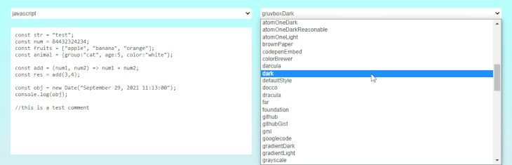
Final Code Editor Example
In this tutorial, we learned how to create a wireframe for an app, use states, create components, style them, and create the app logic. From now on, every time you need to pick up the most appropriate theme, you don’t need to build a test application. You will now have your own tool that you can use!
In the future, you can further customize the project by adding the auth system and database so that users can save their snippets, creating a full-stack playground.
I hope you learned a thing or two from this tutorial. Thanks for reading!
Install LogRocket via npm or script tag. LogRocket.init() must be called client-side, not
server-side
$ npm i --save logrocket

// Code:

import LogRocket from 'logrocket';
LogRocket.init('app/id');
// Add to your HTML:

<script src="https://cdn.lr-ingest.com/LogRocket.min.js"></script>
<script>window.LogRocket && window.LogRocket.init('app/id');</script>
Hey there, want to help make our blog better?
Join LogRocket’s Content Advisory Board. You’ll help inform the type of content we create and get access to exclusive meetups, social accreditation, and swag.
Sign up now
Get to know RxJS features, benefits, and more to help you understand what it is, how it works, and why you should use it.

Explore how to effectively break down a monolithic application into microservices using feature flags and Flagsmith.

Native dialog and popover elements have their own well-defined roles in modern-day frontend web development. Dialog elements are known to […]
LlamaIndex provides tools for ingesting, processing, and implementing complex query workflows that combine data access with LLM prompting.

 Learn more →

2 Replies to "Building a React code editor and syntax highlighter from scratch"
I found a few problems with the code above. First, in your App.js file, when you define the constants defaultLanguage and defaultTheme, you start each with
and end withbut the ending tag should be. Oddly, without that fix, I get a syntax error on the word 'const' inside the App() function. I only figured out the problem by initially commenting out the definitions of defaultLanguage and defaultTheme, which made the error go away. Secondly, in index.js you apparently need to add "import React from 'react';" at the top, else you get a "React is not defined" error.There are few errors in the code, I would like to correct those.
The default value of theme and language doesn’t work, it’s undefined. You need to write those as
`
const defaultLanguage = “javascript” || Object.keys(languages).sort()[0];
const defaultTheme = “atomOneDark” || Object.keys(themes).sort()[0];
`
and in the dropdown.jsx defaultlanguage is never used , modify the code like this. We have only added a if/else condition to check if dropdown component is selected for theme or language change.
`
export const Dropdown = ({ defaultLanguage ,defaultTheme, onChange, data }) => {
const defaultValue = defaultTheme ? defaultTheme : defaultLanguage;
return (
{Object.keys(data)
.sort()
.map((item, index) => {
return (
{item}
);
})}
);
};
`
Thankyouh thankyouhhh so much for this amazing blog, very easy to understand and follow through. I’ll check your other blogs too. Thankyouh again, good work!