
Component-driven development has transformed how we create web applications. This development approach makes it easier to manage and maintain application codebases while also facilitating design consistency and collaboration among developers.

One of the primary advantages of component-driven development is component isolation, which allows you to work on components independently without being distracted by the surrounding application. Storybook.js is one tool that can help with this.
In this tutorial, we’ll go over what Storybook is, how it works, and how to get started with creating stories in a Next.js application using Tailwind CSS for styling. We will cover:
To follow along with this tutorial, you must be familiar with Next.js and Tailwind CSS. Previous experience with Storybook may also be beneficial; however, this article will attempt to cover the basics quickly.
The Replay is a weekly newsletter for dev and engineering leaders.
Delivered once a week, it's your curated guide to the most important conversations around frontend dev, emerging AI tools, and the state of modern software.
Storybook is a web tool for developing and testing UI components in isolation from a specific application. It allows you to create “stories” for each component, which are examples of how the component should look and behave in different contexts:
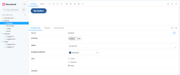
The stories you create can then be displayed in a browser in a development environment, allowing you to easily test and debug your components.
Storybook includes several useful features, such as the ability to add notes, control the component’s state, and check accessibility rules.
It also allows you to interact with the component props and preview how the component would look in different scenarios and states, which in turn allows you to test and debug effectively.
Let’s get started with creating a new Next.js application by running the command below:
npx create-next-app next-storybook
Next, change directory (cd) to the new app, then run the following command to install Tailwind CSS and its dependencies:
npm install -D tailwindcss postcss autoprefixer
After this, run the command below to generate both tailwind.config.js and postcss.config.js as required by Tailwind CSS:
npx tailwindcss init -p
Open the tailwind.config.js and update its code to the one below, so that the content export includes files in our project’s /pages and /components directories.
/** @type {import('tailwindcss').Config} */
module.exports = {
  content: [
    "./pages/**/*.{js,ts,jsx,tsx}",
    "./components/**/*.{js,ts,jsx,tsx}",
  ],
  theme: {
    extend: {},
  },
  plugins: [],
};
Finally, open the default styles/global.css file and add the @tailwind directives shown below to the top of the code:
@tailwind base;
@tailwind components;
@tailwind utilities;
At this point, we’ve successfully configured our Next.js app to work with Tailwind CSS and can begin utilizing Tailwind’s utility classes.
You can add Storybook to a Next.js application simply by running the following command:
npx sb init
If you’re using Next.js v11 and later, it is recommended to use webpack 5 for improved integration and performance:
npx sb init --builder webpack5
Running any of these commands will install the required dependencies and set up a storybook environment for your project. There should also be two new folders created — .storybook and stories.
The .storybook directory contains a main.js file and a preview.js file. These let us configure the look and feel of our application, as well as allowing us to engineer our Storybook environment to our preferences.
The stories folder contains default stories and documentation. We’ll learn how to create our own in a moment.
To test things out, use the following command to launch the Storybook interface:
npm run storybook
# OR
yarn storybook
A new webpage should open at http://localhost:6006, and you should see something like this:
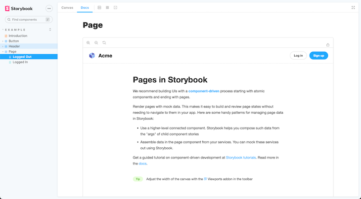
Play around this environment to get a better understanding of how stories and documentations work in Storybook before we begin creating our own.
Once you’re done playing around, go ahead and delete the /stories directory, then update the content of .storybook/main.js to match the following:
module.exports = {
  stories: [
    "../components/**/*.stories.mdx",
    "../components/**/*.stories.@(js|jsx|ts|tsx)",
  ],
  addons: [
    "@storybook/addon-links",
    "@storybook/addon-essentials",
    "@storybook/addon-controls",
  ],
  webpackFinal: async (config) => {
    config.module.rules.push({
      test: /\.scss$/,
      use: ["style-loader", "css-loader", "postcss-loader", "sass-loader"],
    });

    return config;
  },
};
In the code above, we configured Storybook to look for stories/documentation in the /components directory rather than the default /stories directory, allowing us to house our components as well as their respective stories in the same directory.
Storybook does not work with Tailwind CSS by default. As a result, if we create a React component using Tailwind utility classes and then create a story based on this component, the Tailwind CSS changes will not be reflected in the Storybook environment.
To address this issue, we’ve added a webpackFinal option to the .storybook/main.js config file in the previous code. This will instruct Storybook to build with the necessary dependencies required by Tailwind CSS:
. . .
  webpackFinal: async (config) => {
    config.module.rules.push({
      test: /\.scss$/,
      use: ["style-loader", "css-loader", "postcss-loader", "sass-loader"],
    });

    return config;
  },
Also, update the .stories/preview.js file with the code below:
import "../styles/globals.css";

import * as nextImage from "next/image";

Object.defineProperty(nextImage, "default", {
  configurable: true,
  value: (props) => <img {...props} />,
});

export const parameters = {
  actions: { argTypesRegex: "^on[A-Z].*" },
};
This file was updated to import the global stylesheet and to support next-image. As a result, both Tailwind CSS and next-image should function properly in our Storybook environment.
To create a new story, we need to first create the component on which the story will be based. Create a new /components/Card folder in your project root directory. Then, inside this new directory, create two files:
index.js — will contain the main code for our card componentcard.stories.js — will contain the story code for our card componentWhen we’re finished, our project file structure should look like this:
.
├── . . .
├── components
│   └── Card
│       ├── index.js
│       └── card.stories.js
├── pages
│   └── index.js
├── public
└── . . .
Inside the Card/index.js file, paste the following code:
import PropTypes from "prop-types";

const Card = ({ title, showSub, background, imgUrl, children }) => {
  return (
    <div class="flex justify-center">
      <div
        class={`flex flex-col md:flex-row md:max-w-xl rounded-lg bg-${background} shadow-lg`}
      >
        <img
          class=" w-full h-96 md:h-auto object-cover md:w-48 rounded-t-lg md:rounded-none md:rounded-l-lg"
          src={imgUrl}
        />
        <div class="p-6 flex flex-col justify-center">
          <h5 class="text-gray-900 text-xl font-medium mb-2">{title}</h5>
          {showSub && (
            <p class="text-gray-500 text-sm mt-2">This is the card subtitle</p>
          )}
          <p class="text-gray-700 text-base mt-4 mb-4">{children}</p>

          <button
            type="button"
            class="inline-block px-6 py-2.5 bg-blue-600 text-white font-medium text-xs uppercase rounded shadow-md"
          >
            Some action
          </button>
        </div>
      </div>
    </div>
  );
};

export default Card;

Card.propTypes = {
  title: PropTypes.string,
  sub: PropTypes.string,
  showSub: PropTypes.bool,
  imgUrl: PropTypes.string,
  background: PropTypes.string,
};
Using Tailwind CSS utility classes, we created a component in the code above that accepts title, showSub, imgUrl, background, and children prop and generates a basic card with the passed props.
You may have noticed that we also used the React PropTypes package to define our prop types. We’ll need to install it like so:
npm install prop-types
To create the card story, paste the following code inside the card.stories.js file:
import Card from "./index";

export default {
  title: "My Cards",
};

const Template = (arguments_) => <Card {...arguments_} />;

export const GreenCard = Template.bind({});

GreenCard.args = {
  title: "Hello World",
  showSub: false,
  background: "yellow-600",
  imgUrl: "https://path/to/some/image",
  Children: "Lorem ipsum dolor sit amet, consectetur adipisicing elit. Nulla, soluta?",
};
In the code above, we created a new story called “My Cards,” binding the story template to the Card component we created earlier.
We then created a new instance of the Card story called GreenCard and passed the above GreenCard.args values as props to be rendered with our Card component.
Run the following command to restart the Storybook environment:
npm run storybook
Once it’s started, you should see that our card story is now created as shown in the screenshot below:
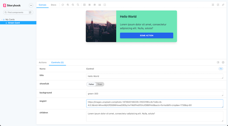
You should also notice that our component is automatically updating as we make changes in the control section.
Furthermore, we have a plethora of customization options at the menu bar for measuring the sizes of our component as well as how it will appear in various viewports and conditions:
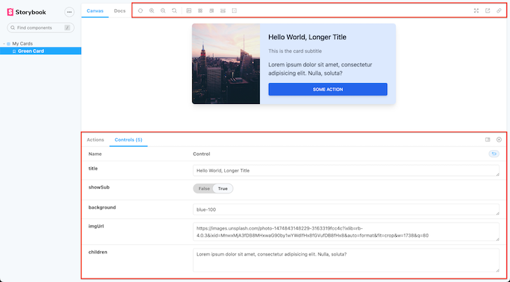
That’s all there is to it! We were able to install Storybook in a Next.js project and set it up to work with Tailwind CSS.
Throughout this article, we have emphasized the importance of component isolation. We also discussed how to use Storybook — a web tool for developing and testing UI components in isolation — in a Next.js application, as well as how to configure Tailwind CSS for such a project.
You may also find the complete source code for this tutorial on GitHub.
Debugging Next applications can be difficult, especially when users experience issues that are difficult to reproduce. If you’re interested in monitoring and tracking state, automatically surfacing JavaScript errors, and tracking slow network requests and component load time, try LogRocket.
LogRocket captures console logs, errors, network requests, and pixel-perfect DOM recordings from user sessions and lets you replay them as users saw it, eliminating guesswork around why bugs happen — compatible with all frameworks.
LogRocket's Galileo AI watches sessions for you, instantly identifying and explaining user struggles with automated monitoring of your entire product experience.
The LogRocket Redux middleware package adds an extra layer of visibility into your user sessions. LogRocket logs all actions and state from your Redux stores.

Modernize how you debug your Next.js apps — start monitoring for free.

When should you move API logic out of Next.js? Learn when Route Handlers stop scaling and how ElysiaJS helps.

Explore how Dokploy streamlines app deployment with Docker, automated builds, and simpler infrastructure compared to traditional CI/CD workflows.

A side-by-side look at Astro and Next.js for content-heavy sites, breaking down performance, JavaScript payload, and when each framework actually makes sense.

AI-generated tests can speed up React testing, but they also create hidden risks. Here’s what broke in a real app.re
Would you be interested in joining LogRocket's developer community?
Join LogRocket’s Content Advisory Board. You’ll help inform the type of content we create and get access to exclusive meetups, social accreditation, and swag.
Sign up now