Modern React applications require more than polished visuals; they demand modular, reusable components that are consistent and easy to maintain. Yet, turning high-fidelity designs into production-ready code remains one of the most fragmented steps in the development process. Designers hand off mockups, developers interpret them, and along the way, alignment often breaks down, which results in duplicated effort, inconsistent UI, and inevitable delayed delivery.

In this article, you’ll learn how to take an open source design from Penpot, a collaborative, Figma-like design tool, and transform it into a fully functional React component, documented and tested with Storybook. The goal is to create a repeatable approach that produces clean, maintainable UI code that stays aligned with the design.
The Replay is a weekly newsletter for dev and engineering leaders.
Delivered once a week, it's your curated guide to the most important conversations around frontend dev, emerging AI tools, and the state of modern software.
Penpot is an open source design and prototyping tool built for designers and developers to collaborate. It is browser-based and platform-independent, meaning anyone can access it without installing special software, unlike traditional tools that lock users into a specific workflow or platform.
Designers often feel limited by tools like Figma or Sketch, which can restrict access due to paid plans, platform dependency (e.g., macOS only), or lack of real-time collaboration with developers who live in code. Penpot removes those limitations by being fully open source, self-hostable, and accessible to anyone on any operating system.
Penpot builds its layout engine on Flexbox, which mirrors how modern UIs are actually implemented in code. This results in less friction during handoff, which means what designers build in Penpot looks and behaves closer to the real web product.
At first glance, Penpot looks a lot like Figma; it has a clean interface, drag-and-drop boards, prototyping flows, team collaboration, and components. But its foundational principles and use cases set it apart.
Penpot is fully open source and browser-based. You can use it in the cloud or host it yourself. That flexibility matters when you hit a paywall in Figma or worry about storing sensitive design systems in a closed ecosystem. With Penpot, design teams can own their design stack, which opens doors for compliance, customization, and cost control.
In Penpot’s latest version, it delivers features that speak directly to modern design-dev pain points:
These features are intentionally built to reflect how real design teams work, especially when developers are part of a team. For example, layout tools in Penpot map directly to frontend systems. You don’t have to guess how a frame will behave on different screens. You can design with confidence, knowing your layout will hold up in code. This alignment saves time, cuts down rework, and improves communication between roles.
The inspect mode is also a huge win. It gives developers clean, copyable HTML and CSS — no more digging for spacing values or guessing at alignments. Best of all, Penpot is free. You can use it for open source projects, teams with strict data policies, organizations that want to avoid vendor lock-in, and design systems with complex dev handoff needs.
So, is Penpot a Figma replacement? It depends on your context. If you’re a solo designer in a Figma-heavy organization, switching might not be worth it. But if you’re part of a team that values open tooling, frontend-friendly layouts, and cost flexibility, then Penpot isn’t just an alternative. It’s a design tool built to think like a developer:
| Feature/Capability | Penpot | Figma |
|---|---|---|
| Licensing | Fully open source, free forever | Proprietary, freemium model with paid tiers |
| Hosting options | Cloud-based or self-hosted (ideal for compliance or privacy) | Cloud-only, no self-hosting |
| Platform support | Browser-based, works across all OS platforms | Browser and desktop apps, with limited functionality offline |
| Collaboration | Real-time team collaboration | Real-time team collaboration |
| Design-to-code alignment | Uses true CSS Flexbox and Grid layout models | Uses custom layout engine, may differ from actual CSS |
| Developer inspect mode | Exposes clean, copyable HTML/CSS for every element | Shows properties but lacks semantic code output |
| Component system | Built on atomic design principles | Strong component system, but not atomic-first |
| Community and customization | Open community, extensible via open codebase | Closed ecosystem, limited to Figma plugins |
| Vendor lock-in | None, teams can fully own their stack | Yes, locked into Figma’s cloud and ecosystem |
| Use cases | Best for dev-heavy teams, open source projects, privacy-first orgs | Best for fast prototyping, solo designers, and orgs already using Figma |
| Cost | Free forever | Free tier available; paid plans for advanced features |
You need to set up the environment before we begin building:
Visit Penpot’s website and sign up for a free account. You’ll be able to create designs and export assets directly from the platform.
Next, set up a basic React project. Use the following commands to create a new project using either Create React App or Vite:
npx create-react-app penpot-storybook-demo
npm create vite@latest penpot-storybook-demo --template react
Then, navigate to your project directory:
cd penpot-storybook-demo
Now, install Storybook into your project by running the following command:
npx storybook@latest init
This will set up Storybook in your project and configure it to run on localhost:6006:
npm run storybook
Storybook should open in your browser, ready to start building UI components.
Now that we have our development environment ready, it’s time to design the UI in Penpot:
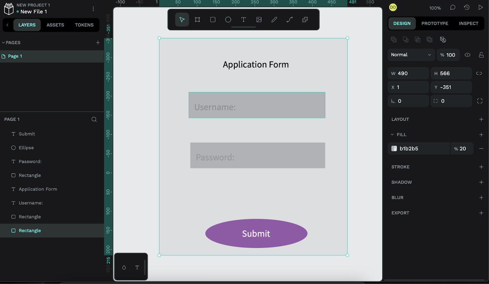
Open Penpot and create a new design. Let’s build an application form for context. Add text fields for the username and password, a button to submit the form, and labels to guide the user. Use a simple layout with a grid or columns to keep everything aligned neatly.
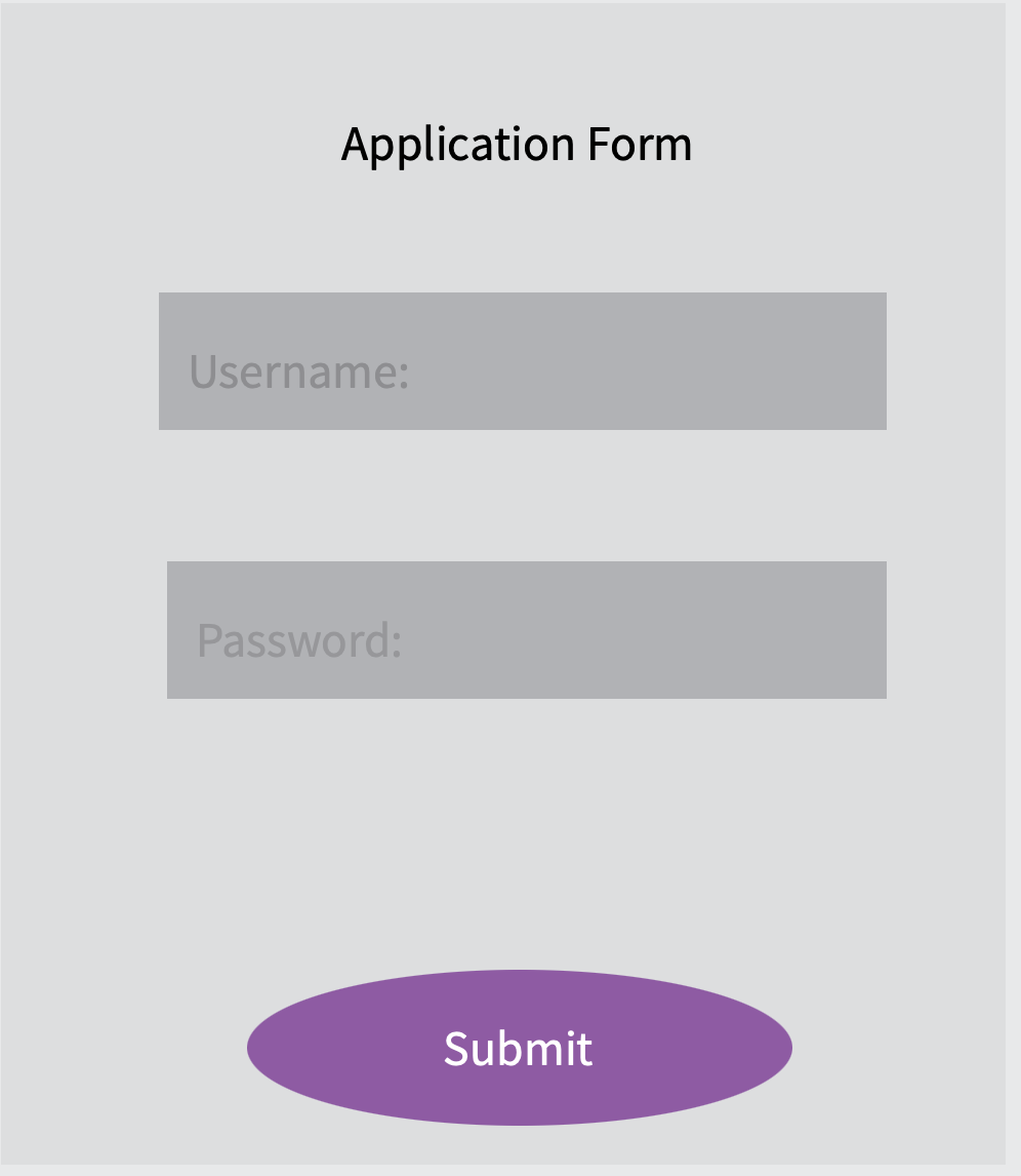
Here’s an example of what the application form might look like:
Use Penpot’s vector tools to draw the basic shapes for your layout; rectangles, ellipses, and lines are all good options. Adjust the size, corner radius, and position of each shape until everything fits together properly. This results in a clear, structured design that can be easily rebuilt in code later:
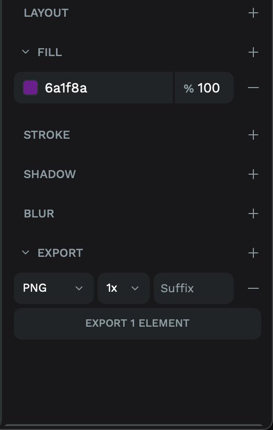
When you finish your design, export the parts you’ll need in your code. These might be SVG icons, PNG images, or a design spec with details like colors and spacing.
To do this in Penpot, click on the elements you want to export. Then, choose a file format that works best for your project:
With the design in hand, we can now start building the actual React component.
Open your React project. Inside the src directory, create a new folder called components. This folder will hold all your UI components.
Inside components, create a new file named LoginForm.js. This will house your login form:
mkdir src/components
touch src/components/LoginForm.js
Use the design you created in Penpot as your reference. You can write the form using Tailwind CSS for quick layout and styling. If you prefer CSS Modules or plain CSS, feel free to swap that in. Here’s a basic version of the form using Tailwind:
import React, { useState, useEffect } from 'react';
export default function LoginForm() {
  const [username, setUsername] = useState('');
  const [password, setPassword] = useState('');
  const [error, setError] = useState('');
  const handleSubmit = (e) => {
    e.preventDefault();
    if (!username || !password) {
      setError('All fields are required');
      return;
    }
    setError('');
    console.log('Submitted form:', { username, password });
  };
  useEffect(() => {
    console.log('LoginForm component mounted');
  }, []);
  return (
    <form onSubmit={handleSubmit} className="space-y-4 max-w-sm mx-auto">
      <div>
        <label htmlFor="username" className="block text-sm font-medium text-gray-700">
          Username
        </label>
        <input
          id="username"
          type="text"
          value={username}
          onChange={(e) => setUsername(e.target.value)}
          className="mt-1 block w-full px-3 py-2 border border-gray-300 rounded-md shadow-sm focus:outline-none focus:ring-indigo-500 focus:border-indigo-500 sm:text-sm"
        />
      </div>
      <div>
        <label htmlFor="password" className="block text-sm font-medium text-gray-700">
          Password
        </label>
        <input
          id="password"
          type="password"
          value={password}
          onChange={(e) => setPassword(e.target.value)}
          className="mt-1 block w-full px-3 py-2 border border-gray-300 rounded-md shadow-sm focus:outline-none focus:ring-indigo-500 focus:border-indigo-500 sm:text-sm"
        />
      </div>
      {error && <p className="text-red-500 text-sm">{error}</p>}
      <button
        type="submit"
        className="w-full bg-blue-500 text-white py-2 rounded-md"
      >
        Login
      </button>
    </form>
  );
}
Here, we’ve used Tailwind CSS for styling and added state handling with useState to manage the form inputs. Make sure to reference your Penpot design specs for exact dimensions, colors, and typography:
Now that we have our component, it’s time to document and test it using Storybook.
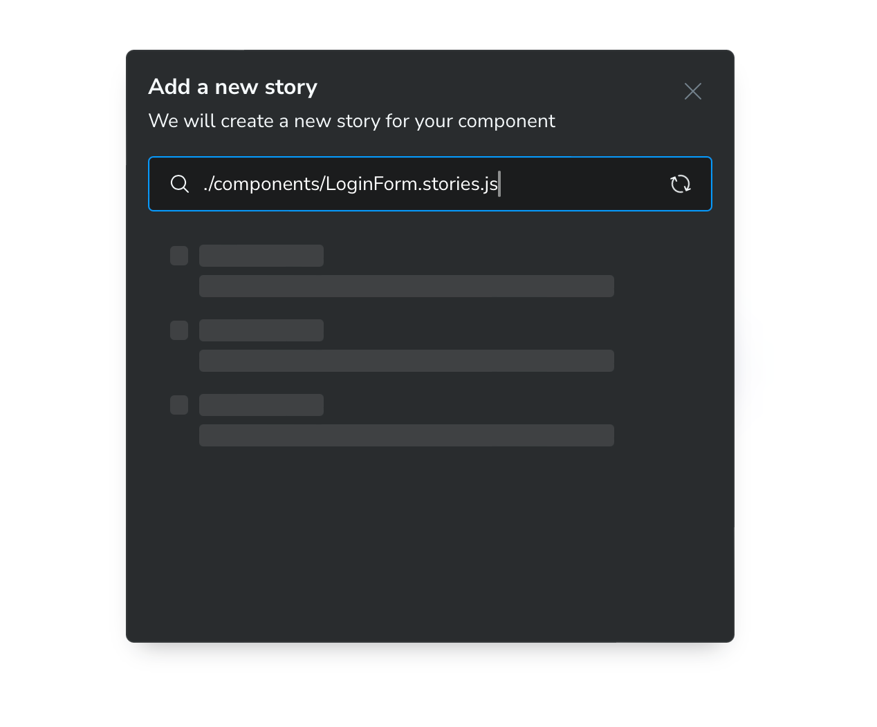
In your src/components folder, create a new file named LoginForm.stories.js to document the login form in Storybook:
import React from 'react';
import LoginForm from './LoginForm';
export default {
  title: 'Components/LoginForm',
  component: LoginForm,
};
export const Default = () => <LoginForm />;
This will allow you to view and test the LoginForm component alone. Storybook will automatically load and display the component.
Open the component in Storybook. Use the built-in tools to check how it looks on different screen sizes. Try resizing the preview window or switching to mobile views.
To catch accessibility issues early, install Storybook’s accessibility add-on:
npm install @storybook/addon-viewport @storybook/addon-a11y
Add it to your .storybook/main.js file, along with any other tools you use.
If you set up your React project with Vite, make sure Storybook can read your project config. Edit your .storybook/main.js file and include the Vite options, especially for paths and plugins like Tailwind:
const { mergeConfig } = require('vite');
const path = require('path');
module.exports = {
  framework: {
    name: '@storybook/react-vite',
    options: {},
  },
  stories: ['../src/**/*.stories.@(js|jsx|ts|tsx)'],
  addons: [
    '@storybook/addon-viewport',
    '@storybook/addon-a11y',
    '@storybook/addon-essentials',
  ],
  async viteFinal(config) {
    return mergeConfig(config, {
      resolve: {
        alias: {
          '@': path.resolve(__dirname, '../src'),
        },
      },
    });
  },
};
Don’t forget to import your Tailwind CSS in .storybook/preview.js:
import '../src/index.css';
This setup ensures that your component stories match the look and behavior of your actual app while allowing you to catch layout and accessibility issues early in development:
Before you push the component to production, take some time to clean it up. Refactor the form so it can be reused, and remove any hard-coded values where possible. Check how the layout looks on different screen sizes and fix any issues that arise, and organize the code so that related functions and elements are grouped together. This will make the component easier to understand and reuse in other parts of your React project.
In this article, we walked through how to convert Penpot designs into functional UI components using React and Storybook. We started by setting up a clean development environment, then designed a login form in Penpot and built it as a reusable React component. From there, we documented and tested it using Storybook. This workflow creates a smooth, consistent handoff between design and development.
Try incorporating this approach in your next project to streamline your UI development pipeline, especially if your form collects details like email addresses or user input across various screens.

Learn how inline props break React.memo, trigger unnecessary re-renders, and hurt React performance — plus how to fix them.

This article showcases a curated list of open source mobile applications for Flutter that will make your development learning journey faster.

Discover what’s new in The Replay, LogRocket’s newsletter for dev and engineering leaders, in the April 1st issue.

This post walks through a complete six-step image optimization strategy for React apps, demonstrating how the right combination of compression, CDN delivery, modern formats, and caching can slash LCP from 8.8 seconds to just 1.22 seconds.
Hey there, want to help make our blog better?
Join LogRocket’s Content Advisory Board. You’ll help inform the type of content we create and get access to exclusive meetups, social accreditation, and swag.
Sign up now

 Learn more →
