This article will cover how to set up a Figma plugin project with webpack to implement the UI using React. The purpose of the plugin will be to generate three random colors and let the user pick one to assign to a selected element in the Figma document.

This example plugin will demonstrate how to establish communication between the UI and the plugin code, and then how to use the API to achieve the given basic task.
The first thing you’ll need to do is create a Figma plugin through the Figma app. This will generate a template project with a manifest.json file, which contains the information of your plugin and its ID. In order to create a project, you need to click on the Community section in the left-hand menu, and then, under the Plugins tab, you can find the Create new plugin button.
Once you create your plugin, it will generate all the required files, but in order to integrate TypeScript and Sass compilers and bundle all the assets, such as JavaScript, style files, and possibly SVGs, we need a bundler. For this we will use webpack.
Before configuring webpack, we need some arrangement for the source files. Create a /src folder and move the ui.html and code.ts files in this folder. You can delete the pre-generated code.js file. Now we need a ui.tsx file, which will contain the React code written with TypeScript. Create this file under the /src folder as well.
The last thing we need to do is edit the ui.html file. This file already contains some HTML and JavaScript, but we only need an HTML element, which will be populated by React. So, replace the entire contents of ui.html with the following line:
<div id="root"></div>
Eventually, the /src folder should look like this:
-- src
 |- ui.tsx
 |- code.ts
 |- ui.html
One last thing we need is to configure the manifest.json file accordingly.
There, you see the main and ui keys. These tell Figma where to look for the files containing the plugin code and the UI code, respectively. Since webpack puts the bundled files under the /dist folder by default, we need to point to specific files under that folder for the main and ui keys.
./dist/code.js is the compiled file from code.ts, and ./dist/ui.html is the HTML file that will contain the inline JavaScript code between the <script></script> tags.
Note that Figma accepts one single file for UI, which means that you cannot have a <script> tag with src attribute pointing to a JavaScript file. This is why the ui.html should contain inline JavaScript code; later, this will be something we specifically tell webpack to do.
{
  ...
  "main": "./dist/code.js",
  "ui": "./dist/ui.html"
}
The first order of business is installing react and react-dom as dependencies. Once you have them in your dependency tree, install webpack, webpack-cli, and typescript as devDependencies. If you already have typescript globally installed, you can skip it.
Now create the webpack.config.js file in the root directory of your plugin project, which should look like this initially, where we defined the mode and devtool. Note that according to the Figma documentation, the devtool definition is required due to the fact that Figma’s eval works differently than normal eval.
const webpack = require('webpack');
const path = require('path');

module.exports = (env, argv) => ({
  mode: argv.mode === 'production' ? 'production' : 'development',
  devtool: argv.mode === 'production' ? false : 'inline-source-map',
})
Now we will define the entry points, which will tell webpack what to bundle.
module.exports = (env, argv) => ({
  mode: argv.mode === 'production' ? 'production' : 'development',
  devtool: argv.mode === 'production' ? false : 'inline-source-map',

  entry: {
    ui: './src/ui.tsx',
    code: './src/code.ts',
  },
})
Next, we will define the rules for checking specific files and load them with loaders. We need the tsx loader and loaders for stylings, and since it is likely that you might want to include SVG files in the UI, it is good to have an SVG loader as well.
Install the following npm packages as devDependencies:
ts-loader
style-loader
css-loader
sass-loader
@svgr/webpack
node-sass
With the loaders added, the configuration file should look like this:
module.exports = (env, argv) => ({
  mode: argv.mode === 'production' ? 'production' : 'development',
  devtool: argv.mode === 'production' ? false : 'inline-source-map',

  entry: {
    ui: './src/ui.tsx',
    code: './src/code.ts',
  },
  module: {
    rules: [
      {
        test: /\.tsx?$/,
        use: 'ts-loader',
        exclude: /node_modules/
      },
      {
        test: /\.sass$/,
        use: [
          'style-loader',
          'css-loader',
          'sass-loader',
        ],
      },
      {
        test: /.svg$/,
        use: '@svgr/webpack',
      },
    ]
  },
})
Now we will tell webpack what plugins to use. We need the html-webpack-inline-source-plugin and html-webpack-plugin plugins.
Install them as devDependencies and then require them at the top of the webpack.config.js file.
const HtmlWebpackInlineSourcePlugin = require('html-webpack-inline-source-plugin')
const HtmlWebpackPlugin = require('html-webpack-plugin')
The first creates an HTML file serving the bundled files. For example, if you have JavaScript and CSS files bundled, these are automatically added into the template HTML file you provide. In our case, styling is already included in the JavaScript, and therefore, we only need a JavaScript file to be included. However, we need that JavaScript inline, and this is what the second plugin does.
We point to src/ui.html for template, and we want the output to be named ui.html. We also want only js files to be inline, which is why we have inlineSource: '.(js)$'. Note that this key requires HtmlWebpackInlineSourcePlugin. Lastly, chunks: ['ui'] instructs webpack to include only the ui.js file in ui.html, given that we do not need code.js in ui.html.
This is the final shape of the webpack.config.js file:
const HtmlWebpackInlineSourcePlugin = require('html-webpack-inline-source-plugin');
const HtmlWebpackPlugin = require('html-webpack-plugin');
const webpack = require('webpack');
const path = require('path');

module.exports = (env, argv) => ({
  mode: argv.mode === 'production' ? 'production' : 'development',
  devtool: argv.mode === 'production' ? false : 'inline-source-map',

  entry: {
    ui: './src/ui.tsx',
    code: './src/code.ts',
  },
  module: {
    rules: [
      {
        test: /\.tsx?$/,
        use: 'ts-loader',
        exclude: /node_modules/
      },
      {
        test: /\.sass$/,
        use: [
          'style-loader',
          'css-loader',
          'sass-loader',
        ],
      },
      {
        test: /.svg$/,
        use: '@svgr/webpack',
      },
    ]
  },
  plugins: [
    new HtmlWebpackPlugin({
      template: './src/ui.html',
      filename: 'ui.html',
      inlineSource: '.(js)$',
      chunks: ['ui'],
    }),
    new HtmlWebpackInlineSourcePlugin(),
  ],
})
In order to be able to include SVGs as React components, we need a custom typing. Create a folder named typings-custom in your root directory, and then, inside it, create a file named svg.d.ts. The content of this file should be:
declare module '*.svg' {
  const content: any;
  export default content;
}
Now we need to include the content of the typings-custom folder in tsconfig.json.
{
  ...
  "include": [
    "./typings-custom/**/*.ts"
  ]
}
Since we are working with JSX, we also need to indicate this in tsconfig.json. Just add the following key-value pair to compilerOptions:
"jsx": "react"
The final version of tsconfig.json should look like this:
{
  "compilerOptions": {
    "target": "es6",
    "jsx": "react",
    "typeRoots": [
      "./node_modules/@types",
      "./node_modules/@figma"
    ]
  },
  "include": [
    "./typings-custom/**/*.ts"
  ]
}
Before adding the build and watch scripts, we need to install types for React and Figma. Install the following npm packages as devDependencies:
@figma/plugin-typings
@types/react
@types/react-dom
Now, in the package.json file, you can add the following scripts to build for production or watch for changes in development:
"scripts": {
  "build": "webpack --mode production",
  "watch": "webpack --mode development --watch"
}
Try running npm run watch in your console; you are likely to get some errors. As far as I have inspected, this is due to the latest version of html-webpack-plugin. To fix this issue, change the version of this package to 3.2.0 in your package.json file, and then run npm install to fetch this specific version.
"html-webpack-plugin": "3.2.0"
This should fix the problem.
To test that everything is working fine, just add a logging line such as console.log('test') into the ui.tsx file and then run npm run watch. Go to Figma, and under Plugins>Development, find your plugin and run it. It should display an empty window. Go to the same menu again and click on Open Console. There you should see the test message in the console.
We basically have two source files: ui.tsx and code.ts. You can think of them as front- and backend codes, respectively. ui.tsx generates the user interface and sends messages to code.ts and code.ts listens to these messages and do stuff accordingly and utilizes the API to control the Figma document and possibly send messages back to inform the UI.
This bidirectional messaging system is the only thing connecting these two files to each other, so in that sense, it is essential if your plugin has a user interface. Sending a message from the UI happens as follows:
parent.postMessage({ pluginMessage: 'MESSAGE' }, '*');
Likewise, sending a message from the plugin code to the UI is very similar:
figma.ui.postMessage('MESSAGE');
I will provide a React component with all the functionalities for the sake of keeping this article short and focusing on the actual subject.
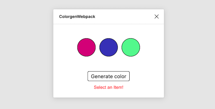
This component generates three random colors when users click the Generate color button. Clicking on any of these colors will set the fill color of the selected element in the Figma document. If no element is selected, the UI shows the message Select an Item! to warn the user.
import * as React from 'react';
import * as ReactDOM from 'react-dom';
import randomColor from 'randomcolor';
import './styles.sass';

interface Props {
}

interface State {
  colors: string[],
  isItemSelected: boolean,
  isColorGenerated: boolean
}

class App extends React.Component<Props, State> {
  constructor(props) {
    super(props);
    this.state = {
      colors: ['#fff', '#fff', '#fff'],
      isItemSelected: false,
      isColorGenerated: false
    }
  }

  componentDidMount() {
    window.onmessage = (msg) => {
      const { type } = msg.data.pluginMessage;
      if (type === "ITEM_SELECTED") {
        this.setState({ isItemSelected: true })
      } else if (type === "ITEM_NOT_SELECTED") {
        this.setState({ isItemSelected: false })
      }
    };
  }

  sendMessage = (type, data = null) => {
    parent.postMessage({
      pluginMessage:
      {
        type,
        data,
      },
    }, '*');
  }

  mapValues = (x) => {
    return (x - 0) * (1 - 0) / (255 - 0) + 0;
  }

  getRGBValues = (str) => {
  var vals = str.substring(str.indexOf('(') +1, str.length -1).split(', ');
    return {
      'r': this.mapValues(parseInt(vals[0])),
      'g': this.mapValues(parseInt(vals[1])),
      'b': this.mapValues(parseInt(vals[2]))
    };
  }

  generateColors = () => {
    const colors = randomColor({ count: 3, format: 'rgb', hue: 'random' });
    this.setState({ colors, isColorGenerated: true });
  }

  assignColor = (color) => {
    this.sendMessage('ASSIGN_COLOR', this.getRGBValues(color));
  }

  render() {
    const { isItemSelected, isColorGenerated, colors } = this.state;
    return (
      <div className="app">
        <div className="colors">
          {colors.map((color, i) => (
            <button
              key={`${i}-${color}`}
              type="button"
              className="color"
              onClick={
                (isItemSelected && isColorGenerated)
                ? () => this.assignColor(color)
                : null}
              style={{backgroundColor: color}}
            />
          ))}
        </div>
        <button
          type="button"
          onClick={this.generateColors}
        >
          Generate color
        </button>
        {!isItemSelected && <div className="alert">Select an Item!</div>}
      </div>
    );
  }
}

ReactDOM.render(<App />, document.getElementById('root'));
What’s important there is the communication between the UI and the plugin code. Sending a message with optional data is handled by the sendMessage utility function. Note how the assignColor function calls sendMessage to alert the plugin code.
sendMessage = (type, data = null) => {
  parent.postMessage({
    pluginMessage:
    {
      type,
      data,
    },
  }, '*');
}
And when the plugin code sends a message, the UI should be able to catch it. This is why we have window.onmessage in the componentDidMount lifecycle hook — to start listening for any incoming messages on component mount.
The only message sent from the UI to the plugin code happens when a generated color is clicked. The UI sends an ASSIGN_COLOR message along with an object, which looks like this:
{
  r: 0.3,
  g: 0,
  b: 1,
}
This is the valid object that Figma accepts when setting a color, and this is why there are some other utility functions, such as getRGBValues and mapValues, which convert the generated color into an object in the form of {r,g,b} and maps the 0-255 range into the 0-1 range, respectively.
There are two messages sent from the plugin code in order to inform the UI whether an element in the Figma document is selected. Then, the component sets a state variable accordingly to update the UI.
Before starting, this documentation page is the reference for everything available in the API. Whenever you need to figure out something, make sure to check this documentation.
In the code.ts file, there is already an example code generated when the project is created. This is a good reference for starting and understanding how the API is used.
You can delete everything in code.ts and just have the following code as the starting point
figma.showUI(__html__);

figma.ui.onmessage = msg => {};
figma.showUI(__html__) is necessary to show the ui.html content, and figma.ui.onmessage is for starting to listen for upcoming messages from the UI.
The plugin has two basic functionalities on the plugin code side:
ASSIGN_COLOR message that comes from the UI in order to set the fills property of the selected element to the color sent along with this messageIn order to detect selections, we can listen on selectionchange through the figma.on function, which takes an event type as the first argument and a callback function as the second.
figma.on('selectionchange', () => {
  detectSelection();
});
Where the detectSelection() function is:
const detectSelection = () => {
  const { selection } = figma.currentPage;
  if (selection.length) {
    figma.ui.postMessage({ type: 'ITEM_SELECTED' });
  } else {
    figma.ui.postMessage({ type: 'ITEM_NOT_SELECTED' });
  }
}
figma.currentPage.selection returns an array of selected nodes. By checking the length of the array, we can conclude whether the selection occurred. If the length is larger than 0, we can send an ITEM_SELECTED message to the UI; otherwise, we send an ITEM_NOT_SELECTED message.
Note that this mechanism does not detect the selection of a single element. Likewise, there is no guarantee that the selected element will have a fills property to set (e.g., a GroupNode does not have a fills property).
For the sake of simplicity, this example assumes the user selects a single element which has the fills property. In a production-ready plugin, this should obviously be handled automatically, and the UI should be informed accordingly to show an appropriate message to warn the users.
Moreover, calling detectSelection() in the main scope is also required in order to detect any element selected before the initialization of the plugin. Otherwise, selectionchange does not fire until the user makes a selection.
With the selection detection in place, code.ts looks like this:
figma.showUI(__html__);
figma.ui.onmessage = msg => {};

figma.on('selectionchange', () => {
  detectSelection();
});

const detectSelection = () => {
  const { selection } = figma.currentPage;
  console.log(selection)
  if (selection.length) {
    figma.ui.postMessage({ type: 'ITEM_SELECTED' });
  } else {
    figma.ui.postMessage({ type: 'ITEM_NOT_SELECTED' });
  }
}

detectSelection();
fills propertyAs mentioned before, when a color is clicked on the UI, an ASSIGN_COLOR message is sent from the UI along with a color data object. So, the first thing we need to do is listen for this message in the figma.ui.onmessage = *msg* => {} function.
figma.ui.onmessage = msg => {
  const { type } = msg;
  if (type === 'ASSIGN_COLOR') {
    const { selection } = figma.currentPage;
    const { data } = msg;
  }
};
const { selection } = figma.currentPage; returns an array of selected elements. As mentioned earlier, we assume there is only one valid element selected. Since we sent data along with the message, we can also destructure msg and get the data.
Note that the key name of data comes from the definition in the sendMessage utility function.
sendMessage = (type, data = null) => {
  parent.postMessage({
    pluginMessage:
    {
      type,
      data,
    },
  }, '*');
}
If you do console.log(selection), you would see that the element you select is an object inside an array, and it has the fills property, which is another array with an object in it. This object has the color property, which has the following format, as previously discussed:
{
  r: 0,
  g: 0,
  b: 0,
}
So, the first attempt you are likely to make would be to set this object by doing the following:
selection[0].fills[0].color = data
However, more complex properties such as fills have readonly objects in them for reasons explained clearly in the Figma documentation.
Since the property itself is not readonly but its content is, Figma tells us to clone the property and perform the changes on that clone before assigning it back to the property. In the document linked above, there are two suggested approaches for cloning. The easiest is to stringfy the object and then parse it back to an object.
const clone = (val) => {
  return JSON.parse(JSON.stringify(val))
}
The rest of the if statement now looks like this:
figma.ui.onmessage = msg => {
  const { type } = msg;
  if (type === 'ASSIGN_COLOR') {
    const { selection } = figma.currentPage;
    const { data } = msg;
    const fills = clone((selection[0] as any).fills)

    fills[0].color = data;
    (selection[0] as any).fills = fills;
  }
};
Since the cloned property is just an object, we can do fills[0].color and assign our data, which is the object containing the color information in the same format with Figma.
The final version of code.ts is as follows:
figma.showUI(__html__);

figma.ui.onmessage = msg => {
  const { type } = msg;
  if (type === 'ASSIGN_COLOR') {
    const { selection } = figma.currentPage;
    const { data } = msg;
    const fills = clone((selection[0] as any).fills)
    fills[0].color = data;
    (selection[0] as any).fills = fills;
  }
};

figma.on('selectionchange', () => {
  detectSelection();
});

const detectSelection = () => {
  const { selection } = figma.currentPage;
  console.log(selection)
  if (selection.length) {
    figma.ui.postMessage({ type: 'ITEM_SELECTED' });
  } else {
    figma.ui.postMessage({ type: 'ITEM_NOT_SELECTED' });
  }
}

const clone = (val) => {
  return JSON.parse(JSON.stringify(val))
}

detectSelection();
For those who want to have the styling in place, here are the contents of the styles.sass file:
*
  outline: none
body
  font-family: Arial, Helvetica, sans-serif
.app
  display: flex
  flex-direction: column
  align-items: center
  button
    border: 1px solid black
    text-align: center
    border-radius: 4px
    font-size: 14px
    padding: 4px 8px
    margin-bottom: 10px
  .colors
    margin: 30px 0
    width: 60%
    display: flex
    justify-content: space-between
    .color
      border: none
      width: 50px
      height: 50px
      border-radius: 50%
      cursor: pointer
      border: 1px solid black
  .alert
    font-size: 12px
    color: rgba(red, 0.7)
In following this tutorial, you should now have an understanding of how to use webpack to integrate React into Figma plugin development. By reading through the documentation from Figma, or possibly checking the source code of other plugins on GitHub or other platforms, you can get familiar with the API and start building your own plugins for Figma.
Install LogRocket via npm or script tag. LogRocket.init() must be called client-side, not
server-side
$ npm i --save logrocket

// Code:

import LogRocket from 'logrocket';
LogRocket.init('app/id');
// Add to your HTML:

<script src="https://cdn.lr-ingest.com/LogRocket.min.js"></script>
<script>window.LogRocket && window.LogRocket.init('app/id');</script>
Hey there, want to help make our blog better?
Join LogRocket’s Content Advisory Board. You’ll help inform the type of content we create and get access to exclusive meetups, social accreditation, and swag.
Sign up now
Discover how to use Gemini CLI, Google’s new open-source AI agent that brings Gemini directly to your terminal.

This article explores several proven patterns for writing safer, cleaner, and more readable code in React and TypeScript.

A breakdown of the wrapper and container CSS classes, how they’re used in real-world code, and when it makes sense to use one over the other.

This guide walks you through creating a web UI for an AI agent that browses, clicks, and extracts info from websites powered by Stagehand and Gemini.

 Learn more →

2 Replies to "Building Figma plugins with React"
https://www.echojs.com/comment/37652/1
Interresting, though for something like this, that’s embedding in another application instead of being the application, I’d probably reach for preact or hyper as another JSX transform option, which will be much lighter. You can even swap in prod vs dev builds for testing. React adds a lot of tooling and niceties that come with a ton of overhead.
You’re looking at probably a 80k deliverable for the example out of the box, vs under 5k using hyper+jsx or preact.
I like React. This just is a case where using something smaller/lighter but being very similar in practice would be better.
1. https://github.com/lukejacksonn/hyperapp-wiki/blob/master/docs/jsx.md
2. https://github.com/preactjs/preact
3. https://github.com/kenoxa/svelte-jsx
As soon as you add the UI, this tutorial is horribly broken. Could you share the github repo?