
The Replay is a weekly newsletter for dev and engineering leaders.
Delivered once a week, it's your curated guide to the most important conversations around frontend dev, emerging AI tools, and the state of modern software.
We’ve all heard the buzzword “design system” thrown up and down. But how do we make sense of it, and more importantly, how do we build one for ourselves? This post will guide you through creating a design system using React, Grommet, and Storybook.

A design system consists of a design language, a component library, and a documentation/style guide website where the first two live.
As detailed in this talk by Emma Wedekind, when developers talk about design systems, they mostly refer to the component library; when designers do, they refer to the design language. Project managers are most likely concerned with the documentation/style guide website where everything lives.
The following expatiates on the purpose of these three pieces:
Design systems generally provide building blocks with which we construct our applications. It leads to consistent user experience across a company’s suite of products as it becomes more complex and teams grow in size.
All major software companies have their own design system. Some examples of popular design systems are Shopify’s Polaris, Google’s Material Design, and Trello’s Nachos.
So, how do you build one for your own brand? You first need to have the three pieces of a design system in place.
Grommet is a React component library that provides responsive and accessible mobile-first code components you can easily use for your projects.
Of particular note is the fact that Grommet provides powerful theming tools that let you tailor the component library to align with your color, type, component interaction, and layout needs. This addresses the design language piece we discussed earlier.
Storybook is an open source tool that allows you to document and explore your code’s components. It works with React, Vue, and Angular, and it also enables you to work on your components in isolation and test them in different states.
Most importantly, Storybook enables automatic generation of a customizable style guide site.
To get started, let’s scaffold a blank React app.
npx create-react-app my-app
cd grommet-storybook-react-app
Open the project in your code editor. The next step is to install Grommet:
npm install grommet styled-components --save
Also install Storybook:
npx -p @storybook/cli sb init
Recall that Storybook can be used for React, Vue, and Angular. The above command will detect which framework we are using and install the appropriate Storybook version. In our case, the React version @storybook/react will be installed.
After the installation, run the app:
npm run storybook
The following screen will be displayed in the browser:
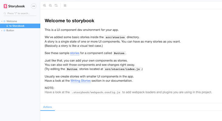
As you can see in the component explorer, Storybook provided two components out of the box for demo purposes. These are the Welcome and Button components.
If we look into our project folder, we’ll notice .storybook and stories folders have been added after the installation.
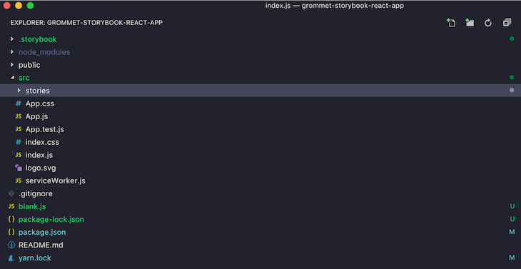
Visit the stories/index.js folder to see the demo components. Observe and remove or comment out the portion below; we will be building our own welcome and button components.
storiesOf('Welcome', module).add('to Storybook', () => <Welcome showApp={linkTo('Button')} />);

storiesOf('Button', module)
  .add('with text', () => <Button onClick={action('clicked')}>Hello Button</Button>)
  .add('with some emoji', () => (
    <Button onClick={action('clicked')}>
      <span role="img" aria-label="so cool">
        😀 😎 👍 💯
      </span>
    </Button>
  ));
This is what should be left:
import React from 'react';

import { storiesOf } from '@storybook/react';
import { action } from '@storybook/addon-actions';
import { linkTo } from '@storybook/addon-links';
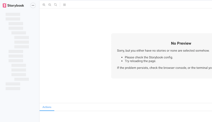
Now, onto the main thing: we’ll start by building welcome and button components just like we saw earlier.
One of the qualities of any good documentation is that it has a welcome note that helps developers get started. This usually provides a setup or installation guide. Let’s pretend we were building a design system for your company. We could use the welcome component as our welcome note. That means it will just be filled with plaintext.
Welcome componentCreate a components folder inside the src folder, then create a Welcome.js file inside components. Place the following code into the file:
import React from 'react';
import { Heading, Paragraph, Box } from 'grommet';

class Welcome extends React.Component {

  render() {
    return (
      <Box direction="column" pad="medium">

        <Heading margin="none" level="3">Chapter 1</Heading>
        <Paragraph margin="none">
          Lorem ipsum dolor sit amet,
          consectetur adipiscing elit,
          sed do eiusmod tempor incididunt ut
          labore et dolore magna aliqua.
        </Paragraph>
        <Paragraph margin="none">
          Lorem ipsum dolor sit amet,
          consectetur adipiscing elit,
          sed do eiusmod tempor incididunt ut
          labore et dolore magna aliqua.
        </Paragraph>

      </Box>
    );
  }

}

export default Welcome;
In the above code, we imported Heading and Paragraph, which are type components from Grommet. We also imported Box, which is a container to lay out our content. Everything is inside a Welcome component, which we have set up for export.
Inside the stories folder, go to index.js and import the Welcome component.
import Welcome from '../components/Welcome';
Also add the following to index.js:
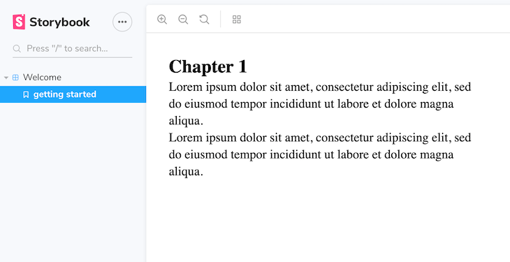
storiesOf('Welcome', module).add('getting started', () => <Welcome />);
In Storybook, a story refers to a component and several possible states of it — for example, a button in different states.
In the code above, the storiesOf() function helps us name a particular story in the component explorer interface, and the .add() function sets up a dropdown, which, when released, presents different states of the component. This will be clearer when we create our next component.
Button componentButtons are used a lot in interfaces. They have great impact on products and are a great place to start when creating a design system.
To create the Button component, create a Button.js file inside the components folder. Paste the following code in:
import React from 'react';
import { Button as GrommetBtn } from 'grommet';


class Button extends React.Component {
  render() {
    return (
      <GrommetBtn label="default" />
    );
  }
}

export default Button;
Notice that because I want to create our own component called Button, I had to rename Grommet’s default button to GrommetBtn to prevent name clashing.
Now import the Button component in index.js:
import Button from '../components/Button';
Add the button story to the same file:
storiesOf('Button', module).add('basic', () => <Button />);
This will render out as shown:
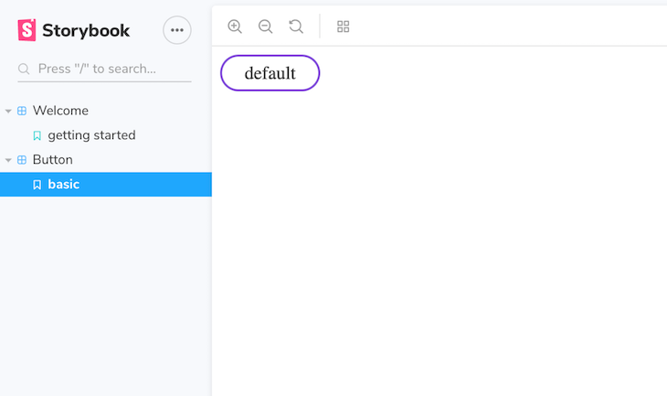
As expected in any design system, we should be able to reuse a component like our button in many situations. This is usually done by passing custom props to the component.
Whatever props are passed will affect the way a component is rendered. Fortunately, Grommet comes with enough props for each component to fill your needs.
To ensure our button component receives any props passed to it from index.js, go to Button.js and add an expression between curly braces.
<GrommetBtn label={this.props.label} {...this.props} />
Now let’s create and document different variations of our button. Go to the button story and make the following changes:
storiesOf('Button', module)
  .add('primary', () => <Button primary label="primary" />)
  .add('secondary', () => <Button primary={false} label="secondary" />)
  .add('plain', () => <Button plain label="plain" />)
  .add('Disabled', () => <Button disabled label="Disabled" />);
When we run the code, we should see the following screen:
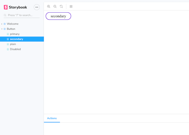
Grommet buttons have lots of useful props, such as accessibilityTitle, active, icon, plain, target, size, onClick, href, id, label, type, etc. Feel free to check them all out here.
It is worth mentioning that Storybook can be supercharged with add-ons, which you can see here. Add-ons are extra features that can be appended to Storybook to make it more useful and add advanced functionality.
Examples are the Source add-on (which lets you view the component’s source code to copy and paste), the notes add-on (for documenting component usage in markdown), and the background add-on for storybook customization.
We’ll now take a look at three ways you can customize your Grommet theme.
const customTheme = {
    global: {
       colors: {
       custom: "#cc6633"
       }
    }
};

const Themed = () => (
  <Grommet theme={customTheme}>
    <Box pad="medium">
      <Anchor icon={<Add />} label="Add" color="custom" />
    </Box>
  </Grommet>
);
ThemeContext.Extend to style components locally.<ThemeContext.Extend
value={{ global: { colors: { doc: '#ff99cc' } } }}
>
<Box pad="large" background="doc" direction="row" />
<Box pad="large" background="doc" direction="row" />
</ThemeContext.Extend>
import styled from 'styled-components`;
import { Button } from 'grommet';
const MyStyledButton = styled(Button)`
   font-weight: bold;
   background-color: #BADA55;
`;

const MyComponent = () => (
  <div>
     Press Button <MyStyledButton label="Press Me" />
  </div>
);
In order to showcase our component library to our whole team, we have to deploy it as a site. You can deploy it to Netlify, GitHub pages, or any static hosting service.
Simply add the following npm script to your package.json:
{
  "scripts": {
    "build-storybook": "build-storybook -c .storybook -o .out"
  }
}
Then run yarn build-storybook.
This will build Storybook from the project directory into a static web app and place it inside the .out directory. You can now deploy the content in the .out directory wherever you want.
To test it locally:
npx http-server .out
In this post, we’ve explored the technologies that will enable you to build a design system. We’ve covered how to implement components, customization, documentation, and hosting your design system. Now go build something awesome!
Install LogRocket via npm or script tag. LogRocket.init() must be called client-side, not
server-side
$ npm i --save logrocket

// Code:

import LogRocket from 'logrocket';
LogRocket.init('app/id');
// Add to your HTML:

<script src="https://cdn.lr-ingest.com/LogRocket.min.js"></script>
<script>window.LogRocket && window.LogRocket.init('app/id');</script>

Learn practical techniques to reduce token usage in LLM applications and build more cost-efficient, scalable AI systems.
Build dynamic forms using a JSON schema-driven approach that keeps frontend and backend validation in sync.

Within roughly the same six-month window, Anthropic shipped Agent Teams for Claude Code, OpenAI published Swarm and the production-ready Agents […]

Compare the top AI development tools and models of March 2026. View updated rankings, feature breakdowns, and find the best fit for you.
Would you be interested in joining LogRocket's developer community?
Join LogRocket’s Content Advisory Board. You’ll help inform the type of content we create and get access to exclusive meetups, social accreditation, and swag.
Sign up now
One Reply to "Building a design system with Grommet and Storybook"
stories/index.js does not exist