
Deciding on a color palette for a website is a tough job. This process relies heavily on the knowledge of design, color theory, and contrast.

Towards the beginning of a thorough web design process, we would typically start with a design tool like Figma. Using this design tool, we can carefully craft our designs, try out different color schemes, and eventually decide what the final product should look like.
The completed design can then be turned into a working prototype using different architectural approaches with CSS and HTML. This tutorial mainly focuses on CSS techniques for setting up color schemes and applying them during the design implementation process.
As we work through the tutorial, I’ll show you three CSS techniques — out of which two are professionally trusted — for creating and implementing a color palette. I’ll also touch on relative colors with now-experimental LCH and LAB color functions.
With a basic understanding of color concepts, you can use any of these techniques with or without a design plan. Before we get into the technicalities, let’s review some basic web design and coloring principles.
Jump ahead:
color-mix() and color-contrast()
The Replay is a weekly newsletter for dev and engineering leaders.
Delivered once a week, it's your curated guide to the most important conversations around frontend dev, emerging AI tools, and the state of modern software.
As a rule of thumb, the age-old 60-30-10 design rule works very well in all areas of coloring and decorating. The web is no exception; creating your own color palette is much easier when you start with this rule.
Each set of digits in the 60-30-10 rule represents a color weight. For the sake of simplicity, let’s call each of them primary, secondary, and accent colors, respectively.
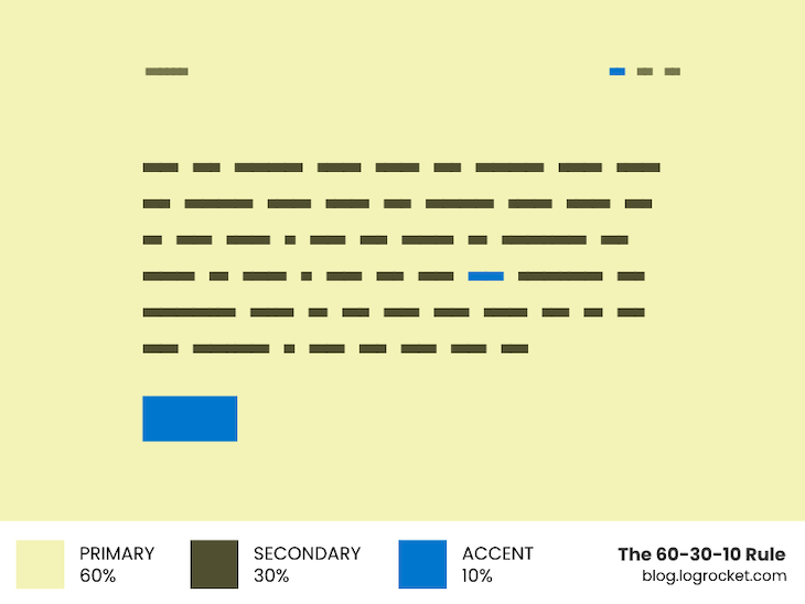
The primary color covers the maximum of the design “real estate” — in other words, about 60 percent of the space on a page. For instance, it is generally the color used in the background.
Next comes the secondary color, which occupies around 30 percent of the design area. Most of the time, it is the color of the text elements that float over the primary color.
Finally, the accent color highlights small but crucial design details, which should only make up about 10 percent of the design area. Call-to-action buttons and hyperlinks are the most common places where an accent color is applied.
This approach of distributing colors across the UI will save us from the headache of using too many colors in our designs and ending up with a complicated color scheme.
Color harmony provides a sense of order and balance in a visual experience. When a design is not visually harmonious, it leaves the viewer with a sense of boredom or chaos.
As an integral part of color harmony, color contrast measures how readable or accessible one color is when placed over another. Designers should check that the color contrast in their designs is high enough to fulfill color accessibility standards before finalizing colors in their work.
Color theory principles also cover some universal ways to choose harmonious colors. Let’s examine two of them, which we’ll use later in the article to generate a color palette.
A color wheel organizes colors around a circle. This allows you to represent a color by the degree value assigned to its position on the wheel.
Any two colors opposite each other on the color wheel are complementary colors, such as red and cyan or blue and yellow. You can calculate the complementary match of a given hue by adding or subtracting 180 degrees from it:
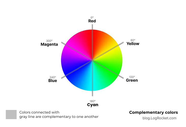
Complementary colors are said to create maximum contrast and stability, hence making designs more accessible in terms of colors. Later in the article, we will use complementary colors to generate the contrasting counterpart for a given hue.
A set of three colors is analogous if they appear together on a 12-part color wheel, such as yellow-green, yellow, and yellow-orange. The analogous counterpart of a given hue is calculated by adding or subtracting 30 degrees from it:
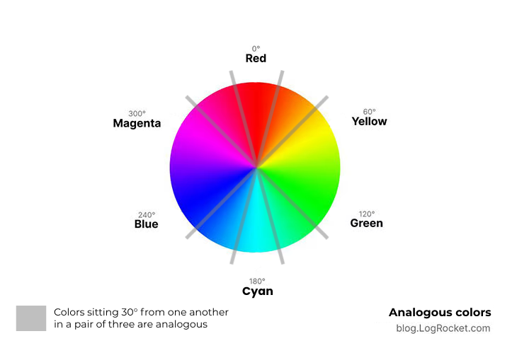
Color combinations made with analogous colors are usually calming and pleasing to the eye. The use of these types of color combinations will save us the hassle of handpicking random colors from the color wheel and checking them again for their harmony.
Now that we have a general idea of color and design theory, let’s get into the technical side of things — i.e., different methods for generating color palettes with CSS.
For convenient and flexible color scheming, we’re going to use the HSL color model. If you haven’t worked with HSL yet, here’s why you should.
While using custom properties and calc() is the preferred way to work with CSS today, developers familiar with a preprocessor such as Sass can use this technique instead. A CSS preprocessor provides more granular control over things than the native CSS, which is probably the best reason to use this method over others.
Let’s pick a hue and generate a color palette using Sass variables only:
$hue: 150;
Based on what we discussed above regarding complementary and analogous colors, let’s write three functions that take the $hue value and generate its complementary and analogous colors. There are two separate functions to get the respective left and right analogous neighbors of a given hue:
//
// Complementary hue can be obtained by adding or
// substracting 180 from the specified hue amount.
//
@function complementary($hue) {
  @return $hue + 180;
}
//
// The right analogous neighbor of a given hue
// amount can be obtained by adding 30 to it.
//
@function rightAnalogous($hue) {
  @return $hue + 30;
}

//
// The left analogous neighbor of a given hue
// amount can be obtained by subtracting 30
// from it.
//
@function leftAnalogous($hue) {
  @return $hue - 30;
}
Using these Sass functions, let’s calculate the complementary and analogous hues for the $hue: 150; we defined in the beginning of this section:
$hue: 150;
$hueAnalogousV1: rightAnalogous($hue);
$hueAnalogousV2: leftAnalogous($hue);
$hueComplement: complementary($hue);
We have four different hue values to use now, which we can use to create our primary, secondary, and accent colors. Keeping in mind the application of each of these color values, here is how we can declare them by adjusting the HSL parameters for saturation and lightness:
$primaryColor: hsl($hue 30% 90%);
$secondaryColor: hsl($hueComplement 25% 20%);
$accentColor: hsl($hueAnalogousV1 50% 50%);
Since the primary color will take up the majority of the screen space, the secondary color needs to contrast well with it. The complementary hue is best suited for this purpose, so it is used as the secondary color.
Our accent color can be any of the analogous hues we created above, as long as the saturation is kept high enough to keep the accent relevant for the highlighted details.
Lastly, we may need some darker variations of our primary color to decorate borders and separators. Likewise, lighter variations of our secondary color may be used to represent less important text details like captions and labels.
$primaryDark500: hsl($hue 20% 85%);
$primaryDark600: hsl($hue 20% 75%);
$secondaryLight500: hsl($hueComplement 5% 30%),
$secondaryLight900: hsl($hueComplement 5% 95%),
Above, I’ve used numbers like 500, 600, and 900 to represent the relative lightness and darkness of a particular color. This helps me recall what a particular color value means.
In the case of highlighted components like CTAs, the accent color will be the background, so planning some colors that contrast well with the accent color would be a wise move:
$accentColor: hsl($hueRightAnalogous 40% 40%);
$accentColorLight900: hsl($hueRightAnalogous 40% 95%);
$accentColor2: hsl($hueLeftAnalogous 40% 40%);
$accentColor2Light900: hsl($hueLeftAnalogous 40% 90%);
Let’s put everything we’ve covered so far into action. Here is an example of a simple page decorated with harmonic colors that adhere to all the color accessibility and contrast guidelines:
See the Pen CSS Sass Color Palette by Rahul Chhodde (@_rahul)
on CodePen.
The palette rebuilds and everything will adjust — almost magically! — once you modify the value for $hue in the above example.
If you’re using Google Chrome, here’s a tip: You can check for contrast issues within the Chrome Developer Tools by clicking the kebab menu, navigating to “More Tools,” and then selecting “CSS Overview”:

Try it on the Codepen demo we just went through.
Essentially, this approach is the same as removing Sass features from the above technique and adding CSS variables instead. For mathematical calculations, we can simply use the calc() CSS function. However, this doesn’t give us that DRY approach we had with Sass.
Having said that, Sass can be combined with this technique on the development front, meaning we can still take advantage of its benefits. I’ll keep this example Sass-free to keep things simple, but you may opt to couple Sass with this method as an exercise:
:root {
  --hue: 300; /* Let's try a different hue this time */
  --hueComplement: calc(var(--hue) + 180);
  --hueRightAnalogous: calc(var(--hue) + 30);
  --hueLeftAnalogous: calc(var(--hue) - 30);
}
As you can see above, we need to calculate complementary and analogous hues manually. The rest of the process is pretty much the same as the last technique, except CSS custom properties (var(--hue) for eg.) are used in place of Sass variables.
The following example illustrates how CSS variables can be used to create variations for the primary and secondary colors:
:root {
  ...
  --primaryDark500: hsl(var(--hue) 20% 85%);
  --primaryDark600: hsl(var(--hue) 20% 75%);
  --secondaryLight500: hsl(var(--hueComplement) 5% 30%);
  --secondaryLight900: hsl(var(--hueComplement) 5% 95%);
}
The same can be done to generate some tints that offer better contrast with accent colors:
:root {
  ...
  --accentV1: hsl(var(--hueRightAnalogous) 40% 40%);
  --accentV1Light900: color-mix(in hsl, var(--accentV1) 20%, white 80%);
  --accentV2: hsl(var(--hueLeftAnalogous) 40% 40%);
  --accentV2Light900: color-mix(in hsl, var(--accentV2) 20%, white 80%);
}
Below is what our demo looks like after we put together the steps in the technique we just discussed. You may try setting the hue value back to 150 and see how the result is exactly the same as the example shared in the last technique:
See the Pen CSS Custom Properties Color Palette by Rahul Chhodde (@_rahul)
on CodePen.
color-mix() and color-contrast()Most browsers do not support color-mix() and color-contrast() CSS4 functions yet. As a result, this method is still in the evolution phase and might not be fully functional. However, since the web is evolving so rapidly, it may be worth learning about these functions.
color-mix() CSS function to create a color paletteThe color-mix() function is currently available as an experimental feature on Firefox only. You can enable it by opening Firefox browser config (about:config), looking up layout.css.color-mix.enabled, and then setting it to true.
With color-mix(), we don’t necessarily have to adjust the saturation and lightness of a color each time we need a different shade or tint of it for our use. We can simply mix black or white with a given color to get it done.
To quickly understand how it works, here’s a simple example of generating green by mixing blue with yellow color:
:root {
  --neon-green: color-mix(in hsl, yellow 60%, blue);
}
The first parameter in color-mix() represents the color profile, and the other two stand for colors to be mixed together to generate a new one.
If we implement this function in the last method we covered, here’s how it will simplify things to generate different variations:
:root{
  ...
  --primary: hsl(var(--hue) 25% 95%);
  --primaryDark500: color-mix(in hsl, var(--primary) 90%, black);
  --primaryLight500: color-mix(in hsl, var(--primary) 90%, white);
}
I replaced the HSL adjustments in the above method with color-mix() and here is what I got. Make sure you view this on Firefox with color-mix() support enabled:
See the Pen CSS Custom Properties Color Palette by Rahul Chhodde (@_rahul)
on CodePen.
Read more in the MDN docs about the color-mix() syntax and parameters.
The color-contrast() function is currently supported only on Safari 15 to 16.1. This means you can’t test it on Windows or Linux without hassle, as Apple discontinued making Safari for Windows and Linux long ago.
As explained in the MDN docs, the color-contrast() function picks the best contrasting color for a given color from a range of color choices. Here’s an example to show how it works:
:root{
  --accent: blue;
  --accentLight900: color-contrast(var(--accent) vs white, cyan, magenta, black);
}
We will have to wait for a bit until we can combine this function with our existing techniques to decide on better contrasting color schemes.
Our device display capabilities have evolved much more rapidly than CSS support for colors. A modern monitor’s color range or gamut is closer to the P3 color space, which covers almost 87 percent of all reflected surface colors.
In comparison, sRGB covers less than 70 percent of this gamut. It is currently not possible to access colors beyond the sRGB with CSS.
The good news is that CSS Color Module Level 4 is actively working on bringing support to the lch and lab color spaces as CSS functions to our browsers.
In simple words, LAB and LCH are advanced color spaces that provide more accurate and vivid colors. These color spaces work almost like the human eye in perceiving and generating colors.
The two color spaces are similar in many ways. LCH corresponds to polar coordinates — lightness, chroma, and hue. Meanwhile, LAB works with cartesian coordinates — lightness and two chromatic axes.
Unlike HSL and RGB, LCH and LAB render all colors with equal lightness. Similarly, all colors with the same chroma value appear equally saturated. This way, we can keep our colors more related to each other and create more vivid color palettes with CSS.
Here is an example showing how we can obtain relative colors with the lch color space introduced in the State of CSS 2022 article. This example shows how the lch function will take a base hex color and change it to the LCH variation with lightness, chroma, and hue customizations:
:root {
  --primary: #eef;
  --primaryDarker: lch(from var(--primary) 90% c h);
  --primaryGrayish: lch(from var(--primary) l 50% h);
  --primaryYellowish: lch(from var(--primary) l c 77%);
}
It will be fascinating to see the variations from these spaces combined with other experimental features like color-mix and color-contrast in the future.
In the article above, we learned about the basics of color harmony and contrast, the 60-30-10 rule of color distribution, and three techniques to create color palettes with CSS. We also took a quick look at the potential future of relative color syntax in CSS.
Choosing colors carefully for a great color palette is generally a design decision. As a frontend developer who often builds interfaces in browsers rather than design tools, these techniques can help you develop a better understanding of color harmony and contrast.
In addition to coding more intuitive and interactive interfaces, you may also find that it is less stressful to convert the design to code with this knowledge.
As web frontends get increasingly complex, resource-greedy features demand more and more from the browser. If you’re interested in monitoring and tracking client-side CPU usage, memory usage, and more for all of your users in production, try LogRocket.
LogRocket lets you replay user sessions, eliminating guesswork around why bugs happen by showing exactly what users experienced. It captures console logs, errors, network requests, and pixel-perfect DOM recordings — compatible with all frameworks.
LogRocket's Galileo AI watches sessions for you, instantly identifying and explaining user struggles with automated monitoring of your entire product experience.
Modernize how you debug web and mobile apps — start monitoring for free.

Why the future of DX might come from the web platform itself, not more tools or frameworks.

A hands-on test of Claude Code Review across real PRs, breaking down what it flagged, what slipped through, and how the pipeline actually performs in practice.
CSS art once made frontend feel playful and accessible. Here’s why it faded as the web became more practical and prestige-driven.

Learn how inline props break React.memo, trigger unnecessary re-renders, and hurt React performance — plus how to fix them.
Would you be interested in joining LogRocket's developer community?
Join LogRocket’s Content Advisory Board. You’ll help inform the type of content we create and get access to exclusive meetups, social accreditation, and swag.
Sign up now