
I’m a big fan of the CSS library vanilla-extract; in my opinion, it’s the most exciting CSS tool since Tailwind CSS. If you are new to vanilla-extract, it is a CSS-in-JS library created by Mark Dalgleish that allows you to harness the power of TypeScript for your CSS.

I am especially excited about vanilla-extract’s killer feature, the Sprinkles API. Sprinkles allows you to create a fully customized design system from first principles. You can use Sprinkles to create your own atomic, utility-first CSS framework instead of using off-the-shelf libraries, such as Tailwind and Tachyon.
In this tutorial, we’ll set up a new Next.js app and use vanilla-extract’s Sprinkles API to create a custom, utility-first CSS framework called Sprinkles Tailwind. We will then use our new framework to recreate the product card demo on the Tailwind CSS homepage. Along the way, we’ll see how vanilla-extract and Sprinkles deal with pseudo-classes, responsive design, and dark mode themes.

The Replay is a weekly newsletter for dev and engineering leaders.
Delivered once a week, it's your curated guide to the most important conversations around frontend dev, emerging AI tools, and the state of modern software.
So why would we develop our own Sprinkles-based, utilities-first CSS library when we can simply use Tailwind, which is already such a popular tool? Three reasons: type safety, customization, and local scope.
First, with Sprinkles, you get the same type hints and compile-time verification as you would with any other Typescript variable, no more documentation verification and class name typos.
Second, Tailwind is both opinionated and has a bit of a learning curve, especially if you are not using the Tailwind preset syntax. With Sprinkles, you are writing CSS instead of Tailwind’s shorthand class names. And because Sprinkles does not start with any built in values, you get to create your CSS framework just the way you like it.
Finally, there’s local scope. One of the benefits of vanilla-extract with CSS modules under the hood is that all of your utility classes are now component-scoped by default. This means you can easily incorporate multiple design systems inside a single app without worrying about style conflicts.
Let’s first start by creating a new Next application and installing vanilla-extract. You can check out the complete source code for this demo project at the GitHub repo here.
Start by creating a new TypeScript version of Next like so:
npx create-next-app@latest --typescript sprinkles-tailwind
After running yarn dev to make sure our installation is working as intended, we’ll install vanilla-extract and Sprinkles:
yarn add @vanilla-extract/css @vanilla-extract/babel-plugin @vanilla-extract/next-plugin @vanilla-extract/sprinkles
Next, include the vanilla-extract/next-plugin in our webpack build process by updating next.config.js to the following:
const {
  createVanillaExtractPlugin
} = require('@vanilla-extract/next-plugin');
const withVanillaExtract = createVanillaExtractPlugin();

/** @type {import('next').NextConfig} */
const nextConfig = {
  reactStrictMode: true,
};

module.exports = withVanillaExtract(nextConfig);
Lastly, because we want our new Sprinkles types to be picked up by the TypeScript compiler and our IDE’s TypeScript server, we will add *.css.ts to our project’s tsconfig.json:
{
    ...
    "include": ["next-env.d.ts", "**/*.ts", "**/*.css.ts", "**/*.tsx"],
    ...
}
One of the main selling points of Tailwind CSS is how it forces users to work within the constraints of a well-defined design system instead of inconsistent, one-off values.
Tailwind also comes prepackaged with a default system with sensible values and reasonable shortcuts for common layout needs. In the case of our project, Sprinkles Tailwind, we’ll take the color palette, typography, and size scales from the Open Props project. We’ll also add some common Tailwind values for layout.
To get started, we’ll first create a colors.css.ts file under the ./styles directory and define our color values:
const palette = {

'gray-0': '#f8f9fa',

'gray-1': '#f1f3f5',
...

'gray-9': '#212529',

'red-0': '#fff5f5',

... /* See https://github.com/Shimin-Zhang/TailSprinkles/blob/main/styles/colors.css.ts for full palette */

};


export default palette;
We’ll do the same for border.css.ts, size.css.ts, typography.css.ts to set up the foundation of our design system.
Once we’ve set up our design system values, we will define our Sprinkles system like so:
import {
  defineProperties,
  createSprinkles,
} from '@vanilla-extract/sprinkles';

import palette from './colors.css';
import { fontFamily, fontWeight, lineHeight, fontSize } from './typography.css';
import { size, space } from './size.css';
import { borderSize, borderRadius } from './border.css';


const responsiveProperties = defineProperties({
  properties: {
    display: ['none', 'flex', 'block', 'inline'],
    flexDirection: ['row', 'column'],
    justifyContent: [
      'stretch',
      'flex-start',
      'center',
      'flex-end',
      'space-around',
      'space-between'
    ],
    alignItems: [
      'stretch',
      'flex-start',
      'center',
      'flex-end'
    ],
    paddingTop: space,
    paddingBottom: space,
    paddingLeft: space,
    paddingRight: space,
...
  },
  shorthands: {
    padding: [
      'paddingTop',
      'paddingBottom',
      'paddingLeft',
      'paddingRight'
    ],
    paddingX: ['paddingLeft', 'paddingRight'],
    paddingY: ['paddingTop', 'paddingBottom'],
...
    placeItems: ['justifyContent', 'alignItems']
  }
});


const systemProperties = defineProperties({
  properties: {
    color: palette,
    background: palette,
    fontFamily: fontFamily,
    fontSize: fontSize,
    ...
  }
});

export const sprinkles = createSprinkles(
  responsiveProperties,
  systemProperties
);

export type Sprinkles = Parameters<typeof sprinkles>[0];
Sprinkles’ defineProperties function transforms our design system tokens into a set of style values. These values are then combined via the createSprinkles so users can consume them in a CSS-in-JS fashion.
Note that we separated our properties into two separate categories. responsiveProperties are ones we will later style in a responsive manner similar to Tailwind’s viewport prefix, i.e., md:. System properties will be conditioned on theme, similar to Tailwind’s dark: prefix. We then export both the Sprinkles object that generates atomic classes and its type, which gives us type safety.
The shorthands key allow us to define CSS shorthand values similar to CSS shorthand and the Tailwind px-*, p-* classes.
Next, we will create a new page and import our new type-safe utilities framework:
import Head from 'next/head'
import { sprinkles } from '../styles/sprinkles.css';

export default function Colors() {
    return (
        <div>
            <Head>
            </Head>
            <h1 className={
              sprinkles({
                ... styles go in here
              })
            }>
                Welcome To Colors
            </h1>
        </div>
    );
}
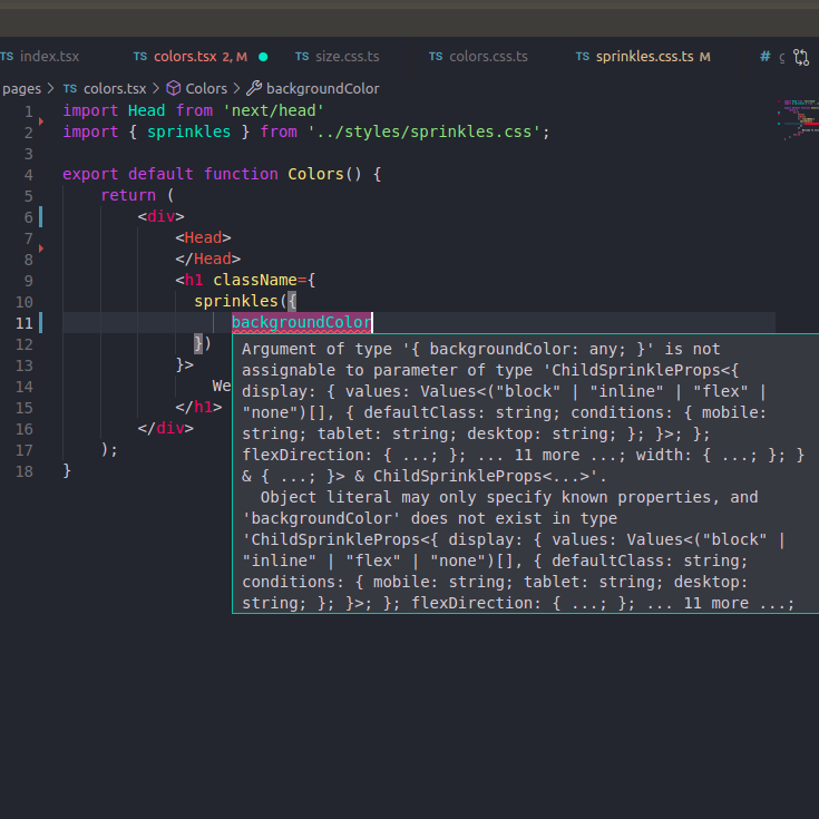
Let’s see Sprinkles’ type safety in action. First, we’ll try to add a valid CSS property, backgroundColor, which is not defined in our Sprinkles app. We see that it throws a type error:
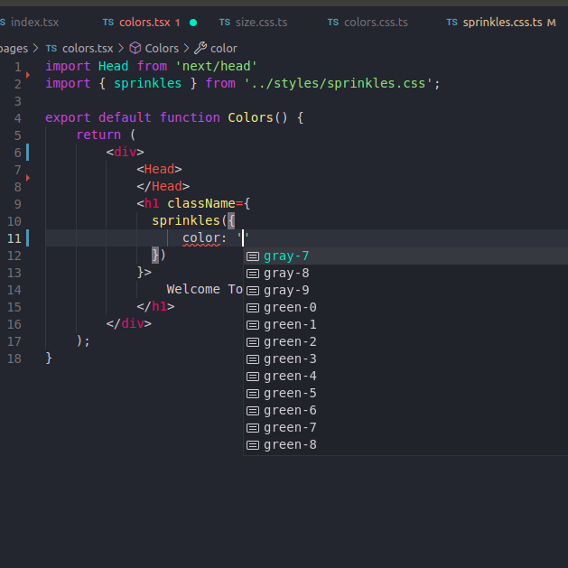
Next, we add the color key and see the list of valid values show up as suggestions:
As expected, using a color value not within the system throws a type error immediately:
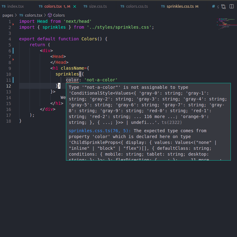
This is much faster feedback cycle than looking up the right Tailwind class name in documentation, making a typo, then waiting for a browser refresh before noticing it.
With the design system all set up, we can now take the product card example from the Tailwind homepage, copy the example HTML, and translate it into our new Sprinkles Tailwind framework:
<h1>
  Tailwind Sprinkles
</h1>
<div
className = {
  st({
    display: 'flex',
    fontFamily: 'sans-serif',
    width: 'size-content-3',
    marginY: 'size-auto',
    background: 'white',
    borderRadius: 'radius-3',
    boxShadow: 'shadow-2'
  })
}>
  <div
    className = {
      st({
        flex: 'none',
        width: 'size-12',
        height: 'size-13',
        position: 'relative',
      })
    }
    >
    <img src="/jacket.jpg" alt=""
    loading="lazy" className = {
      st({
        position: 'absolute',
        width: 'full',
        height: 'full',
        objectFit: 'cover',
        inset: '0'
      })}/>
  </div>
    ...
    /* See https://github.com/Shimin-Zhang/TailSprinkles/blob/main/pages/index.tsx for full file*/
Because we’ve defined our shorthands in our sprinkles.css.ts file, we are able to use marginY in our styles instead of writing marginTop and marginBottom separately.
We run into a few issues while styling our product card that cannot be solved by Sprinkles alone. Sprinkles is a minimal abstraction layer on top of plain CSS properties, so we do not have access to the utility classes like srOnly and the pseudo select :hover to indicate our buttons are clickable.
We need to bring in vanilla-extract to create these more complex styles:
// First we import vanilla-extract
import { style } from '@vanilla-extract/css';

// We create more complex classes
export const srOnly = style({
  position: 'absolute',
  width: '1px',
  height: '1px',
  padding: '0',
  margin: '-1px',
  overflow: 'hidden',
  clip: 'rect(0, 0, 0, 0)',
  whiteSpace: 'nowrap',
  borderWidth: '0'
});

export const clickable = style ({
  ':hover': {
    cursor: 'pointer'
  }
})
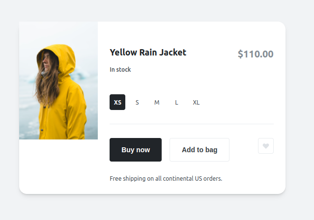
It took some configuring, but we managed to reproduce the same jacket product card! While this is not an exact reproduction (our design system is based off of Open Props), it is a reasonable reproduction that captures the spirit of the original design:
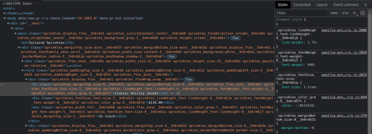
Taking a closer look at the generated HTML, we see that Sprinkles generated prefixed utility class names based on our design tokens. Note that each class is scoped to the component via CSS modules:
Our card is looking great on desktop, but it is not responsive when we shrink our viewport. To fix this, we’ll add viewport-based conditions to our Sprinkles setup. Remember earlier we named our layout properties responsiveProperties? We’ll add that viewport information now:
const responsiveProperties = defineProperties({
  conditions: {
    mobile: {},
    tablet: { '@media': 'screen and (min-width: 768px)' },
  },
  defaultCondition: 'tablet',
  properties: {
    ... same as before
Because we started with our desktop variation, we are unable to start with mobile-first design and will default to tablet view instead. Responsive styles are easy to create with Sprinkles; instead of the property: value format we’ve seen so far, we will use the property: { condition-name: value } syntax instead.
Here’s what a component looks like with the additional mobile viewport layout:
        <div
        className = {
          st({
            display: 'flex',
            fontFamily: 'sans-serif',
            width: {
              tablet: 'size-content-3',
              mobile: 'size-auto'
            },
            marginY: 'size-auto',
            marginX: {
              tablet: 'size-auto',
              mobile: 'size-3',
            },
            background: 'white',
            borderRadius: 'radius-3',
            boxShadow: 'shadow-2'
          })
        }>
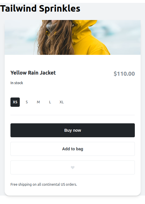
After adding the rest of mobile viewport layouts, our card is now responsive:
Our product card is really coming together!
One last feature that we commonly need for our components these days is the ability to toggle between various themes. Let’s add a dark theme to our product card to demonstrate how it’s done with Sprinkles.
Like with responsive design, we first start by adding a condition and a default value to our system properties:
const systemProperties = defineProperties({
  conditions: {
    lightMode: {},
    darkMode: { '@media': '(prefers-color-scheme: dark)' }
  },
  defaultCondition: 'lightMode',
Unlike with our responsive sizing, here the default lightMode is already what we wanted. And we only have to add dark theme variations when there’s a need. And just like with responsive props, we will use the condition name to differentiate the two themes.
The <div> from earlier with both responsive design and dark mode now looks like this:
<div
className = {
  st({
    display: 'flex',
    fontFamily: 'sans-serif',
    width: {
      tablet: 'size-content-3',
      mobile: 'size-auto'
    },
    marginY: 'size-auto',
    marginX: {
      tablet: 'size-auto',
      mobile: 'size-3',
    },
    background: {
     lightMode: 'white',
     darkMode: 'grape-9',
    },
    borderRadius: 'radius-3',
    boxShadow: 'shadow-2'
  })
}>
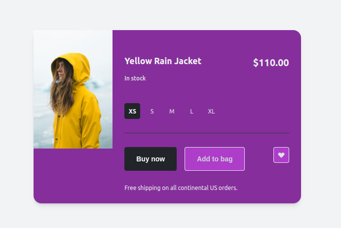
Now, our final dark theme product card looks like this:
I hope this post has convinced you to give vanilla-extract a try next time you start a new project and are in the market for a new CSS framework.
Just like Tailwind CSS, the Sprinkles framework allow you to create a utilities-first CSS framework that is built on a design systems foundation.
Unlike Tailwind CSS, with Sprinkles you get the same type-safe guarantee that you do with rest of your TypeScript files, you get to fully customize it the way you want to, and you get the scope safety of CSS modules.
I’m extremely bullish on the type-safe CSS paradigm that vanilla-extract introduces. Please share your thoughts and experience migrating from Tailwind CSS to Sprinkles in the comment section below.
As web frontends get increasingly complex, resource-greedy features demand more and more from the browser. If you’re interested in monitoring and tracking client-side CPU usage, memory usage, and more for all of your users in production, try LogRocket.

LogRocket lets you replay user sessions, eliminating guesswork around why bugs happen by showing exactly what users experienced. It captures console logs, errors, network requests, and pixel-perfect DOM recordings — compatible with all frameworks.
LogRocket's Galileo AI watches sessions for you, instantly identifying and explaining user struggles with automated monitoring of your entire product experience.
Modernize how you debug web and mobile apps — start monitoring for free.

Write agent-friendly API documentation with OpenAPI, clear schemas, workflow guidance, and llms.txt for safer AI automation.

Local AI proxy tutorial for detecting, masking, and rehydrating PII before prompts reach cloud LLMs.

Learn how Graph RAG uses connected knowledge structures to improve retrieval beyond simple text similarity.
Learn how sibling-index() enables clean, JavaScript-free stagger animations using native CSS.
Hey there, want to help make our blog better?
Join LogRocket’s Content Advisory Board. You’ll help inform the type of content we create and get access to exclusive meetups, social accreditation, and swag.
Sign up now