So you’re a JavaScript whiz who can build pretty much anything — but can everyone use it? In this article, we’ll look at some ways to make rich, accessible JavaScript interfaces. We’ll illustrate our strategies by building a simple Sudoku puzzle that works for everyone, even those who are blind or partially sighted.

The Replay is a weekly newsletter for dev and engineering leaders.
Delivered once a week, it's your curated guide to the most important conversations around frontend dev, emerging AI tools, and the state of modern software.
Retrofitting accessibility to an interface can be difficult and time-consuming; you’ll always get better results if you plan for accessibility right from the start. You may have heard of the acronym POUR which is a great way to approach planning for accessibility.
POUR stands for:
For a grid-based game like Sudoku, the greatest challenge with regard to accessibility is making the interface understandable. Sudoku requires that players know which numbers are entered into each cell of the grid. To be accessible, the Sudoku game will need to convey this information to users who may not be able to see the gameboard.
A classic nine-digit Sudoku puzzle with 81 cells is way too big for most people to be able to tackle if the board is not visible. So, my first decision is to simplify things and make a four-digit Sudoku with 16 cells instead.
Next, there needs to be a consistent way to describe the gameboard — a notation system. My first instinct is to use a simple XY coordinate system, like in chess. However, a Sudoku grid is more complex than a chess board, it’s really a set of grids within a larger grid.
Here’s the notation system that I settled on:

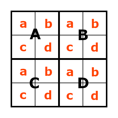
The gameboard consists of four squares arranged in a two-by-two grid.
The squares in the top row are designated as square A and square B. The squares in the bottom row are designated as square C and square D.
Each square contains four cells arranged in a two-by-two grid. The cells in the top row of each square are designated as cell a and cell b. The cells in the bottom row are designated as cell c and cell d.
This notation can describe any cell on the board and conveys the positional information a player needs to solve the puzzle. So, if we incorporate mechanisms to announce a screen reader user’s current position on the board and list the numbers in the corresponding row, column, and square, the game should be understandable.
Now it’s time to start building, keeping the POUR principles in mind. A key tactic in building accessible interfaces is to avoid reinventing the wheel. If a long-established standard HTML control is available to do something, then use it according to its specification, applying CSS to create any desired visual effects.
This miniature Sudoku consists of 16 boxes arranged in a grid, each capable of holding a single number. So, I used 16 <input type="number> elements. These elements are literally designed for this job, plus they have a readonly attribute to mark the fixed value cells that need to be included to make the Sudoku solvable.
I used <div> tags to group the cells into squares and a CSS Grid Layout to organize things. Using a CSS Grid Layout instead of an HTML <table> allows me to order the cells in the code according to my notation system (Aa, Ab, Ac, Ad, Ba, Bb, etc.). The tab order of a page coordinates with its underlying structure, so this will help keep the interface understandable when a keyboard user moves from one <input> to another using the tab key.
<div class="board">
  <div class="square">
    <input type="number" min="0" max="4" length="1" value="">
    <input type="number" min="0" max="4" value="2" readonly>
    <input type="number" min="0" max="4" value="">
    <input type="number" min="0" max="4" value="">
  </div>
  <div class="square">
    <input type="number" min="0" max="4" value="3" readonly>
    <input type="number" min="0" max="4" value="">
    <input type="number" min="0" max="4" value="">
    <input type="number" min="0" max="4" value="1" readonly>
  </div>
  <div class="square">
    <input type="number" min="0" max="4" value="2" readonly>
    <input type="number" min="0" max="4" value="">
    <input type="number" min="0" max="4" value="">
    <input type="number" min="0" max="4" value="4" readonly>
  </div>
  <div class="square">
    <input type="number" min="0" max="4" value="">
    <input type="number" min="0" max="4" value="">
    <input type="number" min="0" max="4" value="1" readonly>
    <input type="number" min="0" max="4" value="">
  </div>
</div>
*, *:before, *:after {
  box-sizing: border-box;
}
body {
  font-size: 1.25rem;
  line-height: 1.35;
}
.board {
  width: 40vh;
  max-width: 90vw;
  height: 40vh;
  max-height: 90vw;
  padding: 0;
  border: 2px solid black;
  display: grid;
  grid-template: repeat(2,1fr) / repeat(2,1fr);
}
.square {
  width: 100%;
  height: 100%;
  margin: 0;
  padding: 0;
  border: 2px solid black;
  display: grid;
  grid-template: repeat(2,1fr) / repeat(2,1fr);
}
.square input {
  display: block;
  color: black;
  width: 100%;
  height: 100%;
  margin: 0;
  padding: 0;
  text-align: center;
  font-size: 7vh;
  border: 1px solid black;
  -moz-appearance: textfield;
}
/* Hide HTML5 Up and Down arrows. */
.square input::-webkit-outer-spin-button, .square input::-webkit-inner-spin-button {
  -webkit-appearance: none;
  margin: 0;
}
Some common problems that web interfaces face with regard to accessibility are text that is too small and UI colors that do not provide enough contrast to be easily visible.
In terms of size, a good rule of thumb is for text to be displayed with an effective font size no smaller than 16 CSS pixels (which is different from device pixels). For the Sudoku game, I’ve gone with a minimum of 20 pixels (specified as 1.25rem where 1rem is 16 pixels), and also increased the standard line-height to 1.35 to space things out a bit more and make them easier to read.
I’ve specified the gameboard’s overall size using vh units (1vh is 1% of the viewport’s height) to try and make it as large as possible while also keeping the game controls visible within the same viewport.
The game predominantly uses black and white to maximize contrast. However, I also need to show which cells are read-only and I want to use color to show where the keyboard focus currently is within the gameboard and (optionally) highlight correct and incorrect cells.
This brings up another common issue — dealing with low color vision. It seems instinctive to use green to highlight correct cells and red to highlight incorrect cells, but red and green are a very poor choice for the majority of people with low color vision.
Instead, I opted to use sky blue to designate correct cells, reddish-purple to designate incorrect cells, and yellow to highlight position. The exact color shades were chosen from the Wong palette. For read-only (readonly) cells, I used white text on a dark gray background. All these color combinations also provide sufficient contrast, as measured using the WebAIM Contrast Checker.
.correct {
  background-color: #56B4E9;
}
.incorrect {
  background-color: #CC79A7;
}
.square input:focus {
  background-color: #F0E442;
}
.square input:read-only {
  background-color: #333;
  color: white;
}
It may not function yet, but we now have something that looks like a miniature Sudoku game. Using a mouse, we can easily point and click to enter numbers in each cell of the grid, and it also works using just the keyboard.
We still need to be able to see the board in order to navigate through it, which is of no use for people with limited or no vision. Fortunately, the Web Accessibility Initiative – Accessible Rich Internet Applications (WAI-ARIA) can help incorporate more assistance.
The aria-label attribute is used to add extra text to things like form elements that are read aloud by screen reader software when they are focused on by a user. I’ve used this attribute to add the notation to each cell.
<div class="board">
    <div aria-label="Square A" class="square">
      <input aria-label="Square A, Cell A." type="number" min="0" max="4" length="1" value="">
      <input aria-label="Square A, Cell B. The value of this cell is fixed." type="number" min="0" max="4" value="2" readonly>
      <input aria-label="Square A, Cell C." type="number" min="0" max="4" value="">
      <input aria-label="Square A, Cell D." type="number" min="0" max="4" value="">
    </div>
    ...
</div>
I’m not required to add the value of the cell to the aria-label as the value is read out by default. But, I happen to know that some screen readers don’t inform the user when an <input> element is read-only, so I’ve included that information.
Now it’s time to make the game actually do something.
We want to be able to:
To achieve these goals, we need to store the correct answer for each cell somewhere and add controls below the gameboard to trigger each of the actions.
There are a few ways we could store the correct answers. I’ve opted for adding a data attribute to each cell, like this:
<input aria-label="Square A, Cell A." data-correct="1" type="number" min="0" max="4" length="1" value="">
The game controls need to be accessible, so I will apply the same design principles as before and use stock HTML in the form of <button> and <input type="checkbox"> elements.
Each element needs a unique id so that I can attach event listeners to the element. I’ll use the standard <label> element to ensure that the highlight toggle checkbox is accessible. I’ll also add an empty <div> that I can use to display announcements to players.
<div class="controls">
<label><input id="highlight" type="checkbox"> HIGHLIGHT</label>
<button id="check">CHECK YOUR ANSWER</button>
<button id="show">SHOW SOLUTION</button>
<button id="restart">RESTART</button>
</div>
<div id="announcement-all-users"></div>
Four simple JavaScript functions are all that is needed to make the game work on a basic level:
let lang = "en";
const messages = {
  en: {
    boardCorrect: "Congratulations, you completed the Sudoku correctly!",
    boardIncorrect: "Hmmm... Not quite correct! Try again. Check 'HIGHLIGHT' to see where you went wrong."
  },
  announcementAllUsersDisplayed: false
}

function highlightCells(e){
  document.querySelectorAll('.square input:read-write').forEach( (cell) => { // toggle correct and incorrect classes for each non read-only cell
    if(document.querySelector('#highlight').checked){
      if(cell.value === cell.dataset.correct){
        cell.classList.add("correct");
        cell.classList.remove("incorrect");
      } else {
        cell.classList.add("incorrect");
        cell.classList.remove("correct");
      }
    } else {
      cell.classList.remove("correct","incorrect");
    }
  } );
}
document.querySelector('#highlight').addEventListener('change', highlightCells );

function checkAnswer(e) {
  let allCorrect = true;
  document.querySelectorAll('.square input').forEach( (cell) => { // check each cell to see if it is correct
    if( cell.value !== cell.dataset.correct){
      allCorrect = false;
    }
  } );
  // make general announcement of success/failure
  if(allCorrect){
    document.querySelector('#announcement-all-users').innerHTML = messages[lang].boardCorrect;
  } else {
    document.querySelector('#announcement-all-users').innerHTML = messages[lang].boardIncorrect;
  }
  messages.announcementAllUsersDisplayed = true;
}
document.querySelector('#check').addEventListener('click', checkAnswer );

function showSolution(e){
  if(messages.announcementAllUsersDisplayed){// remove any existing general annoucements
    document.querySelector('#announcement-all-users').innerHTML = "";
    messages.announcementAllUsersDisplayed = false;
  }
  document.querySelectorAll('.square input').forEach( (cell) => { // set the value of each cell to the correct value
    cell.value = cell.dataset.correct;
  } );
}
document.querySelector('#show').addEventListener('click', showSolution );

function restartGame(e){
  if(messages.announcementAllUsersDisplayed){ // remove any existing general annoucements
    document.querySelector('#announcement-all-users').innerHTML = "";
    messages.announcementAllUsersDisplayed = false;
  }
  document.querySelectorAll('.square input:read-write').forEach( (cell) => { // reset each non read-only cell to be empty
    if(!cell.classList.contains("readonly")){
      cell.value = "";
    }
  } );
}
document.querySelector('#restart').addEventListener('click', restartGame );
We now have a working Sudoku game that is perceivable, operable, and robust (check it out on CodePen), but we still have a bit of work to do to make it fully understandable.
Also, some updates could be made to make the game easier to operate. For example, the highlightCells function only works on a visual level. To be useful for screen reader users we need to expand it a little. Each <input> element of the gameboard already has an aria-label attribute, so we can manipulate that to add or remove the correct or incorrect information when the highlight checkbox is toggled:
let lang = "en";
const messages = {
  en: {
    cellCorrect: "This cell is correct",
    cellIncorrect: "This cell is incorrect",
    boardCorrect: "Congratulations, you completed the Sudoku correctly!",
    boardIncorrect: "Hmmm... Not quite correct! Try again. Check 'HIGHLIGHT' to see where you went wrong."
  },
  announcementAllUsersDisplayed: false
}

function highlightCells(e){
  if(document.querySelector('#highlight').checked){
    document.querySelector('#highlight-help').classList.remove('v-hidden');
  } else {
    document.querySelector('#highlight-help').classList.add('v-hidden');
  }
  document.querySelectorAll('.square input:read-write').forEach( (cell) => {
    let ariaLabelSplit = cell.ariaLabel.split('.');
    if(document.querySelector('#highlight').checked){
      if(cell.value === cell.dataset.correct){
        cell.classList.add("correct");
        cell.classList.remove("incorrect");
        cell.ariaLabel = ariaLabelSplit[0] + ". " + messages[lang].cellCorrect;
      } else {
        cell.classList.add("incorrect");
        cell.classList.remove("correct");
        cell.ariaLabel = ariaLabelSplit[0] + ". " + messages[lang].cellIncorrect;
      }
    } else {
      cell.classList.remove("correct","incorrect");
      cell.ariaLabel = ariaLabelSplit[0];
    }
  } );
}
document.querySelector('#highlight').addEventListener('change', highlightCells );
The highlight function should now work for everyone with only minimal adjustments. One big piece of the puzzle is still missing though (if you’ll pardon the pun).
The Sudoku game is solved when each row, column, and square contains the numbers one through four precisely once. So, screen reader users need a quick and easy non-visual way to find out which numbers are in a particular row, column, or square. For the first time in this project, we need to build extra functionality into the game for just this user group.
I decided to tackle this by adding a 'read' function to the game, triggered by a keyboard shortcut. This is where the aria-live attribute comes in. If we add this attribute to an element (for example, a simple <div>), then when the content of that element changes it is read out by the screen reader software.
This function can be used to make announcements to screen reader users by altering the contents of the element with JavaScript. We’ll add an aria-live attribute to the existing general announcement element and another to the element for messages meant exclusively for screen reader users. This last message could be positioned offscreen in the final version of the game.
<div id="announcement-sr-only" aria-live="polite"></div>
<div id="announcement-all-users" aria-live="polite"></div>
The "polite" value means that when the contents of the live element change, the screen reader will finish what it is currently reading out before reading the announcement. This works well for Sudoku, but if we needed to alert a user to something more pressing we could set aria-live="assertive" which would result in our announcement being read out straight away.
Here’s how the reading function works for our Sudoku game:
announcement-sr-only elementKeyboard shortcuts can be a bit of a minefield with screen readers, as many keys already have shortcuts assigned, and those assignments can change depending on the screen reader’s mode. So use keyboard shortcuts sparingly, only attach the listener to elements where it is needed, and do lots of testing!
To allow the reading function to work, I added an id attribute to help me iterate through the cells, a data-id element for iterating through squares, and an additional class to the readonly cells so I could easily target those cells.
<div class="board">
    <div data-id="A" class="square">
      <input id="11" data-id="A" aria-label="Square A, Cell A." data-correct="1" type="number" min="0" max="4" length="1" value="">
      <input id="12" data-id="B" aria-label="Square A, Cell B. The value of this cell is fixed." data-correct="2" type="number" min="0" max="4" value="2" class="readonly">
      <input id="21" data-id="C" aria-label="Square A, Cell C." data-correct="4" type="number" min="0" max="4" value="">
      <input id="22" data-id="D" aria-label="Square A, Cell D." data-correct="3" type="number" min="0" max="4" value="">
    </div>
    <div data-id="B" class="square">
      <input id="13" data-id="A" aria-label="Square B, Cell A. The value of this cell is fixed." data-correct="3" type="number" min="0" max="4" value="3" class="readonly">
      <input id="14" data-id="B" aria-label="Square B, Cell B." data-correct="4" type="number" min="0" max="4" value="">
      <input id="23" data-id="C" aria-label="Square B, Cell C." data-correct="2" type="number" min="0" max="4" value="">
      <input id="24" data-id="D" aria-label="Square B, Cell D. The value of this cell is fixed." data-correct="1" type="number" min="0" max="4" value="1" class="readonly">
    </div>
    ...
</div>
The below code demonstrates how I set up the interactivity for reading rows. The processes for reading columns and squares are similar.
const size = 4;
let lang = "en";
const messages = {
  en: {
    cellValue: "The value of this cell is ",
    cellEmpty: "This cell is empty.",
    cellEmptyShort: "Empty",
    cellCorrect: "This cell is correct",
    cellCorrectShort: "correct",
    cellIncorrect: "This cell is incorrect",
    cellIncorrectShort: "incorrect",
    cellFixedShort: "fixed value",
    boardCorrect: "Congratulations, you completed the Sudoku correctly!",
    boardIncorrect: "Hmmm... Not quite correct! Try again. Check 'HIGHLIGHT' to see where you went wrong.",
    reading: "Reading",
    currentRow: "current row",
    currentColumn: "current column",
    currentSquare: "square"
  },
  announcementScreenreaderOnlyDisplayed: false,
  announcementAllUsersDisplayed: false
}

let keyboardNavCapture = 0;
let capturedKeys = "";

document.querySelector('.board').addEventListener('keydown', (e) => { // The keyboard focus needs to be within the gameboard for the shortcut to function
  if (e.defaultPrevented) {
    return; // Do nothing if the event was already processed. This helps avoids interfering with existing screen reader keyboard shortcuts
  }
  if(e.key === "Escape"){ // allow the user to cancel a partially captured action
    keyboardNavCapture = 0;
    capturedKeys = "";
  } else if(keyboardNavCapture === 0){
    if(e.key === "r" || e.key === "R"){ // READ action. Capture the next key press to determine what to read
      keyboardNavCapture = 1;
      capturedKeys = "R";
      e.preventDefault();
    }
  } else {
    capturedKeys += e.key.toUpperCase();
    keyboardNavCapture = keyboardNavCapture - 1;
    e.preventDefault();
    if(keyboardNavCapture == 0){
      let actionType = capturedKeys[0];
      let actionDetails = capturedKeys.substring(1);
      capturedKeys = "";
      if(actionType === "R"){ // READ action
        let activeCellId = parseInt(document.activeElement.id);
        if( (actionDetails === "R" || actionDetails === "C" || actionDetails === "S") && !Number.isNaN(activeCellId) ){
          let row = parseInt(document.activeElement.id[0]) * 10;
          let column = parseInt(document.activeElement.id[1]);
          let cellValue = "";
          let announcementScreenreaderOnly = messages[lang].reading + " ";
          switch (actionDetails){
            case "R": // Read out the current row
              announcementScreenreaderOnly += messages[lang].currentRow + ":";
              for (let col = 1; col < (size + 1); col++) {
                cellValue = document.getElementById("" + (row + col)).value;
                if(cellValue === ""){
                  cellValue = messages[lang].cellEmptyShort;
                } else if(document.getElementById("" + (row + col)).classList.contains('readonly')){
                  cellValue += " (" + messages[lang].cellFixedShort + ")";
                } else if(document.querySelector('#highlight').checked){
                  if(cellValue === document.getElementById("" + (row + col)).dataset.correct){
                    cellValue += " (" + messages[lang].cellCorrectShort + ")";
                  } else {
                    cellValue += " (" + messages[lang].cellIncorrectShort + ")";
                  }
                }
                announcementScreenreaderOnly += " " + cellValue;
                if(col < size){
                  announcementScreenreaderOnly += ",";
                }
              }
              break;
              // switch statement continues for reading columns C and squares S
          }
          document.querySelector("#announcement-sr-only").innerText = announcementScreenreaderOnly;
        }
      }
    }
  }

});
Having built the basics for keyboard navigation, I also added keyboard shortcuts for each of the game controls. These are triggered by the C key followed by a character representing the control. For example, CR restarts the game and CS reveals the solution.
I also added a “where am I?” function (triggered by the W key), and a “go” function (triggered by the G key followed by the notation for a specific cell) to allow quick travel around the gameboard. You can see how these are implemented in the final CodePen.
Theoretically, we should now have a fully accessible Sudoku puzzle! As ever though, practice and theory do not always match up, so it’s important to test the game in several ways.
As a first test, always check that the interface can be fully operated without a mouse. Our game passes this with flying colors! We can use the tab key or the keyboard shortcuts to move around the grid, and the game controls can all be triggered using the keyboard too.
N.B., any final version of the game will need sufficient documentation to inform users about any keyboard shortcuts
With the basic keyboard-only test passed, it’s time to move on to testing with a screen reader.
NVDA on a Windows PC is a solid choice for developer testing, and it’s free. You should also use JAWS if you have the funds to access a copy. WebAIM’s overview covers the basics needed to use NVDA for testing. If you’re on a Mac and have the VoiceOver screen reader available, WebAIM has a great intro for using VoiceOver to evaluate Web Accessibility.
N.B., using a screen reader on CodePen is rather tricky; you’ll get better results exporting the code and placing it on your own server for testing
I tested the Sudoku game using NVDA and almost everything worked well. However, there was one unexpected item. It turns out that when NVDA enters a readonly cell it switches out of 'focus' mode and back into 'browse' mode. This mode switch kills the keyboard shortcuts, making the game highly nonintuitive to use. Although finding this error was irritating, it neatly demonstrates the need for testing.
I briefly tried using the disabled attribute instead, but NVDA will not even place the keyboard focus on disabled cells so that didn’t work. Instead, I reworked the code to completely remove the readonly attributes, and then I used JavaScript to enforce read-only behavior on those cells.
In an ideal world, our Sudoku game should now be tested across other screen readers and feedback should be gained from real users. You should always include this final step in your development process whenever possible.
Everything on the web can be made accessible. By planning for accessibility from the start and following the POUR principles throughout your design and build you can create rich JavaScript interfaces that everyone can use.
Check out the final code for yourself on CodePen or on this standalone page (for screen reader testing). I’ve also included a few extra controls so that you can simulate screen reader output without using NVDA yourself, and get an idea of how the game might work if you had partial sight or full loss of vision. Let me know what you think!
Debugging code is always a tedious task. But the more you understand your errors, the easier it is to fix them.
LogRocket allows you to understand these errors in new and unique ways. Our frontend monitoring solution tracks user engagement with your JavaScript frontends to give you the ability to see exactly what the user did that led to an error.

LogRocket records console logs, page load times, stack traces, slow network requests/responses with headers + bodies, browser metadata, and custom logs. Understanding the impact of your JavaScript code will never be easier!

AI companies are buying developer tools as coding agents turn runtimes, package managers, and linters into strategic infrastructure.

Learn how AI-assisted development governance uses rules, agents, hooks, and protocols to help AI coding tools produce safer, more consistent code.

A step-by-step guide to building your first MCP server using Node.js, covering core concepts, tool design, and upgrading from file storage to MySQL.

Using security headers in your Next.js apps is a highly effective way to secure websites from common security threats.
Hey there, want to help make our blog better?
Join LogRocket’s Content Advisory Board. You’ll help inform the type of content we create and get access to exclusive meetups, social accreditation, and swag.
Sign up now