Building a React application can be a complex and time-consuming process, especially when it comes to creating a visually appealing and intuitive user interface. This is where using a UI component library like Grommet can be incredibly valuable.

A UI component library is a collection of pre-built and pre-styled UI components that can easily be integrated into a frontend application. The importance of leveraging a UI component library when building an app that uses a JavaScript frontend framework lies in its ability to save time and effort.
In this article, we’ll step through the process of setting up a new React project and integrating Grommet to give the app’s UI a polished and user-friendly design.
Jump ahead:
Grommet (sometimes referred to as Grommet UI) is a modern design system and UI component library for building beautiful, intuitive, and accessible applications. It is built on top of the React JavaScript library and provides a consistent, responsive design language and a wide range of pre-built and pre-styled components that can be easily integrated into a React application.
Grommet also includes features such as accessibility support, theming, and internationalization, making it a powerful tool for building user-friendly and accessible applications.
Grommet and Chakra UI are both popular React UI frameworks that provide a collection of pre-built and pre-styled UI components for building user interfaces.
One of the key differences between the two frameworks is their design language. Grommet is designed to be a modern and minimalist design system, with a clean and simple aesthetic. In contrast, Chakra UI is designed to be more flexible and customizable, with a wide range of themes and design styles to choose from.
Another difference is the range of components and features offered by each framework. Grommet offers a wide range of components, including buttons, forms, icons, menus, and more. In comparison, Chakra UI provides a more limited range of components but includes unique options such as modals and drawers.
In terms of performance and accessibility, both Chakra UI and Grommet are well-optimized and provide good support for accessibility standards. However, Chakra UI uses the Emotion CSS-in-JS library to style its components, which can result in larger bundle sizes and slower performance compared to Grommet’s inline styling approach.
Overall, both Chakra UI and Grommet are powerful and useful tools for building React applications. The choice between the two will depend on the specific needs and preferences of the developer, such as the desired design language, the range of components and features, and the performance and accessibility requirements.
Let’s explore the process of creating a simple sign-up page using Grommet’s pre-built and pre-styled UI components.
To get started, you’ll need to have Node.js and npm installed on your computer. If you don’t already have these tools, you can download and install them from the Node.js website.
With Node.js and npm installed, you can create a new React project with the following command:
// terminal command
npx create-react-app grommet-demo
This will create a new directory, grommet-demo, with all the necessary files and dependencies for a React project.
Now, navigate to the new directory and start the development server, like so:
// terminal command
cd my-app
npm start
This will start the development server and open your default web browser to http://localhost:3000, where you should see the default React welcome page.
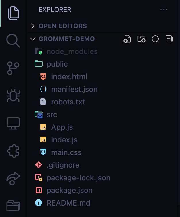
Now that you have a basic React application set up, let’s clean up the React app because we have a lot of boilerplate code.

The Replay is a weekly newsletter for dev and engineering leaders.
Delivered once a week, it's your curated guide to the most important conversations around frontend dev, emerging AI tools, and the state of modern software.
This task is simple. Just delete every file that’s not in the image below and then clear out all the import statements from the remaining files:

Here’s how your stylesheet should look:
html, body{
      margin:0;
      padding:0;
}
In the above code, we’re just doing a simple reset on the margin and padding properties for the entire webpage.
Next, you can add Grommet to the project by running the following command:
// terminal command
npm install grommet grommet-icon
This will install the Grommet library, its dependencies, and the Grommet SVG icon collection. Once installation is complete, you can import the Grommet components and styles into your React app by adding the following line to the top of your application’s entry point file (usually index.js):
// JavaScript [React]
import { Grommet } from 'grommet';
Then, wrap your entire application with the Grommet component, like so:
// JavaScript [React]

import React from 'react';
import ReactDOM from 'react-dom/client';
import App from './App';
import { Grommet } from 'grommet';

const theme = {
  global: {
    font:{
      family: "Roboto",
      size:"18px"
    },
  },
}
const root = ReactDOM.createRoot(document.getElementById('root'));
root.render(
  <React.StrictMode>
    <Grommet theme={theme}>
      <App />
    </Grommet>
  </React.StrictMode>
);
This will give you access to the Grommet components and styles in your React app. You can then use these components to create a Grommet-powered UI for your application.
Notice the theme object that is declared and then passed as a prop to the Grommet component. We’ll use this to customize our Grommet UI. Values declared in the theme object will propagate to all the comments below.
Let’s say you want to create a simple login form with Grommet. You can use the <Form> and <FormField> components to create the form, and the <Button> component to create the submit button.
Your code might look something like this:
// JavaScript [React]
import { Box, Form, FormField, Button } from 'grommet';

function App() {
  return (
      <Box width="medium" margin="auto">
        <Form>
          <FormField label="Username" name="username" />
          <FormField label="Password" name="password" type="password" />
          <Button type="submit" primary label="Submit" />
        </Form>
      </Box>
  );
}

export default App;
This code will create a sign-up form with a username and password field, as well as a submit button. The form will be centered on the page and have a medium width, thanks to the <Box> component.
Grommet also provides a wide range of customizable theme options that could be used to change the look and feel of the form.
For this tutorial, we’ll build and style a sign-up page with a carousel using only Grommet. Here’s how our final project will look:

For this demo, we’ll build the entire app from one component, app.js; we won’t write or import any other components except those from Grommet.
First, open the app.js file and wipe out the current code that’s returned by this component. Your App component should look like this:
function App() {
  return (
    <div className="App">
    </div>
  );
}
Next, import everything you need from Grommet at the top of the app.js file, like so:
import './main.css';
import { Box, Carousel, Image, Heading, Text, TextInput, FormField, Button } from 'grommet';
import { Google } from 'grommet-icons'

function App() {
  return (
    <div className="App">
    </div>
  );
}
Now, let’s set up the sign-up page layout. As you can see in the video above, our page has a two-column layout. The left column holds the carousel and the right column holds the sign-up form.
To achieve this, we‘ll use the <Box> component. This is just an abstraction over CSS flexbox; we can use it to define our layout by setting different props on it. It is very likely that you’ll use the <Box> component very frequently when working with Grommet.
Here’s the updated app:
import './main.css';
import { Box, Carousel, Image, Heading, Text, TextInput, FormField, Button } from 'grommet';
import { Google } from 'grommet-icons'

function App() {
  return (
    <div className="App">
      <Box direction="row" height="100vh">
        <Box width="60%"></Box>
        <Box width="40%" height="100vh" pad="xlarge" background="light-3" justify="center"></Box>
      </Box>
    </div>
  );
}
Now, let’s add the carousel. Notice in the code above, there are two inner<Box> components. Let’s add the carousel to the first component:
import './main.css';
import { Box, Carousel, Image, Heading, Text, TextInput, FormField, Button } from 'grommet';
import { Google } from 'grommet-icons'

function App() {
  return (
    <div className="App">
      <Box direction="row" height="100vh">
        <Box width="60%">
          <Carousel controls={false} play={3000} height="100vh">
            <Image fit="cover" src="https://images.unsplash.com/photo-1668063497279-7ecb0f0ffa8a?ixlib=rb-4.0.3&ixid=MnwxMjA3fDB8MHxwaG90by1wYWdlfHx8fGVufDB8fHx8&auto=format&fit=crop&w=774&q=80" />
            <Image fit="cover" src="https://images.unsplash.com/photo-1639332793139-32eed37bdc99?ixlib=rb-4.0.3&ixid=MnwxMjA3fDB8MHxwaG90by1wYWdlfHx8fGVufDB8fHx8&auto=format&fit=crop&w=774&q=80" />
            <Image fit="cover" src="https://images.unsplash.com/photo-1655742260938-82ab000acc2d?ixlib=rb-4.0.3&ixid=MnwxMjA3fDB8MHxwaG90by1wYWdlfHx8fGVufDB8fHx8&auto=format&fit=crop&w=1740&q=80" />
          </Carousel>
        </Box>

     <Box width="40%" height="100vh" pad="xlarge" background="light-3" justify="center"></Box>
     </Box>
   </div>
  );
}
The carousel has three slides. We achieved this using the <``Carousel``> component with three <``Image >child components.
The final step is to add the sign-up form. Here’s the final look of the app component:
import './main.css';
import { Box, Carousel, Image, Heading, Text, TextInput, FormField, Button } from 'grommet';
import { Google } from 'grommet-icons'
function App() {
  return (
    <div className="App">
      <Box
        direction='row'
        height="100vh"
      >
        <Box width="60%" >
          <Carousel controls={false} play={3000} height="100vh" >
            <Image fit="cover" src="https://images.unsplash.com/photo-1668063497279-7ecb0f0ffa8a?ixlib=rb-4.0.3&ixid=MnwxMjA3fDB8MHxwaG90by1wYWdlfHx8fGVufDB8fHx8&auto=format&fit=crop&w=774&q=80" />
            <Image fit="cover" src="https://images.unsplash.com/photo-1639332793139-32eed37bdc99?ixlib=rb-4.0.3&ixid=MnwxMjA3fDB8MHxwaG90by1wYWdlfHx8fGVufDB8fHx8&auto=format&fit=crop&w=774&q=80" />
            <Image fit="cover" src="https://images.unsplash.com/photo-1655742260938-82ab000acc2d?ixlib=rb-4.0.3&ixid=MnwxMjA3fDB8MHxwaG90by1wYWdlfHx8fGVufDB8fHx8&auto=format&fit=crop&w=1740&q=80" />
          </Carousel>
        </Box>
        <Box width="40%" height="100vh"  pad="xlarge" background="light-3" justify='center'>
          <Box width="80%" fill="horizontal" align='center' >
            <Box as="span" fill="horizontal">
              <Heading
                responsive={true}
                textAlign="start"
                size="xsmall"
                margin="none"
                a11yTitle="Create an account"
              >Create an account</Heading>
              <Text
                textAlign="start"
                size="14px"
                margin={{
                  vertical: "10px"
                }}
                a11yTitle="Let's get started with your 30 days free trial"
              >Let's get started with your 30 days free trial</Text>
            </Box>
            <Box margin={{
              vertical: "2em"
            }}
              fill="horizontal"
            >
              <FormField
                margin={{
                  vertical: ".5em"
                }}
              >
                <TextInput placeholder="Name" size="14px" a11yTitle ="Enter your name"/>
              </FormField>
              <FormField
                margin={{
                  vertical: ".5em"
                }}
              >
                <TextInput placeholder="Email" type="email" size="14px" a11yTitle="Enter your email address" />
              </FormField>
              <FormField
                margin={{
                  top: ".5em",
                  bottom:"2em"
                }}

              >
                <TextInput placeholder="Password" type="password" size="14px" a11yTitle="Enter your password" />
              </FormField>
              <Button
              primary
              label="Create account"
                margin={{
                  vertical: ".5em",
                }}
                color="#101727"
                style={{padding:".5em", borderRadius:"8px", fontSize:"14px"}}
                a11yTitle="Create account button"
              />
              <Button
              icon={ <Google />}
              label="Sign up with Google"
                a11yTitle="Sign up with Google button"
                style={{ padding: ".5em", borderRadius: "8px", fontSize: "14px", borderColor:"#AEAFB860" }}
                margin={{
                  bottom: "1.5em",
                }}
              />
              <Box as ="span" >
                <Text size='14px' color="#AEAFB8" textAlign='center'>Already have an account? <Button href="/" style={{ fontWeight: "900", color: "#01010180" }} a11yTitle="Log in if you already have an account">Log in</Button></Text>
              </Box>
            </Box>
          </Box>
        </Box>
      </Box>
    </div>
  );
}
export default App;
If you refer back to the above sign-up page video, you’ll see that this code creates a sign-up form with the following UI components:
Box has a light-colored background and some padding around the edges; it takes up 40% of the screen’s width and 100% of its heightBox is located within the parent Box; it takes up 80% of the parent Box’s width and stretches horizontally to fill the space. The inner Box contains a Heading and a paragraph of Text, both aligned to the start of the BoxText in the inner Box is another box with three FormFields for the user to enter their name, email address, and password. The FormFields have some vertical margin between them to create spacingFormFields are two buttons. The form will submit when the “Create account” Button is clicked. The “Sign up with Google” Button has a Google icon from the Grommet icons library; it allows the user to sign up using their Google account.Text telling the user they can log in if they already have an account. This Text is aligned to the center of the Box and links to the login pageGrommet is designed to be accessible and meet the requirements of the Web Content Accessibility Guidelines (WCAG). Notice that our <TextI``nput``> and <Button> components have an a11yTitle prop. This helps assistive technologies, like screen readers, understand and navigate the content. Additionally, Grommet uses semantic HTML tags to give context and meaning to the content on the page, further improving its accessibility.
Here’s a link to the complete project on GitHub.
Grommet is a powerful frontend tool. Here are some benefits of using Grommet for building UI in React:
Grommet provides a powerful and efficient way to create a modern, intuitive, and accessible user interface. Grommet provides a wide range of pre-built and pre-styled components that can be easily integrated into a React application, as well as features such as theming, internationalization, and accessibility support.
By following the steps outlined in this article, you can quickly and easily set up a React project with Grommet and start building a user interface for your application. Whether you are a seasoned React developer or a newcomer to the world of frontend development, Grommet is a valuable tool that can help you create a professional and user-friendly application.
Install LogRocket via npm or script tag. LogRocket.init() must be called client-side, not
server-side
$ npm i --save logrocket

// Code:

import LogRocket from 'logrocket';
LogRocket.init('app/id');
// Add to your HTML:

<script src="https://cdn.lr-ingest.com/LogRocket.min.js"></script>
<script>window.LogRocket && window.LogRocket.init('app/id');</script>

AI-generated tests can speed up React testing, but they also create hidden risks. Here’s what broke in a real app.re

Why the future of DX might come from the web platform itself, not more tools or frameworks.

A hands-on test of Claude Code Review across real PRs, breaking down what it flagged, what slipped through, and how the pipeline actually performs in practice.

CSS art once made frontend feel playful and accessible. Here’s why it faded as the web became more practical and prestige-driven.
Hey there, want to help make our blog better?
Join LogRocket’s Content Advisory Board. You’ll help inform the type of content we create and get access to exclusive meetups, social accreditation, and swag.
Sign up now