Say you’re building an email client that lets the user manage their drafts. In this situation, it would be sensible to display a custom context menu with a list of options depending on the chosen draft.

Here is a mock-up:
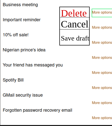
Sure, this solution might work. However, there are is a major problem associated with this context menu: it is not optimized for other screen sizes. This means that while our menu might look great on a laptop, it would appear tiny on a mobile screen. As a result, the user might face accessibility issues while displaying the application on a phone.
So how do we mitigate this issue?
We can solve this problem by using an action sheet.
An action sheet is a UI element that renders a context menu on the bottom of the screen. They are often optimized for various screen sizes and have robust support for icons. Here is a simple example:
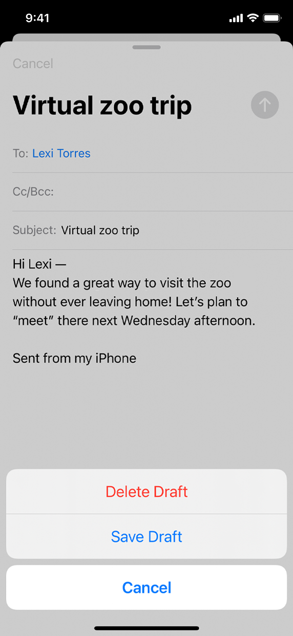
In this article, we will build and customize an iOS-like action sheet in React Native using the react-native-action-sheet module. This will be the outcome of the guide:
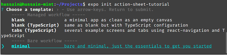
In this article, we will initialize our project using Expo. To do so, start by running the following terminal command:
expo init action-sheet-tutorial
Next, choose the option that says “minimal”:
After that, install the react-native-action-sheet package like so:
cd action-sheet-tutorial #go into project
npm install @expo/react-native-action-sheet
In this section, you will learn the fundamentals of the react-native-action-sheet library.
As the first step, we need to code our action sheet component. To do so, start by creating a file called ActionButton.js. Here, write the following code:
import * as React from "react";
import { useActionSheet } from "@expo/react-native-action-sheet";
import { View, Button } from "react-native";
export default function ActionButton() {
  return (
    <View>
      <Button title="More actions" onPress={() => alert("Button pressed")} />
    </View>
  );
}
In this code snippet, we have rendered a simple Button component onto the screen.
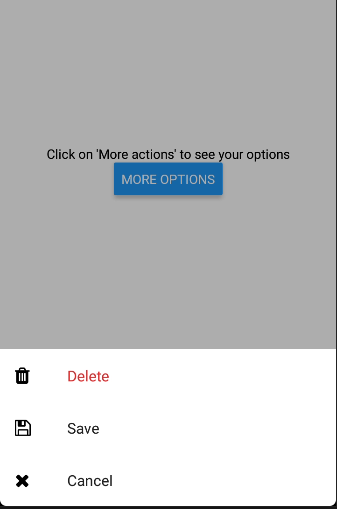
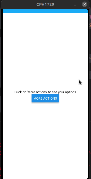
To display the ActionButton module, replace all the code in App.js to the following:
import ActionButton from "./ActionButton";
import { ActionSheetProvider } from "@expo/react-native-action-sheet";
export default function App() {
  return (
    <ActionSheetProvider>
      <View>
        <Text>Click on 'More actions' to see your options</Text>
        <ActionButton />
      </View>
    </ActionSheetProvider>
  );
}
We have now rendered our custom component to the UI. Moreover, notice that we have wrapped our components within ActionSheetProvider tags. This tells React that our app will consist of an action sheet.
Let’s test it out! Run your program with this Bash command:
expo start
Great! Our code works.
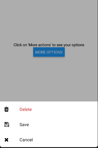
Our next step is to connect React Native’s action sheet API with our project. To make this possible, append the following snippet in ActionSheet.js:
import { useActionSheet } from "@expo/react-native-action-sheet";

const { showActionSheetWithOptions } = useActionSheet();

const openSheet = () => {
  const options = ["Delete", "Save", "Cancel"];
  const destructiveButtonIndex = 0; //the first element in 'options' will denote the Delete option
  const cancelButtonIndex = 2; //Element number 2 in the array will be the 'Cancel' button

  showActionSheetWithOptions(
    {
      options,
      cancelButtonIndex, //the third button will be the 'Cancel' button
      destructiveButtonIndex, //the first button will be the 'Delete' option
    },
    (buttonIndex) => {
      // Do something here depending on the button index selected
      alert("Index pressed: " + buttonIndex);
    }
  );

return (
  <View>
    {/*Edit your Button code here:*/}
    {/*When the button is clicked, execute the openSheet method*/}
    <Button title="More options" onPress={() => openSheet()} />
  </View>
);
This code might seem daunting at first, but it is straightforward to understand. Here is the breakdown:
useActionSheet Hook. This will let us render an action sheet according to our configoptions array that holds the user’s available choicesshowSheetButtonWithOptions function. As a result, React will display our custom-built action sheetalert function to inform the current index of the user’s selected choice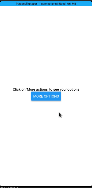
In this portion of the guide, you will learn how to alter the look and feel of your action sheet.
The icons property will draw icons to go along with each option. This might be handy for cases where the designer wants a better looking context menu.
Here is an example of icons in action:
import Icon from "react-native-vector-icons/FontAwesome";
//create an icon array
//each item in the 'icons' array corresponds to its respective index in the 'options' array.
//each item in the array in an Icon component.
const icons = [
  <Icon name="trash" size={20} />,
  <Icon name="save" size={20} />,
  <Icon name="remove" size={20} />,
];

showActionSheetWithOptions(
  {
    options,
    cancelButtonIndex,
    destructiveButtonIndex,
    icons, //pass in our icons array
  },
  (buttonIndex) => {}
);
You can even use images instead of icons like so:
//create an icon array
//this array comprises of `Image` components with source images
const icons = [
  <Image
    source={{
      uri: "https://www.chevychasesection3.org/sites/g/files/vyhlif406/f/styles/news_image/public/pages/trash-278x300.jpg?itok=fK7hIbG-",
    }}
    style={{ width: "200%", height: "200%" }}
  />,
  <Image
    source={{
      uri: "https://img-new.cgtrader.com/items/73665/floppy_disk_3_5_3d_model_3ds_fbx_blend_dae_fc20cd23-1906-47a6-b94e-643026bac619.jpg",
    }}
    style={{ width: "200%", height: "200%" }}
  />,
  <Image
    source={{
      uri: "https://about.twitter.com/content/dam/about-twitter/en/brand-toolkit/brand-download-img-1.jpg.twimg.1920.jpg",
    }}
    style={{ width: "200%", height: "200%" }}
  />,
];

showActionSheetWithOptions(
  {
    options,
    icons,
//further code..
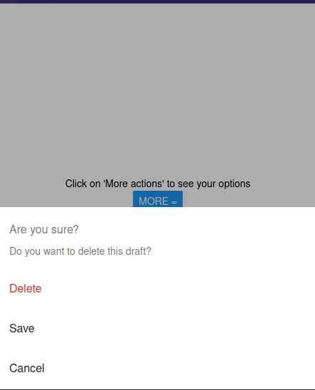
To display a title or a message within your menu, use the title and message argument. One use-case might be for displaying confirmation prompts. An example for this can be to show an alert when the user chooses to delete an item from a list:
showActionSheetWithOptions(
  {
    message: "Do you want to delete this draft?",
    title: "Are you sure?",
    //further options...
  }
  //further code..
);
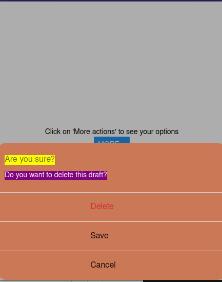
If you want to apply custom CSS to your action sheet, React Native provides the following arguments:
textStyle: Apply any text style props to the optionstitleTextStyle: As the name suggests, this will apply text styles to the titlecontainerStyle: This will apply CSS to the container of the action sheetseperatorStyle: Alter the look of the separatorsUsing custom CSS is crucial for situations where the developer wants to write a custom theme for their app.
Here is a code sample which uses CSS code to modify the menu:
showActionSheetWithOptions(
  {
    showSeparators: true, //display a seperator component after each item.
   //apply custom styles to the action sheet.
    containerStyle: styles.container,
    textStyle: styles.text,
    messageTextStyle: styles.message,
    titleTextStyle: styles.title,
    //further options..
  }
  //further code..
);

//create our styles
const styles = StyleSheet.create({
  container: {
    borderRadius: 20, //our container's borders will be rounded
    backgroundColor: "#cb7856",
  },
  message: {
    backgroundColor: "purple",
    color: "white",
  },
  title: {
    backgroundColor: "yellow",
  },
  text: {
    paddingLeft: "40%", //our options will have a certain amount of padding
  },
});
Here is the associated Expo Snack for this project.
In this guide, you learned how to use and customize action sheets using the react-native-action-sheet module. Its documentation is clear and concise, which means working with action sheets takes up little to no effort.
Thank you so much for reading!

LogRocket's Galileo AI watches sessions for you and and surfaces the technical and usability issues holding back your React Native apps.
LogRocket also helps you increase conversion rates and product usage by showing you exactly how users are interacting with your app. LogRocket's product analytics features surface the reasons why users don't complete a particular flow or don't adopt a new feature.
Start proactively monitoring your React Native apps — try LogRocket for free.
Would you be interested in joining LogRocket's developer community?
Join LogRocket’s Content Advisory Board. You’ll help inform the type of content we create and get access to exclusive meetups, social accreditation, and swag.
Sign up now
This guide walks you through creating a web UI for an AI agent that browses, clicks, and extracts info from websites powered by Stagehand and Gemini.

This guide explores how to use Anthropic’s Claude 4 models, including Opus 4 and Sonnet 4, to build AI-powered applications.

Which AI frontend dev tool reigns supreme in July 2025? Check out our power rankings and use our interactive comparison tool to find out.

Learn how OpenAPI can automate API client generation to save time, reduce bugs, and streamline how your frontend app talks to backend APIs.

 Learn more →
