Interface tabs are a common website component, but developers often face challenges in making this pattern accessible. Screen reader users may encounter some issues reading the content, and users who rely on a keyboard to navigate through a site may require some assistance to make navigation easier.
This article will cover everything you need to know to create an accessible tab interface, including building the HTML structure, adding the CSS styling, and adding JavaScript functionality enhancements.
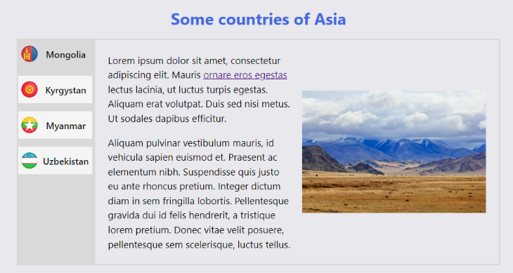
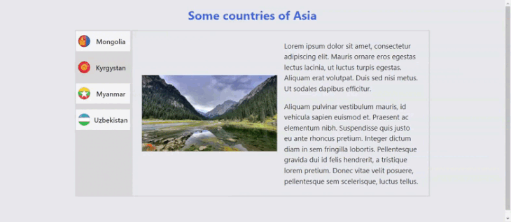
Here’s the tabbed interface that we’ll build in this tutorial:
Let’s get started!
Jump ahead:
The Replay is a weekly newsletter for dev and engineering leaders.
Delivered once a week, it's your curated guide to the most important conversations around frontend dev, emerging AI tools, and the state of modern software.
The HTML structure is very important because it provides screen reader users with the context needed to navigate the interface.
There are two ways that we can use the HTML structure to help define which elements can be focused on with a keyboard. We can use a link-based approach with the <a> element as our tab trigger or we can use the <button> element.
Both approaches take keyboard navigation into consideration by being natively keyboard focusable, but each has advantages and disadvantages. We’ll cover both approaches in this article.
<a> element as the tabThe main advantage of this approach is that we can use the <a> element’s functionality to create the tab’s navigation effect using only HTML and CSS. The <a> element brings keyboard support by taking care of a lot of the focus management and navigation for screen reader users for us!
This approach is also helpful for users who have JavaScript disabled. We’ll only use JavaScript at the end of this tutorial — to enhance some of the <a> element’s functionalities for accessibility purposes.
However, a minor disadvantage to using the <a> element as the tab is that it is counted in the user’s navigation history. In other words, if the user visits all the tabs and then wants to return to their previous site, they’ll have to press the back button many times.
Still, this approach does have progressive enhancement in mind as it offers the greatest tab interface functionality with the lowest technology possible. This approach will work even if JavaScript doesn’t load and even if CSS fails to load as well, so it’s worth considering.
<button> element as the tabUsing the <button> element as the tab has the advantage of not affecting navigation history, making it easier for the user to return to their previous site.
However, this approach requires some extra considerations with HTML to hide all non-active tab content. It also requires some additional decisions with regard to JavaScript, such as determining how to display content, focus management strategies, and some accessibility enhancements.
If you use this approach, you’ll need to consider what will happen if JavaScript doesn’t load on your site. Without a fallback, users will not be able to navigate your tabbed interface. There are several reasons why JavaScript may fail to load. For example, users may have JavaScript disabled due to tracking and privacy concerns, or JavaScript may fail to load due to external factors.
After deciding which approach you’ll use, it’s time to start creating the HTML structure!
<a> element approachLet’s start with the individual tabs. Here, we’ll use the <a> element approach for the HTML structure:
<!-- Tab semantics -->
<ul role="tablist">
  <li role="presentation">
    <a role="tab" href="#panel1" id="tab1">Tab one</a>
  </li>
  <li role="presentation">
    <a role="tab" href="#panel2" id="tab2">Tab two</a>
  </li>
  <li role="presentation">
    <a role="tab" href="#panel3" id="tab3">Tab three</a>
  </li>
  <li role="presentation">
    <a role="tab" href="#panel4" id="tab4">Tab four</a>
  </li>
</ul>

<!-- Tab content semantics -->
<div class="tabpanel-container">
  <section role="tabpanel" id="panel1" aria-labelledby="tab1" tabindex="0"></section>
  <section role="tabpanel" id="panel2" aria-labelledby="tab2" tabindex="0"></section>
  <section role="tabpanel" id="panel3" aria-labelledby="tab3" tabindex="0"></section>
  <section role="tabpanel" id="panel4" aria-labelledby="tab4" tabindex="0"></section>
</div>
Now, let’s examine the structure shown in the above code:
<a> or <button>) within the list items inside a <ul> elementtablist role to our <ul> to provide more context for screen reader users; this role is used to mark a container that wraps a set of tabs. Since the tablist role does not give the tab semantic to the child element, we add the tab role to our <a> elementtablist and tab roles, the HTML will still be read as a list of links or buttons, which is an acceptable fallbackpresentation role to the <li> elements just to remove the semantics; this will help prevent any weird interactions, while still maintaining our fallback in case a particular screen reader doesn’t support ARIA roles<section> element with the tabpanel role. This element is expected to use the same name of the tab as an accessible name. This is why we added the id attribute to our tabs and why we’re using it as a label in our tab panels with the aria-labelledby attributetabindex="0" to our tab panels to allow items inside the tab (like form fields, links, or buttons) to receive the keyboard focus. This will make it easier for keyboard users to access the content<button> element approachIf we use the <button>-based approach, we’ll need to include an extra step. We’ll need to add the hidden attribute to all tab panels except the first tab. This attribute will hide the elements for both sighted users and screen reader users. To ensure the first tab remains visible, it should have the aria-selected="true" attribute.
Our markup for the <button> approach should look something like this:
<!-- Tab semantics -->
<ul role="tablist">
  <li role="presentation">
    <button role="tab" href="#panel1" id="tab1" aria-selected="true">Tab one</button>
  </li>
  <li role="presentation">
    <button role="tab" href="#panel2" id="tab2">Tab two</button>
  </li>
  <li role="presentation">
    <button role="tab" href="#panel3" id="tab3">Tab three</button>
  </li>
  <li role="presentation">
    <button role="tab" href="#panel4" id="tab4">Tab four</button>
  </li>
</ul>

<!-- Tab content semantics -->
<div class="tabpanel-container">
  <section role="tabpanel" id="panel1" aria-labelledby="tab1" tabindex="0"></section>
  <section role="tabpanel" id="panel2" aria-labelledby="tab2" tabindex="0" hidden></section>
  <section role="tabpanel" id="panel3" aria-labelledby="tab3" tabindex="0" hidden></section>
  <section role="tabpanel" id="panel4" aria-labelledby="tab4" tabindex="0" hidden></section>
</div>
So far, we’ve covered the initial considerations for our markup, but there are additional factors we’ll need to keep in mind for certain use cases. Some factors will be controlled more dynamically, but we’ll touch on those a little later in this article’s JavaScript section.
We can relate tabs with the tab panel for screen reader users using the attribute aria-controls. However, this approach will only work on the JAWS screen reader and its use may feel quite verbose, as explained in the article by Heydon Pickering. Instead, we’ll use some focus management strategies which will help keyboard users as well.
To display a tab list with a vertical orientation, you’ll need to add the attribute [aria-orientation="vertical"] to the container. This will indicate to screen reader users that the tabs are stacked vertically.
This will be important when we start discussing navigation strategies for our sample tabbed interface.
Here’s an example showing how the [aria-orientation="vertical"] attribute would be used in a code snippet:
<ul role="tablist" aria-orientation="vertical">
  <li role="presentation">
    <button role="tab" href="#panel1" id="tab1" aria-selected="true">Tab one</button>
  </li>
  <li role="presentation">
    <button role="tab" href="#panel2" id="tab2">Tab two</button>
  </li>
  <li role="presentation">
    <button role="tab" href="#panel3" id="tab3">Tab three</button>
  </li>
  <li role="presentation">
    <button role="tab" href="#panel4" id="tab4">Tab four</button>
  </li>
</ul>
When a user clicks a tab, we’ll need a way to indicate that it was selected.
We’ll use the attribute [aria-selected="true"] to indicate tab selection to screen reader users. Then, we’ll style it with CSS to help indicate selection for sighted users. The [aria-selected="true"] attribute will change dynamically with JavaScript, so it won’t be added to our initial markup.
<li role="presentation">
  <button role="tab" href="#panel1" id="tab1" aria-selected="true">Tab one</button>
</li>
Now that we have a solid HTML structure, it’s time to add some styling with CSS!
For our example tabbed interface, we’re using a link-based approach with the <a> element as our tab trigger. To style the HTML tab structure, we’ll need to add the tab navigation, create the focus indicator, and identify the selected state’s style.
To add the tab navigation, let’s add a CSS rule using the :target selector like so:
.tabpanel:not(:target):not(.visible) {
  display: none;
}
:target is a pseudo-class that checks if an element with an id matches the URL’s fragment.
Since we’re using the <a> element here to add functionality, we can use this selector to hide any non-active tab panels. We’re using the visible class as an exception in our example so that we can add some enhancements with JavaScript later.
Another thing we need to keep in mind is keyboard navigation, and one of the most important things to do in that regard is to create an adequate focus indicator.
You’ve probably noticed a focus indicator while navigating a site using the tab key. Depending on your browser, will appear as a blue or black outline highlighting a selected element.
Browsers offer default focus styles, but they are not sufficient to meet WCAG 2.2 criteria. Therefore, it’s necessary to use additional styling. For more in-depth information on how to create a good focus indicator, read Sara Souiedan’s article on this topic.
For our example, we’ll use the following focus styles:
.tab:focus-visible {
  background-color: royalblue;
  color: whitesmoke;
  outline: 0.2em solid transparent;
}
I decided to use :focus-visible instead of the :focus pseudo-class in order to have the focus style activate only with keyboard navigation. The :focus pseudo-class will also activate when the element is clicked, which can be confusing for users.
:focus-visible is very well supported in modern browsers, so it should not create any kind of conflict. For more information about this property, refer to the MDN documentation.
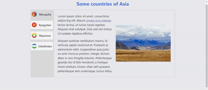
The “Mongolia” option selected below shows how our tab’s focus state would look:
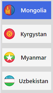
For this project, I decided to use a transparent outline. This is important for Windows high contrast mode. Under this mode, all text and background colors are replaced with those chosen by the operating system, so we can’t depend on the background color to indicate a focus state. The outline is the only reliable way to indicate the focus state.
Now, let’s come back to what I mentioned earlier regarding using the aria-selected="true" attribute to help screen reader users more easily identify the selected tab. We can use this selector to provide a visual cue for the selected tab as well!
.tab[aria-selected="true"] {
  background-color: var(--component-bg);
}
This approach creates a minor problem because of how CSS specificity works. Both selectors, .tab:focus-visible and .tab[aria-selected="true"], have the same specificity level, and both change the background-color property, so the selector rule order is critical.
We want the focus state’s background-color to overwrite any other background-color, including that of the selected state, so we’ll add the .tab:focus-visible selector rule after the .tab[aria-selected="true"] selector rule.
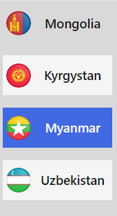
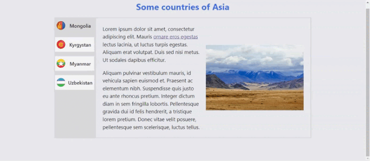
Here’s our result; notice how both styles interact with each other without any specificity problem:
If you’re using the <a> element as your tab, you’ve already created a functional tab interface with the lowest technology possible!
If you used the <button>-based approach, don’t worry! Next, we’re going to add some functionality with JavaScript, which will be crucial for making the tabbed interface more accessible.
There is a lot to unpack in this section; let’s start by checking out what the ARIA Authoring Practices Guide (APG) has to say about this component pattern. Here’s what the ARIA APG’s pattern guide for tab interface considers important for the tab key, the tabindex in tabpanel elements, and the arrow keys.
Regarding the use of the tab key, the ARIA APG suggests the following:
When focus moves into the tab list, place focus on the active
tabelement.
Our first task is to remove the keyboard navigation with the tab key to the non-selected tab so that when the key is pressed, the focus goes directly into the active tab panel. Then, when shift + tab is pressed from the active panel, the focus goes back to its respective tab. Also, we’ll have to indicate tab selection for both screen reader users and sighted users.
Here’s the code I used to address these tasks:
const TABLIST = document.querySelector("#tablist");
const TABS = [...TABLIST.querySelectorAll(".tab")];

const setSelectedTab = (element) => {
  const selectedId = element.id;

  TABS.forEach((e) => {
    const id = e.getAttribute("id");
    if (id === selectedId) {
      e.removeAttribute("tabindex");
      e.setAttribute("aria-selected", "true");
    } else {
      e.setAttribute("tabindex", "-1");
      e.setAttribute("aria-selected", "false");
    }
  });
};
Here, we select all tabs and store the one that is being clicked. Then, we parse the array with all our tabs and compare each id attribute to check if it’s the tab that was selected.
If the tab is not the one we wish to select, we add the tabindex="-1" and aria-selected="false" attributes. However, if the tab is the one we wish to select, we remove the tabindex attribute and add the aria-selected="true" attribute. The <a> and <button> elements are keyboard focusable by default, so there’s no need to add a tabindex="0".
The tabindex="-1" attribute will make an element not focusable with the tab key. When the key is pressed, it will move the focus directly to our active tab panel, enabling us to jump all our tabs. This is also important because it’ll also allow us to manage the focus of the tabs in another that I’ll demonstrate a little later in this article.
Now we all need to do is add event listeners to our tabs to execute this function! For a link-based approach, we’ll need to add an additional event listener to those elements.
With a <button>-based approach, any click event will be activated by the enter and space keys. However, an <a> element will only add those events with the enter key, so we’ll need to add a keydown event listener to check when the space key is pressed.
const handleClick = () => {
  TABS.forEach((element) => {
    element.addEventListener("click", function () {
      setSelectedTab(element);
    });
  });

  // Activates tab with Space. Only necessary if you use the <a> element as a tab

  TABS.forEach((element) => {
    element.addEventListener("keydown", function (e) {
      if ((e.keyCode || e.which) === 32) {
        setSelectedTab(element);
        element.click();
      }
    });
  });
};
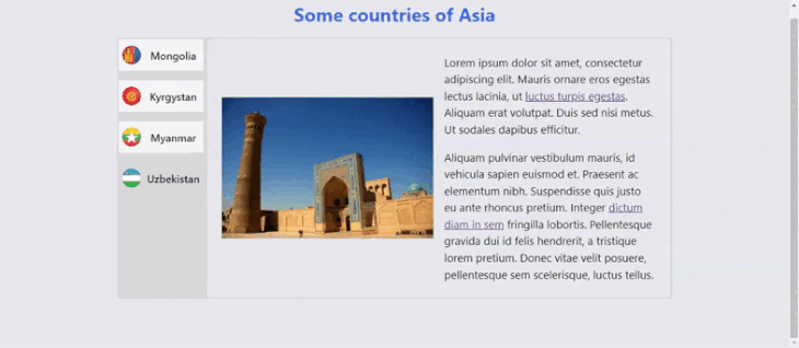
Here’s our result!
tabindex in tabpanel elementsThe ARIA APG recommends the following for the tab list keyboard interaction:
When the tab list contains the focus, [tab] moves focus to the next element in the page tab sequence outside the tablist, which is the tabpanel unless the first element containing meaningful content inside the tabpanel is focusable.
Based on this recommendation, our next task is to check if each tab panel contains a focusable element.
For tab panels that do not contain a focusable element, we’ll retain the tabindex="0" attribute we added previously. Otherwise, we’ll update the attribute to tabindex="-1", so when the tab key is pressed, the focus will be moved to the first focusable element inside the tab panel.
We’ll use this code snippet to check if every tab panel contains focusable elements and change the tabindex attribute as needed:
const TABPANELS = [...document.querySelectorAll(".tabpanel")];

const determineTabindex = () => {
  TABPANELS.forEach((element) => {
    const focusableElements = element.querySelectorAll(
      'button:not([disabled]), [href], input:not([disabled]), select:not([disabled]), textarea:not([disabled]), [tabindex]:not([tabindex="-1"]):not([disabled]), details:not([disabled]), summary:not(:disabled)'
    ).length;

    focusableElements
      ? element.setAttribute("tabindex", "-1")
      : element.setAttribute("tabindex", "0");
  });
};
Here’s our result!
In this example, when we try to use our keyboard to navigate the interface, the focused element will vary depending on whether the tab panel contains a keyboard-focusable element.
The ARIA APG offers specific keyboard navigation recommendations depending on the orientation of the interface’s tabs.
Here are the recommendations when focus is on a tab element in a horizontal tab list:
left arrow: Moves focus to the previous tab. If focus is on the first tab, move focus to the last tab. Optionally, activates the newly focused tab.
right arrow: Moves focus to the next tab. If focus is on the last tab element, move focus to the first tab. Optionally, activates the newly focused tab.
If you’re building an interface with tabs displayed vertically, besides using the attribute aria-orientation="vertical" you’ll have to use the up arrow and down arrow keys instead of the left arrow and right arrow keys.
Here are the recommendations when a tab list has aria-orientation set to vertical:
When a tab list has its aria-orientation set to
vertical:
down arrow performs as right arrow is described above.
up arrow performs as left arrow is described above.
My intention for this project was to build a completely flexible interface, but with this approach at some point the screen will end up being either a horizontal tab list or a vertical tab list. How do we address this?
Let’s start by determining what arrow keys we should use. In this particular case, we have two alternatives:
aria-orientation="vertical" and support only up arrow and down arrow navigation. Otherwise, add the attribute aria-orientation="horizontal" and support only left arrow and right arrow navigation.I usually prefer the simplest solution, so I’ll choose the second option. However, each project is different. If your tab list will always be in a vertical position, you‘d be better off using aria-orientation="vertical" and supporting only up arrow and down arrow navigation.
Here’s the code I used, based on the second option:
const createArrowNavigation = () => {
  const firstTab = TABS[0];
  const lastTab = TABS[TABS.length - 1];

  TABS.forEach((element) => {
    element.addEventListener("keydown", function (e) {
      if ((e.keyCode || e.which) === 38 || (e.keyCode || e.which) === 37) {
        if (element == firstTab) {
          e.preventDefault();
          lastTab.focus();
        } else {
          e.preventDefault();
          const focusableElement = TABS.indexOf(element) - 1;
          TABS[focusableElement].focus();
        }
      } else if (
        (e.keyCode || e.which) === 40 ||
        (e.keyCode || e.which) === 39
      ) {
        if (element == lastTab) {
          e.preventDefault();
          firstTab.focus();
        } else {
          e.preventDefault();
          const focusableElement = TABS.indexOf(element) + 1;
          TABS[focusableElement].focus();
        }
      }
    });
  });
};
Previously, we created a variable that stores all our tabs. We can use it to determine which is the first and last navigation tab. This is important because these tabs have special behavior.
Next, we can check which key codes are related to each arrow key. For that, we can use the site keycode.info to check it out. To ease the process, here’s the list of the key codes:
| Key | Keycode |
|---|---|
| Left Arrow | 37 |
| Up Arrow | 38 |
| Right Arrow | 39 |
| Down Arrow | 40 |
Now, we listen to each key to check the position of the focused tab in the array and we focus on the next element (the right arrow and down arrow) or previous element (the left arrow and up arrow) in the array with the focus() method. Since these elements have the tabindex="-1" attribute, we’ll be able to focus them with this method.
Keep in mind that if the element is the first one on the array, it will move the focus to the last element and vice versa. Another point to consider is that the arrow keys also have the function of moving the scrollbar; we can prevent this behavior with the e.preventDefault() method.
Here’s our interface, showing the use of arrow keys to move between tabs:
In addition to managing the focused state of our component, we need to determine the timing for activating the newly focused tab. In other words, when should the tab panel be shown? Should it be shown when the tab is clicked or when focus is brought to the selected tab?
The answer to this topic is surprisingly nuanced, and W3C has an entire section regarding this topic. To summarize W3C, changing the displayed content at the moment of focusing an element (referred to as follow focus) can be beneficial for certain components but creates accessibility errors for others.
Displaying content at the time of focus can make keyboard navigation easier for sighted users, but screen reader users may not be aware that new content has been added to the page. Additionally, we need to consider the amount of content that will be shown as this could impact performance.
I suggest displaying the content when the tab is clicked. This option could require an extra key press for keyboard users, but it will provide a more inclusive experience for screen reader users.
When the <a> element is clicked, the focus is brought to the selected tab panel, which will cover navigation for screen reader users.
If you decide to display the content based on focus, be sure to use the <button> approach, rather than the <a> element approach.
With a <button> element, you’ll need to handle the focus management with JavaScript. For that, we’ll come back to the handleClick function we created earlier in the CSS section of this article, and we’ll add some adjustments.
First, we’ll create a function that adds or removes the attribute hidden depending on whether the tab panel is being targeted. If the tab panel is the targeted item, we’ll also move the keyboard focus to it. Here’s my approach to this issue:
const showActivePanel = (element) => {
  const selectedId = element.id;
  TABPANELS.forEach((e) => {
    e.hidden = "true";
  });
  const activePanel = document.querySelector(
    `[aria-labelledby="${selectedId}"]`
  );
  activePanel.removeAttribute("hidden");
        activePanel.focus()
};
What we‘re doing here is hiding all tab panels by adding to them the hidden attribute. Next, we’ll select our targeted tab panel by using the aria-labelledby attribute’s value. Remember, each button has an id that we’re using to label the tab panel by using this attribute; this will help us select the correct tab panel.
Now, we just remove the hidden attribute and then bring the keyboard focus to it with the focus() method. Finally, we add the showActivePanel function in our handleClick function to be executed on the click.
Now it’s time to see how the component works as a whole!
<a> element’s initial stateIf we opt to use an <a> element for our tabs, we’ll need to handle the element’s initial state if JavaScript is active.
Here are the actions we want to take when the document loads:
aria-selected="true" and be keyboard focusable when the tab key is pressed; the other tabs should have aria-selected="false" and tabindex="-1" attributesaria-selected="true" and no tabindexWe’ll create the functions for both scenarios.
const activateFirstPanel = () => {
  TABS[0].setAttribute("tabindex", "0");
  TABS[0].setAttribute("aria-selected", "true");
  TABPANELS[0].classList.add("visible");
};
This function will cover our first case. It’s actually quite simple. We have the TABS and TABPANELS node lists already, we can select the first element of each list and add the required properties.
In the earlier CSS section, I mentioned that we were using the visible class as an exception and would add some enhancements with JavaScript later. Well, now it’s the moment for the JavaScript enhancements!
We add this class to the first tab panel to make it visible. Once the user starts interacting with the tab, we’ll need to remove this class.
const checkInitialSelectedTab = () => {
  const targetedTabPanel = document
    .querySelector(".tabpanel:target")
    .getAttribute("aria-labelledby");
  const selectedTab = document.querySelector(`#${targetedTabPanel}`);
  selectedTab.setAttribute("aria-selected", "true");
  selectedTab.removeAttribute("tabindex");
};
Our second scenario is a bit more complicated. Since this panel is being targeted, it will be displayed on the screen by default — this is due to the selector
.tabpanel:not(:target):not(.visible) we used previously. But, we need to look for the tab that activates the panel.
For this, we’ll select the targeted tab panel with JavaScript by using the .tabpanel:target selector in the querySelector() method. Once we have that node, we’ll get the aria-labelledby attribute. The tab’s id is the same as the one that we’re using in this panel’s aria-labelledby attribute, so we’ll use that id to look for the tab, and then we’ll add the necessary attributes.
Now, we just need to execute those functions depending on what the URL contains, so we’ll use another function to handle this:
const handleInitialState = () => {
  TABS.forEach((e) => {
    e.setAttribute("tabindex", "-1");
    e.setAttribute("aria-selected", "false");
  });

  window.location.href.indexOf("#panel") === -1
    ? activateFirstPanel()
    : checkInitialSelectedTab();

  determineTabindex();
};
Well, I lied. There is just a little bit more work that we need to do in this function.
For starters, let’s set the aria-selected attribute of all tabs to false and the tabindex attribute to -1; then we’ll fix the correct one with the created functions.
Next, we need to check if a tab panel is being targeted in the site’s URL. We can use the window.location.href method to get the URL and then use the array indexOf method to check if there is a panel targeted in this URL.
When you use an array function in a string, such as our URL, it will create an array with each character in the string as an element of this array, if the whole world is in this URL, it’ll return the starting position of the string, if not, it’ll return -1. This is what we’ll use to determine what function to execute.
Now, we’ll execute the determineTabindex() function we previously created. We’ll remove the no-js class that we added in our HTML and used to create a fallback in case JavaScript doesn’t load.
We’re almost done!
We previously created a function to check if the tab panels have focusable elements: determineTabIndex(); that function needs to be added there.
Do you remember our setSelectedTab() function? We need to add a small line to remove the visible class in case it was used. To do so, we’ll add the code TABPANELS[0].classList.remove("visible"); before we start checking each tab.
Finally, let’s use the following command to make sure our function handleInitialState() runs when the site loads:
window.onload = handleInitialState;
Remember, this section only applies if you used the <a> element to handle the tabs’ navigation.
Below is our completed accessible tabbed interface! After considering multiple options, I used the link-based approach with the <a> element for this demo. The tabbed UI was designed with a completely flexible layout with no need for media queries.
See the Pen
Accessible tabbed interface by Cristian Diaz (@ItsCrisDiaz)
on CodePen.
This component addresses the main accessibility issues that developers encounter when building a tabbed interface: ensuring that it works properly for keyboard users and that the information is shown correctly to screen reader users.
Building an accessible component can be challenging due to the multiple nuances of accessibility requirements, but it’s important to ensure your website is usable for everyone.
Debugging code is always a tedious task. But the more you understand your errors, the easier it is to fix them.
LogRocket allows you to understand these errors in new and unique ways. Our frontend monitoring solution tracks user engagement with your JavaScript frontends to give you the ability to see exactly what the user did that led to an error.
LogRocket records console logs, page load times, stack traces, slow network requests/responses with headers + bodies, browser metadata, and custom logs. Understanding the impact of your JavaScript code will never be easier!

Learn how to build a full React Native auth system using Better Auth and Expo — with email/password login, Google OAuth, session persistence, and protected routes.

Compare the top AI development tools and models of June 2026. View updated rankings, feature breakdowns, and find the best fit for you.

Learn how Bloom filters reduce database lookups for username availability checks while preserving correctness at scale.
Learn how to test Nuxt apps with Vitest, @nuxt/test-utils, runtime mocks, server route mocks, and Playwright e2e tests.
Hey there, want to help make our blog better?
Join LogRocket’s Content Advisory Board. You’ll help inform the type of content we create and get access to exclusive meetups, social accreditation, and swag.
Sign up now

 Learn more →
