Building an accessible modal can be a tricky task, but with the right tools and techniques, it’s doable. One important aspect of accessibility is ensuring that users can navigate through the modal using only their keyboard. One way to accomplish this is by using the focus-trap-react library.

Before diving into the technical details, let’s first understand what an accessible modal is. An accessible modal, also known as a dialog, is a user interface component that is used to display content in a separate window or overlay on top of the current view. These modals are often used to display forms, confirmations, or additional information that is not essential to the main content of a webpage.
An accessible modal is designed to be usable by all users, including those with disabilities. One of the ways to achieve an accessible modal is by using the focus-trap-react package.
focus-trap-react is a simple, lightweight library that helps trap focus within a specific DOM element, such as a modal dialog or a menu. This ensures that users can navigate through the modal using only their keyboard, without accidentally interacting with elements outside of the modal.
You can use the component to build various types of user interfaces like modals, dropdown menus, and tooltips that are accessible and easy to use for all users, including those with disabilities.
Jump ahead:
focusTrapOptionsfocusTrapOptionsThe Replay is a weekly newsletter for dev and engineering leaders.
Delivered once a week, it's your curated guide to the most important conversations around frontend dev, emerging AI tools, and the state of modern software.
To follow this tutorial, you must have the following software installed:
It’s important to note that the tutorial is using React 18.2.0 and focus-trap-react v10. If you want to see the complete project developed throughout this article, take a look at the GitHub project. Feel free to clone it, fork it, or submit an issue.
Open the command line and navigate to the directory where you want to create the project. Then, uun the following command to create a new React project using Create React App:
npx create-react-app focus-trap-example
This will create a new directory called focus-trap-example with the basic file structure and configuration needed to build a React application. Next, navigate into the new project directory:
cd focus-trap-example
Then, install the focus-trap-react package using npm or Yarn:
npm install focus-trap-react
# or
yarn add focus-trap-react
Once you’ve installed the library, you can start building the modal component.
First, create a new file named Modal.js under the src directory in your project.
Then, import the focus-trap-react library in the new file by adding the following line at the top of the file:
import FocusTrap from "focus-trap-react"
Next, create a new functional component called Modal and use the FocusTrap component to wrap the modal’s content. FocusTrap creates a focus trap that keeps focus within the modal when it is open and returns focus to the element that opened the modal when it is closed:
const Modal = () => {
  return (
    <FocusTrap>
      <div className="modal-content">
        <h2>Modal Title</h2>
        <p>Modal content goes here...</p>
        <button className="link-button">Close Modal</button>
        <a href="#" className="link-href">
          Some tabbable element
        </a>
      </div>
    </FocusTrap>
  )
}
When using FocusTrap, make sure that the component has at least one child element that is tabbable, or a focusable element. Focusable elements are elements in the HTML document that can receive focus, such as buttons, links, input fields, and other interactive elements like checkboxes or select boxes. These elements can be navigated to using the keyboard’s Tab key, and they can also be activated by clicking on them with a mouse or touch device.
The main focusable elements are:
<a> (anchor)<button><input> (all types)<select><textarea></code<label>You can also make other elements focusable by giving them a tabindex attribute. A positive integer value will make the element focusable in the order specified by the number. A tabindex of 0 will make the element focusable but will be navigated to after all elements with a positive tabindex.
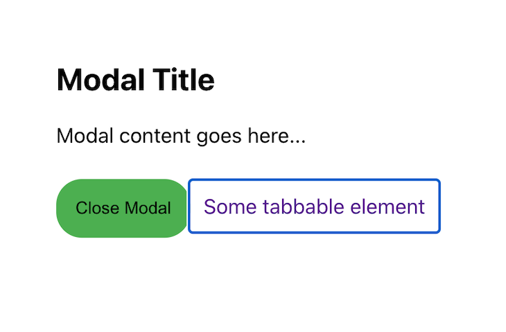
In this example, FocusTrap is used to trap focus within the modal. The modal content includes a button and an a tag in order to make it tabbable, so that FocusTrap can focus on it:
To customize the behavior of FocusTrap, you can use the focusTrapOptions prop to specify which element should be focused when the modal is first opened.
The initialFocus option allows you to specify which element within the focus trap should receive focus when the trap is activated. For example, you might want to set the focus on the link element within the modal:
const Modal = () => {
  return (
    <FocusTrap focusTrapOptions={{ initialFocus: "#modal-link" }}>
      <div className="modal-content">
        <h2>Modal Title</h2>
        <p>Modal content goes here...</p>
        <button className="link-button">Close Modal</button>
        <a href="#" className="link-href" id="modal-link">
          Some tabbable element
        </a>
      </div>
    </FocusTrap>
  )
}
export default Modal
In this example, the a href link will be focused when the modal is open:

We’ll explore other options in another section.
Currently, our modal doesn’t have an open button, and the close button is not functional. Let’s make the modal functional using hooks and functions:
import { useState } from "react"
import FocusTrap from "focus-trap-react"

const Modal = () => {
  const [isOpen, setIsOpen] = useState(false)

  const openModal = () => setIsOpen(true)
  const closeModal = () => setIsOpen(false)

  return (
    <>
      <button onClick={openModal} className="button">
        Open Modal
      </button>
      {isOpen && (
        <FocusTrap focusTrapOptions={{ initialFocus: "#modal-link" }}>
          <div className="modal-content">
            <h2>Modal Title</h2>
            <p>Modal content goes here...</p>
            <button className="link-button" onClick={closeModal}>
              Close Modal
            </button>
            <a href="#" className="link-href" id="modal-link">
              Some tabbable element
            </a>
          </div>
        </FocusTrap>
      )}
    </>
  )
}
export default Modal
In this example, the useState hook is used to create a state variable isOpen, which keeps track of whether the modal is currently open or closed. By default, this variable is set to false, which means the modal is closed when the page first loads.
Two functions, openModal and closeModal, are defined, which change the value of isOpen to true and false, respectively. These functions are passed as handlers to the Open Modal and Close Modal buttons, so that when the buttons are clicked, the modal will open or close. When the isOpen state is true, the modal becomes visible on the screen:
focusTrapOptionsWe looked at the initialFocus option in an earlier section. Let’s look at a few others.
First, consider onPostActivate. This option is called after the focus trap is activated, and after the initial focus has been set. It’s a way to perform additional actions after the modal is opened and the focus is set:
import { useRef } from 'react';
import FocusTrap from "focus-trap-react"

const Modal = () => {
  const firstInputRef = useRef(null);

  return (
    <>
      <button onClick={openModal}>Open Modal</button>
      {isOpen && (
        <FocusTrap
          focusTrapOptions={{
            onPostActivate: () => {
              firstInputRef.current.focus();
            },
          }}
        >
          <div className="modal-content">
            <input type="text" ref={firstInputRef}/>
            <button onClick={closeModal}>Close Modal</button>
          </div>
        </FocusTrap>
      )}
    </>
  )

}
In this example, when the modal is opened and the focus is set, onPostActivate is called, which sets the focus on the first input element in the modal, so the user can start typing in the input field immediately after the modal is opened.
Adding this functionality makes the user experience smoother and more natural, because it’s a common use case to let users enter information in a form after a modal is opened:
Let’s take a look at some other options:
onActivate: This option allows you to specify a callback function that will be executed when the focus trap is activated. For example, you might want to add a class to the modal element to change its appearance when it’s activeonDeactivate: This option allows you to specify a callback function that will be executed when the focus trap is deactivated. For example, you might want to remove the class that was added on activateclickOutsideDeactivates: This option allows you to specify whether the focus trap should be deactivated when the user clicks outside of the trap. It’s a Boolean value that is set to true by default, which means that the focus trap will deactivate when a user clicks outside of it.Now, let’s add these options to our modal:
import { useRef } from "react"
import FocusTrap from "focus-trap-react"

const Modal = () => {
  const modalRef = useRef(null)

  const onActivate = () => {
    modalRef.current.classList.add("active")
  }
  const onDeactivate = () => {
    modalRef.current.classList.remove("active")
  }
  return (
    <>
      <div>
        <button onClick={openModal} className="button">
          Open Modal
        </button>
      </div>
      {isOpen && (
        <FocusTrap
          focusTrapOptions={{
            onActivate,
            onDeactivate,
            clickOutsideDeactivates: true,
          }}
        >
          <div
            className="modal-content"
            ref={modalRef}
          >
           {/* JSX elements */}
          </div>
        </FocusTrap>
      )}
    </>
  )
}
In this example, we are using the useRef Hook to create a reference to the modal element, and then passing it as a ref to the div element that wraps the modal content. This way, we can access the element in the onActivate and onDeactivate callbacks by using modalRef.current.
The onActivate function adds the class "active" to the modal element, which changes the background color to blue when the modal is opened.
The onDeactivate function removes the "active" class from the modal element when the modal is closed.
The clickOutsideDeactivates: true option tells the focus trap to deactivate when a click happens outside the modal, so the modal will close when the user clicks outside the modal:
You can find the full list of options in the focus-trap documentation.
Import the modal component in the App.js and render the modal component:
import "./App.css"
import Modal from "./Modal"

export default function App() {
  return (
    <div className="App">
      <Modal />
    </div>
  )
}
Then, run your app from terminal:
npm start
# or
yarn start
This will start a development server, and you should see the application running in your browser at http://localhost:3000.
To test the modal:
Shift + Tab keys to navigate through the modal in reverse order and check that the focus is moving through the modal’s focusable elements in reverseAdditionally, it’s important to test the modal with a screen reader like JAWS or NVDA to ensure that it’s working as expected for users with different abilities.
focus-trap-react library is a low-level library that provides the basic functionality of trapping focus within a component, but it does not provide built-in accessibility features such as adding ARIA attributes.
You can use another library such as react-aria-modal, which provides fully accessible modal dialogs that follow the WAI-ARIA Authoring Practices, and you can use it with focus-trap-react.
To make a modal accessible, it’s important to follow the WAI-ARIA authoring practices guidelines. This includes providing a clear and descriptive label for the modal, ensuring that the modal can be closed using the keyboard, and trapping focus within the modal so that users can navigate through its content using the keyboard.
In summary, the focus-trap-react library is a simple and effective way to make your modals more accessible. It’s important to note that trapping focus within the modal is only one aspect of making a modal accessible. You should also ensure that the modal is properly labeled and that the close button is clearly visible and easily accessible. Additionally, you should consider the needs of users with screen readers and other assistive technologies.
Install LogRocket via npm or script tag. LogRocket.init() must be called client-side, not
server-side
$ npm i --save logrocket

// Code:

import LogRocket from 'logrocket';
LogRocket.init('app/id');
// Add to your HTML:

<script src="https://cdn.lr-ingest.com/LogRocket.min.js"></script>
<script>window.LogRocket && window.LogRocket.init('app/id');</script>

Build a CRUD REST API with Node.js, Express, and PostgreSQL, then modernize it with ES modules, async/await, built-in Express middleware, and safer config handling.

Discover what’s new in The Replay, LogRocket’s newsletter for dev and engineering leaders, in the March 25th issue.

Discover a practical framework for redesigning your senior developer hiring process to screen for real diagnostic skill.

I tested the Speculation Rules API in a real project to see if it actually improves navigation speed. Here’s what worked, what didn’t, and where it’s worth using.
Hey there, want to help make our blog better?
Join LogRocket’s Content Advisory Board. You’ll help inform the type of content we create and get access to exclusive meetups, social accreditation, and swag.
Sign up now