Building a component UI library is a great way to enforce design standards across an organization or codebase. However, it can come with severe technical roadblocks, especially in large libraries, because it can be easy to end up with a convoluted and hard-to-read codebase.

Thankfully, various tools have been developed to make the component library building process easier. In this article, we’ll be taking a look at some of the tools that make it easier to build component libraries in React Native, primarily Storybook and Shopify Restyle.
React Native has made it easier than ever to create cross-platform and powerful mobile applications using React and Javascript. With tons of community support, React Native also has a healthy ecosystem of plugins and tools that make it easier for software developers to write scalable mobile applications.
First, we’ll be taking a look at Storybook and what it can do for software developers, then dive into creating a very basic component library in React Native using Storybook and a great UI library called Shopify Restyle. At the end of this guide, you’ll have created and documented button and text components.
The Replay is a weekly newsletter for dev and engineering leaders.
Delivered once a week, it's your curated guide to the most important conversations around frontend dev, emerging AI tools, and the state of modern software.
To understand what Storybook is, we’ll first have to cover what component libraries actually are.
Component libraries are a collection of prebuilt UI components that an entire organization can reuse across multiple projects or screens. Component libraries save product teams time, and make it easier to unit test and individually look at parts of an application.
Storybook is an open source tool for building and documenting UI components in isolation. It makes the process of creating and testing UI components simpler.
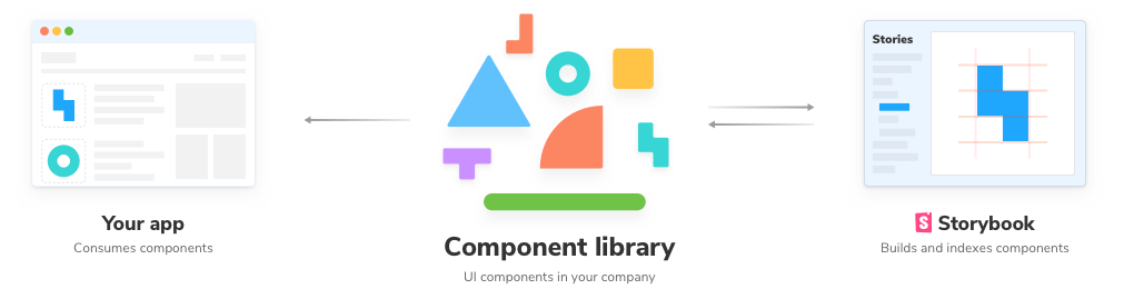
For example, when creating a login page, you’ll likely have several base components like buttons, inputs, and text. Each of these components can be made into a reusable component that you’d then document using Storybook.
Software teams at companies like Google and Atlassian use Storybook to document component libraries across an entire organization to make reusable and sharable codebases.
Shopify Restyle is an open source styling solution for React Native.
From the Restyle documentation:
The Restyle library provides a type-enforced system for building UI components in React Native with TypeScript. It’s a library for building UI libraries, with themability as the core focus.
With Restyle, it’s easy to build components that are constructed around a central theme. This theme is connected to component styles and props, allowing you to access things like set spacings or colors from props.
For example, to style a button component a certain color, Restyle makes it easy to build the button so you can use <Button color="primary400" /> rather than manually typing out a hex value.
At the core of Restyle is a theme object that you define to contain colors, sizes, spacing, and default styles of all of your components. It also offers two prebuilt components – Box and Text to make it really easy to build larger components.
Let’s dive into actually building our component library in React Native. We’ll be using Expo in this tutorial for simplicity and Typescript to take advantage of the powerful typing that Restyle offers. I’ve created a repo that has commits that follow along on this project, you can check that out here.
First, lets initialize a new Expo project in the current directory:
npm i -g expo-cli && expo init -t expo-template-blank-typescript
This will prompt you for your application name, then create all the files and install base dependencies for our new application.
Then, we’ll install our dependencies for Storybook and Restyle:
# Setup Storybook for React Native
npx -p @storybook/cli sb init --type react_native

# Install storybook loader to autoload stories
yarn add -D react-native-storybook-loader
Next, add the following to your package.json to run the storybook loader:
{
  "scripts": {
    "prestorybook": "rnstl"
  }
}
Finally, update your app entry point (App.tsx) to use Storybook:
// App.tsx
import React from 'react';

export { default } from './storybook';
Now, start the storybook server with yarn storybook and start the dev server with yarn ios (or yarn android if you’re running an android emulator.
\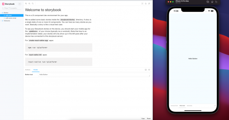
You should see the above screen. If you don’t, close all the running processes, then start storybook and the dev server again.
Congrats! You now have an Expo project set up with Storybook!
Let’s take a look at our files. If you look in the root directory, you’ll see a new folder called storybook with a child folder called stories. This is where the Storybook and stories are configured.
You can see in the Storybook webpage above that we have two stories, the Button story with two variants, with text and with some emoji, then the Welcome story with variant to Storybook.
Let’s now start building out our own component library using Restyle! In this next part, we’ll be setting up the Restyle theme, then building a new Button component using the Box and Text components.
First, install Restyle: yarn add @shopify/restyle.
Next, we’ll set up a core theme for our application.
Create a new file, src/theme.ts and put the following in it:
// src/theme.ts

import { createTheme } from '@shopify/restyle'

const palette = {
  purpleLight: '#8C6FF7',
  purplePrimary: '#5A31F4',
  purpleDark: '#3F22AB',

  greenLight: '#56DCBA',
  greenPrimary: '#0ECD9D',
  greenDark: '#0A906E',

  black: '#0B0B0B',
  white: '#F0F2F3',
};


const theme = createTheme({
  colors: {
    primary: palette.purplePrimary,
    ...palette
  },
  spacing: {
    s: 8,
    m: 16,
    l: 24,
    xl: 40,
  },
  breakpoints: {
    phone: 0,
    tablet: 768,
  },
});

export type Theme = typeof theme;
export default theme;
Then, wrap your app in the Restyle theme provider by updating App.tsx:
// App.tsx

import React from 'react';
import {ThemeProvider} from '@shopify/restyle';

import Storybook from './storybook';
import theme from './src/theme';

const App = () => (
  <ThemeProvider theme={theme}>
    <Storybook/>
  </ThemeProvider>
);

export default App;
If you restart your app, you’ll probably notice no change, but we’ve successfully configured our App to use Restyle! Let’s now create our Box, Text, and Button components.
Lets create our Components folder using Bash:
mkdir -p ./src/Components
First, lets create our Box component in src/Components/Box.tsx:
// Box.tsx
import {createBox} from '@shopify/restyle';
import {Theme} from '../theme';

const Box = createBox<Theme>();

export default Box;
Then, our Text component in src/Components/Text.tsx:
// Text.tsx
import {createText} from '@shopify/restyle';
import {Theme} from '../theme';

const Text = createText<Theme>();

export default Text;
Finally, we’ll create our Button component in src/Components/Button.tsx:
// Button.tsx
import React from "react";
import { BoxProps, TextProps } from "@shopify/restyle";
import { ActivityIndicator, TouchableHighlight } from "react-native";
import { Theme } from "../theme";
import Box from "./Box";
import Text from "./Text";

type ButtonProps = {
  onPress: () => void;
  loading?: boolean;
  textProps?: TextProps<Theme>;
} & Partial<BoxProps<Theme>>;

const Button: React.FC<ButtonProps> = ({
  children,
  onPress,
  loading,
  textProps,
  ...props
}) => (
  <TouchableHighlight underlayColor="transparent" onPress={onPress}>
    <Box
      py="m"
      px="xl"
      backgroundColor="primary"
      borderRadius={8}
      shadowOffset={{ height: 2, width: 0 }}
      shadowRadius={5}
      shadowColor="black"
      shadowOpacity={0.2}
      {...props}
    >
      {loading ? (
        <ActivityIndicator color="white" />
      ) : (
        <Text color="white" {...textProps}>
          {children}
        </Text>
      )}
    </Box>
  </TouchableHighlight>
);

export default Button;
Now let’s point out a few awesome things that we’re doing with our Box and Text components. Notice how we’re using props like py and backgroundColor in our Box component. We’re passing in values that we’ve defined in our theme, like m for spacing or primary for our button color, which is pretty cool!
Now that we have these components built out, lets export all these components in src/Components/index.ts:
// index.ts
export { default as Button } from './Button';
export { default as Text } from './Text';
Now, let’s update our stories so we can see these in Storybook.
First, we’ll delete storybook/stories/Welcome and storybook/stories/Button to get rid of this story we don’t need and update storybook/stories/index.js to be just *import* './Button.stories';.
Create storybook/stories/Button.stories.js:
// Button.stories.js

import React from 'react';
import { action } from '@storybook/addon-actions';
import { text } from '@storybook/addon-knobs';
import { storiesOf } from '@storybook/react-native';
import { Button, Text } from '../../src/Components';
import CenterView from './CenterView';

storiesOf('Button', module)
  .addDecorator((getStory) => <CenterView>{getStory()}</CenterView>)
  .add('with text', () => (
    <Button onPress={action('clicked-text')}>
      <Text>{text('Button text', 'Hello Button')}</Text>
    </Button>
  ))
  .add('with some emoji', () => (
    <Button onPress={action('clicked-emoji')}>
      <Text>😀 😎 👍 💯</Text>
    </Button>
  ))
  .add('loading', () => (
    <Button onPress={action('loading')} loading>
      <Text>Test</Text>
    </Button>
  ));
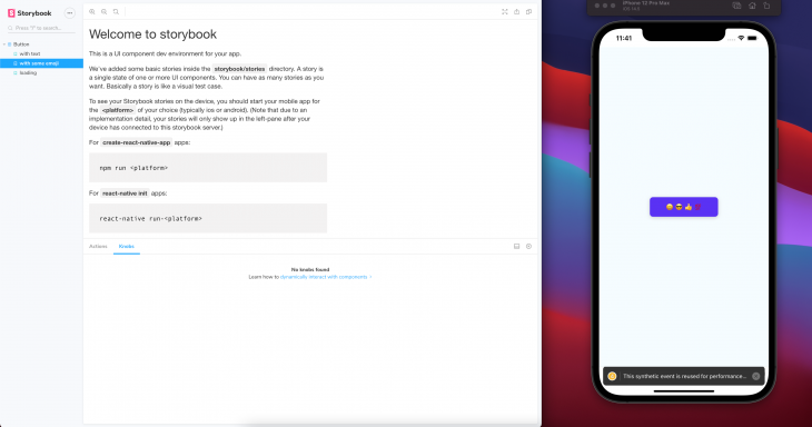
Now, if you look at our Storybook, you should see some nice pretty buttons!
Now, you have a basic component library built with Expo, Storybook, and Restyle! If you want to learn more about Restyle, I recommend reading the Restyle documentation. You can also find the finished code repository here.

LogRocket's Galileo AI watches sessions for you and and surfaces the technical and usability issues holding back your React Native apps.
LogRocket also helps you increase conversion rates and product usage by showing you exactly how users are interacting with your app. LogRocket's product analytics features surface the reasons why users don't complete a particular flow or don't adopt a new feature.
Start proactively monitoring your React Native apps — try LogRocket for free.

Learn about TypeScript v6’s breaking changes, new ES2025 features, and deprecated options. A complete migration guide from v5 to prepare for v7.

Learn how Vite+ unifies Vite, Vitest, Oxlint, Oxfmt, Rolldown, and Node.js management in one CLI.

AI companies are buying developer tools as coding agents turn runtimes, package managers, and linters into strategic infrastructure.

Learn how AI-assisted development governance uses rules, agents, hooks, and protocols to help AI coding tools produce safer, more consistent code.
Hey there, want to help make our blog better?
Join LogRocket’s Content Advisory Board. You’ll help inform the type of content we create and get access to exclusive meetups, social accreditation, and swag.
Sign up now

 Learn more →
