Editor’s note: This article was last updated 17 May 2023 to include additional CSS shape generators, including a button generator, speech bubble generator, glow generator, and more.
CSS is an incredibly powerful styling tool that allows us to create complex shapes, patterns, and more. However, doing so from scratch can be incredibly time-consuming, hence the need for tools that speed up the process. In this article, we’ll review fifteen of the best CSS shape and pattern generators, learning how to use them to generate any shape we desire. Let’s get started!
Jump ahead:
clip-path generatorCSS Generators is a fantastic website that you can use to generate seven different shapes and design patterns directly in your browser, including a starburst, polygon, wave, custom border, section divider, and custom corner. In this tutorial, we’ll learn how to generate a starburst, polygon, and wave shape.
A starburst shape has emanating rays resembling the flash of light produced by an exploding star. Although a starburst shape looks interesting, trying to implement one from scratch can be time-consuming. However, with the starburst shape generator from CSS Generators, we can easily generate a starburst and customize it with the number of sides we want.
To create a starburst shape, head to the homepage, and you’ll be met with a page similar to the one below:
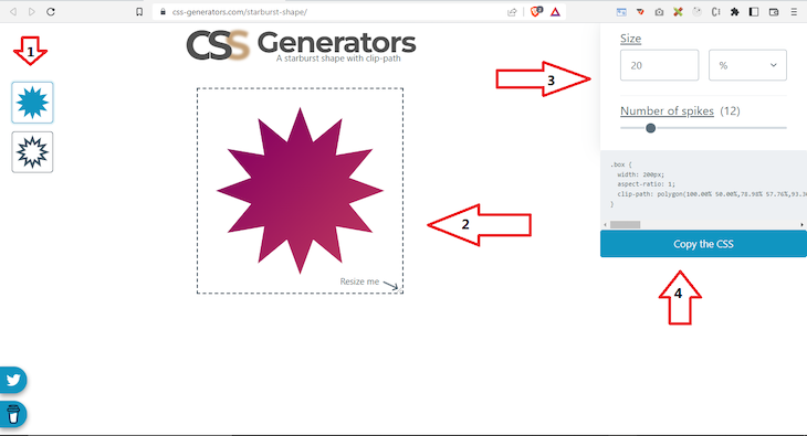
First, select one of the options near arrow one, a star with either a fill or outline. Arrow two indicates the canvas where you’ll see the changes. At arrow three, you can determine the width of the star; it also has a slider that allows you to specify the number of sides of the star. Lastly, arrow four points to the generated CSS that you can copy and use in your project.
The shape in the image above is a dodecagram. Below is the generated CSS for it:
.box {
width: 200px;
aspect-ratio: 1;
clip-path: polygon(100.00% 50.00%,78.98% 57.76%,93.30% 75.00%,71.21% 71.21%,75.00% 93.30%,57.76% 78.98%,50.00% 100.00%,42.24% 78.98%,25.00% 93.30%,28.79% 71.21%,6.70% 75.00%,21.02% 57.76%,0.00% 50.00%,21.02% 42.24%,6.70% 25.00%,28.79% 28.79%,25.00% 6.70%,42.24% 21.02%,50.00% 0.00%,57.76% 21.02%,75.00% 6.70%,71.21% 28.79%,93.30% 25.00%,78.98% 42.24%);
}
To use the generated CSS, you should create an HTML tag and give it a class name from the CSS Generator. Your element can look like the following:
<div class="box"></div>
Creating a polygon from scratch with CSS requires some patience. Therefore, the polygon shape generator is a great help; the steps to generate a polygon using CSS Generators are similar to generating a starburst shape. First, navigate to the CSS Generators website:
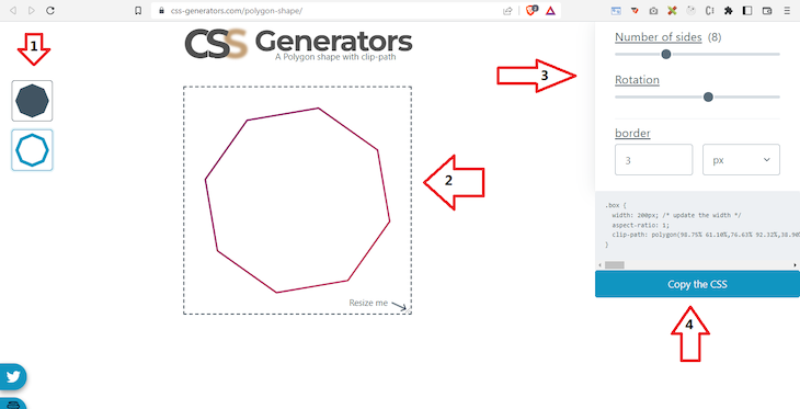
You’ll notice that arrow three houses an extra slider that you can use to rotate the shape. The code below shows the generated CSS for the octagon shape above:
.box {
width: 200px;
aspect-ratio: 1;
clip-path: polygon(98.75% 61.10%,76.63% 92.32%,38.90% 98.75%,7.68% 76.63%,1.25% 38.90%,23.37% 7.68%,61.10% 1.25%,92.32% 23.37%,98.75% 61.10%,calc(92.32% - 2.54px) calc(23.37% - -1.60px),calc(61.10% - 0.67px) calc(1.25% - -2.93px),calc(23.37% - -1.60px) calc(7.68% - -2.54px),calc(1.25% - -2.93px) calc(38.90% - -0.67px),calc(7.68% - -2.54px) calc(76.63% - 1.60px),calc(38.90% - -0.67px) calc(98.75% - 2.93px),calc(76.63% - 1.60px) calc(92.32% - 2.54px),calc(98.75% - 2.93px) calc(61.10% - 0.67px),calc(92.32% - 2.54px) calc(23.37% - -1.60px));
}
Just like before, you should create an HTML tag and a class name from the CSS Generator:
<div class="box"></div>
Creating waves with CSS is notoriously tricky, however, using CSS Generators makes the job more manageable. To get started, follow this link, and you’ll find a page similar to the one below:
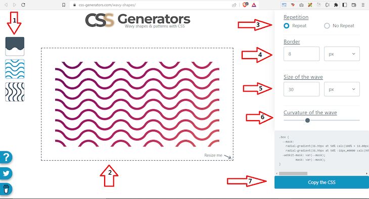
Arrow one indicates the menu for selecting either a filled, horizontal, or vertical wave; in the image above, we selected the horizontal wave. Arrow two points to the resizable canvas where you can preview changes to the wave. The third arrow points to the menu where you choose between having multiple (repeat) or a single (no repeat) wave. In the image above, we chose multiple (repeat).
Next, arrow four indicates the menu used to specify the border width. You can choose the kind of unit from the dropdown, comprising pixels, percentages, and more. In the image above, we selected 8 pixels. Arrow five points to the menu used to specify the size of the wave, which we set to 30px. Arrow six indicates the menu used to specify the curvature of the wave, and lastly, arrow seven is used to copy the generated CSS code:
.box {
--mask:
radial-gradient(38.99px at 50% calc(100% + 18.00px),#0000 calc(99% - 8px),#000 calc(101% - 8px) 99%,#0000 101%) calc(50% - 60px) calc(50% - 19px + .5px)/120px 38px ,
radial-gradient(38.99px at 50% -18px,#0000 calc(99% - 8px),#000 calc(101% - 8px) 99%,#0000 101%) 50% calc(50% + 19px)/120px 38px ;
-webkit-mask: var(--mask);
mask: var(--mask);
}
To use the generated CSS, you should create an HTML tag and a class name from the CSS Generator. Your element can look like the following:
<div class="box"></div>
With CSS Portal, you can easily generate and customize visually appealing shapes and patterns like triangles, border radiuses, buttons, clip paths, flip switches, cubic beziers, scrollbars, and more.
To generate a triangle shape with CSS Portal, first, visit the Triangle Generator homepage, and you’ll see an interface that looks similar to the following:
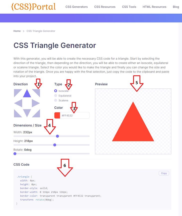
The first arrow points to the menu to select the triangle’s direction; there are eight directions: top, bottom, left, right, top-right, top-left, bottom-right, and bottom-left. In our example, we selected top for the direction of the triangle.
The second arrow points to the menu to select the type of triangle. There are only three options available: isosceles, equilateral, and scalene. The third arrow indicates the menu to select the triangle’s background color. It accepts every format for writing color, including RGBA, RGB, Hex, color names, and a color wheel. In the image above, we selected #FF4532.
Next, the fourth arrow indicates the menu for selecting the dimensions and size of the triangle; here, you can select the width, height, and degree of rotation. We selected a width of 232px, a height of 218px, and a 0deg rotation. The canvas at arrow five will reflect whatever changes you make from arrows one to four. Like with CSS Generators, you can copy the generated CSS code from arrow six. Below is the generated CSS code for the triangle in the image above:
.triangle {
   width: 0px;
   height: 0px;
   border-style: solid;
   border-width: 0 116px 218px 116px;
   border-color: transparent transparent #FF4532 transparent;
   transform: rotate(0deg);
}
To use the generated CSS, you should create an HTML tag and class name from the CSS Portal. Your element should look like the following:
<div class="triangle"></div>
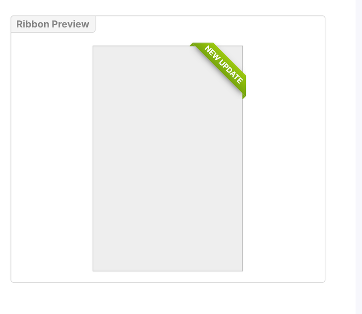
A ribbon is a tag attached to an element that indicates a recent update or news, like a notice for a new feature, deprecation warnings, etc. The image below shows a sample ribbon:
To easily generate a ribbon, we can use the CSS Ribbon Generator tool from CSS Portal:
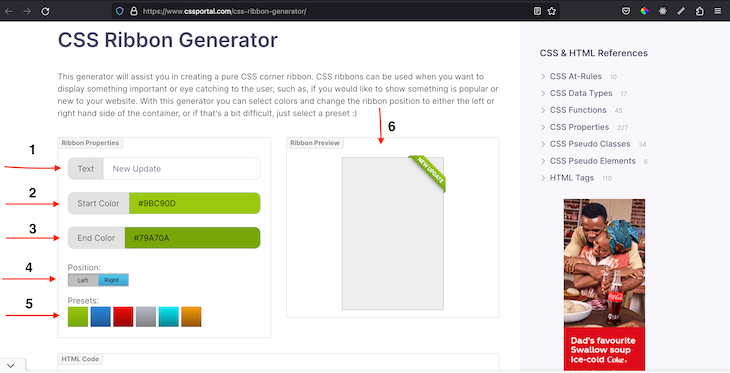
We use the labeled items on the left to modify and customize the ribbon, while the visual preview is shown on the right. You should keep in mind that this generator only allows us to set the text, color gradient, and position of the ribbon. To set the text, update arrow one. To set the color, you can either use one of the presets at arrow five or add manual configuration at arrows two and three. Lastly, arrow four sets the position.
Once you’re satisfied with the appearance of the ribbon, you can copy the HTML and CSS code generated for you, like in the image below:
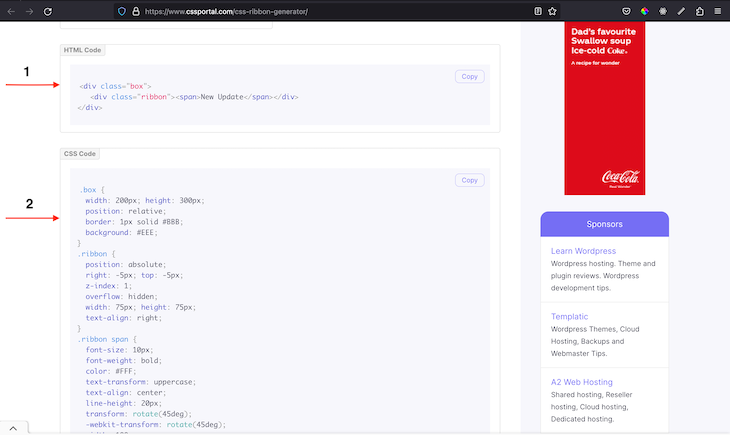
The generated code for the example above is as follows:
// HTML
<div class="box">
   <div class="ribbon"><span>New Update</span></div>
</div>
And:
// CSS
.box {
  width: 200px; height: 300px;
  position: relative;
  border: 1px solid #BBB;
  background: #EEE;
}
.ribbon {
  position: absolute;
  right: -5px; top: -5px;
  z-index: 1;
  overflow: hidden;
  width: 75px; height: 75px;
  text-align: right;
}
.ribbon span {
  font-size: 10px;
  font-weight: bold;
  color: #FFF;
  text-transform: uppercase;
  text-align: center;
  line-height: 20px;
  transform: rotate(45deg);
  -webkit-transform: rotate(45deg);
  width: 100px;
  display: block;
  background: #79A70A;
  background: linear-gradient(#9BC90D 0%, #79A70A 100%);
  box-shadow: 0 3px 10px -5px rgba(0, 0, 0, 1);
  position: absolute;
  top: 19px; right: -21px;
}
.ribbon span::before {
  content: "";
  position: absolute; left: 0px; top: 100%;
  z-index: -1;
  border-left: 3px solid #79A70A;
  border-right: 3px solid transparent;
  border-bottom: 3px solid transparent;
  border-top: 3px solid #79A70A;
}
.ribbon span::after {
  content: "";
  position: absolute; right: 0px; top: 100%;
  z-index: -1;
  border-left: 3px solid transparent;
  border-right: 3px solid #79A70A;
  border-bottom: 3px solid transparent;
  border-top: 3px solid #79A70A;
}
Tooltips are great for accessibility. Generally, a tooltip refers to a text label that appears when a user touches, hovers over, or focuses on an element. To create a tooltip, you have to create the label on an element yourself by using the title attribute:
// HTML
<div title='This is text box'>Hello there! </div>
In the CodeSandbox below, you can see what a plain tooltip looks like. But sometimes, you might need to add more styling to match your website’s theme:
For this, we can use the Tooltip Generator by CSS Portal:
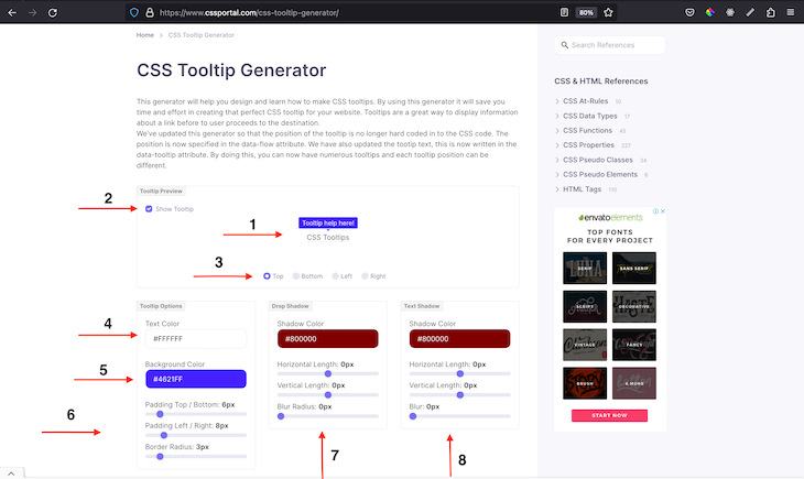
The generator provides an easy-to use-interface for creating a nice looking tooltip. Arrow one is used to preview the tooltip. If you can’t see the tooltip yet, then you need to check the checkbox at menu two, which will allow you test out the tooltip functionality when you hover on menu one.
You can use the menus labelled four, five, and six to set the text color, background color, and paddings and border radius, respectively. You can use menus seven and eight to set drop and text shadow. The code result of the sample in the image above is shown below:
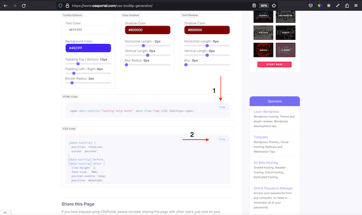
Our customized tooltip can be used in our website as follows:
The Squircley app is a great tool for generating squares, four-sided polygons, and circles. Squircley also provides a downloadable version of the created shape and the generated SVG code:
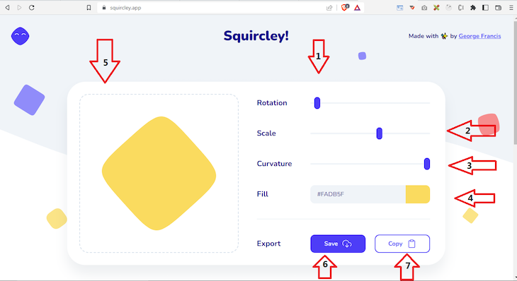
Squircley provides a simple interface that focuses on creating three kinds of shapes. Arrows one, two, and three point to the sliders used to rotate, scale, and apply a curvature to the generated shape. Meanwhile, the fourth arrow is used to specify the shape’s fill or background color. The changes to the shape are visible on the canvas indicated by the fifth arrow.
Interestingly, clicking the Save button at arrow six allows us to download the generated shape as an image that we can use anywhere. Similarly, the seventh arrow points to the Copy button that will copy the generated SVG code of the shape. To use the generated shape, we can embed it in a webpage as follows:
// html (svg)
  <svg viewbox="0 0 200 200" xmlns="http://www.w3.org/2000/svg">
    <path
      d="M 0, 62.5
         C 0, 13.749999999999998 13.749999999999998, 0 62.5, 0
         S 125, 13.749999999999998 125, 62.5
         111.25, 125 62.5, 125
         0, 111.25 0, 62.5"
      fill="#FADB5F"
      transform="rotate(-45,100, 100) translate(37.5,37.5)"
    ></path>
  </svg>
Get Waves is an amazing website that you can use to generate different types of wave shapes for your next project. It also has a feature to generate wave shapes randomly:
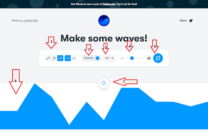
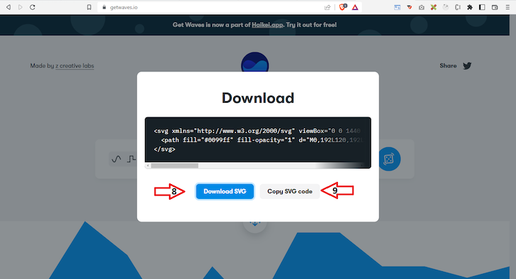
To create a wave shape for your project, you can start from arrow one, which contains the options for the three different types of wave you can generate. You can also select either a fill or outline. Next, set the color and opacity using the second and third arrow menus. Then, we’ll use the fourth arrow menu to vary the distortion of the wave, ranging from a straight line to a spiked line. The best part of this tool is that you can generate a totally random wave shape using the button indicated by the fifth arrow.
The sixth arrow points to the generated shape, while the seventh points to the button that generates a pop-up modal. Finally, the eighth and ninth arrows point to the buttons that you can use to download the shape as an image or copy it as SVG. To use the generated shape, we can embed it into a webpage as follows:
<svg xmlns="http://www.w3.org/2000/svg" viewBox="0 0 1440 320"><path fill="#0099ff" fill-opacity="1" d="M0,288L48,272C96,256,192,224,288,197.3C384,171,480,149,576,165.3C672,181,768,235,864,250.7C960,267,1056,245,1152,250.7C1248,256,1344,288,1392,304L1440,320L1440,320L1392,320C1344,320,1248,320,1152,320C1056,320,960,320,864,320C768,320,672,320,576,320C480,320,384,320,288,320C192,320,96,320,48,320L0,320Z"></path></svg>
A blob is a binary large object; we can use blobs to create visually appealing background images for landing pages, headers, hero pages, and more. Blobmaker provides a great interface for turning triangles, pentagons, and circles into distorted shapes:
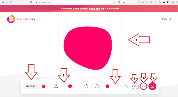
The first arrow points to the end result of our created shape. The second arrow indicates the menu for selecting colors, while the third arrow is used to transition between a triangle, quadrilateral, irregular quadrilateral, and a pentagon. At arrow four, we see the slider for changing a circle into a distorted shape.
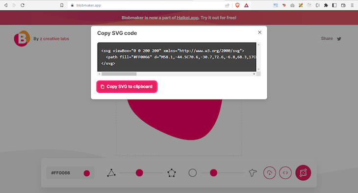
Arrows five and six are used to download the shape as an image and open a modal with the generated styles, respectively. Finally, the button at the seventh arrow is used to automatically generate a random shape. The generated shape for the image above is as follows:
<!--?xml version="1.0" standalone="no"?-->
<svg
  id="sw-js-blob-svg"
  viewBox="0 0 100 100"
  xmlns="http://www.w3.org/2000/svg"
>
  <defs>
    <linearGradient id="sw-gradient" x1="0" x2="1" y1="1" y2="0">
      <stop id="stop1" stop-color="rgba(248, 117, 55, 1)" offset="0%"></stop>
      <stop id="stop2" stop-color="rgba(251, 168, 31, 1)" offset="100%"></stop>
    </linearGradient>
  </defs>
  <path
    fill="url(#sw-gradient)"
    d="M11.6,-22.8C14.1,-18.7,14.5,-13.6,20,-9.7C25.5,-5.7,36.2,-2.9,35.7,-0.3C35.2,2.3,23.6,4.6,16.6,5.9C9.5,7.2,7,7.6,5,10.3C3,13,1.5,18.2,0.4,17.5C-0.8,16.9,-1.6,10.5,-7.5,10C-13.5,9.6,-24.5,15.1,-26.6,14.4C-28.6,13.7,-21.5,6.9,-19,1.5C-16.5,-3.9,-18.5,-7.9,-20.1,-14.9C-21.7,-21.9,-23,-31.9,-19.5,-35.4C-16.1,-39,-8.1,-36,-1.7,-33C4.6,-30,9.2,-26.9,11.6,-22.8Z"
    width="100%"
    height="100%"
    transform="translate(50 50)"
    stroke-width="0"
    style="transition: all 0.3s ease 0s"
  ></path>
</svg>
Another amazing tool on our list is the Softr SVG shape generator, which we can use to generate similar shapes to the Blobmaker:
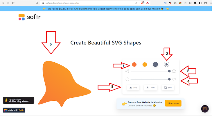
Similar to the tools mentioned above, we can select the color of the shape using the menu at arrow one, and we can toggle random shapes using the menu highlighted by arrow two. The third and fourth arrow menus are used to transition between a triangle, quadrilateral, pentagon, and a circle to a distorted shape. The menu at the fifth arrow provides three options for getting the shape, which include downloading it as a PNG or SVG and copying the code for the shape.
Finally, the generated shape becomes visible on the canvas at the sixth arrow. The code below shows a sample of a generated shape from the Softr shape generator:
<!--?xml version="1.0" standalone="no"?-->
<svg
  id="sw-js-blob-svg"
  viewBox="0 0 100 100"
  xmlns="http://www.w3.org/2000/svg"
>
  <defs>
    <linearGradient id="sw-gradient" x1="0" x2="1" y1="1" y2="0">
      <stop id="stop1" stop-color="rgba(248, 117, 55, 1)" offset="0%"></stop>
      <stop id="stop2" stop-color="rgba(251, 168, 31, 1)" offset="100%"></stop>
    </linearGradient>
  </defs>
  <path
    fill="url(#sw-gradient)"
    d="M19.3,-22C25.2,-18.1,30.3,-12.1,34,-4.1C37.8,4,40.2,14.3,36.3,20.8C32.4,27.3,22.2,30,13.3,30.8C4.4,31.6,-3.1,30.5,-11.3,28.6C-19.5,26.7,-28.3,24,-33.9,17.8C-39.6,11.6,-42.1,1.9,-40,-6.5C-37.9,-14.9,-31,-21.9,-23.6,-25.6C-16.2,-29.2,-8.1,-29.6,-0.7,-28.8C6.7,-27.9,13.4,-25.9,19.3,-22Z"
    width="100%"
    height="100%"
    transform="translate(50 50)"
    stroke-width="0"
    style="transition: all 0.3s ease 0s"
  ></path>
</svg>
Neumorphism is a design style used in graphical user interfaces that combines light and shadows to form amazing shapes. We’ll use Neumorphism.io to generate our shape:
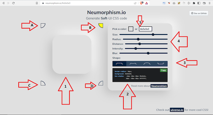
The menus at arrows A, B, C, and D specify the direction where the shadows will come from. In the image above, we selected the option at arrow B. The first arrow shows canvas for displaying the changes to the shape, while the menu at the second arrow will specify the background color where the shape will be used.
The menus at arrow three can specify the size, radius, distance, intensity, and blurriness. The fourth menu arrow can be used to specify the kind of neumorphic shape you want. Finally, you can copy the generated CSS styles:
{
border-radius: 50px;
background: #a6a6a6;
box-shadow: -20px 20px 60px #8d8d8d, 20px -20px 60px #bfbfbf;
}
Loaders are an important in websites, indicating that an action is in progress. We mainly use loaders to tell users to wait while a page or component loads and indicate that an external resource has been fetched or submitted. Website builders commonly use very simple loaders, like in the Sandbox below:
However, this can easily get tiring and boring for users. To spice things up a bit, we’ll create new sets of loaders using this CSS Loading animation Generator:
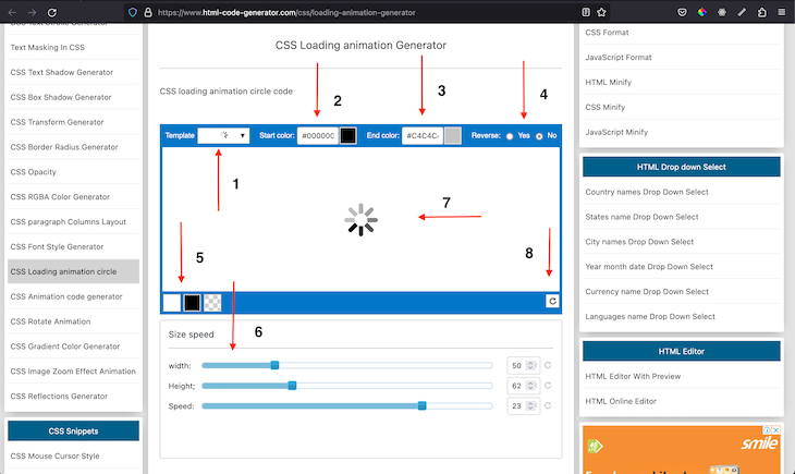
We use menu options two and three to set the colors of the loader at the start and end of the animation, while menu item five adds a background color to the loader container. Interestingly, you can change the direction of the loader using menu option four, and you can change the loading speed, width, and height of the loader using the menu option labelled six. To reset the whole setup, you can use the menu option labelled eight.
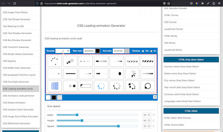
We only see one loader, but when we click on menu option one, we see many loader styles to choose from. The options section should look similar to the image below:
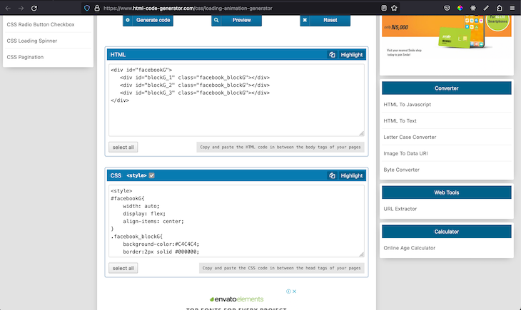
Once we’re satisfied with the loader we created, we can easily generate and copy the HTML and CSS code using the Generate code button:
Now, our code should work seamlessly, like in the CodeSandbox below:
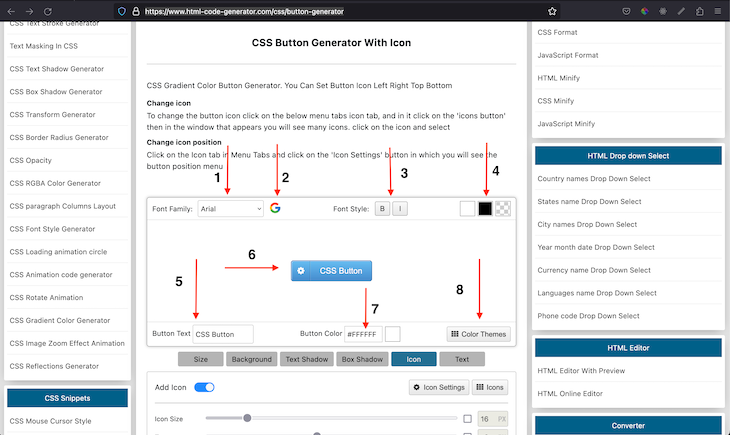
Suppose you’ve been tasked with building a set of buttons, but you don’t have time on your side. You can use this amazing Button Generator to quickly generate buttons with different customization options, like the ability to add icons to the button, change fonts, etc:
The final result of the button is shown in the menu option six. Menu options five, seven, four, and three are used to set the button text, color, layout background color, and font style, respectively.
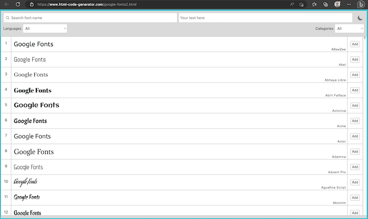
You can use the dropdown at menu option one to select between built-in system font families. However, if you want to use Google Fonts, then menu option two is a safe bet. Clicking on it would show a new dropdown containing the supported Google Fonts:
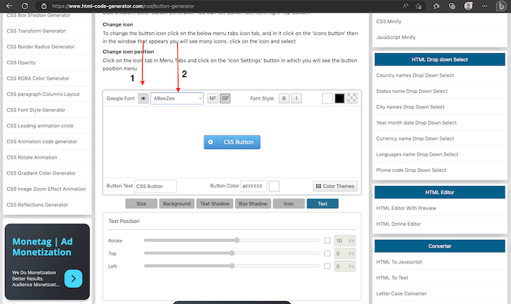
You can press the eye icon labeled one to visually inspect Google Fonts:
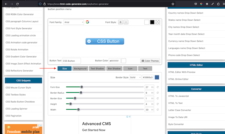
As I mentioned above, the Button Generator provides a lot of customization options for us, like size, background, text shadow, box shadow, icon, text, and color themes. The size option indicated in the image below allows us set the border style, border color, font size, border radius, height, and width of the button:
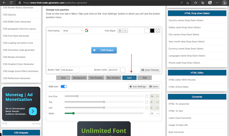
We can use the icon option to change and reposition the icon:
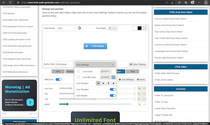
Clicking on Icon Settings allows us to set the icon background color, fore core, position, and location in relation to our button:
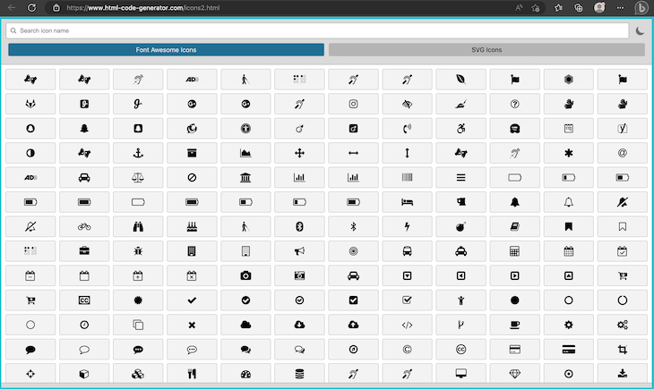
Meanwhile, clicking on Icons Option allows us select the icon of our choice, which will be applied to our button immediately:
Once we’re satisfied with the new button we just created, we can click on the Generate Code button icon to generate the HTML and CSS code for our use case. We can use it in our code like in the following Sandbox:
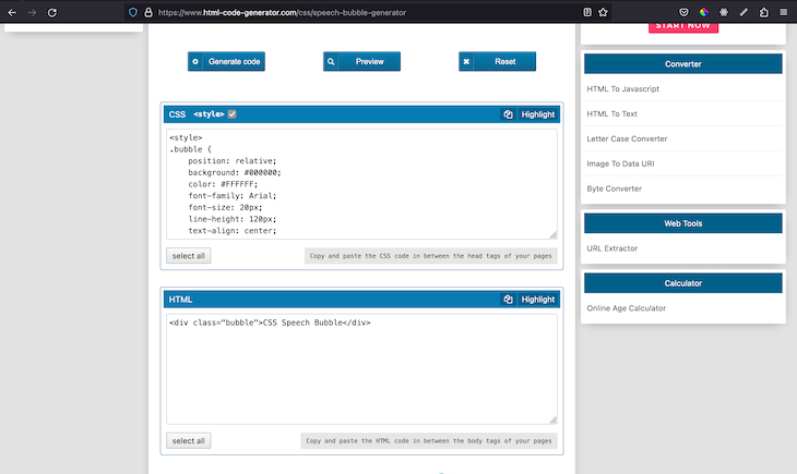
A speech bubble is a fancy box or shape that contains text. Often times, speech bubbles are used to point out fun facts in a webpage or provide better context to a segment of text, like a chat message. To generate a speech bubble, we can use the Speech Bubble Generator:
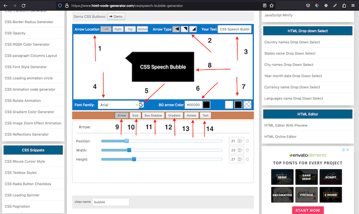
We can preview any changes we make at the arrow labelled eight. We can position the bubble using the menu items labelled one, while menu item two allows us set the style of arrow we want from three available options. We can change the font family using menu items four and five, while six, seven, and three can change the arrow background color, container background color, and the current text in the bubble, respectively.
Suppose we want to add more enhancements to the speech bubble; we can use the menu items from nine to fourteen to modify the position, width, and height of the arrow, size, box shadow, gradient, rotation, and text font, respectively.
We can click on the generate code button to generate the HTML and CSS for our speech bubble:
Our bubble should look similar to the CodeSandbox below:
Pattern Monster is an amazing tool that we can use to generate cool patterns for background images, packaging design, branding, and much more. Navigate to the homepage, and you’ll see a bunch of default designs that you can choose from:
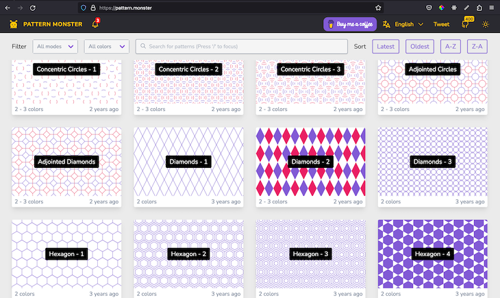
Next, we’ll select a design to begin with; I’ll choose Diamonds- 2. It will take us to a new page where we can customize the default pattern we selected:
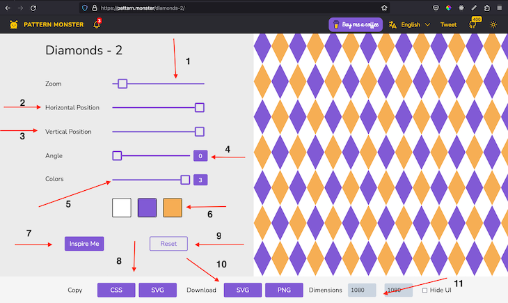
Interestingly, we can zoom in or out of the pattern with menu option one. We can also adjust the horizontal and vertical position as well as the angle of the patterns with options two, three, and four. We can use options five and six to increase or decrease the number of color slots that will be available in the pattern and change a particular color slot.
If you’re not feeling creative at the moment, you can use the inspire me button, labelled seven, to allow the system generate a random pattern for you. If you want to go back to the initial pattern and styles, you can use the reset button labelled nine.
Moreover, you can specify the dimension you want the pattern container to assume using the dimensions menu labelled eleven. Finally, you can copy the CSS or SVG code of the generated pattern and use in your website like in the CodeSandbox below or download it as an SVG or PNG image:
clip-path generatorWe can use the CSS clip-path property to cut out any path of an element to be either hidden or shown. clip-path can help us generate really interesting and complex backgrounds or elements, like triangles, diamonds, squares, crosses, and more. However, using clip-path can be very daunting, hence the creation of this amazing clip-path maker. The landing page should look similar to the image below:
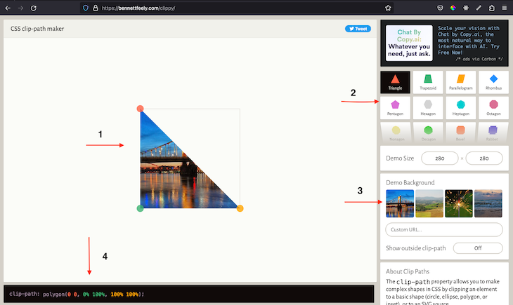
The clip-path generator provides very crucial menu options, like the menu for changing the shape of the clip, labelled two. You can easily change the background color or provide the link to your preferred image. When you’re satisfied with the result, you can use the generated code labelled four in your code:
// HTML
.wrapper {
clip-path: polygon(0 0, 0% 100%, 100% 100%);

background-image: url(https://live.staticflickr.com/4042/4227008489_5724dcb3a7_c.jpg);
width: 500px;
height: 500px;
}
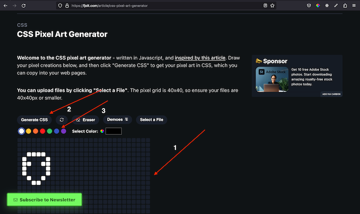
Pixel art is a form of digital art created with graphical software where images are built using only pixels. We can use this CSS Pixel Art Generator to generate pixel art for our website:
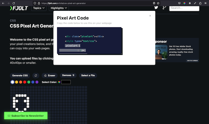
Generally, we can make any kind of shape in the canvas labelled one and change the color of the pixels using menu option three. We can click on the Generate CSS menu item labelled two to open up a popup with the generated HTML and CSS. The popup should look like the following:
We can use the generated code as demonstrated in the CodeSandbox below:
We can put more emphasis on an element by using or combining different kinds of styles, like borders, background colors, etc. However, we can draw even more attention by using styling that makes them appear as if they’re glowing.
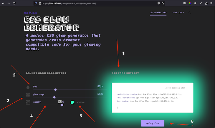
By using box shadows, we can easily generate a glow that can draw some serious attention to elements. To speed up the whole process, we’ll use this amazing CSS Glow Generator. The CSS Glow Generator is fairly simple. It comes with default glow styles but allows users to vary the size and blurriness of the glow using two sliders, labeled two and three in the image below.
Similarly, we can control the transparency of the glow as well as the color of the glow using menu options four and five, while menu option one shows the result. Finally, we can copy the generated styles using menu option six:
Finally, we can use the generated styles in our website like in the demo below:
In this article, we reviewed fifteen amazing tools that we can use to generate CSS styles. We explored how to generate starbursts, polygons, waves, blobs, speech bubbles, and more. These tools enhance how we use CSS and enable us to easily implement cool shapes in our projects.
Thank you for reading through, and I hope you enjoyed this article. Let me know in the comments which CSS shape tool was your favorite. Happy coding!
As web frontends get increasingly complex, resource-greedy features demand more and more from the browser. If you’re interested in monitoring and tracking client-side CPU usage, memory usage, and more for all of your users in production, try LogRocket.

LogRocket lets you replay user sessions, eliminating guesswork around why bugs happen by showing exactly what users experienced. It captures console logs, errors, network requests, and pixel-perfect DOM recordings — compatible with all frameworks.
LogRocket's Galileo AI watches sessions for you, instantly identifying and explaining user struggles with automated monitoring of your entire product experience.
Modernize how you debug web and mobile apps — start monitoring for free.

Compare the top AI development tools and models of July 2026. View updated rankings, feature breakdowns, and find the best fit for you.

Learn how to detect unused and ghost dependencies in JavaScript projects using Knip, a project-level linter that keeps your dependency graph accurate.

Learn how Storybook MCP enables AI agents to understand your component library, generate accurate UI, and validate code using documentation, stories, and automated tests.
Debug RSC hydration mismatches in production with Next.js instrumentation, Suspense isolation, HTML diffing, and CI smoke tests.
Would you be interested in joining LogRocket's developer community?
Join LogRocket’s Content Advisory Board. You’ll help inform the type of content we create and get access to exclusive meetups, social accreditation, and swag.
Sign up now

 Learn more →
