
The myth that minimalist design equates to usable design is well-documented. In designers’ attempts to create interfaces that reduce complexity, they often oversimplify content and interactions based on ideas of simplicity rather than the nuances of the content and needs of the audience.

Aesthetic simplicity is treated as the de facto standard for good design, even when dense, information-rich interfaces — despite their apparent complexity — can be clearer and more usable in many situations.
In this article, we’ll cover what information density is and how designers and developers should consider it when designing and building web and mobile applications.
The Replay is a weekly newsletter for dev and engineering leaders.
Delivered once a week, it's your curated guide to the most important conversations around frontend dev, emerging AI tools, and the state of modern software.
Information density refers to the amount of informational content in an interface — “data ink,” to use Edward Tufte’s phrase — and is measured by the proportion of information to available space. Ultimately, web and mobile apps should find the right information density for a given interface in order to balance both context and design instead of only seeking surface simplicity.
On digital screens, this can include static or interactive content: text, microcopy, labels, links, buttons, controls, diagrams — anything that is instructive or usable, as opposed to purely aesthetic. Data-rich, high-density displays have an abundance of content, whereas data-thin, low-density displays are relatively spare.

There isn’t a universal rule for the right level of information density. The success of an interface depends largely on the extent to which the designer finds the appropriate density for a given context, content, audience, and screen size, the last of which complicates this work.
A layout that achieves an ideal level density on desktop, for example, may become overly dense on a mobile screen, whereas a mobile layout can feel overly simplistic on desktop. Usability and comprehension issues can arise at either end of the spectrum.
Rather than arbitrarily simplifying seemingly “busy” designs, a designer’s task is to artfully manage complexity. Here are some principles and tips to help product teams find ideal information density when working with rich, responsive interfaces.
Interface design focuses on creating context to help people understand the task and content at hand. While the legacy of people like Dieter Rams (“My intention is to omit every unneeded element”) and John Maeda (“The simplest way to achieve simplicity is through thoughtful reduction. When in doubt, just remove”) have conditioned designers to remove superfluous design elements, the emphasis on subtraction can be at the expense of effective context creation, which requires adding detail.
Less emphasized are Rams’ and Maeda’s exhortations to “make a product understandable” and “be careful of what you remove [from a design],” respectively.
When designing interfaces at low fidelity, I find it helpful to incrementally incorporate high-fidelity content — including, for example, microcopy, contextual help text, representative body copy, and key data, etc.
Considering representative content from the start requires designers to make decisions about visual hierarchy while working through the core elements of an interaction.
Consider what questions might a user be asking of this interface. What relevant information can I incorporate to help them answer those without leaving their context? How can I adjust the interaction to make it more understandable to first-time users and efficient for repeat users?
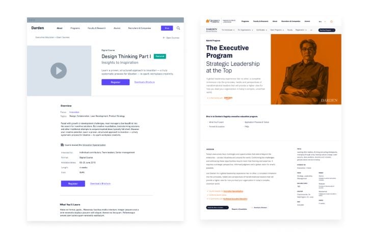
Like filling in the outlines of a coloring book drawing, I treat wireframes as the conceptual boundaries for the final design; as I work in higher fidelity, I’m introducing aesthetic refinements and incorporating detail as I spend more time with the design and put it through usability tests.
The mobile-first design movement was in part a response to poorly handled information density — full desktop websites shoehorned into mobile viewport widths, resulting in unreadably small content and awkward panning and zooming.
Yet as designers learned to prioritize essential elements for small screens and work in fluid grid systems, layouts optimized for mobile viewing risked becoming vacant on desktop and monitor widths.
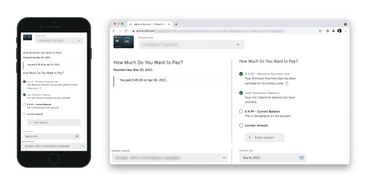
Beyond creating patterns for responsive content behavior (defining stacking rules, for example), it can be helpful to consider ways to maintain similar levels of information density across the range of screen sizes — thus, the creation of responsive design in web development.
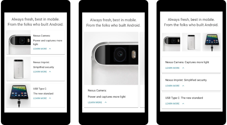
Mobile interfaces don’t need to be sparse to be usable or attractive. A good example of this can be seen in my colleague Kevin’s article about responsive screen heights. He argues that standard content stacking conventions lead to unnecessarily long pages on smaller devices. His explorations show how density can be increased even on marketing pages to good effect.
Some interfaces are too complex to effectively scale down, requiring significant reworking of layouts, navigation structure, and interactions.
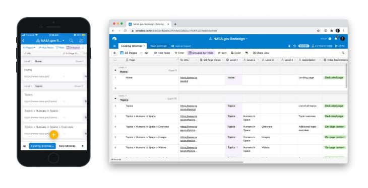
It’s one reason why information-rich products with high levels of interactivity like Airtable create an entirely separate mobile application for showing the same data that users can access on desktop.
In the screenshots below, the browser viewport (1280px × 694px) is about 3.5x larger than the mobile viewport (375px × 667px), and shows 63 table cells compared to the mobile viewport’s 12 cells.
Were the mobile viewport able to display 6 more cells, it would more or less match the proportional density of the desktop view. All things considered, Airtable effectively handles each viewport density well.
Although content — not aesthetic — considerations should prompt designers to work at higher density levels, accessibility standards can serve as guides for preventing interfaces from becoming overly dense.
Even though minimum font size hasn’t been defined for the web (readability depends on the alphabet, contrast ratio, and user’s vision), it’s generally agreed that somewhere around 12px is a good minimum for interface text.
Another helpful reference is mobile touch target size, which Google’s Material Design spec defines as at least 48px square. (It should be noted that the visual representation of the linked element can be smaller than 48px square, but the effective clickable area should be at least that size).
The Material Design density guidelines give helpful examples for maintaining accessibility when introducing higher levels of density.
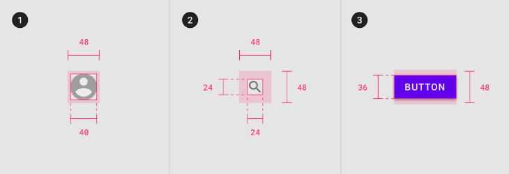
The purpose of increasing density is to help people understand and interact with the content, and the best way to validate that is through usability and comprehension testing — especially on mobile devices.
Apart from standard task usability measures, product teams might keep an eye out for a few things when testing dense interfaces:
The aversion to high-density interfaces is largely an aversion to poorly designed dense interfaces. In his classic The Elements of User Experience, Jesse James Garrett notes that, “When people comment that a design is ‘busy’ or ‘cluttered,’ they’re really reacting to the fact that the design doesn’t lead them smoothly around the page.” The designer has failed to establish clear information and visual hierarchy.
The issue isn’t with the content itself, but how it’s displayed. By reframing complexity as a design problem, and not a content problem, more information that is thoughtfully displayed makes for a more informed, clearer interaction.
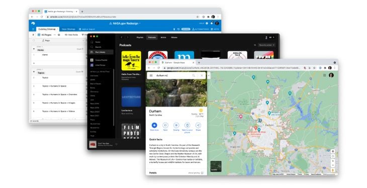
As designers recognize the usability of everyday, information-dense applications like Airtable, Spotify, and Google Maps, they should seek the best level of density rather than the minimal level, seeking the elegance that can result from well-considered displays of complex content.
Install LogRocket via npm or script tag. LogRocket.init() must be called client-side, not
server-side
$ npm i --save logrocket

// Code:

import LogRocket from 'logrocket';
LogRocket.init('app/id');
// Add to your HTML:

<script src="https://cdn.lr-ingest.com/LogRocket.min.js"></script>
<script>window.LogRocket && window.LogRocket.init('app/id');</script>

Build a CRUD REST API with Node.js, Express, and PostgreSQL, then modernize it with ES modules, async/await, built-in Express middleware, and safer config handling.

Discover what’s new in The Replay, LogRocket’s newsletter for dev and engineering leaders, in the March 25th issue.

Discover a practical framework for redesigning your senior developer hiring process to screen for real diagnostic skill.

I tested the Speculation Rules API in a real project to see if it actually improves navigation speed. Here’s what worked, what didn’t, and where it’s worth using.
Would you be interested in joining LogRocket's developer community?
Join LogRocket’s Content Advisory Board. You’ll help inform the type of content we create and get access to exclusive meetups, social accreditation, and swag.
Sign up now