Editor’s note: This article was last updated by Mamta Dalal on 10 July 2024 to include more clickable UI components with shadows, as well as to share a variety of various third-party libraries for adding shadows in React Native applications.
Applying box shadows in a React Native app is not always straightforward. Because developers must build for both Android and iOS platforms, applying consistent box shadows with different platform-specific implementation processes can be tedious.
In this article, we will learn how to implement box shadows in a React Native app across the Android and iOS platforms.
The Replay is a weekly newsletter for dev and engineering leaders.
Delivered once a week, it's your curated guide to the most important conversations around frontend dev, emerging AI tools, and the state of modern software.
There are four React Native shadow props we can use to create shadow boxes for iOS devices. The first is shadowColor, which determines the box shadow’s color. This is the only shadow prop that works for Android devices.
The second prop, shadowOffset, accepts objects containing width and height properties with a numerical value:
{ width: number; height: number}
Because it is described by the X and Y offsets relative to the element the box shadow is applied to, the width property determines the X offset of the shadow while the height property determines the Y offset.
Both width and height props can accept positive and negative values.
The third React Native shadow prop, shadowOpacity, sets the transparency of the box shadow. The prop’s value ranges from 0 to 1, with 0 representing complete transparency and 1 representing complete opacity.
The fourth prop is shadowRadius, which accepts a number as its value to set the blur radius of the component. The larger the value, the larger the blur, making the shadow bigger and lighter. This prop does not accept negative values.
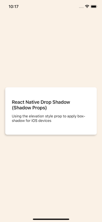
Now, let’s use these props by applying a box shadow to a card component with the following code:
// wherever your return statement is
  <View style={[styles.card, styles.shadowProp]}>
        <View>
          <Text style={styles.heading}>
            React Native Box Shadow (Shadow Props)
          </Text>
        </View>
        <Text>
          Using the elevation style prop to apply box-shadow for iOS devices
        </Text>
      </View>
Next, import StyleSheet to apply multiple styles to the card component:
// remember to import StyleSheet from react-native
const styles = StyleSheet.create({
  heading: {
    fontSize: 18,
    fontWeight: '600',
    marginBottom: 13,
  },
  card: {
    backgroundColor: 'white',
    borderRadius: 8,
    paddingVertical: 45,
    paddingHorizontal: 25,
    width: '100%',
    marginVertical: 10,
  },
  shadowProp: {
    shadowColor: '#171717',
    shadowOffset: {width: -2, height: 4},
    shadowOpacity: 0.2,
    shadowRadius: 3,
  },
});
With the code added, the app renders a card with a box shadow:
styles.elevation prop for Android box shadowsTo add box shadows in Android, we can use the elevation prop, which uses the Android Elevation API.
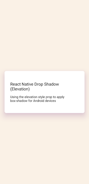
Let’s apply a box shadow to a card component to learn how to use a box shadow with this method. Note that the styles.elevation prop only works when it is applied to a <View> component:
// wherever your return statement is
<View style={[styles.card, styles.elevation]}>
        <View>
          <Text style={styles.heading}>
            React Native Box Shadow (Elevation)
          </Text>
        </View>
        <Text>
          Using the elevation style prop to apply box-shadow for Android devices
        </Text>
</View>
Next, import the StyleSheet again to style the card:
// remember to import StyleSheet from react-native
const styles = StyleSheet.create({
  heading: {
    fontSize: 18,
    fontWeight: '600',
    marginBottom: 13,
  },
  card: {
    backgroundColor: 'white',
    borderRadius: 8,
    paddingVertical: 45,
    paddingHorizontal: 25,
    width: '100%',
    marginVertical: 10,
  },
  elevation: {
    elevation: 20,
    shadowColor: '#52006A',
  },
});
By setting the elevation to 20 with a shadowColor, we can apply a box shadow to our Android card component:
Notice that there is no control over the blur radius, opacity, and offset of the box shadow; we only have control over the color of the shadow.
In this section, we will combine the elevation style props and shadow props to implement box shadows for both Android and iOS devices rather than using two separate processes.
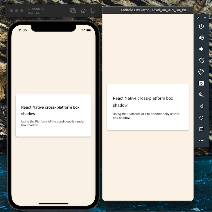
Using the React Native Platform API, let’s create a function we can later invoke to conditionally render a box shadow for our card component based on a user’s device.
We’ll begin by setting up the card:
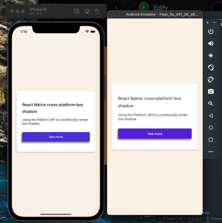
 <View style={[styles.card, styles.boxShadow]}>
        <View>
          <Text style={styles.heading}>
            React Native cross-platform box shadow
          </Text>
        </View>
        <Text>Using the Platform API to conditionally render box shadow</Text>
</View>
Next, under our styles object, let’s create the generateBoxShadowStyle function that applies the box shadow based on a user’s operating system:
const generateBoxShadowStyle = (
  xOffset,
  yOffset,
  shadowColorIos,
  shadowOpacity,
  shadowRadius,
  elevation,
  shadowColorAndroid,
) => {
  if (Platform.OS === 'ios') {
    styles.boxShadow = {
      shadowColor: shadowColorIos,
      shadowOffset: {width: xOffset, height: yOffset},
      shadowOpacity,
      shadowRadius,
    };
  } else if (Platform.OS === 'android') {
    styles.boxShadow = {
      elevation,
      shadowColor: shadowColorAndroid,
    };
  }
};
With the code we just implemented, our app can now check the user’s device platform and apply the appropriate box shadow props.
Next, let’s invoke the generateBoxShadowStyle function and pass in the value of our shadow and elevation props as arguments:
generateBoxShadowStyle(-2, 4, '#171717', 0.2, 3, 4, '#171717');
This renders the following to both platforms:
To simplify our workflow, use the React Native Shadow Generator tool to generate the code for a box shadow and see a preview of the box shadow on both Android and iOS.
While we applied a standard box shadow, there are use cases when we may need full control of the box shadow’s offset, opacity, and blur radius. These use cases can include:
<FlatList> or <Pressable> component with a custom styleWith the current implementation, this design flexibility is not possible. However, we can overcome these limitations with the react-native-drop-shadow package.
react-native-drop-shadowThe react-native-drop-shadow package is a View component that takes its nested component, creates a bitmap representation, and then blurs and colors it to the style’s shadow values, similar to applying shadows in iOS with the shadow props.
To get started, install react-native-drop-shadow using one of the following commands:
yarn add react-native-drop-shadow
#or
npm i react-native-drop-shadow
Once the installation is complete, re-sync the Android Gradle build toolkit or restart the development server.
Next, we can import the package:
import DropShadow from "react-native-drop-shadow";
Now, let’s create a custom button using the <Pressable> component and wrap it with the DropShadow component we just imported.
The box shadow on the button in the screenshot below is what we want to create. Notice the consistency in both Android and iOS platforms:

The DropShadow component is the parent component of our <Pressable> component, which we styled to look like a button. We want it in this order because we want to apply the drop shadow to our button and not the text in the button:
// wherever your return statement is
// Don't forget to import the Pressable component from react-native
<DropShadow style={styles.shadowProp}>
          <Pressable
            style={styles.button}
            onPress={() => console.log('pressed')}>
            <Text style={(styles.text, styles.buttonText)}>See more</Text>
          </Pressable>
</DropShadow>
To make our <Pressable> component look like a button and add the drop shadow to the DropShadow component, add the following stylesheet:
const styles = StyleSheet.create({
shadowProp: {
    shadowColor: '#171717',
    shadowOffset: {width: 0, height: 3},
    shadowOpacity: 0.4,
    shadowRadius: 2,
  },
  button: {
    backgroundColor: '#4830D3',
    alignItems: 'center',
    justifyContent: 'center',
    height: 42,
    borderRadius: 4,
    marginTop: 30,
  },
  buttonText: {
    color: '#fff',
  },
  text: {
    fontSize: 16,
    lineHeight: 21,
    fontWeight: 'bold',
    letterSpacing: 0.25,
  },
});
Besides the Pressable component, DropShadow can also be applied to other clickable components such as TouchableOpacity and TouchableHighlight.
Let’s take an example:
   <ScrollView style={{ backgroundColor: 'white' }}>
    <View style={{ margin: 16 }}>
       <DropShadow style={styles.shadowProp}>
        <TouchableOpacity style={styles.button}
                                 onPress={this.onClick}>
        <Text style={{fontSize: 30}}>Click Here</Text>
        </TouchableOpacity>
      </DropShadow>
      </View>
  </ScrollView>
The stylesheet code would be:
   const styles = StyleSheet.create({
    button: {
    backgroundColor: '#DAF7A6',
    alignItems: 'center',
    justifyContent: 'center',
    height: 42,
    borderRadius: 4,
    marginTop: 30,
  },
  buttonText: {
    color: '#fff',
  },
  shadowProp: {
    shadowColor: '#C70039',
    shadowOffset: {width: 0, height: 3},
    shadowOpacity: 0.4,
    shadowRadius: 2,
    elevation:16,
  },
});
This renders a TouchableOpacity component with a reddish shadow:

You could also render a clickable View by enclosing it within a Touchable component, such as a TouchableHighlight, and then add a shadow to the clickable View as well:
 <ScrollView style={{ backgroundColor: 'white' }}>
      <View style={{ margin: 16 }}>
        <DropShadow style={styles.shadowProp}>
        <TouchableHighlight onPress={() => {
        Alert.alert("Touchable Highlight pressed.");
      }}
        style={styles.touchable}
        activeOpacity={0.5}
        underlayColor="#67c904"
      >
        <Text style={styles.text}>Click Me!</Text>
      </TouchableHighlight>
      <TouchableHighlight style={styles.button} underlayColor={"COLOR"}
      style = {styles.button} onPress = {() => this.onClickView()}>
   <View >
       <Text style={{fontSize: 20}}>Click First</Text>
    </View>
   </TouchableHighlight>
  </DropShadow>
 </View>
</ScrollView>
Use the following stylesheet to apply the styles:
const styles = StyleSheet.create({
button: {
    backgroundColor: '#DAF7A6',
    alignItems: 'center',
    justifyContent: 'center',
    height: 42,
    borderRadius: 4,
    marginTop: 30,
  },
  touchable: {
    height: 50,
    width: 200,
    borderRadius: 10,
    alignItems: 'center',
    justifyContent: 'center',
    backgroundColor: '#FFC300'
  },
  buttonText: {
    color: '#fff',
  },
  shadowProp: {
    shadowColor: '#C70039',
    shadowOffset: {width: 0, height: 3},
    shadowOpacity: 0.4,
    shadowRadius: 2,
    elevation:16,
  },
});
As you can see, the TouchableHighlight has also been rendered with a drop shadow:

react-native-shadow-2The react-native-shadow-2 package is an improved version of react-native-shadow that provides more functionalities, TypeScript support, and is written from scratch to reduce dependencies that affect performance.
Unlike implementing a drop shadow with react-native-drop-shadow, which creates a bitmap representation of its child components, react-native-shadow-2 uses the react-native-svg shadow plugin for consistent implementation across the Android and iOS platforms.
To get started, install both of these packages in the project directory root:
yarn add react-native-svg react-native-shadow-2
#or
npm i react-native-svg react-native-shadow-2
To ensure this runs on iOS, CD into the ios directory and run pod install to sync the packages we just installed:
// import the package right at the top
import {Shadow} from 'react-native-shadow-2';

// wherever your return statement is
<Shadow
        distance={5}
        startColor={'#00000010'}
        containerViewStyle={{marginVertical: 20}}
        radius={8}>
        <View style={[styles.card, {marginVertical: 0}]}>
          <View>
            <Text style={styles.heading}>
              React Native cross-platform box shadow
            </Text>
          </View>
          <Text style={styles.boxShadow}>
            Using the Platform API to conditionally render box shadow
          </Text>
          <DropShadow style={styles.shadowProp}>
            <Pressable
              style={styles.button}
              onPress={() => console.log('pressed')}>
              <Text style={(styles.text, styles.buttonText)}>See more</Text>
            </Pressable>
          </DropShadow>
        </View>
      </Shadow>
The code produces the following:
Several shadow generator tools are available to facilitate the easier creation of shadows in React Native apps and make things easier for developers.
The React Native Shadow Generator tool mentioned earlier was created by Ether Creative. It’s a simple tool that lets developers adjust shadow depths using a slider. However, this tool doesn’t offer a GUI to customize other shadow properties:

Another shadow generator tool not only allows developers to customize the depth but also allows them to set the shadow color. It also renders previews for both Android and iOS devices:

After playing around with the depth and the color using the slider and color picker, you can simply copy the shadow properties code into your app and run the app. It’s as easy as that!
This shadow generator for mobile frameworks offers an even better GUI style customization for developers, where they can select width, height, radius, color, and opacity.
Although the website for the tool shows previews only for iOS devices, the code can also be applied to Android devices:

Let’s now try copying the shadow properties code generated through this tool in an application and test it out. We’ll create a View for a card, a Text component, and a Pressable. We’ll apply the code from the tool to both the View and the Pressable component:
<View style={styles.container}>
      <View style={[styles.card, styles.shadowProp]}>
        <View>
          <Text>
            React Native cross-platform shadows
          </Text>
        </View>
         <Pressable style={[styles.button, styles.shadowProp]}
            onPress={() => console.log('pressed')}>
            <Text>Click here</Text>
          </Pressable>
      </View>
</View>
The shadow properties can be added through the stylesheet as shown below:
const styles = StyleSheet.create({
  container: {
    flex: 1,
    justifyContent: 'center',
    alignItems: 'center',
    backgroundColor: '#FAF1E6',
    paddingHorizontal: 20,
  },
  card: {
    backgroundColor: 'white',
    borderRadius: 8,
    paddingVertical: 45,
    paddingHorizontal: 25,
    width: '100%',
    marginVertical: 10,
  },
  shadowProp: {
  shadowColor:'#C70039',
      shadowOffset: {
      width: 8,
      height: 8,
},
  shadowOpacity: 1,
  shadowRadius: 0,
  elevation: 16,
},
  button: {
    backgroundColor:  '#DAF7A6' ,
    alignItems: 'center',
    justifyContent: 'center',
    height: 42,
    borderRadius: 4,
    marginTop: 30,
  },
});
Another React Native shadow generator tool works on Edge and Chrome browsers. It features a customizable slider to adjust a component’s shadow depth and provides a preview for both Android and iOS. However, other shadow properties cannot be customized with this tool.
In this context, the tool is quite basic. You can copy the code from their site and then do your fine-tuning to customize other properties:

Another unimaginatively named tool is the shadow generator tool by dotmind, which is more advanced than those described above. It doesn’t provide a slider or GUI mechanism to customize shadow properties nor does it render any preview on the site. Instead, you install the tool in your project folder and then use it in your code:
yarn add @dotmind/rn-shadow-generator
npm i @dotmind/rn-shadow-generator –save
I tweaked the example from dotmind’s React Native Shadow Generator to create a simple app that displays a Pressable component and a set of Text components, all of which have shadows, albeit with different properties.
The ShadowView component provided by the tool has three customizable properties: 1) level, which can increase shadow dimensions, 2) shadowColor, which helps change the shadowColor style attribute, and 3) direction, which helps to change shadow direction.
The markup and the stylesheet code are given below:
import { DirectionType, ShadowView } from '@dotmind/rn-shadow-generator';
. . .
 type ItemType = {
  level: number;
  shadowColor?: string;
  direction?: DirectionType;
};

const BASIC_ITEMS: ItemType[] = [
  { level: 8 },
  { level: 16 },
  { level: 22 },
];

const App = () => {
  const _renderItem = useCallback(
    ({
      item: { level, shadowColor, direction },
    }: {
      item: ItemType;
      index: number;
    }) => {
      return (
        <ShadowView
          level={level}
          shadowColor={shadowColor}
          direction={direction}
          style={styles.shadowContainer}>

          {<Text style={styles.propsTypeLabel}>
            Text <Text style={styles.valueLabel}>{'X'}</Text>
          </Text>}
        </ShadowView>
      );
    },
    [],
  );

  return (
    <ScrollView >
      <ShadowView level={16} shadowColor='#17202a' direction={'bottom'} >
        <Pressable
          style={styles.button}
          onPress={() => console.log('pressed')}>
          <Text style={(styles.buttonText)}>Click Here</Text>
        </Pressable>
      </ShadowView>
      <FlatList
        data={BASIC_ITEMS}
        renderItem={_renderItem}
        numColumns={2}
        contentContainerStyle={styles.flatListContentContainer}
        keyExtractor={(_, index) => index.toString()}
        scrollEnabled={false}
      />
    </ScrollView>
  );
};

const styles = StyleSheet.create({

  button: {
    backgroundColor: '#DAF7A6',
    alignItems: 'center',
    justifyContent: 'center',
    height: 30,
    borderRadius: 12,
    marginTop: 30,
  },
  buttonText: {
    color: '#000',
  },

  flatListContentContainer: {
    paddingVertical: 20,
  },

  propsTypeLabel: {
    fontFamily: 'Avenir Next',
    textAlign: 'center',
    fontSize: 12,
  },
  valueLabel: {
    fontFamily: 'Avenir Next',
    textAlign: 'center',
    fontWeight: '600',
  },
  shadowContainer: {
    margin: 20,
    marginBottom: 30,
    marginTop: 0,
    height: 50,
    flex: 1,
    alignItems: 'center',
    justifyContent: 'center',
    borderRadius: 5,
  },
});
The code above renders the following output:

Finally, another great shadow generator tool is react-native-fast-shadow. This tool also belongs to the ‘download and install’ category. As the name suggests, the USP of this tool is its speed:
npm install react-native-fast-shadow
yarn add react-native-fast-shadow
Here’s an example use case:
import { ShadowedView } from 'react-native-fast-shadow';
. . .
<ShadowedView
  style={{
    shadowOpacity: 0.4,
    shadowRadius: 12,
    shadowOffset: {
      width: 5,
      height: 3,
    },
  }}
>
  <Image source={require('./kitten.png')} style={{ borderRadius: 30 }} />
</ShadowedView>
To test the tool, I reused code from the example given at the site and tweaked it a bit:
import { ShadowedView, shadowStyle } from 'react-native-fast-shadow';
. . .
const App: () => Node = () => {
  console.log(Platform.OS === 'ios');
    return (
    <ScrollView style={{ backgroundColor: 'white' }}>
      <View style={{ margin: 16 }}>
        <View style={{ flexDirection: 'row', marginBottom: 20 }}>
          <ShadowedView
            style={{
              width: 150,
              height: 200,
              borderRadius: 20,
              borderBottomRightRadius: 50,
              backgroundColor: '#dbfff2',
              borderColor: '#7af0c5',
              marginRight: 20,
              ...shadowStyle({
                opacity: 0.4,
                radius: 12,
                offset: [5, 3],
              }),
            }}
          />
          <ShadowedView
            style={{
              width: 60,
              height: 60,
              borderRadius: 30,
              backgroundColor: '#d6dbff',
              ...shadowStyle({
                color: '#221db2',
                opacity: 0.8,
                radius: 10,
                offset: [0, 3],
              }),
            }}
          />
        </View>

        <View
          style={{
            width: 250,
            height: 200,
            marginBottom: 20,
          }}
        >
        </View>

        <ShadowedView
          style={{
            alignSelf: 'flex-start',
            ...shadowStyle({
              color: '#221db2',
              opacity: 0.4,
              radius: 25,
              offset: [5, 3],
            }),
            marginBottom: 20,
          }}
        >
          <Image
            style={{ borderRadius: 60 }}
            source={require('./assets/kitten.png')}
          />
        </ShadowedView>
      </View>
    </ScrollView>
  );
};
This code produces the following output:

The major problem with shadow props in React Native is that they cannot be used in Android applications.
However, by using react-native-drop-shadow and react-native-shadow-2, we can easily implement consistent box shadows in our React Native apps for both Android and iOS platforms. Several third-party tools and libraries also facilitate the creation of shadows for both these platforms.
The full code used in this tutorial is available on GitHub. Feel free to drop a comment to let me know what you think of this article. You can also find me on Twitter and GitHub. Thank you for reading!

LogRocket's Galileo AI watches sessions for you and and surfaces the technical and usability issues holding back your React Native apps.
LogRocket also helps you increase conversion rates and product usage by showing you exactly how users are interacting with your app. LogRocket's product analytics features surface the reasons why users don't complete a particular flow or don't adopt a new feature.
Start proactively monitoring your React Native apps — try LogRocket for free.

Learn how to build a full React Native auth system using Better Auth and Expo — with email/password login, Google OAuth, session persistence, and protected routes.

Compare the top AI development tools and models of June 2026. View updated rankings, feature breakdowns, and find the best fit for you.

Learn how Bloom filters reduce database lookups for username availability checks while preserving correctness at scale.
Learn how to test Nuxt apps with Vitest, @nuxt/test-utils, runtime mocks, server route mocks, and Playwright e2e tests.
Hey there, want to help make our blog better?
Join LogRocket’s Content Advisory Board. You’ll help inform the type of content we create and get access to exclusive meetups, social accreditation, and swag.
Sign up now

 Learn more →
