Editor’s note: This article was last updated on 25 August 2023 to add information about advanced animation techniques for your React project, including micro-interactions and chaining animation sequences.

Animation provides a compelling user experience for modern web apps, bringing them to life and avoiding that dreaded flat look. But adding animations can be a difficult and time-consuming task, and if your app has multiple components, it only gets more complicated!
In this article, we’re going to take a look at how you can add animation to React components with a single line of code using the AutoAnimate library.
Jump ahead:
The Replay is a weekly newsletter for dev and engineering leaders.
Delivered once a week, it's your curated guide to the most important conversations around frontend dev, emerging AI tools, and the state of modern software.
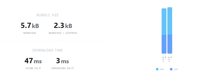
AutoAnimate is an open source animation utility library with zero configuration that adds smooth transitions to React components while also being very lightweight (2.3KB):
Most animation libraries require more configuration, and some require changing the existing component structure to apply animations. AutoAnimate, however, requires only a single line of code to animate components and does not require changing any existing components. It also offers the benefit of being straightforward to integrate with an existing codebase.
AutoAnimate makes for a smooth experience when an element changes in the DOM. In the following section, we’ll compare AutoAnimate with React Transition Group, which is a simple transition library for component entering and exiting, but with some additional configurations.
Let’s create an alert message with React Transition Group and AutoAnimate so you can see the difference between the libraries for yourself.
The following component shows how to add animation using React Transition Group:
App.jsx
import React, { useState, useRef } from 'react';
import { createRoot } from 'react-dom/client';
import { Container, Button, Alert } from 'react-bootstrap';
import { CSSTransition } from 'react-transition-group';

import 'bootstrap/dist/css/bootstrap.min.css';
import './styles.css';

function Example() {
  const [showButton, setShowButton] = useState(true);
  const [showMessage, setShowMessage] = useState(false);
  const nodeRef = useRef(null);

  return (
    <Container style={{ paddingTop: '2rem' }}>
      {showButton && (
        <Button
          onClick={() => setShowMessage(true)}
          size="lg"
        >
          Show Message
        </Button>
      )}
      <CSSTransition
        in={showMessage}
        nodeRef={nodeRef}
        timeout={300}
        classNames="alert"
        unmountOnExit
        onExited={() => setShowButton(true)}
      >
        <Alert
          ref={nodeRef}
          variant="primary"
          dismissible
          onClose={() => setShowMessage(false)}
        >
          <Alert.Heading>
            Animated alert message
          </Alert.Heading>
          <p>
            This alert message is being transitioned in and
            out of the DOM.
          </p>
          <Button
            variant="primary"
            onClick={() => setShowMessage(false)}
          >
            Close
          </Button>
        </Alert>
      </CSSTransition>
    </Container>
  );
}
const container = document.getElementById('root');
const root = createRoot(container);
root.render(<Example />);
Add the following styles to add the transition:
//styles.css
.alert-enter {
  opacity: 0;
  transform: scale(0.9);
}
.alert-enter-active {
  opacity: 1;
  transform: translateX(0);
  transition: opacity 300ms, transform 300ms;
}
.alert-exit {
  opacity: 1;
}
.alert-exit-active {
  opacity: 0;
  transform: scale(0.9);
  transition: opacity 300ms, transform 300ms;
}
The code above will produce the following output:

To add this transition, we have added a few lines of CSS and passed a few props to the CSS transition component. Check out the CodeSandbox for this React Transition Group example.
Now, let’s reproduce the same animation using AutoAnimate with zero configuration.
The following component shows you how to add an animation using AutoAnimate:
//App.jsx

import React, { useState, useRef } from 'react';
import { createRoot } from 'react-dom/client';
import { Container, Button, Alert } from 'react-bootstrap';
import autoAnimate from '@formkit/auto-animate';

import 'bootstrap/dist/css/bootstrap.min.css';

function Example() {
//Auto Animate
  const parent = useRef(null);
  const [showButton, setShowButton] = useState(true);
  const [showMessage, setShowMessage] = useState(false);

  useEffect(() => {
    parent.current && autoAnimate(parent.current);
  }, [parent]);

  return (
    <Container style={{ paddingTop: '2rem' }}>
      {showButton && (
        <Button
          onClick={() => setShowMessage(true)}
          size="lg"
        >
          Show Message
        </Button>
      )}
      <div ref={parent}>
        {showMessage && (
          <Alert
            ref={nodeRef}
            variant="primary"
            dismissible
            onClose={() => setShowMessage(false)}
          >
            <Alert.Heading>
              Animated alert message
            </Alert.Heading>
            <p>
              This alert message is being transitioned in
              and out of the DOM.
            </p>
            <Button
              variant="primary"
              onClick={() => setShowMessage(false)}
            >
              Close
            </Button>
          </Alert>
        )}
      </div>
    </Container>
  );
}
const container = document.getElementById('root');
const root = createRoot(container);
root.render(<Example />);
Here, we used the same code that we used for React Transition Group, but we have included the AutoAnimate library and added the useAutoAnimate Hook ref to the Alert parent element (<div>).
That’s all we need to do! It’s not necessary for us to add the CSS or transition duration. Let’s see the output here:

We can see here that we’ve created the same animation with zero configuration — this is how AutoAnimate differs from other libraries!
Check out this AutoAnimate example on CodeSandbox.
AutoAnimate is a single-function utility that accepts a parent element of the component that needs to be animated. The animation is then applied to the immediate child elements of the parent element.
AutoAnimate triggers the animations when a child element is inserted into the DOM, removed from the DOM, or moved into the DOM.
To install AutoAnimate, use one of the following commands:
npm install @formkit/auto-animate
yarn add @formkit/auto-animate
pnpm add @formkit/auto-animate
Next, import the autoAnimate function into the component that you want to animate, like so:
import autoAnimate from '@formkit/auto-animate'
Practically, to animate a component, we need to create a reference variable using the useRef Hookm and pass it as an argument to the autoAnimate function inside a useEffect declaration. Then, we need to add the reference variable to the parent element, as seen here:
//App.jsx

import { useState } from 'react'
import autoAnimate from '@formkit/auto-animate'

const App = function () {
  const [items, setItems] = useState([0, 1, 2])
  const parent = useRef(null);

  useEffect(() => {
    parent.current && autoAnimate(parent.current);
  }, [parent]);

  const add = () => setItems([...items, items.length])

  return
  <>
  <ul ref={parent}>
    {items.map(
      item => <li key={item}>{ item }</li>
    )}
  </ul>
  <button onClick={add}>Add number</button>
  </>
}

export default App
Here, we have passed the reference variable, parent, to the autoAnimate function as an argument, and also to the <ul> parent element. When the Add number button is clicked, the newly added list will be animated. In the next section, we will look at some more examples.
In the previous section, we looked at one use case for AutoAnimate when comparing the library to the React Transition Group library. In this section, we will explore further use cases for the AutoAnimate library in your applications.
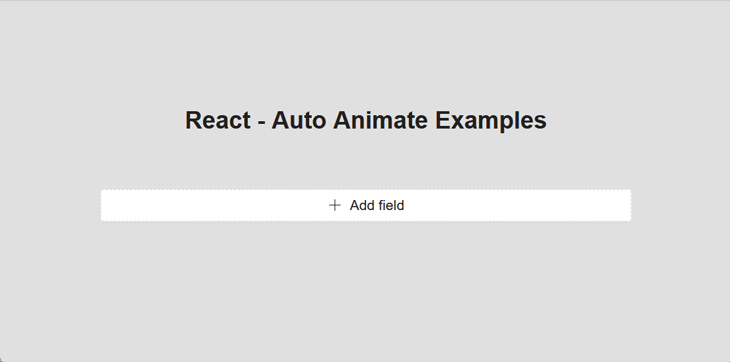
Most applications have dynamic input Form components. Now, we will create a dynamic component, so add the following code:
N.B., I have used the Ant Design
Formfor the sake of simplicity for this walkthrough.
//DynamicForm.jsx

import { MinusCircleOutlined, PlusOutlined } from '@ant-design/icons';
import { Button, Form, Input, Space } from 'antd';
import React from 'react';

const DynamicForm = () => {
    return (
            <Form name="dynamic_form_nest_item" autoComplete="off" >
                <Form.List name="users">
                    {(fields, { add, remove }) => (
                        <div>
                            {fields.map(({ key, name, ...restField }) => (
                                <Space
                                    key={key}
                                    style={{
                                        display: 'flex',
                                        marginBottom: 8,
                                    }}
                                    align="baseline"
                                >
                                    <Form.Item
                                        {...restField}
                                        name={[name, 'first']}
                                        rules={[
                                            {
                                                required: true,
                                                message: 'Missing first name',
                                            },
                                        ]}
                                    >
                                        <Input placeholder="First Name" />
                                    </Form.Item>
                                    <Form.Item
                                        {...restField}
                                        name={[name, 'last']}
                                        rules={[
                                            {
                                                required: true,
                                                message: 'Missing last name',
                                            },
                                        ]}
                                    >
                                        <Input placeholder="Last Name" />
                                    </Form.Item>
                                    <MinusCircleOutlined
                                      onClick={() => remove(name)}
                                      />
                                </Space>
                            ))}
                            <Form.Item>
                                <Button
                                    type="dashed"
                                    onClick={() => add()}
                                    block
                                    icon={<PlusOutlined/>
                                    }>
                                    Add field
                                </Button>
                            </Form.Item>
                        </div>
                    )}
                </Form.List>
            </Form>
    );
};

export default DynamicForm;
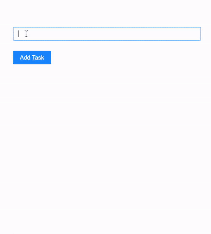
Now, we will see the following output when we run the component. When we click on Add field, the inputs are added in a fraction of a second; it feels like bad UX to me!
Let’s animate the form with AutoAnimate using a single line. Import the autoAnimate function inside the DynamicForm component:
import autoAnimate from '@formkit/auto-animate/react;
Next, create a reference variable called parent using the useRef Hook and pass it as an arguement to the autoAnimate function inside a useEffect declaration like so:
  const parent = useRef(null);

  useEffect(() => {
    parent.current && autoAnimate(parent.current);
  }, [parent]);
Then, pass the reference to the parent element <div>, as seen below:
<div ref={parent}>
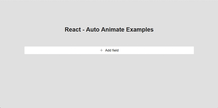
Now, run the code again and you will see the magic of AutoAnimate in action!
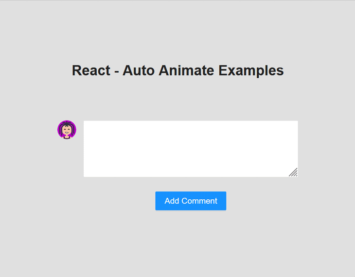
Another use case is to auto-animate the Comments component of an application. In the example below, we are developing a Comments component, which is used to add comments to a post. If a new comment is added, it is displayed at the top of a list:
//Comments.jsx
import {Avatar, Button, Comment, Form, Input,} from 'antd';
import React, {useState, useRef, useEffect} from 'react';
import autoAnimate from '@formkit/auto-animate'
const {TextArea} = Input;

const Editor = ({onChange, onSubmit, submitting, value}) => (
    <>
        <Form.Item>
            <TextArea rows={4} onChange={onChange} value={value}/>
        </Form.Item>
        <Form.Item>
            <Button
                htmlType="submit"
                loading={submitting}
                onClick={onSubmit}
                type="primary"
                >
            Add Comment
            </Button>
        </Form.Item>
    </>
);

const Comments = () => {
    const [comments, setComments] = useState([]);
    const [submitting, setSubmitting] = useState(false);
    const [value, setValue] = useState('');
    const parent = useRef(null);

    useEffect(() => {
      parent.current && autoAnimate(parent.current);
    }, [parent]);

    const handleSubmit = () => {
        if (!value) return;
        setSubmitting(true);
        setTimeout(() => {
            setSubmitting(false);
            setValue('');
            setComments([
                ...comments,
                {
                    author: 'Leia',
                    avatar: 'https://api.multiavatar.com/Starcrasher.png',
                    content: <p>{value}</p>,
                },
            ]);
        }, 500);
    };

    const handleChange = (e) => {
        setValue(e.target.value);
    };

    return (
        <>
            <ul ref={parent}>
                {comments.map((comment) => (
                        <Comment
                            key={comment.content}
                            author={comment.author}
                            avatar={
                                    <Avatar
                                      src="https://api.multiavatar.com/Starcrasher.png"
                                      alt="Leia"
                                    />
                                    }
                            content={
                                <p>
                                    {comment.content}
                                </p>
                            }
                        />
                    )
                )}
            </ul>
            <Comment
                avatar={
                  <Avatar src="https://api.multiavatar.com/Starcrasher.png" alt="Leia"/>
                }
                content={
                    <Editor
                        onChange={handleChange}
                        onSubmit={handleSubmit}
                        submitting={submitting}
                        value={value}
                    />
                }
            />
        </>
    );
};

export default Comments;
In the example above, we have a comment input. When the user types a comment and clicks Add Comment, the entered comment is appended at the top with an animation. To animate the list, we have added an AutoAnimate hook reference to the <ul> element.
Now, we will see the following output when we run the component:
AutoAnimate allows us to customize our animations and control their final state, enabling us to tailor the animations according to the industry’s best practices and improve the user experience.
We can customize an animation’s transition time by passing a duration props as a second argument to the autoAnimate function. Let’s see this in action with a dynamic card.
In this example, we made the transition 500ms long, so when the user clicks Add Task, a new card is inserted and all other cards are moved after 500ms:
//DynamicComponents.jsx

import React, {useState} from "react";
import {Avatar, Button, Card, Col, Form, Input, Row} from 'antd';
import autoAnimate from "@formkit/auto-animate";

const {Meta} = Card;

export default function DynamicComponents() {
    const [comments, setComments] = useState([]);
    const parent = useRef(null);

    useEffect(() => {
      parent.current && autoAnimate(parent.current, {duration: 500});
    }, [parent]);

    const handleSubmit = (values) => {
        if (!values) return;
        setComments((prev) => [{content: values.content}, ...prev]);
    };

    return (
        <>
            <Form
                name="basic"
                onFinish={handleSubmit}
                autoComplete="off"
            >
                <Form.Item
                    name="content"
                >
                   <Input/>
                </Form.Item>
                <Form.Item>
                    <Button htmlType="submit" type="primary">
                        Add Task
                    </Button>
                </Form.Item>
            </Form>
            <Row gutter={[16, 24]} ref={parent}>
                {comments.map((comment) => (
                    <Col span={6} key={comment.content}>
                        <Card
                            style={{
                                width: 100,
                            }}
                            cover={
                                <img
                                    alt="example"
                                    src="https://gw.alipayobjects.com/zos/rmsportal/JiqGstEfoWAOHiTxclqi.png"
                                />
                            }
                        >
                            <Meta
                                avatar={
                                <Avatar src="https://api.multiavatar.com/Starcrasher.png"/>
                                  }
                                description={comment.content}
                            />
                        </Card>
                    </Col>
                ))
                }
            </Row>
        </>
    );
}
Now, we will see the following output when we run the component:
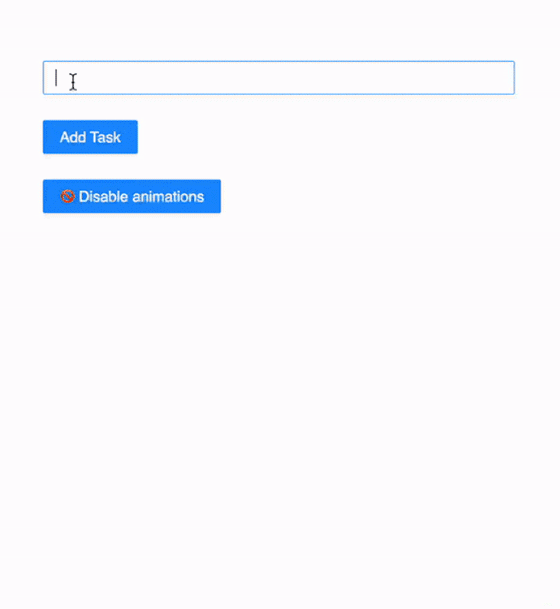
Sometimes, it may be necessary to disable an animation and enable it at a later time. AutoAnimate provides enable and disable functions that permit us to do just that. However, the autoAnimate function does not provide much flexibility in how it is used. Therefore, we’ll use the useAutoAnimate Hook provided by AutoAnimate to gain more control over our animations.
useAutoAnimate can be imported this way:
import { useAutoAnimate } from "@formkit/auto-animate/react";
The useAutoAnimate Hook can be used similarly to the autoAnimate function in the previous examples. The only difference is that useAutoAnimate provides a parent reference variable, as well as enable and disable functions that accept Boolean values, which allow us to control whether or not we want to animate the parent element.
The following code block demonstrates how this Hook works:
//DynamicCards.jsx

import React, {useState} from "react";
import {Avatar, Button, Card, Col, Form, Input, Row} from 'antd';
import {useAutoAnimate} from "@formkit/auto-animate/react";

const {Meta} = Card;

export default function DynamicCards() {
    const [comments, setComments] = useState([]);
    const [parent, enable] = useAutoAnimate({duration: 500});
    const [isEnabled, setIsEnabled] = useState(true)

    const handleSubmit = (values) => {
        if (!values) return;
        setComments((prev) => [{content: values.content}, ...prev]);
    };

    function toggle () {
        enable(!isEnabled)
        setIsEnabled(!isEnabled)
    }

    return (
        <>
            <Form
                name="basic"
                onFinish={handleSubmit}
                autoComplete="off"
            >
                <Form.Item
                    name="content"
                >
                    <Input/>
                </Form.Item>
                <Form.Item>
                    <Button htmlType="submit" type="primary">
                        Add Task
                    </Button>
                </Form.Item>
                <Form.Item>
                    <Button onClick={toggle} type="primary">
                        { isEnabled ? "🚫 Disable" : "✅ Enable" } animations
                    </Button>
                </Form.Item>
            </Form>
            <Row gutter={[16, 24]} ref={parent}>
                {comments.map((comment) => (
                    <Col span={6} key={comment.content}>
                        <Card
                            style={{
                                width: 100,
                            }}
                            cover={
                                <img
                                    alt="example"
                                    src="https://gw.alipayobjects.com/zos/rmsportal/JiqGstEfoWAOHiTxclqi.png"
                                />
                            }
                        >
                            <Meta
                                avatar={
                                  <Avatar
                                  src="https://api.multiavatar.com/Starcrasher.png"/>}
                                  description={comment.content}
                            />
                        </Card>
                    </Col>
                ))
                }
            </Row>
        </>
    );
}
Here, we used our previous example by adding enable and disable options to it. Animation is controlled by the enable Boolean prop passed to the useAutoAnimate Hook.
Now, we will see the following output when we run the component:
AutoAnimate is a zero-config utility that also provides an option to customize the default animation keyframes and use custom animations. However, AutoAnimate’s default animation offerings will typically be enough for most components in my experience.
N.B., you can find the complete code of this tutorial in this CodeSandbox.
Although AutoAnimate is primarily known for its ability to animate elements with just one line of code, it is possible to create complex animations with minimal effort through some experimentation.
As with the previous examples, to add micro-interactions to our applications using AutoAnimate, we simply need to reference the autoAnimate function in the underlying DOM node of the element’s parent. However, AutoAnimate only animates a child element added or removed in the DOM. Therefore, we cannot animate things like an element’s background color or transformation.
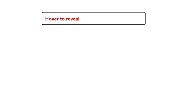
However, we can use the onMouseOver and onMouseLeave event handlers to create hover-triggered animations in our applications as seen in the following example:
import React, { useState } from "react";
import { autoAnimate } from '@formkit/auto-animate/react';

export function Accordion() {
  const [showMessage, setShowMessage] = useState(false);
  const parent = useRef(null);

  return (
    <div ref={parent}>
      <strong
        onMouseOver={() => setShowMessage(!showMessage)}
        onMouseLeave={() => setToggle(false)}
      >
        Hover to reveal
      </strong>
      {showMessage && (
        <p>
          Lorem ipsum dolor sit amet consectetur adipisicing
          elit. Vel explicabo corrupti, expedita commodi est
          repellendus laborum dolores, maxime officia
          facilis perspiciatis. Debitis a cupiditate
          expedita atque libero quis beatae vero!
        </p>
      )}
    </div>
  );
}
Here, we are conditionally adding and removing the p element from the DOM using the onMouseOver event handler. This will cause the element to animate in and out when the strong element is hovered upon:
Animations can grab users’ attention when they are rendered in a unique way. One common way to achieve this is by chaining animation sequences. This means taking multiple animations and playing them one after the other, often with some overlap between them.
For example, instead of animating a list of items uniformly as shown in the GIF below, we could animate them individually to create a stagger effect. This would create a more dynamic and visually appealing animation:
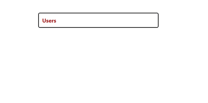
Based on our knowledge of AutoAnimate, we can achieve this effect by nesting each list item within different parent elements and referencing separate autoAnimate functions with different duration values:
import React, { useState } from "react";
import { useAutoAnimate } from "@formkit/auto-animate/react";

export function Stagger() {
  const [user1] = useAutoAnimate({ duration: 100 });
  const [user2] = useAutoAnimate({ duration: 200 });
  const [user3] = useAutoAnimate({ duration: 300 });
  const [toggle, setToggle] = useState(false);

  return (
    <div>
      <strong
        onMouseOver={() => setToggle(!toggle)}
        onMouseLeave={() => setToggle(false)}
      >
        Users
      </strong>
      <div>
        <div>
          <div ref={user1}>
            {toggle && <p}>Ellen</p>}
          </div>
          <div ref={user2}>
            {toggle && <p>Charlie</p>}
          </div>
          <div ref={user3}>
            {toggle && <p>Ellen</p>}
          </div>
        </div>
      </div>
    </div>
  );
}
This will cause the list to gradually appear one after the other when the user moves their cursor over the strong element:
The complete code for the examples above can be found in this CodeSandbox.
Animations can make or break your applications. A good rule of thumb is to have a set of intuitive best practices to adhere to when adding animations to your React applications. Some of the industry’s best practices are as follows:
AutoAnimate makes React animation very simple with its zero-config approach, ease of use, and speedy implementation. It helps devs efficiently provide smooth user experiences in their projects. In addition to the examples we looked at today with React, AutoAnimate also supports Vue, Angular, and Svelte. You can find examples of other JavaScript frameworks in the official docs.
Let me know of your own experiences using AutoAnimate in the comments below and thanks for reading!
Install LogRocket via npm or script tag. LogRocket.init() must be called client-side, not
server-side
$ npm i --save logrocket

// Code:

import LogRocket from 'logrocket';
LogRocket.init('app/id');
// Add to your HTML:

<script src="https://cdn.lr-ingest.com/LogRocket.min.js"></script>
<script>window.LogRocket && window.LogRocket.init('app/id');</script>

AI-generated tests can speed up React testing, but they also create hidden risks. Here’s what broke in a real app.re

Why the future of DX might come from the web platform itself, not more tools or frameworks.

A hands-on test of Claude Code Review across real PRs, breaking down what it flagged, what slipped through, and how the pipeline actually performs in practice.

CSS art once made frontend feel playful and accessible. Here’s why it faded as the web became more practical and prestige-driven.
Would you be interested in joining LogRocket's developer community?
Join LogRocket’s Content Advisory Board. You’ll help inform the type of content we create and get access to exclusive meetups, social accreditation, and swag.
Sign up now

 Learn more →
