Checkboxes and tables are useful additions for many mobile applications. Checkboxes can increase an app’s interactivity, while tables are beneficial for displaying data. Unfortunately, creating checkboxes and table components from scratch can be a tedious, lengthy process.

In this article, we’ll demonstrate how to easily create and style tables and checkboxes for a React Native iOS or Android app. We’ll review the individual components and properties of React Native checkboxes and tables. We’ll also demonstrate how to add different types of checkboxes and tables to a React Native app.
As a prerequisite for this article, complete the basic setup required to run a React Native application. For an overview on how to set up a development environment for React Native on your local machine, refer to the official documentation. You may also wish to use a toolchain, such as Create React App.
The Replay is a weekly newsletter for dev and engineering leaders.
Delivered once a week, it's your curated guide to the most important conversations around frontend dev, emerging AI tools, and the state of modern software.
Run the below command to initialize a React Native project:
npx react-native init tablechekboxExample
This will create a new RN project with a basic template.
Use one of the below commands, depending on whether you want to run the project on iOS or Android:
yarn run ios or npm run ios

yarn run android or npm run android
Let’s take a look at how to create checkboxes in React Native.
First, install the @react-native-community/checkbox package by running this command:
yarn add @react-native-community/checkbox or npm install @react-native-community/checkbox
Before adding checkboxes to an app, let’s first review the checkbox common properties in React Native:
onChange is a function property. It is used to trigger the native input eventvalue is a Boolean property. It is used to assign a value to the checkbox. The checkbox updates when its value is changed. The default value for the checkbox is falsedisabled is a Boolean property. It is used to verify that the checkbox is enabled. The default value for this property is falseonValueChange is a callback function. It updates the value property to reflect the user’s actions.Here are some React Native checkbox properties for iOS apps:
hideBox is a Boolean property that is used to specify if the box should be hidden. The default value of this property is falselineWidth is a number property. It is used to specify the width of the check mark and box lines. The default value of this property is 2.0pxboxType is a circle or square property. It is used to specify the type of box to use. This property defaults to a circletintColor is a Boolean property that is used to add the color of the box when the checkbox is Off. Its default value is #aaaaaaonCheckColor is used to check the check mark color. This property defaults to #007affonFillColor is used to check the interior color of the checkbox. This property defaults to transparentanimationDuration is used to add the duration of any animations. This property defaults to 0.5seconAnimationType is used to specify the type of animation that should be used when the checkbox gets checked. This property defaults to strokeoffAnimationType is used to specify the type of animation that should be used when the checkbox gets uncheckedHere’s a React Native checkbox property for Android apps:
tintColors is a Boolean property. It has a color value for true when the checkbox is checked and the color value for false when the checkbox is uncheckedFor more information about React Native checkbox properties, refer to the official documentation.
Now that we’ve reviewed checkbox properties, let’s add checkboxes to a sample React Native app. In our example, a user will select from a list of popular frontend frameworks and then click multiple checkboxes to save the result.
Here’s the code for the React Native checkbox example:
import React, {Component} from 'react';
import {Platform, StyleSheet, Text, View, Button} from 'react-native';
import CheckBox from '@react-native-community/checkbox';
const initialState = {
  react: false,
  next: false,
  vue: false,
  angular: false,
};
export default function Checkbox() {
  const [state, setState] = React.useState(initialState);
  const [toggleButton, setToggleButton] = React.useState(false);
  return (
    <View style={styles.container}>
      <View>
        <View>
          <View style={styles.checkboxWrapper}>
            <CheckBox
              value={state.react}
              onValueChange={value =>
                setState({
                  ...state,
                  react: value,
                })
              }
            />
            <Text>React js</Text>
          </View>
          <View style={styles.checkboxWrapper}>
            <CheckBox
              value={state.next}
              onValueChange={value =>
                setState({
                  ...state,
                  next: value,
                })
              }
            />
            <Text>Next js</Text>
          </View>
          <View style={styles.checkboxWrapper}>
            <CheckBox
              value={state.vue}
              onValueChange={value =>
                setState({
                  ...state,
                  vue: value,
                })
              }
            />
            <Text>Vue js</Text>
          </View>
          <View style={styles.checkboxWrapper}>
            <CheckBox
              value={state.angular}
              onValueChange={value =>
                setState({
                  ...state,
                  angular: value,
                })
              }
            />
            <Text>Angular js</Text>
          </View>
        </View>
        <Button
          onPress={() => setToggleButton(toggleButton => !toggleButton)}
          title="Save"
        />
      </View>
      {toggleButton && (
        <View style={styles.resultContainer}>
          {Object.entries(state).map(([key, value]) => {
            return (
              value && (
                <View key={key} style={{paddingHorizontal: 5}}>
                  <Text>{key}</Text>
                </View>
              )
            );
          })}
        </View>
      )}
    </View>
  );
}
const styles = StyleSheet.create({
  textInput: {
    borderColor: 'gray',
    borderWidth: 1,
  },
  resultContainer: {
    flexDirection: 'row',
    padding: 10,
  },
  container: {
    flex: 1,
    justifyContent: 'center',
    alignItems: 'center',
    backgroundColor: '#F5FCFF',
  },
  checkboxWrapper: {
    flexDirection: 'row',
    alignItems: 'center',
    paddingVertical: 5,
  },
});
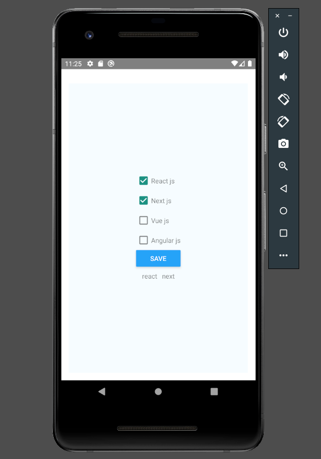
Here are the checkboxes in the React Native app:
Now, let’s review how to build a table in a React Native application using the react-native-table-component npm package.
Install the react-native-table-component package by running the following command:
yarn add react-native-table-component or npm install react-native-table-component
React Native tables are made up of several components: Table, TableWrapper, Row, Rows, Col, Cols, and Cell. Each component may be configured in the React Native app using the following properties:
data has an array of the data displayed in the TablewidthArr adds width to each columnheightArr adds height to each columnstyle adds CSS styling for Table containertextStyle adds style for the text within the Table cellsborderStyle specifies the color and width of the Table‘s exterior lineNow, we’ll create a basic sample table UI that displays the table data.
Here’s the code for the React Native table component:
import React from 'react';
import {StyleSheet, View} from 'react-native';
import {Table, Row, Rows} from 'react-native-table-component';
const tableData = {
  tableHead: ['Type', 'Stars', 'Issues'],
  tableData: [
    ['React js', '182k', '701'],
    ['Vue js', '193k', '324'],
    ['Angular js', '20.8k', '1.7k'],
    ['Next js', '80.5k', '893'],
    ['Svelte js', '55.3k', '534'],
  ],
};
function TableSample() {
  const [data, setData] = React.useState(tableData);
  return (
    <View style={styles.container}>
      <Table borderStyle={{borderWidth: 2, borderColor: '#42b983'}}>
        <Row
          data={data.tableHead}
          style={styles.head}
          textStyle={styles.text}
        />
        <Rows data={data.tableData} textStyle={styles.text} />
      </Table>
    </View>
  );
}
export default TableSample;
const styles = StyleSheet.create({
  container: {
    flex: 1,
    padding: 10,
    justifyContent: 'center',
    backgroundColor: '#fff',
    paddingTop: 20,
  },

  head: {height: 44, backgroundColor: '#42b983'},
  text: {margin: 6},
});
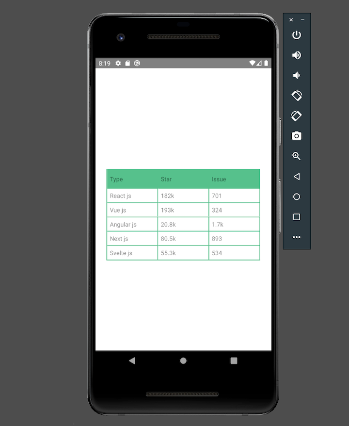
Here’s the basic table in the React Native app:
Now, we’ll create a table UI with a fixed header and a horizontal and vertical scroll. We’ll use React Native’s ScrollView to add the scrolling functionality.
Here’s the code the for the scrollable table example:
import React from 'react';
import {StyleSheet, View, ScrollView} from 'react-native';
import {Table, Row} from 'react-native-table-component';
const tableDataSample = {
  tableHead: [
    'Table heading 1',
    'Table heading 2',
    'Table heading 3',
    'Table heading 4',
    'Table heading 5',
    'Table heading 6',
    'Table heading 7',
    'Table heading 8',
    'Table heading 9',
  ],
  widthArr: [140, 160, 180, 100, 120, 140, 160, 180, 200],
  tableData: [['Table column 1', 'Table column 2', 'Table column 3', 'Table column 4', 'Table column 5', 'Table column 6', 'Table column 7', 'Table column 8', 'Table column 9'],
        ['Table column 1', 'Table column 2', 'Table column 3', 'Table column 4', 'Table column 5', 'Table column 6', 'Table column 7', 'Table column 8', 'Table column 9'],
        ['Table column 1', 'Table column 2', 'Table column 3', 'Table column 4', 'Table column 5', 'Table column 6', 'Table column 7', 'Table column 8', 'Table column 9'],
        ['Table column 1', 'Table column 2', 'Table column 3', 'Table column 4', 'Table column 5', 'Table column 6', 'Table column 7', 'Table column 8', 'Table column 9'],
        ['Table column 1', 'Table column 2', 'Table column 3', 'Table column 4', 'Table column 5', 'Table column 6', 'Table column 7', 'Table column 8', 'Table column 9'],
        ['Table column 1', 'Table column 2', 'Table column 3', 'Table column 4', 'Table column 5', 'Table column 6', 'Table column 7', 'Table column 8', 'Table column 9'],
        ['Table column 1', 'Table column 2', 'Table column 3', 'Table column 4', 'Table column 5', 'Table column 6', 'Table column 7', 'Table column 8', 'Table column 9'],
        ['Table column 1', 'Table column 2', 'Table column 3', 'Table column 4', 'Table column 5', 'Table column 6', 'Table column 7', 'Table column 8', 'Table column 9'],
        ['Table column 1', 'Table column 2', 'Table column 3', 'Table column 4', 'Table column 5', 'Table column 6', 'Table column 7', 'Table column 8', 'Table column 9'],
        ['Table column 1', 'Table column 2', 'Table column 3', 'Table column 4', 'Table column 5', 'Table column 6', 'Table column 7', 'Table column 8', 'Table column 9'],
        ['Table column 1', 'Table column 2', 'Table column 3', 'Table column 4', 'Table column 5', 'Table column 6', 'Table column 7', 'Table column 8', 'Table column 9'],
        ['Table column 1', 'Table column 2', 'Table column 3', 'Table column 4', 'Table column 5', 'Table column 6', 'Table column 7', 'Table column 8', 'Table column 9'],
        ['Table column 1', 'Table column 2', 'Table column 3', 'Table column 4', 'Table column 5', 'Table column 6', 'Table column 7', 'Table column 8', 'Table column 9'],
    ],
};
export default function ScrollableTable() {
  const [data, setData] = React.useState(tableDataSample);
  return (
    <View style={styles.container}>
      <ScrollView horizontal={true}>
        <View>
          <Table borderStyle={{borderWidth: 1, borderColor: '#42b983'}}>
            <Row
              data={data.tableHead}
              widthArr={data.widthArr}
              style={styles.header}
              textStyle={styles.text}
            />
          </Table>
          <ScrollView style={styles.scrollContainer}>
            <Table borderStyle={{borderWidth: 1, borderColor: '#42b983'}}>
              {data.tableData.map((rowData, index) => (
                <Row
                  key={index}
                  data={rowData}
                  widthArr={data.widthArr}
                  style={[
                    styles.rowSection,
                    index % 2 && {backgroundColor: '#fff'},
                  ]}
                  textStyle={styles.text}
                />
              ))}
            </Table>
          </ScrollView>
        </View>
      </ScrollView>
    </View>
  );
}
const styles = StyleSheet.create({
  container: {flex: 1, padding: 16, paddingTop: 30, backgroundColor: '#fff'},
  rowSection: {height: 40, backgroundColor: '#E7E6E1'},
  header: {height: 50, backgroundColor: '#42b983'},
  text: {textAlign: 'center', fontWeight: '100', color: 'black'},
  scrollContainer: {},
});
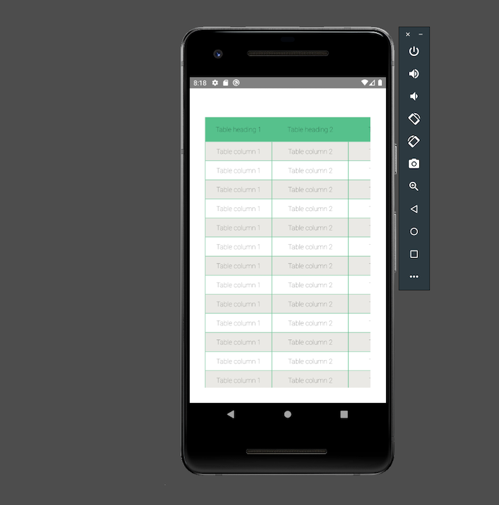
Here’s the scrollable table in the React Native app:
In this article, we investigated how to build and style checkboxes and tables in React Native. We reviewed individual React Native checkbox and table properties. We also demonstrated how to add checkboxes, a basic table, and a table with a fixed header and horizontal and vertical scrolling to a React Native application.
The complete code for the projects used in this article is available in this GitHub repo.

LogRocket's Galileo AI watches sessions for you and and surfaces the technical and usability issues holding back your React Native apps.
LogRocket also helps you increase conversion rates and product usage by showing you exactly how users are interacting with your app. LogRocket's product analytics features surface the reasons why users don't complete a particular flow or don't adopt a new feature.
Start proactively monitoring your React Native apps — try LogRocket for free.

Learn how sibling-index() enables clean, JavaScript-free stagger animations using native CSS.

useEffect breaks AI streaming responses in ReactSee why useEffect breaks AI streaming in React, and how moving stream state outside React fixes flicker and stale updates.

A real-world debugging session using Claude to solve a tricky Next.js UI bug, exploring how AI helps, where it struggles, and what actually fixed the issue.

CSS wasn’t built for dynamic UIs. Pretext flips the model by measuring text before rendering, enabling accurate layouts, faster performance, and better control in React apps.
Would you be interested in joining LogRocket's developer community?
Join LogRocket’s Content Advisory Board. You’ll help inform the type of content we create and get access to exclusive meetups, social accreditation, and swag.
Sign up now

